10,000 search results
(0.05 seconds)
- Channel Surfing JNL by Jeff Levine,
$29.00In 1999, Jeff Levine released a freeware font called "Channel Tuning JL" scanned from drawings made with a felt tip marker and designed as if the letters were breaking up due to poor reception such as on pre-digital TV sets. Over a decade later, Jeff has totally reworked the font—giving it cleaner lines, an extended character set and renaming it Channel Surfing JNL to set it apart from the roughly-drawn original. - Karben 105 Stencil by Talbot Type,
$19.50 Karben 105 Stencil is a contemporary stencil font. The stencil breaks in the letters are applied in a way that is sensitive to the forms of the character in pursuit of a more elegant stencil. Karben 105 Stencil is available in a family of three weights. Karben 105 Stencil is closely related to Karben 105 and Karben 205 . All of the Karben fonts feature an extended character set, including accented characters for Central European languages.
 - Kroppen Round by Talbot Type,
$19.50 Kroppen Round is a geometric, stencil-style font based on Talbot Type Kaleko Round, and is available in four weights. Kroppen is not strictly a stencil font given that several characters, notably the O, are not stencilled. The design has more to do with achieving each character from a single stroke, or series of single strokes. Kroppen Round features an extended character set to include accented characters for additional Central European languages.
 - Clarified JNL by Jeff Levine,
$29.00 Based on William H. Page’s Clarendon Extended wood type from the 1800s, Clarified JNL is digitally available in both regular and oblique versions. In the days of wood and metal type, foundries often made changes to an existing design to make their font more unique and different from their competitors. Clarified JNL is different from Clarenwood JNL (which is partially based on another wood type Clarendon and features many alternate letter forms).
 - Lorelei by insigne,
$21.99 Lorelei is an exuberant and bouncy script. The ink seems to be slathered onto the surface in a casual and spontaneous manner, making for a flowing and feminine script that is perfect for invitations or greeting cards. The script also contains a large number of OpenType alternates and ligatures to extend the impulsive nature of the lettering. Lorelei is named for a young German maiden that supposedly threw herself into the Rhine.
 - Fazon by Tour De Force,
$30.00 Compact and condensed, Fazon font family belongs to design inspired by vintage typefaces. It is available in 7 weights – from Light to Black. Contrast in letter design gets higher as weights get thicker which assigns dose of display elements in heavier weights of Fazon. Contains 5 stylistic sets (4 for uppercase and 1 for lowercase letters) and fractions. Fazon covers extended Latin character map. Ideal usage: packages and labels, posters, titles, websites.
 - Cowling Sans AOE by Astigmatic,
$24.95 Cowling Sans AOE is a charming Art Deco architectural style typeface. It is the cleaned-up, refined revival and elaboration of a lettering design from “Lettering for Commercial Purposes” by Wm. Hugh Gordon published in 1918. What began as a basic character set of Capitals, lowercase, and two styles of ampersand has been expanded to a full character set including unlimited fractionals, superiors & inferiors, ordinals, tabular, proportional, and oldstyle figures, and an expanded language glyph set, all with a smallcaps and Caps to Smallcap set to match. This lettering style exudes the charm of its era with every word set in it by way of the small details that set it apart from other sans typestyles.
 - Rundfunk Antiqua by Linotype,
$29.99Rundfunk-Antiqua was originally designed as a font for small point size and shorter texts. It was presented 1933/35 by Linotype Designstudio but unfortunately never developed as a font family, including only Antiqua roman and sans-serif bold. Such an unusual combination resulted from the font combinations common during that time. The font’s basic forms tend toward the Transitional style but its details come from the influence of Jugendstil. - Haboro Slab by insigne,
$- Haboro Slab. It’s a nose-to-the-grindstone kind of font like the first of its family. This slab serif pushes through the clutter powerfully in editorial and corporate work such as business websites and software. The Haboro hyperfamily as a whole is known for its ability to make the work clear and simple, even with the fonts’ advanced angle--and Slab is no change here. Consistent with Haboro, too, the simplified geometric features of the slab face just make sense, no matter where you use it. Its timeless wedge-molded serifs give this family the formula it needs to function flexibly in jobs from fashion to packaging. Enhance your output with the font’s wide range of ligatures and alternates, including OpenType alternates. Use Haboro Slab’s large pair of solution glyphs and various other OpenType specifics, too, to give your message the clarity it deserves. Even more, it couples well with the sophisticated didone of the Haboro hyperfamily to further expand your capabilities. Haboro Slab has every quality you need for successful lettering. Use this modification on a classy tradition to mold and shape your next layout, whether website, iPhone app, advertising, or newspaper. There is no work Haboro Slab won’t power through.
 - Oun by Ezzazebra,
$15.00 Inspired from Cambodia’s alphabet, Khmer. I tried to explore the visual of the original character in Latin characters. Inspired by 2 gothic fonts, Old London (for the modern/straight feel) and Berliner (for the dynamic between thin and bold line). The letters are made with pencil in a millimeter block book, then scanned into clean vector format. And the result can be use for Display or a Headline with traditional or ethnic theme, including film, game, event, etc.
 - Code Saver by Dharma Type,
$9.99 Code Saver — Next-generation monospaced font — 1. Code Saver is a monospaced font family for coding and tabular layout. 2. Code Saver is a clean, natural and simple monospaced font family. 3. Code Saver consists of 6 style, Regular, Medium, Bold and their 11° Italic. 4. Code Saver has 93.33% condensed width for more usable space. 5. Code Saver has good distinguishability and legibility especially numerals. 6. Code Saver brings a fresh sensitivity to boring old existing monospaced fonts.
 - Woodline by Jeff Levine,
$29.00 Most folks might picture wood type lettering as the fancy styles of the 1880s which so perfectly evoked images of the Old West. Occasionally there is an exception to that rule, as an online image of some vintage wood letters with an Art Deco influence inspired a revival as a digital type face. Wood Lined JNL features a bold alphabet with an engraved line throughout the characters, and is available in both regular and oblique versions.
 - Shameless by Positype,
$79.00 I will spare you the long-winded description this time and all of the motivations and witty innuendoes. Quite frankly, I forgot about creating this typeface and it sat on my hard drive for almost a year. Luckily, my daughter Isobel saw the initial drawings one day and ask me about those pretty letters and I remembered… yep, that happened. That said, time made this a better typeface… with fresh eyes and time, much was redrawn, retooled and expanded to something I truly enjoy playing with. Shameless makes extensive use of Contextual alternates to create a proper ebb and flow from letter to letter. Interestingly, there are only a handful of ligatures… instead many special combinations are accounted for solely by relying on Contextual Alts. Mix in Stylistic Alts, Swashes, responsive Titling Alts, numerous Style Sets, etc and you can have a lot of fun. I created 2 versions. A ‘Standard’ version that has 2200+ characters and a ‘Deluxe’ version that has 2400+ characters and an interesting caveat… I plan on expanding the Deluxe version any time I have an idea to add to the typeface… and as such, buyers will receive all of those updates at no charge (with updates going directly to the distributors). You get what you pay for… no insane discounts. Oh, and if you are wondering… Shameless is based on my handwriting using Kuretake Zig CocoIro pens. I love these pens.
 - Toffee by Font Kitchen,
$9.99 Add some sweet flavor to your next project with Toffee, the newest release from Font Kitchen. Sweet and sophisticated in 9 different weights, all with true italics. Toffee’s handcrafted glyphs and sharp serifs bring an old-fashioned flavor with a modern twist. We’ve slow-cooked Toffee with the finest ingredients, including stylistic alternates, fractions, ligatures, tabular/proportional figures, and more. Whether you need a bold, playful weight or something more light and elegant, Toffee is a great way to add a warm, inviting personality to your next project with a handmade feel.
 - Inka by CarnokyType,
$49.00 Inka is the name by which the closest-ones called my partner. Inka is also the name of a text typeface – in its form very friendly and welcoming. The same way as relationships develop through the life, text typefaces develop, too. I had started the work on this typeface about the same time as I met Inka, while reaching the final output has been a long and progressive process. Inka is a modern serif typeface with wide universality in functions (various editorial usages as books, magazines, annual reports…). The concept and the scope of the complete type family are based on the principle of optical sizes of the typeface designed for the particular use of the size of typesetting. Inka consists of several drawing variations for the typesetting of small sizes (Small), text typesetting (Text), larger typesetting sizes (Title), and headlines sizes (Display). Two constructive alternatives, differing in the height of the construction of the font signs, further extend the variability of the usage of the typeface. Inka A has classical proportions ideal for book typesetting. Inka B has lower ascenders and descenders, lower uppercase glyphs and numbers. Typeface with such construction allows us to use the typesetting efficiently while using tighter leading and still looking more contemporary. Each of the font set (Display, Title, Text, Small) consists of four weights (Regular, Medium, Bold, Black), each has wide character set and a lot of OpenType features. “Inka is dedicated to Inka.”
 - Ribbons by Positype,
$20.00 Ribbon type. Holy grail of complex-lettering-turned typeface or an elusive Loch Ness monster that is often teased, possibly seen in the wild, but never confirmed? From the amazing lettering artist and author Martina Flor and masterful type designer Neil Summerour, comes the aptly named Ribbons. Ribbons is a sincere and well-conceived approach to providing a reliable solution to ribbon and ribbon-styled type for creative professionals when a lettering artist just isn’t available. Ribbons provides both flat and ‘folded’ options with the Regular and Fold styles, but then raises the bar with separate layer styles that will allow you to easily create the elegant back and forth movements produced with ribbon-style lettering we have all come to appreciate. These layer options are provided in both ‘smooth’ and ‘pleated’ connected styles. Flor and Summerour didn’t stop there. Each typeface was expanded with a number of stylistic alternates, additional swashed and flourished letters, ligatures, and even more in order to provide as many decorative options as possible to the creative. To round out the nine fonts available in the typeface and to ‘put a bow on it’, they’ve added a separate Shadow style and two different color fonts (available exclusively with family purchases).
 - Hidebeast by Allouse Studio,
$16.00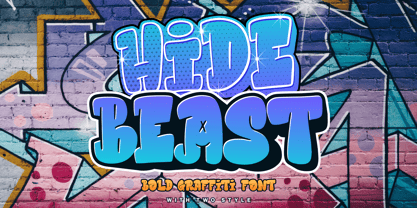 Proudly Present, Hidebeast a Bold Graffiti Font With Two Styles. Hidebeast is perfect for any titles, logo, product packaging, branding project, megazine, social media, wedding, or just used to express words above the background. Both style come with Multi-Lingual Support. Enjoy the font, feel free to comment or feedback, send me PM or email. Thank You!
 - Calmbelt by Allouse Studio,
$16.00 Proudly Present, Calmbelt A Bold Graffiti Font With Two Styles. Calmbelt is perfect for any titles, logo, product packaging, branding project, megazine, social media, wedding, or just used to express words above the background. Calmbelt come with Multi-Lingual Support. Enjoy the font, feel free to comment or feedback, send me PM or email. Thank You!
 - Deuterium by Kostic,
$40.00 This versatile font family comprises 10 distinct weights, ranging from the delicate Thin to the bold and distinctive Ultra Heavy. What makes Deuterium special is its approach to the heavy styles. Balancing geometric principles with the challenges of extreme weight, Deuterium manages to preserve the geometric character even when the stems expand to extraordinary widths and the apertures narrow to the size of a dot. In the world of type design, geometric sans-serif fonts are known for their precision and adherence to symmetry. Deuterium deviates from this norm while keeping its geometric essence — it is a thoughtful reinterpretation of the classic style. Whether you’re designing for branding, headlines, or text, Deuterium is a versatile tool that adds a modern touch to your projects. It explores geometry in unconventional heavy styles, making your designs stand out with a subtle yet distinct geometric charm.
 - Young Money by Mans Greback,
$69.00 Young Money is a script font that expresses a sense of forwardness and spontaneity. Its calligraphic strokes were created with a brush, giving it a wild and fast appearance that's perfect for conveying energy and movement. This font is ideal for sporty designs, trendy logos, and anything that requires a touch of youthful vigor. With its Bold and Italic styles, Young Money is versatile enough to be used for a variety of design purposes. The Italic style gives the font a more emphasized look, while the Bold style adds an extra level of impression and strength. The swashes included in the font allow for even more customization, giving designers the ability to create truly unique and expressive designs. Whether you're designing a logotype, poster or product brand, Young Money is a font that perfectly captures the spirit of youth and vitality. Use underscore _ after a word to make a swash. Example: Wild_ Use multiple underscores to make longer swashes. Example: Bonfires_____ Use # after any letter to make a swash version. Example: Spring#Zone# The font is built with advanced OpenType functionality and has a guaranteed top-notch quality, containing stylistic and contextual alternates, ligatures and more features; all to give you full control and customizability. It has extensive lingual support, covering all Latin-based languages, from Northern Europe to South Africa, from America to South-East Asia. It contains all characters and symbols you'll ever need, including all punctuation and numbers.
 - Burstwick by Fettle Foundry,
$10.00 Burstwick is a sans-serif typeface inspired by modern workhorse typefaces and designed for everyday use. It has unique personality but doesn’t suffer in more practical situations, and is very flexible: there are six weights, ranging from thin to bold, and matching oblique italicis. Lifting elements from grotesque, geometric, and humanist styles, and putting legibility at the forefront, each weight is drawn with higher contrast and subtle asymmetrical features to enhance individuality and aid in readability, particularly at body sizes on websites. These features are intended as an alternative to rigid geometric lines, bringing a natural feeling to glyphs, resulting is a friendly, but professional choice for any organisation or designer. The foundation of the design is a large X-height, which further aids in differentiating lowercase characters from one another. This allows Burstwuck to feel open, airy, and really shine when used in single-family type hierachies, particulalry in headlines and larger text. Through its 630 glyphs, Burstwick supports many Latin languages, with thorough kerning for accented character combinations, making it an ideal choice for organisations considering multilingual users, and the perfect addition to any designer’s toolbox. In addition to accented characters, a large number of special characters and alternatives have been included to increase choice and flexibility. Among these are expand currency symbols, oldstyle figures, math operators, and symbols. Language support includes: Bosnian, Catalan, Czech, Danish, German, English, Spanish, Estonian, Finnish, French, Irish, Croatian, Hungarian, Icelandic, Italian, Lithuanian, Latvian, Maltese, Dutch, Norwegian, Polish, Portuguese, Romanian, Slovak, Slovenian, Albanian, Swedish, Turkish.
 - Retro Blanche by Pista Mova,
$9.00 Blanche is a hand-drawn, retro script font. This font is perfect for all your fun designs! Use Blanche to create logos, branding, stickers, shirts, signs, posters, quotes, instagram posts, procreation designs and more! Includes shadow/extrude versions that are perfectly sized to fit Blanche Regular - so you can layer both fonts easily! Blanche Regular Blanche Extrude Thank You!
 - SF Eccentric Opus - Unknown license

- Fonitek - Unknown license

- Quibel - Unknown license

- Neustyle - 100% free

- Realest by Font Row,
$24.99 A great addition to every graphic designer's toolkit. Realest™ is a modern slab serif display font designed with mathematical precision. The entire typeface is crafted with consistent angles & measurements down to the smallest detail. It is built on mathematics. For this reason, it is a highly versatile display font, ideal for branding, logos, websites, ads, graphics, clothing & printable materials. What makes Realest™ stand out is its classy yet modern style. It could be classified as 'futuristic' (due to its square-shaped structure), yet the slab serif details add a touch of class that most futuristic fonts lack. This gives it a unique character, making it ready to perform well in a wide variety of creative projects. Features: • A unique fusion of Modern & Slab Serif styles. • Designed with mathematical precision. • The characters share the exact same dimensions (where possible). • Monospaced (with even spacing between characters). • Comes with a generous number of alternate glyphs & accented characters. • Available in both Regular & Extended (wide) styles. • Highly versatile Realest™ Extended is a completely free font that can be used in commercial projects.
 - Aceisida by JB Design,
$9.00 ACEISIDA is a font that supports over 100 languages from around the world. Basic and some Extended Cyrillic, Basic, Additional and Extended Latin, Basic Greek, and some newly added characters recently entered into use in everyday life. ACEISIDA is a font that elegantly combines the timelessness of antique design with the modernity of the grotesque. The absence of serifs results in a universally readable and sophisticated format. It was designed to focus on the main text, complementing other design fonts without disrupting them. This font is perfect for those who appreciate minimalism and refinement, and its smooth lines make it suitable for various design projects. It adds understated elegance to any design, making it the ideal choice for those who value simplicity, modernity, and sophistication. The font includes many glyphs for the Kazakh language, catering to the ongoing transition to the Latin script and accommodating various spellings. It also features a basic set of characters and glyphs with accents for the Greek language and an uppercase version of the letter “eszett” for German.
 - Vesta by Linotype,
$29.99 In the late 1990s Gerard Unger won the assignment to design the signage system for the Holy Year celebrations to be held in Rome in 2000. The system he developed in cooperation with the design agency n|p|k used a classically inspired serif typeface, but the earlier proposals included a sans-serif, which became Vesta (2001). Vesta is a versatile family that can be used as a display face alongside Unger's serif faces Gulliver, Capitolium or Coranto; it can also be used on its own, even in longer texts. Vesta is narrower and therefore more economical than some commonly used sans serifs such as Arial and Helvetica; there is also a noticeable contrast between thick and thin parts, which makes it more lively. Vesta is to be extended with narrow versions, small capitals and old style numerals, along with some special versions for headlines.
 - DeSoto by Stephen Rapp,
$49.00 Warm and inviting— DeSoto is a titling face sure to add a touch of grace to many projects. Its name and inspiration come from a few letters in a 1958 DeSoto magazine advertisement. Many automobile ads back then used wide faces to create a feeling of luxury and elegance. DeSoto gives you that same feeling, but in a more contemporary fashion. DeSoto’s extended width characters show a hint of old school aesthetics. It comes in four styles all featuring a balance of caps and smallcaps. As a titling face, DeSoto will work in all kinds of setting; well… maybe not death metal flyers, but who knows? Taking advantage of OpenType programming, DeSoto features include alternate characters, fractions, oldstyle figures, ligatures, case-sensitive punctuation, ornaments and swashes, and Central European language support. All features, including ornaments, are included with each weight, taking full advantage of the OpenType format.
 - Halogen Flare by Positype,
$29.00 When I released Halogen, I asked ‘Who doesn't want or need an expansive contemporary extended sans that has a sense of style and swagger… what if it had a lowercase, small caps and various numeral options… how could you say no?’ Go, click on the Halogen link and read on, if you're interested. Halogen was well-received, so I decided to take it further with Halogen Flare (the name kinda tips you off as to what kind of typeface it is, don't ya think?). As always, I prefer not to take short cuts and provide an anemic offering of glyphs — a modern typeface offered today must provide more than just the basics and this one does — lowercase, smallcaps, old style numerals, tabular forms, stylistic and titling alternates, fractions, case-sensitive features, and even an alternate uppercase ordinal set is included. Now, go make cool print and digital things with it.
 - Churchward Marianna by BluHead Studio,
$25.00Churchward Marianna and Churchward Marianna Shadow are two more OpenType font releases by BluHead Studio, LLC from the exciting and unique library of Joseph Churchward type designs. The round, bulbous letterforms take on individual personalities of their own. These fonts can't wait to express humor, spunk and just plain bold fun! - Giraffe by Fenotype,
$19.00 Giraffe is a wide and bold rounded serif in two styles. Giraffe occupies a large space and is best used as display type to convey a confident look. Giraffe comes with a set of Stylistic Alternates for letters C,G,J,R,S, a, c, f, g, r, s and $.
 - Addison by Kimmy Design,
$15.00 Addison is a typeface that brings together modern western styles with a rustic texture. Between Addison West, with thick block serifs, and Circus, a more decorative face, the two would bring an authentic and unique style to any artwork. The bold faces make a stand and standout for any design concept.
 - Architectural Lettering by Outside the Line,
$19.00 This font is for architects everywhere. This all cap font was created for use with CAD programs. It gives the handlettered look of old to computer generated blueprints. Architectural Lettering Bold is the heavier weight for Architectural Lettering. This additional weight makes a best selling font even more versatile. It has all the international currency symbols. Architectural Lettering Regular was redesigned in 2006 to include the same. It can be found in the book “Indie Fonts 3, a Compendium of Digital Type from Independent Foundries”.
 - Halokia by Locomotype,
$18.00 Introducing Holakia, a monoline script font based on the condensed style that is trendy, elegant and stylish. Supported by many OpenType features such as discretionary ligatures, swashes, contextual alternates etc. It has the potential to create interesting, beautiful and eye-catching typography combinations. Halokia is available in upright and italic versions. This font is perfect for use on packaging designs, quote prints, wedding invitations or personal logos. It is ideal for displaying something that is old-fashioned to make it look more modern and bold.
 - Bayview JNL by Jeff Levine,
$29.00Around the turn of the 20th Century, the Inland Type Foundry produced a display face named Studley. It was a variation on a design by another foundry called Florentine. A condensed face with a bold, clean look, the design resembled the warmth and feel of a classic wood type. Best applied to headlines and titles, the font reads amazingly well at even 18 point renderings. Jeff Levine had added his own personal touch to his digital version of this old favorite and renamed it Bayview JNL. - Getrok by Prioritype,
$19.00 Typeface inspired by the wild style of street graffiti artists. There are two styles, namely regular and extrude. Great for poster design, product packaging, merchandise and so on. Features: Uppercase, Lowercase, Numeral, Punctuation & Multilingual. Thanks.
 - Homeland BT by Bitstream,
$50.99Lettering designer Ray Cruz, creator of Bitstream’s VeraCruz, Fat Albert and Cruz Cantera, and many other typefaces, introduces Homeland BT, a finely drawn family of six weights, including two italics. This text and display typeface has a generous x-height and overall body width for great legibility at small text sizes. The exaggerated serifs impart a sense of stability and comfort, and give headlines a unique styling. Available in PostScript OpenType format, Homeland’s extended glyph set covers the Western and Central European, Baltic and Turkish languages. - Framework Mono by High Peak,
$21.00 Framework Mono is a modern monospaced typeface. A close relative of the original Mittelhorn font family, with whom it shares some letter and number design features, the two fonts are ideal companions. It comes in 3 weights, 3 uprights and matching italics. Designed with opentype features, each weight includes extended language support, fractions, arrows, ligatures and more. Perfectly suited for graphic design and for any display use. It could nicely work with code editors, web, editorial design, as well as corporate tabular data sheets and more. Enjoy!


