9,029 search results
(0.159 seconds)
- Granjon by Linotype,
$29.99 The design for Granjon was produced at the English branch of Linotype under the direction of George William Jones and appeared in 1928. This reproduction of a Garamond typeface was based on the typeface sample of the Frankfurt font foundry Egenolff from the year 1592 . The roman characters of the sample were made by Claude Garamond and the italic forms were designed by Robert Granjon. Jones made sure that the Granjon font remained true to the original characters of Garamond and Granjon.
 - Madrone by Adobe,
$29.00Madrone is an Adobe Originals typeface designed by Barbara Lind in 1991. Madrone was digitized from proofs of the woodtype collection in the National Museum of American History of the Smithsonian Institution in Washington, D.C. A fat face roman, Madrone is typical of popular early nineteenth-century styles. Fat face types are characterized by their squatness and extreme letter width. One familiar version of this design is Bodoni Ultra Bold. Madrone is eye-catching for display uses in advertising and packaging. - Alinea Incise by Présence Typo,
$36.00Alinea is a typeface in 3 styles (Sans, Incise, and Serif) conceived for being mixed in the same document. Alinea incise is a flare serif (incise in French). It finds its origin in the roman letters carved in stone. The great advantage of such a style is that it can be associated to any other style of typeface. The most famous flare serifs are: Optima of Hermann Zapf, Pascal of José Mendoza, Amerigo of Gerard Unger and Alinea Incise of course! - Poster 1492 by LightHouse,
$49.00A bold typeface with very very extensive cap height, and short descenders. Poster 1492 is suitable for headlines, titles, newspapers, magazines, and advertisements. Poster 1492 is an OpenType/TTF Unicode font. - Cairoli Now by Italiantype,
$39.00 Cairoli was originally cast by Italian foundry Nebiolo in 1928, as a license of a design by Wagner & Schmidt, known as Neue moderne Grotesk. Its solid grotesque design (later developed as Aurora by Weber and Akzidenz-Grotesk by Haas) was extremely successful: it anticipated the versatility of sans serif superfamilies thanks to its range of weights and widths, while still retaining some eccentricities from end-of the century lead and wood type. In 2020 the Italiantype team directed by Cosimo Lorenzo Pancini and Mario De Libero decided to produce a revival of Cairoli, extending the original weight and width range and developing both a faithful Classic version and a Now variant. The Cairoli Classic family keeps the original low x-height range, very display-oriented, and normalizes the design while emphasizing the original peculiarities like the hook cuts in curved letters, the high-waisted uppercase R and the squared ovals of the letterforms. Cairoli Now is developed with an higher x-height, more suited for text and digital use, and adds to the original design deeper ink-traps and round punctuation, while slightly correcting the curves for a more contemporary look. Born as an exercise in subtlety and love for lost letterforms, Cairoli stands, like its lead ancestor from a century ago, at the crossroads between artsy craftsmanship and industrial needs. Its deviations from the norm are small enough to give it personality without affecting readability, and the expanded weight and width range make it into a workhorse superfamily with open type features (alternates, stylistic sets, positional numbers) and coverage of over two hundred languages using the latin extended alphabet.
 - Cairoli Classic by Italiantype,
$39.00 Cairoli was originally cast by Italian foundry Nebiolo in 1928, as a license of a design by Wagner & Schmidt, known as Neue moderne Grotesk. Its solid grotesque design (later developed as Aurora by Weber and Akzidenz-Grotesk by Haas) was extremely successful: it anticipated the versatility of sans serif superfamilies thanks to its range of weights and widths, while still retaining some eccentricities from end-of the century lead and wood type. In 2020 the Italiantype team directed by Cosimo Lorenzo Pancini and Mario De Libero decided to produce a revival of Cairoli, extending the original weight and width range and developing both a faithful Classic version and a Now variant. The Cairoli Classic family keeps the original low x-height range, very display-oriented, and normalizes the design while emphasizing the original peculiarities like the hook cuts in curved letters, the high-waisted uppercase R and the squared ovals of the letterforms. Cairoli Now is developed with an higher x-height, more suited for text and digital use, and adds to the original design deeper ink-traps and round punctuation, while slightly correcting the curves for a more contemporary look. Born as an exercise in subtlety and love for lost letterforms, Cairoli stands, like its lead ancestor from a century ago, at the crossroads between artsy craftsmanship and industrial needs. Its deviations from the norm are small enough to give it personality without affecting readability, and the expanded weight and width range make it into a workhorse superfamily with open type features (alternates, stylistic sets, positional numbers) and coverage of over two hundred languages using the latin extended alphabet.
 - Offense by Reserves,
$49.00 Offense is an unyielding rectangular slab-serif face designed with consistently balanced letterforms and a refined finish. It’s extremely angular geometric form commands attention in display settings, yet is also legible in short text blocks. Numerous alternate character sets allow room for customization, while the expanded ligatures push letter combinations to the limit. Stylistically, Offense’s almost crude, sharp-cornered construction is balanced by it’s sophisticated finish and attention to detail, often unrealized in similar faces of this genre. The upright weights are complimented by pairings of true italics, completely rebuilt, slightly narrower in width with modified letterforms, increasing their contrast and flow. Features include: Precision kerning Standard Ligatures set including 'f' ligatures (fi, fl, ff, fh, fj, ffl, ffi, ffj) Discretionary Ligatures set including (ft, rt, ae, oe, st, ft, ct, oc, oo, ry, AE, OE, AL, TH, HE, AK, AN, TT, HD, AM, AP, AR, NF, NE, NH, NL, NB, FL, ND, FE, AB, OB, OD, OF, OG, OH, OK, OL, OM, ON, OO, OP, OQ, OR, OU, AH, UE, UF, UB, UD, UH, UK, UL, UM, UN, UP, UR, UU, MP, XY, YX, KY, WY, VY, AF, FF, FI) Alternate characters (O, o, S, s, a, h circumflex, @, ®, ¶, $, &, _, and various ligature alternates) Case forms (shifts various punctuation marks up to a position that works better with all-capital sequences) Capital Spacing (globally adjusts inter-glyph spacing for all-capital text) Slashed zero Full set of numerators/denominators Automatic fraction feature (supports any fraction combination) Extended language support (Latin-1 and Latin Extended-A) *Requires an application with OpenType and/or Unicode support.
 - Eponymous by Monotype,
$25.99 Eponymous is an Egyptian-style typeface with chunky, scalloped serifs. It is available in five weights in both roman and italic. I have always loved slab serif type and have created Eponymous to fulfil a yearning for a versatile, stylish and contemporary slab face. A key design characteristic is the implementation of scalloped serifs which, to me, imbues the typeface with a distinctive personality. Make use of the Open Type features that are part of Eponymous. For a start, you can implement some stylistic alternates, so, if the main characters don’t quite suit your concept, try activating Stylistic Set 1. There’s also a full set of small caps included. You can mix and match these characters with regular lowercase to create some interesting unicase typography. Of course, all characters have complementing diacritics, enabling multi-language support. Key features: Eponymous is is an Egyptian-style typeface with chunky, scalloped serifs 5 weights in roman and italic: Light | Regular | Medium | Bold | Black Full set of small caps with diacritics and figures 30+ alternate characters Full European character set 650+ glyphs per font Eponymous was redrawn and re-spaced to a higher standard in April 2021 (v2.0).
 - Sqwared by Monotype,
$25.00 Sqwared is a square sans serif type family... with flares! This typeface has a retro, hand-painted quality – the slight flaring of its verticals evoke the steady brush of a signwriter. Sqwared benefits from large, open counters and a generous x-height that aids clarity and legibility, while a wide footprint gives these fonts a degree of stature and an air of confidence. Each character was drawn while immersed in a late sixties/early seventies vibe, but there’s no reason why Sqwared can’t be used for your contemporary designs. There are 16 fonts altogether, ranging from Thin to Ultra weights in both roman and italic. It has a Latin character set that covers all Latin European languages. Sqwared will dazzle in headlines, add flair and distinction to your logo designs, bring flamboyance to your branding material, and your body text will most definitely be unique! Variable fonts are included in this family, so you can tune the weight of each font to your exact preference. Key features: 8 weights in Roman and Italic Old Style Figures included Full European character set (Latin only) 440 glyphs per font.
 - Miss Mable by Cory Maylett Design,
$25.00 Miss Mable is a high-quality, well-proportioned contemporary typeface with variations in thick and thin strokes that contains a hint of previous decades. I wanted to create enough weights and widths to make the typeface suitable for a wide range of uses where a soft, stylish, and friendly look is appropriate. The Miss Mable type family consists of 44 fonts. The family encompasses seven weights across three widths in Roman and italics plus variable versions. Each font contains a complete set of characters for Western and Central European languages. In addition, OpenType features include dynamic fractions, alternate glyphs, ligatures, plus proportional, tabular, and old-style numerals. These high-quality fonts are fully compatible with Windows, Macintosh, and Linux. Also for sale are two Miss Mable variable fonts that include all Roman and italic glyphs of every width and weight plus everything in between. For example, if you need something slightly bolder than bold and a little wider than semi-condensed, the variable fonts make that possible without distortion. Variable technology is new, however. All modern web browsers support variable fonts, but support for most desktop software is still spotty.
 - Rigatoni by Sudtipos,
$39.00 Rigatoni is a didone display family with exceptional readability. Based on a German mid-century lettering specimen by Nerdinger, designer Alejandro Paul expanded the face into an extensive family, with 5 weights, italics, and a 2 weights stencil version. Its tall letterforms and sturdy serifs give it a noble bearing when set in all caps; in the lower case its large x-height and spacious counters imbue it with a welcoming tone. A plethora of alternate and swash characters let you create distinctive settings for identities, labels, titles, and headlines. Use the shorter ascender and descender variants for aesthetic effects, or to prevent collisions in tightly stacked text. Since we've imagined Rigatoni being used for restaurants, menus, and food packaging, Sudtipos asked to designer Esteban Diácono to create some 3D visualizations. Ale’s type has never looked saucier!
 - Reimbrandt by IKIIKOWRK,
$19.00 Proudly Present Reimbrandt - Art Nouveau Type, created by ikiiko. Reimbrandt is a classic typeface that is a perfect representation of the timelessness and romance of the past, inspired by the beautiful Art Nouveau era. This alluring typeface transports you back to a time when elegance and grace were the norm. This font exudes beauty and romance with its simple, decorative shapes reminiscent of the painstaking craftsmanship of the Art Nouveau era. This typeface is perfect for an vintage vibes, classic & vintage poster layout, fashion look book, book cover, packaging, food & beverages and also good for quotes, or simply as a stylish text overlay to any background image. What's included? Uppercase & Lowercase Number & Punctuation Multilingual Support Works on PC & Mac
 - P22 Tyndale by IHOF,
$24.95Quill-formed roman/gothic with an olde-worlde flavor. Some background in the designer's own words: "A series of fonts came to mind which would be rooted in the medieval era -for me, a period of intense interest. Prior to Gutenberg's development of commercial printing with type on paper in the mid-1400s, books were still being written out by hand, on vellum. At that time, a Bible cost more than a common workman could hope to earn in his entire lifetime. Men like William Tyndale devoted their energies to translating the Scriptures for the benefit of ordinary people in their own language, and were burned to death at the stake for doing so. Those in authority correctly recognized a terminal threat to the fabric of feudal society, which revolved around the church. "This religious metamorphosis was reflected in letterforms: which, like buildings, reflect the mood of the period in which they take shape. The medieval era produced the Gothic cathedrals; their strong vertical emphasis was expressive of the vertical relationship then existing between man and God. The rich tracery to be seen in the interstices and vaulted ceilings typified the complex social dynamics of feudalism. Parallels could be clearly seen in Gothic type, with its vertical strokes and decorated capitals. Taken as a whole, Gothicism represented a mystical approach to life, filled with symbolism and imagery. To the common man, letters and words were like other sacred icons: too high for his own understanding, but belonging to God, and worthy of respect. "Roman type, soon adopted in preference to Gothic by contemporary printer-publishers (whose primary market was the scholarly class) represented a more democratic, urbane approach to life, where the words were merely the vehicle for the idea, and letters merely a necessary convenience for making words. The common man could read, consider and debate what was printed, without having the least reverence for the image. In fact, the less the medium interfered with the message, the better. The most successful typefaces were like the Roman legions of old; machine-like in their ordered functionality and anonymity. Meanwhile, Gutenberg's Gothic letterform, in which the greatest technological revolution of history had first been clothed, soon became relegated to a Germanic anachronism, limited to a declining sphere of influence. "An interesting Bible in my possession dating from 1610 perfectly illustrates this duality of function and form. The text is set in Gothic black-letter type, while the side-notes appear in Roman. Thus the complex pattern of the text retains the mystical, sacred quality of the hand-scripted manuscript (often rendered in Latin, which a cleric would read aloud to others), while the clear, open side-notes are designed to supplement a personal Bible study. "Tyndale is one of a series of fonts in process which explore the transition between Gothic and Roman forms. The hybrid letters have more of the idiosyncrasies of the pen (and thus, the human hand) about them, rather than the anonymity imbued by the engraving machine. They are an attempt to achieve the mystery and wonder of the Gothic era while retaining the legibility and clarity best revealed in the Roman form. "Reformers such as Tyndale were consumed with a passion to make the gospel available and understood to the masses of pilgrims who, in search of a religious experience, thronged into the soaring, gilded cathedrals. Centuries later, our need for communion with God remains the same, in spite of all our technology and sophistication. How can our finite minds, our human logic, comprehend the transcendent mystery of God's great sacrifice, his love beyond understanding? Tyndale suffered martyrdom that the Bible, through the medium of printing, might be brought to our hands, our hearts and our minds. It is a privilege for me to dedicate my typeface in his memory." - Arabetics Symphony by Arabetics,
$59.00 Arabetics Symphony is a Sans Serif Latin typeface with a comprehensive support for the Arabetic scripts, including Quranic texts. It is designed with a uniform glyph thickness and weight throughout, using a combination of simplified and clear open lines and curves and plenty of spikes and visual hints to compensate for the missing Latin serifs or traditional cursive Arabic calligraphic influence. This type family is suitable for both text and display applications. Additional Latin spacing is added to match an overall open-looking Arabic and is further maintained by a careful implementation of a typical Latin font kerning process. The design of this font family, including metrics and dimensions, was intended to make its Latin harmonize with other Arabetics foundry fonts. Arabetics Symphony fully supports MS 1252 Western and 1256 Arabic code pages, in addition to all the transliteration characters required by the ALA-LC Romanization tables. Users can either select an accented character directly or form it by keying the desired combining diacritic mark following an unaccented character. For Arabic, it fully supports Unicode 6.1, and the latest Arabic Supplement and Extended-A Unicode blocks. The Arabic design of this font family follows the Mutamathil Taqlidi design style with connected glyphs, emphasizing vertical strokes to bring added harmony, and utilizing slightly varying x-heights to match that found in Latin. The Mutamathil Taqlidi type style uses one glyph for every basic Arabic Unicode character or letter, as defined by the Unicode Standards, and one additional final form glyph, for each freely-connecting letter of the Arabic cursive text. Arabetics Symphony includes the required Lam-Alif ligatures in addition to all vowel diacritic ligatures. Soft-vowel diacritic marks (harakat) are selectively positioned with most of them appearing on similar high and low levels—top left corner—, to clearly distinguish them from the letters. Tatweel is a zero-width glyph. Keying the “tatweel” key (shft-j) before Alif-Lam-Lam-Ha will display the Allah ligature. Arabetics Symphony includes both Arabic and Arabic-Indic numerals, in addition to generous number of punctuation and mathematical symbols. Available in both OpenType and TrueType formats, it includes two weights, regular and bold, each has normal, Italic, and left-slanted styles.
 - Arabetics Latte by Arabetics,
$59.00 Arabetics Latte is a Latin Serif typeface with a comprehensive support for the Arabetic scripts, including Quranic texts. While its seemingly-idiosyncratic Latin design eliminates the excessive usage of serifs and offsets the visual effects of several geometrically-intense glyphs, its Times Romanesque proportions gives a full nod to the beginnings of Latin types and produces an overall stable look-and-feel of a classical Serif style, making it suitable for both text and display applications. Liberal spacing is maintained throughout to match that of the Arabic text and is further supplemented by a careful implementation of a typical Latin kerning. The overall design of this font, including metrics and dimensions, was intended to make its Latin harmonize well with most other Arabetics foundry fonts. Arabetics Latte fully supports MS 1252 Western and 1256 Arabic code pages, in addition to all the transliteration characters required by the ALA-LC Romanization tables. Users can either select an accented character directly or form it by keying the desired combining diacritic mark following an unaccented character. For Arabic, it fully supports Unicode 6.1, and the latest Arabic Supplement and Extended-A Unicode blocks. The Arabic design of this font family follows the Mutamathil Taqlidi design style with connected glyphs, emphasizing vertical strokes to bring added harmony, and utilizing slightly varying x-heights to match that found in Latin. The Mutamathil Taqlidi type style uses one glyph for every basic Arabic Unicode character or letter, as defined by the Unicode Standards, and one additional final form glyph, for each freely-connecting letter of the Arabic cursive text. Arabetics Latte includes the required Lam-Alif ligatures in addition to all vowel diacritic ligatures. Soft-vowel diacritic marks (harakat) are selectively positioned with most of them appearing on similar high and low levels—top left corner—, to clearly distinguish them from the letters. Tatweel is a zero-width glyph. Keying the tatweel key (shft-j) before Alif-Lam-Lam-Ha will display the Allah ligature. Arabetics Latte includes both Arabic and Arabic-Indic numerals, in addition to generous number of punctuation and mathematical symbols. Available in both OpenType and TrueType formats, it includes two weights, regular and bold, each has normal, Italic, and left-slanted styles.
 - Arpa by Özhan Yurtseven,
$20.00 Arpa is a display sans and condensed font family. The source of inspiration of this typeface is “wheat-barley”. This typeface has three styles. Extensive Latin language support and features multiple weights.
 - Caslon Graphique by ITC,
$29.99 The Englishman William Caslon punchcut many roman, italic, and non-Latin typefaces from 1720 until his death in 1766. At that time most types were being imported to England from Dutch sources, so Caslon was influenced by the characteristics of Dutch types. He did, however, achieve a level of craft that enabled his recognition as the first great English punchcutter. Caslon's roman became so popular that it was known as the script of kings, although on the other side of the political spectrum (and the ocean), the Americans used it for their Declaration of Independence in 1776. The original Caslon specimen sheets and punches have long provided a fertile source for the range of types bearing his name. Identifying characteristics of most Caslons include a cap A with a scooped-out apex; a cap C with two full serifs; and in the italic, a swashed lowercase v and w. Caslon's types have achieved legendary status among printers and typographers, and are considered safe, solid, and dependable. Caslon Antique was designed by Berne Nadall and brought out by the American type foundry Barnhart Bros & Spindler in 1896 to 1898. It doesn't bear any resemblance to Caslon, but has the quaint crudeness of what people imagine type looked like in the eighteenth century. Use Caslon Antique for that old-timey" effect in graphic designs. It looks best in large sizes for titles or initials. Caslon Black was designed by David Farey in the 1990s, and consists of one relatively narrow and very black weight. It is intended exclusively for titles or headlines. Caslon Black has a hint of the original Caslon lurking in the shadows of its shapes, but has taken on its own robust expression. Caslon Graphique was designed by Leslie Usherwood in the 1980s. The basic forms are close to the original Caslon, but this version has wide heavy forms with very high contrast between the hairline thin strokes and the fat main strokes. This precisely drawn and stylized Caslon has verve; it's ideal for headlines or initials in large sizes."
 - Silva Display by Blackletra,
$50.00 Designed primarily for editorial use, Silva is a superfamily ideal to typographically complex environments requiring a highly versatile typeface. With slightly condensed proportions, generous x-height, moderated ascenders and descenders and robust serifs, it is an extremely readable and economic type. Subdivided in two optical sizes, the family has a total of 26 fonts including italics. Silva has an extensive character set — with extensive language support — that provides both old style and lining figures as well as their respective tabular versions, fractions, various ligatures, small capitals, arrows and a number of different symbols.
 - Phola by RainBomb Studio,
$16.00 Phola is a brand new geometric san-serif display type family. It consists of 64 fonts and includes an extensive character set and multilingual support. Crafted with love this font family offers a numerous styles (Regular, Solid, Square, Diablo, Oblique, Outline, Clean) the family allows for extensive use cases. This OpenType font offer a fantastic options for users to create some unique artwork. Perfect for branding, Logos, web design, headers, titles, displays, posters and other related projects. Family is mostly rectangular in shaped with either sharp or diagonal corners.
 - Urban Tour by Roland Hüse Design,
$10.00 -This font has been basically designed for poster display in black weight and big size (mostly for capital letters). The rest of the family is a derivative work of it. I can’t guarantee if it works well on small size print. -Future updates may follow in the near future or on request. Please feel free to contact me via rolandhuse@aol.com about the following: -This family does not contain all the language extensions, but I am willing to create any extensions (including Cyrillic) on request; - Discovering kerning problems while using; Or any other question.
 - The Spring by Sakha Design,
$14.00 The Spring is a romantic and sweet handwritten font. It looks astonishing on love letters, greeting cards, logos, business cards, and every other design which needs a personalized touch. This font is PUA encoded which means you can access all of the glyphs and swashes with ease!
 - Sweet Flower Monogram by AEN Creative Studio,
$14.00 Sweet Flower Monogram is an incredibly beautiful and romantic monogram with handwritten script font, featuring little hearts as ornaments. It looks stunning on wedding invitations, logos, labels, business branding, thank you cards, quotes, greeting cards, business cards and every other design which needs a handwritten touch.
 - Sweet Nancy by Matteson Typographics,
$9.99 Sweet Nancy is a monoline connected script typeface with a nostalgic, yet modern feel. Elegant cues inspired by Art Deco combine with a modern lettering style for lovely invitations, announcements, logos, book jackets and menus. Enjoy Sweet Nancy’s flowing lines in whimsical, romantic or fantastical designs.
 - Hello Berlin by Hrz Studio,
$14.00 Hello Berlin is a sweet, all round and flexible handwritten font. Warm, romantic and jolly, this font will turn each of your project ideas into real works of art. This font is PUA encoded which means you can access all of the glyphs and swashes with ease!
 - Bellayla by Motokiwo,
$18.00 Bellayla (also known as Bridgesty), a lovely calligraphy font with romantic taste. It's bouncy, elegant, and gorgeous script font that very recommended to be your wedding font. Bellayla comes with ligature, contextual alternates, initial & final form features, stylistic set, swash, and multilingual that already PUA encoded.
 - Valentine's Letters by Greater Albion Typefounders,
$5.00 Remember party banners made out of string and letters on cutout card shapes? Well, Valentine's letters is the typeface equivalent of these joyful banners. Valentine's Letters will let you string heart shapes, each bearing an individual character across the page, making a romance filled banner. Have fun!
 - Monday Night by Letterena Studios,
$9.00 Monday Night is a romantic and sweet calligraphy typeface with characters that dance along the baseline. It will add a luxury spark to any design project that you wish to create! Monday Night is PUA encoded which means you can access all glyphs and swashes with ease!
 - Algeline by Blankids,
$26.00 Introducing of our new product the name is Algeline a Romantic Script Font. Algeline inspired by modern calligraphy style this font is a fun theme very good for display, tshirt design, craft, quote sign, logotype and etc FEATURES : Uppercase Lowercase Number Punctuation Multilingual PUA Encode Opentype
 - Southiya by Stringlabs Creative Studio,
$25.00 Southiya is an equally elegant and authentic script, full of love. Use it to add a romantic spark to any design project! The Southiya font is a great choice to increase the prominence in your project. Although the typography is traditional, the basic elements are great.
 - Green Leaves by Sakha Design,
$14.00 Green Leaves is a romantic and sweet handwritten font. It looks astonishing on love letters, greeting cards, logos, business cards, and every other design which needs a personalized touch. This font is PUA encoded which means you can access all of the glyphs and swashes with ease!
 - Secret Boudoir by Creative Corner,
$9.00 Secret Boudoir is a handwritten type of font with a sensual, romantic vibe. The style of handwritting is feminine. The font contains decorative alternative capitals. It will be perfect for themes like weddings, lifestyle, feminity but also for quotes, titles, blogs for product names and packaging.
 - Thanklove by Sakha Design,
$14.00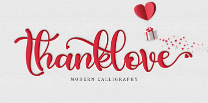 Thanklove is a romantic and sweet handwritten font. It looks astonishing on love letters, greeting cards, logos, business cards and every other design which needs a personalized touch. This font is PUA encoded which means you can access all of the glyphs and swashes with ease!
 - Airthay by Nirmana Visual,
$17.00 Airthay is a Beautiful Modern Calligraphy script font carefully created with a touch of romantic. This is a beautiful combination of timeless elegance and authentic calligraphy, For those of you who are needing a touch of elegance and modernity for your designs, this font is for you!
 - Love Bug by PizzaDude.dk,
$20.00Yet another one of those romantic looking fonts. The lowercase looks pretty ordinary, while the uppercase swings around with a mixture of tagging / grunge / comicscript and casual handwriting. It works out extremely well with letters and stuff!. For fun, try writing in uppercase only...looks swell!! - Valentine's Fleurons by Greater Albion Typefounders,
$3.95 Valentine's Fleurons is a bit of romantic (the emotion, not the era) fun!. Need a few dingbats for that special card you're making for that special person-or for others to give to their special person(s)? You'll find them here in a charming hand-drawn style.
 - Maybelle by Monotype,
$15.99 Designed by calligrapher Rachel Yallop, Maybelle is pretty and proudly romantic, with delicate flourishes and a superbly handwritten, calligraphic sensibility. Drawn with a pointed pen and ink, this script boasts dainty loops and high contrast letterforms. Maybelle is available with some ligatures and alternate glyph shapes.
 - Aryaduta by Hrz Studio,
$12.00 Aryaduta is a romantic and gorgeous looking typeface. It can be used for various purposes, such as logos, wedding invitation, t-shirt, letterhead, signage, news, posters, badges and more. This font is PUA encoded which means you can access all of the glyphs and swashes with ease!
 - Carlotte by Rezastudio,
$9.00 Carlotte is a romantic and beautifully flowing handwritten font. It is suitable for logos, business cards, weddings, t-shirt designs, books, magazines, quotes, fashion, watermarks, invitations, signatures, packaging. This font is PUA encoded, which means you can access all of the glyphs and swashes with ease!
 - Bataler by Eldertype Studio,
$13.00 Introducing Bataler Vintage Font with elegent and professional style, perfect for adding some romance and charm to your designs. This script functions most strongly as a display or headline font. suitable for logo, logotype, branding,wedding, fashion, label, book cover, t-shirt, instagram post, and other
 - Holy Christmas Tree by Andrey Font Design,
$12.00 Holy Christmas Tree is a beautiful and natural handwritten font. It is ideal for holiday-themed greeting cards and for any crafting project that requires a romantic touch. This font is PUA encoded which means you can access all of the glyphs and swashes with ease!