10,000 search results
(0.07 seconds)
- Belanda by Subectype,
$13.00 Introducing the new "Belanda" font, a monoline script font. For those of you who are needing a touch of clean monoline handwritten Font, chic and modernity for your designs, this font was created for you! If there's anything else you are unsure of feel free to pop me a message :) That's it! Have fun using Belanda Fonts!
 - Danisha by Balpirick,
$15.00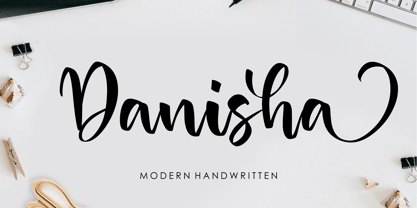 Danisha is a Modern Handwritten Font. Danisha is perfect for product packaging, branding project, megazine, social media, wedding, or just used to express words above the background. Danisha also multilingual support. Lowercase font Stylistic Alternates Ligatures Symbols & Punctuation OpenType Features. Enjoy the font, feel free to comment or feedback, send me PM or email. Thank you!
 - History Stranger by Allouse Studio,
$16.00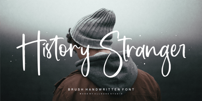 Proudly Presenting, History Stranger A Brush Handwritten Font. History Stranger is perfect for any titles, logo, product packaging, branding project, megazine, social media, wedding, or just used to express words above the background. History Stranger also come with Multi-Lingual Support. Enjoy the font, feel free to comment or feedback, send me PM or email. Thank You!
 - Violante by Balpirick,
$15.00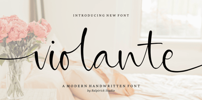 Violante is a Modern Handwritten Font. Violante is perfect for product packaging, branding project, megazine, social media, wedding, or just used to express words above the background. Violante also multilingual support. Lowercase font Stylistic Alternates Ligatures Symbols & Punctuation OpenType Features. Enjoy the font, feel free to comment or feedback, send me PM or email. Thank you!
 - Magic Romance by Zeenesia Studio,
$19.00 Introducing Magic Romance Magic Romance is a modern and elegant serif font. Magic Romance is well-suited for advertising, branding, logotypes, packaging, titles, headlines and editorial design. We hope you enjoy the font, please feel free to comment if you have any thoughts or feedback. Or email me at zeenesia@gmail.com. Thanks for purchasing and have fun!
 - Billie Kimber by Allouse Studio,
$16.00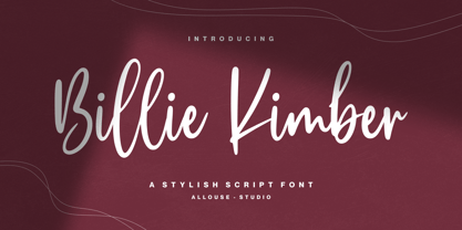 Proudly Presenting, Billie Kimber A Stylish Script Font. Billie Kimber is perfect for any titles, logo, product packaging, branding project, megazine, social media, wedding, or just used to express words above the background. Billie Kimber also come with Multi-Lingual Support. Enjoy the font, feel free to comment or feedback, send me PM or email. Thank You!
 - Impana by Craft Supply Co,
$15.00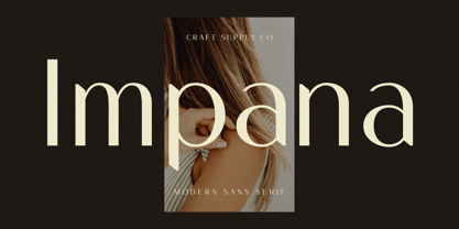 Introducing Impana: A modern sans-serif font that redefines contemporary design. With its sleek lines and versatile style, Impana brings a fresh perspective to modern aesthetics. This typeface is ideal for greeting card, packaging, brand identity, poster, or any purpose to make your design project look eye catching and trendy. Feel free to play with this typeface!
 - Guardian Snowing by Allouse Studio,
$16.00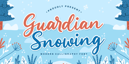 Proudly Presenting, Guardian Snowing a Modern Calligraphy Font Guardian Snowing is perfect for any titles, logo, product packaging, branding project, megazine, social media, wedding, or just used to express words above the background. Guardian Snowing also come with Multi-Lingual Support. Enjoy the font, feel free to comment or feedback, send me PM or email. Thank You!
 - Bloody Silence by Allouse Studio,
$16.00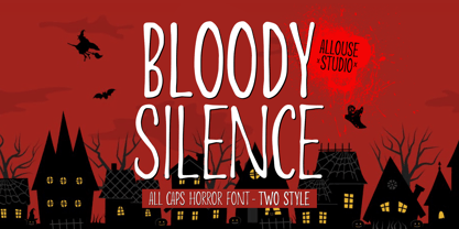 Proudly Presenting, Bloody Silence All Caps Horror Font With Two Style. Bloody Silence is perfect for any titles, logo, product packaging, branding project, megazine, social media, wedding, or just used to express words above the background. Bloody Silence also come with Multi-Lingual Support. Enjoy the font, feel free to comment or feedback, send me PM or email.
 - Violetail by Balpirick,
$15.00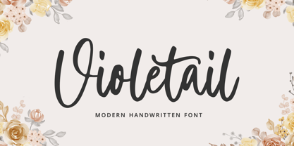 Violetail is a Modern Handwritten Font. Violetail Modern is an elegant and dainty handwritten font that features sweet and delicate swashes. This original look will appeal to a wide range of crafty ideas, from letterheads and titles, to stationery. Violetail also multilingual support. Enjoy the font, feel free to comment or feedback, send me PM or email. Thank you!
 - Horror Corps by Allouse Studio,
$16.00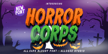 Proudly Presenting, Horror Corps a Handdrawn All Caps Bloody Font. Horror Corps is perfect for any titles, logo, product packaging, branding project, megazine, social media, or just used to express words above the background. Horror Corps also come with Multi-Lingual Support. Enjoy the font, feel free to comment or feedback, send me PM or email. Thank You!
 - Rumah Singgah by Allouse Studio,
$16.00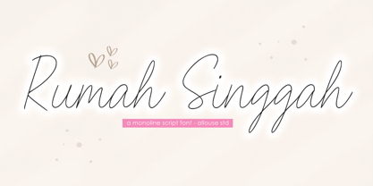 Proudly Presenting, Rumah Singgah A Monoline Script Font Rumah Singgah is perfect for any titles, logo, product packaging, branding project, megazine, social media, wedding, or just used to express words above the background. Rumah Singgah also come with Multi-Lingual Support. Enjoy the font, feel free to comment or feedback, send me PM or email. Thank You!
 - Blackbone by Balpirick,
$15.00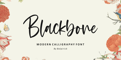 Blackbone is a Modern Calligraphy Font. Blackbone is a lovely and delicate script font that exudes elegance and class. This font was particularly crafted for those who need a beautiful and refreshing look to their designs. Blackbone also multilingual support. Enjoy the font, feel free to comment or feedback, send me PM or email. Thank you!
 - Guardian Circus by Balpirick,
$15.00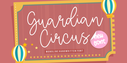 Guardian Circus Font. Guardian Circus is a Monoline Handwritten Font. Guardian Circus is a sweet, thin and natural handwritten font. It looks friendly and adaptable and it will certainly enhance each and every one of your designs. Guardian Circus also multilingual support. Enjoy the font, feel free to comment or feedback, send me PM or email.
 - Guthen Jaqueline by Allouse Studio,
$16.00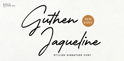 Proudly Presenting, Guthen Jaqueline A Stylish Siganture Font Guthen Jaqueline is perfect for any titles, logo, product packaging, branding project, megazine, social media, wedding, or just used to express words above the background. Guthen Jaqueline also come with Multi-Lingual Support. Enjoy the font, feel free to comment or feedback, send me PM or email. Thank You!
 - Summer Lightning by Allouse Studio,
$16.00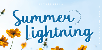 Proudly Present, Summer Lightning a Handwritten Font. Summer Lightning is perfect for any titles, logo, product packaging, branding project, megazine, social media, wedding, or just used to express words above the background. Summer Lightning also come with Multi-Lingual Support. Enjoy the font, feel free to comment or feedback, send me PM or email. Thank You!
 - Houstonfield by PeachCreme,
$19.00 Houstonfield is not another script font suitable for any project. Add a touch of luxe and elegance to your project. This font is perfect for signature logos, modern invitation, wine labels and many more. Swipe the preview to get some inspiration. If you have any other questions, feel free to drop me a message:) Happy designing, Gulya
 - American Mountain by Allouse Studio,
$16.00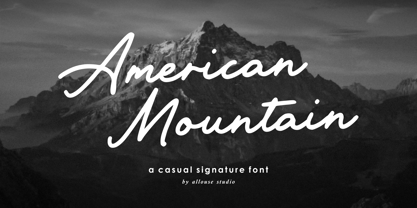 Proudly Presenting, American Mountain A Casual Signature Font. American Mountain is perfect for any titles, logo, product packaging, branding project, megazine, social media, wedding, or just used to express words above the background. American Mountain also come with Multi-Lingual Support. Enjoy the font, feel free to comment or feedback, send me PM or email. Thank You!
 - Andra Cookie by Allouse Studio,
$16.00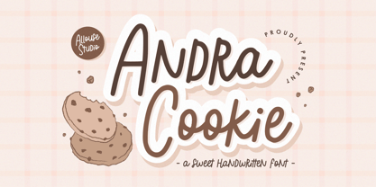 Proudly Presenting, Andra Cookie A Sweet Handwritten Font Andra Cookie is perfect for any titles, logo, product packaging, branding project, megazine, social media, wedding, or just used to express words above the background. Andra Cookie also come with Multi-Lingual Support. Enjoy the font, feel free to comment or feedback, send me PM or email. Thank You!
 - Steally Grace by Allouse Studio,
$16.00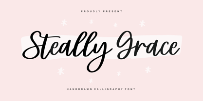 Proudly Presenting, Steally Grace a Handdrawn Calligraphy Font. Steally Grace is perfect for any titles, logo, product packaging, branding project, megazine, social media, wedding, or just used to express words above the background. Steally Grace also come with Multi-Lingual Support. Enjoy the font, feel free to comment or feedback, send me PM or email. Thank You!
 - Doodleset by Luxfont,
$20.00 Get ready to meet an unusual family of fonts - Doodleset! Here, each typeface is like a hero with a unique story, creating an amazing assortment. From designing inspirational quotes to designing advertisements and events, every font will become a tool for your ideas. Features: - Free Demo font to check it works. - Sans serif & Serif - Calligraphy and Script - Multilingual - Kerning
 - Supremely Luxurious by TypeClassHeroes,
$15.00 Introducing Supremely Luxurious, Access your OpenType features to access the large selection of alternate letters and ligatures. Use this font for any branding, product packaging, invitation, quotes, t-shirt, label, poster, logo etc. Feature Uppercase & Lowercase Number & Symbol International Glyphs Multilingual support Alternative Ligature Feel free to drop us a message any time Hope you enjoy it.
 - Jackson California by Allouse Studio,
$16.00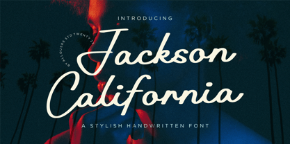 Proudly Presenting, Jackson California A Fancy Script Font. Jackson California is perfect for any titles, logo, product packaging, branding project, megazine, social media, wedding, or just used to express words above the background. Jackson California also come with Multi-Lingual Support. Enjoy the font, feel free to comment or feedback, send me PM or email. Thank You!
 - Kalimaya Soultice by Allouse Studio,
$16.00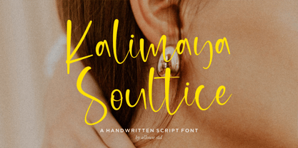 Proudly Presenting, Kalimaya Soultice A Handwritten Script Font. Kalimaya Soultice is perfect for any titles, logo, product packaging, branding project, megazine, social media, wedding, or just used to express words above the background. Kalimaya Soultice also come with Multi-Lingual Support. Enjoy the font, feel free to comment or feedback, send me PM or email. Thank You
 - Trilogi Materialism by Allouse Studio,
$16.00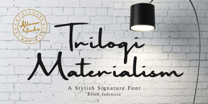 Proudly Presenting, Trilogi Materialism A Stylish Signature Font. Trilogi Materialism is perfect for any titles, logo, product packaging, branding project, megazine, social media, wedding, or just used to express words above the background. Trilogi Materialism also come with Multi-Lingual Support. Enjoy the font, feel free to comment or feedback, send me PM or email. Thank You!
 - Girlish by Balpirick,
$15.00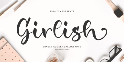 Girlish is a Lovely Modern Calligraphy Font. Girlish is perfect for product packaging, branding project, megazine, social media, wedding, or just used to express words above the background. Girlish also multilingual support. Lowercase font Stylistic Alternates Ligatures Symbols & Punctuation OpenType Features. Enjoy the font, feel free to comment or feedback, send me PM or email. Thank you!
 - Onry Display by NicolassFonts,
$35.00 Onry Display is a modern family based on Willgray font family. It comes in 20 weights, 10 uprights, and matching italics. The ExtraBold weight is free of charge. This font family can be used as a headline or as a body copy typeface. The font features excellent legibility for print, as it does for reproduction on TV screens.
 - Jakarta Brittany by Allouse Studio,
$16.00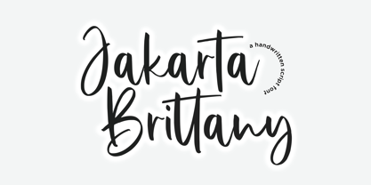 Proudly Presenting, Jakarta Brittany A Handwritten Script Font. Jakarta Brittany is perfect for any titles, logo, product packaging, branding project, megazine, social media, wedding, or just used to express words above the background. Jakarta Brittany also come with Multi-Lingual Support. Enjoy the font, feel free to comment or feedback, send me PM or email. Thank You!
 - Spicy Garlic by Allouse Studio,
$16.00 Proudly Present, Spicy Garlic a Handwritten Brush Font. Spicy Garlic is perfect for any titles, logo, product packaging, branding project, megazine, social media, wedding, or just used to express words above the background. Spicy Garlic also come with Multi-Lingual Support. Enjoy the font, feel free to comment or feedback, send me PM or email. Thank You!
 - Jingle Balle by Allouse Studio,
$16.00 Proudly Presenting, ingle Balle A Christmas Font With Two Styles. Jingle Balle is perfect for any titles, logo, product packaging, branding project, megazine, social media, wedding, or just used to express words above the background. Jingle Balle also come with Multi-Lingual Support. Enjoy the font, feel free to comment or feedback, send me PM or email. Thank You!
 - Gecko Moria by Allouse Studio,
$16.00 Proudly Presenting, Gecko Moria a Horror Handdrawn Font. Gecko Moria is perfect for any titles, logo, product packaging, branding project, megazine, social media, or just used to express words above the background. Gecko Moria also come with Multi-Lingual Support. Enjoy the font, feel free to comment or feedback, send me PM or email. Thank You!
 - Burnfolk by Allouse Studio,
$14.00 Burnfolk a Brush Font that bring an a natural brush impression. Come with separate alternate and Multi-Lingual Support. Burnfolk is perfect for any tittles, logo, product packaging, branding project, megazine, social media, wedding, or just used to express words above the background. Enjoy the font, feel free to comment or feedback, send me PM or email. Thank You!
 - Top Forty by Jeff Levine,
$29.00 A 1963 issue of Billboard Magazine contained an ad for Jimmy Smith (along with some other artists on the same record label) that was hand-lettered in a free-form style similar to show-card ‘one-stroke’ typographic design. This was the inspiration for Top Forty JNL, which is available in both regular and oblique versions.
 - Comickes by Allouse Studio,
$16.00 Proudly Presenting, Comickes A Handwritten Comic Font with 4 Styles. Comickes is perfect for any titles, logo, product packaging, branding project, megazine, social media, wedding, or just used to express words above the background. Comickes also come with Multi-Lingual Support. Enjoy the font, feel free to comment or feedback, send me PM or email. Thank You!
 - Sticky Buttercup by Allouse Studio,
$16.00 Proudly Presenting, Sticky Buttercup a Quirky Handwritten Font. Sticky Buttercup is perfect for any titles, logo, product packaging, branding project, megazine, social media, wedding, or just used to express words above the background. Sticky Buttercup also come with Multi-Lingual Support. Enjoy the font, feel free to comment or feedback, send me PM or email. Thank You!
 - ROBO - Personal use only

- Emoticons - Personal use only

- Cyberspace - Personal use only

- Quirkley JNL by Jeff Levine,
$29.00When a type design job needs a bit of snap, yet needs to remain unconventional, think of Quirkley JNL. Its name speaks volumes - a bold, quirky sans serif - great for headlines and display work. - Boppa Delux by Patricia Lillie,
$39.00 Say it with authority and style with Boppa Delux, a big, bold display font in four weights. For use in OpenType aware applications, Boppa Delux includes small caps, alternates, case sensitive forms, and more.


