10,000 search results
(0.03 seconds)
- Robot Monster NF by Nick's Fonts,
$10.00A design experiment run amok! To some, the upper case A of this font resembles a diving helmet. If you put same on a guy in a gorilla suit, you have the really cheesy 50s sci-fi movie that gives the font its name. Both versions of this font contain the Unicode 1252 (Latin) and Unicode 1250 (Central European) character sets, with localization for Romanian and Moldovan. - Inland Edwards NF by Nick's Fonts,
$10.00 Variations on a theme by Nicholas J. Werner for St. Louis' Inland Type Foundry provided the pattern for this happy family, released in 1895 and 1899. Both flavors of this font feature the 1252 Latin, 1250 Central European, 1254 Turkish and 1257 Baltic character sets.
 - Actium by Type Mafia,
$45.00 Actium is a contemporary multilingual sans serif typeface developed to help perfect typography automatically. Type Mafia has focussed on words with odd combinations of capital letters and numbers, such as product names and postal codes such as WD40 and H1N5, jump out of the text. They sit awkwardly together as the numerals have been designed to work with the lowercase, not the uppercase letters – affecting readability.To fix this Type Mafia invented Smart Capo™. Smart Capo™ Smart Capo is a feature that automatically activates once you type an uppercase letter together with a number. When a capital letter is sat next to a numeral, Smart Capo converts the letter to a mid-cap — a contemporary alternative to small caps — and the default old-style numeral to a lining numeral. Actium’s mid-caps and lining numerals have been designed with the same height (between cap and x-height) so they sit comfortably next to each other and fit more harmoniously into text. Smart Capo applies equal attention to capitalised words without any numbers, such as NAVO and USA, and are also automatically set into mid-capitals. Working on its own, Smart Capo saves time and money for the typographer — taking the pain out of text formatting — and makes it a more pleasurable experience for the reader. This feature is made possible by the use of ‘contextual alternates’, an OpenType feature used in modern font software, working with a set of characters specially designed at mid-cap height. By default these changes automatically take place so it doesn't need to be switched on, it will just work. Actium Actium’s design has an unusual diagonal contrast — much more common in a serifed face than in a sans serif — giving it more bite. The typeface looks elegant when set in large sizes and remains very legible when shown in small sizes. The family consists of six weights in two styles, making a dozen fonts. Weights range from light to black in roman and true italic. All fonts are fully loaded with functional elements. Actium boasts an extended Latin character set and with Greek. This means a wide range of Western languages are supported: perfect for use in bilingual publications and packaging. For numerals, each font includes old-style and lining figures in both proportional and tabular widths, with superiors and inferiors. These allow you to select the right set of numbers for the right task.
 - Liebling by Font-o-Rama,
$25.00Liebling (in English: Sweetheart) was developed according to the sans serif font Mein Schatz with the purpose of having two typefaces which match perfectly. The contrast between thicks and thins was set very low. Just enough to contrast with same-weight Mein Schatz. One of the typeface’s characteristic features, also like its partner, is the availability of ligatures within an expert set. Liebling offers the characters sh, sp, st, ty among others and alternative letters for v and w. The majuscules of the expert set have curved elements allowing the designer to put the typeface to a highly individualistic use for displays and headlines. Another feature of the typeface are two different figure systems. In addition to the old style figures for use in continuous text, Liebling offers regular table figures within the expert set. - Camden by Geoffrey Lee,
$18.00Camden is based on the types used in Camden's 'Remaines concerning Britaine' published in London in 1638. The object was to avoid the contradiction inherent in most 'distressed' typefaces made to give the effect of the imperfections in old print. This means that apparently worn characters are perfectly repeated throughout a setting. The makeup of the Camden fonts means that, with a little extra keying time, alternate characters may be brought in which overcome this. Also many characters are provided which have 'period identities' such as the long s with ligatures, tied sorts ct, sp and st, swash characters in the italic and the double vv, all of which can add a specific age identity. - Old Typewriter - Unknown license

- Fenomen Slab by Signature Type Foundry,
$35.00 The geometrical drawing of Fenomen Slab follows the guidelines set by our other font family Fenomen Sans. It is a perfect companion of Fenomen Sans, as well as being a standalone font family capable of delivering its own expression and aesthetics. The set contains four width proportions – Normal, SemiCondensed, Condensed and ExtraCondensed in eight weights ranging from Hairline to Black. Every font of the family contains four types of numerals, small caps, ligatures and contextual alternates. The typeface was developed between the years 2014–2017 and was subjected to a series of tests for the fluent legibility of all fonts even in extreme conditions. Narrow fonts provide this set with the maximum use including newspaper typesetting. The typeface has an elegant, delicate design in thin fonts and sufficient legibility in bold. Mutual contrast produces great creative tension. Font name acronyms described: SCN = SemiCondensed CN = Condensed XCN = ExtraCondensed
 - Idiom by Reserves,
$39.99 Idiom is an extra-condensed, tightly spaced display face with congruent forms exuding a strong sense of rhythm and elevation. The basic stenciled geometric shapes are reminiscent of the decorative style found with P22 Albers and Futura Black. Careful consideration of each letter's construction, relative to all characters, lends Idiom a decided sense of cohesion and sophistication. The included non-traditional 'weights' (Medium and Bold) are completely blacked out, creating entirely new letterforms that exhibit a very stark, contemporary sense. Increasing the versatility of the Idiom family, a selection of OpenType features allow access to a set of contrasting linear punctuation forms, unconventional ligatures, case-sensitive punctuation and more. Features include: Basic Ligature set including 'f' ligatures (ae, oe, fi, fl, ff, fh, fj, ft, fa, ct, st, rt, ot, ta, sa, mi, si, vi, su, oc, oo, ru, ib) Alternate characters (M, W, T, ß, _, $, @, (), {}, [], /, \, |, -, –, —, +, -, ±, ≤, ≥, , «, », and more) Case forms (shifts various punctuation marks vertically to a position that works better with all-capital sequences, in this case the numerals or letters with ascenders) Slashed zero Full set of numerators/denominators and superscript/subscript Automatic fraction feature (supports any fraction combination) Extended language support (Latin-1 and Latin Extended-A) *Requires an application with OpenType and/or Unicode support.
 - Offense by Reserves,
$49.00 Offense is an unyielding rectangular slab-serif face designed with consistently balanced letterforms and a refined finish. It’s extremely angular geometric form commands attention in display settings, yet is also legible in short text blocks. Numerous alternate character sets allow room for customization, while the expanded ligatures push letter combinations to the limit. Stylistically, Offense’s almost crude, sharp-cornered construction is balanced by it’s sophisticated finish and attention to detail, often unrealized in similar faces of this genre. The upright weights are complimented by pairings of true italics, completely rebuilt, slightly narrower in width with modified letterforms, increasing their contrast and flow. Features include: Precision kerning Standard Ligatures set including 'f' ligatures (fi, fl, ff, fh, fj, ffl, ffi, ffj) Discretionary Ligatures set including (ft, rt, ae, oe, st, ft, ct, oc, oo, ry, AE, OE, AL, TH, HE, AK, AN, TT, HD, AM, AP, AR, NF, NE, NH, NL, NB, FL, ND, FE, AB, OB, OD, OF, OG, OH, OK, OL, OM, ON, OO, OP, OQ, OR, OU, AH, UE, UF, UB, UD, UH, UK, UL, UM, UN, UP, UR, UU, MP, XY, YX, KY, WY, VY, AF, FF, FI) Alternate characters (O, o, S, s, a, h circumflex, @, ®, ¶, $, &, _, and various ligature alternates) Case forms (shifts various punctuation marks up to a position that works better with all-capital sequences) Capital Spacing (globally adjusts inter-glyph spacing for all-capital text) Slashed zero Full set of numerators/denominators Automatic fraction feature (supports any fraction combination) Extended language support (Latin-1 and Latin Extended-A) *Requires an application with OpenType and/or Unicode support.
 - Ensenada by Wordshape,
$30.00 Ensenada is a typeface designed based on hand-cut lettering that adorns businesses throughout the city of Ensenada in Baja California in Mexico. - What was the inspiration for designing the font? Looking at the hand-cut lettering in Ensenada, Mexico. Variations on this type of lettering are often used by Mexican pop-techno acts. - What are its main characteristics and features? It is a geometric display face that works in both retro and futuristic settings. - Usage recommendations: Display type
 - Tiara by Tanincreate,
$16.00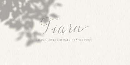 Tiara is a lovely modern calligraphy script typeface with contemporary accents. It is great for wedding invitations, branding, headline, logotype, apparel, packaging, advertising etc. Tiara script comes in uppercase, lowercase, punctuation, symbols & numerals, stylistic set alternate, ligatures, multilingual support . All lowercase letters include beginning and/or ending swashes which gives a realistic hand-lettered style. To use the swashes, a program that supports OpenType features is needed (Adobe Photoshop CS, Adobe Illustrator CC, Adobe Indesign, Corel Draw, ect.)
 - Aliens & Cows by Zetafonts,
$39.00 Aliens and Cows is an ultra condensed sans serif display typeface designed by Francesco Canovaro. Inspired by the title cards of 1980's science fiction movies, it features thin letterforms with a ultra wide spacing - perfect for minimal logo design and editorial display use. It features sci-fi themed alternates as well a set of lined small caps and word ligatures, and covers over forty languages using the Latin alphabet as well as Greek and Cyrillic.
 - Kernel by JCFonts,
$19.00 Kernel is a square geometric type family in six weights with matching obliques and small caps. The design mixes slightly rounded terminals and shoulders with square counterforms, giving the shapes a strong masculine and futuristic look, great for applications like innovation, technology, sports and of course, sci-fi ! The fonts, delivered in Opentype format, include diacritics for most European languages and come with a variety of Opentype features : two stylistic sets, tabular figures, case-sensitive forms, fractions and more.
 - Ebisu by Thinkdust,
$10.00 Ebisu is a sans serif family consisting of 10 different weights. Designed by Alex Haigh in 2010, and influenced by one of his original designs from 2008 Hiruko - Ebisu loses the soft sans serif curves, for a more robust geometric styling. But it’s much more than a geo-replica. The lowercase characters also have a more exaggerated sharpness that gives the whole family a unique look and feel. The kerning has been individually crafted for each letter, with vigorous attention - to ensure that each letter from is produced in a way that works with every member of the set, for a tightly knit sans serif family. It speaks many languages too. The open type features have an extended character set to support Eastern and Western European languages. With each weight conveying a different personality, Ebisu is set to become the modern new sans serif family to sit alongside you classics for versatility, cleanliness and a crafted edge.
 - Gloria Monoline by IM Studio,
$15.00 Gloria Monoline is a text serif with an editorial focus designed by Ikhsan Maulana. The idea for a typography job came from a design school letter-making exercise: Get a pair of scissors and some large sheets of paper, and start cutting. The resulting letters and the act of cutting them from paper inform the type design process, resulting in strong, simple shapes and open, inviting textures. The tone is crisp and straightforward. The classic letterforms, with a playful touch, give the design a personality that is both practical and spontaneous. The text weight is capable of adjusting copies at various sizes to print and render clearly on screen. Its lightest and heaviest weights work best at display sizes. Great care has been taken to save typists time with OpenType features including contextual punctuation and symbols to match case-sensitive, lower-case, and all-caps settings, as well as set images set for each use.
 - MEGA SLANT LINE by TypoGraphicDesign,
$19.00 CONCEPT/CHARACTERISTICS This strikingly bold, black and extended 3D font reminiscent of sci-fi films and experimental typeface design. The font acts as a chain of ligatures and thus receives a unique aesthetic. The unique letter forms are in sharp contrast to other fonts and thus stand out as a unique selling point. APPLICATION AREA Posters, music cover, book cover, logos, as a headline font for magazines or websites … TECHNICAL SPECIFICATIONS Headline Font | Display Font | Sci-Fi Font »Mega Slant Line« OpenType Font with 303 glyphs – alternative letters and ligatures (with accents & €) & 2 styles (regular & 3d) KONZEPT/BESONDERHEITEN Diese auffällig plakative, fette und breitlaufende 3D Schrift erinnert an Sci-Fi Filme und ist experimentelle Schriftgestaltung. Die Schrift wirkt wie eine Kette aus Ligaturen (Buchstabenverbindungen) und erhält somit eine ganz eigene Ästhetik. Die sehr eigenen Buchstabenformen werden sich deutlich von anderen Schriften abheben und somit als Alleinstellungsmerkmal herausstechen. Der Fluss ergiebt sich aus den EINSATZGEBIETE Plakate aller Art, Musik Cover, Buchcover, für Logos und Wortmarken, als Displayschrift für Zeitschriften oder Websites… TECHNISCHE INFORMATIONEN Headline Font | Display Font | Sci-Fi Font »Mega Slant Line« OpenType Font with 303 glyphs – alternative letters and ligatures (with accents & €) & 2 styles (regular & 3d)
 - Romp by Positype,
$30.00 With all ego aside, Romp was designed and influenced by my daughter, Angel. For some time now, she has wanted me to design a font based on her handwriting. But each time I sit down to do it, I run into more that she needs to do and redo. On a recent attempt, I ran into the same situation again. Instead of moving on to something else, I decided to whip out a sumi brush and start making letters...for me, type design is something a little ‘serious’ and never a time to just have fun. This typeface proved that notion wrong—it really was fun. As a result, each letter encouraged another and the design grew...and grew! The happy result spawned 3 separate sets of letters & numerals (small caps and some ligatures too!). Using the beauty of OpenType, these 3 sets have been fused into one, randomly generating font set. If you are using any type of OpenType enabled application, then the Romp Pro typeface is the way to go. They include everything found in the 3 separate variants for each style as well as entirely expanding offering of additional small cap and ligature sets.
 - Speed Bump by Three Islands Press,
$19.00 I, uh, don't know quite what to say. I'd toiled so long over Pumpkinseed back in '96 that I guess I needed a good, wild ride to shake out the head cramps, or something. Whatever grabbed me, it forced me to sit down and design a typeface real fast directly in Fontographer (had never done that before). Took less than two hours to finish the regular character set. No way to explain it, but the exercise actually paid off -- I think. And now that there was Speed Bump, there simply had to be a companion dingbat set. (Beats the heck out of me.) So check out Speed Bump's wacky character(s) and, if you're really bored, the 200-some-odd little pictures in Speed Bump Pi.
 - Cedar Street by Three Islands Press,
$39.00 There's something satisfying about tweaking to perfection a typeface based on the particular style of lettering applied to a particular kind of paper by a particular human hand. One day, in pursuit of this curious sense of satisfaction, I sat down with a porous pad of lined note paper and printed out the alphabet with a ballpoint pen. I found particularly interesting the bulbous ends of the strokes where the ink soaked in. I couldn't help myself: I drew out the rest of the character set, scanned, hand-traced, and -- as with all 3IP font designs -- manipulated every glyph to an obsessive degree. Named it Cedar Street, after a favorite address of mine. Full release has a single medium weight with a thorough character set.
 - Hasta La Pasta NF by Nick's Fonts,
$10.00This loopy offering is patterned after a typeface from the 1888 specimen book from the Central Type Foundry of St. Louis, called simply "Spiral". The ragged contours on the original face have been smoothed out, but it still is an attention-getter. Both versions of this font include the complete Unicode Latin 1252 and Central European 1250 character sets. - Defense by Reserves,
$49.00 Defense is an unyielding rectangular slab-serif stencil face designed with consistently balanced letterforms and a refined finish. It’s extremely angular geometric form commands attention in display settings, yet is also legible in short text blocks. The stencil mark width varies accordingly with each weight, helping to further define each style. Numerous alternate character sets allow room for customization, while the expanded ligatures push letter combinations to the limit. Stylistically, Defense’s almost crude, sharp-cornered construction is balanced by it’s sophisticated finish and attention to detail, often unrealized in similar faces of this genre. The upright weights are complimented by pairings of true italics, completely rebuilt, slightly narrower in width with modified letterforms, increasing their contrast and flow. Features include: Precision kerning Standard Ligatures set including 'f' ligatures (fi, fl, ff, fh, fj, ffl, ffi, ffj) Discretionary Ligatures set including (ft, rt, ae, oe, st, ft, ct, oc, oo, ry, AE, OE, AL, TH, HE, AK, AN, TT, HD, AM, AP, AR, NF, NE, NH, NL, NB, FL, ND, FE, AB, OB, OD, OF, OG, OH, OK, OL, OM, ON, OO, OP, OQ, OR, OU, AH, UE, UF, UB, UD, UH, UK, UL, UM, UN, UP, UR, UU, MP, XY, YX, KY, WY, VY, AF, FF, FI) Alternate characters (O, o, S, s, a, h circumflex, @, ®, ™, ¶, $, &, _, and various ligature alternates) Case forms (shifts various punctuation marks up to a position that works better with all-capital sequences) Capital Spacing (globally adjusts inter-glyph spacing for all-capital text) Slashed zero Full set of numerators/denominators Automatic fraction feature (supports any fraction combination) Extended language support (Latin-1 and Latin Extended-A) *Requires an application with OpenType and/or Unicode support.
 - Ares by Adam Jagosz,
$15.00 Ares is a crisp all-caps display typeface suitable for sci-fi logos and titles. It owes its peculiar futuristic vibe to angular, top-heavy letters that hang from the cap-height instead of sitting on the baseline. The typeface consists of six subfamilies available in 10 weights, as well as as two variable fonts of three axes: Weight [wght], ranging from 1 to 1000, Mid-height [MHGT], ranginf from 0 to 1000, Tracking [TRAK], ranging from 0 to -40. The mid-height axis affects the typeface's waistline, including crossbars, and divides the fonts into three subfamilies: Ares Lo, Ares, and Ares Hi. These three families are solid-stroked, and the other three families are their stencil-stylized counterparts: Ares Broken Hi, Ares Broken, and Ares Broken Lo. The tracking axis is only available in the variable versions, and proportionally affects the kerning, thus helping set the type more tightly without effort. Ares supports a wide range of Latin-based orthographies, including not only European, but also Vietnamese as well as major African languages like Hausa, Fula or Ewe.
 - Vanitas by Reserves,
$49.00Vanitas is an elegant high contrast contemporary sans. It is rooted in the style of a classic didone, excluding the typical serifs and ball terminals as well as being designed with a cleaner, more reductionist appearance. Strict attention was given to the cohesiveness and balance between letterforms as well as the careful refinement of all curves. Stylistically, Vanitas’ alluring, sophisticated sensibility is directly inspired by high fashion. The upright styles are complimented by a pairing of optically adjusted true italics, which were purposefully adapted to retain the sharpness of their counterparts. Abandoning traditionally executed cursive italic letterforms retains Vanitas’ sharp characteristic through each style. Features include: Precision kerning Standard Ligatures set including ‘f’ ligatures (fb, ff, fh, fi, fj, fk, fl ffb, ffh, ffi, ffj, ffk, ffl, ffy, ae, oe, AE, OE) Discretionary Ligatures set including (st, ct, No) Alternate characters (H, A, AE, Q, $, h circumflex, ¶ and numero sign) Case forms (shifts various punctuation marks up to a position that works better with all-capital sequences) Capital Spacing (globally adjusts inter-glyph spacing for all-capital text) Slashed zero Full set of numerators/denominators Tabular Lining, Proportional Lining, Tabular Oldstyle and Proportional Oldstyle Figures Automatic fraction feature (supports any fraction combination) Extended language support (Latin-1 and Latin Extended-A) *Requires an application with OpenType and/or Unicode support. - Scriptonite by Jonahfonts,
$30.00 A freehand OpenType face, including 20 ligatures as well as the most popular discretionary ligatures. (ft, ct and st) Usage recommendations: Posters, titles, book covers, books, greeting cards, packaging, invitations, magazine articles, titling and advertising.
 - Mailbox Letters Two JNL by Jeff Levine,
$29.00Mailbox Letters Two JNL is the second typeface from Jeff Levine inspired by metal lettering used on mailboxes and homes. Each cast letter or number sat on a lower "rail" which was then slipped into a slot that held them firmly in place. Jeff's Inventory JNL looked close enough to the original type style to use as a model for this font, and for typographic purposes there are certain punctuation and other glyphs that "float" above the rail. Limited character set. - vastra by AdultHumanMale,
$6.00 vastra is a slim, futuristic, bauhaus inspired typeface. It has plenty of those pesky foreign glyphs and various alternates of the standard alphabet. It’s available in 5 different weights from light to Heavy and is complimented by 5 italicized versions of the 5 different weights too. I wanted this font to look like background set typography in a 70’s sci-fi movie. D A N G E R You can buy it in singles, pairs or the whole damn brood.
 - Fakir Pro by Underware,
$50.00 Fakir | A Hindu ascetic or religious mendicant, especially one who performs feats of magic or endurance. The well known feats performed by them include sitting steadily on a bed of nails and walking on burning coals. Blackletter | A script used throughout Western Europe from approximately 1150 to 1500. It continued to be used for the German language until the 20th century. Fakir, a blackletter with a holy kiss is a contemporary interpretation of gone letterforms with origin in blackletters. More precisely, we based the construction on broadnip textura, with lots of broken, edgy, interrupted strokes – try to sit on a nail bed and you’ll know why fakirs like to read just these kind of fonts! After being abandoned for some time (not accepted, nearly forbidden), we would like to give our generation a blackletter from here and now. So Fakir is not a revival, but an all new 21st-century blackletter. Fakir is a set of edgy text and display fonts, ranging from tight and heavy to light and wide. It has 11 fonts, all supporting Underware Latin Plus character set, that covers 219 languages.
 - Andale Teletext by Monotype,
$41.99Teletext fonts have a defined character set comprising alphanumeric and graphics characters. The Andale Teletext fonts also include G3 Smooth Mosaics and Line Drawing Set support as defined in ETSI EN 300 706, for Teletext 2. Andale Teletext includes the following character sets: Latin G0 and G2 sets, Latin National Option Sub-Sets, Cyrillic set, Greek set. Andale Teletext family includes 3 fonts: Andale Telext regular, Andale Telext 43 and Andale Teletext 83. - Casttano by Beary,
$8.00 Casttano is modern feminine font, every single letters have been carefully crafted to make your text looks beautiful. With modern script style this font will perfect for many different project ex: photography, watermark, quotes, blog header, poster, wedding, branding, logo, fashion, apparel, letter, invitation, stationery, etc. This font including alternate glyph. You can access the alternate glyph via Font Book (Mac user) or Windows Character Map (Windows user). Ligature & alternate glyph: at att bt btt ct ctt dt dtt et ett ft ftt gt gtt ht htt it itt jt jtt kt ktt lt ltt mt mtt nt ntt ot ott pt ptt qt qtt rt rtt st stt ut utt vt vtt wt wtt xt xtt yt ytt zt ztt Foreign languages support: ÀÁÂÃÄÅÆÈÉÊËÌÍÎÏÐÑÒÓÔÕÖÙÚÛÜÝßàáâãäåæèéêëìíîïðñòóôõöùúûüýÿ Thanks for looking.
 - Alight Slab by Eclectotype,
$40.00 Alight Slab is, wait for it... A light slab! Designed to be set large, in headlines or subheads and (very) short paragraphs of running text. It has slightly super-eliptical forms and crisp details, giving it a contemporary look. Alight Slab features automatic fractions, a discretionary ct ligature, and a capital sharp s. Anultra Slab is an ultra bold accompanying typeface.
 - Battleslab by Kostic,
$40.00 Battleslab is a slab serif made for setting few words in large sizes. Two heavily contrasted weights work well when combined, with its mono-line wide light and heavy black it is perfect for making that "one-two punch" in headlines or logotypes. Display oriented Battleslab derived from Battlefin Family (which is much more comprehensive with its ligatures, italics and SC).
 - Marriage Monograms by Kaer,
$24.00 At this time I found the Album of monograms – a guide for doing handicrafts in families and educational institutions. It was published in St. Petersburg in 18ХХ. Finally, I found an authentic English style monograms set. These monograms are characterized thin swirled lines and lush foliage patterns. I manually redesigned and vectorized two sets of alphabets (narrow and wide) and happy to introduce you Marriage Monograms font. You’ll get the set includes Wide and Narrow capitals, so you can make your own monogram, by combining letters you want. +SVG file as well. Please note, you should use graphic applications such as Adobe Illustrator or Photoshop, but not Microsoft Word. All you need is place the Narrow one on top of the Wide one. Please feel free to request any help you need: kaer.pro@gmail.com All the best, Roman.
 - Just Sunday by Ahmad Jamaludin,
$15.00 Introducing! New Elegant Script Font. Just Sunday! Just Sunday is modern feminine font, every single letters have been carefully crafted to make your text looks beautiful. With modern script style this font will perfect for many different project ex: logo, photography, watermark, quotes, blog header, poster, wedding, branding, logo, fashion, apparel, letter, invitation, stationery, etc. Just Sunday also includes Regular and Bold, full set of uppercase and lowercase letters, multilingual symbols, numerals, punctuation. The font has smooth wet ink texture, so would be perfect for all types of printing techniques+you can do embroidery, laser cut, gold foil etc. Just Sunday has beautiful ligature following : Ju Su St af ah ak al am an as at ay ch ck cl ct dd ef eh ek el em en es et ey ff if ih ik im in il is it iy ll nn oo sh sl ss st tt uf uh uk um un ul us ut uy Contact me if you have any questions: dharmasahestya@gmail.com Thanks! dharmas Std
 - Candy Paint by Crumphand,
$20.00 Introducing, Candy Paint fonts. Candy Paint have a unique shape, rounded and fun. Comes with 4 style Regular, Outline and Extrude, then can mix and match with Stylistic Set. What's Included Inside The Fonts ? Uppercase Lowercase Symbols Numerals Stylistic Set 1 Stylistic Set 2 Stylistic Set 3 Stylistic Set 4 European Multilingual Thank you, Regards!
 - Compita by Studio Buchanan,
$12.00 Compita is a Neo-Grotesk(ish) typeface that started life as a love-letter to Berthold's classic. But for every rigid, Neue-Haasism, there exists an equal and opposite amount of humanist attributes – along with a deliberate dose of creative license. It has some over-emphasised features and terminal endings which help to create its friendly personality, but sits them on a slightly condensed overall width. Together they help balance each other out, creating a face that feels both affable and professional. Aff-essional perhaps? The character set contains everything the modern day designer needs, including diacritic support for over 30 languages. And It’s packed full of the usual opentype features (that most will probably ignore) – Small caps, multiple number sets, and discretionary ligatures, to name just a few. Whether it’s deployed as a display face, or as the dependable choice for text, Compita is useable across multiple disciplines. Set in online, on screen or in print – it’s proof that not everything has to be Montserrat or Raleway...
 - Six Pounder by Crumphand,
$20.00 Introducing, Sixpounder Fonts. inspired by indonesian Tribes, Tatto and Poster band. easy to read, easy access to opentype. What's Included The Fonts ? Uppercase Lowercase Symbols Numbers Stylistic Set 1 Stylistic Set 2 Stylistic Set 3 Stylistic Set 4 European Multilingual Thank You, Regards!
 - Make Tracks by Gerald Gallo,
$20.00 The character set contains 47 left foot animal track designs. The shift+character set contains the 47 right foot animal track designs corresponding to the character set.
 - Sinister Plot - Unknown license

- Café Pop - Unknown license

- Olyford Variable by NicolassFonts,
$148.99 Olyford Variable font is a contemporary sans serif typeface that is derived from the Olyford font family. It features a range of weights and italics. OpenType features: Access All Alternates, Stylistic Alternates (Alternative n, m, p, q, r, u), Stylistic Set 1 (Alternative K, k), Stylistic Set 2 (Alternative W), Stylistic Set 3 (Alternative t), Stylistic Set 4 (Alternative w), Stylistic Set 5 (Alternative 5), Stylistic Set 6 (Alternative ¢, $, €, ₽, ¥), Stylistic Set 7 (Alternative Đ, Ħ, Ð, ≠, ∫), Standard Ligatures, Discretionary Ligatures, Proportional Figures, Tabular Figures, Case-Sensitive Forms, Fractions, Kerning, Denominators, Numerators, Scientific Inferiors, Subscript, Superscript, Ordinals, Localized Forms.


