7,416 search results
(0.022 seconds)
- Riverside JNL by Jeff Levine,
$29.00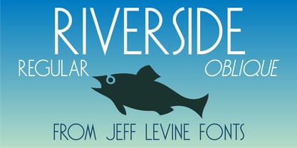 The Art Deco design of Riverside JNL was based on the hand lettered title found on the 1932 sheet music for "By the River Sainte Marie", and is available in both regular and oblique versions.
 - Collins Florets by Wiescher Design,
$12.50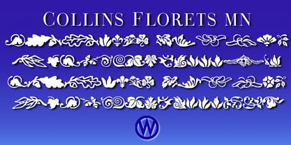 Collins Florets is a collection of embellishments. I found them in the endless archives of Erik Spiekermann. I scanned them and carefully corrected the outlines, to keep the rough look of yesterday. Yours Gert Wiescher
 - Restaurant And Lounge JNL by Jeff Levine,
$29.00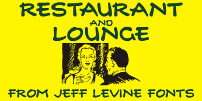 Restaurant and Lounge is a casual, brush-style type face based on hand lettering found on a 1940s matchbook for the Park Avenue Restaurant (a popular dining spot during the golden years of Miami Beach).
 - Kazincbarcika Script by Roland Hüse Design,
$9.00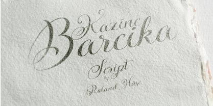 An elegant calligraphy script. I named it after my hometown, Kazincbarcika. I think it looks interesting written down.The first letter I designed was the initial "K" and I have built the whole set around that.
 - Shout by HiH,
$12.00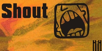 Shout is a “Hey, Look at ME” font. It is an attention-getting font for posters, flyers and ads. Its lineage includes the Haas Type Foundry’s 19th century advertising font, Kompakte Grotesk, which Jan Tschichold (1902-1974) dryly described as “extended sans serif” and which graphic designer Roland Holst (1868-1938) would have disapprovingly referred to as a “shout,” as opposed to the quiet presentation of information that he believed was the proper function of advertising. In 1963 Letraset released what appears to be an updated variation in multiple weights designed by Frederick Lambert called Compacta. Shout draws heavily on Compacta, as well as other similar fonts of the 50s and 60s like Eurostile Bold Condensed and Permanent Headline. In weight, it falls about halfway between Compacta Bold and Compacta Black, but with a relatively heavier lower case that is not so easily pushed around by the upper case. After all, one can shout while sitting down. Shout is the first font released with our new encoding, as noted in the All_customer_readme.txt. The Euro symbol has been moved to position 128 and the Zcaron/zcaron have been added at positions 142/158 respectively. Otherwise, Shout has our usual idiosyncratic glyph selection, with the German ch/ck instead of braces, a long s instead of the Greek mu and our usual Hand-in-Hand symbol. There are also left and right glyphs of a big mouth ]ing (135/137) and left and right glyphs of an angry man shouting (172/177). Please use Shout with discretion. Folks get tired of being yelled out. After awhile, they stop listening. Shout ML represents a major extension of the original release, with the following changes: 1. Added glyphs for the 1250 Central Europe, the 1252 Turkish and the 1257 Baltic Code Pages. Add glyphs to complete standard 1252 Western Europe Code Page. Special glyphs relocated and assigned Unicode codepoints, some in Private Use area. Total of 355 glyphs. 2. Added OpenType GSUB layout features: pnum, ornm, liga, hist & salt. 3. Added 266 kerning pairs. 4. Revised vertical metrics for improved cross-platform line spacing. 5. Revised hyphen, dashes & math operators. 6. Minor refinements to various glyph outlines. 7. Inclusion of both tabular & proportional numbers. Please note that some older applications may only be able to access the Western Europe character set (approximately 221 glyphs). The zip package includes two versions of the font at no extra charge. There is an OTF version which is in Open PS (Post Script Type 1) format and a TTF version which is in Open TT (True Type)format. Use whichever works best for your applications.
 - Danza Macabra by 2D Typo,
$36.00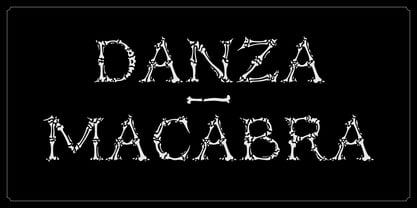 That's a special horrific font with an intricate pattern of bones. All letters are put together of nonrecurring elements drawn individually by hand. The classical forms as we see it sound afresh with the bones attire.
 - Confirmation JNL by Jeff Levine,
$29.00An old set of brass stencils spotted for sale on eBay were the inspiration for this font from Jeff Levine. Redrawn completely from scratch, Jeff retained the narrow "M" and angled corners found in the original. - Spring#7 by Joey Maul,
$12.00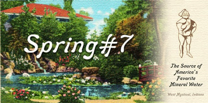 Spring#7 is a 1900s-style font based on text on postcards found after the turn of the century. Italic in nature, it works nicely for text and graphics that need a humble old-timey look.
 - Scrolls A by Wiescher Design,
$39.50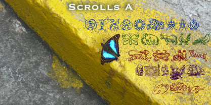 Scrolls A are a set of pictorial scrolls like signs of the zodiac, animals, dishes, flowers, symbols, decorative and Americana. They are beginning of last century American. Your I-found-them-somewhere type-designer, Gert Wiescher
 - Via Roma Display by Font&Co.,
$19.00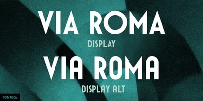 A font inspired by regime propaganda inscriptions found in Italian institutional and civic architecture of the 20’s and 30’s. Bold, severe lettering, suggestive of pre-war Italian Art Deco and American Depression Modern aesthetics.
 - Stencil Plate JNL by Jeff Levine,
$29.00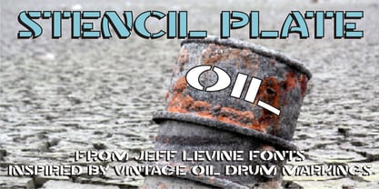 A brass stencil hand cut to mark the tops of oil drums yielded the lettering for Stencil Plate JNL. The font emulates the retro feel of the unique letter forms found in the original antique design.
 - Olden Daze NF by Nick's Fonts,
$10.00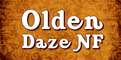 Another gem found in the pages of "Alphabets A to Z": rustic and rollicking fun in one face. Both versions of this font support the Latin 1262, Central European 1250, Turkish 1254 and Baltic 1257 codepages.
 - Summerville JNL by Jeff Levine,
$29.00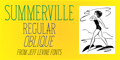 Summerville JNL is a condensed Art Nouveau slab serif design inspired by a typeface called “Superior” [found in the Barnhart Brothers & Spindler type specimen book circa 1897], and is available in both regular and oblique versions.
 - Vtg Stencil UK No. 2 by astype,
$29.00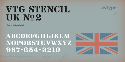 The Vtg Stencil series of fonts by astype are based on real world stencils. The UK No. 2 design was derived from authentic one inch A2 Roman stencil plates from Great Britain, manufactured around the 1950s.
 - Jealous Punk by Bogstav,
$15.00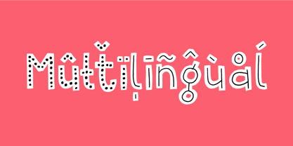 Here's a font that would love to play with your designs! Especially the ones where kids toys or packaging is involved - but feel free to play around with the 5 different versions with your other designs!
 - Gobsmacked by Hanoded,
$15.00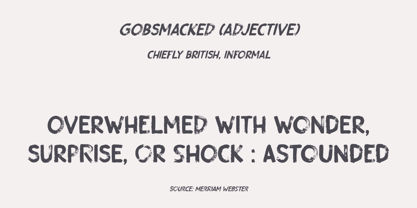 Gobsmacked is a rather new English word. It has been around since 1959 and was used mostly around Liverpool at that time. The word means: ’astounded’, ‘flabbergasted’ (another nice word!) or ‘speechless’. Gob could be of French or Scottish Gaelic origin and means ‘mouth’. Gobsmacked font was created using a brush and black gouache. The result is a very eroded, very legible and quite unique brush font. I have created alternates for the lower case letters, plus two double letter ligatures (oo and ss). Use it for any design that needs a little brushwork; I am sure the result will leave you gobsmacked!
 - Plain Stupid by PizzaDude.dk,
$17.00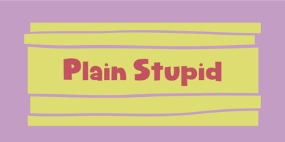 Really, there is nothing stupid about this font. In some strange and weird way, I just thought that the name sounded like something eye-catching - in the same way that the font is eye-catching! It may look like your average comic font, but it's not! I carefully put a lot of funk, twist, comic and a spoonful of pizzadude into each and every letter. The result is a bouncy crazy looking comic font. Oh, I almost forgot - I topped the letters with a spoonful of grafitti mixed with the sounds of a party...that's the recipe for this lovely multilingual font! :)
 - Nixon Script by Barnbrook Fonts,
$30.00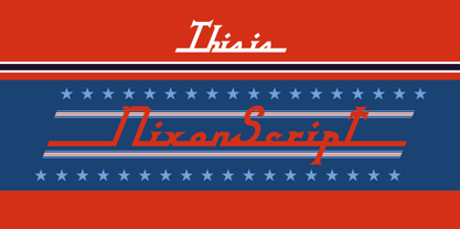 NixonScript is a display typeface inspired by the typographic emancipation given voice by 1950s and '60s north American vernacular type. NixonScript's starting point was lettering found on a 1960s camera found in a Chicago junk shop, but its development saw it transformed from a punchy sans-serif to a more thoughtful serif, with a lowered x-height and a vibe of almost priestly piousness. Rather than a simple regular italic, a bold italic is offered. During its development, the regular version seemed almost placid but with the double emphasis of bold and italic, NixonScript gained an energetic, self-congratulatory form.
 - Robusto by Galapagos,
$39.00Thirteen or 14 years ago I admired, out loud, a book I found on a shelf in Matt Carter's office. That Christmas I was pleasantly surprised to find that Matt had found another copy of the book and he gave it to me. The book was about the life of Oswald Cooper and it contained numerous specimens of Cooper's lettering jobs. Among them was an interesting image of 7 letter that spelled out the word 'Robusto'. These letters were used as the model for the font Robusto. All I needed to do was develop 221 other glyphs to finish the font. - Steamed by Hanoded,
$15.00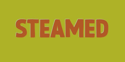 I have upgraded my existing font software and also bought new font software to play around with. It takes some time getting used to working with it; the upgraded software feels similar to what I am used to, but handles things differently and the new software is intuitive, but comes with its own language and ways of doing things. I spend most days reading the handbooks and watching online tutorials, but I did manage to create a font. Steamed is a hand drawn all caps display font that comes with a whole bunch of accented glyphs (even Vietnamese) to play around with.
 - Ristella by Mans Greback,
$59.00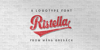 Ristella - a logotype script font. This high-quality typeface is created by Måns Grebäck. Its style is bold and has large, attention-grabbing uppercase letters. Ristella contains alternate and stylistic alternates, as well as multiple ligatures. With its hundreds of glyphs it also has support for a wide range of languages. How do you make a swash? Combine an ending and a tail to make a swash. Endings are found in the following symbols: [ ] { } Tails are found in the following symbols: < > § _ ¤ Example: Ristella}> With ligatures activated, write multiple tail symbols to make a longer swash. Example: Tailextender]¤¤¤
 - Pacaembu by Naipe Foundry,
$60.00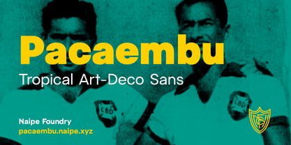 Pacaembu is a sans serif typeface that finds its roots in Brazilian football. This seven weight family began as a study of the stone lettering found in the Paulo Machado de Carvalho Municipal Stadium, affectionately known as the Estádio Pacaembu, a real gem of the Art-Deco style inaugurated in 1940. These art-deco letters, like football itself, were brought to Brazil by Europeans and out there in the tropics found a totally unique personality. Pacaembu is a celebration of Brazilian Football, it’s unique flavours, moves, sights and colors which have been delighting fans for generations.
 - LT Festive Medium - 100% free

- Gretoon Highlight - Personal use only

- Miso - 100% free

- La chata - 100% free

- Alba Super - Personal use only

- Kid Kosmic - Personal use only

- CMSquish - 100% free

- Pushki Pro by The Type Fetish,
$35.00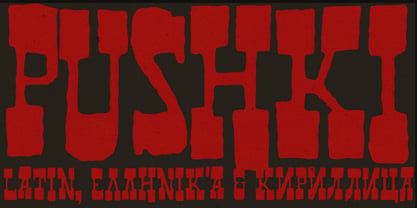 Pushki Pro is based on some hand lettering found on a Russian poster. Pushki Pro works with your OpenType-savvy applications, using contextual alternatives, to alternate between the upper and lowercase letters preventing adjacent glyphs from repeating.
 - Caramel Sky by Melonaqua,
$8.00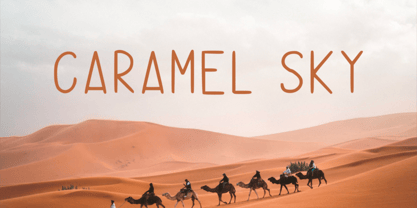 Caramel Sky is a naturally handwritten font that comes with 5 different styles. This design was inspired by blackboard menu penmanships found on coffee shops. A fun and spontaneous typeface suitable for various home or business projects.
 - Snack Stand JNL by Jeff Levine,
$29.00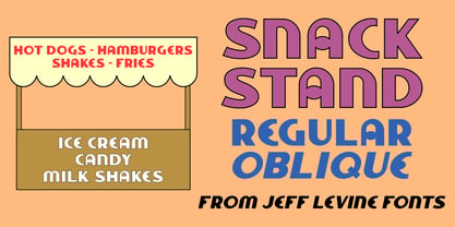 A 1940s film taken around Coney Island happened to show a sandwich vendor’s stand with its hand painted signs. The stylized Art Deco lettering inspired Snack Stand JNL, which is available in both regular and oblique versions.
 - SP Tanya by Remote Inc,
$39.00I found her in a German market while searching for the perfect parsnip. She was smoking catnip cigarettes and squeezing kumquats to test their ripeness. She had hair like a camel and index fingers like a Viking. - Office Manager JNL by Jeff Levine,
$29.00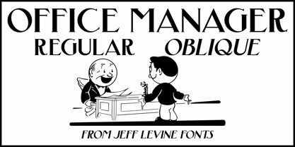 “Stillson” is an Art Nouveau-influenced font found within the pages of the 1881 Barnhart Bros. & Spindler type specimen book. The digital revival is called Office Manager JNL, and is available in both regular and oblique versions.
 - Floralissimo by Wiescher Design,
$39.50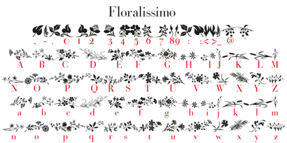 Floralissimo are flowery embellishments that I found in several old publishing books dating back over a hundred years. I thought they might be useful for some of you, so I digitized them. Your digitizing typedesigner, Gert Wiescher
 - Metalmark Stencil JNL by Jeff Levine,
$29.00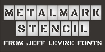 A lot of interesting variations in lettering style can be found in sets of antique tin or brass marking stencils. One such set was the model for Metalmark Stencil JNL, a bold sans with a chamfered look.
 - Same Old English JNL by Jeff Levine,
$29.00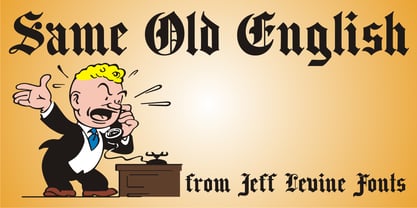 Same Old English JNL is your basic, everyday Old English text font with one small difference—it more resembles a hand-lettered typeface complete with tiny inconsistencies than it does the "perfect" versions found in printer's type.
 - Roman Stencil JNL by Jeff Levine,
$29.00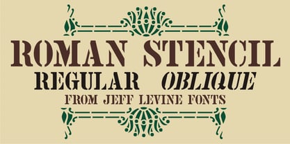 Roman Stencil JNL is a condensed version of the classic Roman typeface found on many vintage hand-punched brass stencils made for packing and shipping merchandise. This digital interpretation is available in both regular and oblique styles.
 - Pickfair JNL by Jeff Levine,
$29.00Pickfair JNL is based on the vintage wood type Vandenburgh Tuscan (circa 1867), and gets its name from the mansion owned by Douglas Fairbanks and Mary Pickford—two of the founding partners of United Artists movie studios. - Tiposka by ATK Studio,
$15.00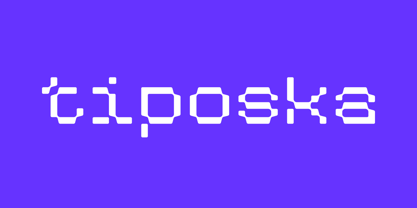 A new monospaced font with tech and experimental style by Atk Studio. Created for electronic displays found in modern techie world. This type features a Latin Standard character set, covering multiple languages written with the Latin script.


