10,000 search results
(0.064 seconds)
- Mokka by Ludwig Type,
$45.00 Mokka is a robust and crisp typeface with strong serifs and individual forms. Even in text and striking in display, it is suitable for a wide variety of uses. The style-linked family includes oldstyle and lining figures both tabular and proportional.
 - Brab by VSF,
$30.00 A bold grotesque typeface in the best traditions of the Star Wars logo. It has clean geometric lines, a humnaist character, it combines a tech feeling with a friendly organic feeling. Will work excellently as a white text on a busy background.
 - Quant Antiqua by ParaType,
$30.00 The typeface was designed at the Polygraphmash type design bureau in 1989 by Lyubov Kuznetsova. Based on the typeface Literanutnaya (Latinskaya) of the Berthold typefoundry (St.-Petersburg, 1901), a version of Lateinisch typeface of H. Berthold (Berlin, 1899). For use in text matter.
 - Vivala Sans by Johannes Hoffmann,
$15.00 The character of Vivala Sans Round is modern and stylish with elegant squarish shapes. The family includes five weights. A large x-height is ideal for titles and body text. The extended character set supports languages like Western, Central European, and Eastern European.
 - Astoria by Alan Meeks,
$45.00 Based heavily on Gill especially in the mid weights, Astoria has a subtle top left serif which makes it not quite a Roman and not quite a Sans. Designed specifically as a text face it still works very well as a headline font.
 - Logx 10 by Fontsphere,
$12.00 LOGX-10 is a geometric minimalistic all-caps display typeface. Designed for strong headers, original graphic designs, visual identification and for many types of designs. It works not only in headings and subtitles but also in arrangements of various sizes and long text.
 - Spearion by Outerend,
$20.00 Like spearheads moving in directions, the core idea of creating “Spearion” fonts was originated from concepts of speed, flow and movement. These slab fonts would be great for your next projects such as logos, film and TV credits, marketing materials, and many more!
 - Barbecue by Gaslight,
$20.00 Experimental, geometric, bold sans. Ideal for posters. Only posters, only large size! If you want tranquility and prim punctuality Barbecue is not for you. If you want use Barbecue for body text - you're crazy. If you want madness and hooliganism - Barbecue for you!
 - Kareemah by Sea Types,
$19.00 Kareemah is humanist typography, composed of roman and italics with 16 styles and 8 weights (800 glyphs) including ligatures, alternates, small caps,old style figures, fractions, superiors, inferiors and more. Perfectly legible and clean for long, simple texts in headlines. "Specimen Kareemah PDF"
 - Taz by LucasFonts,
$49.00 Although the Taz family was designed for newspapers, it works equally well in many other contexts. The fonts have been used in glossy magazines, sales catalogues and corporate brochures, for instance. Taz is appreciated for its readability in longer texts at medium sizes.
 - Larque by Furiosum,
$20.00 Larque is a slab serif text typeface. The tall x-height and the open counters makes the font very legible at small sizes. Larque includes extended latin characters, ligatures, oldstyle figures and Open Type features. It is available in roman and medium weight.
 - Pottery by Nurf Designs,
$16.00 Pottery is a beatiful script font. This font is great for your next creative project such as logos, printed quotes, invitations, cards, product packaging, headers, Logotype, Letterhead, Poster, Apparel Design, Label, and etc. Pottery comes with uppercase, lowercase, numerals, punctuations, multilingual support .
 - Lonely Annie by Sander's Conspiracy,
$20.00Lonely Annie is a fun font for titles or body text. Each letter of the font appears hollow, but with thick borders -- like a little stained glass window. It looks great in small and large sizes, especially with "Outline" or "Shadow" turned on. - Fried Cassava by Gassstype,
$22.00 Fried Cassava - Natural Handwritten Font with a natural style and dramatic movement. Crafted manually with love and passion, This font is great for your next creative project such as logos, printed quotes, invitations, cards, product packaging, headers, Logotype, Letterhead, Poster, Label, and etc.
 - CS Fuzzy Logic by URW Type Foundry,
$39.99 CS are the initials of Carsten Strinkau, a young German graphic and type designer who studied in Hamburg. CS Fuzzy Logic combines coincidence and logic. The individual glyphs of Fuzzy Logic are almost dissolved but keep its sharpness and readability in texts.
 - Stone Print by Stone Type Foundry,
$54.00 Stone Print is a "green" typeface. It uses less space than the most popular text typefaces without sacrificing legibility. Made for the reader, the environment, and whoever pays the bills. Together with Cycles, SFPL, and Arepo it makes up a superfamily of typefaces.
 - Boochild by Gassstype,
$28.00 Boochild - Natural Handwritten Brush Font with a natural style and dramatic movement. Crafted manually with love and passion, This font is great for your next creative project such as logos, printed quotes, invitations, cards, product packaging, headers, Logotype, Letterhead, Poster, Label, and etc.
 - Carnelian Antique by Tanincreate,
$16.00 Carnelian Antique, a contemporary, flowing style script. This elegant font it is perfect for branding, logos, invitation, headlines, texts and more. Carnelian Antique features: multi language support (for most of Western Europe), ligatures, alternates for low case letters (including multi language letters).
 - Matrice by Studio Sun,
$20.00 Matrice is a sans serif (Semi Extended) display font family in 8 weights plus matching natural italics. support 75+ Languanges (Latin Based) influenced by the grotesk typefaces developed in the early 20th century, perfect for branding (Identity), logotype, headline text, and caption.
 - Good Looking Karma by Gassstype,
$25.00 Good Looking Karma is a Handwritten Brush font made with Procreate app with Rough style and dramatic movement this font is great for your next creative project such as logos, printed quotes, invitations, cards, product packaging, headers, Logotype, Letterhead, Poster, Label, and etc.
 - Heathtop by Warnetype,
$6.00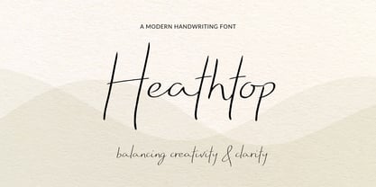 A modern handwritten script font that balances creativity with clear legibility that contains upper & lowercase characters, all punctuation and numerals. Designed so the text reflects stylish natural handwriting, with ligatures and carefully kerned characters mixed with unjoined letters for a contemporary feel.
 - Simeon by astype,
$40.00 Simeon is well suited for setting an short and medium amount of text with an historic impression. OpenType features: - over 650 glyphs - Central European faces - stylistic alternates and historical forms - ornaments, signs, zodiac, symbols - proportional & mediaeval numerals - numerators, denominators and fractions - Roman numerals
 - Bruce Old Style by Bitstream,
$29.99This is the Bruce Foundry’s Old Style No.20, which was loosely based on the Miller & Richard Old Style. It was recut at Lanston under Sol Hess’ direction in 1909, and survives as the second text face in the Sears Roebuck Catalogue. - Hirondelle by JBFoundry,
$18.00 With over 900 characters and with the contextual alternates, Hirondelle offers you a perfectly connected writing. By activating swashes, your texts will take a more remarkable expression. With its four weights, you will have a wide choice for your invitations, advertisements, packaging …
 - Tinderbox by Device,
$29.00 16th and 17th century formal handwriting forms the basis for Tinderbox, an antique script. Preserving the rough impression of a quill pen on parchment, Tinderbox evokes old manuscripts, ecclesiastical texts, gothic inscriptions, faded tattoos and horror literature; spooky calligraphy for the digital age.
 - Sanstuy by Gassstype,
$22.00 Sanstuy - Dynamic Typeface Font with a natural style and dramatic movement. Crafted manually with love and passion, This font is great for your next creative project such as logos, printed quotes, invitations, cards, product packaging, headers, Logotype, Letterhead, Poster, Label, and etc.
 - Post Box by Great Scott,
$16.00 Written in a ballpoint pen style POST BOX is a neighborly sans serif is slightly condensed and slanted. Scribbled quickly but readable. Exact but still human. Perfect for print, package and display use. You can also use it in shorter paragraph text.
 - Cartwheel by Sansani Fonts,
$- Cartwheel, a super bold and playful display font designed by Tom Censani was inspired by the imperfect beauty of hand-lettered signs at theme parks and the bouncy cadence of text inside comic book bubbles. Cartwheel is a fun attention-grabbing font.
 - Laksmi by Dotzeem,
$15.00 Introducing, Laksmi is a clean Variable Sans Serif Typeface for your Design that is fit for your next creative project such as logos, product packaging, Logotype, Letterhead, Poster, Apparel Design, Label, and etc. This Laksmi Typeface includes also support a Multilingual Characters.
 - Eklekt by Yinon Ezra,
$9.00 The Magical look of Eklekt is not made by chance, it is created with the combination of graphic-sharp shapes and a flow curves that looks a bit like it is written by hand. Can be used for logos, headlines and short text.
 - Kyrial Sans Pro by Mostardesign,
$- Designed in 2011 by Olivier Gourvat, this font family has generous proportions with a range of weights make it a versatile family for print, text, signage, branding and web design work. Kyrial Sans Pro offers lots of OpenType goodness and broad language support.
 - Vivala Slab by Johannes Hoffmann,
$15.99 The family includes eight styles being seven uprights and an inline style. Vivala Slab is ideal for use in headline sizes, but it also works properly within text blocks and information design. Opentype features are ligatures, ordinals, fractions, numerators, denominators, superscript and subscript.
 - Foda Naskh by Fo Da,
$50.00 Foda Naskh is a modern naskh typeface that Combines the originality and modernity, which shows the letters beauty and the ease of reading. Foda Naskh is typical for books, the writing of newspapers, headlines, magazines, poetry, long and short text paragraphs and more..
 - Kotes by Gassstype,
$22.00 Kotes - Natural Handwritten Allcaps Font with a natural style and dramatic movement. Crafted manually with love and passion, This font is great for your next creative project such as logos, printed quotes, invitations, cards, product packaging, headers, Logotype, Letterhead, Poster, Label, and etc.
 - Brooklyn Samuels by Samuelstype,
$30.00 Brooklyn Samuels is a sans-serif family of fonts designed by Hans Samuelson. Based on geometrical shapes it is primarily intended for headline use but also offers excellent legibility in small sizes. Stylistic sets offer a more text-friendly alternative for some letters.
 - Arable by Heyfonts,
$18.00 Arable Font Is "Unique Display Font" refers to a specific type of typography that is characterized by its distinctive, one-of-a-kind design, and it is typically used for eye-catching and decorative purposes. Here's a detailed explanation of what a unique display font is: -Distinctive Design: Unique display fonts stand out because of their distinct and unconventional design. They often deviate from traditional letterforms and can take on a wide range of creative and artistic shapes. Unlike standard, legible fonts used for body text, display fonts prioritize aesthetics over readability. -Specialized Use: Display fonts are not intended for extended reading. Instead, they are used in small quantities for headlines, titles, logos, posters, banners, invitations, and other design elements where visual impact is essential. Their unique and attention-grabbing design makes them ideal for drawing attention to specific text. -Creative Freedom: Designers have creative freedom when creating unique display fonts. This allows for a wide array of styles, from whimsical and ornate to futuristic and abstract. Some display fonts may be inspired by art movements, cultures, historical periods, or nature, leading to highly original and thematic designs. -Limited Character Set: Display fonts often have a limited character set compared to standard fonts. They typically include uppercase letters, numbers, and basic punctuation marks, but may lack lowercase letters or extended characters. This limitation is due to their specialized use and focus on visual impact. -Customization: Some unique display fonts are custom-designed for specific projects or brands. Designers work closely with clients to create a font that aligns with the brand's identity or the project's theme, ensuring a truly unique and tailored result. -Combination with Other Fonts: In many design projects, unique display fonts are paired with more standard, legible fonts to achieve a balance between visual impact and readability. This combination allows for a harmonious and effective overall design.
 - DT Skiart Serif Leaf by Dragon Tongue Foundry,
$10.00 ‘Skiart Serif Leaf’ has been on a long growing path getting to where it is now. Originally inspired by the san serif font ‘Skia’ by Mathew Carter for Apple. ‘Skiart’ was designed to feel more like a serifed font, but without any serifs. It took a step between sans serif and serif fonts. Next on the path towards a serif font came Skiart Serif Mini, with tiny serifs added. This was a true serif font, although they were subtle. This font ‘Skiart Serif Leaf’ is the next in the series. After many reiterations, ‘Skiart Serif Leaf’ was built and rebuilt many times until finally, this version deserved to be presented to the world. Style and flow had been added to this font. It remained fully readable and feels as clean and normal as any of the best body copy serifs, and yet has an original modern flair to it. The font feels strong and solid while having a subtle organic flow in its form. If compared to one of the more commonly used serifs like ‘Times New Roman’, the ‘Skiart Serif Leaf’ lowercase is more open with a taller x-height, increasing its readability and friendliness. The serifs are smaller and less distracting. They are not pretending to be ligatures. This font may be organic but is not in anyway script like. Where ‘Times’ makes its p q b d forms out of a barely touching oval and stem, the ‘Serif Leaf’ forms are much more firmly attached, appearing clearly as single letters. The standard setting for the a’s and g’s are round single story, feeling warmer and more inviting in the ‘Serif Leaf’ font. Much more friendly than the stuffy double storied versions in fonts like ‘Times’ etc. ‘Skiart Serif Font’ comes with a somewhat organic italic.
 - Matrise Pro by CheapProFonts,
$10.00 A new font in the style of a dot matrix/needle-printer. I have used some slightly smaller dots when designing the diacritics - this makes them easier to separate from the main letters. I have also used variable letter widths (and kerning), as opposed to the technology's original monospaced design - this to make the text more readable. Matrise Pro has a more modern/streamlined design, while Matrise Text Pro features a more "oldstyle" look with spurs and notches... ALL fonts from CheapProFonts have very extensive language support: They contain some unusual diacritic letters (some of which are contained in the Latin Extended-B Unicode block) supporting: Cornish, Filipino (Tagalog), Guarani, Luxembourgian, Malagasy, Romanian, Ulithian and Welsh. They also contain all glyphs in the Latin Extended-A Unicode block (which among others cover the Central European and Baltic areas) supporting: Afrikaans, Belarusian (Lacinka), Bosnian, Catalan, Chichewa, Croatian, Czech, Dutch, Esperanto, Greenlandic, Hungarian, Kashubian, Kurdish (Kurmanji), Latvian, Lithuanian, Maltese, Maori, Polish, Saami (Inari), Saami (North), Serbian (latin), Slovak(ian), Slovene, Sorbian (Lower), Sorbian (Upper), Turkish and Turkmen. And they of course contain all the usual "western" glyphs supporting: Albanian, Basque, Breton, Chamorro, Danish, Estonian, Faroese, Finnish, French, Frisian, Galican, German, Icelandic, Indonesian, Irish (Gaelic), Italian, Northern Sotho, Norwegian, Occitan, Portuguese, Rhaeto-Romance, Sami (Lule), Sami (South), Scots (Gaelic), Spanish, Swedish, Tswana, Walloon and Yapese.
 - Sedid by Fontuma,
$20.00 Sedid, “solidity; It is an Arabic term meaning “righteousness”. In particular, the correctness and soundness of a word is indicated by this word. The fact that I gave this name to the writing family is to point out its accuracy and robustness. This typeface, which is sans serif, consists of three families: ▪ Sedid: Font family containing Latin letters ▪ Sedid Pro: Font family including Latin, Arabic and Hebrew alphabets ▪ Sedid World: A family of typefaces including Latin, Cyrillic, Greek, Arabic and Hebrew alphabets Those who want to meet a new face of writing for their works and projects and make a difference in their work should meet the Sedid writing family. This typeface is as serious as it is affectionate, and solid as well as elegant. The Sedid font family can be used as a text and title font in all publishing and printing areas, magazines, newspapers, books, banner and poster designs, and websites. Sedid also has a pleasant-looking, flexible face with smooth lines and transitions. The inner and outer spaces of the font are proportioned so that the text can be read easily. Sedid font family consists of 14 fonts, seven plain and seven italic. The font family includes open type features, as well as a large number of ligatures, small caps, modifiers, and currency symbols of many countries.
 - Agmena Paneuropean by Linotype,
$103.99Agmena™ has no historical precursor; it was designed from scratch by Jovica Veljovi? whose aim was to create a new book typeface. Although it generally has certain similarities with the group of Renaissance Antiqua fonts, it is not clearly derived from any of these. Clear and open forms, large counters and a relatively generous x-height ensure that the characters that make up Agmena are readily legible even in small point sizes. The slightly tapering serifs with their curved attachments to letter stems soften the rigidity of the typeface, bringing Agmena to life. This non-formal quality is further enhanced by numerous tiny variations to the letter shapes. For example, there are slight differences to the terminals of the b", the "d" and the "h" and minor dissimilarities in the forms and lengths of serifs of many of the letters. The tittles over the "i" and "j" and those of the German umlauts are almost circular, while the diamond shape that is more characteristic of a calligraphic script is used for the punctuation marks. Although many of these variations are only apparent on closer inspection, they are enough to give Agmena the feeling of a hand-made typeface. It is in the larger point sizes that this feature of Agmena comes particularly into play, and individual characters gain an almost sculptural quality. The italic variants of Agmena are actually real cursives. The narrower and thus markedly dynamically formed lowercase letters have a wider range of contrast in terms of line thickness and have the appearance of having been manually produced with a quill thanks to the variations in their terminals. The lowercase "a" assumes a closed form and the "f" has a descender. The italic capitals, on the other hand, have been consciously conceived to act as a stabilising element, although the way they have been inclined does not produce a simply mechanical effect. This visual convergence with the upright characters actually means that it is possible to use letters from both styles in combination. Agmena is available in four weights: Book, Regular, Semibold and Bold, and each has its matching italic variant. Veljovi? designed Book and Regular not only to provide an optical balance between various point sizes, such as between that used for the text and that used in footnotes, but also to take account of different paper forms: Regular for lined paper and Book for publishing paper. Agmena's range of characters leaves nothing to be desired. All variants include small caps and various numeral sets with oldstyle and lining figures for setting proportional text and table columns. Thanks to its pan-European language support, Agmena can be used to set texts not only in languages that use the Latin alphabet as it also features Cyrillic and Greek characters. The set of standard ligatures has been extended to include special combinations for setting Greek and Serbian. Agmena also has some initial letters, alternative glyphs and ornaments. Agmena is a poetic text font with forms and spacing that have been optimised over years of work to provide a typeface that is ideal for setting books. But its letters also cut a good figure in the larger font sizes thanks to their individual, vibrant and, in some cases, sculptural effects. Its robust forms are not merely suited to a printed environment, but are also at home among the complex conditions on terminal screens. You can thus also use Agmena as a web font when designing your internet page."Agmena has received the Certificate of Excellence in Type Design at the Type Directors Club of New York TDC2 competition in 2013.