10,000 search results
(0.04 seconds)
- Autentico realistic handwriting by Redy Studio,
$19.00 Beautiful and sexy handwriting types. You will love the look of this font. Autentico font was inspired by modern calligraphy, but with a more crushed look, making it perfect for wedding invites, greeting cards, or logos. Use the upper case letters to add elegance to images or give your design some style. We included a full set of lower and upper case letters, numbers, punctuation marks, and 93 ligatures to take your design to the next level. Authentico features: A full set of upper & lowercase characters Numbers & punctuation 93 Gorgeous ligatures Alternates in lowercase Multilingual symbols PUA Encoded Characters – Fully accessible without additional design software. Feel free to give me a message if you have a problem or question. Thank you so much for taking the time to look at one of our products.
 - Australia Script by Dhan Studio,
$16.00 Australia Script is an elegant style handwritten font with a slightly rough scratch, which has a signature style, this font is intentionally made with ligatures and unique alternatives to your various personal designs. Perfect for invitations, greeting cards, news, branding, logos, business cards, posters, product packaging, blog posters, etc. How to access all alternative characters, using Windows Character Map with Photoshop: https://www.youtube.com/watch?v=Go9vacoYmBw How to access all alternative characters using Adobe Illustrator: https://www.youtube.com/watch?v=XzwjMkbB-wQ Australia Script is coded with PUA Unicode, which allows full access to all the extra characters without having special designing software. Mac users can use Font Book , and Windows users can use Character Map to view and copy any of the extra characters to paste into your favourite text editor/app.
 - Ameston by Gatype,
$10.00 Ameston is an organic handwritten font suitable for branding, signatures, wedding invitations, promotions, product packaging and other necessities. This font is modern, simple, but still authentic. To enable the OpenType Stylistic alternative, you need a program that supports Adobe Illustrator CS, Adobe Indesign & CorelDraw X6-X7, Microsoft Word 2010 or a later version. How to access all alternative characters using Adobe Illustrator: https://www.youtube.com/watch?v=XzwjMkbB-wQ Ameston is coded with PUA Unicode, which allows full access to all additional characters without having to design any special software. Mac users can use Font Book, and Windows users can use Character Map to view and copy any additional characters for pasting into your favorite text editor / application. How to access all alternative characters, using the Windows Character Map with Photoshop: https://www.youtube.com/watch?v=Go9vacoYmBw
 - Anthony Hartman by Letterena Studios,
$10.00 Your branding missing something that makes people amaze? Looking for an elegant font to attract your audiences or customers? What if we told you, you only need to change one element to engage and convert your clients? Introducing Anthony Hartman - A Modern Script Font Giving you a simple, yet gorgeous solution to your branding. This font is another level script font. It encapsulates the essence of elegance and modernity. With its clean script-type design and curved indentations, this font will take your projects to the next level! Use it for headings, logos, business cards, printed quotes, invitations of all sorts, cards, packaging, and your website or social media branding. Anthony Hartman includes Multilingual Options to make your branding globally acceptable. Features: Ligatures Alternates Swashes Multilingual Support PUA Encoded Numerals and Punctuation
 - Bonna by Eurotypo,
$28.00 Bonna and Bonna Bold is a casual calligraphy family Font with an original textured appearance that will allow you to create an effect even more authentic. It’s an exclusively Open Type release with 815 glyphs, 93 ornaments to combine with letters and decorate your text. There are plenty of options to create something unique and special with lots of possibility an infinity of combinations: standard and discretionary ligatures, several swashes and stylistics alternates for each letter, catchwords, tails that can be added to the beginning or end of each letter, and much more. These ravishing fonts have already an extended character set to support Central and Eastern as well as Western European languages. Bonna was designed to help your projects look more creative, wonderful and fascinating! Have fun with it!
 - Tropicane by Heyfonts,
$18.00 Tropicane - Stylish Typeface refers to a font that possesses a distinct and attractive aesthetic, often characterized by unique design elements, creative flair, and an overall fashionable or contemporary look. Stylish typefaces are crafted to make a visual impact and are frequently chosen for design projects where the typography plays a crucial role in conveying a specific mood, personality, or brand identity. Here's an in-depth explanation of the characteristics and significance of a stylish typeface: - Distinctive Design Elements: Stylish typefaces stand out due to their distinctive design features. This may include unique letterforms, creative ligatures, elegant serifs, or modern sans-serif shapes. The goal is to create a visually appealing and memorable set of characters. - Contemporary Aesthetic: The term "stylish" implies a modern and fashionable design. Stylish typefaces often incorporate contemporary design trends, keeping up with current aesthetics to ensure that they remain visually relevant and appealing. - Versatility: Stylish typefaces are often versatile, suitable for a variety of design applications. Whether used for branding, editorial design, websites, or marketing materials, these typefaces maintain their stylish appeal across different contexts. - Attention to Detail: A stylish typeface is characterized by meticulous attention to detail. Designers pay close attention to the shapes, proportions, and spacing of individual characters to create a harmonious and visually pleasing overall appearance. - Expressive Characters: Stylish typefaces can convey a sense of expressiveness and personality. This expressiveness can be achieved through unique letter shapes, playful elements, or the incorporation of design features that evoke a particular mood or emotion. Applicability to Branding: Brands often use stylish typefaces to create a distinctive visual identity. A stylish font can contribute to the overall brand image, helping to communicate the brand's values, tone, and style to the target audience. - Innovative Typography: Stylish typefaces are often at the forefront of typographic innovation. They may push the boundaries of traditional letterforms, experimenting with new shapes, styles, and arrangements to create a sense of novelty and creativity. - Readability and Functionality: Despite their emphasis on style, these typefaces generally maintain a balance between visual appeal and readability. Clear and legible letterforms are crucial, ensuring that the text remains accessible while still making a stylish statement. - Adaptability to Trends: Stylish typefaces are often designed with an awareness of design trends. This adaptability allows them to stay relevant over time, making them a popular choice for designers who want their projects to reflect a contemporary and stylish aesthetic. - Customization Options: Some stylish typefaces come with additional features, such as alternative characters, ligatures, or stylistic sets, offering designers the flexibility to customize the appearance of the text for specific design needs. In summary, a stylish typeface is a carefully crafted font that goes beyond mere functionality, aiming to enhance the visual appeal and expressiveness of the text.
 - Adelphi PE by Rosetta,
$70.00 Adelphi is a geometric sans, redefined for the northern side of the English Channel. Typographic modernism was a late arrival in Britain — due partly to the Second World War and to the strong local type tradition. This delay provided for fruitful divergence, thus modernism was not adored in quite the same way as it had been in Germany and central Europe. It was instead rethought and repurposed against the backdrop of the bleak British weather and postwar social reform – a continental fashion statement reshaped into a more humanist variant. Likewise, when crafting Adelphi, Nick Job reimagined the constraints that defined the geometric sans as a genre. Whereas other typefaces seem overly bound by the rules, Adelphi feels relaxed and approachable. Elementary square and circular shapes are merely implied. A keen observer may notice that the uncomplicated letterforms occasionally reveal a subtle naïveté associated with early Grotesques. Brunel’s bridges and Harry Beck’s tube map spring to mind alongside the Bauhaus and Futura. But Adelphi is by no means nostalgic! It is a contemporary, comprehensive, and durable system with a pragmatic set of features. These include a wide array of weights, ‘uniwidth italics’, and variable extenders that go from tall and flat in Adelphi Text to short and sharp in Adelphi Display, with default Adelphi standing midway between these two extremes. You can set the extenders to your preference in the all-inclusive variable font or use one of the three static fonts that come packed together, priced as a single font. The pan-European support for Latin, Cyrillic and Greek scripts already makes for a vast character set, but Adelphi takes things a step further by including alternate glyphs to satisfy the DIN1450 legibility norm, a range of ordinals that can be used to create specialist compositions in all three scripts and two kinds of fractions and arrows. Play with the alternates or use it as-is. Either way, this understated beauty will carry you through.
 - Open Book ING by Ingrimayne Type,
$9.00 OpenBookING is a gimmick or novelty font that has letters on pages of a book. It is caps only and monospaced. The letters on the upper-case keys are on the left-handed pages of an open book and the letters on the lower-case keys are the same letters but on the right-handed pages of an open book. One could alternate upper and lower case keys to get letters on complete books, but the Opentype feature of contextual alternatives (calt) does this automatically. Several previous typefaces from IngrimayneType used the calt feature to alternate shapes that fit together in an interlocking pattern, such as alternating concave and convex shapes. OpenBookING uses the calt feature in a different way, to alternate two halves of a symmetrical shape. To provide two copies of numbers and common symbols, some non-alphabetical characters are unavailable because their slots were taken by the second form of the number or common symbol. If stylistic set one (ss01) is turned on, spaces are replaced with empty pages. This may leave you with unwanted spaces at the end of lines, and to eliminate them, turn off the feature (or change the font) for these spaces. The empty pages can be used in a layer to add color to the text. There is also a second set of empty pages with a filled page that can also be used in layers. (See poster for examples.) These pages are on the (logicalnot multiply) and (register divide) characters for the first set and on the (ordmasculine ellipsis) and (macron trademark) keys for the second set. Finally, OpenBookING has a large set of accented characters if anyone should need them. The letters used on the books were derived from the font Myhota-Bold. For a related typeface of letters on book covers, see NewLibrary. OpenBookING has limited uses and is priced accordingly.
 - Fangs ALot by Ingrimayne Type,
$9.00 FangsALot is a bizarre typeface family that was designed to alternate two character sets. These sets are alternated automatically in applications that support the OpenType feature Contextual Alternatives (calt). The template used to design characters is a distorted triangle that resembles a curved tooth or a fang. This shape can be flipped horizontally, vertically, and both horizontally and vertically to give four orientations. Two of these orientations are used in the regular style and two in what is called the italic style. I thought the fang motif did not come through clearly in the regular and italic styles. Rather the impression they give is more like graffiti lettering. To emphasize the fang motif I added two more members to the family by filling fang outlines with unadorned sans-serif characters. Then to allow more color in lettering, I added two more styles with letters on black. I then had six styles based on triangles skewed left and right. Why not fill the family out with three more styles based on an isosceles triangle? The end result is a family of nine. All members of the family are monospaced and are hard to read. The three graffiti-like styles have some alternative letters that can be accessed with the OpenType feature Stylistic Sets. Also, for each style it is possible to use only one set of characters by adding a space after each letter and then adjusting the character spacing. The graffiti-like styles can be useful in situations where the hard-to-read property is not important but where a menacing and vicious touch is needed, such as topics of sharks, teeth, biting, and vampires.
 - BD Gitalona by Balibilly Design,
$22.00 We introduce our high-complex typeface. A wide range of serifs for text and display titles are divided into one prominent sub-family and four display sub-families. Comes shifted from serif to sans serif to fulfilling the completeness of this font family that we named BD Gitalona. In addition to these massive things, this font family is filled with an explorative and experimental decorative version that we present separately. Figure out the decorative version BD Gitalona Moxa to make the aesthetic appeal of this whole typeface! Inspiration The world of entertainment moves non-stop. One by one, figures appeared and left. We expect to create something to entertain previous trends with packaging more relevant to the present. More specifically, we admire and are inspired by some of the world's leading and top singers with a segmented nature. We imagine so many figures that can affect every viewer. However, each artist or singer has a segment because almost all of them have characteristics. The Design The basic design of this typeface begins with a transitional serif shape with sharp, shapeless corners. Then in the middle of the invention, there was an opportunity to explore it further from the readability side by adding an optical variable that can adjust the serif thickness when used together between large, medium to paragraph text sizes for editorials. The shift from serif to sans-serif with the contrast initiated by the shift of the serif family form as a different variable also makes this font richer in terms of the features it contains. Parts are expected to add to the user satisfaction with the complexity of this font. The Features BD Gitalona consists of one sub-family intended for body text with nine weights from Thin(100) to Black(900) and four other display sub-families such as Display serif, Flick, Harmony Sans and Contrast Sans. Each consists of four weights Thin(100), Regular Weight(400), Bold(700), and Black(900). And again, there are also retailed separately; the BD Gitalona Variable font, which is designed to accommodate all Subfamily in 1 font file, and BD Gitalona Moxa, an experimental typeface. A total of 700+ glyphs in each style. Advanced OpenType features functionally and aesthetically, such as Case-sensitive forms, small caps, standard and discretionary ligatures, stylistic alternates, ordinals, fractions, numerator, denominator, superscript, subscript, circled number, slashed zero, old-style figure, tabular and lining figure. Supports multi-languages including Western Europe, Central Europe, Southeast Europe, South America, and Oceania.
 - Wolesbro by Locomotype,
$10.00 Wolesbro is a brush font designed to give a natural handwriting look without forgetting readability for typography. Comes with two different brush styles; Wolesbro One and Wolesbro Two so you can more easily work with your design. OpenType features include: Ligatures for natural double letters and contextual alternates for casual terminal form.
 - New Yorker Type Pro by Wiescher Design,
$45.00 New-Yorker-Type was one of the first typefaces I tried my hand at in 1985. I meant it as a revival of the typeface used by the New Yorker magazine. I did not scan it. I just looked at the type and redrew it completely by hand. Only much later did I come to know, that there is a bundle of similar typefaces of that period. Rea Irvin's design for New-Yorker magazine was just one of them, maybe the best. In the next step I repaired some of the mistakes that I made more than thirty years ago. Now on the eve of 2020 I gave the font a complete overhaul and added a set of Swash Initials, Cyrillic and Greek glyphs and many ligatures. The font now has 1075 glyphs and is all set for most latin writing systems. On top of that I made two versions, a Classic one with rounded corners and a pointed Pro version for a more up-to-date look. Take your pick. Yours sincerely, honoring Rea Irvin a great type- and magazine-designer, Gert Wiescher
 - Mr Foodie by Hipopotam Studio,
$30.00 Mr Foodie is a set of 825 icons divided into 7 groups – 109 fruit icons, 157 kitchen icons, 120 animal products icons, 100 veggie icons, 107 desserts icons, 127 beverages icons, and 105 other food related icons. You can find a full, multi-color list of every icon with its name and corresponding character on a dedicated website or in a pdf manual. It’s a multilayer font so every group consists of 4 fonts – Regular, Back, Front, and 3rd Color. The Regular style is for single color use only and the Back, Front, and 3rd Color styles are necessary if you want to achieve a multicolor effect. Position three identical text boxes exactly on top of each other, apply layer font styles, and choose whatever colors you like. You’ll quickly discover that some icons don’t have 3rd Color style. This is not a mistake – a lot of things look good with just two colors. Use it to make logos, illustrations, games, app icons, t-shirts, mugs, cooking books, restaurant menus, interior decorations, invitations, balloons, and any other project where fine crafted food drawing is needed.
 - Automobile Contest by Asd Studio,
$15.00 Introducing the new font Automobile Contest - Handbrush, the new version of Qillsey Einstein Font, a type of script that has a natural scratch texture. I made by using a brush pen that makes the impression seem natural. My font is complete with two StylisticSet which will make the writing more beautiful and charming. This typeface is suitable for use in a variety of design fields, such as event advertisements, product promotions, book titles, activity titles, logos, adventure, and others. This font can when paired with serif font types will make your design project more beautiful and perfect. I highly recommend using a program that supports OpenType featuresand Glyphs panels such as Adobe Illustrator, Adobe Photoshop CC, Adobe InDesign, or CorelDraw, so you can see and access all Glyph variations. This font is encoded with Unicode PUA, which allows full access toall additional characters without having special design software. Mac users can use Font Book, and Windows users can use Character Map to view and copy one of the extra characters to paste into your favorite text editor / application. I hope you enjoy the font, thank you.
 - New Yorker Type Classic by Wiescher Design,
$45.00 New-Yorker-Type was one of the first typefaces I tried my hand at in 1985. I meant it as a revival of the typeface used by the New Yorker magazine. I did not scan it. I just looked at the type and redrew it completely by hand. Only much later did I come to know, that there is a bundle of similar typefaces of that period. Rea Irvin's design for New-Yorker magazine was just one of them, maybe the best. In the next step I repaired some of the mistakes that I made more than thirty years ago. Now on the eve of 2020 I gave the font a complete overhaul and added a set of Swash Initials, Cyrillic and Greek glyphs and many ligatures. The font now has 1075 glyphs and is all set for most latin writing systems. On top of that I made two versions, a Classic one with rounded corners and a pointed Pro version for a more up-to-date look. Take your pick. Yours sincerely, honoring Rea Irvin a great type- and magazine-designer, Gert Wiescher
 - 1509 Leyden by GLC,
$49.00 This script font was inspired by the type used in Leyden by Jan Seversz to print Breviores elegantioresque epistolae [...], author Francesco Filfelo, circa 1509. The original font contains all lower case characters, except w, eth, thorn, lslash, oslash and so... and almost upper case. In addition, one set of small lombardic initials were also nearly complete. It take place instead of the Bold style (in only one package)offering a real and rare complete historical printing set... The original small "a" hight was 2,8 mm !, the upper case hight no more than nearly 5 mm, the initials hight almost 15 mm, covering nearly two lines. This font includes "long s", naturally, as typically medieval and also a few ligatures, but not any variants. We have entirely recreated some characters, upper, lower and initials, to fill gaps. It is used as variously as web-site titles, posters and fliers design, publishing texts looking like ancient ones, or greeting cards, all various sorts of presentations, menus, certificates, as a very decorative, elegant and unusual font, besides its historical scrupulous reality... This font supports enlargement as well as small size.
 - Cedag by Product Type,
$15.00 Introducing Cedag, a stunning Display San serif font that exudes elegance and boldness. The font boasts two unique families, regular and round, both offering a modern twist to a classic look. With its sleek and stylish design, Cedag is perfect for any project that requires a confident and sophisticated aesthetic. The regular family features a classic San serif style with a modern twist, while the round family has a bolder, more playful look. And with multilingual support, you can use Cedag for projects around the world. Whether you’re designing a logo, branding materials, or any other creative project, Cedag is a versatile and impressive font that will elevate your work to the next level. Its bold and confident style is perfect for any modern design, making it a must-have for any designer or creative professional. What’s Included : - File font - All glyphs Iso Latin 1 - We highly recommend using a program that supports OpenType features and Glyphs panels like many Adobe apps and Corel Draw, so you can see and access all Glyph variations. - PUA Encoded Characters – Fully accessible without additional design software. - Fonts include Multilingual support
 - Walbaum by Monotype,
$50.99 First designed in the early 1800s, Walbaum never achieved the audience or acclaim it deserved – despite its easy elegance, and sophisticated persona. It’s been fully restored for this expansive family, which includes 32 weights including ornaments and two decorative cuts. Walbaum offers the kind of warmth that’s missing from comparable typefaces such as Bodoni or Didot, feeling effortlessly approachable and legible. Monotype team Carl Crossgrove, Charles Nix and Juan Villanueva have adhered to designer Justus Erich Walbaum’s original intentions, also incorporating work by the designer’s son into some of its more extreme display weights – pushing the possibilities of Walbaum without compromising on its spirit. Text weights work well for the demands of digital environments, while decorative and display weights offer more dramatic, sculptural forms. Unusually, the family also includes a generous range of ornaments. From massive billboards, to micro-type on e-readers, Walbaum has it covered. The family is available as OpenType OTF font format, and includes over 600 glyphs with OpenType typographic features including small capitals, old style and lining figures, proportional and tabular figures, fractions and ligatures. Featured in: Best Fonts for Logos
 - Neue Aachen by ITC,
$40.99 Impressed by the quality of the Aachen typeface that was originally designed for Letraset in 1969 and extended to include Aachen Medium in 1977, Jim Wasco of Monotype Imaging has extended this robust display design to create an entire family. Derived from the serif-accented Egyptienne fonts dating to the early 20th century, Aachen has serifs that are very solid but considerably shorter than those of its precursor. The incorporated geometrical elements, such as right angles and straight lines, provide the slender letters of Aachen with a slightly technological, stencil-like quality. Despite this, the effect of Aachen is by no means static; its dynamism means that this typeface, originally designed for use in headlines, has come to be used with particular frequency in sport- and fitness-related contexts. Jim Wasco, for many years a type designer at Monotype Imaging, recognized the potential of Aachen and decided to extend the typeface to create an entire typeface family. He appropriated the existing Aachen Bold in unchanged form and first created the less heavy cuts, Thin and Regular. Wasco admits that he found designing the forms for Thin a particular challenge. It took him several attempts before he was able to achieve consistency within the glyphs for Thin and, at the same time, retain sufficient affinity with the original Aachen Bold. But he finally managed to adapt the short serifs and the condensed and slightly geometrical quality of the letters to the needs of Thin. The weights Light, Book, Medium and Semibold were generated by means of interpolation. Supplemented by Extralight and Extrabold, the new Neue Aachen can now boast a total of nine different weights. Wasco initially relied on his predilection for genuine cursives in his designs for the Italic cuts. But it became apparent with these first trial runs that the soft curves of cursives did not suit Aachen and led to the loss of too much of its original character. Wasco thus decided to compromise by using both inclined and cursive letters. Neue Aachen Italic is somewhat narrower than its upright counterparts; the lower case 'a' has a closed form while the 'f' has been given a descender, but the letters have otherwise not been given additional adornments. The range of glyphs available for Neue Aachen has been significantly extended, so that the typeface can now be used to set texts not only in Western but also Central European languages. Wasco has also added a double-counter lowercase 'g' while relying on the availability of alternative letters in the format sets for the enhancement of the legibility of Neue Aachen when used to set texts. The seven new weights and completely new Italic variants have enormously increased the potential applications of Aachen and the range of creative options for the designer. While the Bold weights have proved their worth as display fonts, the new Book and Regular cuts are ideal for setting text. And the subtlety of Ultra Light will provide your projects with a quite unique flair. The new possibilities and opportunities in terms of design and applications that Neue Aachen offers you are not restricted to print production; you can also create internet pages thanks to its availability as a web font.
 - Arbuckle by GarageFonts,
$39.00 Arbuckle is a bubbly and buoyant display typeface. The family contains two layering fonts to allow for the control and styling of the bubble highlights.
 - IMPuzzled by Ingrimayne Type,
$9.00 IMPuzzled uses the OpenType feature of Contextual Alternatives to alternate two sets of characters. The sets are on two puzzle pieces that tessellate, that is, fit together to fill the plane with no gaps or overlaps. Empty pieces are on the brace keys and can be used to fill spaces. The black or solid style is designed to be used in a layer under the regular style, though it can be used alone if adjacent pieces are given different colors. This unusual font has limited uses but may be appropriate when the topic is related to the broad areas of puzzles, puzzled, and fitting pieces together.
 - Only Fools and Horses - Unknown license

- Haiku by AcidType,
$12.00 Haiku is a very modern old-style typeface. Inspired by late Renaissance-era typography, and carefully optimised for both display and text, digital and print. Featuring ligatures, old-style numerals, wide language support, and true italics.
 - Ralligant by DYSA Studio,
$19.00 Ralligant a New Modern Serif Typeface. This another collection of Serif is perfect for your next branding project, excellent for your business. Ralligant have a smooth edges, so this font gives an authentic handcrafted feel style.
 - Maloya by DYSA Studio,
$19.00 Maloya is a new handwritten font. This another collection of calligraphy is perfect for your next branding project, excellent for your business. Maloya have a natural edges, so this font gives an authentic handcrafted feel style.
 - Krete by BluHead Studio,
$29.00 BluHead Studio continues its collaboration with British designer Roy Preston by producing Krete, Roy’s latest text family. This first release of 12 weights includes Light, Book, Regular, Medium, Bold, and Black, each with a drawn italic.
 - Microdot by 2D Typo,
$24.00 Microdot is a pixel typeface that uses 5 by 7 grid. Fonts supports Latin, Cyrillic, and Hebrew, all with thoroughly designed diacritics. Microdot makes use of advanced OpenType features, just as any other modern text typeface.
 - Playfulion by DYSA Studio,
$19.00 Playfulion is a new playful typeface. This another collection of display is perfect for your next branding project, excellent for your business. Playfulion have a natural edges, so this font gives an authentic handcrafted feel style.
 - Wonderplay by DYSA Studio,
$19.00 Wonderplay is a new playful typeface. This another collection of display is perfect for your next branding project, excellent for your business. Wonderplay have a natural edges, so this font gives an authentic handcrafted feel style.
 - JH Lina by JH Fonts,
$60.00 JH Lina is an Arabic Naskh typeface, including four weights; it is typical for long running text, headlines, branding , news letters, magazines, signage and electronic publishings ... The diacritic positioning is fine tuned per the publishers requirements.
 - Eligade by DYSA Studio,
$19.00 Eligade a New Modern Serif Typeface. This another collection of Serif is perfect for your next branding project, excellent for your business. Eligade have a smooth edges, so this font gives an authentic handcrafted feel style.
 - Agression by Gassstype,
$27.00 Agression-Handwritten Brush font with a Rough style and dramatic movement. This font is great for your next creative project such as logos, printed quotes, invitations, cards, product packaging, headers, Logotype, Letterhead, Poster, Label, and etc.
 - Reacher Sans by Callout,
$19.00 Reacher-Sans is an elegantly simple sans-serif font. Designed for versatility, it possesses unique letters perfect for logos and still maintains a simple and readable look beautiful for both headlines and large blocks of text.
 - Pacifica by Solotype,
$19.95This is really Congo from Barnhart Bros. & Spindler, but we felt it would be improved if we smoothed out some of the curves slightly. Conjures up visions of Pacific Islands and other exotic ports of call. - P22 1722 by IHOF,
$39.95 An historical font based on early 18th century printing, with the visual effect of uneven inking and indifferent presswork on handmade paper. Ideal for evoking the period. Effective in continuous text setting or in display sizes.
 - Rushfiel by Rotterlab Studio,
$10.00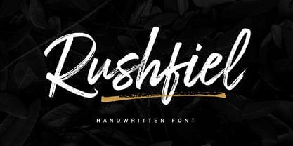 Introducing Rushfiel, a handwritten font made with quick-drying brush strokes in a distinctive styles. It's perfect for branding projects, household appliances design, product packaging or just as a text overlay for background images or posters.
 - Pen Gothic JNL by Jeff Levine,
$29.00 Pen Gothic JNL emulates lettering made with a round nib lettering pen, and is loosely based on some text found on the popular 1918 song "Ja-Da". The font is available in regular and oblique versions.
 - Kitchen Utensils by Celebrity Fontz,
$24.99 Kitchen Utensils is a pictorial font with 36 different common kitchen tools and appliances in the shape of the letters of the alphabet and numbers. Perfect for cooking and kitchen-related texts, recipes, and culinary publications.
 - Gluster by Maulana Creative,
$14.00 Gluster Serif Display Font Typeface is a single weight black serif, modern casual typeface perfect use for headline, logo, magazine, and any editorial design needs also readable body text. I hope you like it, keep awesome!
 - Crunk by Nerfect,
$15.00Crunk was inspired by the creator's (at the time) teenaged hoodlum of a brother. The font Crunk is great for headlines and text and has served its creator well over the years since it was made.
