10,000 search results
(0.111 seconds)
- Luks Deco by Nasir Udin,
$24.00 Luks Deco took inspiration from the glory of Roaring 20’s when the Art Deco style rose to its heyday. The strong geometric shape emphasizes the touch of retro yet modern style. Luks Deco is a good choice who wants to give Art Deco vibes to their designs. Luks Deco’s weight range from light to black, suitable to cater of all you need. The O,C,G and Q letters (and all glyphs that have circle form) have a bit different shape from light to black which will give unique display look for overall design. - Uppercase
 - Burlesk Queen JNL by Jeff Levine,
$29.00 Burlesk Queen JNL was inspired by the hand lettered title “Gypsy” on the sheet music for "Everything's Coming Up Roses" from the movie musical based on the autobiography of famed stripper Gypsy Rose Lee. With just four basic letters to work with [G,Y,P and S], a full character set was drawn from scratch. The design features bold spur serif characters on individual ‘marquees’ bordered with lights. Burlesk Queen One JNL is the original version with white characters on black panels, while Burlesk Queen Two JNL has those panels stripped away to provide black letters on a white background.
 - Aladdin by CozyFonts,
$20.00 Aladdin Black is the 3rd member of our Aladdin Bold Font Family. This new style is extra bold and slightly rounded on the outsides of the glyphs. It is fat, fancy, fearless, forward, devilish, heavy, and stylized. Aladdin Bold was my first font introduced in 2012. I've always felt there were possibilities of adding styles to this family and something triggered the decision, so...here it is. I took much time deliberating over many of the finer details in this version of Aladdin and I hope the 'devil is in the details' for whoever decides to try on Aladdin Black.
 - Puipui by Jipatype,
$25.00 Puipui is a sans serif typeface with a rounded, contrast stroke and minimal look. Comes with 9 weights and italics of each weight total 18 styles. Support multi-languages and Thai language. Suitable for Headline or text body. Puipui can help you to create a mood and tone of cuteness suitable for kid, pet, food product or anything about cuteness content.
 - Heartland by NREY,
$25.00 Heartland font family is a pack of the bold connected script and rounded sans. Font is great to use for logotype, menu and product labels, prints, posters, branding, social media. This pack include 3 fonts: - Heartland Script - Heartland Sans - Heartland Sans Condensed - Heartland Italic Sans - Heartland Bold Sans Download Heartland for your next project today! Thank you and have a great day!
 - Frusta by District,
$20.00 Frusta is an earnest family of slab-serifs softened by tapered serifs and slightly squared curves that give it a warmth often absent in other slabs. Monoline and with a geometric foundation, this three-weight family includes true italics that can be their own headline face. The airy, yet sturdy construction makes this perfect for small text, infographics, and headlines of all sizes.
 - Astoria Classic Sans by Alan Meeks,
$45.00 The latest addition to the Astoria Range, Astoria Classic Sans has the same basic Characteristics as Astoria but with vertical stress. A sans-serif companion to Astoria Sans. Unlike Astoria, but like Astoria Classic, the Italics in form are old style yet with a modern look. Designed specificaly as a text face it still works very well as a headline font.
 - Queensberry by Talbot Type,
$17.00 Queensberry is a contemporary take on the classic, Egyptian slab-serif style. It is a highly legible text font and an elegant display font at larger sizes. Its versatility is further enhanced by the free-flowing, bespoke italic, which is loaded with personality. Queensberry is available in a full family of five weights and includes a full range of accented characters.
 - The Voyager by Ana's Fonts,
$15.00 The Voyager is a sans serif display font with a retro look. With over 100 ligatures, small caps, and swashes, The Voyager is perfect for logotype design, magazine layouts, in titles and short texts. It includes: Three weights: Light, Regular and Bold & Italics 100+ ligatures for both the lowercase characters and the caps Small caps Swashes A set of frames
 - Le Marino by Letteralle,
$23.00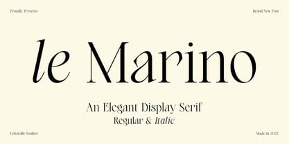 Introducing, le Marino! a stylish font that is luxury and modern. the combination of regular and italic version adds to the appeal and usability. le Marnino is a versatile font, perfect for editorial projects, Logo design, Wedding, Clothing Branding, product packaging, magazine headers, or simply as a stylish text overlay to any background image. I hope you enjoy! Letteralle Studios
 - Sport News by WAP Type,
$15.00 SPORT NEWS headline magazine, logo racing Awesome sport font with italic wide letters, modern letter cutout and dynamic slant. Ideal for sports headline of Megazine, car race, logo and monogram of automotive game or other modern dynamic text Font “Sport News” compares favorably with its readability and massiveness, creates the effect of power and speed. but with a slightly different font design.
 - Argumend by Ayca Atalay,
$29.00 Argumend | A Humanistic Slab Serif Typeface Argumend is a versatile slab serif typeface with a wide range of Opentype features. Create strong and eye catching headlines with its upper case ligatures or make use of its many weights and true italics to create mindful body copy; either way, Argumend is rich with typographic options to help create attention worthy text.
 - Alfonsina by Eduardo Dulin,
$20.00 Alfonsina is a high contrast condensed didone typeface well-suited to classy magazines, short text, branding design, packaging and advertising. With a great set of alternates and swashes, allowing for more stylized designs. This font of thin serifs includes italic, strengthening the concept of its design. Alfonsina contains a set of more than 500 characters and supports a variety of languages.
 - FM Ephire by The Fontmaker,
$16.00 FM Ephire is a hand-drawn, multilingual, type family of five weights with complimenting italics. Stuffed with tons of features, Ephire really shines through its artistic and stylish, yet elegant feel of natural handwriting. It is your best choice whenever you design greeting cards, banners or posters, and it also handles pretty well for body text, even in small sizes. Enjoy Ephire!
 - Suomi Sans by Suomi,
$25.00 There are many sans serif typefaces with calligraphic tendencies, but Suomi Sans is different: the outside forms are fairly basic, fairly narrow sans serif style, but the counter forms have a strong calligraphic flair with accented upper left and lower right hand corners. With six weights in Roman and italic, Suomi Sans works well for both headline and text use.
 - Antonia by Typejockeys,
$60.00 Antonia is an original type family of 46 font, 7 weights and 4 optical sizes. Born in the middle of the Alps, Antonia is as modern as it is down to earth. The multi-variant package includes text, display, and italic styles, looking crisp and perfect in all sizes and applications. Antonia is our first release available in Variable font format.
 - Zanjabeel Arabic by Boharat Cairo,
$20.00 Zanjabeel is an Arabic typeface with a hybrid design between the Naskh and Modern Kufi styles, comes in 9 weights, and some italic letters that give a unique and dynamic feel. the typeface works well with large sizes, headlines, and short text. also, works in printing and digital uses. The typeface is a collaboration with the Egyptian designer Ibrahim Hamdi
 - Ciabatta by Sudtipos,
$39.00 Ciabatta is a luscious font made especially for packaging. Thanks to 5 weights, it can be used for all eventualities; powerful in headlines or as lettering, yet very legible in small texts. Its shapes are slightly narrow and based on classical italics but Ciabatta includes alternates with a double-storey ‘a’ and ‘g’ which offer a more formal appearance upright.
 - Bandera Display Cyrillic by AndrijType,
$21.00 This contrast serif typeface is good for display use. Bandera Display Cyrillic has six weights with original italics. It catches attention in headlines of posters and magazines. It works well with Bandera Cyrillic (slab serif), Osnova Cyrillic (sans serif) and Bandera Text Cyrillic (serif) fonts. Bandera is Spanish for 'flag'. And Bandera is a symbol of Ukrainian fighting for freedom for many years.
 - Nouvelle by Mina Arko,
$45.00Nouvelle is an elegant sans serif family of six fonts (light, regular, semibold and italics). This modular typeface works just as well as display typeface as it does in body text. Because of the high x-hight it stays readable in very small sizes. It has 1884 characters: oldstyle numerals, ligatures and extra characters that support almost all European languages. - Range Serif by Eclectotype,
$36.00 Range Serif is a sharp, contemporary, wedge serif typeface with just a hint of fraktur influence. There are five weights from light to black, each with corresponding italics. This is a typeface designed for demanding typographic work; it’s legible at small sizes, but unique at display sizes. There is an abundance of OpenType features in each font, including: Ligatures - all fonts contain standard f-ligatures. Contextual Alternates - Range Serif has been carefully designed to not ‘need’ ligatures. If you choose to deactivate them, the contextual alternates feature will make sure an alternative f is used before certain letters to avoid clashing. Fractions - When activated, numbers separated by a slash will automagically turn into fractions. Numerals - There are many different figure sets. These are Proportional Lining, Tabular Lining, Proportional Oldstyle, Tabular Oldstyle, Superiors and Scientific Inferiors. A slashed zero feature is also included. Small Caps - All styles include small caps, for both small caps and capitals to small caps functions. Ornaments - For convenience, the arrows are grouped in the ornaments feature. Case Sensitive Forms - There are different punctuation and bracket glyphs for all caps usage. Stylistic Alternates / SS01 - The italic fonts contain alternates for the letters A, K, R, U and X. Range Serif is a versatile and fully-featured typeface, ideal for corporate identities, contemporary art catalogs, even t-shirt slogans. The language coverage is impressive (Latin Extended A is fully covered) so Range Serif should prove a useful text and display workhorse for speakers of many different tongues. The typeface includes an array of currency symbols, including the new symbols for Indian Rupee and Turkish Lira. Also check out the accompanying sans serif version, Range Sans.
 - Trakya Rounded by Bülent Yüksel,
$19.00 Thrace (/θreɪs/; Greek: Θράκη, Thráki; Bulgarian: Тракия, Trakiya; Turkish: Trakya) is a geographical and historical region in Southeast Europe, now split among Bulgaria, Greece, and Turkey, which is bounded by the Balkan Mountains to the north, the Aegean Sea to the south, and the Black Sea to the east. It comprises southeastern Bulgaria (Northern Thrace), northeastern Greece (Western Thrace), and the European part of Turkey (East Thrace). Trakya Rounded is a modern sans serif with a geometric touch. It has a modern streak which is the result of a harmonization of width and height especially in the lowercase letters to support legibility. Trakya Rounded is softer and rounder than it's sibling Trakya Sans. They're both ideally suited for advertising and packaging, editorial and publishing, logos, branding and creative industries, posters and billboards, small text, way-finding and signage as well as web and screen design. Trakya Rounded provides advanced typographical support for Latin-based languages. An extended character set, supporting Central, Western and Eastern European languages, rounds up the family. The designation “Trakya Rounded 500 Regular” forms the central point. The first figure of the number describes the stroke thickness: 100 Thin to 900 Bold. "Trakya Rounded" comes in 5 weights and italics and has the company of "Trakya Rounded Alt" that also comes in 5 weights and italics for a total of 20 styles. The family contains a set of 630+ characters. Case-Sensitive Forms, Classes and Features, Small Caps from Letter Cases, Fractions, Superior, Inferior, Denominator, Numerator, Old Style Figures are easily accessible in all graphic programs. Trakya Rounded is the perfect font for web use. Enjoy using it.
 - Velvet by Reserves,
$39.99 Velvet is a heavy rounded block retro face inspired by the typeset album cover of the protopunk rock band The Velvet Underground’s debut. Stylistically, Velvet’s extreme angled terminals exude a sense of tension and irreverance, contrasting the smooth rounded block letter forms.
 - ITC Pino by ITC,
$29.99The ITC Pino™ typeface family is Slobodan Jelesijevic’s second suite of commercial fonts. Although a small family of three weights, it is remarkably versatile. Like many typefaces, Pino grew out of a desire for a particular kind of design. Jelesijevic was creating a series of illustrations for a children’s magazine and needed a typeface that was lighthearted, legible and would complement his illustrative style. Unable to find exactly what he needed, he decided to make his own font. “I spent the better part of a day looking for just the right typeface,” he recalls. “Of course, the hard part was finding something that would harmonize perfectly with my drawings. A custom font was not part of the project brief or budget, but I thought that perhaps I could use it again.” The regular weight of Pino became the solution to Jelesijevic’s problem. Jelesijevic did use the font again, but quickly realized that the single weight needed companion designs. Pino Bold and Black followed in quick succession. Before licensing the designs to ITC, the three-weight family provided headlines, book cover titles and even short blocks of text copy in several of Jelesijevic’s design projects. Born in Gornji Milanovac, Serbia, in 1951, Jelesijevic graduated with a degree in graphic communication and lettering from the Faculty of Applied Arts in the University of Arts in Belgrade. Currently, in addition to typeface design, he is sought out as a graphic designer and illustrator. When not working on design projects, he teaches graphic communications at the Faculty of Art in the University of Niš, Serbia. Pino is a stressed sans of slightly condensed proportions. Pino’s generous x-height, clearly defined counters and distinctive character shapes enable it to fulfill a wide variety of typographic applications. Friendly without being sanguine, the Pino type family will communicate with charm and vitality. - Farm Wave by Authentype,
$11.00 Farm Wave Regular & italic - beauty font design include regular & italic font Image used : All photographs/pictures/logo/vector used in the preview are not included, they are intended for illustration purpose only.
 - Stabia by Eurotypo,
$29.00 Stabia is a multi-purpose typeface with large wedge-angular serifs. It is delicate and highly readable at very small sizes but reveals all its strength and personality when used at big sizes. The contrast of the sharped serifs provides a fresh and very contemporary look. The family has 5 weights, ranging from Light to Black (including italics) and is ideally suited for advertising and packaging, book text, editorial and publishing, logo and branding, small text as well as web and epub. Stabia provides advanced typographical support with features such as ligatures, small capitals, alternate characters, case-sensitive forms, fractions, and super- and subscript characters. It comes with a complete range of figure set options – oldstyle and lining figures, each in tabular and proportional widths. As well as Latin-based, the typeface family also supports Central European languages. Stabiae was an ancient Roman town, located close to the modern town of Castellammare di Stabia approximately 4.5 km southwest of Pompeii. According to the account written by his nephew, Pliny the Elder was at the other side of the bay in Misenum when the Mount Vesuvius eruption started. He travelled by galley ship across the bay, partly to observe the eruption more closely, and partly to rescue people from the coast near the volcano. Pliny died at Stabiae the following day, probably during the arrival of the sixth and largest pyroclastic surge of the eruption caused by the collapse of the eruption plume.
 - Eskorte Latin by Rosetta,
$60.00 Eskorte is a diligently designed Latin type family with an uncomplicated, engaging poise that conveys a crisp, businesslike tone. Its precise range of styles looks to no-nonsense efficiency and ease of use by non-designers in the office and text-intensive professional environments. Eskorte supports over ninety languages in a full range of weights, with both upright and matching italics. The italics are lively, fluid forms that infuse their charms into text settings or take on their own personality in large, dominant headlines. In concert with the hardworking upright styles, the two fit smartly into a range of publications, from corporate to casual. All of the weights and styles offer an adept set of features like small caps, case-sensitive punctuation, and both tabular and proportional figures to make short work of any typographic task. Whether employed in enterprise reports, lifestyle publications, or identity work, Eskorte is ready for business.
 - Opal by Linotype,
$29.99 Opal Pro is a text family designed by Hannes von Döhren in 2008. It gives every text a noble character. The typeface has long ascenders that clearly rise above the capital letters and a low x-height. Opal’s letters sport inktraps at stroke junctions, which on one hand create a cutout feeling and on the other hand strengthens the image in larger point sizes. In total, the letterforms have clear emphasis on their verticals and horizontals; they do not fear the weight on their curves. In addition to the Italic and Bold, the Opal type family includes a Script face, whose letterforms include connections, similar to handwriting. On top of that, the typeface possesses swash letters for italic and script, small caps, many ligatures and borders & ornaments. With a little bit of care, designers will be able to create the finest of traditional, elegant work with this family.
 - Aptifer Sans by Linotype,
$29.00 Aptifer Sans and Aptifer Slab are two 21st century typeface families created by Mårten Thavenius. Each family has seven weights, in roman and italic respectively, making 28 font styles in total. A heritage from two design traditions can be seen in Aptifer. One is the robust American gothic typefaces, like M. F. Benton’s, from around 1900. This is combined with the openness and legibility that comes from the humanist tradition. The sans serif part of the family, Aptifer Sans, is designed without excessive details disturbing the reading. Its sibling, Aptifer Slab, with its wedge slab serifs is more eye-catching but still suited for text settings. The italics fit well into the text flow of the roman. They are a bit narrower than the roman and have cursive characteristics. Both Aptifer Sans and Aptifer Slab are highly legible typefaces and can be used both in print and on screen.
 - BlackBeast Typeface by Linkor Digital,
$13.00 BlackBeast Typeface v1 is a dapper handwritten font with a personal charm. With hard strokes and a signature style, Black Beast is perfect for branding projects, labeling, clothing, movie sceen, poster, movie title, album covers, logos, etc.
 - Galeb by Tour De Force,
$25.00 Galeb is simple geometric sans font family in 4 weights - Light, Regular, Bold and Black, ideal for corporate and editorial projects. With angled stem endings, Galeb gives enough impression to be used as display font as well.
 - Abdo Screen by Abdo Fonts,
$49.50 Abdo Screen is a very simple Naskh font for satellite channels, presentations, videos and advertisements. it comes in sixth weights Thin, Light, Regular, Medium, Bold and Black. This font also contains some of Stylistic Sets and Ligatures.
 - Breve Title by DSType,
$50.00 Breve was designed for use in editorial projects. Simple but with enough personality to stand by is own, in a quest for a more forceful and contemporary appearance. All the fonts in Breve superfamily, share the same exact structure, both in terms of anatomy and functionality. The Text versions provide a softer and warm feel to the typographic palette and is intended for use in much longer passages of text, while the Title versions are distinguished by non-descending letterforms, making the titles and headlines much more uniform and interesting. The News version is more classic, with ball terminals and classic proportions, while the Display is, somehow, the set of fonts we had to design: extra-black, ultra-contrasted, proud-display fonts.
 - Breve News by DSType,
$50.00 Breve was designed for use in editorial projects. Simple but with enough personality to stand by is own, in a quest for a more forceful and contemporary appearance. All the fonts in Breve superfamily, share the same exact structure, both in terms of anatomy and functionality. The Text versions provide a softer and warm feel to the typographic palette and is intended for use in much longer passages of text, while the Title versions are distinguished by non-descending letterforms, making the titles and headlines much more uniform and interesting. The News version is more classic, with ball terminals and classic proportions, while the Display is, somehow, the set of fonts we had to design: extra-black, ultra-contrasted, proud-display fonts.
 - Breve Sans Title by DSType,
$50.00 Breve was designed for use in editorial projects. Simple but with enough personality to stand by is own, in a quest for a more forceful and contemporary appearance. All the fonts in Breve superfamily, share the same exact structure, both in terms of anatomy and functionality. The Text versions provide a softer and warm feel to the typographic palette and is intended for use in much longer passages of text, while the Title versions are distinguished by non-descending letterforms, making the titles and headlines much more uniform and interesting. The News version is more classic, with ball terminals and classic proportions, while the Display is, somehow, the set of fonts we had to design: extra-black, ultra-contrasted, proud-display fonts.
 - Breve Display by DSType,
$50.00 Breve was designed for use in editorial projects. Simple but with enough personality to stand by is own, in a quest for a more forceful and contemporary appearance. All the fonts in Breve superfamily, share the same exact structure, both in terms of anatomy and functionality. The Text versions provide a softer and warm feel to the typographic palette and is intended for use in much longer passages of text, while the Title versions are distinguished by non-descending letterforms, making the titles and headlines much more uniform and interesting. The News version is more classic, with ball terminals and classic proportions, while the Display is, somehow, the set of fonts we had to design: extra-black, ultra-contrasted, proud-display fonts.
 - Breve Slab Title by DSType,
$50.00 Breve was designed for use in editorial projects. Simple but with enough personality to stand by is own, in a quest for a more forceful and contemporary appearance. All the fonts in Breve superfamily, share the same exact structure, both in terms of anatomy and functionality. The Text versions provide a softer and warm feel to the typographic palette and is intended for use in much longer passages of text, while the Title versions are distinguished by non-descending letterforms, making the titles and headlines much more uniform and interesting. The News version is more classic, with ball terminals and classic proportions, while the Display is, somehow, the set of fonts we had to design: extra-black, ultra-contrasted, proud-display fonts.
 - FF Sale by FontFont,
$41.99 British type designer Tony Booth created this script FontFont in 1996. The family contains 4 weights: Light Italic, Regular, Medium Italic, and Bold Italic and is ideally suited for advertising and packaging and poster and billboards. FF Sale provides advanced typographical support with features such as ligatures, alternate characters, and case-sensitive forms. It comes with proportional lining and tabular lining figures.
 - Lichtspiele Reklame by Typocalypse,
$29.00 Lichtspiele Reklame is the ultra condensed version of Lichtspiele inspired by the 1920s — the golden age of cinema — where neon lights and marquee letters decorated cinema facades. Lichtspiele Reklame is crafted for large narrow formats and contains the display font and two italics (italic & contra-italic), like in these 20s, a time where movie announcements were shown on huge so called Litfaßsäulen.
 - Soft Aura by Sarid Ezra,
$15.00 Soft Aura is a minimalist and simple sans family that have four fonts in total. You will get the regular, italic, bold, and bold italic in the package. You can use this font for any purpose, suitable for contrast logotype and branding. Combine the style fonts, italic and bold in one word to get stylish contrast look. This font also support multi language.