10,000 search results
(0.046 seconds)
- Solastion by GlyphStyle,
$18.00 Solastion is a signature style font that looks both bold and sheer. An elegant looking font and lots of unique characters like natural hand strokes. – Font feature Uppercase, Lowercase, Numerals & Punctuations, Stylistic Alt, Stylistic Set, Swash Ligature, Multilanguage
 - Belonk by Sulthan Studio,
$12.00 Belonk is a bold, simple and sweet handwritten font. Its authentic look and feel will add a great touch to your designs. Use this font for stickers, svg designs, shirts, mugs, social media, monograms, and more! Thank you!
 - Cintra by Graviton,
$12.00 Cintra font family has been designed for Graviton Font Foundry by Pablo Balcells in 2014. It is a sans serif, bold, geometric typeface with subtle rounded angles, which provides a soft, pleasent appearence. Cintra consists of 8 styles.
 - Hupper Nush by madeDeduk,
$16.00 Really excited to introduce Hupper Nush is a bold handwriting font with cool character! Hupper Nush will be perfect for all your designs project. Hupper Nush Included: Uppercase Lowercase Number & Symbol International Glyphs Ligature Hope you enjoy it.
 - Mechanoid by Studio K,
$45.00 Mechanoid is a machine age font: crisp, clean, bold and unadorned, yet with a distinctive character of its own. As the name suggests it is well suited to engineering or technological themes, yet versatile enough for universal applications.
 - Alipe Script by TeGeType,
$29.00 Alipe Script is a new script typefaces family. Alipe Script family has light, medium and bold fonts, all with ligatures, alternates and a set of ornaments. It can be used for text as well as for titling applications.
 - Shalleh by Akifatype,
$14.00 Shalleh is a bold script font, featuring Arabic Style. Designed expertly to make your project or work more modern, this font can be used for various projects such as: greeting cards, branding, logos, screen printing, and many others.
 - Sicero by Konstantine Studio,
$12.00 Back in 1800 - 1900, the Serif fonts or known as Roman styles were very popular. Used in so many media, came from calligraphic technique and refined till it became a solid style even so many sign painters use this letter style back in that era. And today, these kinda style still got their fans who love the elegant yet clean solid style. That's what this came for. Please welcome, Sicero Duo Fonts. Its a dynamic duo fonts that came in Serif and Sans-Serif style which is perfectly fit to each other. Bring the old vibes instantly to your project with them :) Sicero Roman A Serif style font with implementations of old-era style, clean and done in click-by-click to fulfil your perfectionist personal. And it comes in Old Style Numbering too, to make the vibes stronger in the whole vintage design when using it. Sicero Sans A Sans-Serif font to make a good pair with Sicero Roman still holding those old vibes but a little bit modern touch in here to reach wider range of trends. Use it all alone is still good to go if you want something different with not pairing it with Sicero Roman as well. Available in OTF, TTF, and Webfonts. Enjoy it more. Have some fun with it, Oldsport :) Cheers, Konstantine Studio
 - Gradl Initialen ML by HiH,
$12.00 Max Joseph Gradl designed Art Nouveau jewelry in Germany. At least some of his designs were produced by Theodor Fahrner of Pforzheim, Germany -- one of the leading manufacturers of fine art jewelry on the Continent from 1855 to 1979. I don't know if he designed for Fahrner exclusively, but every example I found was produced by that firm. I assume it was also the same M.J, who edited a book, Authentic Art Nouveau Stained Glass which was reissued by Dover and is still available. For an artist as accomplished as Gradl was, he is very tough to research. There just does not seem to have been much written about him. The jeweler is visible in most of his typeface designs. They exhibit a sculptural quality as if they were modeled in clay (or gold) rather than drawn on paper. His monograms, especially, reflect that quality. Those shown in plates 112 through 116 in Petzendorfer actually appear to have been designed specifically for fabricating in the form of gold or silver pendents. Of the initial letters that came out of Germany during this period, these by Gradl seem unusually open and lyrical. They seem to be dancing on the page, rather than sitting. Please note that Gradl designed only the decorated initials. All other characters supplied were extrapolated by HiH, including the accented initials. Orn.1 (unicode E004) is based on a jeweled gold clasp designed by Gradl (please check out Gallery Image on Myfonts.com). Also included are an art nouveau girl’s face, a swan and the face from Munch’s “Scream”, from scans of old printer’s ornaments. Gradl Initialen M represents a major extension of the original release, with the following changes: 1. Added glyphs for the 1250 Central Europe, the 1252 Turkish and the 1257 Baltic Code Pages. Added glyphs to complete standard 1252 Western Europe Code Page. Special glyphs relocated and assigned Unicode codepoints, some in Private Use area. Total of 341 glyphs. Both upper & lower case provided with appropriate accents. 2. 558 Kerning Pairs. 3. Added OpenType GSUB layout features: salt, dlig, ornm and kern. 4. Revised vertical metrics for improved cross-platform line spacing. 5. Refined various glyph outlines. 6. Alternative characters: 16 upper case letters (with gaps in surrounding decorations for accents above letter). 8. Four Ornaments: face1, face2, swan and orn1 (silhouette of Gradl clasp) The zip package includes two versions of the font at no extra charge. There is an OTF version which is in Open PS (Post Script Type 1) format and a TTF version which is in Open TT (True Type)format. Use whichever works best for your applications.
 - Second Reign by Mans Greback,
$59.00 Second Reign is a decorative medieval typeface. With borders and diamonds, this magic typeface of extreme variability brings us to glorious worlds in the golden times of epic sagas. Second Reign is the typeface of a viking king or a knight order. Use it for a Middle Ages game, a fantasy headline, or as a logotype for anything of historical theme. With usage in any modern software, the letters will automatically overlap and embrace in an elegant way. To make heraldic symbols, copy these icons: 🐉 🐎 👑 🗡 🦁 🦅 🦌 + ♖ × ✝ ⚓ * ⚔ † ‡ Alternatively write %A %B %C ... etc to create the heraldry. (Download required.) Dragon, Horse, Crown, Sword, Eagle, Deer, Cross, Anchor are some of the logos. Use [ ] for side borders. Example: [Royal⚔Thrones] The Second Reign family consists of four variations: The weight styles Thin, Medium and Bold, plus the decorated Border style. The font is built with advanced OpenType functionality and has a guaranteed top-notch quality, containing stylistic and contextual alternates, ligatures and more features; all to give you full control and customizability. It has extensive lingual support, covering Greek and Cyrillic, as well as all Latin-based languages, from North Europe to South Africa, from America to South-East Asia. It contains all characters and symbols you'll ever need, including all punctuation and numbers.
 - Josef K Paneuropean by Juliasys,
$38.95 With the Josef K *, Julia Sysmäläinen continues her artistic debate on Franz Kafka’s writing style. This time the designer of FF Mister K is not drawn to Kafka’s literary works created at night but to those the writer produced at daytime as a high-ranking, confident bureaucrat – Dr Franz Kafka. The typefaces Josef K “Paneuropean” and “Strong European” echoe Kafka’s prestigious status at the Workmen’s Accident Insurance Institute of the Austro-Hungarian Empire. Their ductus, originating from a broad-nibbed ink pen combines a clear, self-confident stroke with the calligraphic features so typical for Franz Kafka’s handwriting. While both typefaces are more straightforward and bolder than the wonderfully erratic fonts of the FF Mister K family Josef K Paneuropean is best characterized as a semibold handwriting textface. Josef K Strong European, Sysmäläinen’s latest “K”-accomplishment, provides an ideal complement to it as a distinctly bold display face – great for headlines, product names and branding. It combines perfectly not only with Josef K Paneuropean but also with all the FF Mister K textfaces. Both Josef K Paneuropean and Josef K Strong European have Western, Central European and Extended Cyrillic character sets. With more than 2500 glyphs they support over 100 languages. *Kafka’s persona Josef K is a leading bank officer – reminiscent of the author himself – in the novel The Trial.
 - Sada by Arabetics,
$45.00 Sada is a text font designed with hand held devices and ebooks in mind. Glyphs are designed to be larger than usual and very clear with soft visual characteristics and many traditional Arabic calligraphic transitional features incorporated to improve legibility. The word “sada” means “echo” in Arabic. Even though Sada is a cursive style font it offers clearly distinguished and visually unified letter shapes in every position of a word. Sada supports all Arabetic scripts covered by Unicode 6.1, and the latest Arabic Supplement and Extended-A Unicode blocks, including support for Quranic texts. It comes with three weights, regular, bold, and ultra-light. Each weight has normal and left-slanted “italic” styles. The script design of this font family follows the Arabetics Mutamathil Taqlidi style and utilizes varying x-heights. The Mutamathil Taqlidi type style uses one glyph per every basic Arabic Unicode character or letter, as defined by the Unicode Standards, and one additional final form glyph, for each freely-connecting letter in an Arabic text. Sada includes the required Lam-Alif ligatures in addition to all vowel diacritic ligatures. Sada’s soft-vowel diacritic marks (harakat) are only selectively positioned with most of them appearing on similar lower or upper positions to emphasize they are not part of letters. Kashida is zero width glyph.
 - Dienstag by insigne,
$24.99 With its extended sans-serif style, Dienstag boasts a sleek and sophisticated look that's perfect for a wide range of projects. Whether you're designing a website, creating branding materials, or producing print publications, Dienstag's refined elegance is sure to make a lasting impression. Compared to Montag, Dienstag has a slightly more formal feel, thanks to its lack of rounded terminators. But that doesn't mean it's any less versatile – in fact, Dienstag's four original weights have now been expanded to ten, giving you even more flexibility in your designs. With OpenType features that include simplified versions of many characters, you can easily create unique and eye-catching titles that stand out from the crowd. But Dienstag is just one part of the larger Montag superfamily, which also includes Mittwoch, and Donnerstag. Each font in this collection offers its own unique style and flair, giving you a wealth of options to choose from when it comes to your next project. Whether you're looking for a bold and dynamic font or a more refined and understated style, you're sure to find the perfect fit in the Montag family. So why wait? Check out Dienstag and the rest of the Montag superfamily today, and start creating designs that are sure to captivate and inspire! With its elegant style and versatile functionality, Dienstag is the perfect choice for designers who demand the best.
 - Factually Handwriting by Mans Greback,
$69.00 Factually Handwriting is a stunning signature-style font that conveys a sense of expressive hand-lettering with a genuine touch. Its effortless strokes and wild curves make it perfect for adding a personal touch to your projects. Designed with a focus on authenticity, Factually Handwriting captures the beauty of natural handwriting, and consists of eight styles, including Regular, Italic, Bold, Alternate, Alternate Italic. Each style of Factually Handwriting offers a unique aesthetic, giving you the freedom to experiment with different looks and create truly personalized designs. This font is perfect for everything from logos and branding to social media posts and invitations. With its natural charm and expressive strokes, Factually Handwriting adds a touch of warmth and personality to any project. Use undercore _ anywhere in a to make a swash. Example: Hand_Signature Use multiple underscores to make different swashes. Example: Candy___Bars Use * to make flowers! Beautiful*Spring Blue***Roses The font is built with advanced OpenType functionality and has a guaranteed top-notch quality, containing stylistic and contextual alternates, ligatures and more features; all to give you full control and customizability. It has extensive lingual support, covering all Latin-based languages, from Northern Europe to South Africa, from America to South-East Asia. It contains all characters and symbols you'll ever need, including all punctuation and numbers.
 - Rostley by Mans Greback,
$69.00 Rostley is a stunning serif font that blends classic elegance with ornamental charm. The uppercase design is bold, retro and proper, making it perfect for elegant and decorative designs. The font is perfect for projects that need a touch of beauty, such as logos, wedding invitations, and other formal designs. With its floral and leafy accents, Rostley adds a touch of cuteness and sophistication to any design. Designer Mans Greback has combined traditional serif design with modern style to create a unique and timeless font. The decorative alternates of Rostley allow you to add a personal touch to your designs, making them truly one of a kind. Whether you're creating something for fashion, beauty, or any other industry, Rostley is the perfect choice for a font that is both beautiful and functional. Use parenthesis symbols ( ) { } [ ] to make floral elements. Example: (Flower Style] The Rostley family consists of Regular and Italic. The font is built with advanced OpenType functionality and has a guaranteed top-notch quality, containing stylistic and contextual alternates, ligatures and more features; all to give you full control and customizability. It has extensive lingual support, covering all Latin-based languages, from Northern Europe to South Africa, from America to South-East Asia. It contains all characters and symbols you'll ever need, including all punctuation and numbers.
 - Shocka Family by Skinny Type,
$23.00 Shocka Family is a confident serif. Designed to reflect nature, it creates a sense of softness and natural expression. We pushed the concept in a usability-focused direction, to work as a bold tool and a beautiful communicator. Variable Shocka enables fluid design in 9 weights, italics and 2 styles with major latin based languages. The right slant advances aesthetics, brings energy and makes it suitable for modern designs. The type family blends organic curves and soft repetition into strong and harmonious types. At large dot sizes you can appreciate the shape of the letters, while the same control and focus creates an even texture for small dot sizes and long reads. Fonts extend their use by giving weights ranging from light to black. The natural curve, a swollen and sloping stem, grows in character as the font gains weight. While the thinner weight has lowered contrast and optical correction to create a warm and soft look. The Shocka Family character set combines additional symbols, style alternatives, unique binding, and case sensitive punctuation - resulting in a stable, hard-working family ready to tackle projects of any size. I can't wait to see what you do with Shocka Family! Feel free to use the #Skinny_Type and #Shocka Family font tags to show what you've done visit my Instagram : https://www.instagram.com/skinny.type/ Thank you!
 - Corpsy by Mofr24,
$11.00 Introducing Corpsy, the horror display font with a trash style and a unique droplet touch. Its spooky design perfectly captures the essence of Halloween, nightmares, and horror. Ideal for posters, t-shirts, art crafts, unique headlines, logotypes, and many more. What makes Corpsy unique is its distinct droplet effect, adding an extra layer of fear to any design. This font also pairs well with other horror-themed families such as Ghoulish and Gruesome. Corpsy comes in various styles, including regular and bold, and boasts an extensive character set, making it versatile for any project. Its special features include ligatures, stylistic alternates, and swashes. The design concept for Corpsy was to create a font that could embody the essence of all things horror, yet still retain a unique and identifiable style. We wanted to create a font that could stand out amongst the other horror display fonts available. We created Corpsy for designers who wanted to create horror-themed designs that were more than just clichés. This font is perfect for those looking to push the boundaries of horror design and create something new and unique. Corpsy is not a revival or based on any historical design. It was created from scratch, with the goal of becoming a staple font in the horror design world. Try Corpsy today, and take your horror designs to the next level.
 - First Reign by Mans Greback,
$49.00 First Reign is a decorative medieval typeface. With borders and ornaments, this swirly uppercase typeface of extreme variability brings us to glorious worlds in the golden times of epic knight sagas. First Reign is the typeface of a Royal House, of vikings, kings and queens. Use it for a Middle Ages game, a fantasy headline, or as a logotype for anything of historical theme. With usage in any modern software, the letters will automatically overlap and embrace in an elegant way. To make heraldic symbols, copy these icons: 🐉 🐎 👑 🗡 🦁 🦅 🦌 + ♖ × ✝ ⚓ * ⚔ † ‡ Alternatively write %A %B %C ... etc to create the heraldry. (Download required.) Dragon, Horse, Crown, Sword, Eagle, Deer, Cross, Anchor are some of the logos. Use [ ] for side borders. Example: [Magic⚔Thrones] The First Reign family consists of four beautiful styles: Decorated capital font provided in Thin, Medium and Bold, plus a Border style. The font is built with advanced OpenType functionality and has a guaranteed top-notch quality, containing stylistic and contextual alternates, ligatures and more features; all to give you full control and customizability. It has extensive lingual support, covering Greek and Cyrillic, as well as all Latin-based languages, from North Europe to South Africa, from America to South-East Asia. It contains all characters and symbols you'll ever need, including all punctuation and numbers.
 - Decipher by Mans Greback,
$69.00 Decipher, designed by Mans Greback, is an edgy graffiti-inspired font that captures the essence of street art and hip-hop culture. With its cool, calligraphic and marker-style handwriting, Decipher brings the energy and speed of urban life into your designs. Perfect for projects that require a touch of street-smart attitude, this font will take your creations to the next level. The typeface comes in four styles: the Regular style and the Symbols style, both provided in Bold. The Symbols style is a unique addition, offering a variety of tag elements such as swashes, arrows, stars, and crowns to enhance your designs further and unleash your creativity. The font is built with advanced OpenType functionality and has a guaranteed top-notch quality, containing stylistic and contextual alternates, ligatures, and more features; all to give you full control and customizability. It has extensive lingual support, covering all Latin-based languages, from Northern Europe to South Africa, from America to South-East Asia. It contains all characters and symbols you'll ever need, including all punctuation and numbers. Mans Greback is a Swedish typeface designer dedicated to crafting diverse and versatile fonts. With a passion for a wide range of typographic styles, he has developed a range of fonts that are appreciated and utilized by designers around the world.
 - Kunstler Grotesk by HiH,
$12.00 Künstler Grotesk ML is one of a number of typeface designs that attempts to reconcile Germany’s blackletter tradition with the international familiarity of roman letterforms in a simple, robust design suitable for meeting the demands of a modern industrial economy, while rejecting the extraneous ornamentation of the departing Victorian era. It is an all-cap design with a number of playful ligatures. It has an appealing boldness that reverses well. Künstler means ‘artist’ in German. I had always assumed it was a person’s name until I came across the translation. Lesson: conjecture is not fact. Grotesk refers to a sans serif letterform tradition. Kunstler Grotesk was originally released by Bauer'sche Giesserei of Frankfurt am Main circa 1900. Künstler Grotesk ML represents a major extension of the original release, with the following changes: 1. Added glyphs for the 1250 Central Europe, the 1252 Turkish and the 1257 Baltic Code Pages. Added glyphs to complete standard 1252 Western Europe Code Page. Special glyphs relocated and assigned Unicode codepoints, some in Private Use area. Total of 350 glyphs, 260 kerning pairs. 2. Added OpenType GSUB layout features: pnum, salt, dlig (19) and hist. 3. Revised vertical metrics for improved cross-platform line spacing. 4. Redesigned mathematical operators. 5. Included tabular (std) & proportional (opt) numbers. 6. Refined various glyph outlines. 7. Made CcNnOoSsZz-kreska available (salt). 8. Incorporated alternate glyphs in lower case.
 - Kubrick by Quadrat,
$25.00 Kubrick is an experiment in extremes. The Light font is very tall and slender, the Black font is very massive, and Kubrick's slender counters push some of its glyphs to the edge of recognition. The thin counters and negative spaces also give text set in Kubrick a definite visual sparkle, especially in all-uppercase settings. Because of its extreme letterforms, Kubrick is recommended only for large display use. The default letterspacing is set fairly wide to keep text legible. Kubrick was a double-experiment. One part of it was to see how heavy and massive a typeface I could make while still keeping it legible. The other part was to develop a Multiple Master font. Multiple Master fonts were a format developed by Adobe that allowed the user to change things like the weight and width of a typeface. Monollith started as just such a Multiple Master typeface, but when Adobe discontinued the Multiple Master format, I stopped work on the typeface. Later I decided to continue work on it, but as five separate font weights: Light, Medium, Bold, ExtraBold and Black. Very rectilinear letterforms with extremely narrow counters and negative spaces. The five fonts go from very thin and condensed to very heavy and extended. Use in large display settings where unornamented high visual impact is desired.
 - ATF Railroad Gothic by ATF Collection,
$59.00 First introduced by the American Type Founders Company in 1906, Railroad Gothic was the quintessential typographic expression of turn-of-the-century industrial spirit—bold and brash in tone, and a little rough around the edges. A favorite for the plain speak of big headlines, Railroad Gothic quickly gained popularity among printers. Its condensed but robust forms were likely a source of inspiration for later families of industrial sans serifs. The design feels like a cleaned-up version of some earlier Victorian gothics, notable for their uneven proportions and awkward letterforms. ATF offered a number of sizes of Railroad Gothic as metal type, with cuts varying in design considerably from size to size. Creating this new digital version involved interpreting the characteristics of different sizes and making some aesthetic choices: where to retain the design’s familiar unstudied gawkiness, and where to make improvements. The new ATF® Railroad Gothic features a measured, harmonious interpretation of the original, and has been extended with four new weights (each bolder than the last). The heaviest weights are carefully designed to keep counters open, no matter how dense the overall effect may be, maintaining legibility at any display size. This contemporary rendition of a historic American design boasts a full Latin character set, including glyphs undreamed-of in the heyday of railroads.
 - BD Gitalona Moxa by Balibilly Design,
$19.00 This is an Experimental typeface, a direct descendant of the BD Gitalona font family, which has a supermassive family with Variable technology. However, this version is more on the aesthetic aspect, which is experimental and exploratory. It complements the beauty of the primary typeface that we released separately. If you are a fan of Effectiveness and flexibility, please learn more about BD Gitalona and BD Gitalona Variable! Inspiration The world of entertainment moves non-stop. One by one, figures appeared and left. We expect to create something to entertain previous trends with packaging more relevant to the present. More specifically, we admire and are inspired by some of the world's leading and top singers with a segmented nature. We imagine so many figures that can affect every viewer. However, each artist or singer has a segment because almost all of them have characteristics. The Design The basic design of this typeface begins with a transitional serif shape with sharp, shapeless corners. Then in the middle of the invention, there was an opportunity to explore it further from the readability side by adding an optical variable that can adjust the serif thickness when used together between large, medium to paragraph text sizes for editorials. The shift from serif to sans-serif with the contrast initiated by the shift of the serif family form as a different variable also makes this font richer in terms of the features it contains. Parts are expected to add to the user satisfaction with the complexity of this font. The Features BD Gitalona consists of one sub-family intended for body text with nine weights from Thin(100) to Black(900) and four other display sub-families such as Display serif, Flick, Harmony Sans and Contrast Sans. Each consists of four weights Thin(100), Regular Weight(400), Bold(700), and Black(900). And again, there are also retailed separately; the BD Gitalona Variable font, which is designed to accommodate all Subfamily in 1 font file, and BD Gitalona Moxa, an experimental typeface. A total of 700+ glyphs in each style. Advanced OpenType features functionally and aesthetically, such as Case-sensitive forms, small caps, standard and discretionary ligatures, stylistic alternates, ordinals, fractions, numerator, denominator, superscript, subscript, circled number, slashed zero, old-style figure, tabular and lining figure. Supports multi-languages including Western Europe, Central Europe, Southeast Europe, South America, and Oceania.
 - Night Sign JNL by Jeff Levine,
$29.00 For decades, the soft glow of a neon sign beckoned weary travelers to roadside rest courts, told the hungry individual where to eat; let enthusiastic revelers know where the night life was happening. There is something special about a neon sign, yet changing times, city ordinances and even technology itself is turning this staple of urban life for over a hundred years into a museum piece. Night Sign JNL emulates the craft of hand-formed neon signage and it (along with a few added special effects) can really add some good-old-fashioned pizzazz to a print or web project.
 - Cowgirl by By Meg Burk,
$25.00 An uppercase font that has versatile character. Got a story to tell? Cowgirl can help you tell it. Includes western-themed vector illustrations handmade by Meg Burk. I grew up spending almost every family vacation as a road trip across the southwestern US. In these adventures, I fell in love with learning about the nature around us; deserts, mountains, plains, piñon trees, rainbow trout, black bears, eagles, and more. I fell into freezing cold white water rapids, explored long-abandoned cliff dwellings, camped under the Milky Way, saw old cave markings, stone markings, preserved art, and read many a many old map legends. These memories are visceral and the inspiration that I get from them permeates my every day. Take a piece of these stories with you and use them in your designs, too. Handmade, meant to last a lifetime and inspire others for decades to come.
 - Alta Mesa by FontMesa,
$25.00Alta Mesa is a revival of an old type design from the 1800's that was sold by most of the type foundries in the US and Europe of that time period so it is difficult to know the foundry of origin. New with this version are the fill fonts and plain styles, the fill fonts may be used as stand alone fonts, however the letter spacing is much wider, the plain versions are recommended if you desire a solid black weight. The regular Fill font is in registration with the Regular and Open versions while the Fill L font is in registration with the L and Open L versions. This was a very charming font in its time which was heavily used on old billheads and letterheads. We're pleased to bring this type design, which hasn't been used for over 100 years, into the digital world today. - KG One More Night by Kimberly Geswein,
$5.00 Tall, skinny handwritten letters in both a wide and a narrow version. The uppercase slots hold all of the wide versions, while the lowercase slots hold all of the narrow versions.
 - Faminela by Runsell Type,
$16.00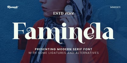 Faminela font is perfect for many of your projects like logos & branding, photography, invitations, watermarks, advertisements, product designs, stationery, wedding designs, labels, product packaging, special events and much more.
 - Mokacinoy by Runsell Type,
$16.00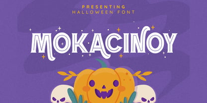 Doetomb font is perfect for many of your projects like logos & branding, photography, invitations, watermarks, advertisements, product designs, stationery, wedding designs, labels, product packaging, special events and much more.
 - Ragshie by Runsell Type,
$16.00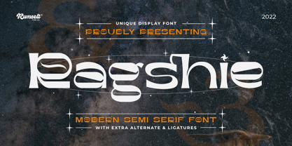 Ragshie font is perfect for many of your projects like logos & branding, photography, invitations, watermarks, advertisements, product designs, stationery, wedding designs, labels, product packaging, special events and much more.
 - Ergano by Runsell Type,
$16.00 Ergano font is perfect for many of your projects like logos & branding, photography, invitations, watermarks, advertisements, product designs, stationery, wedding designs, labels, product packaging, special events and much more.
 - Stamcoe by Runsell Type,
$16.00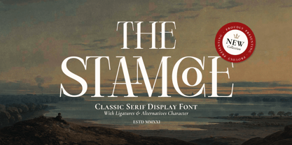 Stamcoe font is perfect for many of your projects like logos & branding, photography, invitations, watermarks, advertisements, product designs, stationery, wedding designs, labels, product packaging, special events and much more.
 - Cernais by Runsell Type,
$16.00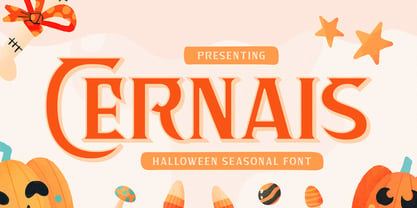 Cernais font is perfect for many of your projects like logos & branding, photography, invitations, watermarks, advertisements, product designs, stationery, wedding designs, labels, product packaging, special events and much more.
 - Festern by Runsell Type,
$16.00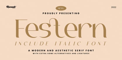 Festern font is perfect for many of your projects like logos & branding, photography, invitations, watermarks, advertisements, product designs, stationery, wedding designs, labels, product packaging, special events and much more.
 - Ragolc by Runsell Type,
$16.00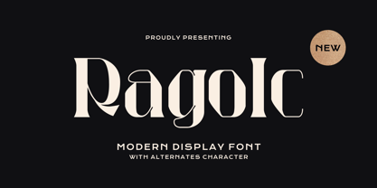 Ragolc font is perfect for many of your projects like logos & branding, photography, invitations, watermarks, advertisements, product designs, stationery, wedding designs, labels, product packaging, special events and much more.
 - Tamarind by Runsell Type,
$16.00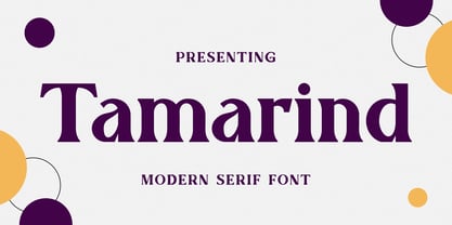 Tamarind font is perfect for many of your projects like logos & branding, photography, invitations, watermarks, advertisements, product designs, stationery, wedding designs, labels, product packaging, special events and much more.
 - Sufgaretype by Runsell Type,
$16.00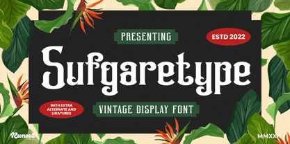 Sufgaretype font is perfect for many of your projects like logos & branding, photography, invitations, watermarks, advertisements, product designs, stationery, wedding designs, labels, product packaging, special events and much more.
 - Westernal by Runsell Type,
$16.00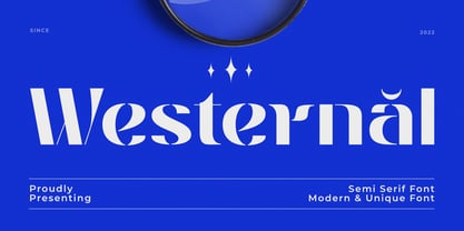 Westernal font is perfect for many of your projects like logos & branding, photography, invitations, watermarks, advertisements, product designs, stationery, wedding designs, labels, product packaging, special events and much more.
 - Bienvica by Runsell Type,
$16.00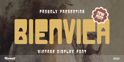 Bienvica font is perfect for many of your projects like logos & branding, photography, invitations, watermarks, advertisements, product designs, stationery, wedding designs, labels, product packaging, special events and much more.
 - Rightside by FHFont,
$18.00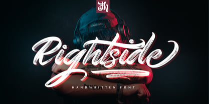 Rightside is a script font designed with a dry brush. The font includes OpenType features. Suitable for element design, events, t-shirts, logos, badges, stickers, awesome artwork, and more.