10,000 search results
(0.065 seconds)
- ITC Adderville by ITC,
$29.99On a cold winter's night, George Ryan, of Galápagos Design Group, began musing on the possibilities for a “truly original” sans serif typeface. What came out of his musing, and his always-present sketchpad, was ITC Adderville, a typeface whose visual impact is immediate and strong. Ryan explains how he did it: “The rounded ends of its strokes and their skewed baseline contact create an illusion of dancing feet. The tops of lowercase stems emit serif buds, suggesting transition into or out of the serifed form. The spear-like lowercase stroke terminators, along with other distinctive elements such as the stylized reticulation of the lowercase 'g' segments, the salute of that same character's spur, and the bold, non-self-conscious 'i' and 'j' dots, all contribute to the playful and unique nature of this design.” The result is a friendly, lively type family whose graduated weights -- book, medium, and heavy -- lend themselves especially well to use at small display sizes and in short blocks of text. - Nationale by Greater Albion Typefounders,
$15.00 Nationale is inspired by the lettering of early 20th century share certificates and bonds. It includes a complete set of stylistic alternates for all letter forms, and two sizes of numerals. National speaks of the steam age, and the age of traditional design and engineering, when aesthetic concerns mattered just as much as function. Bring a touch of the elegant past to your work with Nationale.
 - Rodfat by Rizki Permana,
$15.00 Rodfat is a gorgeous, old-timey display font with a modern feel! Inspired by the industrial revolution, It will bring back the early days of the 20th century. This collection comes in two styles: One and Two. It is possible to be paired perfectly when used together. Perfectly suited for any display use. It could easily work for design product names, posters, signage, packages, logos, labels, and eye-pleasing typographic designs and more.
 - Erotique by Zetafonts,
$39.00 Designed by Cosimo Lorenzo Pancini and Mariachiara Fantini with the help of Solenn Bordeau, Erotique is an evolution of the original design by Zetafonts for Lovelace, that challenges its romantic curves with the glitchy and fluid aesthetic of trans-modern neo-brutalist typography. The seductive "evil serif" look of the Pheimester-like Oldstyle letter shapes is made edgier by the quirky connections and unexpected calligraphic twirls that marry digital distortions to traditional penmanship. Sensuous but sharp, Erotique speaks the language of teasing, and unrequited love, over-the-top and restrained like a show of Japanese Kinbaku, and beautifully heartbreaking like a friendzone valentine. Designed for display use, this high-contrast serif typeface is ready to take center stage in projects where a subtle elegance and an edgy, aggressive touch are required. For branding use it is paired by a Erotique Ornaments, a set of interlocking patterns based on the font letter-shapes, allowing for striking packaging, digital and ambient design. For editorial use it can add a sharp sensuality to logos and titles thanks to an impressive array of alternate glyphs, subtle ligatures and a set of whiplike fleurons, collected in the Erotique Flourishes pack. The typeface has been developed in the regular, medium and bold weight plus a monoline version, all of which have been paired with an Alternate version to give immediate access the more exotic alternate letterforms. With a character set of over five hundred glyphs, all the the weights of Erotique cover almost 200 languages using extended latin, and include advanced Open Type features as Stylistic Alternates, Standard and Discretionary Ligatures, Positional Numerals, Swash and Case Sensitive Forms. If you are a typeface lover, be warned: Erotique could be your fatal attraction!
 - Jenson Classico by Linotype,
$29.99In 1458, Charles VII sent the Frenchman Nicolas Jenson to learn the craft of movable type in Mainz, the city where Gutenberg was working. Jenson was supposed to return to France with his newly learned skills, but instead he traveled to Italy, as did other itinerant printers of the time. From 1468 on, he was in Venice, where he flourished as a punchcutter, printer and publisher. He was probably the first non-German printer of movable type, and he produced about 150 editions. Though his punches have vanished, his books have not, and those produced from about 1470 until his death in 1480 have served as a source of inspiration for type designers over centuries. His Roman type is often called the first true Roman." Notable in almost all Jensonian Romans is the angled crossbar on the lowercase e, which is known as the "Venetian Oldstyle e." In the 1990s, Robert Slimbach designed his contemporary interpretation, Adobe Jenson™. It was first released by Adobe in 1996, and re-released in 2000 as a full-featured OpenType font with extended language support and many typographic refinements. A remarkable tour de force, Adobe Jenson provides flexibility for a complete range of text and display composition; it has huge character sets in specially designed optical sizes for captions, text, subheads, and display. The weight range includes light, regular, semibold, and bold. Jenson did not design an italic type to accompany his roman, so Slimbach used the italic types cut by Ludovico degli Arrighi in 1524-27 as his models for the italics in Adobe Jenson. Use this family for book and magazine composition, or for display work when the design calls for a sense of graciousness and dignity. - Cutoff Pro by URW Type Foundry,
$49.99 The first plain weight of Cutoff was designed in 2005 to be used in Miele, an independent Italian free magazine. The need was for an elegant, unusual and legible semi-serif with contemporary flavour. I was fascinated by the deconstructivist work of Jeff Keedy (Hard Times Thick), Phil Baines (Can You, You Can) and Otl Aicher (Rotis), so my aim was to get the feeling of a cut transitional typeface; at the same time felt the exigence to work on the whole shape of the glyphs, in order to soften the “90s deconstructivist” effect and obtain a more balanced and readable design. In the last years I further worked on the typeface adding the other styles, extending the character set and refining the letterforms. Finally the precious collaboration with URW++ brought in 2010 to a complete OpenType Pro font family, with multilingual and advanced typographic features. Fulvio Bisca, July 2010
 - Blue Goblet Christmas Ornaments by insigne,
$32.00 insigne is pleased to present new Christmas ornaments as the latest in the Blue Goblet series, a series of fonts and ornaments by artist Cory Godbey. This best-selling series has now been extended to include a new Christmas-themed member. Hand drawn by the artist, the Blue Goblet additions are a fun and lively take on Christmas ornaments. Expressive and spontaneous, these ornaments seem to dance their way across the page. They can be used in conjunction with the original Blue Goblet Ornaments and the Blue Goblet fonts, which include both a sans serif and serif member. Combine them to form interesting compositions, or insert them directly into your layout as chapter headings or illustrations. There are over 60 of the Christmas-themed ornaments, including Christmas trees, bows, ivy and more. Check out the .pdf or the promotional graphics to see all of these great options.
 - Gill Hebrew by Lerfu,
$55.00Near the end of his life, legendary type designer Eric Gill lived in Jerusalem, and became interested in the typesetting of the Hebrew alphabet and the challenges it entailed. He designed his own Hebrew font which has not (to my knowledge) been digitized before. It is sometimes held up as an example of how not to do a Hebrew font: Gill introduced strange serifs and shapes that were jarring to readers used to more traditional fonts. But it is quite readable, and does start to grow on you after a while; extended text in Gill Hebrew is possible. I've added a set of alternate digits that are based on the shapes of the letters (Gill's digits are pretty standard text figures). I've also made some of the Unicode Hebrew symbols that Gill didn't (e.g. New Sheqel Sign, Alef-Lamed ligature, etc.) and also included vowel-points. - Okaytext by Okaycat,
$24.50The inspiration for the Okaytext family came from seeing so many fun, highly individualized special-use fonts. Alongside this massive selection, the choice of simple, plain & readable typefaces is relatively spartan. As a newly established foundry, we feel it a "must" to contribute our very best work to this important but oft-neglected genre of fonts. So the construction of the Okaytext family began. We feel that a rounded, sans serif font should be easily read, and very clean looking. It does not need to tire the eyes with any needless twists or silly quirks. So is Okaytext, it exists simply to be read, and hopes that it is a pleasant read. Okaytext is perhaps our most versatile font yet, its ultra-simplicity makes it adaptable to the demands of almost any typeset environment. Okaytext is extended, containing the complete West European diacritics & ligatures, making it suitable for multilingual environments & publications. - Stardelle by Letterhanna Studio,
$19.00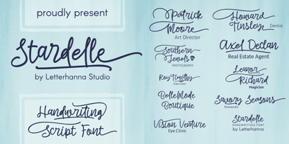 "Introducing 'Stardelle,' a bold and beautifully handcrafted font that adds a touch of elegance to your designs. With its flowing lines and abundant swashes, 'Stardelle' exudes charm and sophistication. This handwritten font is perfect for adding a personal and artistic flair to invitations, posters, branding, and more. Let 'Stardelle' illuminate your creativity and bring a touch of magic to your projects."
 - Lumiere Rosie by Kaligra.co,
$29.00 Introducing Lumiere Rosie – A Gorgeous modern sans serif with ton of stylistic alternates to choose. Its bold clean and simple. Works wonderfully on its own for logos, headlines, posters, packaging and many more! And with Three different weights to choose, your option to create more unique and versatile design is a lot wider. Have fun and create more. Your Imagination only your limit!
 - Ruby Lights by Bogstav,
$17.00 Say hello to Ruby Lights - a bold rounded font, made to bring fun and joy to your designs! Ruby Lights has no sharp edges, everything has gentle rounded corners and edges, leaving a soft yet vibrant look. Go ahead and use Ruby Lights for your children’s books, posters of any kind, invitations or maybe packaging - actually anything that needs a fresh handmade attitude!
 - Cast Shadow JNL by Jeff Levine,
$29.00Cast Shadow JNL uses the same wood type as found in Trade Printer JNL and adds to it a cast shadow in right or left versions for a bold and unique look. Both fonts have limited character sets and should be used in point sizes larger than normally chosen to compensate for the visual discrepancy due to the cast shadow's effects. - Watchmaker by Ingrimayne Type,
$5.95 Watchmaker was designed with the limitations imposed by a simple LCD that is meant only to display numbers. Most LCD typefaces use some diagonals to make the letters look better. This one does not and from it you can see why a few diagonals are needed to display letters on a LCD. Watchmaker is monospaced and comes in plain and bold weights.
 - Bhuron by Twinletter,
$15.00 Introducing the Bhuron Blackletter Font. fonts that can give you the option to mix and match for a unique and attractive look. This font can be used in a variety of projects to create a vintage and elegant style. Use it to enhance visual projects, titles, or banners, packaging with a bold classic look that exudes style, elegance, and strong personality.
 - Fatkat by HansCo,
$15.00 Fat Kat is a bold retro serif fonts that feels clean and fun an incredible modern retro aesthetic. This font features a ligature feature on capital letters which allows the font to look unique with a wavy style. Use this Fat Kat serif font to add that special modern retro touch to any design idea you can think of! Enjoy!
 - Segikan by Areatype,
$- Segikan is a elegant and warm serif typeface with a nuance classic. This typeface was intended to improve upon the legibility. Included 14 Fonts, upright and slant. From light to black styles. OpenType features allow for the implementation of typographic such as ligatures and multiple language support. Good choice for branding, magazines, posters, advertising, print, packaging, headlines, web design etc.
 - Compilation Grotesk by Estudio Calderon,
$14.00 Compilation Grotesk is a variable font concept that includes 9 sort of adjustable heights inspired principally on Matterhorn Headliners 2. The "height" axis allowes the glyphs expand along the Y-axis upward from the baseline as the values increases from 700 to 1100. Due to it, the system adapts keeping the contrast and the original proportions. Don't stretch it out, just adjust it!
 - Boinger by Letterhend,
$19.00 Introducing, Boinger - An Expanded Typeface. This font looks great and standout for tittle, headline, logo, etc. Perfectly to be applied to the other various formal forms such as invitations, labels, logos, magazines, books, greeting / wedding cards, packaging, fashion, make up, stationery, novels, labels or any type of advertising purpose. Features : - uppercase & lowercase - numbers and punctuation - multilingual - alternates & ligatures - PUA encoded
 - Ingy Star Tilings by Ingrimayne Type,
$9.00 IngyStarTilings allows one to create a variety of patterns that have stars. Some of them are quite common and others less so. A sample file is available that shows possible patterns that can be constructed with this typeface, including some non-star repeating patterns. As the posters indicate, some of the patterns constructed with the regular version are intended to be multicolored.
 - F line by alphabeet.at,
$30.00 f-line is a special handwriting monoline font face, with one constant line from glyph to glyph and variable width. It was drawn for the designer’s thesis in 2010 and expanded until 2021 with a lot of open type features. It’s built up with three glyph sets to let the glyphs rotate automatically, and amongst other type features initial forms are available.
 - WBP Ripples by Studio Jasper Nijssen,
$20.00 Stone skipping creates water ripples. This font expands by the same principle. A small, narrow base growing to the top, right, bottom and left until it reaches the shores. In this case: from the mean line to the baseline and caps height with a max. of three lines. WBP Ripples is a beautiful, friendly looking and playful display font for everyday use.
 - ITC Kokoa by ITC,
$29.99ITC Kokoa is the work of German graphic designer Jochen Schuss. Schuss found the seeds of inspiration on a trip to Ghana and expanded and experimented with the idea on the computer. It includes an array of symbols and borders to complement its stylized letters. ITC Kokoa retains a touch of its African roots but is overall a modern, funky font. - Churchward Maori by BluHead Studio,
$25.00Churchward Maori is the second of a series of eight Maori style typefaces designed by New Zealand type designer Joseph Churchward, and released by BluHead Studio, LLC. Churchward Maori infuses standard Latin glyph forms with traditional Maori decorative elements to create a wildly organic design. BluHead Studio expanded the character set to support standard Latin character sets. BluHead previously released Churchward Ta Tiki. - Figgins Tuscan by HiH,
$12.00 Early in the 19th century, foundries began releasing a variety of decorated ornamental letters based on the Tuscan letterform. Fancy Tuscan letters quickly became so popular, they eventually came to represent the cluttered extremes of Victorian design. Foundries competed with each other to produce most extravagantly decorated letterforms. As often happens, success turned to excess. What is often overlooked is the long history of the Tuscan style. Early examples have been traced back to ancient Rome. Indeed, the characteristic bifurcation may have represented a fishtail to the early Christians, thus sharing in the roll of symbolic identification played by the simple drawing of a fish as a whole. Later. trifurcation was developed as an alternate termination, followed by loops, full fishtails, curls, hooks and other fancy variations. Nicolete Gray provides an extensive history in her Appendix One of NINETEENTH CENTURY ORNAMENTED TYPEFACES. According to Gray, the first metal typeface based on the Tuscan form was the Ornamented of 1817 by Vincent Figgins of London. Thorowgood followed suit in 1821, Fry in 1824 and Caslon in 1830. Each was to re-visit the form many times during the Victorian era. Here we present our interpretation of what Figgins might have produced in a basic, plain Tuscan form - free of the decorative additions. We are pretty safe here because Figgins was very creative. He explored many of the terminal variations listed above and combined them with different decorative devices to produce a constant stream of new faces to meet the demands of the marketplace. Figgins Tuscan ML represents a major extension of the original release, with the following changes: 1. Added glyphs for the 1250 Central Europe, the 1252 Turkish and the 1257 Baltic Code Pages. There are also a few glyphs for Anglo-Saxon, Gaelic and Old Gaelic. Total of 355 glyphs. 2. Added OpenType GSUB layout features: aalt, ornm and liga ˜ with total 34 lookups. 3. Added 351 kerning pairs. 4. Redesigned several glyphs: the comma, quotes, brackets, braces, acute accent, and grave accent. 5. Revised vertical metrics for improved cross-platform line spacing. Please note that some older applications may only be able to access the Western Europe character set (approximately 221 glyphs). The zip package includes two versions of the font at no extra charge. There is an OTF version which is in Open PS (Post Script Type 1) format and a TTF version which is in Open TT (True Type)format. Use whichever works best for your applications.
 - Multi by Type-Ø-Tones,
$60.00 Multi is an extensive sans serif typeface family that consists of two subfamilies: Multi Text that comprises three weights (roman & italic) and Multi Display (seven weights, roman & italic). Vitality bursts forth from Multi. It has a distinctive ‘phrasing’ (in the musical sense), neither humanist nor glyphic, somewhere in between, exploring uncharted territory. Its design is pragmatic, yet not rigid, slightly tinged with tiny incised touches. This is clearly noticeable in Multi Display: the roman lowercase’s asymmetric stems are very softly tapered, with bevelled, sharp upstrokes. Furthermore, all weights consistently share these idiosyncrasies from Thin to Poster. With its lower contrast, wider proportions, shorter ascenders and descenders, Multi Text was purposely adjusted to meet all the requirements of a legible typeface for newspapers in paper and screen, as they were manually hinted. It also has a few new features, such as the outstrokes of the roman ‘l’ and the italic ‘a’, which bring a subtle calligraphic feel to the text flow.
 - Forgotten Melody by Anmark,
$12.00 I’m pleased to introduce new handwritten font Forgotten Melody. Forgotten Melody comes in two styles: Regular and Extras. This font includes ligatures and a full set of lowercase alternates to make your text as close to a natural handwritten script as possible. Forgotten Melody Regular is an elegant, modern, feminine font. Uppercase letters are ideal for your wedding monograms and logos. Use this font for wedding invitations, branding, packaging, magazines, letterpress address, social media, restaurant menus, greeting cards, headers and so on. Forgotten Melody Extras is a symbol font (includes 62 hand drawn musical and floral elements). You can use these characters either separately or in combination with Forgotten Melody Regular (or any other fonts). The symbols are perfect for creating your own logo, greeting cards, photo overlays, scrapbooking, writing letters and just for fun! The font has extensive language support, it includes English and European latin-based languages: French, Italian, Spanish, Portuguese, German, Swedish, Norwegian, Danish, Finnish and others.
 - Studio Neon by LLW Studio,
$22.00 Studio Neon is an all-caps display font constructed with three rounded-end strokes; the lowercase set is included as a repeat of the uppercase to make setting type just that little bit easier. It’s a modern rendition of neon sign lettering, with a decidedly art deco pedigree, and is intended for use in larger sizes of type, upwards of 36 pt. It’s perfect for a design that wants to imitate neon — use Photoshop layer effects to light it up! I originally started this font with only a few letters, since I could not find a neon-style font made with 3 strokes that looked modern. (Once I started, I found out why. It's a LOT of work!) Most traditional neon fonts include a “bent tube” element in the design; however, not all modern neon signage is constructed with the tubes bent. I also wanted to design a fun font that would have more life than just as an imitation of signage — something to inspire designers who love the geometry of art-deco type. So I made all the corners consistent, with no references to bent tubes. Use this font for any application that needs a bold and decorative look. Studio Neon should work well for sign production and even vinyl cut applications at larger sizes.
 - Display Intense by Gerald Gallo,
$20.00 Display Intense is a display font designed specifically for display, headline, logotype and similar applications. It is not intended for text use or for use at small sizes.
 - Dual by North Type,
$- DUAL is a full width sans-serif typeface with an experimental side. Its straight lines and 90 degree angles give it a very geometric feel without hindering its legibility. It’s now available in 6 weights, ranging from 100 to 600. The idea behind DUAL has been brewing for quite some time, and though there has been many “experimental” released in the past, it does have its unique features. For starters, it is a fully usable and legible font in its original state. Also, its 251 alternate glyphs and 10 stylistic sets are, of course, its main attraction making DUAL a very versatile typeface for any user, from the casual designer to the hardcore artist. Finally, it has extensive additional language support for the Americas and parts of Europe. With its 563 glyphs, It’s actually two fonts in one, and thus the name DUAL. Enjoy!
 - Tilda Script by Roman Polishchuk,
$25.00 Tilda Script Family is a clean and lining script with regular and non-connect versions in four weights. With this family you can craft solid logotypes with a unique look, set posters and ads, and even run longer lines of copy on packaging. Tilda Script is a versatile family with extensive language support and advanced typographic features including:Ligatures, Stylistic Alternates, Stylistic Sets.
 - Undergrunge Tornado by Roland Hüse Design,
$19.00 This is another grunge style hand drawn font I created with a poster marker. Including all Latin language extensions, Cyrillic and Japanese Hiragana and Katakana. It's an all caps font. I drew a couple versions of each letter then picked one of them for lower and one for uppercase so they can be combined for better flow and more even more natural look.
 - Hardy Har Har NF by Nick's Fonts,
$10.00In their circa 1900 specimen catalog, Barnhard Brothers and Spindler called this typeface "Samoa", suggesting exotic locales. On the other hand, it also suggests some serious fun, and is named in honor of British artist Dudley Hardy, whose posters used a very similar typeface extensively. Both versions of this font include the complete Unicode Latin 1252 and Central European 1250 character sets. - Brasileiro by CastleType,
$19.00 Brasileiro, a CastleType Original, is a new art deco design inspired by the seven letters used for the masthead of the Brazilian magazine 'Para Todos' from the 1920s. Described as "great fun" and "nova e exuberante", Brasileiro captures the playful and joyful spirit of Brazil. Contains some alternates in the lowercase position, extensive language support for Latin and Cyrillic languages, and much more.
 - Allorette by Greater Albion Typefounders,
$20.00 Allorette is a display face inspired by the precepts of the ‘Arts and Crafts’ movement - it is both functional and beautiful, a good clear all capitals face with distinctive design touches, but immediately clear and legible. Especially suitable for poster and signage work. An extensive range of discretionary ligatures are included, readily giving the aspect of carefully thought out hand-drawn lettering.
 - Hjem by Hanoded,
$15.00 Hjem, in Danish, means ‘at home’ or ‘home’. I made this font ‘hjem’, so I thought the name was quite appropriate! Hjem is a rounded, handmade display font that comes with extensive language support and cute swashes. Use this versatile font for your packaging designs, book covers, party posters or whatever you want. I am sure this font will feel right hjem!
 - Modern Gothic by Pau Gomas Studio,
$14.99 Experimental Font designed to be used as a Display Typeface. Modern Gothic Family is inspired by Old Black Letter and Sans Serif Fonts. Its strokes have High Contrast. It has no ornaments to be readable in small sizes too. If you seek exclusive design, this font is perfect to create it.
 - Envoy by Tim Rolands,
$20.00 Envoy is a serif type inspired primarily by Garalde oldstyle types like those of Claude Garamond. As such, it is particularly well suited for book and magazine text. Characteristic details more typical of Venetian oldstyle faces serve to give Envoy just a bit more personality. The base family includes regular, italic, bold, bold italic and small capitals. Expert sets add ligatures and alternate letterforms. Display sets include letterforms customized for titling. Originally designed in 1995 and 1996, for the 1996 Morisawa International Typeface Design Competition, Envoy was later revived, completed and publicly released in 1998. During the initial design, the family was known as Truman in honor of Northeast Missouri State University becoming Truman State University, but the name was changed to Envoy prior to entry in the competition.
 - Birdfrey by Grappix Studio,
$15.00 More information about this Font Introducing our new modern serif retro bold display font "Birdfrey" Birdfrey is a modern serif font with a fresh and beautiful look. It has a modern and vintage look. It has extra glyphs to give more options for crafters in designing. Swirly extras will make it look classy and elegant. Birdfrey is perfect for any project, for modern or even retro vintage design. It's covering a wide range of project types, from bold magazine imagery, to wedding invitations, to branding, poster design and so much more. Font Features: Uppercase and Lowercase Numeral and Punctuation Can be used in any software, like Adobe Photoshop, Illustrator, Silhouette Studio, even Microsoft Word, PowerPoint and others. Let me know if you have any questions at all :) Thank You! Grappix Studio
 - Strokes by Favorite Fonts,
$17.00 The "Strokes" font family presented here has several styles: regular, italic, bold and bold italic. The font supports the alphabet consisting of Latin letters and symbols, Cyrillic, Tatar. The composition of the font "Strokes" includes graphemes from uppercase and lowercase letters, numbers, standard characters. The originality of the font lies in its name. The "Strokes" font is made up of many intersecting lines, forming rounded sans-serif letters, but at the same time smooth and easy to read, which will fit perfectly into your composition. The unusualness and attractiveness of the font makes it noticeable among the texts that surround us everywhere. This property is convenient to use on signs, logos, corporate identity, product packaging. The decorativeness of the font is eye-catching and will add important accents to your work.