10,000 search results
(0.057 seconds)
- Encercle Draft by Typodermic,
$11.95 With Encercle Draft, you can create circles and other shapes containing numbers up to 999999. Here's how it works: hold shift and type the number of digits, followed by a number. If you want the number 25, hold shift, type 2 followed by 25. If you want the number 250, hold shift, type 3 followed by 250. You can also type letters, periods, slashes, hyphens, question marks and exclamation points. Create an inverse white-on-black effect using your application's Bold feature. Easily change shapes by selecting a different font style from your application's font menu. Encercle Draft is available in the following shapes. Circle Square Box (wide rectangle) Box with rounded ends (tab) Diamond Circle inside a diamond Hexagon Hexagon rotated Octagon Triangle up Triangle down Triangle right Triangle left Quote bubble with left tail Quote bubble with right tail Quote bubble with no no tail Cloud (thought bubble) Encercle Draft uses OpenType technology. Most current graphic design applications support basic OpenType features but there are a few exceptions including AutoCAD, SketchUp, Solidworks and Canva. Encercle Draft will work in Affinity, Inkscape, GIMP, Adobe apps (not Photoshop Elements), Microsoft apps (not Powerpoint), Sibelius and more. Encercle Draft includes a PDF manual with examples. There's also an advanced feature which allows you to create solid-colored backgrounds. For a thicker, sans-serif style, check out Encercle Sans. For more complex layered effects with a different selection of typefaces and shapes, check out Numbers with Rings. Encercle PDF user manual.
 - Encercle Sans by Typodermic,
$11.95 With Encercle Sans, you can create circles and other shapes containing numbers up to 999999. Here's how it works: hold shift and type the number of digits, followed by a number. If you want the number 25, hold shift, type 2 followed by 25. If you want the number 250, hold shift, type 3 followed by 250. You can also type letters, periods, slashes, hyphens, question marks and exclamation points. Create an inverse white-on-black effect using your application's Bold feature. Easily change shapes by selecting a different font style from your application's font menu. Encercle Sans is available in the following shapes. Circle Square Box (wide rectangle) Box with rounded ends (tab) Diamond Circle inside a diamond Hexagon Hexagon rotated Octagon Triangle up Triangle down Triangle right Triangle left Quote bubble with left tail Quote bubble with right tail Quote bubble with no no tail Cloud (thought bubble) Encercle Sans uses OpenType technology. Most current graphic design applications support basic OpenType features but there are a few exceptions including AutoCAD, SketchUp, Solidworks and Canva. Encercle Sans will work in Affinity, Inkscape, GIMP, Adobe apps (not Photoshop Elements), Microsoft apps (not PowerPoint), Sibelius and more. Encercle Sans includes a PDF manual with examples. There's also an advanced feature which allows you to create solid-colored backgrounds. For a thinner, classic architecture/drafting style, check out Encercle Draft. For more complex layered effects with a different selection of typefaces and shapes, check out Numbers with Rings. Encercle PDF user manual.
 - Brother XL&XS by TipoType,
$19.00 Brother XL & XS is an expansion of Brother 1816, one of the best sellers of 2016: myfonts.com/fonts/tipotype/brother-1816 We decided to add new widths to the type system, designing a condensed version (XS) that is perfect for narrow spaces without loosing legibility, and an expanded version (XL) with a lot of character for display uses but without abandoning funcionality. Both typefaces where created to adapt in diverse design languages being able to be “retro” or “modern” making it very flexible and working well in texts or titles, in print or screens. Brother XL & XS mixies Geometric shapes with Humanistic strokes at the same time. You can choose between a pure geometric or humanistic style, condensed or expanded, or even mix between XS, XL, or its alternate characters to create the feeling that you need for your projects. Its humanistic nature makes it easy to read, legible in small sizes; perfect for branding, editorial and signage. It has a total of 32 fonts, which are divided into 2 groups: XS (16 condensed weights) & XL (16 expanded weights). Each weight has +460 characters, +20 alternates, angular and straight edges, swashes, fractions, ordinals and much more.... Brother has also been specially designed for web (using hinting instructions), making it work in small and large sizes on different types of screen resolutions.
 - NATRON by Posterizer KG,
$25.00 NATRON is rounded and condensed sans serif typeface, designed for tight-fitting text. Supports Latin and Cyrillic codepages for Western, East and Central European, and Baltic countries. The NATRON family has two weights, medium and bold, and a collection of thematic adapted pictograms (for food product packaging and textile industry). This typeface has been designed for all type of visual communication projects and especially for labels and packaging and accompanying declarations.
 - HU Kinderland KR by Heummdesign,
$25.00 It is a neat and friendly handwriting typeface with unadorned innocence. The tight handwriting gives off a cute atmosphere as if it were written by a young person. In the existing KINDERLAND, only Regular and Bold were introduced, but the Korean version of the font introduces two white weights. White weight can give a unique feel by saving only the border and not filling the typeface. This font contains Korean.
 - Laureen Zaza by Zaza type,
$29.00 Laureen zaza is an Arabic typeface that has a very particular appearance. It combines the characteristics of different genres; most notably the contrast of serif faces. While its design is influenced by Kufic and the Naskh style. Laureen zaza consists of two typefaces, text and display, and 4-weights. It’s a perfect choice for bold headlines, oversize typography, fashion logos, branding, identity, website design, album art, covers, posters, advertising, etc.
 - Arta Machine by Wacaksara co,
$12.00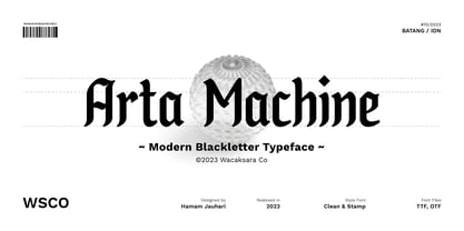 Introducing "Arta Machine" font, a modern blackletter typeface that skillfully combines classic elegance with contemporary flair. This versatile font family offers two unique styles: 'clean' for a sleek and refined appearance, and 'stamp' for a bold and rugged aesthetic. This font is perfect for use as poster designs, branding, logos, apparel, cards, packaging, quote, web, headline, tattoo, or other design needs. Features : Multilanguage Alternates PUA Encoded Ligatures Thank you.
 - Sagasti by Eurotypo,
$32.00 Sagasti is a font family that contains two weights: Regular and Bold, with their corresponding Italics style. These fonts are characterized by a straight and generous serif that provides consistent stability. We have focused on controlling vertical, horizontal and oblique strokes thicknesses, as well as curved strokes. All glyphs were carefully drawn and precise kerning control has been made, providing optimal readability for texts and the beauty of the headlines.
 - Emblema by Corradine Fonts,
$29.95 Emblema is an evocative font that exudes Art Deco style from early decades of the 20th Century. Its geometric shapes give a clean and modern look to any design where it is applied. Emblema was designed in 12 subtly different weights and is ideal for achieving the same weight in a single word when using different point sizes. Open Type users can access an extensive set of alternative and ornamental characters including 3 different size sets of caps, providing the utmost in versatility.
 - P22 Hieroglyphic by P22 Type Foundry,
$24.95Hieroglyphs were a pictorial alphabet used in Ancient Egypt from 3100 BC to approximately 300 AD. This font set features over 250 different phonetic and decorative hieroglyphics, complete with an extensive translation chart. P22’s Hieroglyphic font adapts one of the world’s most ancient forms of art and communication for today’s technology. Note: This is not an automatic word translator. It is a font set. It is used just like any other font and does not require special software skills. - Abrikos by PizzaDude.dk,
$15.00 Abrikos is apricot in danish. A lovely and sweet fruit, often underestimated and not very well known - but if you ask me, it is delicious! The letters were drawn using a small brush, and as you can see, I almost ran out of ink - leaving the letters somewhat rough. I made 4 different versions of each lowercase letter, and these cycle automatically as you type in order to make some randomness. I threw in an extensive set of international characters as well! Enjoy!
 - Nolger by TypeClassHeroes,
$19.00 Nolger is a groovy font come with 90's groovy style serif. Groovy and refined you can explore and combine creating rhythm for comfortable reading. This font supports more than 100 Latin-based languages and has extensive Cyrillic and Greek support for languages like Russian, Bulgarian, Ukrainian, and many more. Feature Uppercase & Lowercase Number & Symbol International Glyphs Multilingual support Alternative Ligature Cyrillic & Greek Feel free to drop us a message any time and follow my shop for upcoming updates. Hope you enjoy it.
 - Artful Dodger by Hanoded,
$15.00 The Artful Dodger is a character in Charles Dickens' Oliver Twist. Dickens wrote his books in the Victorian Era, which also gave birth to a beautiful and extensively used typeface called Clarendon. The typeface was developed by Robert Besley and first published in 1845. Artful Dodger was modeled on the glyphs found in a 1865 book, which was typeset in Clarendon. Artful Dodger has not been 'cleaned', so the glyphs look rough and worn, just like the book I found them in.
 - Elegant Script Pro by SoftMaker,
$7.99 This typeface was created in 1972 and reworked by SoftMaker in 2010. Elegant Script Pro is perfect for invitations to weddings, celebrations, and dinner parties. Elegant Script Pro comes with a huge character set that covers not only Western European languages, but also includes Central European, Baltic, Croatian, Slovene, Romanian, and Turkish characters. Case-sensitive punctuation signs for all-caps titles are included as well as many fractions, an extensive set of ligatures, and separate sets of tabular and proportional digits.
 - Contempo Gothic by Arkitype,
$20.00 Contempo Gothic is a modern sans serif with a geometric approach. It comes in 18 weights, 9 uprights and its matching italics. Designed with opentype features including stylistic sets and tabular figures. Contempo Gothic includes extensive language support, fractions, arrows, ligatures and more. Perfectly suited for graphic design and any display use at any size. It could easily work for websites, blogs, signage, corporate identities, publishing and editorial design to name a few. Contempo Gothic is super versatile for everyday design use.
 - Rukola by Nikola Giacintova,
$39.99 Rukola, a friendly brush script that follows in the footsteps of sign painting, features an extensive character set and language support. Turn on the OpenType function and swash alternatives for a more authentic, original appearance. For select characters, simply use the number of spaces after the character to choose from an array of swashes on the final character. Rukola contains small caps for writing in large letters. The typeface is an original script for your poster, package and brand designs.
 - Louisa by Julia Hanft,
$30.00 Louisa is a monospaced font-family designed and optimized specifically for small font sizes. But even as headline font it looks good. It has a very good distinguishability of letter forms and legibility even in longer text paragraphs. The character of Louisa is a combination of strong elements and warm, friendly forms. The font family is not only designed for coding and tabular layout, but can be used in different fields of communication design. Therefore it provides two stylistic sets with different letter forms: one with the look of serious modern typewriter font, the second with more soft letter forms and elements of a real italic. Additionally it consists oldstyle numbers (and of course tabular numbers) and a set arrows. The font is available in four styles: regular, italic, bold and bold italic.
 - Compose by Arkitype,
$18.00 Compose is a clean modern and minimal font family. It has nine weights each with an oblique version. Compose has alternate "a" and "y" options as stylistic sets, circled numerals, arrows and more to make up the extensive character set. Suited for graphic design and display use. It is an excellent editorial typeface option as well as a perfect fit for web, signage, corporate and branding. With a higher x-height Compose had great legibility in smaller sizes, it is versatile typeface and a great addition to your font library, a typeface that can easily become a go to font option.
 - Tokyo Geisha by Kitchen Table Type Foundry,
$15.00 My wife was watching ‘Memoirs Of A Geisha’ the other day, and I am going to take my son Sam to see Japan in May this year, so when I started drawing out the glyphs for this font, the name was already chosen! Tokyo Geisha is a handmade brush font. I made it with Chinese ink and one of the Chinese brushes my late father in law gave me. Tokyo Geisha is a font with speed and a certain flamboyance. It comes with extensive language support and a cool .notdef glyph. I am sure you will put it to good use! Arigato Kozaimasu!
 - Valentia Nit by Eurotypo,
$59.00 “Valentia Nit” is a copperplate typeface enriched with swashes and extensions in alternate characters. Its main feature is the intense contrast between thick and thin strokes that gives you clarity of reading while providing a delicate and subtle texture in the text. Another feature is the spontaneity of its stems, the agile and casual ties, which in fact, these combinations can offer the designer a variety of possibilities to structure a logo or headline in sophisticated lettering style. “Valentia Nit” was designed to combine with our previous font “Valentia” in order to obtain the necessary hierarchy of texts using changing thicknesses.
 - Nibbles by Typogama,
$19.00 Nibbles is a linear dingbat typeface inspired by the theme of food and food trucks. With symbols ranging from burgers, pancakes, or desserts, to food trucks and toilet signs, this font aims to cover all your hungry design needs! To help with its application, each pictogram can either be found through its glyph placement or by simply typing out the name of the food item. Type burger and presto, your burger pictogram will appear! With its simple application and extensive symbols, Nibbles can be used for branding, menus, editorial layouts, posters, and any food related projects.
 - Pikelet by Aah Yes,
$14.00Pikelet is a misprinted grunge font ideally suited to headlines, poster and display. As well as irregularities of printing in the actual letters, the ordinary versions contain "print errors" around some of the letters, whereas the Clean versions are identical but without those extra bits of overprint. The All Caps version has 2 sets of capitals which are different to the capitals in the Regular version (and to each other). And the jumbled versions have varying amounts of mis-alignment, but not variations in size. There's also an extensive selection of accented characters for both Western & Eastern European languages, and punctuation and fractions. - Inquired by Akrtype Studio,
$19.00 Inquired handwritten font is a seductive font that is made with a touch of elegance and feeling to give the best touch. Inquired handwritten font an elegant combination of a script. It is slender, feminine and classy, while still maintaining a friendly feel. Inquired handwritten font is versatile and will work perfectly for fashion, e-commerce brands, trend blogs, wedding boutiques or any business that wants to appear upscale and chic. Inquired handwritten font is perfect for creating original and functional designs. It has extensive language support and tons of ligatures, stylistic sets that add visual interest to every letter.
 - Raisin Rage by Missy Meyer,
$12.00 It's a weird name, but it's a weird font! Introducing RAISIN RAGE, a quirky font that expresses that feeling of when you bite into a cookie expecting it to be full of chocolate chips, but it's full of squishy, rubbery raisins instead. (Don't write to me, raisin lovers - you'll never change my mind.) Raisin Rage has some fun casual elements like varying stroke widths plus some bouncing heights which make this fun to use for branding, packaging, logos, and more; I've cleaned the letters up extensively, so the font is great for cutting and crafting as well!
 - Roadie PB by Pink Broccoli,
$16.00 Roadie was inspired by a 1981 Hallmark card with lettering that was full of frolicking fun. Filled with a childish persona and a playful bounce, this Roadie has a lot to offer. As with some of my previous type designs, it is a typographic dance, wonderfully skipping across designs, surprising with each letter typed. With an extensive character set, and clean sharpie marker-like look, Roadie is a joy to typeset with, and it comes with a stylistic alternates feature that shuffles the Capitals and lowercase that share similar unicase forms that add to the quirky playfulness.
 - Dopelton by Variatype,
$22.00 Introducing Dopelton, a signature font that transcends the ordinary, embodying the essence of personal style and sophistication. Crafted with meticulous attention to detail, Dopelton is more than a font; it’s a stroke of individuality, a visual symphony that transforms signatures into works of art. Each letter in Dopelton carries a distinctive flair, reminiscent of a signature penned by a hand writer. The fluid strokes seamlessly merge, creating a harmonious rhythm that captures the art of the handwritten with a contemporary twist. The balance between elegance and readability is finely tuned, making Dopelton versatile for various design purposes. Dopelton is not confined to the limits of static characters; it adapts to the natural flow of the hand, ensuring a unique signature experience every time. The font’s dynamic nature brings authenticity to digital signatures, providing a touch of human warmth in the digital realm. The details of Dopelton are a testament to its craftsmanship. Subtle curves, refined loops, and a tasteful interplay of thick and thin lines give each letter a signature-worthy personality. Whether used for branding, invitations, or personalized stationery, Dopelton adds a touch of refined charm to any project. This signature font is designed to make a statement—bold yet graceful, modern yet timeless. Dopelton is more than a font; it’s an extension of your identity, a signature that leaves a lasting impression. Elevate your designs with Dopelton and let your words carry the unmistakable touch of personalized elegance. FONT FEATURES Additional Accents 68 Languages Kerning Alternates Ligatures Swashes
 - Miller Text by Carter & Cone Type Inc.,
$35.00 Matthew Carter’s Miller is a seminal reinvigoration of the 19th-century Scotch Roman, serving forthright, authoritative body copy and headlines since 1997. Miller Text has always been the epitome of a reliable publication workhorse. Alongside the three-quarter-height Scotch numerals, Miller Text includes optional oldstyle and lining figures, each with appropriately aligned currency and other symbols. A complete set of fractions, with arbitrary superiors and inferiors, is also included. Miller Text features an Extended Latin character set, which covers all major languages and dialects written with the Latin alphabet.
 - Karben 205 by Talbot Type,
$19.50 Karben 205 is inspired by the classic, no nonsense DIN, and has a form that follows its highly legible function. Based on a lozenge, it has a clean and pure geometry with even stroke weights. Karben 205 is available in a family of five weights, and is also available with character variations as Karben 105. There are also monospaced variants of both Karben 105 and Karben 205 and a stencil version. All of the Karben fonts feature an extended character set, including accented characters for Central European languages.
 - CG Gothic by Monotype,
$29.99This is a family of "Gothic" types from the Monotype Design Studio. The faces named "Gothic No. 1 through 4" were produced by Compugraphic. Gothic No. 1 is a condensed, late 19th century American-style sans serif typeface. Gothic No. 2 and Gothic No. 3 are based on the Metro #2 series, designed by W.A. Dwiggins for Mergenthaler Linotype during the 1920s and 30s. Gothic No. 4 looks vaguely like Gothic number one, but is heavier and smaller on the body. Gothic Extra Light Extended is a very light and wide design. - Blushing Rose by Sarid Ezra,
$17.00 Introducing, Blushing Rose - A Stylish Modern Serif with Ligatures and Alternates Blushing Rose is a stylish and modern serif with a bunch of alternates for each characters and ligatures that will make your presentation or logo even more stunning and attractive! You can use this font for unlimited purpose such as wedding invitation, branding, or even your own logo. The ligatures will make your logo more advanced without many steps. This fonts support Multi Language. Features Uppercase & Lowercase Number & Symbol Extended Multi language Alternates for each characters Ligatures
 - Roanne by Tour De Force,
$25.00 Roanne is a sans serif family named after a town in France. This font family contains 2 width variations: Normal and Condensed, and all together counts 44 font styles. Equipped with OpenType features (Tabular Figures, Fractions, Stylistic Alternates, Localization for Serbia, Poland and the Netherlands, Case Sensitive brackets) for extended Latin and Cyrillic character set with a small charming set of Dingbats. For easier usage as webfont, Roanne font files contain numeric values for CSS weight attribute – 100, 150, 200, 300, 400, 500, 600, 700, 800, 850, 900.
 - Karben 105 by Talbot Type,
$19.50 Karben 105 is inspired by the classic, no nonsense DIN, and has a form that follows its highly legible function. Based on a lozenge, it has a clean and pure geometry with even stroke weights. Karben 105 is available in a family of five weights, and is also available with character variations as Karben 205. There are also monospaced variants of both Karben 105 and Karben 205 and a stencil version. All of the Karben fonts feature an extended character set, including accented characters for Central European languages.
 - VVDS Organum by Vintage Voyage Design Supply,
$10.00 Elegant and easy to use serif font family with contrast in vertical and horizontal strokes. Its variety of weights provides a range of choices that will help you to find the best typographic look. Use all caps to get the classic serif look, like Didones, or use it normally for a playful serif look. Normal and Medium widths are good for text blocks and Thin and Light, or Bold and Black are perfect for Headliners. Every letter in a word looks like as if written specially next to each other, as in hand lettering. You can use it in gentle and minimal projects, and also in projects with bold and heavy typographic base. Also, for more individuality, Organum comes with discretionary ligatures and few stylistic alternates for every caps and some lowercase letters.
 - Electrostatic JNL by Jeff Levine,
$29.00 Electrostatic JNL was inspired by the 1930s lettering for radio station WMCA in New York City. It was found as part of an ad for the station in a 1932 radio broadcasting trade magazine. WMCA went on the air Feb. 6, 1925. According to Wikipedia, the "MCA" call letters stood for the Hotel McAlpin, where the station's original studio and transmitter were located. "W" is the call sign prefix for all broadcast stations East of the Mississippi River; with the exception of KDKA (Pittsburgh), which was the nation's first commercial radio station. This bold novelty typeface with lightning bolds intersecting the characters can be used to represent anything from electricity to stormy days; power generators to brute force and so forth. Electrostatic JNL is available in both regular and oblique versions.
 - Boho by Latinotype,
$39.00 Boho is inspired by a bohemian girl who is a free soul and creative spirit. She is a city girl, but she loves spending a lot of time outdoors and being close to nature. She loves art and going to the antiques and organic food markets. She is a wild and free spirit who knows no bounds. Boho is Coto Mendoza’s first Script font family, which is based on gestual calligraphy with Cola pen. A first exposure to gestual strokes applied to font design can be seen in her previous work, Macarons. Boho consists of 4 subfamilies: Script, Line, Sans and Serif. Each subfamily comes in 4 weights: Regular, Bold, Italic and Bold Italic. Script and Line versions include a teardrop terminal variant. Dingbats and ornaments are also included. Boho. Love and creative spirit!
 - Prushkov by Arrière-garde,
$9.00 Prushkov is the first typeface that I made. Its name comes from the town I lived in at the time. The design was inspired by both geometric typefaces like Futura, and didone fonts like Bodoni. Its aim (perhaps quite bold) is to blend high contrast with mathematical excellence. Prushkov will work well as a display font, both in uppercase and lowercase. It has a wide array of stylistic alternates for all of the capitals and some lowercase glyphs too.
 - Wiley by Molly Suber Thorpe,
$17.99 Wiley is a ligature-rich, decorative typeface with full support for both Latin and Modern Greek. It's a modern twist on vintage Western serif fonts that makes unique logos, personal stationery, and monograms. Wiley has over 80 ligatures and alternates (for Greek, too!), so it's extremely customizable and versatile. Its 500+ glyphs include: the complete Latin alphabet (with all accent marks), the complete Modern Greek alphabet, 80 standard and discretionary ligatures in both Latin and Greek, numerals, ordinals, and fractions, decorative ornaments and finials, extensive punctuation and diacritical markings.
 - Schotis Text by Huy!Fonts,
$35.00 Schotis Text is a workhorse typeface designed for perfect reading on running texts. Its design is based in Scotch Roman 19th-century style but designed from scratch, with a more contemporary and not nostalgic look. It has seven weights plus matching italics, with 1100 glyphs per font, with a very extended character set for Latin based languages as well as Vietnamese, and shows all its potential with OpenType-savvy applications. Every font includes small caps, ligatures, old-style, lining, proportional and tabular figures, superscript, subscript, numerators, denominators, and fractions. The Scotch Romans were one of the most used letters during the 19th and early 20th century, but they don’t have their own place in the main typographical classifications. They appeared at the beginning of the 19th century with Pica No. 2 in the catalog of William Miller (1813) and assumed the British route towards high contrast and vertical axis modern Romans. In fact, they were called just Modern. In opposition to the continental route of Fournier, Didot, and Bodoni, the English way opted for a wider, more legible letter also resistant to bad printing conditions. The name Schotis comes from the misspelling of Scottish that gave the name to a popular dance in Madrid in the 19th-century. It first was called Schotis and today is knows as Chotis.
 - Advertisers Gothic by HiH,
$12.00 Advertisers Gothic is bold and brash, like the city it comes from, Chicago. It was designed by the accomplished German-American matrix engraver, Robert Wiebking, for the Western Type Foundry in 1917. As its name suggests, it was designed for commercial headliner work, much as Publicity Gothic by Sidney Gaunt for BB&S the year before. See our Publicity Headline. Alternate letters ‘A’ & ‘S’ are provided. The most popular ad words “Free!”, “New!” and “Sale” (with both esses) are provided at an angle for dramatic tension. Advertisers Gothic became quite popular because it was effective. It can work equally well for a flyer advertising a non-profit event as for a magazine product ad. This font refuses to be a wimp. Use it boldly. Advertisers Gothic ML represents a major extension of the original release, with the following changes: 1. A total of 335 glyphs (compare) with added glyphs for the 1250 Central Europe, the 1252 Turkish and the 1257 Baltic Code Pages. 2. Added OpenType GSUB layout features: pnum, ornm, liga, hist & salt ˜ with total 13 lookups. 3. Added 209 kerning pairs. 4. Revised vertical metrics for improved cross-platform line spacing. 5. The most popular ad words “Free!”, “New!” and “Sale” (with both esses) are provided at an angle for dramatic tension The zip package includes two versions of the font at no extra charge. There is an OTF version which is in Open PS (Post Script Type 1) format and a TTF version which is in Open TT (True Type)format. Use whichever works best for your applications.
 - Camille by Arabetics,
$45.00 Camille was designed with exaggerated emphasis on letter vertical characteristic, by virtually eliminating the typical Arabic horizontal line look. This font glyph weights and look and feel are heavily influenced by early Kufic Quranic calligraphy style. Camille supports all Arabetic scripts covered by Unicode 6.1, and the latest Arabic Supplement and Extended-A Unicode blocks, including support for Quranic texts. This font family includes two letter spacing flavors: isolated for small text and overlapped for large or display text. The two spacing flavors have one weight each with a normal and a left-slanted Italic version. The script design of this font family follows the Arabetics Mutamathil Taqlidi style utilizing varying x-heights. The Mutamathil Taqlidi type style uses one glyph per every basic Arabic Unicode character or letter, as defined by the Unicode Standards, and one additional final form glyph, for each freely-connecting letter of the Arabic cursive text. Camille includes the required Lam-Alif ligatures in addition to all vowel diacritic ligatures. Soft-vowel diacritic marks (harakat) are selectively positioned with most of them appearing on similar high and low levels—top left corner—, to clearly distinguish them from the letters. Tatweel is a zero-width glyph.