10,000 search results
(0.088 seconds)
- Alquitran Stencil by RodrigoTypo,
$45.00 Alquitran Stencil is a variant of Alquitran Pro. Alquitran stencil is specially designed for titles, with stencil effect.,Iin addition to Regular and Bold Alquitran Stencil also contains Rough and Rounded with additionally traces Extras (1-2) that are dingbats that support the text to look much more realistic.
 - Createland by Awan Senja,
$14.00 Createland is a bold display font, carefully handcrafted to become a true favorite. Its casual charm makes it appear wonderfully down-to-earth, readable and, ultimately, incredibly versatile. Createland will look outstanding in any context, whether it�s being used on busy backgrounds or as a standalone headline!
 - Fox Chicken by Fox7,
$12.00 Fox Chicken Font is a lively and playful display font that is perfect for adding a touch of fun and cheer to any design project. Designed with a focus on creativity and originality, this font features bold and expressive characters that are guaranteed to make your designs stand out.
 - RM Deco by Ray Meadows,
$19.00 A mixture of bold and fine line helps this distinctive design evoke the spirit of the 1930s Jazz Age. Due to the modular nature of this design there may be a slight lack of smoothness to the curves at very large point sizes (around 100 pt and above).
 - Giddelham by wearecolt,
$29.00 Giddelham is classy curvy and italic. A bold set of characters which flow in to an elegant, simple flourish. Giddelham offers several ligatures to help the flow and shape of your words. Giddelham is ideal for titles, subheadings and makes for a great start point for a sexy logo.
 - Wood Poster Display JNL by Jeff Levine,
$29.00 Wood Poster Display JNL is a more casual sans wood type, with a bold and friendly appeal. This font offers a pleasant design which lends itself perfectly to titling, price cards, event notices and any print or web design that prefers a less formal structure to its typography.
 - Fergana by Hazztype,
$18.00 Fergana is a square display sans-serif typeface with an inverted or reverse contrast. It uses a very high contrast to be as loud, bold and noticeable as possible. Fergana is a powerful option at large sizes for use on headings, posters, billboards, magazines, advertisements, from casual to hipster.
 - Leon by Hafontia,
$99.00 Leon is a modern wide sans serif type family in Hebrew and Latin. It comes in four styles to match any design need - Headers in Black or Thin to long text in regular and Bold. Includes full Hebrew support including punctuation. Designed in Tel Aviv by Ben Nathan, 2021.
 - Comfort by Jehansyah,
$9.00 short and bold font, cute and looks professional and a nuanced logo font that you can customize with the elegant look you want there are several alternatives that you can use and combine, and there are italics to make it easier for you to work on your design project
 - Furriatt by DVType,
$16.00 Furriatt is a heavy weight bold all caps display typeface. It’s perfect for posters, logos, merch, covers and all stuff you want to print or display in larger format. Font also contain alternative characters set, you could match it with standard glyph to get the best rhythm of letters.
 - Hisbullah by ARToni,
$23.00 Hisbullah is a bold, unique and stylish display font with an Arabic look. Designed to give a luxurious and elegant impression by combining modern and classic styles to make it timeless. This font is suitable for any purpose such as industrial, religious, gaming, movie, music themes, and so on
 - Icebold by Balpirick,
$15.00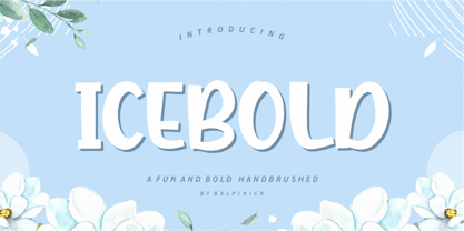 ICEBOLD is a Fun and Bold Hand brushed Font. ICEBOLD is perfect for product packaging, branding project, magazine, social media, wedding, or just used to express words above the background. It support multilingual. Enjoy the font, feel free to comment or feedback, send me PM or email. Thank you!
 - HGWelles by Just My Type,
$20.00 Designed for a privately-published luxury edition of The Time Machine, HGWelles Ultralight, Regular and Bold are now being made available to the public. This is the Welles of the early 20th century, seeing many of his predictions coming true and anticipating the shape of things yet to come.
 - The Bounde by Cititype,
$12.00 The Bounde is a bold script, carefully handcrafted to become a true favorite. Its casual charm makes it appear wonderfully down-to-earth, readable and, ultimately, incredibly versatile. The Bounde will look outstanding in any context, whether it’s being used on busy backgrounds or as a standalone headline!
 - Bodine by Balevgraph Studio,
$12.00 Bodine is a bold and geometric looking display font. It can easily be matched to an incredibly large set of projects, so add it to your creative ideas and notice how it makes them stand out! What's Included? Uppercase & Lowercase Numbers & Punctuation Alternate & Ligature Multilingual Support PUA Encoded
 - Mares by Alex Camacho Studio,
$24.00 Mares is an unicase typeface inspired by the American psychedelic movement from the mid 1960’s where capitals and lowercase used to be mixed and distorted to become part of the image. Mares is a bold and modern psychedelic font for use on special occasions. The bigger the better.
 - RM Smoothsans by Ray Meadows,
$19.00 A family of soft, rounded, yet bold display faces which can successfully be used in conjunction with one another. Due to the modular nature of this design there may be a very slight lack of smoothness to the curves at extremely large point sizes (around 200 pt and above).
 - Tomboy LP by LetterPerfect,
$39.00 Tomboy is a type design based on informal handwriting. Its presence on the page is friendly and easy to read, suitable for correspondence, brief text, and for display use in titles and headlines. Three weights -- Light, Medium & Bold -- allow Tomboy to speak in a wide range of voices.
 - Bakrie by 160 Std,
$20.00 Bakrie is a bold and incredibly unique display font. Masterfully designed to become a true favorite, this font has the potential to bring each of your creative ideas to the highest level! suitable for use in many design forms, for example Headline, Magazines, Postcards, Logos, DIY Projects, Brand, Apparel, Quotes, and much more.
 - Heifin by Daily Studio,
$16.00 Heifin is a beautiful bold typeface designed by Daily Studio. Contain unique upper and lowercase best for any purpose, especially to make a title, logo, and branding. This font will make your projects looks more stunning and amazing. Use your creativity to mix and match with other font to create a masterpiece.
 - Trajana Sans by Tipo Pèpel,
$28.00 The "Trajana Sans" is a sans-serif typeface family based on the shapes and proportions of the characters in the Trajan's Column in Rome. It consists of 4 weights, Light, Regular, DemiBold & Bold. Ideal to give a classic look and renewed our jobs without having to resort to the usual Trajan font.
 - Moresign by Invasi Studio,
$19.00 Inspired by Urban Lifestyle, Moresign Font is bold, readable, and tailored to your street art designs. With alternate glyphs and multilingual Latin accents, Moresign Font adds dynamically to titles, logos, packaging, branding, and magazines. It adds impact to words above the background with precision: Moresign Font – the perfect font for making a statement.
 - Raks by PeachCreme,
$14.00 Meet our new font "Raks"! These eye-catchy letters work great for headings and logos. If you would like to add some vanguard touches to your design, then this font is for you! Bold and curvy lines of "Raks" will give dramatic look for nearly any text from magazine headers to product emblems.
 - Distingue by Burntilldead,
$18.00 Introducing Distingue, an elegant ligature serif font. This font is made to bring strong statement, design with bold geometric face and have swash on alternate characters to keep it look stylish and sharp. An easy & perfect choice to make your design projects; logo, branding, invitation, social media ads & website have classy looks.
 - Concordia by RMU,
$30.00 In 1915 the Leipzig based foundry Heinrich Hoffmeister released the bold condensed version of its Sensation font family which is the most outstanding. The letters f, l and the long s have stylistic alternatives. To get access to all ligatures it is recommended to activate both OT features Standard and Discretionary Ligatures.
 - Kunstler Grotesk by HiH,
$12.00 Künstler Grotesk ML is one of a number of typeface designs that attempts to reconcile Germany’s blackletter tradition with the international familiarity of roman letterforms in a simple, robust design suitable for meeting the demands of a modern industrial economy, while rejecting the extraneous ornamentation of the departing Victorian era. It is an all-cap design with a number of playful ligatures. It has an appealing boldness that reverses well. Künstler means ‘artist’ in German. I had always assumed it was a person’s name until I came across the translation. Lesson: conjecture is not fact. Grotesk refers to a sans serif letterform tradition. Kunstler Grotesk was originally released by Bauer'sche Giesserei of Frankfurt am Main circa 1900. Künstler Grotesk ML represents a major extension of the original release, with the following changes: 1. Added glyphs for the 1250 Central Europe, the 1252 Turkish and the 1257 Baltic Code Pages. Added glyphs to complete standard 1252 Western Europe Code Page. Special glyphs relocated and assigned Unicode codepoints, some in Private Use area. Total of 350 glyphs, 260 kerning pairs. 2. Added OpenType GSUB layout features: pnum, salt, dlig (19) and hist. 3. Revised vertical metrics for improved cross-platform line spacing. 4. Redesigned mathematical operators. 5. Included tabular (std) & proportional (opt) numbers. 6. Refined various glyph outlines. 7. Made CcNnOoSsZz-kreska available (salt). 8. Incorporated alternate glyphs in lower case.
 - Bosphorus by Bülent Yüksel,
$19.00 Ideally suited for advertising and packaging, editorial and publishing, logo, branding and creative industries, poster and billboards, small text, wayfinding and signage as well as web and screen design. Optimized for web, tablet and smartphone applications. Also “Bosphorus” is a perfect screen display font. Technical information: “Bosphorus” provides advanced typographical support for Latin-based languages. An extended character set, supporting Central, Western and Eastern European languages, rounds up the family. The designation “Bosphorus 50 Normal 53 Regular” forms the central point. The first figure of the number describes the stroke thickness: 51 Thin to 56 Black. 5 Width / 6 Weights and italics also “Bosphorus” total 60 types. The family contains a set of 530 characters. Case-Sensitive Forms, Classes and Features, Fractions, Superior, Inferior, Denominator, Numerator, Old Style Figures just one touch easy In all graphic programs. You can contact me at buyuksel@hotmail.com, pre-purchase and post-purchase with questions and for technical support. UPDATE: 1- Some glyph unicode error correction / 04-06-2018 - Euro Unicode - Idottacent Unicode - Oganec Unicode - Middot Unicode 2- New Version 2.0 / 25-06-2021 You can enjoy using it.
 - Bosphorus Variable by Bülent Yüksel,
$149.00 Ideally suited for advertising and packaging, editorial and publishing, logo, branding and creative industries, poster and billboards, small text, wayfinding and signage as well as web and screen design. Optimized for web, tablet and smartphone applications. Also “Bosphorus” is a perfect screen display font. Technical information: “Bosphorus” provides advanced typographical support for Latin-based languages. An extended character set, supporting Central, Western and Eastern European languages, rounds up the family. The designation “Bosphorus 50 Normal 53 Regular” forms the central point. The first figure of the number describes the stroke thickness: 51 Thin to 56 Black. 5 Width / 6 Weights and italics also “Bosphorus” total 60 types. The family contains a set of 530 characters. Case-Sensitive Forms, Classes and Features, Fractions, Superior, Inferior, Denominator, Numerator, Old Style Figures just one touch easy In all graphic programs. You can contact me at buyuksel@hotmail.com, pre-purchase and post-purchase with questions and for technical support. UPDATE: 1- Some glyph unicode error correction / 04-06-2018 - Euro Unicode - Idottacent Unicode - Oganec Unicode - Middot Unicode 2- New Version 2.0 / 25-06-2021 3- Variable / 18-02-2022 You can enjoy using it.
 - ITC Kahana by ITC,
$29.99As if gliding in on the tide, ITC Kahana floats across the page with the pulse and sway of the sacred Hawaiian hula dance. The original drawings for this display typeface were created while designer Teri Kahan lived in the Aloha State, and its bold verticals symbolically convey the power and strength of the Polynesian people. Kahan has spent most of her life working with letters. She discovered Speedball lettering pens in her teens, opened a design studio that specialized in the lettering and calligraphic arts while in her early twenties, and grew her business in California and Hawaii. Today, she embraces new design challenges and digital technology, but letters are still at the core of her work. In ITC Kahana, Kahan created a design that is both distinctive and versatile. Menus, posters, display headlines, packaging and brochures fall easily within this typeface's range. And the word “kahana” is more than just a namesake: in Hawaiian, “kaha” means “to mark, draw, place, turn or surf,” and “na” means “belonging to.” ITC Kahana also includes an enchanting decorated alphabet in the lowercase position that expands this typeface's usefulness to the designer. - Moving Headlines JNL by Jeff Levine,
$29.00 For decades, visitors to Times Square could look up and read the up-to-the-minute news flashes that moved across a giant electric sign on the face of the old New York Times Building (now known simply as One Times Square). According to Wikipedia's article on OneTimes Square: "On November 6, 1928, an electronic news ticker known as the Motograph News Bulletin (colloquially known as the "zipper") was introduced near the base of the building. The zipper originally consisted of 14,800 light bulbs and a chain conveyor system; individual letter elements (a form of movable type) were loaded into frames to spell out news headlines. As the frames moved along the conveyor, the letters themselves triggered electrical contacts which lit the external bulbs (the zipper has since been upgraded to use modern LED technology)." An example of this was seen in the 1933 Warner Bothers film "Picture Snatcher" starring James Cagney. This example inspired Moving Headlines JNL.
 - New Lincoln Gothic BT by Bitstream,
$50.99New Lincoln Gothic is an elegant sanserif, generous in width and x-height. There are twelve weights ranging from Hairline to UltraBold and an italic for each weight. At the stroke ends are gentle flares, and some of the round characters possess an interesting and distinctive asymmetry. The character set supports Central Europe, and there are three figure sets, extended fractions, superior and inferior numbers, and a few alternates, all accessible via OpenType features. Back in 1965, Thomas Lincoln had an idea for a new sanserif typeface, a homage of sorts, to ancient Roman artisans. The Trajan Column in Rome, erected in 113 AD, has an inscription that is considered to be the basis for western European lettering. Lincoln admired these beautiful letterforms and so, being inspired, he set out to design a new sanserif typeface based on the proportions and subtleties of the letters found in the Trajan Inscription. Lincoln accomplished what he set out to do by creating Lincoln Gothic. The typeface consisted only of capital letters. Lincoln intentionally omitted a lowercase to keep true his reference to the Trajan Inscription, which contains only magiscule specimens. The design won him the first Visual Graphics Corporation (VGC) National Typeface Competition in 1965. The legendary Herb Lubalin even used it to design a promotional poster! All this was back in the day when typositor film strips and photo type were all the rage in setting headlines. Fast forward now to the next millennium. Thomas Lincoln has had a long, illustrious career as a graphic designer. Still, he has one project that feels incomplete; Lincoln Gothic does not have a lowercase. It is the need to finish the design that drives Lincoln to resurrect his prize winning design and create its digital incarnation. Thus, New Lincoln Gothic was born. Lacking the original drawings, Lincoln had to locate some old typositor strips in order to get started. He had them scanned and imported the data into Freehand where he refined the shapes and sketched out a lowercase. He then imported that data into Fontographer, where he worked the glyphs again and refined the spacing, and started generating additional weights and italics. His enthusiasm went unchecked and he created 14 weights! It was about that time that Lincoln contacted Bitstream about publishing the family. Lincoln worked with Bitstream to narrow down the family (only to twelve weights), interpolate the various weights using three masters, and extend the character set to support CE and some alternate figure sets. Bitstream handled the hinting and all production details and built the final CFF OpenType fonts using FontLab Studio 5. - Noemi Slab by Brackets,
$22.00 Noemí is a broad typeface based on a formally classic skeleton, but with a strong Meccano character, where its quadrangular serifs are the protagonists of the slab style. It is a typeface designed to solve the basic problems of newspaper printing, adapted to a novel and strong communication, in the case of a wide typeface and with generous ink traps making the impression. Noemí was born from the need to create a broad, functional typeface family with a strong compact character intended for use in the press. Intended for editing and layout in a newspaper / magazine with a wide range of subfamilies thought and designed to achieve a diverse graphic functionality; designed from the same common skeleton, with a style based on the mix between the Mecan characters of traditional typewriter fonts and Roman fonts.
 - Deco Sans by Alan Ronn,
$30.00This font was created while looking at the various shapes my handwriting consistently took, especially in the ways that letters would have breaks in them. Over the course of a few months I continually tweaked the letter forms and shapes, and lo and behold, I developed Deco Sans. This family currently only includes a thin weight, as I'm only one person, and very busy with college. I'm continuing work on a regular, bold, and possibly a future italic weight, but these may not be released for many months to come. As this is a very thin font, it should be used at sizes no smaller than around 16 or 18pt as it tends to get lost in whitespace, and looks best at large sizes. As such, this weight should be considered more of a display font than a text font, however, I predict a regular weight to be very readable and much more useable for the everyday. - Quendel by URW Type Foundry,
$39.99 Quendel has been expanded to become Quendel Happy Family. Apart from the new Bold weight for easy distinction and emphasis, there are now four other very exciting variants, rendering different writing tools and writing materials. The basic form of Quendel was written with a Japanese bamboo tip and therefore embodies a form letter of natural flow. The new versions show other features that provide the feel of written scripts. While the styles Wood and Crayon include some alternate characters, Q Marking Pen and Q Fingertip, due to their apparently more complex enacted forms, do not need additional alternates without looking stiff or boring. The wood relief of Quendel Wood was created by a freehand wood relief drawn with oiled chalk. Quendel Marking Pen seems to be written with a felt-tip pen soon depleted. At the same time it is also reminiscent of the blooming effect, which we know from photography. The name of Quendel Fingertip suggests what can be seen - someone seems to have written with the finger in a grainy material. One would like to try it himself. The effect of broken lines which can be gained by writing with chalk as reflected in Quendel Crayon. Almost like parched sandy soil, the writing material seems to crumble.
 - Dog Eared by Andy Babb,
$19.20 Each character of Dog Eared began its life as a half-inch wide strip of paper, folded and Scotch-taped into formation, and then scanned and recreated digitally. Dog Eared is distinguished from other folded paper style typefaces by its robustness and versatility: each numeral and upper- and lowercase letter has a stylistic alternate. Dog Eared Striped is a traditional single color font, while Dog Eared Solid is a chromatic variant that can be used for a two-toned effect. Layer and multiply Dog Eared Striped and Dog Eared Solid together to achieve even more color variety.
 - Beauty Modelina by Agny Hasya Studio,
$9.00 Beauty Modelina is a Modern Stylish Serif Display Font with a Decorative, and Elegant Style Come in 2 (two) weights (regular & bold) including slants, and is created with Stylistic Alternates and Ligatures. Perfect for your design projects like logos, branding, advertising, product designs, stationery, photography, art quotes, wedding designs, fashion designs, and more. Featured with Uppercase and Lowercase, Numeral and Punctuation, Multilingual Support, and Opentype Features.
 - Delarosa by Agny Hasya Studio,
$9.00 Delarosa is a Modern Serif Display Font with Retro Vintage Style yet Decorative, and Elegant Come in 2 (two) weights (regular & bold) including slants, and is created with Stylistic Alternates and Ligatures. Featured with Uppercase and Lowercase, Numeral and Punctuation, Multilingual Support, and Opentype Features. Perfect for your design projects like logos, branding, advertising, product designs, stationery, photography, art quotes, wedding designs, fashion designs, and more.
 - NATRON Rough by Posterizer KG,
$25.00 NATRON Rough is the textured version of NATRON (rounded and condensed sans serif), in two weights, medium and bold. It features stylistic alternates and ligatures. Both fonts support Latin and Cyrillic codepages for Western, East and Central European, and Baltic countries. Designed for tight-fitting text, NATRON Rough is great for display, branding, labels, packaging, advertising, food, sports, titles, and any other type of visual communication projects.
 - Bintaro by Rhd Studio,
$24.00 BINTARO is a clean and powerful serif font with a bold, rounded shape. It comes with two regular styles, and outline. BINTARO is a good choice for a variety of projects such as logos & branding, invitations, stationery, social media posts, clothing, advertising, product packaging, product design, labels, photography, watermarks, special events or whatever. WHAT IS INCLUDED: Multilingual support Alternatives A, B, E, F, P, R PUA Encoded
 - Honolulu by Ana's Fonts,
$12.00 Honolulu is a cute hand-drawn font with four variations: - Regular, filled, sans and sans filled - Plus jumpy versions of each font (accessed by activating contextual alternates). Each font includes: - Two sets of caps - Numbers and punctuation - Multilingual support Fresh and perfect for the summer, in any design that needs a bold hand-drawn feel, such as postcards, notes and quotes, logos and branding.