10,000 search results
(0.778 seconds)
- Roswita by Ws Studio,
$14.00 Proudly Present, Roswita Font Roswita is an excellent handwritten font that will make your work stand out through its elegant and curvy lines. Great for product packaging, branding projects, magazine covers, social media, weddings, or simply used to express words over a background. also multilingual support Ligature Dusty Enjoy the font, feel free to comment or give feedback, send me a PM or email. Thank you!
 - Soul Doubt by Allouse Studio,
$16.00 Proudly Presenting, Soul Doubt a Graffiti Font with Two Syles. Soul Doubt is perfect for any tittles, logo, product packaging, branding project, megazine, social media, wedding, or just used to express words above the background. Both font come with underline styles and extras, also come with Multi-Lingual Support. Enjoy the font, feel free to comment or feedback, send me PM or email. Thank You!
 - Maulidine by Subectype,
$15.00 Maulidine is a beautiful modern calligraphy font. It includes elegant ending swashes which makes it perfect to give a luxurious feel to your designs. It’s perfect for logos, product packaging, wedding invitations, branding, headlines, signage, labels, signature, book covers, posters, quotes and more. What's Included: Mauldine Script - TTF I hope you enjoy this font. If you have any questions please don't hesitate to drop me a message :)
 - Histeagin Sans by Yahya Type,
$22.00 Histeagin Sans – Sans serif version of Histeagin. Histeagin Sans – this style works well for branding projects, logo, wedding designs, social media posts, advertisements, product packaging, product designs, label, photography, watermark, invitation, or whatever project you’re working on. WHAT’S INCLUDED? Uppercase & lowercase letters Numbers, punctuation Ligature & Huge Stylistic alternate Multilingual support. Still got a question? Send me a message and I’ll be happy to answer! qura.yahya@gmail.com
 - Star Whisper by Allouse Studio,
$16.00 Star Whisper a Fun Handwritten Easter Font that will bring joy to your Easter Season. Star Whisper is perfect for any tittles, logo, product packaging, branding project, megazine, social media, wedding, or just used to express words above the background. Star Whisper also come with Multi-Lingual Support. Enjoy the font, feel free to comment or feedback, send me PM or email. Thank You!
 - Vinegart by FHFont,
$19.00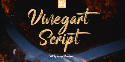 Vinegart is a script font with a hand-lettered, dry brush style, with OpenType feature include in the font. Suitable for design, element design, wedding, event, t-shirt, logo, badges, sticker, and awesome work. Features Of The Font: - All Standard Character, Symbol, Multi-lingual Support, Ligature, Stylistic Sets and Swashes. - PUA Encoding Follow Me: - https://www.instagram.com/FHFont - https://twitter.com/FH_Font - https://www.facebook.com/FHFont/ - https://id.pinterest.com/feydesign/
 - African Patchwork by Scholtz Fonts,
$12.00African Patchwork was inspired by my observation that many traditional African patterns have strong similarities to the patterns of the American quilting tradition. I chose one of the patterns from the African Pattern Font 04 - Mali (based on traditional bogolan mud cloth designs) that reminded me of quilting patterns and superimposed it onto the Zim Black characters, to create a fusion of African and American design. - Twist Jelly by Allouse Studio,
$16.00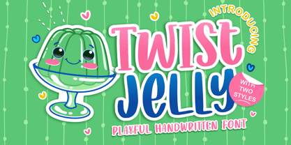 Proudly Presenting, Twist Jelly a Playful Handwritten Font with two styles, Basic and Slab Serif. Twist Jelly is perfect for any tittles, logo, product packaging, branding project, megazine, social media, wedding, or just used to express words above the background. Twist Jelly come with Multi-Lingual Support for each style. Enjoy the font, feel free to comment or feedback, send me PM or email. Thank You!
 - Sanpaullo by Garisman Studio,
$20.00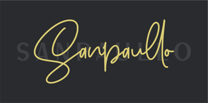 Introducing Sanpaullo - Handwritten Font Sanpaullo is a natural signature font, this font Is perfect for logo, invitation, stationery, wedding designs, social media posts, advertisements, product packaging, product designs, label, photography, watermark, special events or anything. Sanpaullo comes with full set of uppercase and lowercase letters, multilingual symbols, numerals, punctuation. If you have any questions please don't hesitate to drop me a message. Garisman Studio
 - La Maison Brush by Allouse Studio,
$16.00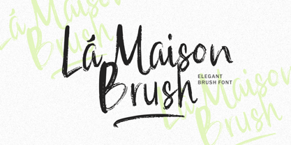 La Maison Brush a Elegant Brush Font with many options underline styles for your need! La Maison Brush is perfect for any tittle, logo, product packaging, branding project, megazine, social media, wedding, or just used to express words above the background. La Maison Brush also come with Multi-Lingual Support. Enjoy the font, feel free to comment or feedback, send me PM or email. Thank You!
 - Alinnea by Garisman Studio,
$20.00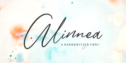 Introducing Alinnea - Signature Font Alinnea is a natural signature font, this font Is perfect for logo, invitation, stationery, wedding designs, social media posts, advertisements, product packaging, product designs, label, photography, watermark, special events or anything. Alinnea comes with full set of uppercase and lowercase letters, multilingual symbols, numerals, punctuation. If you have any questions please don't hesitate to drop me a message. Garisman Studio
 - Walkout by Sronstudio,
$18.00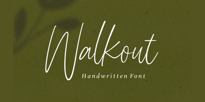 introducing Walkout - Handwritten Font Walkout is a natural handwritten font, this font Is perfect for logo, invitation, stationery, wedding designs, social media posts, advertisements, product packaging, product designs, label, photography, watermark, special events or anything. Walkout comes with full set of uppercase and lowercase letters, multilingual symbols, numerals, punctuation. If you have any questions please don't hesitate to drop me a message :) Thank You, Sronstudio
 - Girly Love by Letterfreshstudio,
$12.00 Girly Love is modern handwritten script with dancing up and down the baseline, and comes with lovely alternates. It works perfectly for logos, fashion, stationery, letterpress, magazines, menus, books, invitations, wedding and greeting cards, packaging, labels, apparel, marketing and more. Girly Love also includes alternates, ligatures and multiple language support. If you need help or advice, please contact me by e-mail letterfreshstudio@gmail.com.
 - Mandalaz Sensei by Allouse Studio,
$14.00 Mandalaz Sensei is a Brush Font Family. These font come with Multi-Lingual Support and swash separated to make it easier to play with. Mandalaz Sensei is perfect for any tittles, logo, product packaging, branding project, megazine, social media, wedding, or just used to express words above the background. Enjoy the font, feel free to comment or feedback, send me PM or email. Thank You!
 - Ankerisey by FHFont,
$19.00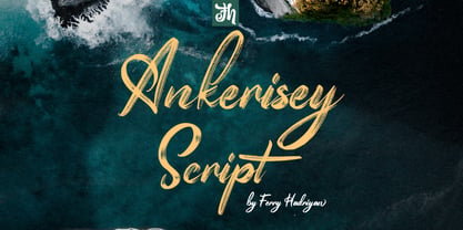 Ankerisey is script font with a hand-lettered, dry brush style, with OpenType feature include in the font. Suitable for design, element design, wedding, event, t-shirt, logo, badges, sticker, and awesome work. Features Of The Font: - All Standard Character, Symbol, Multi-lingual Support, Ligature, Stylistic Sets and Swashes. - PUA Encoding Follow Me: - https://www.instagram.com/FHFont - https://twitter.com/FH_Font - https://www.facebook.com/FHFont/ - https://id.pinterest.com/feydesign/
 - Delighty by Balpirick,
$15.00 Proudly Present, Delighty Font. Delighty is a Modern Handwritten Font. This sweet font has nice smooth lines. Delighty is perfect for product packaging, branding project, megazine, social media, wedding, or just used to express words above the background. This font includes TTF and OTF, Delighty also multilingual support. Enjoy the font, feel free to comment or feedback, send me PM or email. Thank you!
 - Java Coffee by ReivNick,
$12.00 Java Coffee Script Font is an adorable and visually elegant signature script font. Comes with alternatives and ligatures. Perfect for editorial projects, branding, weddings, social media, product design, stationery, advertising other romantic projects, or simply as a stylish text overlay to any background image. Features : Uppercase and Lowercase Stylistic Alternates & Ligatures Numerals & Punctuation PUA Encoded Contact me If you have any questions. Thank you!
 - Handsetting by Sronstudio,
$18.00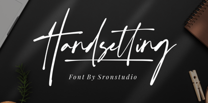 Introducing Handsetting - Modern Signature Handsetting is a stylish signature font perfect for branding, invitation, stationery, wedding designs, social media posts, advertisements, product packaging, product designs, label, photography, watermark, special events, or anything. Handsetting comes with full set of uppercase and lowercase letters, ligatures, multilingual symbols, numerals, and punctuation. If you have any questions please don't hesitate to drop me a message :) Thank You, Sronstudio
 - Balisay by Sronstudio,
$18.00 Meet Balisay, A Calligraphy font that is perfect for branding, invitation, stationery, wedding designs, social media posts, advertisements, product packaging, product designs, label, photography, watermark, special events, and more. Features: Uppercase and lowercase letters 70+ Lowercase Swash alternates Multilingual symbols, numerals, and punctuation How do access swashes alternate? https://sronstudio.com/sronstudio-font-guide/ Any question? Don't hesitate to drop me a message :) Follow Instagram: @sronstudio
 - Adelaide & Georgie by Allouse Studio,
$16.00 Adelaide & Georgie a Friendly Handwritten Typeface that will give you an fun, playful and friendy impression. Adelaide & Georgie is perfect for any tittles, logo, product packaging, branding project, megazine, social media, wedding, or just used to express words above the background. Adelaide & Georgie also come with Multi-Lingual Support. Enjoy the font, feel free to comment or feedback, send me PM or email. Thank You!
 - Brillion by Subectype,
$15.00 Brillion is a casual, rounded handwritten font. Perfect for your personal branding and any awesome project such as logos, invitations, stationery, wedding designs, social media posts, advertisements, product packaging, product designs, labels, photography, watermarks, special events and much more ! Brillion comes in Regular & Italic style, with 100+ Ligatures and includes Multilingual support. If you have any questions please don't hesitate to drop me a message.
 - Brightstone by Balpirick,
$15.00 Proudly Present, Brightstone Font. Brightstone is a Modern Handwritten Script Font. This font is suitable for use in your design projects.s It is perfect for wedding, event, invitation, escort card, table number, header menus, display, logos, slider blog, custom address, stamps, packaging, greeting card, etc. - also multilingual support Enjoy the font, feel free to comment or feedback, send me PM or email. Thank you!
 - Dream Script by Lián Types,
$49.00 One of my dreams as a type-designer was making a good looking chancery cursive. Full of life, like some of the best calligraphers around the world do on their artworks. With Julian Waters, John Stevens and Denis Brown (just to name a few of them) (1) chancery, or italic script, was transformed into a new, exciting and very fresh style of calligraphy mainly at the end of 20th Century. Dream Script may be that dream named above made true. I have been practicing chancery in the way I learnt from those calligraphers for many years now. Making a font out of my ink-sketches was a tough work, since they were closer of -being art- than of -being type-. However, this font rescues many aspects of handmade calligraphy: You have to look at it really close to notice it is actually a font, and that was one of my goals. The secret of a good looking chancery is on its subtle details: pen angle is constantly changing, even on the strokes which seem straight. Capitals and swashes have to be done a little faster than lowercase letters. The rhythm has to be even, in spite of its playful look. The fact that makes Dream look alive is that it has many alternates per glyph. This makes each word look unique like it happens in calligraphy: you will find alternates for the beginning/ending of a word/phrase, some for the middle of it, some interchangeable. Also, to accompany the script, you will find Dream Caps, which was inspired in the eternally beautiful trajan capitals. Place them like I did on the posters and you will have great results for sure. The font works great in small, middle and big sizes and can be a great selection for magazines, wedding invitations, perfumes, and posters. Close your eyes, and Dream with me... TECHNICAL Dream Script Pro is the most complete style, it contains all the alternates and ligatures (OT programmed, better if you use Adobe applications) If you plan to use the font for text, be sure to activate the less decorative capitals, which are placed in the “salt” group of alternates. Dream Script Standard has less glyphs than the Pro one, it contains just some ligatures for a better legibility. (OT programmed, better if you use Adobe applications) NOTES (1) Not only are they great artists, but also good people, who are always willing to share with their students all what they know. I would also like to thank Ricardo Rousselot, whose work inspired me this time to make “The Dream Script” exlibris; and to Alisara Tareekes, a very talented friend which international calligraphy conferences gave me: She kindly helped me with some tips to make this font better.
 - Quattro Tempi by GRIN3 (Nowak),
$16.00Language support includes Western, Central and Eastern European character sets, as well as Baltic and Turkish languages. - Galicya by GRIN3 (Nowak),
$19.00Language support includes Western, Central and Eastern European character sets, as well as Baltic and Turkish languages. - 11S01 Black Tuesday Italic - Unknown license

- 11S01 Black Tuesday Offset - Personal use only

- Michigan Signature by Cititype,
$19.00 Michigan Signature, is a monoline Calligraphy script font, the font looks slightly lower in a constant direction. Like making a quick signature, firm and strong decisions. feature 78 ligatures Support languages: Western Europe, Central / Eastern Europe, Baltic, Turkish, Romanian Lowercase beginning and ending swashes (titling and swash alternates) Alternates glyph This font is very elegant for your digital signature. Likewise for the brand (logotype). Its natural ligature makes this font great for writing quotes as well as the unique message text. This is a signature font that deserves a collection because Michigan Signature suits everyone. young and old, natural or elegant, it's up to you to package it. Thanks
 - Priego by Brenners Template,
$19.00 Here are Modern Sans created with a bit of playfulness and clear grotesque. However, clear visibility and balanced contrast, are the main features of all glyphs. This modern Sans font family is designed to complement each other with balanced stem consistency and resisting Alternates. If you want to meet a grotesque with a different feel, try using these Alternates. Basic Systems 9Weights, 18Styles Italics OpenType Features Stylistic Alternates - C, G, N, P, S, a, g, s, y (including extended Latins) Standard Ligatures - ff, ffi, fi, fl Fractions Oldstyle Figures Tabular Figures Circled Numbers Multilingual Support Western Europe, Central/Eastern Europe, Baltic, Turkish, Romanian Basic Cyrillic Ukraine
 - TA Typefire by Tural Alisoy,
$- Typefire font will be known as TA Typefire from now on. Additionally, Cyrillic, Caucasian Albanian scripts and some glyphs were added. I made some slight modifications to letters. I hope you like it. Much love! TA Typefire is perfectly suited for editorial design, branding, magazines, logos, headings and more. TA Typefire OT Features: aalt, calt, case, dlig, dnom, frac, kern, liga, locl, numr, ordn, salt, sinf, ss01, ss02, ss03, subs, sups Supported Languages: Western Europe, Central/Eastern Europe, Baltic, Turkish, Romanian, Cyrillic, Caucasian Albanian Amount of glyphs included 456 Latin Plus languages supported 94% Latin Plus diacritics included 88% source: underware TA Typefire graphic presentation at Behance
 - Times New Roman PS Cyrillic by Monotype,
$67.99In 1931, The Times of London commissioned a new text type design from Stanley Morison and the Monotype Corporation, after Morison had written an article criticizing The Times for being badly printed and typographically behind the times. The new design was supervised by Stanley Morison and drawn by Victor Lardent, an artist from the advertising department of The Times. Morison used an older typeface, Plantin, as the basis for his design, but made revisions for legibility and economy of space (always important concerns for newspapers). As the old type used by the newspaper had been called Times Old Roman," Morison's revision became "Times New Roman." The Times of London debuted the new typeface in October 1932, and after one year the design was released for commercial sale. The Linotype version, called simply "Times," was optimized for line-casting technology, though the differences in the basic design are subtle. The typeface was very successful for the Times of London, which used a higher grade of newsprint than most newspapers. The better, whiter paper enhanced the new typeface's high degree of contrast and sharp serifs, and created a sparkling, modern look. In 1972, Walter Tracy designed Times Europa for The Times of London. This was a sturdier version, and it was needed to hold up to the newest demands of newspaper printing: faster presses and cheaper paper. In the United States, the Times font family has enjoyed popularity as a magazine and book type since the 1940s. Times continues to be very popular around the world because of its versatility and readability. And because it is a standard font on most computers and digital printers, it has become universally familiar as the office workhorse. Times?, Times? Europa, and Times New Roman? are sure bets for proposals, annual reports, office correspondence, magazines, and newspapers. Linotype offers many versions of this font: Times? is the universal version of Times, used formerly as the matrices for the Linotype hot metal line-casting machines. The basic four weights of roman, italic, bold and bold italic are standard fonts on most printers. There are also small caps, Old style Figures, phonetic characters, and Central European characters. Times? Ten is the version specially designed for smaller text (12 point and below); its characters are wider and the hairlines are a little stronger. Times Ten has many weights for Latin typography, as well as several weights for Central European, Cyrillic, and Greek typesetting. Times? Eighteen is the headline version, ideal for point sizes of 18 and larger. The characters are subtly condensed and the hairlines are finer." - Times New Roman Seven by Monotype,
$67.99In 1931, The Times of London commissioned a new text type design from Stanley Morison and the Monotype Corporation, after Morison had written an article criticizing The Times for being badly printed and typographically behind the times. The new design was supervised by Stanley Morison and drawn by Victor Lardent, an artist from the advertising department of The Times. Morison used an older typeface, Plantin, as the basis for his design, but made revisions for legibility and economy of space (always important concerns for newspapers). As the old type used by the newspaper had been called Times Old Roman," Morison's revision became "Times New Roman." The Times of London debuted the new typeface in October 1932, and after one year the design was released for commercial sale. The Linotype version, called simply "Times," was optimized for line-casting technology, though the differences in the basic design are subtle. The typeface was very successful for the Times of London, which used a higher grade of newsprint than most newspapers. The better, whiter paper enhanced the new typeface's high degree of contrast and sharp serifs, and created a sparkling, modern look. In 1972, Walter Tracy designed Times Europa for The Times of London. This was a sturdier version, and it was needed to hold up to the newest demands of newspaper printing: faster presses and cheaper paper. In the United States, the Times font family has enjoyed popularity as a magazine and book type since the 1940s. Times continues to be very popular around the world because of its versatility and readability. And because it is a standard font on most computers and digital printers, it has become universally familiar as the office workhorse. Times?, Times? Europa, and Times New Roman? are sure bets for proposals, annual reports, office correspondence, magazines, and newspapers. Linotype offers many versions of this font: Times? is the universal version of Times, used formerly as the matrices for the Linotype hot metal line-casting machines. The basic four weights of roman, italic, bold and bold italic are standard fonts on most printers. There are also small caps, Old style Figures, phonetic characters, and Central European characters. Times? Ten is the version specially designed for smaller text (12 point and below); its characters are wider and the hairlines are a little stronger. Times Ten has many weights for Latin typography, as well as several weights for Central European, Cyrillic, and Greek typesetting. Times? Eighteen is the headline version, ideal for point sizes of 18 and larger. The characters are subtly condensed and the hairlines are finer." - Times New Roman WGL by Monotype,
$67.99 In 1931, The Times of London commissioned a new text type design from Stanley Morison and the Monotype Corporation, after Morison had written an article criticizing The Times for being badly printed and typographically behind the times. The new design was supervised by Stanley Morison and drawn by Victor Lardent, an artist from the advertising department of The Times. Morison used an older typeface, Plantin, as the basis for his design, but made revisions for legibility and economy of space (always important concerns for newspapers). As the old type used by the newspaper had been called Times Old Roman," Morison's revision became "Times New Roman." The Times of London debuted the new typeface in October 1932, and after one year the design was released for commercial sale. The Linotype version, called simply "Times," was optimized for line-casting technology, though the differences in the basic design are subtle. The typeface was very successful for the Times of London, which used a higher grade of newsprint than most newspapers. The better, whiter paper enhanced the new typeface's high degree of contrast and sharp serifs, and created a sparkling, modern look. In 1972, Walter Tracy designed Times Europa for The Times of London. This was a sturdier version, and it was needed to hold up to the newest demands of newspaper printing: faster presses and cheaper paper. In the United States, the Times font family has enjoyed popularity as a magazine and book type since the 1940s. Times continues to be very popular around the world because of its versatility and readability. And because it is a standard font on most computers and digital printers, it has become universally familiar as the office workhorse. Times?, Times? Europa, and Times New Roman? are sure bets for proposals, annual reports, office correspondence, magazines, and newspapers. Linotype offers many versions of this font: Times? is the universal version of Times, used formerly as the matrices for the Linotype hot metal line-casting machines. The basic four weights of roman, italic, bold and bold italic are standard fonts on most printers. There are also small caps, Old style Figures, phonetic characters, and Central European characters. Times? Ten is the version specially designed for smaller text (12 point and below); its characters are wider and the hairlines are a little stronger. Times Ten has many weights for Latin typography, as well as several weights for Central European, Cyrillic, and Greek typesetting. Times? Eighteen is the headline version, ideal for point sizes of 18 and larger. The characters are subtly condensed and the hairlines are finer."
 - Times New Roman by Monotype,
$67.99 In 1931, The Times of London commissioned a new text type design from Stanley Morison and the Monotype Corporation, after Morison had written an article criticizing The Times for being badly printed and typographically behind the times. The new design was supervised by Stanley Morison and drawn by Victor Lardent, an artist from the advertising department of The Times. Morison used an older typeface, Plantin, as the basis for his design, but made revisions for legibility and economy of space (always important concerns for newspapers). As the old type used by the newspaper had been called Times Old Roman," Morison's revision became "Times New Roman." The Times of London debuted the new typeface in October 1932, and after one year the design was released for commercial sale. The Linotype version, called simply "Times," was optimized for line-casting technology, though the differences in the basic design are subtle. The typeface was very successful for the Times of London, which used a higher grade of newsprint than most newspapers. The better, whiter paper enhanced the new typeface's high degree of contrast and sharp serifs, and created a sparkling, modern look. In 1972, Walter Tracy designed Times Europa for The Times of London. This was a sturdier version, and it was needed to hold up to the newest demands of newspaper printing: faster presses and cheaper paper. In the United States, the Times font family has enjoyed popularity as a magazine and book type since the 1940s. Times continues to be very popular around the world because of its versatility and readability. And because it is a standard font on most computers and digital printers, it has become universally familiar as the office workhorse. Times?, Times? Europa, and Times New Roman? are sure bets for proposals, annual reports, office correspondence, magazines, and newspapers. Linotype offers many versions of this font: Times? is the universal version of Times, used formerly as the matrices for the Linotype hot metal line-casting machines. The basic four weights of roman, italic, bold and bold italic are standard fonts on most printers. There are also small caps, Old style Figures, phonetic characters, and Central European characters. Times? Ten is the version specially designed for smaller text (12 point and below); its characters are wider and the hairlines are a little stronger. Times Ten has many weights for Latin typography, as well as several weights for Central European, Cyrillic, and Greek typesetting. Times? Eighteen is the headline version, ideal for point sizes of 18 and larger. The characters are subtly condensed and the hairlines are finer."
 - Times New Roman Small Text by Monotype,
$67.99In 1931, The Times of London commissioned a new text type design from Stanley Morison and the Monotype Corporation, after Morison had written an article criticizing The Times for being badly printed and typographically behind the times. The new design was supervised by Stanley Morison and drawn by Victor Lardent, an artist from the advertising department of The Times. Morison used an older typeface, Plantin, as the basis for his design, but made revisions for legibility and economy of space (always important concerns for newspapers). As the old type used by the newspaper had been called Times Old Roman," Morison's revision became "Times New Roman." The Times of London debuted the new typeface in October 1932, and after one year the design was released for commercial sale. The Linotype version, called simply "Times," was optimized for line-casting technology, though the differences in the basic design are subtle. The typeface was very successful for the Times of London, which used a higher grade of newsprint than most newspapers. The better, whiter paper enhanced the new typeface's high degree of contrast and sharp serifs, and created a sparkling, modern look. In 1972, Walter Tracy designed Times Europa for The Times of London. This was a sturdier version, and it was needed to hold up to the newest demands of newspaper printing: faster presses and cheaper paper. In the United States, the Times font family has enjoyed popularity as a magazine and book type since the 1940s. Times continues to be very popular around the world because of its versatility and readability. And because it is a standard font on most computers and digital printers, it has become universally familiar as the office workhorse. Times?, Times? Europa, and Times New Roman? are sure bets for proposals, annual reports, office correspondence, magazines, and newspapers. Linotype offers many versions of this font: Times? is the universal version of Times, used formerly as the matrices for the Linotype hot metal line-casting machines. The basic four weights of roman, italic, bold and bold italic are standard fonts on most printers. There are also small caps, Old style Figures, phonetic characters, and Central European characters. Times? Ten is the version specially designed for smaller text (12 point and below); its characters are wider and the hairlines are a little stronger. Times Ten has many weights for Latin typography, as well as several weights for Central European, Cyrillic, and Greek typesetting. Times? Eighteen is the headline version, ideal for point sizes of 18 and larger. The characters are subtly condensed and the hairlines are finer." - Times New Roman PS Greek by Monotype,
$67.99In 1931, The Times of London commissioned a new text type design from Stanley Morison and the Monotype Corporation, after Morison had written an article criticizing The Times for being badly printed and typographically behind the times. The new design was supervised by Stanley Morison and drawn by Victor Lardent, an artist from the advertising department of The Times. Morison used an older typeface, Plantin, as the basis for his design, but made revisions for legibility and economy of space (always important concerns for newspapers). As the old type used by the newspaper had been called Times Old Roman," Morison's revision became "Times New Roman." The Times of London debuted the new typeface in October 1932, and after one year the design was released for commercial sale. The Linotype version, called simply "Times," was optimized for line-casting technology, though the differences in the basic design are subtle. The typeface was very successful for the Times of London, which used a higher grade of newsprint than most newspapers. The better, whiter paper enhanced the new typeface's high degree of contrast and sharp serifs, and created a sparkling, modern look. In 1972, Walter Tracy designed Times Europa for The Times of London. This was a sturdier version, and it was needed to hold up to the newest demands of newspaper printing: faster presses and cheaper paper. In the United States, the Times font family has enjoyed popularity as a magazine and book type since the 1940s. Times continues to be very popular around the world because of its versatility and readability. And because it is a standard font on most computers and digital printers, it has become universally familiar as the office workhorse. Times?, Times? Europa, and Times New Roman? are sure bets for proposals, annual reports, office correspondence, magazines, and newspapers. Linotype offers many versions of this font: Times? is the universal version of Times, used formerly as the matrices for the Linotype hot metal line-casting machines. The basic four weights of roman, italic, bold and bold italic are standard fonts on most printers. There are also small caps, Old style Figures, phonetic characters, and Central European characters. Times? Ten is the version specially designed for smaller text (12 point and below); its characters are wider and the hairlines are a little stronger. Times Ten has many weights for Latin typography, as well as several weights for Central European, Cyrillic, and Greek typesetting. Times? Eighteen is the headline version, ideal for point sizes of 18 and larger. The characters are subtly condensed and the hairlines are finer." - Times New Roman PS by Monotype,
$67.99In 1931, The Times of London commissioned a new text type design from Stanley Morison and the Monotype Corporation, after Morison had written an article criticizing The Times for being badly printed and typographically behind the times. The new design was supervised by Stanley Morison and drawn by Victor Lardent, an artist from the advertising department of The Times. Morison used an older typeface, Plantin, as the basis for his design, but made revisions for legibility and economy of space (always important concerns for newspapers). As the old type used by the newspaper had been called Times Old Roman," Morison's revision became "Times New Roman." The Times of London debuted the new typeface in October 1932, and after one year the design was released for commercial sale. The Linotype version, called simply "Times," was optimized for line-casting technology, though the differences in the basic design are subtle. The typeface was very successful for the Times of London, which used a higher grade of newsprint than most newspapers. The better, whiter paper enhanced the new typeface's high degree of contrast and sharp serifs, and created a sparkling, modern look. In 1972, Walter Tracy designed Times Europa for The Times of London. This was a sturdier version, and it was needed to hold up to the newest demands of newspaper printing: faster presses and cheaper paper. In the United States, the Times font family has enjoyed popularity as a magazine and book type since the 1940s. Times continues to be very popular around the world because of its versatility and readability. And because it is a standard font on most computers and digital printers, it has become universally familiar as the office workhorse. Times?, Times? Europa, and Times New Roman? are sure bets for proposals, annual reports, office correspondence, magazines, and newspapers. Linotype offers many versions of this font: Times? is the universal version of Times, used formerly as the matrices for the Linotype hot metal line-casting machines. The basic four weights of roman, italic, bold and bold italic are standard fonts on most printers. There are also small caps, Old style Figures, phonetic characters, and Central European characters. Times? Ten is the version specially designed for smaller text (12 point and below); its characters are wider and the hairlines are a little stronger. Times Ten has many weights for Latin typography, as well as several weights for Central European, Cyrillic, and Greek typesetting. Times? Eighteen is the headline version, ideal for point sizes of 18 and larger. The characters are subtly condensed and the hairlines are finer." - Christmas Melody by Reyrey Blue Std,
$15.00 Christmas Melody is modern calligraphy font made by handwritten with a classic style and a touch of elegance. Christmas Melody is perfect for red wine label, vodka label, upscale packaging, wedding stationery, invitations, business cards, branding and other projects that require a touch of handwriting and luxury. Try Christmas Melody, enjoy the richness of OpenType features and let her fun and elegant excitement make you happy and enhance your creativity! You can use this font very easily. Features : · All Uppercase and Lowercase · Number & Symbol · Supported Languages · Alternates and Ligatures · PUA Encoded
 - Rogelio Script by Joelmaker,
$15.00 Rogelio Script is a stylish modern calligraphy font with casual chic flair. It is perfect for branding, wedding invites and cards, signature and maybe for red wine label. Rogelio Script includes full set of gorgeous uppercase and lowercase letters, numerals, a large range of punctuation and variation ligatures. All lowercase letters include beginning and ending swashes, giving realistic hand-lettered style. What you get, darling? In order to use the beautiful swashes, you need a program that supports OpenType features such as Adobe Illustrator CS, Adobe Photoshop CC, Adobe Indesign and Corel Draw.
 - Smoothing by Hanzel Space,
$25.00 Smoothing is a stylish modern calligraphic font in an original handwriting style. It's perfect for branding, wedding invitations and cards, and maybe for red wine labels. Smoothing includes a full set of beautiful upper and lower case letters, numbers, a wide variety of punctuation marks and 46 ligatures. All lowercase letters include initial and final strokes, giving a realistic handwritten style. What did you get, honey? Full Set of standard alphabet and punctuation Extra set of ending swashed lowercase Handwritten ligatures Thanks so much for checking out my shop! Happy creating! Cheers! Hanief - Hanzel Space

