10,000 search results
(0.041 seconds)
- OL Hebrew Formal Script With Tagin by Dennis Ortiz-Lopez,
$30.00 This font contains every variant found in the Hebrew Bible such as the “mutilated” Waw in Numbers 25: verse 12, the small Heh in Genesis 2: verse 4 and the Nun Inversum before Numbers 10: verse 35 and after verse 36 and elsewhere as well as oversized consonants and various double-wide consonants used in inscriptions.
 - Boucle2 by TipografiaRamis,
$39.00 Bouclé.2 – an upgraded edition of Bouclé fonts (2009), with careful refinements to glyph shapes and extension of glyph amounts, which enabled support of more Latin languages. New edition consists of eight styles: Light, Regular, Bold weights for plain and round fonts respectably, plus Regular and Light italics. Typeface is released in OpenType format with some OpenType features.
 - Grimnotes by Allouse Studio,
$16.00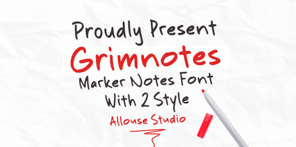 Proudly Presenting, Grimnotes a Marker Notes Font with 2 styles Grimnotes is perfect for any titles, logo, product packaging, branding project, megazine, social media, wedding, or just used to express words above the background. Grimnotes also come with Multi-Lingual Support. Enjoy the font, feel free to comment or feedback, send me PM or email. Thank You!
 - Radugo by Twinletter,
$10.00 Radugo is a san serif font family designed with light strokes that make up a vintage style with a rustic touch and a stamp with 2 fonts, as the ribs in your design work, and able to beautify and strengthen your work in the form of logotypes, typography, hand lettering, packaging, t-shirts, labels, and many more.
 - PR Swirlies 01 by PR Fonts,
$10.10 This font is a collection of simple calligraphic ornaments suitable for invitations, gift tags, and anything that can benifit from a “spoonful of sugar” visually. The "Sand Drift" version combines well with: PR Bramble Wood 1, PR Bramble Wood 2, PR Hallow Doodles 01, PR Hallow Doodles 02, PR Cauldron, PR Swirlies 01], PR Swirlies 05.
 - Resonant Chilliner by Lemonthe,
$9.00 Resonant Chilliner is a spectacular duo font (Serif and Script). Perfect for product packaging, branding project, magazine, social media, and much more. Add this font to your favorite creative ideas and notice how it makes them come alive! NOTE: Quick access beginning and ending swash with ligature, add (2-3)x underscore before or after lowercase a-z.
 - XLaserTrain by Ingrimayne Type,
$14.95 The first release of XLaserTrain, a toy train font, was constructed by taking bits from the four LetterTrain fonts. Version 2, released in late 2010, added a great many cars with holiday and party themes. The bold version has smoke over the cars and you may have to adjust line spacing (leading) to have it display properly.
 - Fd Twist by Fortunes Co,
$9.00 The Twist font is a bold typeface with a playful appearance. I tried to combine 2 fonts inspired by TV broadcasts, mid-century storybooks. It is suitable for broadcast, labels, logos, magazines, clothing and other commercial purposes. You can choose from three styles, regular, round, and rough, so you can get the retro/modern look you want
 - FF Inkling by FontFont,
$30.99 American type designer Joel Decker created this script FontFont in 1997. The family contains 2 weights: Regular and Bold and is ideally suited for advertising and packaging, poster and billboards as well as software and gaming. FF Inkling provides advanced typographical support with features such as ligatures and case-sensitive forms. It comes with proportional oldstyle figures.
 - FF Beadmap by FontFont,
$41.99 British type designers David Crow and Ian Wright created this display FontFont in 2002. The family contains 2 weights and is ideally suited for advertising and packaging, editorial and publishing as well as poster and billboards. FF Beadmap provides advanced typographical support with features such as ligatures and case-sensitive forms. It comes with tabular lining figures.
 - Satimah by Attype Studio,
$13.00 Satimah is a stunning Arabic style typeface that brings an elegant and professional look to any design. With its simple yet refined design, this font is perfect for a wide range of projects, from branding to editorial and beyond. The font also comes with stylistic set 1 and 2, as well as stylistic alternates for some characters, giving you even more creative options. Satimah is particularly well-suited for Islamic design and Islamic theme events, thanks to its beautiful calligraphic flourishes and timeless elegance. With both regular and italic versions, this font is versatile enough to be used in a wide range of design applications. And with multilingual support, you can be sure that your message will be communicated clearly and effectively no matter where your audience is located. Features : - Satimah Family Font - Stylistic Alternates - Stylistic Set - Multilingual, US Roman, Latin 1 Support --- This Font Support Language: Afrikaans, Albanian,Asu, Basque, Bemba, Bena, Breton, Catalan, Chiga, Cornish, Danish, Dutch, English, Estonian, Faroese, Filipino, Finnish, French, Friulian, Galician, German, Gusii, Indonesian, Irish, Italian, Kabuverdianu, Kalenjin, Kinyarwanda, Luo, Luxembourgish, Luyia, Machame, Makhuwa-Meetto, Makonde, Malagasy, ManxMorisyen, North Ndebele, Norwegian Bokmål, Norwegian Nynorsk, Nyankole, Oromo, Portuguese, Quechua, Romansh, Rombo, Rundi, Rwa, Samburu, Sango, Sangu, Scottish Gaelic, Sena, Shambala, Shona, Soga, Somali, Spanish, Swahili, Swedish, Swiss German, Taita, Teso, Uzbek (Latin), Volapük, Vunjo, Zulu, Hope you enjoy with our font! Attype Studio
 - Schotis Text by Huy!Fonts,
$35.00 Schotis Text is a workhorse typeface designed for perfect reading on running texts. Its design is based in Scotch Roman 19th-century style but designed from scratch, with a more contemporary and not nostalgic look. It has seven weights plus matching italics, with 1100 glyphs per font, with a very extended character set for Latin based languages as well as Vietnamese, and shows all its potential with OpenType-savvy applications. Every font includes small caps, ligatures, old-style, lining, proportional and tabular figures, superscript, subscript, numerators, denominators, and fractions. The Scotch Romans were one of the most used letters during the 19th and early 20th century, but they don’t have their own place in the main typographical classifications. They appeared at the beginning of the 19th century with Pica No. 2 in the catalog of William Miller (1813) and assumed the British route towards high contrast and vertical axis modern Romans. In fact, they were called just Modern. In opposition to the continental route of Fournier, Didot, and Bodoni, the English way opted for a wider, more legible letter also resistant to bad printing conditions. The name Schotis comes from the misspelling of Scottish that gave the name to a popular dance in Madrid in the 19th-century. It first was called Schotis and today is knows as Chotis.
 - Gundrada ML by HiH,
$12.00 Gundrada ML was inspired by the lettering on the tomb of Gundrada de Warenne. She was buried at Southover Church at Lewes, Sussex, in the south of England in 1085. The Latin inscription on her tomb, STIRPS GUNDRADA DUCUM, meaning “Gundrada, descendant of the Duke” may have led to the speculation that she was the daughter of William, Duke of Normandy and bastard son of Robert the Devil of Normandy and Arletta, daughter of a tanner in Falaise. In 1066 William defeated Harold at the Battle of Hastings and was crowned William I of England. More commonly known as William the Conquerer, he commissioned a string of forts around the kingdom and charged trusted Norman Barons to control the contentious Anglo-Saxon population. William de Warenne, husband of Gundrada, was one of these Barons. There has also been the suggestion that Gundrada may have been the daughter of William’s wife, Matilda of Flanders, by a previous marriage. According to the Dictionary of National Biography (Oxford University Press, Oxford, England 1921-22), both of these contentions are in dispute. Searching the past of a thousand years ago is like wandering in a heavy fog: facts are only dimly in view. Regardless, I know that I found these letterforms immediately engaging in their simplicity. Unadorned and unsophisticated, they have a direct honesty that rests well in the company of humanistic sans serifs like Franklin Gothic or Gill Sans, appealing to a contemporary sensibility. The lettering on the tomb is in upper case only. Although Gundrada does not sound Norman French to me, her husband certainly and her father probably were Norman French. Nonetheless, the man that carved her tombstone was probably Anglo-Saxon, like most of the people. For that reason, we are quite comfortable with a fairly generic lower case from an Anglo-Saxon document of the time. The time was a time of transition, of contending language influences. This font reflects some of that tension. Features 1. Multi-Lingual Font with 389 glyphs and 698 Kerning Pairs. 2. OpenType GSUB layout features: onum, dlig, liga, salt & hist. 3. Tabular Figures and Alternate Old-Style Figures. 4. Alternate Ruled Caps (line above and below, matching to brackets). 5. Central Europe, Western Europe, Turkish and Baltic Code Pages. 6. Additional accents for Cornish and Old Gaelic. 7. Stylistic alternates A, E, y and #. 8. Ligatures ST, Th, fi and fl. 9. Historic alternate longs. The zip package includes two versions of the font at no extra charge. There is an OTF version which is in Open PS (Post Script Type 1) format and a TTF version which is in Open TT (True Type)format. Use whichever works best for your applications.
 - Geliat by Wahyu and Sani Co.,
$99.99 Geliat would be the youngest brother of Creo, retaining the letterform and proportion but has more geometric looks. This font family comes in two versions which has some different default glyphs. Geliat family has similar letterform with Creo, while the Alt version has common geometric letterform. Italic styles of Geliat were designed using semi-rotalic method. The round parts have 5 degrees italic angle, while the vertical strokes were made in 10 italic degrees. The result gives the styles look more circular than most geometric typefaces with the same 10 degrees italic angle. Each version of Geliat has 2 variable fonts along with 10 different predefined weights from Thin to Heavy with matching italics. Each family member of Geliat also equipped with useful OpenType features such as Ordinals, Superscripts, Scientific Inferiors, Stylistic Sets, Tabular Lining, Standard Ligatures, Fractions, Numerators & Denominators. Each font has 500+ glyphs which covers Western & Eastern Europe, and other Latin based languages. Geliat will be suitable for many creative projects, from logos, posters, presentations, headlines, lettering, branding, quotes, titles, magazines, headings, web banners, mobile applications, art quotes, advertising, packaging design, book title, and more! Sky is the limit!
 - Ropers by Ardyanatypes,
$17.00 Feel how the tones mesmerize you - say HELLO to "Ropers" - a Bold Serif Typeface with agile and alive ligatures and alternates. Designed to use in mid-tones harmonic, the stark contrast of the bold & wondrous uppercase of the regular serif balances calmly to mix matches your works More unique with the ligatures and alternates shape stream will make your typography truly eccentric Ropers are easy to pair with other fonts and no special software is required to type out the standard characters of the Typeface. To access the Opentype Ligatures and Alternates you will need software that supports Opentype features in fonts. super match with various types of works such as promotional themes, greetings, products cover, brands logo, and much more. No need to worry, Ropers are also available in multi-language usage, which makes your work easier. Thank you and have a nice day
 - Whiskey Tango by Missy Meyer,
$15.00 I've been in a vintage-meets-modern mood in my most recent font construction, and this is no exception. Whiskey Tango is a fun retro-style tall and narrow sans-serif font with a scoop of variety: it includes over 110 items in the Private Use Area, including small caps, alternates, ligatures, and ordinal indicators. There's just enough imbalance in stroke widths to make this font a little goofy and quirky, and really charming. All of the lines and curves are clean and sharp, making it great for text that's large, medium, or small. And it's great for crafting as well! As usual for me, this font contains over 300 extended Latin characters for language support, as well as full uppercase and lowercase sets of Greek and Cyrillic characters. And everything, as always, is fully PUA-encoded so all characters are easy to access, no matter what method you use.
 - Museum Fournier by T4 Foundry,
$16.00Museum Fournier is inspired by a set of Rococo capitals designed by Pierre Simon Fournier le Jeune circa 1760. The matrices are part of a set imported to Sweden by J.P. Lindh in 1818 from Breitkopf & Härtel in Leipzig, Germany. They are now in the Nordiska Museum in Stockholm. Type designer Torbjörn Olsson has expanded the original 31 lead matrices in the collection to 55 characters. Please note that the font contains capitals only, no lower case letters and no figures either. Museum Fournier is an OpenType creation, for both PC and Mac. Swedish type foundry T4 premiere new fonts every month. Museum Fournier is our ninth introduction. Museum Fournier is part of the growing Museum type family. Museum also includes three different border fonts, an ornament font with some of Granjon's arabesques and Museum Tertia Cursive, an exquisite 1700's typeface with modern additions. - Rennie Mackintosh Allan Glens by CRMFontCo,
$35.00Since the 2006 launch of Rennie Mackintosh Glasgow, the world’s first lowercase Mackintosh-style typeface, designer George R. Grant has been pleased with its acceptance by Mackintosh lovers around the world. In fact, “Glasgow” has proved to be as popular as the original “founding” font, the classic Charles Rennie Mackintosh Font. By modifying many of these letterforms, and giving a more “freehand” shaping, George has developed this latest offering. The font has irregular “serifs” at the extremities of each stem - a suggestion of being handwritten. The name “Allan Glens” comes from the high school Mackintosh attended which, coincidentally, George did too. Says George, “As the school no longer exists, I wanted a way to perpetuate the Allan Glen’s name in type. I can think of no better way than associating it with the name of one of the school’s most famous sons. One of the glyphs even features the school logo”. - Queulat by Latinotype,
$- Queulat is a hybrid typeface that combines two different styles, reflecting charm, freshness and, especially, a strong personality. The font is inspired by Modern and Grotesk styles. The former is shown in some characteristic features such as teardrop terminals, which give the typeface an attractive unique look, making it an ideal choice for logotypes and labelling. The latter, with its rationality, makes Queulat a stable and strong face for headings and subheadings. The combination of styles can be clearly seen by comparing the regular with the alt version. The regular version is more simple than the alt one. Differently, the alternative version possesses more features of the Modern style, like teardrop terminals in ‘k’ and ‘v’. Queulat also comes with a Unicase version, in which a higher number of shapes can be found, resulting in a unique colourful display.
 - Brda by Linotype,
$29.99Brda originally designed by the Polish designer Franciszek Otto for the Powiat weekly newspaper. Powiat needed a new, dynamically drawn sans serif for its headlines, and Otto's Brda fit the bill. Combining traditional Grotesk letterforms with witty subtleties, like the notched-joint seen in the capital G, Brda displays a novel design that works best when set large. The typeface is named after the Brda river, which runs through Bydgoszcz, Poland, the city where Powiat is published. The Brda family includes three weights, each with a companion italic: Regular, Bold, and Extra Bold. The Brda family's Extra Bold weight was one of the winners selected in the 2003 International Type Design Contest, sponsored by Linotype GmbH. Franciszek Otto also teaches graphic design at the Secondary Art School in Bydgoszcz, where his typefaces rank among the students' favorites. - Queulat Soft by Latinotype,
$- The font is the soft version of the Queulat basic and condensed families, but keeping the same features as the original typeface. Queulat Soft is a hybrid font that combines different styles, reflecting charm, freshness and, especially, a strong personality. The font is inspired by Modern and Grotesk styles. The former is shown in some characteristic features such as teardrop terminals, which give the typeface an attractive unique look, making it an ideal choice for logotypes and labelling. The latter, with its rationality, makes Queulat Soft a stable and strong face for headings and subheadings. The combination of styles can be clearly seen by comparing the Regular with the Alt version. The Regular version is more simple than the Alt one. Differently, the alternative version possesses more features of the Modern style, like teardrop terminals in ‘k’ and ‘v’.
 - Supera Gothic by W Type Foundry,
$25.00 Supera Gothic is a design inspired by the early geometric and humanist typefaces of the 20th century. Its characters draw inspiration from Erbar Grotesk by Jakob Erbar and Johnston by Edward Johnston; hence, in heavier weights, the “f” and “t” bars are pointed which honor Erbar’s work, and Supera’s uppercases and numbers reflect Johnston’s proportions and features. The result is a sans serif family with both, a historical and modern touch perfectly suited for all types of graphic works. Super Gothic comes in 9 weights plus its matching italics and is equipped with a large range of opentype features. Fun fact, Erbar had attended calligraphy classes carried out by Anna Simons, who was a former student of Johnston (Tracy, 1986). Maybe in modern times, they had met through social media, and some collaborative work would have risen, who knows.
 - Malenda by Gold Type,
$12.00 Malenda is my new elegant serif font that will give your projects a touch of luxury and style. It’s perfect for logotypes, branding, monograms and wedding invitations, blog headlines, and more. Browse through all the previews and get as inspired as I was when creating this font. Supported Languages: Armenian, Baltic, Central/Eastern Europe, Cyrillic, Elymaic, English, Ethiopic, Georgian, Old Hungarian, Romanian, Southeast Asia, Western Europe Please contact us if you have any questions, we are happy to help you!
 - Glathen Fantastic by Gold Type,
$12.00 lathen Fantastic is my new elegant serif font that will give your projects a touch of luxury and style. It’s perfect for logotypes, branding, monograms and wedding invitations, blog headlines, and more. Browse through all the previews and get as inspired as I was when creating this font. Supported Languages: Armenian, Baltic, Central/Eastern Europe, Cyrillic, Elymaic, English, Ethiopic, Georgian, Old Hungarian, Romanian, Southeast Asia, Western Europe Please contact us if you have any questions, we are happy to help you!
 - King & Queen by Fikryal,
$18.00 Introducing King & Queen – Display Serif font. This font is very suitable to be applied in various aspects of design, and your branding. Also, it’s perfect for logos, branding, title, social media posts, advertisements, product packaging, product designs, label, photography, watermark, special event, magazine, web designs, etc. Features : King & Queen (All Caps) Multilingual Support, including Latin, Western Europe, Central/Eastern Europe, Baltic, Turkis, Romanian, etc. If you have any questions please don’t hesitate to contact me follow my Instagram: fkryall Thank you
 - Sweet Frosting by Danielle Eneh,
$18.00 Sweet Frosting is a cute script font designed to be reminiscent of a script from a handwritten menu or sign. It will add a quirky, fun but still elegant touch to your designs. The smooth edges create a clean look for your modern design projects. It’s perfect for branding projects, social media posts, product packaging, product designs, labels, and invitations. Sweet Frosting comes with 297 glyphs- including 2 uppercase sets, lowercase, numerals, punctuation and includes 16 ligatures for a more natural handwritten feel. OPENTYPE: Sweet Frosting is an opentype font and recommended for programs that support opentype features such as Adobe Illustrator, Adobe Photoshop, Adobe Indesign, Pages, Word. Please make sure you know how to access these features before purchasing. ➤ What’s Included ❤ 297 glyphs — 2 Uppercase sets, lowercase, numbers, symbols, punctuation, 16 styled ligatures ❤ Multilingual Support : AÀÁÂÃÄÅCÇDÐEÈÉÊËIÌÍÎÏNÑOØÒÓÔÕÖUÙÜÚÛWYÝŸỲŸÆŒßÞþ
 - Kompot Sans by VP Creative Shop,
$20.00 Kompot typeface with 2 styles Kompot Sans is swirly, vintage typeface with 2 styles to enchant your next project. They are loaded alternate glyphs and multilingual support. Very versatile fonts that works great in large and small sizes. Basic latin, advanced latin, basic Cyrillic and advanced Cyrillic character sets are supported! Kompot Sans is perfect for branding projects, home-ware designs, product packaging, magazine headers - or simply as a stylish text overlay to any background image. Uppercase numeral, punctuation & Symbol Regular Outline Alternate glyphs Multilingual support Basic and Advanced Cyrillic support How to access alternate glyphs? To access alternate glyphs in Adobe InDesign or Illustrator, choose Window Type & Tables Glyphs In Photoshop, choose Window Glyphs. In the panel that opens, click the Show menu and choose Alternates for Selection. Double-click an alternate's thumbnail to swap them out.
 - Al Murberry by Aluyeah Studio,
$90.00 Bonjour! Murberry a fashion chic display font. This font was carefully crafted and inspired by one of leading fashion brand in the world. In general, it creates a luxurious and elegant look in design. Coming to you with 50+ luxury ligature and 30+ alternate in 4 weight – light, normal, medium and bold – to create a perfectly beautiful, classy, chic, elegant, and luxurious design. Use this font for your fashion brand, resort, cosmetics, invitations, wedding, branding, packaging, magazines, boutique, social media, restaurant, spa, greeting cards, headers, headline and many more. Features: OpenType support Multilingual support (15 languages) PUA Encoded Super Easy to Use alternates – It’s OpenType support but you can easily call alternates character using special combination like a.2 c.2 e.3 etc so you don't need special software. To get results like the preview just type Mu.2RBe.5RRY
 - Prostir Sans by Kobuzan,
$25.00 Prostir Sans is a powerful typeface of the humanistic sans serif. He strives to be a "workhorse" that does almost any job without unnecessary problems, while remaining expressive enough. Has large x-heights and small ink traps. The typeface looks emotional and feels free, combining smooth curves and contrasting connections. It consists of 2 conditional parts — Basic and Display, which differ in the thickness of diacritical symbols and additional elements. This contrast adds unusual rhythm and liveliness. It has 7 grades in weight and and supports variable, adjustable on two axes, which allows you to fine-tune the desired style with sliders. Features: – Total glyph set: 753 glyphs; – 14 styles (7 weights x 2 widths); – Support 210+ languages; – Latin Extended; – Cyrillic Basic + Bulgarian letters; OpenType features: – Proportional, oldstyle, circled, tabular numerals, superiors, fractions; – Punctuations and symbols; – Arrows; – Stylistic sets; – Ligatures; – Case-sensitive forms.
 - White Stork by Almazova Dolzhenko,
$12.00 White Stork is a handwritten font family which contains two versions Serif and Sans. So you can combine them to get a more interesting design. The font has simple shapes so it will be versatile to use. It will look great for logotypes, quotes, greeting cards, prints, branding design and much more. Hand-drawn font White Stork contains 2 sets of uppercase (serif and sans), 2 sets of lowercase (serif and sans), alternate set of lowercase letters for serif font, ligatures for double f and t letters. Multilingual support is included. Features: Uppercase & Lowercase Serif Uppercase & Lowercase Sans Alternate set of Lowercase Serif Numerals & Punctuation Ligatures (watch preview) Multilingual support Serif and Sans I hope this font will help you to create you unique design. If you have any question, feel free to contact me! Thanks! Lena (instagram @almaz_dolzhe)
 - Al Gracheva by Aluyeah Studio,
$120.00 Grace and Cheval, the inspiration for the name Gracheval. The word "cheva" comes from Old French cheval (horse) and literally means "horsemanship". Gracheva gives the impression of elegance and powerful like a horse galloping on the shore. Gracheva is a premium display typeface that conveys a charming elegance but powerful like a graceful wild horse that can be applied to many areas of design. Coming with 130+ stunning and super easy to use alternates and ligatures. Very suitable for apps, magazine, headline, website, ads, product package and all type of design project you have. Features: OpenType support Multilingual support (15 languages) PUA Encoded Super Easy to Use alternates - You can easily call alternates using special combination like A.2 S.2 A.E R.A etc. To get results like the preview just type G.3R.AC.HE.2V.2A.4
 - Kaizen by Colllab Studio,
$9.00 Presenting Kaizen! A Bold Handbrush Font in 2 Versions. This font made with the perfect combination of each character. You can combine with Extra to get a unique combination. It looks original and can be used for all your project needs. Each glyph has its own uniqueness and when meeting with others will provide dynamic and pleasing proximity. This font can be used at any time and in any project. You can see in the presentation picture above, Kaizen looks unique and Japanese style on design projects. So, Kaizen can't wait to give its touch to all your design projects such as quotes, poster design, personal branding, promotional materials, website, logotype, product packaging, etc. WHAT'S INCLUDED? 1. Kaizen Version One (Solid) • The first version comes with uppercase, lowercase, ligatures, numeral, punctuation, symbols, and Standard Latin Multilingual Support (Afrikaans, Albanian, Catalan, Danish, Dutch, English, French, German, Icelandic, Indonesian, Italian, Malay, Norwegian, Portuguese, Spanisch, Swedish, Zulu, and More). 2. Kaizen Version Two (Inline texture) • The first version comes with uppercase, lowercase, ligatures, numeral, punctuation, symbols, and Standard Latin Multilingual Support (Afrikaans, Albanian, Catalan, Danish, Dutch, English, French, German, Icelandic, Indonesian, Italian, Malay, Norwegian, Portuguese, Spanisch, Swedish, Zulu, and More). 2. Extra Swashes • Included 6 Underline Swashes. You can feature all with typing c_1 until c_6 (in both versions) A Million Thanks Colllab Studio
 - Brokson by Andrey Sharonov,
$25.00 This font pair was crafted by hand under inspiration of old-fashioned typography on different vintage labels, packages, sighs and others. It’s will be a godsend for those who want to add vintage mood to design project. Collection includes Script, Serif and it’s variations like Regular, Rough and Aged. This pair perfectly cooperating with each other. Brokson can be used in different purposes: lettering and logotype, labels, t-shirts, product packaging, advertising and many others. In addition to the basic set, Brokson Script has beautiful alternatives of Uppercase characters, variations of the end for Lowercase and some ligatures. Also, there are two types of end-swashes and eight lengths of each style. Brokson Serif was designed as a secondary and additional font after Script, but in the process of their use I realized it also look great as a priority. Quick combinations for Opentype features: Uppercase Alternates - just add for example «2, 3, or 4» after Uppercase; End-letter - just add «2» at the end of the word; End-swashes (tails) - just add _1, _2, _3… or /1, /2, /3…up to 8, where number is length of tail. This combinations works only with activated Standard Ligatures option in Opentype panel (Adobe Illustrator / Photoshop). Multilingual Support Danish, Dutch, English, Estonian, Faroese, Finnish, French, German, Hungarian, Icelandic, Italian, Norwegian, Polish, Portuguese, Slovene, Spanish, Swedish, Turkish.
 - Mr Robot by Hipopotam Studio,
$16.00 Mr Robot is a typeface designed for our next book for children. We wanted to have a colorful, dimensional and edgy looking letters for headlines. There are three ways to use Mr Robot. You can align three text frames with same text but with different colors and font styles (Regular, Shadow 1 or Shadow 3 and Shadow 2) or with ALLinONE font style but select a different OpenType Stylistic Sets (set 1 is like Shadow 1, set 2 like Shadow 2 and set 3 like Shadow 3). This works great but we don’t like to have unnecessary text frames in our layouts so we added a very cool Contextual Alternates OpenType feature. You just need Mr Robot ALLinONE style and only one text frame. First make sure that Contextual Alternates is off. Type every character three times (RRROOOBBBOOOTTT), select colors for each letter (first letter of every three is a side shadow, second is bottom shadow and third is a front of the dimensional letter). When everything is set just turn Contextual Alternates back on. Styles and alignment will be set automatically. Check out the Users Manual for a visual explanation. For web fonts it is better (at least for now) to use the first method (with font styles) as the OpenType features are not supported in older browsers.
 - Laster by Calamar,
$12.00 Introducing you my NEW Laster Font! It's hand-drawn signature font with dancing baseline and elegant smooth lines that will look awesome on your branding materials, wedding invitations, headings, greeting cards and any other amazing projects you are working on. Laster font includes Upper and Lowercase Basic Characters, Standard and Discretionary Ligatures, Numbers and Punctuation. Laster is also available for Western European, Central European and South Eastern European Languages.
 - TA Modern Times by Tural Alisoy,
$17.00 The Modern Times is the most popular font developed by me. It was sold more than any other of font that I created. The earlier version supported Western Europe, Central/Eastern Europe, Baltic, Turkish, Romanian, Cyrillic, Greek, Georgian languages. Last year, I decided to update it. The new version is called TA Modern Times. Its OpenType features include 1200 glyph, Stylistic Alternates, Stylistic Set 01–12, Standard and Discretionary Ligatures, Numerators, Denominators, Subscript, Superscript, Ordinals, Contextual Alternates and Kerning. Currently, supported languages are as following: Western Europe, Central/Eastern Europe, Baltic, Turkish, Romanian, Cyrillic, Greek, Hebrew. Additionally, the font has multiple styles such as Semi Condensed, Condensed, Extra Condensed, Ultra Condensed, Rounded, Inline, Outline, Semi Expanded, Expanded, Extra Expanded, Ultra Expanded. 6 previous versions of the font are FREE. You may download and enjoy it. Latin Plus languages supported 95% Latin Plus diacritics included 88% TA Modern Times OpenType features list: aalt, calt, case, dlig, dnom, frac, kern, liga, locl, numr, ordn, salt, sinf, ss01, ss02, ss03, ss04, ss05, ss06, ss07, ss08, ss09, ss10, ss11, ss12, subs, sups TA Modern Times graphic presentation at Behance
 - Le Monde Courrier Std by Typofonderie,
$59.00 A rounded slab in 4 styles In our age, since the arrival of microcomputing, the majority of professional letters have been composed in quality typefaces. Typewriters & the typestyles they used have become antiques. A letter set in Times or Helvetica & printed with a laser printer at 600 dpi or more are of such quality that one can no longer distinguish it with a document produced by offset printing. But letters composed in this way appear overly institutional when a bit of informality is needed. Le Monde Courrier, designed by Jean François Porchez, attempts to re-establish a style halfway between writing and printing. Informal neo-tech style This rounded slab serif returns the informal character of “typewritten” fonts to letters and suit well all bad conditions, from inkjet printed memos to webfonts use. With a unique typographic colour, it integrate itself with the rest of the Le Monde family with effective contrast. The verticals metrics and proportions of Le Monde Courrier are calibrated to match perfectly others Typofonderie families. Bukva:raz 2001 Type Directors Club .44 1998 European Design Awards 1998
 - Always by Scholtz Fonts,
$19.00 Always is an elegant script font in six styles. Always makes full use of extravagant ascenders and descenders, giving the font a generous, opulent appearance. To use the font to its best advantage, we suggest that the user allows a generous line spacing. (For example: use multiple line spacing of no less than 1.3 when using the MS Word application). Always comes in six styles, condensed light, light, condensed regular, regular, black and fat, giving the user enough variety for all possible uses. Use a combination of styles for product branding, book covers, greeting cards, wedding media, women’s advertising media. The Always combination will enable you to use different styles of the same font for headings, sub-headings and body text. Always makes use of OpenType features and includes a number of automatic and discretionary ligatures, giving the font a varied, handwritten effect. Always contains over 283 characters - (upper and lower case characters, punctuation, numerals, symbols and accented characters are present) as well as characters for ligatures and alternate characters. It has all the accented characters used in the major European languages.
 - Lamebrain BRK Pro by CheapProFonts,
$10.00 The first handwritten font from CheapProFonts - and what a beauty it is! The original font had no diacritics at all, so all have been designed to fit. This friendly looking font is ready to scribble some notes or something. ALL fonts from CheapProFonts have very extensive language support: They contain some unusual diacritic letters (some of which are contained in the Latin Extended-B Unicode block) supporting: Cornish, Filipino (Tagalog), Guarani, Luxembourgian, Malagasy, Romanian, Ulithian and Welsh. They also contain all glyphs in the Latin Extended-A Unicode block (which among others cover the Central European and Baltic areas) supporting: Afrikaans, Belarusian (Lacinka), Bosnian, Catalan, Chichewa, Croatian, Czech, Dutch, Esperanto, Greenlandic, Hungarian, Kashubian, Kurdish (Kurmanji), Latvian, Lithuanian, Maltese, Maori, Polish, Saami (Inari), Saami (North), Serbian (latin), Slovak(ian), Slovene, Sorbian (Lower), Sorbian (Upper), Turkish and Turkmen. And they of course contain all the usual "western" glyphs supporting: Albanian, Basque, Breton, Chamorro, Danish, Estonian, Faroese, Finnish, French, Frisian, Galican, German, Icelandic, Indonesian, Irish (Gaelic), Italian, Northern Sotho, Norwegian, Occitan, Portuguese, Rhaeto-Romance, Sami (Lule), Sami (South), Scots (Gaelic), Spanish, Swedish, Tswana, Walloon and Yapese.
 - 1456 Gutenberg B42 Pro by GLC,
$42.00 Is it necessary to tell the Gutenberg story? 1456 Gutenberg Pro is the second Gutenberg typeface produced by GLC foundry (look at our 1456 Gutenberg). This font was created from the so called "B42" character set used for the two Gutenberg Latin Bibles (42 and 36 lines), but with a better and finer design than in our first version, more faithful to the finest original printed books appearance. We offer also now a larger choice of the original ligatures and Latin abbreviations, as complete as possible to be usable with OTF specifications. The complete basic alphabet (with "long s" naturally)is strictly looking like the real one (including the curious twisted "X"). We have only recreated the capitals W and J, who was not existing in the time. The numerals, no more existing in the original type set, were inspired from those in use a few years later by early following printers, but matching with the Gutenberg font's pattern. The font includes West (including Celtic), East, Central European, Baltic and Turkish glyphs.