10,000 search results
(0.042 seconds)
- Astarie by Yukita Creative,
$12.00 Astarie is a modern sans with a trendy and not stiff style that will make your poster, cover, or logo more stunning and stand out! This font supports Multi-Language. This font will go well with logos, headlines, titles, and minimal layouts.
 - Food Zone by Seemly Fonts,
$12.00 Food Zone is a childish, easy-to-read display font that conveys impeccable friendliness. Whether you’re using it for crafts, digital design, presentations, or making greeting cards, this font has the potential to become your favorite go-to font, no matter the occasion!
 - MTF Gummy Candies by Miss Tiina Fonts,
$9.00 Gummy Candies is a playful and childish display font. Whether you’re using it for crafts, digital design, presentations, or making greeting cards, this font has the potential to become your favorite go-to font, no matter the occasion! Having no Caps letters.
 - Cheerful Peach by Sakha Design,
$12.00 Cheerful Peach is a cute and playful display font that conveys impeccable friendliness. Whether you’re using it for crafts, digital design, presentations, or making greeting cards, this font has the potential to become your favorite go-to font, no matter the occasion!
 - Blober by LomoHiber,
$- I'm proud to present my Blober. He is a cute young font which will be helpful if you are going to design something cute and lovely. Fill him with pattern or texture and Blober will reflect the emotion in any way you want.
 - erqif by Guixis,
$24.75 This font is a nod to paper notebooks in which a long time ago students made notes. That's why the font looks like written by hand. The inspiration of this family font is the phrase, "Let me go back to the past".
 - People Dingbat by Beewest Studio,
$30.00 People Dingbats Font is high quality dingbats font. Whether you’re using it for crafts, digital design, fashion design, presentations, book cover, magaizine or making greeting cards, this font has the potential to become your favorite go-to font, no matter the occasion!.
 - Teapot by Ingrimayne Type,
$9.00 Teapot is a font with letters on teapots. Upper-case letters have the handles on the right and lower-case characters have the handles on the left. The letters on the teapots are from the typeface InsideLetters. A revision in 2018 added some characters that can be used to create multicolored lettering. A pdf file here shows how to use them.
 - Bowling by Ingrimayne Type,
$14.95 Bowling has letters on bowling pins. On the upper-case keys, the bowling pins are white with black letters and on the lower-case keys the pins are black with white letters. The lower-case letters can be colored and placed behind the upper-case letters to give two-color lettering. (The letters on the pins are from the typeface InsideLetters.)
 - Porkshop by Chank,
$99.00 Porkshop is a font of retro vintage flavor with a hefty dose of immigrant-influenced naive typography. It's fundamentally inspired by an old-but-still-prominent "Pork Shop" sign in Manhattan. I like to think that this font was made by a signmaker's apprentice who didn't yet have a grasp on the subtleties of elegant letterforms, but put his gusto into perfectly sharp serifs. While pointy little serifs are cool, the real shine of this font comes from the imaginative combination of uppercase and lowercase shapes. This unique mixture in the lowercase reminds me of an indeterminate European accent in the big city. Big and strong and easy to understand. Best rendered in 3-foot tall metal type, Porkshop works well in print and on screens, too. The Bolds and Italics are brand new in 2011.
 - Cindie Mono by Lewis McGuffie Type,
$34.99 Cindie Mono is a multi-width display font. Six different widths – A (condensed) through F (super extended) – mathematically correspond with one-another creating a stackable type family. Each face contains all caps full West, Central and East European language support. All diacritics and marks are done in a hairline to add style and contrast. And Cindie Mono is ideal for posters, headlines and display lettering. The inspiration for Cindie Mono came from the lettering styles on optometrists sight-test posters. Then through several stages of development the overall concept for Cindie became of a half-broken Commodore64 and the computer from the 1985 movie 'Weird Science' hooked up to a dot-matrix printer spitting out reams of mechanical but distorted mono-lettering all the while an old modem you can't seem find keeps beeping and beeping and beeping...
 - Galette by Paragraph,
$- Galette is a contemporary all-purpose sans-serif for printing and online delivery, allowing the use of one layout both as printed material and online without loss of quality or legibility. Not only a high resolution printing font with extensive kerning, it was designed from the ground up for clear and uniform display on the computer screen. It displays more predictably than the traditional fonts: no overhangs are used, the stroke thickness of capitals and lower case letters is identical, making hinting or antialiasing smoother at any point size and zoom combination. The hint of Art Nouveau makes the font more expressive and individualistic. A number of alternative capitals allows the font’s expression to be turned up or down at will. A generous complement of accented characters (Western & Eastern European, Baltic, Turkish) enables multi-lingual use.
 - Stretto by Canada Type,
$29.95 Stretto (Italian for narrow) is a revival, correction and expansive update of an Aldo Novarese reverse-stress font called Sintex, which he did for VGC in 1973. Openly idiosyncratic and playfully rebellious in its design, this alphabet fuses the straights and rounds in an unusual manner, riffing on the idea of hand-made sign and wood type forms while adhering to its odd grid’s parameters. In spite of its counter-stress, its legibility is high and even, helped by its unicase forms and very distinct counters. First released in 2007, it became quite popular with film studios and nostalgia designers (Sintex was the font used for David Bowie’s Hunky Dory album and Life on Mars? single). A dozen years later we revisited it for an update. Stretto now comes with over 660 characters and includes Pan European language support.
 - Stellar by Monotype,
$29.99Robert Hunter Middleton drew the original design of Stellar for the Ludlow Typograph Company in Chicago. Work began in the late 1920s, when Middleton was asked to create a sans serif type family to compete with European imports of Futura and Kabel. Stellar was Middleton's attempt to raise the ante. Where Futura and Kabel were geometric in design and monotone in weight, Stellar was based on roman character proportions and stroke weighs were stressed. In the late 1990s, Dave Farey took on the task of reviving the Stellar design. While Ludlow cut Stellar in a full range of point sizes, the family was limited to just a roman and bold design. Farey's revival is twice as large a family. It ranges from a very light called Stellar Nova to a very bold called Zeta In between are Lyra and Epsilon. - Lotto by Canada Type,
$24.95 Designed by expert ad artist Herbert Thannhaeuser for East German foundry Typoart in 1955, Lotto was until now one of the long lost gems of European sign and brush lettering faces. Unlike in Kurier (Thannhaeuser’s other brush face digitized by Canada Type as Puma), the forms’ brush construct uses a series of strokes that are mostly sudden, whimsical, and at times even look like great genius being born out of simple afterthought or straight-forward idiosyncracy. For instance, check out the simple brush pause that is the top of the f, the confident yet welcoming serifs on the T, the similarly-themed C/E and O/Q relationship, and much more. Lotto comes with over 400 glyphs, contains a few alternates and ligatures sprinkled throughout the character set, and includes support for the majority of Latin languages.
 - Hutton by Fettle Foundry,
$10.00 Hutton is a sans-serif typeface with flattened overshoots, such as shoulders, arms, and bowls. There are seven weights, from light to bold, with matching oblique italics. Inspired by using a ruler to write straight lines, and offering additional horizontality to characters, Hutton’s flattened bowls are intended to evoke a sense of flatness and retro influence – as if drawn at a drafting table. Featuring closed counters and low-contrast, Hutton is closely related to grotesque sans serif designs of the 20th Century, but with something a little different. Included is comprehensive European language support with contextual kerning on common diacritic combinations – as well as localised alternatives for languages such as Polish. Also included are two stylistic sets, which feature characters with a more geometric quality or a more humanistic quality, depending on which you would like to bring to your design.
 - Duero by Eurotypo,
$34.00 The Duero is one of the major rivers of the Iberian Peninsula, flowing from its source across northern-central Spain and Portugal to its outlet at Porto. The "Duero viñatero", is an area of the Duero Valley where its famous wines are produced. "Duero", a new script font designed by Olcar Alcaide. Its slight bounce and intentional irregularity gives your words a wonderful flow. The thick and thin strokes in this typeface combine balance and harmony. "Duero" has OpenType features such as Stylistics and Contextual alternates, Swashes, Ligatures, that allow you to mix and match pairs of letters and a Central European language support to fit your design. This will help your creativity and make it easier to make the impressive and elegant typographic work. "Duero" looks good on food packaging, logo design, business-cards, fashion, magazines, menus, book covers and much more!
 - Banknote 1948 by Ingo,
$39.00 A very expanded sans serif font in capital letters inspired by the inscription on a bank note Old bank notes tend to have a very typical typography. Usually they carry decorative and elaborately designed markings. For one thing, they must be practically impossible to forge and for another, they should make a respectable and legitimate impression. And in the days of copper and steel engravings, that meant nothing less than creating ornate, shaded or otherwise complicated scripts. Designing the appropriate script was literally in the hands of the engraver. That’s why I noticed this bank note from 1948. It is the first 20 mark bill in the then newly created currency ”Deutsche Mark.“ All other bank notes of the 1948 series show daintier forms of typography with an obvious tendency toward modern face. The 1949 series which followed shortly thereafter reveals the more complicated script as well. For whatever reason, only this 20 mark bill displays this extremely expanded sans serif variation of the otherwise Roman form applied. This peculiarity led me in the year 2010 to create a complete font from the single word ”Banknote.“ Back to those days in the 40’s, the initial edition of DM bank notes was carried out by a special US-American printer who was under pressure of completing on time and whose engravers not only engraved but also designed. So that’s why the bank notes resemble dollars and don’t even look like European currency. That also explains some of the uniquely designed characters when looked at in detail. Especially the almost serif type form on the letters C, G, S and Z, but also L and T owe their look to the ”American touch.“ The ingoFont Banknote 1948 comprises all characters of the Latin typeface according to ISO 8859 for all European languages including Turkish and Baltic languages. In order to maintain the character of the original, the ”creation“ of lower case letters was waived. This factor doesn’t contribute to legibility, but this kind of type is not intended for long texts anyway; rather, it unfolds its entire attraction when used as a display font, for example on posters. Banknote 1948 is also very suitable for distortion and other alien techniques, without too much harm being done to the characteristic forms. With Banknote 1948 ingoFonts discloses a font like scripts which were used in advertising of the 1940’s and 50’s and were popular around the world. But even today the use of this kind of font can be expedient, especially considering how Banknote 1948, for its time of origin, impresses with amazingly modern detail.
 - STP Stencil by Sete Std,
$30.00 Developed from the STP Display, the STP Stencil Typeface follows the same characteristic premise as its sister, in addition to composing the same number of Latin characters. What distinguishes them it’s that the STP Stencil can be applied more easily anytime, anywhere, increasing the possibility of being used in a more craft and artistic way. Since it has characteristics of a stencil font, it brings a more urban and contemporary look, which makes ideal to use it in public spaces with large circulation of people. In addition, wayfinding, architectural, advertising, packaging, posters, among others projects, are a good request for STP Stencil show its vigor and all its beauty. The STP Stencil is a modular feature source, perfect to use it in major event signaling projects or similar. It can also be useful in any demands that requires improvisation and quick solutions. The STP Stencil has very expressive forms and counterforms, but still counts with the practicality of a stencil source and its infinite possibilities of use. With a complete Latin alphabet, STP Stencil covers over 90% of the supported languages, covering the entire American continent, East and West Europe and most of the countries of Africa, Asia and Oceania.
 - Anuschka by Anomali Creative,
$10.00 Introducing **ANUSCHKA** - Faux Cyrillic Display Font Faux Cyrillic, pseudo-Cyrillic, pseudo-Russian or faux Russian typography is the use of Cyrillic letters in Latin text, usually to evoke the Soviet Union or Russia, though it may be used in other contexts as well. It is a common Western trope used in book covers, film titles, comic book lettering, artwork for computer games, or product packaging which are set in or wish to evoke Eastern Europe, the Soviet Union, or Russia. A typeface designed to emulate Cyrillic is classed as an ethnic typeface. **ANUSCHKA** came with that protest and propaganda vibe. It's contain a complete Simple Latin Glyphs, with extra ligatures, D-Ligature, Stylistic set for the main character to make it stencil look and distressed look. --- This font can be used with all software that can read standard fonts. Check out my instagram: https://www.instagram.com/anomalicreatype/ Thanks so much for checking out my shop! All the best, **Krisna Teja** Anomali Creatype #typeface #Stencil #FauxCyrillic #Cyrillic #Military #Protest #Poster #vintage #Extreme #design #Vintage #graphic #calligraphy #Retro #typography #propaganda #Poster #blackletter #retrostyle #illustration #Russian #socialist #character #set #uppercase #decorative #black #classic #Uppercase #handmade #capital #bold #number #modern #tattoo #english #art #label #logo #middle #typographic #antique #sign #letterhead #fashion #filmtitles #russia #comicbooklettering #videogames #computergames
 - Arista Sans by Dora Typefoundry,
$18.00 Arista Sans is a true sans serif typeface enhanced with bold, high-contrast geometric shapes. Arista is perfect if you want to try to make your presentation perfect for all purposes, social media graphics or other designs. And of course you can use this font and pair it well with a bold sans serif. Features: All Caps Font with different uppercase and lowercase Number & Symbol Supported Languages Alternates and Ligatures PUA Encoded What is included: Arista Sans Regular Arista Sans Outline We highly recommend using a program that supports OpenType features and Glyphs panels like Adobe apps and Corel Draw, so you can see and access all Glyph variations. This type of family has become the work of true love, making it as easy and fun as possible.I really hope you enjoy it! if you have any questions or problems please contact email:doratypefoundry@gmail.com Thank you Enjoy the font and go get creative :)
 - Sticky Fingers by Comicraft,
$19.00 LOOK OUT! It's kinda creepy, we know, but we're convinced that this font does whatever a spider can -- in fact, we believe it can actually spin a web of pretty much any size, and even catch thieves as if they were bugs of some sort -- let's say flies. In fact we'd almost go so far as to say that, in the chill of night (perhaps at the scene of a crime) this font may just arrive like a streak of light in the nick of time. We're releasing this font now not for wealth or fame, we ignore those things, action is our reward. Here at Comicraft we think of life as a great big bang up, and whenever there's a hang up, you won't find us climbing -- or crawling -- the walls... well, not without STICKY FINGERS anyway. Find yourself a pair of webshooters and this font is the perfect complement to any Halloween costume.
 - Sanseki by Hanoded,
$20.00 The term Sanseki (Japanese for Three [Brush] Traces) is used to describe three famous Heian period calligraphers: Yaseki, Gonseki and Saseki. Not that I would ever dream of comparing my messy brush-work with theirs, but the name stuck and I kind of liked it. I used Chinese ink and a high quality brush (which I got in a sale actually) to create this font. All glyphs were hand painted in one go! Sanseki is a very detailed brush font. Upper and lower case letters mingle and there’s even an alternate for every lower case glyph. Comes with an abundance of diacritics.
 - French Plug by HiH,
$8.00 Frank H. Atkinson was a popular Art Nouveau sign painter in Chicago, Illinois. He designed signs for the Cadillac Motor Car Co., Chicago Academy of Fine Arts and the department store Marshall Field. Oddly enough, he even designed signs for other sign painters. In 1908 he published a book, Sign Painting, which sold well. French Plug, a bold, rounded, all-cap design in an American Art Nouveau style from that book. It has a relaxed, easy-going informality that is useful for ads and flyers. It also would have fit very nicely with many French posters of the period.
 - Brandan by Andfonts,
$69.00 If you're looking for the perfect font to make your logo stand out, then look no further than Brandan font. This modern and cool font is sure to give your logo, text, or any other design element a unique and eye-catching look. Whether you're looking for a font for a logo, lettering, website, or something else entirely, Brandan font has got you covered. Plus, it looks great on both light and dark backgrounds, so you know your design is going to look nice no matter where it's seen. Check out Brandan font today and give your design a professional edge!
 - Praha Nouveau by Matt Frost,
$30.00 I found this type specimen on the statue of Jan Hus in Prague’s Old Town Square. The statue was designed in 1903 by Ladislav Saloun, and its writing is the cutest Nouveau font I've ever seen. Filling in the blanks, I realized the need for a standard lower case because the caps are so wild. The result is a very type-able and dynamic Nouveau. I encourage you to mix up your upper and lower cases for curious results. Use the lower case for running type. Go to http://facebook.com/frostfoundry to share this and see more!
 - Fruity Splash by Olivetype,
$18.00 Introducing Fruity Splash, the perfect way to add a playful and fun touch to your project! This display font is ideal for creating eye-catching logos, product packaging, and headlines that stand out from the competition. With its unique blend of hand-drawn lettering and vibrant vibes, Fruity Splash will give your design an energizing energy that won't go unnoticed! Its bouncy curves are sure to make any text pop with life. Features : Basic Latin Uppercase and Lowercase Numbers, symbols, and punctuations Multilingual Support. Fully accessible without additional design software Simple Installations works on PC & Mac Thank You
 - The overthinkers by Joanne Marie,
$26.00 The overthinkers is a semi script hand lettering font for all of your hand lettering designs! With two sets of uppercase glyphs, three sets of lowercase and over 230 ligatures no two words will be same! So your designs will truly look hand lettered. With so much choice be careful not to overthink your designs ;). This font is perfect on it’s own or you may like to use it with your existing hand lettering fonts. Go ahead and try it out - it’ll compliment any design! It’s perfect for merchandise and food packaging, book designs, logos and much more.
 - Tastykare by Invasi Studio,
$17.00 Are you looking for a font that's as delicious as your favorite food? Meet Tastykare Font! It's a playful, all caps display font that gives your designs a retro-bold, bouncy vibe. Whether you're working on a menu, a recipe book, or a food blog, this font is perfect for anything culinary. Tastykare Font is super versatile, with alternates and multilingual support. So, it doesn't matter if you're cooking up a flyer for a local event or a poster for a big campaign - this font has got you covered. So, go ahead and satisfy your hunger for design with Tastykare Font!
 - Fonde SS by Sensatype Studio,
$15.00 fonde is a elegant chic font for brand, logo and quotes design. Based on our experience as a graphic designer who works for a lot of companies, we often are requested to design a logo in a unique style but with an elegant shape. So, we try to brainstorming and create this font to make the idea is going out. This is perfect for BRANDING and LOGO DESIGN. You will get classy, elegant, and certainly unique logos with this font. fonde is also included full set of: uppercase and lowercase letters multilingual characters numerals punctuation Wish you enjoy our font. :)
 - White Signature by Lunas Type,
$19.00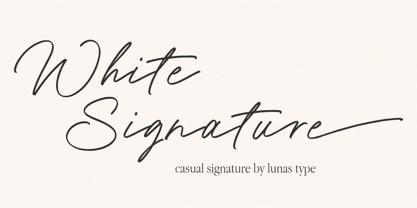 Introducing, White Signature! A versatile and captivating font that combines the casual charm of handwriting with the elegance of a signature style. This font is designed to elevate various design needs, offering a perfect balance between approachability and sophistication. With its fluid letterforms and relaxed strokes, White Signature brings a sense of authenticity and personality to any project. Whether used for branding, invitations, packaging, or social media graphics, this font adds a touch of refinement and individuality. Let White Signature be your go-to choice for creating designs that exude a casual yet elegant vibe, making a lasting impression on your audience.
 - Good Show by HIRO.std,
$17.00 Good Show is a Bold Script Font This font describes about stylist, humanist, dynamic, funny, easy going, cool, and easy to use and will bring a good harmony when the letters are connected and paired each other. Good Show inspired from pop culture era. FEATURES - Uppercase and Lowercase letters - Support Opentype Features - Contextual Alternates - Stylistic Alternates - Numbering and Punctuations - PUA Encoded Characters - Multilingual Support - Works on PC or Mac - Simple Installation USE Good Show works great in any Branding, Logotype, Apparel, Poster, Product Packaging, Advertisement, Label, Product Design, Magazine and any projects that need Bold Handwritten Font. Enjoy using! Thanks. HIRO.std
 - Chalky Fingers by Jeremy DV Boyd,
$14.00 Chalk lettering without the mess! Chalky Fingers was designed by a genuine chalkboard artist as his go-to hand-lettering style for custom illustrating menu boards for bars and cafés – now available for all to enjoy as a font. A rough textured font, hand-drawn with real artists’ chalks and perfect for use on restaurant & cafe menu boards, signage, posters, displays, t-shirts, social media quotes, children’s books and food packaging. Chalky Fingers includes loads of swashes and arrows to give extra emphasis to your messages. Numbers, punctuation and multi-language characters are all included. Enjoy getting Chalky Fingers!
 - Back To School by MDF,
$4.00 The Back to School Doodle font is a delightful and imaginative typeface that captures the essence of the back-to-school season with its playful doodles and vibrant charm. Each letter is adorned with whimsical illustrations, reminiscent of a child's doodles on a classroom desk. This font features hand-drawn characters filled with fun and colorful details. From doodled stars, pencils, and books to playful arrows, apples, and globes, every letter is an artwork in itself. The doodles add a sense of excitement and creativity to the font, making it perfect for capturing the spirit of going back to school.
 - Buena by mazefonts,
$53.00 Hello Buena - From Wood to Digital Type Buena is the first word I read on a letterpress paper, printed by my colleague and friend Wolfgang Wick. I was fascinated by the power of this fat wooden letters at first glance. So I started to create a digital version of it and »Buena Black« was born. Due to the fact that the original punches had only upper- case glyphs, I created the lowercase characters by myself. After that it was time to design the family... Buena is full of OpenType features. To get fully acces, go to www.mazefonts.de and Download the Type Specimen.
 - Pardesi by Hanoded,
$15.00 Pardesi font is named after a song from Raja Hindustani, a 1996 Bollywood movie directed by Dharmesh Darshan. The lead roles were played by Aamir Khan and Karisma Kapoor. Together they sing: 'Pardesi, pardesi, jaana nahi', meaning so much as: 'Foreigner, foreigner, don't go'. I remember this song very well, as I was backpacking through India and Nepal at the time and it was played over and over again on all long distance buses I took. Pardesi font is a fat, rounded, marker-pen font, ideal for books and posters. It comes with extensive language support.
 - Chromosome by Three Islands Press,
$19.00 It hit me one day that the '60s-vintage labelmaker I had lying around might make an interesting display face. I began playing with it -- clicking out letters at various pressures, scanning the results, going over the scans in a vector-graphics program. Looked pretty good. To my chagrin, however, I soon afterward got a glimpse of someone else's label-tape font. Though modeled after a more modern device, its rocketing popularity prompted me to set Chromosome aside for a year or so. Finally finished it up in late-1995. Full release has light and heavy weights, regular and reversed styles.
 - Fox Love by Fox7,
$16.00 Fox Love is a cute and fun color font. This font is your go-to for crafting cute greeting cards that express affection and warmth. Whether you’re a designer, a social media influencer, or someone with a penchant for creative expression. Fall in love with its authentic feel and use it to create gorgeous invitations, beautiful stationary art, eye-catching social media posts, and cute greeting cards. 🌺🌺 Learn more about color font support on third-party apps here: https://www.colorfonts.wtf/ 🌺🌺 🌺🌺 Please note that the Canva do not support color fonts! 🌺🌺
 - Floral Decay by Mircea Boboc,
$22.00 This is Floral Decay, your seasonal autumn font with jaded, weathered, and earthy contours of rustic lettering. As they blend into words, the characters evoke floral arrangements of a decaying beauty. It is versatile, playful, and perfect for Graphic Design decorations! This font is unique because, in order to create it, I had to answer some tricky questions: What makes autumn… autumn? Capturing the essence of the other seasons into your letters comes easier. For instance, in order to suggest summer, you only need to draw a few flowers. How about autumn? You could garnish your letters with a few grapes, you might think, but it would only result in a grape-themed font. The notion that is more directly associated with autumn is the image of falling and withering leaves, which brought me to the second question. How exactly are you going to create something beautiful out of a somewhat morbid premise, like wilted leaves? Well, I soon realized that by creating a handwritten font and preserving the right imperfections, you can actually portray collateral beauty. In this context, asymmetry is important because it suggests decay. Further on, the design concept required the letters to come very close together, so that every typed word can be regarded as a floral arrangement. How close together, though? As much as possible without confusing one with the other, risking a lack of legibility. Therefore, in contrast with the demo version of this font, this actual version provides the ideal kerning.
 - Ductus by Thomas Jockin,
$35.00 Ductus is a five weight typeface that is both ancient and contemporary. Drawing on various sources such as rustic capitals, Naskh arabic calligraphy, and black-letter, Ductus is a reflection on how the broad-nib pen can be relevant for today’s designer.