10,000 search results
(0.149 seconds)
- Europa Grotesk SH by Scangraphic Digital Type Collection,
$26.00 Since the release of these fonts most typefaces in the Scangraphic Type Collection appear in two versions. One is designed specifically for headline typesetting (SH: Scangraphic Headline Types) and one specifically for text typesetting (SB Scangraphic Bodytypes). The most obvious differentiation can be found in the spacing. That of the Bodytypes is adjusted for readability. That of the Headline Types is decidedly more narrow in order to do justice to the requirements of headline typesetting. The kerning tables, as well, have been individualized for each of these type varieties. In addition to the adjustment of spacing, there are also adjustments in the design. For the Bodytypes, fine spaces were created which prevented the smear effect on acute angles in small typesizes. For a number of Bodytypes, hairlines and serifs were thickened or the whole typeface was adjusted to meet the optical requirements for setting type in small sizes. For the German lower-case diacritical marks, all Headline Types complements contain alternative integrated accents which allow the compact setting of lower-case headlines.
 - Bonning by Greater Albion Typefounders,
$8.95 Bonning is a Roman face full of the spirit of the 1920s. It was inspired by a (real)estate agent's For Sale board seen in an old sepia photograph from that era and combines visual flair and period with good clear legibility. A range of Opentype features including alternate forms, old style numbers and fractions, as well as discretionary and standard ligatures are included. Three weights are offered, including a shadowed black form are offered, all in a choice of three widths. It's the ideal face for signage with a period feel, as well as posters, headings and feature paragraphs.
 - Europa Grotesk No. 2 SH by Scangraphic Digital Type Collection,
$26.00 Since the release of these fonts most typefaces in the Scangraphic Type Collection appear in two versions. One is designed specifically for headline typesetting (SH: Scangraphic Headline Types) and one specifically for text typesetting (SB Scangraphic Bodytypes). The most obvious differentiation can be found in the spacing. That of the Bodytypes is adjusted for readability. That of the Headline Types is decidedly more narrow in order to do justice to the requirements of headline typesetting. The kerning tables, as well, have been individualized for each of these type varieties. In addition to the adjustment of spacing, there are also adjustments in the design. For the Bodytypes, fine spaces were created which prevented the smear effect on acute angles in small typesizes. For a number of Bodytypes, hairlines and serifs were thickened or the whole typeface was adjusted to meet the optical requirements for setting type in small sizes. For the German lower-case diacritical marks, all Headline Types complements contain alternative integrated accents which allow the compact setting of lower-case headlines.
 - Quropa - Unknown license

- Neuropa by Device,
$39.00 Neuropa is a five-weight extended sans that projects a muscular corporate authority. The bowls of the rounded characters use an ‘obround’ form, and the apexes of the A and V and the uprights on the D and E are curved to suggest a sleek modernity.
 - VLNL Bon Bon by VetteLetters,
$35.00 Exuberantly delicious and lusciously sweet! VLNL Bon Bon embodies the perfect after dinner treat. Chocolate is a known aphrodisiac and bonbons are its most romantic carrier. Bonbon is not for nothing the French word for ‘good’ twice! You could definitely consider VLNL Bonbon the typographic equivalent of these exquisite chocolate sweets. Inspired by lettering on an Amsterdam church facade and a ladies clothing store window, Donald DBXL Beekman started drawing the first incarnation of Bon Bon already in 2004. The original idea was an alphabet design with slanted oval inner shapes and extremely long and striking serifs. This proved to be a quite demanding design job, so It took Bon Bon some time to get finished. But now it’s here in all its extravagant glory. Most recently a number of lowercase characters were added to make Bon Bon more versatile. Totally insane and over-top-the-top it has been called. But hey, we all love Bon Bon. Don't we?
 - Europa Text by Solotype,
$19.95This circa 1910 European face was introduced into the United States by a German type foundry traveling salesman during the great depression of the 1930s. We have used it quite successfuly in sizes as small as 10 and 12 point. - Hebrew Europa by Samtype,
$125.00 Beautiful font, good for posters, books, and folders. This is a complete font with all diacritic marks (Nikud and Taamim) and also Shevana, Kamatz Katan, Dagesh Chazak and Holam chaser.
 - TC Europa by Monotype,
$29.99Europa gives a rectangular appearance to words. Strokes have lightly flaired terminals to give the effect of serifs. The Europa font is excellent for headlines in journals. - Europa Grotesque by Red Rooster Collection,
$49.00 Europa Grotesque is a condensed sans serif font family that was originally designed by Sam Ardell (TP) in the 1950’s for the Techni-Process Collection. Steve Jackaman (ITF) acquired the rights to the TP Collection in 1991 and produced Europa Grotesque in its digital form in 1994. Europa Grotesque has impressive impact at display and subhead sizes, and its geometric forms sustain that distinctiveness in both all-caps and lowercase. The family is flexible and freeform enough to support both a laid-back feel while still feeling tight and controlled.
 - BON ViVER - Unknown license

- Bon Guia by T-26,
$29.00 - Bon Voyage by Great Lakes Lettering,
$24.00 Based on the handwriting of Taryn Sutherland of Twinkle and Toast. Great Lakes Lettering is thrilled to release Bon Voyage. Add a flair of elegance and whimsy to your DIY designs.
 - Bon Ami by Fontop,
$12.00 Bon Ami is a hand lettered condensed font perfect to add a fun feel and individual look to everything you create including cards & invites, logos, souvenirs, stationary, and so on. It also works perfectly when pairing with other fonts, f.e. with my Paramaribo font (as in the image with the cupcake). The font consists of Latin multilingual support as well as uppercase letters, lowercase letters, numbers and basic punctuations.
 - Bon Foyage by Ahmad Jamaludin,
$15.00 Start new year for new font! present to you, Bon Foyage! Bon Foyage is a Vintage modern serif typeface with unique letterforms, beautiful alternative glyphs, and complete multilingual support. Every letter has a subtle uniqueness to it, from the alternate letterforms of "g, j, y", these glyphs are memorable! This font is perfect for editorial projects, logo design, clothing branding, product packaging, magazine headers, or simply as a stylish text overlay to any background image. Features : Unique letterforms Works on PC & Mac Simple Installations Accessible in the Adobe Illustrator, Adobe Photoshop, Adobe InDesign, even work on Microsoft Word. PUA Encoded Characters Fully accessible without additional design software. Follow my shop for upcoming updates including additional glyphs and language support.
 - Bon Apetit by Monotype,
$29.99Food stuff - Bon Apit by Papermode Co,
$16.00 Bon Apit is a monoline script typeface with extra features. Bon Apit comes in a handmade style and can perfectly be used for an elegant addition to any logo, invitation, product packaging, hand-written quote, greetings card, labels, logos, magazines, books, greeting/wedding cards, packaging, fashion, stationery, novels, labels or any type of advertising purpose. Includes multi-lingual support and special ligatures If you do not have programs that support OpenType features like Adobe Illustrator and CorelDraw X Versions, you can access all alternates using Font Book (Mac) or Character Map (Windows). Thank you!
 - Eunoia by Shinntype,
$39.00 Eunoia is an eye-popping, high-contrast, condensed, geometric, sans serif typeface. The family is not, as is usual, built around variance in weight or skew, but alternate letterforms. Eunoia is a system of six fonts with interchangeable characters. Use the fonts individually (each has a quite distinct personality), or mix and match to create eunique wordmarks.
 - Aurora by Bitstream,
$29.99 One of the classic old German large x-height Grotesques revised and still in use, identifiable by the rounded form of certain diagonal strokes.
 - Eutopia by Tipofil,
$- I was inspired by the letters of the mythical “Ideales” tobacco package, designed in 1936 in Barcelona by Carlos Vives, director of the designers studio of the Rieusset graphical industry. We have also studied other geometrical models from the 1920s, to be highlighted among them the alphabet drawn by Cornelis André Vlaanderen at Amsterdam in 1928, which would have been very probably the inspiration for the famous tobacco package. Eutopia has been born with the aim to be useful for the current graphic communications. For that purpose almost 400 glyphs have been designed and more than 2200 kerning pairs have been defined. The multiple diacritic signs have been prepared to allow a multilingual use in most of the languages based on Latin alphabet. The OpenType features have been used to get alternate characters of “A” and “g”, and also ligatures, lowercase numbers and other typographic refinements.
 - Kuroga by Grontype,
$10.00 Kuroga is a captivating and distinctive handwriting font that effortlessly blends artistry with legibility. Every stroke of this unique typeface exudes personality and charm, making it stand out in the realm of handwritten fonts. The letters flow seamlessly, creating a rhythmic and organic appearance that mimics the natural ebb and flow of handwriting. Kuroga is Perfect for quotes, packaging, cards, posters, stickers, social media posts and more! Features: Unique Swash Basic Latin Glyphs Uppercase and Lowercase Letters Ligatures & Alternate Numeral and Punctuation Multilingual Support Thankyou for picking up this font, hope you enjoy it. Regard, grontype
 - Eurobia by Greater Albion Typefounders,
$24.00 Eurobia is a family of two typefaces - Regular and Plain. They are display faces with a strongly European feel and a strong flavour of the 1920s. My suggestion would be to use them for poster or banner work, or packaging or cover design, with the heading text set in Eurasia Regular and subsidiary text set in Eurobia plain. Why not give that European flavour to your next project? We see Eurobia as a fun typeface, for advertising products like confectionery or concerts. We had a lot of fun designing it and hope you'll like it too!
 - Aurora by Tilde,
$39.75 - Euroque by CozyFonts,
$20.00 Euroque is the 23rd font family from Cozyfonts Foundry, a California Foundry established in 2012 by designer and typographic illustrator Tom Nikosey Euroque began with pencil sketches, as all my fonts trace their beginnings. Influenced by European poster art of the 1920s and 1930s Euroque takes its name almost literally, European Style. These fonts are designed as a Small Caps Family, where the lower case mirrors the Upper case in design but its weights are compatible and consistent.
 - Euroika by Ingrimayne Type,
$12.95 Crisp and clean with a non-traditional italics, Euroika is a decorative, serifed alphabet. The letters have high contrast between the thick and thin strokes and the lower-case letters have a small x-height. The family consists of ten members.
 - EuroSans by profonts,
$41.99 Euro Sans Pro ? created by German type designer Ralph M. Unger - is a classical and modern Roman Sans Serif at the same time. The family comprises of 12 styles, each with more than 500 glpyhs covering standard Latin, Central European, and Cyrillic. It is an all purpose typeface, a strong and expressive roman sans serif with a French touch to it. Euro Sans Pro provides excellent readability in all sizes, for small copy as well as for very large letters on posters and signs. The character complement also includes small caps and old style figures, and the corresponding OTF features are built into the fonts as well.
 - D3 Euronism Bold - Unknown license

- CR2 by T-26,
$19.00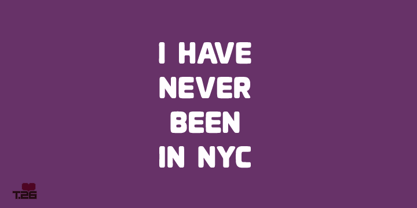
- Quropa Hollow - Unknown license

- Times Europa LT by Linotype,
$29.99In 1931, The Times of London commissioned a new text type design from Stanley Morison and the Monotype Corporation, after Morison had written an article criticizing The Times for being badly printed and typographically behind the times. The new design was supervised by Stanley Morison and drawn by Victor Lardent, an artist from the advertising department of The Times. Morison used an older typeface, Plantin, as the basis for his design, but made revisions for legibility and economy of space (always important concerns for newspapers). As the old type used by the newspaper had been called Times Old Roman," Morison's revision became "Times New Roman." The Times of London debuted the new typeface in October 1932, and after one year the design was released for commercial sale. The Linotype version, called simply "Times," was optimized for line-casting technology, though the differences in the basic design are subtle. The typeface was very successful for the Times of London, which used a higher grade of newsprint than most newspapers. The better, whiter paper enhanced the new typeface's high degree of contrast and sharp serifs, and created a sparkling, modern look. In 1972, Walter Tracy designed Times Europa for The Times of London. This was a sturdier version, and it was needed to hold up to the newest demands of newspaper printing: faster presses and cheaper paper. In the United States, the Times font family has enjoyed popularity as a magazine and book type since the 1940s. Times continues to be very popular around the world because of its versatility and readability. And because it is a standard font on most computers and digital printers, it has become universally familiar as the office workhorse. Times™, Times™ Europa, and Times New Roman™ are sure bets for proposals, annual reports, office correspondence, magazines, and newspapers. Linotype offers many versions of this font: Times™ is the universal version of Times, used formerly as the matrices for the Linotype hot metal line-casting machines. The basic four weights of roman, italic, bold and bold italic are standard fonts on most printers. There are also small caps, Old style Figures, phonetic characters, and Central European characters. Times™ Ten is the version specially designed for smaller text (12 point and below); its characters are wider and the hairlines are a little stronger. Times Ten has many weights for Latin typography, as well as several weights for Central European, Cyrillic, and Greek typesetting. Times™ Eighteen is the headline version, ideal for point sizes of 18 and larger. The characters are subtly condensed and the hairlines are finer. Times™ Europa is the Walter Tracy re-design of 1972, its sturdier characters and open counterspaces maintain readability in rougher printing conditions. Times New Roman™ is the historic font version first drawn by Victor Lardent and Stanley Morison for the Monotype hot metal caster." - Times Europa Office by Linotype,
$50.99The Times Europa Office family is designed after the model of the original serif family produced by Walter Tracy and the Linotype Design Studio in 1974. A redesign of the classic Times New Roman typeface, Times Europa was created as its replacement for The Times of London newspaper. In contrast to Times New Roman, Times Europa has sturdier characters and more open counter spaces, which help maintain readability in rougher printing conditions. Times Europa drastically improved on the legibility of the bold and italic styles of Times New Roman. Overall, text set in Times Europa is easier to read, and quicker to digest. Akira Kobayashi, Linotype’s Type Director, brought Times Europa up to speed for the new millennium in 2006. Now optimized for office communication instead of newspaper design, Times Europa Office offers a familiar yet refreshingly new appearance for serif text. Because of The Times of London’s specific printing conditions in the early 1970s, Times Europa originally had some intentional errors built into its letterform design. These inconsistencies created an even image in newspaper text in the long run. However, these design elements bear no role on modern office communication and its needs. Kobayashi redrew these problem forms, eliminating them completely. Now Times Europa’s font weights appear clearer and easier to read than ever before. - Europa Grotesk SB by Scangraphic Digital Type Collection,
$26.00 Since the release of these fonts most typefaces in the Scangraphic Type Collection appear in two versions. One is designed specifically for headline typesetting (SH: Scangraphic Headline Types) and one specifically for text typesetting (SB Scangraphic Bodytypes). The most obvious differentiation can be found in the spacing. That of the Bodytypes is adjusted for readability. That of the Headline Types is decidedly more narrow in order to do justice to the requirements of headline typesetting. The kerning tables, as well, have been individualized for each of these type varieties. In addition to the adjustment of spacing, there are also adjustments in the design. For the Bodytypes, fine spaces were created which prevented the smear effect on acute angles in small typesizes. For a number of Bodytypes, hairlines and serifs were thickened or the whole typeface was adjusted to meet the optical requirements for setting type in small sizes. For the German lower-case diacritical marks, all Headline Types complements contain alternative integrated accents which allow the compact setting of lower-case headlines.
 - European Soft Pro by Bülent Yüksel,
$19.00 EUROPEAN SOFT PRO ABOUT FAMILY: What makes "European Soft Pro" elegant, friendly and contemporary is its very rounded curves with very open terminals. "European Soft Pro" has been designed with a higher "x-height" than other fonts in its class to make tiny readability more obvious in any use situation. It will be ideal for use in small sizes such as business cards or mobile applications. This typeface is also equipped with powerful OpenType features to satisfy the most demanding professionals. It has solid features like case sensitivity, small, true capitals, full ligatures, tabular figures for tables, old style figures to elegantly insert numbers into your sentences and more alternative characters to give personality to your projects. The extended, "European Soft Pro" supports around 85 languages in the Latin, Cyrillic and Greek scripts, and its non-Latin components were developed with native consultants. With over 1200+ glyphs per style, "European Soft Pro" cares about localised letterforms and has the OpenType features to match. FEATURE SUMMARY: - 9 weights: Thin, ExtraLight, Light, Book, Regular, Medium, Bold, ExtraBold, and Black. - 4 widths: Normal, Narrow, Condensed, and Extra Condensed. - Matching italics (12º) for all weights and widths . - Matching small caps for all weights and widths. - Lining and old style figures (proportional and tabular). - Alternate characters (A, G, M, N, R, U, a, g, l, m, n, u, y). - Unlimited fractions. - Automatic ordinals (1st, 2nd, 3rd, etc.). - 24 Dingbats + 19 Social Media and Block Chain icons. - Extended language support: Most Latin-based scripts (including Vietnamese), Cyrillic, and Greek. - Extended currency support. You can contact me at buyuksel@hotmail.com, pre-purchase and post-purchase with questions and for technical support. You can enjoy using it.
 - European Sans Pro by Bülent Yüksel,
$19.00 EUROPEAN SANS PRO ABOUT FAMILY: What makes "European Sans Pro" elegant, friendly and contemporary is its very rounded curves with very open terminals. "European Sans Pro" has been designed with a higher "x-height" than other fonts in its class to make tiny readability more obvious in any use situation. It will be ideal for use in small sizes such as business cards or mobile applications. This typeface is also equipped with powerful OpenType features to satisfy the most demanding professionals. It has solid features like case sensitivity, small, true capitals, full ligatures, tabular figures for tables, old style figures to elegantly insert numbers into your sentences and more alternative characters to give personality to your projects. The extended, "European Sans Pro" supports around 85 languages in the Latin, Cyrillic and Greek scripts, and its non-Latin components were developed with native consultants. With over 1200+ glyphs per style, "European Sans Pro" cares about localised letterforms and has the OpenType features to match. FEATURE SUMMARY: - 9 weights: Thin, ExtraLight, Light, Book, Regular, Medium, Bold, ExtraBold, and Black. - 4 widths: Normal, Narrow, Condensed, and Extra Condensed. - Matching italics (12º) for all weights and widths . - Matching small caps for all weights and widths. - Lining and old style figures (proportional and tabular). - Alternate characters (A, G, M, N, R, U, a, g, l, m, n, u, y). - Unlimeted fractions. - Automatic ordinals (1st, 2nd, 3rd, etc.). - 24 Dingbats + 19 Social Media and Block Chain icons. - Extended language support: Most Latin-based scripts (including Vietnamese), Cyrillic, and Greek. - Extended currency support. You can contact me at buyuksel@hotmail.com, pre-purchase and post-purchase with questions and for technical support. You can enjoy using it.
 - Wallau No2 Pro by SoftMaker,
$10.99 Blackletter is the classic “German” printing type. Starting in the 16th century and lasting well into the 20th century, most works in Germany were printed using blackletter types. Today, blackletter fonts are mainly used decoratively. If you want to communicate a feeling of old-world quality or nostalgia, blackletter fonts are the preferred choice – use them on signs, in brochures or on invitation cards. “Wallau No2 Pro” is a classic blackletter font of its epoch which inspires you to create vintage-looking designs with ease.
 - Rundgotisch No2 Pro by SoftMaker,
$10.99 Blackletter is the classic “German” printing type. Starting in the 16th century and lasting well into the 20th century, most works in Germany were printed using blackletter types. Today, blackletter fonts are mainly used decoratively. If you want to communicate a feeling of old-world quality or nostalgia, blackletter fonts are the preferred choice – use them on signs, in brochures or on invitation cards. “Rundgotisch No2 Pro” is a classic blackletter font of its epoch which inspires you to create vintage-looking designs with ease.
 - Fraktur No2 Pro by SoftMaker,
$10.99 Blackletter is the classic “German” printing type. Starting in the 16th century and lasting well into the 20th century, most works in Germany were printed using blackletter types. Today, blackletter fonts are mainly used decoratively. If you want to communicate a feeling of old-world quality or nostalgia, blackletter fonts are the preferred choice – use them on signs, in brochures or on invitation cards. Fraktur No2 Pro is a classic blackletter font of its epoch which inspires you to create vintage-looking designs with ease.
 - Europe Underground - Personal use only

- Europe Underground - Personal use only

- Sister Europe - Unknown license


Page 1 of 250Next page