4,333 search results
(0.016 seconds)
- Kaaos Pro by The Type Fetish,
$25.00 Kaaos Pro is based on the logo of the Finnish hardcore band of the same name. It was expanded to include extended Latin, extended Cyrillic and Greek alphabets so it will work with most languages in Europe and the Americas.
 - Quattro Tempi by GRIN3 (Nowak),
$16.00Language support includes Western, Central and Eastern European character sets, as well as Baltic and Turkish languages. - Galicya by GRIN3 (Nowak),
$19.00Language support includes Western, Central and Eastern European character sets, as well as Baltic and Turkish languages. - Michigan Signature by Cititype,
$19.00 Michigan Signature, is a monoline Calligraphy script font, the font looks slightly lower in a constant direction. Like making a quick signature, firm and strong decisions. feature 78 ligatures Support languages: Western Europe, Central / Eastern Europe, Baltic, Turkish, Romanian Lowercase beginning and ending swashes (titling and swash alternates) Alternates glyph This font is very elegant for your digital signature. Likewise for the brand (logotype). Its natural ligature makes this font great for writing quotes as well as the unique message text. This is a signature font that deserves a collection because Michigan Signature suits everyone. young and old, natural or elegant, it's up to you to package it. Thanks
 - Priego by Brenners Template,
$19.00 Here are Modern Sans created with a bit of playfulness and clear grotesque. However, clear visibility and balanced contrast, are the main features of all glyphs. This modern Sans font family is designed to complement each other with balanced stem consistency and resisting Alternates. If you want to meet a grotesque with a different feel, try using these Alternates. Basic Systems 9Weights, 18Styles Italics OpenType Features Stylistic Alternates - C, G, N, P, S, a, g, s, y (including extended Latins) Standard Ligatures - ff, ffi, fi, fl Fractions Oldstyle Figures Tabular Figures Circled Numbers Multilingual Support Western Europe, Central/Eastern Europe, Baltic, Turkish, Romanian Basic Cyrillic Ukraine
 - TA Typefire by Tural Alisoy,
$- Typefire font will be known as TA Typefire from now on. Additionally, Cyrillic, Caucasian Albanian scripts and some glyphs were added. I made some slight modifications to letters. I hope you like it. Much love! TA Typefire is perfectly suited for editorial design, branding, magazines, logos, headings and more. TA Typefire OT Features: aalt, calt, case, dlig, dnom, frac, kern, liga, locl, numr, ordn, salt, sinf, ss01, ss02, ss03, subs, sups Supported Languages: Western Europe, Central/Eastern Europe, Baltic, Turkish, Romanian, Cyrillic, Caucasian Albanian Amount of glyphs included 456 Latin Plus languages supported 94% Latin Plus diacritics included 88% source: underware TA Typefire graphic presentation at Behance
 - Times New Roman PS Cyrillic by Monotype,
$67.99In 1931, The Times of London commissioned a new text type design from Stanley Morison and the Monotype Corporation, after Morison had written an article criticizing The Times for being badly printed and typographically behind the times. The new design was supervised by Stanley Morison and drawn by Victor Lardent, an artist from the advertising department of The Times. Morison used an older typeface, Plantin, as the basis for his design, but made revisions for legibility and economy of space (always important concerns for newspapers). As the old type used by the newspaper had been called Times Old Roman," Morison's revision became "Times New Roman." The Times of London debuted the new typeface in October 1932, and after one year the design was released for commercial sale. The Linotype version, called simply "Times," was optimized for line-casting technology, though the differences in the basic design are subtle. The typeface was very successful for the Times of London, which used a higher grade of newsprint than most newspapers. The better, whiter paper enhanced the new typeface's high degree of contrast and sharp serifs, and created a sparkling, modern look. In 1972, Walter Tracy designed Times Europa for The Times of London. This was a sturdier version, and it was needed to hold up to the newest demands of newspaper printing: faster presses and cheaper paper. In the United States, the Times font family has enjoyed popularity as a magazine and book type since the 1940s. Times continues to be very popular around the world because of its versatility and readability. And because it is a standard font on most computers and digital printers, it has become universally familiar as the office workhorse. Times?, Times? Europa, and Times New Roman? are sure bets for proposals, annual reports, office correspondence, magazines, and newspapers. Linotype offers many versions of this font: Times? is the universal version of Times, used formerly as the matrices for the Linotype hot metal line-casting machines. The basic four weights of roman, italic, bold and bold italic are standard fonts on most printers. There are also small caps, Old style Figures, phonetic characters, and Central European characters. Times? Ten is the version specially designed for smaller text (12 point and below); its characters are wider and the hairlines are a little stronger. Times Ten has many weights for Latin typography, as well as several weights for Central European, Cyrillic, and Greek typesetting. Times? Eighteen is the headline version, ideal for point sizes of 18 and larger. The characters are subtly condensed and the hairlines are finer." - Times New Roman Seven by Monotype,
$67.99In 1931, The Times of London commissioned a new text type design from Stanley Morison and the Monotype Corporation, after Morison had written an article criticizing The Times for being badly printed and typographically behind the times. The new design was supervised by Stanley Morison and drawn by Victor Lardent, an artist from the advertising department of The Times. Morison used an older typeface, Plantin, as the basis for his design, but made revisions for legibility and economy of space (always important concerns for newspapers). As the old type used by the newspaper had been called Times Old Roman," Morison's revision became "Times New Roman." The Times of London debuted the new typeface in October 1932, and after one year the design was released for commercial sale. The Linotype version, called simply "Times," was optimized for line-casting technology, though the differences in the basic design are subtle. The typeface was very successful for the Times of London, which used a higher grade of newsprint than most newspapers. The better, whiter paper enhanced the new typeface's high degree of contrast and sharp serifs, and created a sparkling, modern look. In 1972, Walter Tracy designed Times Europa for The Times of London. This was a sturdier version, and it was needed to hold up to the newest demands of newspaper printing: faster presses and cheaper paper. In the United States, the Times font family has enjoyed popularity as a magazine and book type since the 1940s. Times continues to be very popular around the world because of its versatility and readability. And because it is a standard font on most computers and digital printers, it has become universally familiar as the office workhorse. Times?, Times? Europa, and Times New Roman? are sure bets for proposals, annual reports, office correspondence, magazines, and newspapers. Linotype offers many versions of this font: Times? is the universal version of Times, used formerly as the matrices for the Linotype hot metal line-casting machines. The basic four weights of roman, italic, bold and bold italic are standard fonts on most printers. There are also small caps, Old style Figures, phonetic characters, and Central European characters. Times? Ten is the version specially designed for smaller text (12 point and below); its characters are wider and the hairlines are a little stronger. Times Ten has many weights for Latin typography, as well as several weights for Central European, Cyrillic, and Greek typesetting. Times? Eighteen is the headline version, ideal for point sizes of 18 and larger. The characters are subtly condensed and the hairlines are finer." - Times New Roman WGL by Monotype,
$67.99 In 1931, The Times of London commissioned a new text type design from Stanley Morison and the Monotype Corporation, after Morison had written an article criticizing The Times for being badly printed and typographically behind the times. The new design was supervised by Stanley Morison and drawn by Victor Lardent, an artist from the advertising department of The Times. Morison used an older typeface, Plantin, as the basis for his design, but made revisions for legibility and economy of space (always important concerns for newspapers). As the old type used by the newspaper had been called Times Old Roman," Morison's revision became "Times New Roman." The Times of London debuted the new typeface in October 1932, and after one year the design was released for commercial sale. The Linotype version, called simply "Times," was optimized for line-casting technology, though the differences in the basic design are subtle. The typeface was very successful for the Times of London, which used a higher grade of newsprint than most newspapers. The better, whiter paper enhanced the new typeface's high degree of contrast and sharp serifs, and created a sparkling, modern look. In 1972, Walter Tracy designed Times Europa for The Times of London. This was a sturdier version, and it was needed to hold up to the newest demands of newspaper printing: faster presses and cheaper paper. In the United States, the Times font family has enjoyed popularity as a magazine and book type since the 1940s. Times continues to be very popular around the world because of its versatility and readability. And because it is a standard font on most computers and digital printers, it has become universally familiar as the office workhorse. Times?, Times? Europa, and Times New Roman? are sure bets for proposals, annual reports, office correspondence, magazines, and newspapers. Linotype offers many versions of this font: Times? is the universal version of Times, used formerly as the matrices for the Linotype hot metal line-casting machines. The basic four weights of roman, italic, bold and bold italic are standard fonts on most printers. There are also small caps, Old style Figures, phonetic characters, and Central European characters. Times? Ten is the version specially designed for smaller text (12 point and below); its characters are wider and the hairlines are a little stronger. Times Ten has many weights for Latin typography, as well as several weights for Central European, Cyrillic, and Greek typesetting. Times? Eighteen is the headline version, ideal for point sizes of 18 and larger. The characters are subtly condensed and the hairlines are finer."
 - Times New Roman by Monotype,
$67.99 In 1931, The Times of London commissioned a new text type design from Stanley Morison and the Monotype Corporation, after Morison had written an article criticizing The Times for being badly printed and typographically behind the times. The new design was supervised by Stanley Morison and drawn by Victor Lardent, an artist from the advertising department of The Times. Morison used an older typeface, Plantin, as the basis for his design, but made revisions for legibility and economy of space (always important concerns for newspapers). As the old type used by the newspaper had been called Times Old Roman," Morison's revision became "Times New Roman." The Times of London debuted the new typeface in October 1932, and after one year the design was released for commercial sale. The Linotype version, called simply "Times," was optimized for line-casting technology, though the differences in the basic design are subtle. The typeface was very successful for the Times of London, which used a higher grade of newsprint than most newspapers. The better, whiter paper enhanced the new typeface's high degree of contrast and sharp serifs, and created a sparkling, modern look. In 1972, Walter Tracy designed Times Europa for The Times of London. This was a sturdier version, and it was needed to hold up to the newest demands of newspaper printing: faster presses and cheaper paper. In the United States, the Times font family has enjoyed popularity as a magazine and book type since the 1940s. Times continues to be very popular around the world because of its versatility and readability. And because it is a standard font on most computers and digital printers, it has become universally familiar as the office workhorse. Times?, Times? Europa, and Times New Roman? are sure bets for proposals, annual reports, office correspondence, magazines, and newspapers. Linotype offers many versions of this font: Times? is the universal version of Times, used formerly as the matrices for the Linotype hot metal line-casting machines. The basic four weights of roman, italic, bold and bold italic are standard fonts on most printers. There are also small caps, Old style Figures, phonetic characters, and Central European characters. Times? Ten is the version specially designed for smaller text (12 point and below); its characters are wider and the hairlines are a little stronger. Times Ten has many weights for Latin typography, as well as several weights for Central European, Cyrillic, and Greek typesetting. Times? Eighteen is the headline version, ideal for point sizes of 18 and larger. The characters are subtly condensed and the hairlines are finer."
 - Times New Roman Small Text by Monotype,
$67.99In 1931, The Times of London commissioned a new text type design from Stanley Morison and the Monotype Corporation, after Morison had written an article criticizing The Times for being badly printed and typographically behind the times. The new design was supervised by Stanley Morison and drawn by Victor Lardent, an artist from the advertising department of The Times. Morison used an older typeface, Plantin, as the basis for his design, but made revisions for legibility and economy of space (always important concerns for newspapers). As the old type used by the newspaper had been called Times Old Roman," Morison's revision became "Times New Roman." The Times of London debuted the new typeface in October 1932, and after one year the design was released for commercial sale. The Linotype version, called simply "Times," was optimized for line-casting technology, though the differences in the basic design are subtle. The typeface was very successful for the Times of London, which used a higher grade of newsprint than most newspapers. The better, whiter paper enhanced the new typeface's high degree of contrast and sharp serifs, and created a sparkling, modern look. In 1972, Walter Tracy designed Times Europa for The Times of London. This was a sturdier version, and it was needed to hold up to the newest demands of newspaper printing: faster presses and cheaper paper. In the United States, the Times font family has enjoyed popularity as a magazine and book type since the 1940s. Times continues to be very popular around the world because of its versatility and readability. And because it is a standard font on most computers and digital printers, it has become universally familiar as the office workhorse. Times?, Times? Europa, and Times New Roman? are sure bets for proposals, annual reports, office correspondence, magazines, and newspapers. Linotype offers many versions of this font: Times? is the universal version of Times, used formerly as the matrices for the Linotype hot metal line-casting machines. The basic four weights of roman, italic, bold and bold italic are standard fonts on most printers. There are also small caps, Old style Figures, phonetic characters, and Central European characters. Times? Ten is the version specially designed for smaller text (12 point and below); its characters are wider and the hairlines are a little stronger. Times Ten has many weights for Latin typography, as well as several weights for Central European, Cyrillic, and Greek typesetting. Times? Eighteen is the headline version, ideal for point sizes of 18 and larger. The characters are subtly condensed and the hairlines are finer." - Times New Roman PS Greek by Monotype,
$67.99In 1931, The Times of London commissioned a new text type design from Stanley Morison and the Monotype Corporation, after Morison had written an article criticizing The Times for being badly printed and typographically behind the times. The new design was supervised by Stanley Morison and drawn by Victor Lardent, an artist from the advertising department of The Times. Morison used an older typeface, Plantin, as the basis for his design, but made revisions for legibility and economy of space (always important concerns for newspapers). As the old type used by the newspaper had been called Times Old Roman," Morison's revision became "Times New Roman." The Times of London debuted the new typeface in October 1932, and after one year the design was released for commercial sale. The Linotype version, called simply "Times," was optimized for line-casting technology, though the differences in the basic design are subtle. The typeface was very successful for the Times of London, which used a higher grade of newsprint than most newspapers. The better, whiter paper enhanced the new typeface's high degree of contrast and sharp serifs, and created a sparkling, modern look. In 1972, Walter Tracy designed Times Europa for The Times of London. This was a sturdier version, and it was needed to hold up to the newest demands of newspaper printing: faster presses and cheaper paper. In the United States, the Times font family has enjoyed popularity as a magazine and book type since the 1940s. Times continues to be very popular around the world because of its versatility and readability. And because it is a standard font on most computers and digital printers, it has become universally familiar as the office workhorse. Times?, Times? Europa, and Times New Roman? are sure bets for proposals, annual reports, office correspondence, magazines, and newspapers. Linotype offers many versions of this font: Times? is the universal version of Times, used formerly as the matrices for the Linotype hot metal line-casting machines. The basic four weights of roman, italic, bold and bold italic are standard fonts on most printers. There are also small caps, Old style Figures, phonetic characters, and Central European characters. Times? Ten is the version specially designed for smaller text (12 point and below); its characters are wider and the hairlines are a little stronger. Times Ten has many weights for Latin typography, as well as several weights for Central European, Cyrillic, and Greek typesetting. Times? Eighteen is the headline version, ideal for point sizes of 18 and larger. The characters are subtly condensed and the hairlines are finer." - Times New Roman PS by Monotype,
$67.99In 1931, The Times of London commissioned a new text type design from Stanley Morison and the Monotype Corporation, after Morison had written an article criticizing The Times for being badly printed and typographically behind the times. The new design was supervised by Stanley Morison and drawn by Victor Lardent, an artist from the advertising department of The Times. Morison used an older typeface, Plantin, as the basis for his design, but made revisions for legibility and economy of space (always important concerns for newspapers). As the old type used by the newspaper had been called Times Old Roman," Morison's revision became "Times New Roman." The Times of London debuted the new typeface in October 1932, and after one year the design was released for commercial sale. The Linotype version, called simply "Times," was optimized for line-casting technology, though the differences in the basic design are subtle. The typeface was very successful for the Times of London, which used a higher grade of newsprint than most newspapers. The better, whiter paper enhanced the new typeface's high degree of contrast and sharp serifs, and created a sparkling, modern look. In 1972, Walter Tracy designed Times Europa for The Times of London. This was a sturdier version, and it was needed to hold up to the newest demands of newspaper printing: faster presses and cheaper paper. In the United States, the Times font family has enjoyed popularity as a magazine and book type since the 1940s. Times continues to be very popular around the world because of its versatility and readability. And because it is a standard font on most computers and digital printers, it has become universally familiar as the office workhorse. Times?, Times? Europa, and Times New Roman? are sure bets for proposals, annual reports, office correspondence, magazines, and newspapers. Linotype offers many versions of this font: Times? is the universal version of Times, used formerly as the matrices for the Linotype hot metal line-casting machines. The basic four weights of roman, italic, bold and bold italic are standard fonts on most printers. There are also small caps, Old style Figures, phonetic characters, and Central European characters. Times? Ten is the version specially designed for smaller text (12 point and below); its characters are wider and the hairlines are a little stronger. Times Ten has many weights for Latin typography, as well as several weights for Central European, Cyrillic, and Greek typesetting. Times? Eighteen is the headline version, ideal for point sizes of 18 and larger. The characters are subtly condensed and the hairlines are finer." - Oksana Sans by AndrijType,
$33.00 Oksana Sans is a gothic sister of the Oksana Text typeface. Supports all European Latin and Cyrillic codepages.
 - Brigida by Monotype,
$29.99The Brigida font was influenced by a very common European letter form used in Sweden between 1350-1500. - Bloody Murder BB by Blambot,
$20.00A classic, comic book sound effects font, inspired by 1970's horror books! Contains dozens of European characters! - Carnelian Antique by Tanincreate,
$16.00 Carnelian Antique, a contemporary, flowing style script. This elegant font it is perfect for branding, logos, invitation, headlines, texts and more. Carnelian Antique features: multi language support (for most of Western Europe), ligatures, alternates for low case letters (including multi language letters).
 - Benelux by Talbot Type,
$17.99 Benelux is inspired by European styles of the late twentieth century, their origins can be traced back to the Bauhaus. Broadly geometric and with an emphasis on legibility, it's well-balanced and is equally effective at both text and display sizes. Benelux is available in five weights and features an extended character set, including accented characters for Central European languages.
 - Maryland Bawlmer by Cititype,
$17.00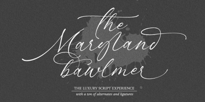 Maryland Bawlmer is a modern and luxurious calligraphy with a natural look. perfect for wedding invitations, calligraphy logos for branding, elegant websites, personalized gifts, social media posts, photography and more! Featuring 81 ligatures, 7 Alternate Set Styles (SS01-SS07) and Supports Western European, Central/Eastern European, Baltic, Turkish, Romanian Language Elegant, modern, luxurious, stylish and a natural touch blended in Maryland Bawlmer
 - Fusione by Paweł Burgiel,
$38.00 Fusione is a handwritten, informal, sketch-like typeface drawn by hand using ink and a sharp nib pen on smooth paper. It is useful for display, poster, books titling, advertising, and magazine work. Best used in Open Type apps, it has automatically exchanging alternates for better simulate true handlettering. Character set support Central and Eastern European as well as Western European languages.
 - Inky Pinky by Designova,
$29.00 InkyPinky - a lovely & playful handwritten font inspired by kids cartoons & sketchbooks, completely handmade and developed with perfection The typeface is actually simple in design but with a touch of uniqueness, it can be perfectly useful for designing posters, flyers, cartoons, comics, graphics, logotype, web, and display usage. Please see the examples shown above to get an idea about the capability of this typeface. InkyPinky comes with a total of 252 glyphs having Extended character sets including Western European, Central European, and South-Eastern European character sets having support for 19 languages: Afrikaans, Albanian, Catalan, Croatian, Danish, Dutch, English, Estonian, Finnish, French, German, Italian, Lithuanian, Norwegian, Portuguese, Slovenian, Spanish, Swedish, Zulu.
 - Mtwane by Scholtz Fonts,
$9.50 Mtwane is a contemporary font, fusing the vigor of African design with the clean-lined sophistication of the European fonts popular at the turn of the 20th century. In the wake of African Renaissance, European and African cultures are counter-influenced, resulting in an exciting fusion of the two. Mtwane plays on the line between upper and lower case characters, creating a young, powerful, in-your-face effect. Use Mtwane for clear, powerful impact in contemporary design. Mtwane contains over 250 characters - (upper and lower case characters, punctuation, numerals, symbols and accented characters are present). It has all the accented characters used in the major European languages.
 - Brewer Display by VistaType,
$24.00 Introducing our latest display typeface called Brewer Display. A classic and elegant looking Display font with a Modern feel, inspired by the Modern logos. Brewer is perfectly made for logos, invitations, labels, Symbols, magazines, books, greeting/wedding cards, packaging, fashion, makeup, stationery, novels, or any advertising purposes. Characteristics: Uppercase Font Numbers and Punctuation marks Basic / Western-European / Central-European / South-Eastern European Language Support Free Updates & Addons We hope you enjoy it – please do let us know what you think, comments & likes are always hugely welcomed and appreciated. More importantly, please don’t hesitate to drop me a message if you have any issues or queries.
 - Rodge by Designova,
$15.00 Rodge is a unique display typeface perfect for headlines, big text, branding, logotypes & graphic design purposes such as posters, flyers and advertisements. This all-caps font can be an excellent choice for creating outstanding logos, promotional content, and marketing presentations that can bring uniqueness and freshness at its level best. The typeface comes with OpenType Stylistic Alternatives feature giving you the option to add some unique characters. Please see the examples shown above to get an idea of the capability of this typeface. Rodge comes with extended language support including Western European, Central European, and South-Eastern European character sets (total of 238 glyphs).
 - Daphnis by RMU,
$35.00 Walter Tiemann’s elegant display font brought to life again and carefully extended with Baltic, Turkish and Central European character sets.
 - Numbskull by The Type Fetish,
$25.00 Numbskull contains an expanded character set including: Central, Eastern and Western European languages, The Baltic, Cyrillic, Esperanto, Greek and Turkish.
 - Contact Pro by RMU,
$35.00 Based on the letterforms of Matheis' Contact, this font was completely redrawn, digitized and extended to include Central European glyphs.
 - Resotho by Glukfonts,
$10.00 Resotho is a geometric sans serif (uppercase) family. It comes in 18 weights, 9 uprights and 9 italics. Perfect for graphic design, branding, packaging design but very versatile. Language support covering Western, South, and Central Europe. The Extralight & Extralight Italic weights are free of charge.
 - Lovely Bluebells by Susan Brand Design,
$18.00 Introducing Lovely Bluebells Script font. A totally swoon worthy romantic font. Perfectly suited for a diversity of design projects, including logos, branding, wedding designs and social media posts. Lovely Bluebells include multilingual support for All Western Europe languages, as well as Afrikaans. xx Susan
 - Muge by Linecreative,
$18.00 Muge is awesome for branding and logotype, Muge has a modern, trendy and elegant impression. Muge Comes with Ligatures and lots of alternate characters & unlock types featured so you can mix and match like a you want. Muge also supports multi-language (Western Europe Latin)
 - Estandar Rounded by Latinotype,
$- Estandar Rounded is a retro and vintage wayfinding sans serif font, inspired by old signals in central park and Europe. It is a Condensed sans with their tall x-height. The family has 6 Weights, italics and dingbats. It is an extension of Estandar font.
 - Hedone by Jehoo Creative,
$19.00 Blending minimalist and elegant styles makes Hedone typeface have a classy character. Hedone is a condensed sans typeface but in some glyphs it has a complete circle shape, and the ink trap on each glyph makes a strong elegant impression on Hedone typeface. it's perfect for a striking vintage and elegant minimalist theme design. Stunning details and versatile possibilities for this font make it an essential addition to any type magazines, posters, album covers, brochures, social media posts, web UI and so on. 4 weights with more than 475 glyphs each, have the Opentype Alternate feature, ligature, and discretionary ligature. Support Western Europe, Central / Eastern Europe, Baltic, Turkish, Romanian, Cyrillic making it very flexible when combined with other typefaces.
 - Radonezh by Simeon out West,
$22.00 The Radonezh font is a Latin alphabet layout based on Russian Lettering I have seen. The font is designed to give a classic Medieval Eastern European feel with a hand-lettered style. Radonezh comes with full punctuation, a complete character set for most Western European Latin alphabet languages, Cyrillic languages, and polytonic orthography for Greek. Being a decorative font, it works best at larger point sizes.
 - RM Almanack by Ray Meadows,
$19.00 Based on William Caslon’s design (c1720) which was itself based on Dutch Baroque typefaces. The old saying “when in doubt, use Caslon.” can now be updated ... “use RM Almanack instead!” Includes: Western European, Central European, Baltic & Turkish sets Due to the modular nature of this design there may be a slight lack of smoothness to the curves at very large point sizes (around 100 pt and above).
 - Oblivian Text by Jörg Schmitt,
$35.00 Oblivian Text is a sans serif type family of ten weights plus italics. The typeface is based on geometric forms with bits and pieces of modern humanistic grotesque fonts. It comes along with various OpenType features such as table, old style figures and a stylistic character set. Oblivian Text has an extended character set that supports Central and Eastern European as well as Western European.
 - Benedetta by Designova,
$23.00 Benedetta is a beautiful and lovely handwritten font for luxury / signature / branding / logotype / personal invites / greeting cards / promotional graphics. Benedetta is completely handmade with perfection and aesthetics at its level best. Advanced Kerning & Essential Ligatures: We have performed advanced, in-depth kerning to make sure the font looks amazing on all possible letter combinations. The font includes extended language support including Western European & Central European sets.
 - Linoma by FlehaType,
$21.99 Linoma is a handmade font duo consisting of a sans and a stencil version. Its rough and textured appearance derives from the linocutting technique. Use Linoma Stencil as headline or display font and Linoma Sans when you need text settings in smaller sizes. Linoma is suitable for packaging, books, magazines, products and branding projects. It supports most of Central European and Easter European languages.
 - 1648 Chancellerie by GLC,
$42.00 This font was inspired by the hand-written 1648 Munster peace treatise signed by French King Louis XIV and German emperor Ferdinand II. It is a Cancellaresca font style, meticulously written and almost legible. It contains Western (including Celtic) and Northern European, Icelandic, Baltic, Eastern, Central European and Turkish diacritics. The numerous alternates and ligatures made the font looking like a real various hand.
 - Orbis Pro by RMU,
$35.00 Walter Brudi's elegant shadowed display font brought to life again and carefully extended with Baltic, Turkish and Central European character sets.
 - Cocoro by Okaycat,
$29.50 Cocoro is a rounded textured font. Cocoro is extended, containing West European diacritics & ligatures, making it suitable for multilingual environments & publications.