1,647 search results
(0.016 seconds)
- Neospace Exp - Personal use only

- Abscissa - Unknown license

- Nautilo Font System by Die Typonauten,
$9.90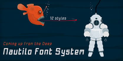 Technical systems rule!
 - Signboard JNL by Jeff Levine,
$29.00Signboard JNL is based on die-cut cardboard display lettering once made by the Duro Decal Company (now Duro Art Industries) of Chicago, Illinois. Available in various sizes, these letters and numbers could be affixed to a number of different surfaces to make affordable signs, displays and show cards. - PythonianDeluxe - Unknown license

- DraftWerk by The Northern Block,
$16.70 A minimal rounded typeface inspired by architecture and furniture detail drawings. The idea was to develop a font that would showcase precise radius corners at large formats and would also downsize to produce stylish body text. Details include 4 weights, a complete character set, manually edited kerning and Euro symbol.
 - Eurofurence Modified - Unknown license

- Metablue by Qaratype,
$17.00 Metablue is a geometric sans font family who dares the modernism and the harmony of the curves. It has very rounded curves with very open terminals that makes this font family elegant, friendly and contemporary. The typeface is versatile and can be successfully used in Magazines, Posters, Branding, Websites etc. It can meet the needs of professionals who want a family of clean geometric font; elegant with a wide character set for more than 130 languages of Western Europe, Europe Eastern, Central Europe, Greek and Cyrillic for international communication.
 - BenderHead AEF by Altered Ego,
$45.00Now, more than ever, the world needs BenderHead. Why? – Because... it just does. Don't ask why, just take our word for it. BenderHead has its thicks and thins all mixed up. For you typographic aficionados, stroke weights and hairline weights aren't consistent, and many rules of typographic design were broken to make this font. We're sure there's a use for it... we've used it on CD covers and posters - and have seen it on a poster for the Zelda video game at Babbages. It's offered here for the first time through Altered Ego Fonts. I don't think we need to explain its history, its inspiration, or its historical reference to you... (we're not certain there is any.) Just accept it as it is, and use it profusely. Benderhead AEF features a full character set, including the Euro. It supports the following codepages: -Latin 1 -Latin 2 (Eastern Europe) -Western Baltic -Turkish AEF highly recommends the OpenType version for compatibility with future Macintosh and Windows operating systems. Not to mention they work better in Adobe InDesign. - Borda by The Northern Block,
$39.00 A carefully drawn geometric typeface. Exacting angles are combined with smooth corner details to form a clean, legible font with a modern appearance. The compact nature of the letterforms allows for great use of space across text layouts. Details include 6 weights with italics, extended European & Cyrillic character set, manually edited kerning and Euro symbol.
 - Arcle by The Northern Block,
$12.80 A modern geometric typeface with precise radius detailing. Each character has it’s own unique subtleties and style variations, with careful adjustment you can create dynamic page layouts. The elegant curves are best demonstrated using the lighter weight at large scale. Details include 5 weights, a complete character set, manually edited kerning and Euro symbol.
 - DyeLine by The Northern Block,
$12.80 A modern geometric typeface influenced by architectural reproduction drawings such as blueprints and dyelines. The concept was to create a font that displays a simple elegance at large scale and would also be able to produce great legibility for body text. Details include 5 weights, a complete character set, manually edited kerning and Euro symbol.
 - Pantano Pro by Latinotype,
$39.00 Pantano is a handmade grunge typeface inspired by the rustic style of Amazonia. This update adds more diacritics, alternate characters and more ligatures give a sensual and naturalistic touch to the written word. Designed by Luciano Vergara and LCF. Languages include: Basic Latin, Western European, Euro, Catalan, Baltic, Turkish, Central European, Romania, Pan African Latin.
 - Hoxton by The Northern Block,
$19.30 A modern humanistic san serif typeface. The horizontal structure of the font gives it a clean lateral dynamic that is ideal for on screen uses. Also the proportions have been condensed to maximize the use of space across various layouts. Details include seven weights, a full character set, manually edited kerning and Euro symbol.
 - Beval by The Northern Block,
$16.70 A humanistic sans-serif typeface with subtle chamfer detailing. It’s strong lateral emphasis is combined with open apertures to create sharp and legible letter forms. These balanced and narrow proportions make it ideally suited to a variety of online applications. Details include 8 weights, a standard character set, manually edited kerning and Euro symbol.
 - Intropol by The Northern Block,
$18.00 A modern journalistic style typeface. The subtle condensed characters create great economy of space best suited to brochure, editorial and magazine layouts. Also using the contrasting weights you can add great dimension across headline and body copy. Details include 6 weights with italics, an extended European character set, manually edited kerning and Euro symbol.
 - SF Espionage Medium - Unknown license

- Welcome by Solotype,
$19.95This is another of those early 20th century, post art nouveau types from Europe. Probably German. - DOOMED - Unknown license

- Cobol by The Northern Block,
$12.80 A modern geometric typeface evolved from a systematic grid. The consistency of form lends itself to a wide variety of applications and used at large scale creates a powerful impact. Also the characters have compact widths allowing for a great economy of space across layouts. Details include 4 weights, a complete character set, manually edited kerning and Euro symbol.
 - Tadao by The Northern Block,
$19.30 A precise rounded typeface with a clean and linear appearance. The simple compact nature of the design allows for great economy of space across layouts. Also deliberate consideration has been paid to inner corners to ensure no dark areas are produced within texts. Details include 6 weights, an extended European character set, manually edited kerning and Euro symbol.
 - Teletex by The Northern Block,
$16.70 A typewriter style slab serif typeface. The design is influenced by the font Rockwell and uses a combination of precise geometry with subtle elliptical curves. The harmony of these elements creates a distinctive and functional typeface suitable for a variety of graphic design applications. Details include 4 weights, a complete character set, manually edited kerning and Euro symbol.
 - LineWire by The Northern Block,
$16.70 A modern geometric typeface influenced by the work of Dutch designer Wim Crouwel . The angular nature of the design lends itself strongly towards large display applications but because each character is formed from a consistent grid, stylish body copy can also be achieved. Details include 6 weights, a complete character set, manually edited kerning and Euro symbol.
 - Construct by Breitenlauf,
$20.00 Construct is a technically based headline font that can also be used as body text. The font has some new ligatures that are automatically applied. Construct particularly suitable for headlines which should have a urban and technical character.
 - Pilatus by Milan Rohrer Studio,
$20.00 The Pilatus font is a sans-serif standard technical font based on the ISO 3098 standard. The standard was developed for a good reading when reducing technical plans on films. The font follows clear rules and geometric proportions.
 - Signs Of Yesterday JNL by Jeff Levine,
$29.00Signs of Yesterday JNL brings another twenty-six vintage signs inspired by a series of decals once made by the Duro Decal Company (now Duro Art Industries) of Chicago. This font complements the original twenty-six designs found in Too Much Information JNL. There are two blank sign panels on the parenthesis keys for use in creating custom retro signage. - Televisio by Suomi,
$25.00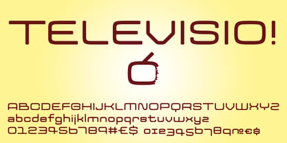 Televisio is a headline font witha technical retro feel.
 - Estandar by Latinotype,
$- Estandar is a retro and vintage wayfinding sans serif font, inspired by old signal in central park and Europe.
 - Aklimat MF by Masterfont,
$59.00 Elegant font family with a technical twist, formal yet elegant.
 - Bernhard Bold Condensed by Bitstream,
$29.99A freely drawn heading face prepared in 1912 by Lucian Bernhard for Bauer. The typeface enjoys a vogue in Europe. - Dekal by The Northern Block,
$29.00 A modern display typeface with ultra sharp detailing. The unique line style takes influence from earlier fonts produced in the 1970’s by Letraset. These lines are then blended with a stronger letterform creating a more visually dynamic font suitable for today’s market. Details include: three unique styles, all caps character set with alternatives, manually edited kerning and Euro symbol.
 - hooge 05_55 Cyr2 - Unknown license

- RBNo2.1 by René Bieder,
$25.00 RBNo2.1 is a condensed sans serif typeface with a technical and geometric appearance. The family includes 2 versions (RBNo2.1a and RBNo2.1b) and has 7 weights with matching italics. RBNo2.1 feels comfortable in technical surroundings with short text passages, in brochures, catalogs, magazines, posters, websites headlines and logos.
 - Refuse Pro by The Type Fetish,
$25.00 Refuse has an extended Latin, extended Cyrillic and Greek alphabet so it will work with most languages in Europe and the Americas.
 - Do It Yourself JNL by Jeff Levine,
$29.00 Do It Yourself JNL was modeled after self-adhesive vinyl letters and numbers manufactured by Duro Art Industries of Chicago - formerly the Duro Decal Company. The hand-drawn look of the original lettering was retained by Jeff Levine to stay true to the design, and the rectangles that border each glyph represent the pieces of self-adhesive vinyl onto which the characters were silk screened. Limited character set.
 - Quintus by JOEBOB graphics,
$22.00 This font is an adaptation of the typeface I designed for TJX Europe, which was used in their branding campaigns for the TK MAXX stores all over Europe. Most characters were given a major facelift and also a few extra ligatures were added in the process. Quintus comes with a regular and a bold version so it offers more variety in use. It also works well in all caps.
 - Memphis by Linotype,
$40.99 Because of the geometric basis of its forms, Memphis is often thought of as a font for technical fields, making a rational, purposeful impression. This emphasis on objectivity is well-suited to technical texts, but Memphis is appropriate for any text which should exhibit a clear, neutral character.
 - Merced by Latinotype,
$49.00 A fresh, curly and delicious sans serif. Designed by Daniel Hernandez, Merced is a sans serif font that can be given different uses due to its wide variety of alternate types. Its main virtue is the endless number of possibilities for you to write words, texts or paragraphs. Languages include: Basic Latin, Western European, Euro, Catalan, Baltic, Turkish, Central European, Romanian and Pan Africa Latin.
 - Vulgary by Etewut,
$24.00 Vulgary is a script family that includes 4 fonts. They match each other but can be used separately as well. It supports all euro languages based on Latin alphabet. To use swashes you have to open glyphs panel in menu Window. The font is compatible on both Windows and Mac. You can use it in all popular apps like Adobe, Corel Draw, Microsoft, Final Cut etc.
 - CCS Neue Rinjani by Creative Corner Studio,
$29.00 Neue Rinjani is a all-caps sans serif with Wide Stretch contemporary typographic, vintage futuristic art-deco touch Streamline influence of the 1930s and 1940s. A mix from the old Euro-American signage/advertising letters and modern clean sans serif, carefully mousecrafted to bring you the genuine feel of the era. If you're into classic/vintage letter designs, then this typeface suits best for you.


