10,000 search results
(0.033 seconds)
- Nestor Quirky Typeface by Hipfonts,
$18.00 Nestor is a retro inspired display typeface that's unique, lovable, and quirky. It's perfect for headlines, advertising, posters, branding, social media, quotes, prints, and much more. If you're in need of a typeface that has groovy curves with a bold personality, then Nestor is for you.
 - Ottmar by Atom,
$17.00 Ottmar is a bold casual script font, created using a brush that is etched on paper with care to produce a unique and organic character. With contextual alternate and ligature it will give a very special nuance if used in the design. Hope you like it!
 - Lumier Texture by Tour De Force,
$15.00 Lumier Texture is font family targeting designers who work with packages, labels, posters - who are looking for characteristic and striking letters. It's textured version of Lumier font family and as that, it's compatible with Lumier Bold. It is adviced to be used as desktop font only.
 - Movie Production JNL by Jeff Levine,
$29.00 Inside the pages of the August, 1930 issue of “The New Movie Magazine” is an ad for Warner Brothers-First National Pictures – hand lettered in a bold Art Deco sans. This was the basis for Movie Production JNL, which is available in both regular and oblique versions.
 - Walanor by Konstantine Studio,
$10.00 Jump back to the retro vintage vibes with WALANOR. A bold, casual, and fun display font. Inspired by the visual trends of so-called retro and vintages from the 80s era. We talk about disco, pop culture, vinyl records, sign painting, magazines, posters, labels, and many more.
 - Shabon Dama by Abdulrhman Saeed,
$19.99 Shabon Dama is a cheerful fun Arabic typeface, it bridges the gap between formal and fun, thus keeping it readable. It fits well with video games rated for everyone, kids comics and books, and cheerful marketing. Featuring three weights: Light, Regular, and Bold. ARABIC CHARACTERS ONLY.
 - Zeo xay by Saxofont,
$25.00 Zeo Xay is bold and elegant serif font. Simple and easy to use, this font will be very beautiful if you mix it with your various craft designs. This font is PUA encoded which means you can access all of the glyphs and swashes with ease!
 - !Sketchy Times - Unknown license

- Bastia by Jen Wagner Co.,
$17.00 Bastia is a classy, bold upper and lowercase typeface that looks incredible in both large and small settings. Best used as a display for headings and logos, Bastia's clean lines and smooth curves give any project an extra touch of class. See how it looks when used for body text in the 11th sample image above. I also love combining Bastia and clean sans serifs for minimal logos (see the "Lucky Finch" sample logo). This download also includes a special outline version of the serif, so you can layer text or add some flair to your logos and display type. There are also alternates available for "k" and "s" that give each letter some extra curves (available via the special characters panel One thing to note about Bastia is the letter spacing. It was intentionally spaced for clean reading if you wanted to use it for body type, so I recommend setting the spacing a little tighter for display use (around -10 to -20 should do!). Includes: Bastia Bold (uppercase & lowercase) Bastia Bold Outline (uppercase & lowercase) Numbers & punctuation Foreign language support Alternates for "k" and "s" – available via the special characters panel
 - ITC Oldrichium by ITC,
$29.99Spirited, unaffected and buoyant, the ITC Oldrichium type family pays homage to the calligraphy and typeface designs of Czech designer Oldrich Menhart. “I came upon one of Menhart's typefaces over a decade ago,” says George Thompson, designer of ITC Oldrichium. “I've been collecting examples of his work ever since.” Thompson was born in Chicago and grew up in north-west Indiana. “While I've been an educator and general graphic designer for over 30 years, lettering and type design have always been an important part of my work,” he says. Thompson now spends much of his free time designing typefaces. ITC Oldrichium is a subtle melding of the shapes and proportions of Menhart's Manuscript typeface, the energetic strokes of his calligraphy, and Thompson's own design skills. The result is a distinctive, powerful, and exceptionally versatile typeface family. Available in light, regular, demi bold and bold weights, with corresponding italics for all but the bold, ITC Oldrichium is comfortable setting both text and display copy. In addition to the basic weights, Thompson has created an Engraved version for those times when an especially powerful statement is called for. - Standard CT by CastleType,
$59.00 CastleType was commissioned in 1991 by San Francisco Focus magazine to digitize three members of the Standard family. This is a Continental lineale that was popular in Switzerland in the 1950s and later in the United States. A cousin to the classic sans serifs, Standard is an alternative that is considerably warmer and a bit more idiosyncratic. In 2008, CastleType released additional members of the Standard CT family to make it a complete typographic solution with three widths (normal, condensed, extended) of four weights each (Regular, Medium, Bold, and Extra Bold). Some of the original Standard fonts, particularly Standard Regular, appear to have been hastily designed (or perhaps too closely imitated Helvetica); these have been greatly improved in the CastleType versions with more harmonious proportions and other refinements. The three lighter weights of the Extended subfamily were designed from scratch based on the new Standard CT Regular and Standard CT Extended Extra Bold. More recently, four light weights (Light, Extra Light, Ultra Light, and Hairline) have been added to each of the three widths. The entire Standard CT family includes support for most European languages, OpenType features, arbitrary fractions, and a collection of geometrics, dingbats & fleurons.
 - Nazanin by Linotype,
$187.99Nazanin, originally named Haghighi, is a modern Arabic text face first produced by Linotype in 1978. Its popular design was converted into OpenType format in 2005, taking full advantage of digital technology to allow accurate positioning of diacriticals and kerning refinements. The counters and inter-character proportions of Nazanin are characteristic of Persian display lettering and typography. This is particularly true of Nazanin bold, which gives a strong image when used for display purposes. Nazanin possesses fuller, deeper characters than is normally exhibited in Arabic typography: its angled counters contributing to fluid, well-balanced, yet vibrant, letterforms. Originally designed for Farsi typesetting, Nazanin has now become popular for Arabic typesetting as well. Nazanin is available in two OpenType weights: Nazanin Light and Nazanin Bold. Both of the fonts include Latin glyphs (from Palatino Roman and Palatino Bold, respectively) inside the font files, allowing a single font to set text in both most Western European and Arabic languages. Nazanin incorporate the Basic Latin character set and the Arabic character set, which supports Arabic, Persian, and Urdu. They include tabular and proportional Arabic, Persian, and Urdu numerals, as well as a set of tabular European (Latin) numerals. - Axeo by Asritype,
$13.00 Axeo is a freeform serif typeface. With more than 500 glyphs for each cut, Axeo supporting wide Latin Base Languages. The font structures is sans-serif typeface. Then, the fonts is made into serif (serifed) using rhombus and adapted/modified rhombus (before remove overlaps) placed on its appropriate positions. This fonts is released first, while the sans-serif is being in process. There are 10 fonts; 5 weight in normal width: Light, Regular, Medium, Bold, and Black; and 4 in semi-condensed: Light, Regular, Medium, Bold and Black, too. The fonts has some minor character variations, all are sets in SS01.There are also standard and discretionary ligatures, arrow, some geometric shapes and ornaments. With its sansserif structure, the Medium, Bold and Black fonts is playful with text effect in various applications such MS Word, CorelDraw or others to enhance the appearance. Its serif form will make unique enhancements. Thus, the fonts is suitable for Branding, logos, cards, advertisements, banners, display and more; for the main texts or its companions. While the light, regular and medium fonts can also be used as description text, card text, note, caption and longer non-formal texts or other usages.
 - Maxengine by Ditatype,
$29.00 Maxengine is a bold script font that refuses to conform. This rebellious yet playful typeface marries boldness with a touch of whimsy, creating a dynamic and unique script that captures attention and refuses to be confined by traditional design norms. The characters in Maxengine boast a rounded shape, bringing a sense of friendliness and approachability to the bold script. What truly sets it apart is the intentionally uneven outline details, adding an element of spontaneity and creative flair to each letter. This unconventional approach results in a font that exudes personality and breaks away from the ordinary. In addition, enjoy the features here. Features: Ligatures Stylistic Sets Multilingual Supports PUA Encoded Numerals and Punctuations Maxengine fits in headlines, logos, posters, flyers, branding materials, greeting cards, print media, editorial layouts, and many more designs. Find out more ways to use this font by taking a look at the font preview. Thanks for purchasing our fonts. Hopefully, you have a great time using our font. Feel free to contact us anytime for further information or when you have trouble with the font. Thanks a lot and happy designing.
 - Biotrons by Ditatype,
$29.00 Biotrons is not your ordinary bold display serif font—it's a visual powerhouse that commands attention with its unique design. This font is a daring exploration of boldness and precision, bringing a cutting-edge aesthetic to the world of script typography. The characters in Biotrons are defined by their bold strokes and sharp corners, creating a strong and impactful visual presence. The deliberately uneven outlines add an element of unpredictability, giving each letter a sense of individuality and flair. Biotrons is a font that thrives on breaking away from the expected norms, offering a dynamic and modern take on the traditional script. Enjoy the features here. Features: Ligatures Stylistic Sets Multilingual Supports PUA Encoded Numerals and Punctuations Biotrons fits in headlines, logos, posters, flyers, branding materials, greeting cards, print media, editorial layouts, and many more designs. Find out more ways to use this font by taking a look at the font preview. Thanks for purchasing our fonts. Hopefully, you have a great time using our font. Feel free to contact us anytime for further information or when you have trouble with the font. Thanks a lot and happy designing.
 - Spheris - Personal use only

- Check Mate by Funk King,
$5.00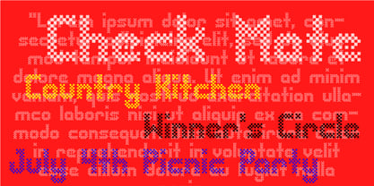 Check Mate is a modern, playful checkerboard-style font.
 - Altemus Pinwheels by Altemus Creative,
$11.00 Each style is a collection of 174 pinwheel designs.
 - KG This Is Not Goodbye by Kimberly Geswein,
$5.00 Neat, calligraphy-style handwriting using a chisel-tipped marker.
 - Procyon by Fatchair,
$6.95A dot-matrix style display font with a twist. - Gothic Handtooled Bastarda by Intellecta Design,
$18.95a grunge style font mixing carved design with blackletter - Evangeliaire Uncial by Intellecta Design,
$14.90an approach to the uncial medieval style of letters - KG Next To Me by Kimberly Geswein,
$5.00 Hand sketched lettering in a chalkboard, Pinterest inspired style.
 - Sukato by Thinkdust,
$10.00 A neue rave typeface; Pacman-style chunky, sharp, creative.
 - KG Second Chances by Kimberly Geswein,
$5.00 Hand sketched lettering in a chalkboard, Pinterest inspired style.
 - Biscuits And Gravy by Fenotype,
$19.95 Biscuits and Gravy is hand painted sign style font.
 - KG Alphabet Regurgitation by Kimberly Geswein,
$5.00 Fun, mixed, jumbled lettering in a variety of styles.
 - Quarca by insigne,
$24.75 Quarca's masculine power runs strong across the page with bold self-assurance and a raw energy that courses through its thick veins. Don't think the continuous, smooth geometry of this semi-modular face is captively chained to the grid, though. Quarca has been cautiously optimized to engage the reader's eye. Achieving an attractive balance to its sturdy design, the open forms of this "rounded square" geometric sans -together with a tall x-height- make the font legible even when using the compact widths. This high-impact typeface definitely doesn't sacrifice versatility for style. These compact widths, with their raw heart and strength, are perfect for callouts, while the extended widths provide you with the platform for a punchy and extremely efficient headline. The font has a thinner weight and transcends to an intense bold. The face's geometric or technological construction also tends to make it right at home on the web. The family consists of 36 fonts -six weights plus italics. Where Quarca truly stands out, though, is its wide number of OpenType typographic choices and optional glyphs, allowing you to design your piece with a personal, one-of-a-kind variant touch. These variations consist of Experimental Capitals, Angled Capital Terminals, and "Future Stencil". In all, you can find more than one hundred of these alternate glyphs. Quarca is well-suited for anything you are able to throw at it. Devised for today's multi-disciplined designer, this clear and infinitely versatile family provides tremendous value to your toolbox.
 - Akoodi by Product Type,
$17.00 Introducing Akoodi, the ultimate superhero font for all your design projects! This bold and stylish serif font features a superhero theme that’s perfect for creating eye-catching titles and headlines for movie posters and graphic design projects. With its strong, prominent serifs and unique character design, Akoodi is a versatile font that can be used for a wide range of projects, from branding and marketing materials to book covers and packaging designs. The font includes a full set of upper and lowercase letters, punctuation, and numerals, making it a complete solution for all your design needs. With its superhero theme and stylish serifs, Akoodi is a font that will make your projects stand out from the crowd. So why wait? Grab your copy of Akoodi today and start creating designs that are as bold and daring as a superhero! Furthermore, Akoodi is equipped with advanced features that make it easy to use and customize. The font comes with a full set of alternate characters, including a range of ligatures and swashes, which add an extra touch of style to your designs. Additionally, the font is fully compatible with a wide range of design software, making it simple to use no matter what your design process looks like. What’s Included : - File font - All glyphs Iso Latin 1 - Ligature, Alternate - We highly recommend using a program that supports OpenType features and Glyphs panels like many Adobe apps and Corel Draw, so you can see and access all Glyph variations. - PUA Encoded Characters – Fully accessible without additional design software. - Fonts include Multilingual support
 - Calissha Script by Mega Type,
$10.00 Calissha Script is a handmade font created with a brush and ink, bold and irregular baseline. Contains a complete set of lowercase, uppercase, alternates, ligatures, punctuation, numbers, and multilingual support. And additional Calissha Capitals, working in harmony with Calissha Script to create typography awesome creations. Get some inspiration from the preview above. Contains a complete set of lowercase, uppercase, ligatures, punctuation, numbers, and multilingual support. Calissha Script is perfect for use in watercolor design or lettering style bold hand, such as blog header, branding, t-shirt, weddings, social media, product design, stationery, advertising, apparel, cover books, business cards, greeting cards, branding, merchandise, invitations and handmade quotes and more. Calissha Script features OpenType stylistic alternates, ligatures and International support for most Western Languages is included. To enable the OpenType Stylistic alternates, you need a program that supports OpenType features such as Adobe Illustrator CS, Adobe Indesign & CorelDraw X6-X7, Microsoft Word 2010 or later versions.How to access all alternative characters using Adobe Illustrator: https://www.youtube.com/watch?v=XzwjMkbB-wQ Calissha Script is coded with PUA Unicode, which allows full access to all the extra characters without having special designing software. Mac users can use Font Book , and Windows users can use Character Map to view and copy any of the extra characters to paste into your favourite text editor/app.How to access all alternative characters, using Windows Character Map with Photoshop: https://www.youtube.com/watch?v=Go9vacoYmBw If you need help or have any questions, please let me know. I'm happy to help :) Thanks & Happy Designing!
 - Burford Rustic by Kimmy Design,
$10.00 Burford Rustic is the weathered and textured alternative to the Burford Family. It works the same way as Burford as a layer-based font family, but with some style variations and new layering options. It includes 20 font files, starting with four texture variations from Black, Bold, Light to Ultralight. It also includes and Outline and two Inline Weights. Additionally it offers three line weights (light, medium and bold) for top layering options. There are two extruded fonts and two drop shadow fonts, all either in a solo version and set with Burford Rustic Black for users not using Opentype programs. For users that have Opentype programs, such as Adobe Illustrator, Photoshop, InDesign, Microsoft Publisher and Quark, each font also comes with a set of Stylistic Alternatives for letters A C E F G H P Q R. There are two versions of each letter, and by using contextual alternatives, no two letters next to each other will be the same. Burford Rustic Basic package is created for users who don’t have access to programs with Opentype capabilities and are unable to use the layering effect. Burford Rustic can still be a powerful tool as each font can also be used on it’s own. It includes every font file not needed for the layering effect. The Burford Rustic Ornaments uses all basic keyboard characters - around 100 total elements per set. They are designed to go specifically with Burford Rustic and use the same textured edge. The set includes: banners, borders, corners, arrows, line breaks, catchwords, anchors and many more!
 - Stubble by Aah Yes,
$12.00Stubble is a distressed grunge font with many useful variations that make things easy. It comes in both a Regular and Bold version, and a Smudged version as if the print block has slipped a little bit just at the vital moment. Also there’s 2 jumbled versions with the letters and numbers, and some punctuation, at odd angles and slightly off-whack; there’s 2 versions with little bits of overprint on most of the main characters (as if the corners of the block or stamp have just caught the paper); a couple of Caps Only versions; plus condensed and expanded versions of the main faces. The Bold version is not an exact expanded version of the Regular version, please note, the characters are different (i.e. the misprinting is different) in the two weights. Western and Central European accented characters are included, and there’s a set of replacements for double-letter combinations such as bb, dd and OO, TT, so that 2 different letters will appear - which avoids having exactly the same grunge letter appearing twice in succession (20 or more pairings for each case, all the pairings that reasonably exist) which work as ligature replacements. The whole family constitutes a comprehensive package that offers a great variety of ways of presenting a grunge typeface for display, headlines and posters, while maintaining the thread of the same sans-serif style. The zip package contains both the TTF and OTF versions of the font. Install only one version on the same machine, installing both versions may produce all sorts of erratic behavior. - Arsapia by URW Type Foundry,
$49.99 Michael Hoffmann manufactures digital fonts for 30 years. At URW++ he contributed to the technological progress. Over the years, he also specialized in the ideal representation of fonts on screen and the complex assembly of international fonts with scripts of all countries. In his latest project he put the emphasis on developing a highly readable typeface. Less interested in the design as in the functionality of this typeface, he designed Arsapia which he has now installed as a system font on all his computers. Michael Hoffmann studied Japanology at the University of Hamburg and traveled in the early years of his professional activity frequently to Japan, there to train the IKARUS font production tools to Japanese customers. In his spare time he plays guitar or golf depending on the weather. The typeface Arsapia has been designed in such a way that all three font styles Light, Regular and Bold have the same width. When a user therefore opts for the use of Arsapia Light, even though he has already written his text in Regular, nothing changes with respect to the letter tracking. When choosing the Bold for emphasis: Nothing changes except the blackness of the letters. A font change does not engender unwanted line and page breaks of itself. All letters can be clearly distinguished from each other. 1 l I O 0 are all different. For programmers and lovers of monospaced fonts Michael Hoffmann has developed a fourth typeface: Arsapia Mono. This is the perfect terminal font.
 - Gunplay by Typodermic,
$11.95 Are you tired of weak, flimsy fonts that can’t handle the heat? Look no further than Gunplay—the tenacious stencil typeface that will make your message stand out from the pack. Inspired by the iconic 1972 film The Getaway, Gunplay exudes a gritty, rugged aesthetic that demands attention. With three different special effect styles, this font brings a bold and authoritative voice to your designs. Whether you’re looking to make a statement with a bold headline or add a touch of grit to your body text, Gunplay has got you covered. With its rugged design, this typeface can handle anything you throw its way. So if you’re ready to take your designs to the next level, give Gunplay a try. With its tough voice of authority, this font is sure to leave a lasting impression. Some Latin-based European writing systems are supported, including the following languages. Afaan Oromo, Afar, Afrikaans, Albanian, Alsatian, Aymara, Basque, Bemba, Bikol, Breton, Cape Verdean, Creole, Catalan, Cebuano, Chamorro, Chavacano, Danish, Dawan, Dholuo, Dutch, English, Estonian, Faroese, Fijian, Filipino, Finnish, French, Frisian, Friulian, Galician, Genoese, German, Guadeloupean Creole, Haitian Creole, Hiligaynon, Icelandic, Ilocano, Indonesian, Irish, Italian, Jamaican, Kaqchikel, Kikongo, Kinyarwanda, Kirundi, Lombard, Low Saxon, Luxembourgish, Makhuwa, Malay, Ndebele, Neapolitan, Norwegian, Novial, Occitan, Papiamento, Piedmontese, Portuguese, Quechua, Rarotongan, Romansh, Sango, Saramaccan, Sardinian, Scottish Gaelic, Shona, Sicilian, Silesian, Slovak, Slovenian, Somali, Sotho, Spanish, Swahili, Swazi, Swedish, Tagalog, Tetum, Tshiluba, Tsonga, Tswana, Tumbuka, Uzbek (Latin), Venetian, Võro, Walloon, Waray-Waray, Wayuu, Xhosa, Yapese, Zapotec Zulu and Zuni.
 - Kontext Dot by Elster Fonts,
$20.00 Imagine a font that is easier to read the smaller it is – or the further away the text is. There are already many rasterised fonts, I wanted to take it to the extreme and use as few dots as possible. The result is a typeface that lives up to its name. Each individual circle makes no sense on its own; individual letters are only recognisable in the context of all associated circles, individual letters are most likely to be recognised in the context of whole words. Attached to a building wall, text would be readable from a great distance and become increasingly difficult to decipher the closer you get to the building. Placed on the ground or on a large flat roof, text would only be readable from a higher building, an aeroplane or - depending on the size - in Google Earth. Kontext has old style figures, superscript numerals, case-sensitive questiondown and exclamdown and an alternative ampersand, 390 glyphs at all. Use the same value for font size and line spacing to keep the lines in the grid, or change the line spacing in 10% steps. Change the spacing in 100-unit increments to keep the grid. The numbers in the family- and style-names refer to the (ca.) grey value of the respective background and the font itself. Kontext Dot 00-33 has e.g. a white background (0%) and 33% grey value. Kontext Dot 66-33 has a 66% background and 33% grey value. »Positive« styles (first number smaller than the second number) have kerning, »negative« styles (first number bigger than the second number) can have none.
 - Miedinger by Canada Type,
$24.95 Helvetica’s 50-year anniversary celebrations in 2007 were overwhelming and contagious. We saw the movie. Twice. We bought the shirts and the buttons. We dug out the homage books and re-read the hate articles. We mourned the fading non-color of an old black shirt proudly exclaiming that “HELVETICA IS NOT AN ADOBE FONT”. We took part in long conversations discussing the merits of the Swiss classic, that most sacred of typographic dreamboats, outlasting its builder and tenants to go on alone and saturate the world with the fundamental truth of its perfect logarithm. We swooned again over its subtleties (“Ah, that mermaid of an R!”). We rehashed decades-old debates about “Hakzidenz,” “improvement in mind” and “less is more.” We dutifully cursed every single one of Helvetica’s knockoffs. We breathed deeply and closed our eyes on perfect Shakti Gawain-style visualizations of David Carson hack'n'slashing Arial — using a Swiss Army knife, no less — with all the infernal post-brutality of his creative disturbance and disturbed creativity. We then sailed without hesitation into the absurdities of analyzing Helvetica’s role in globalization and upcoming world blandness (China beware! Helvetica will invade you as silently and transparently as a sheet of rice paper!). And at the end of a perfect celebratory day, we positively affirmed à la Shakti, and solemnly whispered the energy of our affirmation unto the universal mind: “We appreciate Helvetica for getting us this far. We are now ready for release and await the arrival of the next head snatcher.” The great hype of Swisspalooza '07 prompted a look at Max Miedinger, the designer of Neue Haas Grotesk (later renamed to Helvetica). Surprisingly, what little biographical information available about Miedinger indicates that he was a typography consultant and type sales rep for the Haas foundry until 1956, after which time he was a freelance graphic designer — rather than the full-time type designer most Helvetica enthusiasts presume him to have been. It was under that freelance capacity that he was commissioned to design the regular and bold weights of Neue Haas Grotesk typeface. His role in designing Helvetica was never really trumpeted until long after the typeface attained global popularity. And, again surprisingly, Miedinger designed two more typefaces that seem to have been lost to the dust of film type history. One is called Pro Arte (1954), a very condensed Playbill-like slab serif that is similar to many of its genre. The other, made in 1964, is much more interesting. Its original name was Horizontal. Here it is, lest it becomes a Haas-been, presented to you in digital form by Canada Type under the name of its original designer, Miedinger, the Helvetica King. The original film face was a simple set of bold, panoramically wide caps and figures that give off a first impression of being an ultra wide Gothic incarnation of Microgramma. Upon a second look, they are clearly more than that. This face is a quirky, very non-Akzidental take on the vernacular, mostly an exercise in geometric modularity, but also includes some unconventional solutions to typical problems (like thinning the midline strokes across the board to minimize clogging in three-storey forms). This digital version introduces four new weights, ranging from Thin to Medium, alongside the bold original. The Miedinger package comes in all popular font formats, and supports Western, Central and Eastern European languages, as well as Esperanto, Maltese, Turkish and Celtic/Welsh. A few counter-less alternates are included in the fonts.
 - Hamerslag by Paweł Burgiel,
$38.00 Hamerslag is an ultra-condensed serif type family with uncomplicated, regular appearance, large x-height, relatively high contrast and modern glyphs shapes. Available in four styles, contain fraction- and scientific numerals, standard ligatures, currency symbols, proportional and tabular lining figures. Its wide character set support 200 Latin-script languages, 50 Cyrillic-script languages and 190+ romanizations/transliterations, e.g. The United Nations romanizations, Chinese official romanization (Hanyu Pinyin), BGN/PCGN (United States Board on Geographic Names and the Permanent Committee on Geographical Names for British Official Use), American Library Association / Library of Congress romanizations and others. The OpenType PostScript CFF (.otf) and OpenType TrueType TTF (.ttf) support encodings: Windows 1250 Latin 2 (Eastern European), Windows 1251 Cyrillic, Windows 1252 Latin 1 (ANSI), Windows 1254 Turkish, Windows 1257 Baltic, ISO 8859-1 Latin 1 (Western), ISO 8859-2 Latin 2 (Central Europe), ISO 8859-3 Latin 3 (Turkish, Maltese, Esperanto), ISO 8859-4 Latin 4 (Baltic), ISO 8859-5 Cyrillic, ISO 8859-9 Latin 5 (Turkish), ISO 8859-10 Latin 6 (Scandinavian), ISO 8859-13 Latin 7 (Baltic 2), ISO 8859-14 Latin 8 (Celtic), ISO 8859-15 Latin 9, ISO 8859-16 Latin 10, Macintosh Character Set (US Roman). Supported OpenType features: Acces All Alternates, Capital Spacing, Case-Sensitive Forms, Denominators, Fractions, Glyph Composition/Decomposition, Historical Forms, Kerning, Localized Forms, Numerators, Ordinals, Proportional Figures, Scientific Inferiors, Slashed Zero, Standard Ligatures, Stylistic Alternates, Subscript, Superscript, Tabular Figures. Kerning is prepared as single ('flat') table for maximum possible compatibility with older software.
 - Prossima Moda by Mans Greback,
$59.00 Prossima Moda is a font that radiates modernity and fashion-forward style. Its sleek and contemporary design evokes a sense of sophistication and elegance, while its contrasting lines add a touch of visual interest and intrigue. The font exudes a cool and sweet vibe, creating a captivating and alluring atmosphere. With Prossima Moda, each letter is meticulously crafted to showcase its unique beauty, creating a harmonious blend of form and function. The font's smooth curves and clean lines give it a polished and refined look, reflecting the precision and attention to detail that are synonymous with the fashion industry. This font not only captures the spirit of the latest fashion trends, but it also embodies a sense of individuality and self-expression. It is a font that speaks to the modern individual who seeks to make a statement and stand out from the crowd. The font is built with advanced OpenType functionality and has a guaranteed top-notch quality, containing stylistic and contextual alternates, ligatures, and more features; all to give you full control and customizability. It has extensive lingual support, covering all Latin-based languages, from Northern Europe to South Africa, from America to South-East Asia. It contains all characters and symbols you'll ever need, including all punctuation and numbers. Mans Greback is the innovative designer behind the captivating Prossima Moda font. Hailing from Sweden, Mans has established himself as a prominent figure in the world of typeface design, renowned for his diverse and versatile portfolio.
 - Burford by Kimmy Design,
$10.00 Burford is a font family that I sketched while traveling through Europe. I was mesmerized by all the unique typography that was showcased throughout the five countries I visited. Inspired by all that I had seen, I found myself spending 4-5 hours per day in Amsterdam’s Vondel Park drawing characters. Once back in the states I digitalized Burford, deciding it would make for a beautiful layer-based font. Burford Pro package comes with all 18 layering fonts including 5 base layers, 3 top layers, 5 bottom layers and 2 sets of graphic elements. They are strategically made to build on top of each other, creating a cohesive and easy to use layer-based family. Each font also comes with a set of Stylistic Alternatives for letters A C E F G H P Q R. Burford Basic package is created for users who don’t have access to premiere design programs (such as Illustrator, InDesign, Photoshop, etc) and are unable to use the layering effect. Burford can still be a powerful tool as each font can also be used on its own. It includes every font file not needed for the layering effect. (Include 13 fonts - Burford Basic, Dots, DropShadow, Extras Set A, Extras Set B, Extrude B, Extrude C, Inline, Line, Marquee, Outline, Stripes A and Stripes B). The Burford Extras set uses all basic keyboard characters - around 100 total elements per set. They are designed to go specifically with Burford and complement its varying styles perfectly. The set includes: banners, borders, corners, arrows, line breaks, catchwords, anchors and many more!
 - Nature Boy by Adorae Types,
$20.00 Nature Boy was born in a fantasy world of old, where you can find magic, elegance, dreams and fun all together... just like nature in its purest form with its leafy curves and shapes that make it peacefully enjoyable. Soft and simple yet fairly ornamental, attributes that create an enchanting atmosphere but keep the texts legible at the same time when combined. Nature Boy can bring life and magic to every design, from editorial to posters, brands and packagings. Just picture this font on any product intended to move your soul and take you on a journey into a different and most beautiful place and time and let the adventure begin. This font family is made up of optically corrected regular, italic and bold types. All of them contain functional ligatures with alternative glyphs for texts and words to be dynamical and fluently graphed.

