3,158 search results
(0.011 seconds)
- Cosmopolite by Ivan Rosenberg,
$16.00 Cosmopolite is hand brushed font with multilingual support. Is ideal for t-shirts, magazines, phone covers, social media, restaurant menus, greeting cards, invitations, weddings, headers and many more. This brush font comes with a complete set of lowercase and uppercase characters, a contextual alternates, numerals and multilingual support. --- For access to Stylistic Alternates is required software with glyphs panel like Photoshop, illustrator, Inkscape etc. Ligatures shows up automatically. Cosmopolite Font include multilingual support for western and central Europe. If you have any questions or suggestions don't hesitate to contact me.
 - Closeby by Papanapa,
$30.00 Closeby is friendly, cheerful, and extremely addictive! Closeby is a hand-drawn display font with more than 80 ligatures and a curious personality. Designed for big titles, its ultra-condensed style works as a unicase and fills the spaces with visually unique typographic compositions. Perfect for packaging, posters, food and drink menus, or book covers, its gravitational point varies between cases, and can be used in all uppercase, all lowercase, or mixing the two to obtain restless and sparkling results. Closeby has support for Western Europe and more than 65 languages.
 - Drawboard BT by Bitstream,
$50.99Drawn by Italian graphic designer Nicola Serradimigni, Drawboard is a fun, freeform display typeface. Serradimigni based each character on a rectangle and kept the use of curved shapes and diagonals to a minimum. Serradimigni had intended to use his sketches as a basis for a more precise outline, but we liked the spontaneity of the drawings so much that we encouraged him to keep that motif. The looseness of Drawboard is the result. The character set supports Central Europe, and includes some upper and lowercase alternates accessible via OpenType features. - Alter Biom by Glen Jan,
$30.00 Alter Biom is eclectic sans-serif inspired by many type styles from calligraphy and blackletter to modernism. It will work great as titles and headlines, short display-textlines on book covers, magazines, packaging or posters. On the web this type must be used in large point sizes for best legibility. It supports Latin Extended-A (Western, Central Europe, Baltic, Turkish) and Cyrillic encoding languages and contain minimal set of opentype features – lining digits, case sensitive punctuation, small-numeric forms and scripted fractions. Fully functional Demo style is distributed free for non-commercial using.
 - Waldo by The Northern Block,
$49.95 Waldo is a bold, stencil-focused display typeface loosely based on a 1973 science fiction movie poster for "The Battle For The Planet of The Apes". Narrow rectangular slots cut into heavyweight forms create a stylish and energetic font ideal for apparel, books, film titles, packaging and posters. Included in the font are over 400 characters with four unique styles; Black, Stencil, Outline, and Shadow. Opentype features consist of digital numerals, tabular figures, numerators, denominators and fractions. Other features cover alternate lowercase f and r, with language support for Western, South and Central Europe.
 - Typold by The Northern Block,
$29.55Typold originated out of the desire to improve geometric forms and push beyond previous achievements through collaborative working methods and knowledge sharing. The result is a finely balanced modern sans serif constructed from mathematical inputs, typographers needs, and the natural hand and eye of an artisan. Details include nine weights and matching italics, three separate widths, 1000 characters with an alternative lowercase a and y, small caps, 12 variations of numerals, Opentype features inferiors, superiors, fractions, case sensitive punctuation, extended symbols including emoji's and language support covering Western, South and Central Europe. - Nurom by The Northern Block,
$25.80 Nurom is a contemporary sans-serif typeface influenced by the early grotesque style which is neutral and legible in purpose with a fresh personality. The goal wasn't about historic revival; it was to make a new Grotesk that could compete in an overcrowded market while offering strength, clarity and function across a vast array of applications. Details include six weights (bold free), a regular italic, and over 400 characters per style. Opentype features include decimal figures, fractions, case sensitive punctuation and language support for Western, South, and Central Europe.
 - Biscayne by JVB Fonts,
$39.00 Biscayne is inspired by the old and classic Art Deco art and architecture found in some building ads from the 1930's in the Art Deco District of Miami. The name of the font family is one of the most emblematic and representative places in Miami City. Biscayne can be used mainly in titles, display and short texts. This typeface family supports East Europe languages. It also includes standard and discretionary ligatures, alternative style of uppercase, fractions, numerators and denominators, end and/or terminal forms and other OpenType features.
 - Frakto by Linotype,
$29.99Frakto is a two-weight family of calligraphic Fraktur-style typefaces designed by Julius de Goede. One of the main categories of Blackletter typefaces, Fraktur was developed around 1517, and was used throughout Germany and Northern Europe well into the 20th century. With Frakto, Julius de Goede has re-applied the written element of the script back into the Fraktur style, rejuvenating and reinvigorating it for 21st century display use. Frakto is the perfect fit for certificates and newsletter headlines. We recommended using it in point sizes from 12-pt on up. - Nuber Next by The Northern Block,
$39.95 Nuber Next is a modern geometric sans influenced by the popular neo-grotesques of the 1950s including Helvetica and Univers. Carefully remastered from the original Nuber type family to improve letter shape, overall uniformity and introduce a flexible width system capable of handling a wider variety of typographic applications. Details include 750 characters per font, nine weights and five widths with matching italics. Opentype features include seven variations of numerals, fractions, case-sensitive forms, stylistic alternates, ligatures, extended monetary symbols and language support covering Cyrillic, Western, South and Central Europe.
 - Architype Schwitters by The Foundry,
$99.00 Architype Konstrukt is a collection of avant-garde typefaces deriving mainly from the work of artists/designers of the inter-war years, whose ideals have helped to shape the design philosophies of the modernist movement in Europe. Due to their experimental nature character sets may be limited. Architype Schwitters was developed from the phonetic experiments made by Kurt Schwitters with his 1927 universal alphabet, where he attempted to link sound and shape. He ‘played with’ using heavier, wider, rounded forms to convey the vowels, creating a unique visual speech texture.
 - Kopik by The Northern Block,
$49.50 Kopik is a modern hand-drawn script inspired by the 1960's architectural handwriting style practised by draftsmen. Originated using a Copic 1.0 Multiliner pen, then traced digitally using a stylus and tablet to help reduce imperfections. The result is a simple, readable, monolinear typeface with a marker pen quality suitable for a wide range of written applications. Details include 440 characters, three weights with matching italics, alternative a, g, and y four numerals variations. Opentype features inferiors, superiors, fractions and language support covering Western, South and Central Europe.
 - Zenoa by Brenners Template,
$19.00 Zenoa Display Serif Font Family - They are sharp and sensitive, but connected-oriented. That's why they're designed by incorporating hook glyphs into an elegant serif style. Somewhat high contrast between vertical and horizontal, they reveal the strong individuality of each glyph, so you can create creative layouts. The meticulous design stands out so that readability and individuality can be expressed in harmony. And, these are the special excellences of this font family: Stylish Alternates and Ligatures where calligraphic subtlety is artistically connected. These OpenType features are decorative pleasures of using this font family more functionally. Please check first if the app you are using supports these features. They are easy to use in Adobe apps such as Photoshop and Illustrator. Alternates : A, B, C, D, E, F, G, H, J, K, L, M, N, P, Q, R, S, T, U, V, W, X, Y. Standard Ligatures : ff, fi, fl Discretionary ligatures : Am, Ba, Ca, Ch, De, En, Fr, Ge, Ha, In, Lo, Mi, No, Pa, Ro, Sa, Th, Va, Wo, Yo, an, bi, ck, de, ee, gn, ha,ie, lo, mo, no, oo, pr, ro, ss, st, te, um, ve, we, yo. Supported Languages: Western Europe, Central/Eastern Europe, Baltic, Turkish, Romanian
 - Wedge Gothic by HiH,
$12.00 Bold, muscular, vaguely oriental, Wedge Gothic ML is the original name of this font released by Barnhart Bros. and Spindler of Chicago in 1893. The straight-forward, no-nonsense name tells us exactly what to expect: sans-serif letterforms based on wedge-shaped vertical strokes. The typeface was dropped for awhile -- it does not appear in the 1907 catalog for example -- but reappeared in 1925 as Japanette. What is the opposite of "straight-forward" anyway? According to McGrew, Wedge Gothic was originally created for the Chicago Herald newspaper. The designer is unknown. A distinctive display face, useful when a strong and unusual statement is desired. Wedge Gothic ML features: 1. Glyphs for the 1250 Central Europe, the 1252 Western Europe, the 1254 Turkish and the 1257 Baltic Code Pages. Total of 335 glyphs. 2. OpenType GSUB layout features: pnum, ornm, hist & salt. 3. 66 kerning pairs. 4. Both tabular & proportional numbers. 5. Alternate bullets. The zip package includes two versions of the font at no extra charge. There is an OTF version which is in Open PS (Post Script Type 1) format and a TTF version which is in Open TT (True Type)format. Use whichever works best for your applications.
 - Rival Sans by Mostardesign,
$25.00 A sans serif with a dynamic look for complex typographic work. Rival Sans is a sans serif font family possessing many strengths. Its 32 fonts and 2 styles, make Rival Sans a very versatile family and suitable for many graphic design projects such as branding, signage, editorial creation, advertising, packaging, broadcasting or logo creation. With the endings cut at 10 degrees and sharp cuts on the top of the stems of certain characters (like the l, b or the d) Rival Sans gives dynamism and readability to the lengthiest of editorial content. This beveled font design also gives rhythm to a text's sentences as well as a very functional look. All these design details give this new font family a modern, energetic and humanistic look. Rival Sans also has many powerful OpenType features such as case sensitivite forms, small capitals, old style and tabular figures, slashed zero, ligatures, fractions,and alternative characters to give personality to graphic design projects. Designed also for complex editorial content, this typeface has a powerful home kerning system called "Pro Kerning". With more than 2500 pairs of glyphs and many languages, Pro Kerning optimizes headlines, subtitles, texts as well as long paragraphs in real time. In addition to these extended features, the italic styles of this fonts family have been drawn as fully-fledged styles with different designs from their regular version so that the italic texts look like calligraphic phrases. Rival Sans has an extended character set with over 930 glyphs. This family covers over 130 languages from Western Europe, Eastern Europe and Central Europe. In addition to all the features of its kind, Rival Sans is part of a very complete "type system" with style variants such as the serif version Rival Serif or the slab version Rival Slab. With all these typefaces, you have 62 styles to make your own vibrant and professional graphics or web creations while maintaining consistency in your creations.
 - Auchentaller by HiH,
$12.00 Auchentaller was inspired by a travel poster by Josef Maria Auchentaller in 1906. To our knowledge, it was never cast in type. Grado lies on the northern Adriatic, between Venice and Trieste. At one time the port for the important Roman town of Aquileia. With the decline of the Roman Empire, the upper Adriatic region came under the rule of the Visigoths, the Ostrogoths, the Byzantines, the Lombards, the Franks, the Germans, the Venetians and finally, in 1796, the Austrian Hapsburgs. So it remained until the dissolution of the Austro-Hungarian Monarchy in 1919, following World War I, when the seaport of Trieste was awarded to Italy. With Trieste came Montefalcone, Aquileia and Grado. The area was marked by years of political tension between Italy and Yugoslavia, exemplified by the d'Annunzio expedition to capture Fiume (Rijeka) in September, 1919. Some basic discussion of the period from 1919 to 1939 may be found in Seton-Watson’s Eastern Europe Between The Wars (Cambridge 1945) and Rothschild’s East Central Europe Between The Two World Wars (Seattle 1974). In 1965 I was traveling by train from Venice to Vienna. Crossing the Alps, the train stopped for customs inspection at the rural Italian-Austrian border, just above Slovenia. We were warned not to get off the train because there were still shooting skirmishes in the area. Through all this, Grado remained literally an island of tranquility, connected to the mainland by a only causeway and lines on a map. Auchentaller not only painted the beach scene at Grado, he moved there, living out the rest of his life in this comfortable little island town. His travel illustration contains the text from which the design of our font Auchentaller is drawn. The text translates: "Seaside resort : Grado / Austrian coastal land". Please see our gallery images to see a map locating Grado, as well as Auchentaller’s painting of the resort. Auchentaller is a monoline all-cap font, light and open in design , with a lot of typically art nouveau letter forms. Included in our font are a number of ligatures. As is frequently seen in designs by German speakers, the umlaut is embedded in the O & U below the tops of the letters. This approach led to two whimsies: a happy umlauted O and a sad umlauted U. This font has a clean, crisp look that is very appealing and very distinctive. Auchentaller ML represents a major extension of the original release, with the following changes: 1. Added glyphs for the 1250 Central Europe, the 1252 Turkish and the 1257 Baltic Code Pages. Add glyphs to complete standard 1252 Western Europe Code Page. Special glyphs relocated and assigned Unicode codepoints, some in Private Use area. Total of 336 glyphs. 2. Added OpenType GSUB layout features: pnum, liga, salt & ornm. 3. Added 116 kerning pairs. 4. Revised vertical metrics for improved cross-platform line spacing. 5. Revised ‘J’. 6. Minor refinements to various glyph outlines. 7. Inclusion of both tabular & proportional numbers. 8. Inclusion of both standard acute and Polish kreska with choice of alternate accented glyphs for c,n,r,s & z. Please note that some older applications may only be able to access the Western Europe character set (approximately 221 glyphs). The zip package includes two versions of the font at no extra charge. There is an OTF version which is in Open PS (Post Script Type 1) format and a TTF version which is in Open TT (True Type)format. Use whichever works best for your applications.
 - Externa by Typenemy,
$19.99 Externa™ is inspired by science fiction culture. A typeface to be used in the outer space, outside the atmosphere of our planet. Perfect for logos, film, video games, packaging, signs, album covers and more. Included in Externa™: Support for over 94 languages. Over 400 glyphs. Take your designs to the future with Externa™. Please note: artwork is not included with font purchase. The images above are intended as Externa™ examples of use only. Externa™ was designed and created by Franz Noise. Designer: Franz Noise Publisher: Typenemy Format: OpenType OTF Release date: 2020/2021
 - Interrupt Display Pro by T4 Foundry,
$21.00Torbjörn Olsson's Interrupt is a salty dog of a sanserif, harboring memories of freighters unloading their cargo in a run-down port. Interrupt works great for signs, and looks just fine painted on the side of a wooden crate or stencilled on an old tarpaulin. Interrupt is recommended for use over 36 points. You have run out of packing crates and would like to use it on paper? Sure, Interrupt can add its sturdy sailor's gait to any medium... just don't set any novel in Interrupt. Not even Melville. Interrupt is an OpenType typeface for both PC and Mac. - Mirai by GT&CANARY,
$34.00 Mirai, a new geometric sans font family, is clean, strong and composed yet effortlessly contemporary. Mirai is a Japanese word meaning “the future”. While inspired by iconic fonts throughout history, Mirai has its own unique character with a Zen-like neutral tone. Mirai’s geometric shapes, mono-line and especially its high X-height make it legible and easily recognizable. The Mirai font family is comprised of 12 styles with 6 different weights from Thin to black, along with matching italics. Each weight has been specifically designed to contrast with other weights offering countless possibilities for use in web, print, package and sign design.
 - Randolph by Jukebox Collection,
$32.99 Randolph is a popular font family from Jukebox done in an old fashioned copperplate etching style that harkens back to the days of old leather-bound shop ledgers and hand painted window signs. The large and wide letterforms of Randolph make a bold statement that will add solidity and impact to any design. Jukebox fonts are available in OpenType format and downloadable packages contain both .otf and .ttf versions of the font. They are compatible on both Mac and Windows. All fonts contain basic OpenType features as well as support for Latin-based and most Eastern European languages.
 - Yo Quiero Taquitos NF by Nick's Fonts,
$10.00The basic letterforms of this typeface were found in a lettering book, Rotalución Decorativa, published in Barcelona in the 1940s. Add a lowercase and a few flourishes suggested by a hand-painted sign seen at a neighborhood tavern on Staten Island, and you have a seriously fun face. To add even more spice, the font also contains alternate characters in the Logical Not, ASCII circumflex and tilde positions. It also contains a few alternate characters in the ASCII circumflex and tilde positions to perk things up. Both versions of the font contain characters to support all major European languages. - Juno by W Type Foundry,
$20.00 JUNO is a soft & friendly script font for display use. Inspired by latin American vernacular signs, defined by the freshness of the freehand strokes, and mixed with the rigor of typography. Juno is well suited for packaging, headlines, advertising and any handmade feels graphic. Designed with a wide range of options, its variables move between tow poles; regular to black & condensed to expanded, plus true italics. This 40 font family sums up to 5 weight subfamilies: Regular, Semi Condensed, Condensed, Semi Expanded, Expanded. Designed with powerful opentype features, alternate characters and extended language support. We’re proud to introduce: Juno.
 - Qedysans by Alit Design,
$12.00 Introducing QEDYSANS Typeface 💚💚QEDYSANS💚💚is a sans serif font that has an elegant romantic concept, supported by 813 glyphs. The QEDYSANS font has a lot of alternative characters, from swash, ligature and of course it is also supported by multilingualism. In addition, QEDYSANS also has 14 families from Thin to Heavy. So it can be used for body text and header text. Qedysans is very suitable for design concepts that are elegant, simple, minimalist and romantic. Can be used for wedding card designs, shop signs, logotypes, promotions on Instagram and so on.
 - Cigar by Durotype,
$22.00 Cigar is a revival of a 1970s and 1980s typeface called Cucumber or Nassel Black or Scanner. It has been carefully redrawn and expanded into a full-featured OpenType font. Cigar Octo and Cigar Quarto are new angular reinterpretations of Cigar. In Cigar Octo, most round shapes have been replaced by octagonal shapes. In Cigar Quarto, most round shapes have been replaced by rectangular shapes. Use Cigar to get attention. Use it for headlines, advertisements, magazines, brochures, book covers, corporate design, presentations, websites, signs, event announcements, and for other things that need attention. For more information about Cigar, download the PDF Specimen Manual.
 - Andron Corpus Publix by SIAS,
$49.90 The two fonts Andron Corpus Publix-General and Andron Corpus Publix-Transport offer a selection of most useful public orientation signs as occurring in public spaces as well as in digital and printed media. The unusual feature of these fonts is a thorough and fancyful typographical detailing, which makes the characters appear more sophisticated and less schematic. The ductus of these fonts matches the style of Andreas Stötzner’s Andron typeface family. Use these fonts for signage systems, marking, catalogues and brochures. Test the unusual high recognisability – with small sizes and at large distances – and compare to other, more template-like fonts!
 - Adelios by Ilham Herry,
$20.00 Adelios is a display typeface with 12 styles that can stand alone or with layering system. There are 6 styles that can stand alone: Outline, Base 01, Inline, Block, Wireframe, and Monoline, and also allows for mix and match to make this font more decorative by adding Outline, Extrude, Line, Cast, Light, Bottom. Traveling posters, movie theater sign, and Building art deco were the main inspiration for this font. Geometric and decorative shapes are the main characteristics of this font. This font is perfect for Headline, Poster, Signage, Menuboard, Greetingcard, etc. Hope you enjoy with this font.
 - Bandalero by Linotype,
$29.99Bandalero is a witty display font from British designer Richard Yeend. The letterforms in this poster/display typeface are quite square-ish and geometric. The lowercase letters have short x-heights, and the uppercase letters look dressed for a showdown, with bandoleer-like elements strapped across their tops. Because of this, Bandalero should only be used in large sizes, where it can really stare down its opponent, or reader. This might be the best font yet for a keep out sign! Bandalero was designed in 2003, and is part of the Take Type 5 collection, from Linotype GmbH." - Better Valentina by madjack.font,
$10.00 Better Valentina Font Duo is a hand brush font created with brush and ink. Better Valentina Font Duo This typeface is ideal for use in bold watercolor designs or handwritten styles, such as blog titles, posters, wedding elements, t-shirts, clothing, book covers, business cards, greeting cards, branding, cafe / restaurant signs. merchandise, etc. Contains the complete set: - Uppercase - Lowercase - alternative - fasteners - Punctuation - number - Multilingual support. How to access all alternative characters, using the Windows Character Map with Photoshop: - https://www.youtube.com/watch?v=Go9vacoYmBw How to access all alternative characters using Adobe Illustrator: - https://www.youtube.com/watch?v=XzwjMkbB-wQ Thank you!
 - Hoodie by TypeUnion,
$25.00 Hoodie was born out of a love for retro Americana and vintage signs but designed with a contemporary fresh twist that makes the font a true attention seeker. The font is made up of 7 weights, plus 3 fun specials (dots, lines and shade) that create a multitude of uses and options. From logos to packaging and everything in between, Hoodie will be an attention grabber in all types of layouts and placements. Hoodie has features such as extensive language support, case sensitive characters, ligatures and number options (Denominator, Numerator, Superior and Inferiors), making it a truly versatile font.
 - Calathos by Gassstype,
$25.00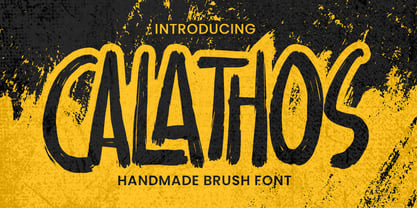 Introducing Calathos– Handmade Brush Font is a Signature Style and classy style, this font is great for your creative projects such as watermark on photography, and perfect for logos & branding, photography, invitation, watermark,advertisements,product designs, stationery, wedding designs,label ,product packaging, special events or anything that need handwritting taste. Calathos a natural handwritten feel. This handmade font will make your design has a beautiful natural touch for each details. It is perfect for any design project as Invitation,logo, book cover, craft or any design purposes. photos, photography overlays, signs, window art, scrapbooking, tags and so much more!
 - Gloding Sophia Script by madjack.font,
$17.00 Gloding Sophia Script is a hand brushed font created with brush and ink. Gloding Sophia Script This typeface is ideal for use in bold watercolor designs or handwritten styles, such as blog titles, posters, wedding elements, t-shirts, clothing, covers books, business cards, greeting cards, brands, cafe/restaurant signs. merchandising, etc. Contains full set: - Uppercase - Lowercase - alternative - fasteners - Punctuation - number - Multilingual support. How to access all alternative characters, using the Windows Character Map with Photoshop: - https://www.youtube.com/watch?v=Go9vacoYmBw How to access all alternative characters using Adobe Illustrator: - https://www.youtube.com/watch?v=XzwjMkbB-wQ Thank you!
 - Squickt by Wiescher Design,
$39.50 Squickt was the first script I designed. The name is an atrocity, I don't remember what was on my mind, when I decided on that name, but after 25 years it is to late to change, so I have to stick with it. I have recently gone over the script and changed a little stroke here, a curve there and I added Small-Caps. The font is very useful for all kinds of signs, that have to look spontaneous. You can even condense or extend it without me going berserk; Squickt is very robust. Your scribe Gert Wiescher
 - Paestum by Three Islands Press,
$24.00Paestum is a Latin typeface inspired by Greek inscriptions of the 6th and 5th centuries B.C. Its name comes, suitably, from the Latin name for Poseidonia, a former Greek city south of Naples whose two remaining Doric temples have been on antiquities tours since at least the 1700s. Others have scanned this terrain before, of course, but earlier designs failed to supply a lower case. Although Paestum includes complete upper- and lowercase alphabets, diacritics, numerals, and essential punctuation, it does not have many unhistorical glyphs -- such as currency symbols and the @ sign. Paestum comes with three weights: light, medium, and heavy. - Reslaby by Letterayu Studio,
$19.00 Reslaby is a Vintage Slab Serif font that will make your designs look unique and fun. It's perfect for labels, quotes, posters, DIY projects, branding, packaging, greeting cards, websites, photos, photographic overlays, signs, window art, scrapbooking, tags and more! What's Included : + Standard glyphs + Web Font + Multilingual Accent + Works on PC & Mac + Simple installations Accessible in the Adobe Illustrator, Adobe Photoshop, Adobe InDesign, even work on Microsoft Word. PUA Encoded Characters - Fully accessible without additional design software. Fonts include multilingual support Image used : All photographs/pictures/vector used in the preview are not included, they are intended for illustration purpose only. Thank You
 - Typewalk 1915 by Typocalypse,
$39.00 »Typewalk 1915« is a vintage and slightly quirky Grotesque branded by history. It is a homage to European sign painter and lettering traditions of the early 20th century. »Typewalk 1915« also speaks in the proto-rational and graphical language of the »Werkbund Objectivity« which was used around 1915. »Typewalk 1915« works great for cultural, editorial and branding purposes. Speaking with its unique voice, it is well-prepared and versatile for all sorts of web and print projects. »Typewalk 1915« has 11 distinct weights from thin to heavy in upright and italic. »Typewalk Mono 1915« is its fitting Monospaced Version.
 - Whatzis JNL by Jeff Levine,
$29.00Whatzis JNL is a collection of over 85 decorative question marks gathered from the Jeff Levine font collection and assembled into one convenient file for use in specialty projects where ad copy is based on questions or curiosity. No need to search through dozens of fonts for your background images, as they're all here. Ads such as "Have a question about your insurance?," "What's New at Harper, Jones and Harper?" or "Ask Us! - We are the Experts!"... or signs saying "May We Help You?" benefit from some well placed display question marks - especially when printed in contrasting colors or screened-back in halftones. - Plastic Toys by Trim Studio,
$12.00 Plastic Toys is a basic display font for mom and kids crafter. It created to complete the normal type of font but need a playful and plasticy feel that crafter always needed. because of it feels, you can mix and match this style with various handbrush and normal strong font to get the feel of what your design needed Its perfectly suited for crafter and graphic artist to complete their design such as invitation, advertisement, poster, logo, birthday, product sign, and many more! Plastic Toys Font also Lightweight, even so contains All Standard glyphs and punctuations
 - Herova Italic by Gatype,
$9.00 HEROVA is a modern display font with a unique font.This customizable font will look great on a variety of design ideas such as, inding styles, high contrast and light weight fonts perfect for feminine logo signs, fashion & editorial design heads, branding projects,Clothing Branding, packaging, magazine titles, advertisements, T -shirts, postcards, valentines, posters, invitations, weddings, branding projects, social media posts, magazines, book covers and more! This will add a fun and friendly touch to any of your projects! This font is PUA encoded which means you can access all the glyphs and sweeps easily and more.
 - Nibbles by Typogama,
$19.00 Nibbles is a linear dingbat typeface inspired by the theme of food and food trucks. With symbols ranging from burgers, pancakes, or desserts, to food trucks and toilet signs, this font aims to cover all your hungry design needs! To help with its application, each pictogram can either be found through its glyph placement or by simply typing out the name of the food item. Type burger and presto, your burger pictogram will appear! With its simple application and extensive symbols, Nibbles can be used for branding, menus, editorial layouts, posters, and any food related projects.
 - Mr. Mamoulian by Comicraft,
$19.00 “In some way I was Mr Mamoulian, and someone else was writing and drawing this stuff. He kept sending me these pages. I had to sign my name and pass them off as my own. I had no choice. He was holding my aged mother hostage, you see. I told him when the pages were due and he somehow got them to me. Sometimes he left them in secret locations. I don't remember them at all.” -- Brian Bolland Mr. Mamoulian has four weights with automatic alternating uppercase letters, Crossbar I Technology, and European, Vietnamese & Cyrillic language support.