1,897 search results
(0.017 seconds)
- Kunstler Grotesk by HiH,
$12.00 Künstler Grotesk ML is one of a number of typeface designs that attempts to reconcile Germany’s blackletter tradition with the international familiarity of roman letterforms in a simple, robust design suitable for meeting the demands of a modern industrial economy, while rejecting the extraneous ornamentation of the departing Victorian era. It is an all-cap design with a number of playful ligatures. It has an appealing boldness that reverses well. Künstler means ‘artist’ in German. I had always assumed it was a person’s name until I came across the translation. Lesson: conjecture is not fact. Grotesk refers to a sans serif letterform tradition. Kunstler Grotesk was originally released by Bauer'sche Giesserei of Frankfurt am Main circa 1900. Künstler Grotesk ML represents a major extension of the original release, with the following changes: 1. Added glyphs for the 1250 Central Europe, the 1252 Turkish and the 1257 Baltic Code Pages. Added glyphs to complete standard 1252 Western Europe Code Page. Special glyphs relocated and assigned Unicode codepoints, some in Private Use area. Total of 350 glyphs, 260 kerning pairs. 2. Added OpenType GSUB layout features: pnum, salt, dlig (19) and hist. 3. Revised vertical metrics for improved cross-platform line spacing. 4. Redesigned mathematical operators. 5. Included tabular (std) & proportional (opt) numbers. 6. Refined various glyph outlines. 7. Made CcNnOoSsZz-kreska available (salt). 8. Incorporated alternate glyphs in lower case.
 - KNF Damryl by Kenan Nasibov Fonts,
$29.00 KNF Damryl is a monospaced display font that can also be described as a modern geometric sans serif. Inspired by geometrics and postmodernist typefaces like Gridnik and FRAC, KNF Damryl is most suitable for headlines, posters, magazines, and logos. KNF Damryl has a bold presence and an artfully utilitarian feel, making it an incredible addition to your typeface library.
 - Arcaro JNL by Jeff Levine,
$29.00 There are times when a typeface is used so consistently that it becomes somewhat synonymous with the subject it's used in. The opening and end titles for the ABC-TV series "Naked City" (1958-1963) were set in a bold version of a popular font emulating the look of calligraphic hand lettering. Arcaro JNL is a somewhat lighter and slightly modified version of this typeface and is offered in both regular and oblique versions. The name Arcaro comes from one of the regular characters in this superbly-written police drama, Detective Frank Arcaro.
 - Elfinotes by Gassstype,
$22.00 Hello Everyone, introduce our new product Elfinotes is a Fun Display Font .This is Cute & Lovely Craft font with a natural handwritten feel. This handmade font will make your design has a beautiful natural touch for each details. It is perfect for any design project as Invitation,logo, book cover, craft or any design purposes. Elfinotes is font with strong and challenging nuances. very suitable for the title, typography, Poster, magazines, brochures, packaging,Websites and much more for your design needs, making your designs more modern and professional
 - Lemonade Soda by Gassstype,
$23.00 Hello Everyone, introduce our new product Lemonade Soda - Bold Handmade Carefully Crafted All Caps Display, inspired by the title of the sports poster and We make it very energetically. Lemonade Soda font with strong and challenging nuances. very suitable for the title, typography, Poster, magazines, brochures, packaging,Websites and much more for your design needs, making your designs more modern and professional Inspired by Logo style and combination with Cute Craft style. that will fulfill your design needs for quotes,sporty theme, logotype, wordmark, etc. This has many opentype features and support multi language.
 - Deposta by Black Studio,
$14.00 Deposta handwriting fonts are a charming collection of typefaces that encapsulate the authenticity and organic flow of handwritten script. Each font within the Deposta family is carefully crafted to evoke a sense of elegance, yet maintain a casual and natural appearance. With varying styles and weights, these fonts exhibit fluid strokes, graceful curves, and nuanced detailing, capturing the essence of handwritten text while offering versatility for diverse design projects. Whether used for invitations, branding, or creative endeavors, Deposta handwriting fonts bring a delightful touch of personal expression and sophistication to any typographic composition.
 - Kafka by Julia Bausenhardt,
$45.00 This font is based on the handwriting of author Franz Kafka and captures his expressive handwriting style, using the manuscript of The Trial and his diaries as the primary reference. The font presents the elegance and nervousness with which he wrote his letters and book manuscripts. To resemble naturalistic writing and remain as authentic and irregular as possible (without becoming impossible to read), a great number of extended ligatures was added. As an extra, several drawings from Kafka‘s diaries are included. A full international character set is featured.
 - On The Town JNL by Jeff Levine,
$29.00 On the Town JNL is a reworking of Parks Department JNL, giving it a classic "solid black Art Deco treatment". The wide monoline font of the original design was inspired by hand lettering on a WPA (Works Progress Administration) poster. Art Deco typography and the streamlined style it embraced often conjures up images of New York City in the 1930s and 1940s, thus On the Town JNL is named for the classic MGM musical starry Gene Kelly, Frank Sinatra and Jules Munchen that was filmed on location in "the city that never sleeps".
 - Squabslab by Gassstype,
$23.00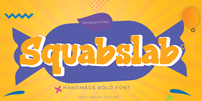 Hello Everyone, introduce our new product Squabslab - Handmade Bold Font Display, inspired by the title of the sports poster and We make it very energetically. Squabslab font with strong and challenging nuances. very suitable for the title, typography, Poster, magazines, brochures, packaging,Websites and much more for your design needs, making your designs more modern and professional This handmade font will make your design has a beautiful natural touch for each details. It is perfect for any design project as Invitation,logo, book cover, craft or any design purposes.
 - Raisin Muffin by Gassstype,
$23.00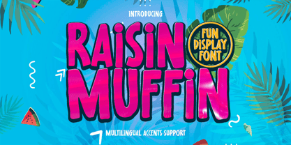 Hello Everyone, introduce our new product Raisin Muffin is a Fun Display Font .This is Cute & Lovely Craft font with a natural handwritten feel. This handmade font will make your design has a beautiful natural touch for each details. It is perfect for any design project as Invitation,logo, book cover, craft or any design purposes. Raisin Muffin is font with Creative Display Fun and challenging nuances. very suitable for the title, typography, Poster, magazines, brochures, packaging,Websites and much more for your design needs, making your designs more modern and professional.
 - TE HAFS2 Tharwat Emara2 by Tharwat Emara,
$49.00 It is known as the Hafs Quraan2 Font for its extensive use in the copying and transmission of books because it helps the writer to write more quickly than any other font since the Islamic times and then Alnaskh Quraan font wrote the "Quran"And the advantages of Alnaskh Quraan font are clarifying the letters and show their beauty and splendor. Naskh Font for writing the Holy Qur’an by Raweya Hafs, for the first time, the possibility of coloring all its letters to learn Tajweed - The possibility of coloring letters, various forms of one letter
 - Swifter by Keristyper Studio,
$14.00 Introducing Swifter a racing display with strong sports nuances. This font is good for logo design, Social media, Movie Titles, Books Titles, short text even long text letters, and good for your secondary text font with sans or serif. **Featured:** * Standard Uppercase & Lowercase * Numeral & Punctuation * Multilingual : ä ö ü Ä Ö Ü ß ¿ ¡ * Alternate & Ligature * PUA encoded We recommend programs that support the OpenType feature and the Glyphs panel such as Adobe applications or Corel Draw. so you can use all the variations of the glyphs. Hope you enjoy our fonts!
 - Bargain by Arkalandara,
$115.00 Handwriting is a unique and personal expression of language created by individuals using a pen, pencil, or other writing instrument. It encompasses various styles, characteristics, and nuances that make each person's writing distinctive. Pointed shapes and characters refer to the specific forms and angles of the letters and symbols in a written script. Pointed shapes in handwriting typically involve the presence of sharp angles or well-defined points in the formation of letters. This can contribute to a more angular and edgy appearance in the overall writing style.
 - Architectuur NF by Nick's Fonts,
$10.00Letterpress type, crafted by H. Th. Wijdeveld, founding editor and chief designer of the legendary Dutch art and architecture magazine Wendingen, provided the inspiration for this typeface. The original design graced a 1925 issue examining the work of Frank Lloyd Wright, and Wijdeveld created his typeface by assembling bits of standard brass rules. This version features several of the meanders typical of Wijdeveld’s graphic design in the dagger, double dagger, ASCII tilde and ASCII circumflex positions. Both versions of the font include 1252 Latin, 1250 CE (with localization for Romanian and Moldovan). - Linotype Constitution by Linotype,
$29.99Frank Marciuliano designed the basic forms of Linotype Constitution around those of the swash alphabets of the 18th century. While the capitals are generously designed, the lower case letters have more reserved forms and are narrower. The characters of Constitution seem to have been set to paper with a feather and ink. The marked stroke contrast and elegant forms makes it a dynamic and sentimental font. The capitals can be used as initials mixed with other fonts, but Constitution is also good for texts which should give a feeling of nostalgia. - Ludwigon by IbraCreative,
$17.00 Ludwigon is a contemporary serif typeface that seamlessly melds timeless elegance with a modern sensibility. With its gracefully elongated serifs and refined letterforms, Ludwigon exudes sophistication and readability, making it a versatile choice for a wide range of applications. Its clean lines and balanced proportions lend an air of classic refinement, while subtle design nuances, such as tapered stroke endings and graceful curves, infuse it with a touch of contemporary flair. Ludwigon strikes a harmonious balance between tradition and innovation, making it a compelling choice for projects seeking a timeless yet fresh typographic aesthetic.
 - Dritch by Grontype,
$14.00 Dritch. is a mystical font with a unique and modern geometric style. It is suitable for logos, quotes, social media posts, film titles and stationary. It works with different themes such as mystical, tribal, ethnic, magical, and fantasy. Enjoy! is a fresh, geometric, sans-serif font family. The geometric, near-monoline construction lends a classic durability, tempered by softened edges and vibrant shapes. Friendly and charismatic in lowercase; sophisticated and authoritative in uppercase. Hard lines and sharp corners mesh with smooth, rounded letterforms, while humanist nuances add warmth
 - Moochio by Brothergrounds Studio,
$9.99 Introducing Moochio - Display Craft Font with strong and challenging nuances. very suitable for the title, typography, magazines, brochures, packaging and much more for your design needs, making your designs more modern and professional What's Included : + Standard glyphs + Web Font + Works on PC & Mac + Simple installations Accessible in the Adobe Illustrator, Adobe Photoshop, Adobe InDesign, even work on Microsoft Word. PUA Encoded Characters - Fully accessible without additional design software. Fonts include multilingual support Image used : All photographs/pictures/vector used in the preview are not included, they are intended for illustration purpose only. Cheers! Thank You
 - FHA Modernized Ideal Classic by Fontry West,
$25.00 Frank H. Atkinson's book Atkinson Sign Painting was published in 1909. For decades, this book served as the manual for sign painters - a handbook for hand lettering. Atkinson’s book described techniques, layouts and several sample alphabets. Modernized Ideal Classic was inspired by one of these demonstration alphabets. Although Classic has its beginnings in art deco, it is very comfortable in any period or style of design. It is most appropriate in headline and display text, poster copy and signs. We've included some nice stylistic alternates and an interesting array of ligatures.
 - Blackbuster by Gassstype,
$25.00 Hello Everyone, introduce our new product Blackbuster - All Caps Bold Typeface Display, inspired by the title of the sports poster and We make it very energetically. Blackbuster font with strong and challenging nuances. very suitable for the title, typography, Poster, magazines, brochures, packaging, Websites and much more for your design needs, making your designs more modern and professional. This handmade font will make your design has a beautiful natural touch for each details. It is perfect for any design project as Invitation,logo, book cover, craft or any design purposes.
 - Camille by Arabetics,
$45.00 Camille was designed with exaggerated emphasis on letter vertical characteristic, by virtually eliminating the typical Arabic horizontal line look. This font glyph weights and look and feel are heavily influenced by early Kufic Quranic calligraphy style. Camille supports all Arabetic scripts covered by Unicode 6.1, and the latest Arabic Supplement and Extended-A Unicode blocks, including support for Quranic texts. This font family includes two letter spacing flavors: isolated for small text and overlapped for large or display text. The two spacing flavors have one weight each with a normal and a left-slanted Italic version. The script design of this font family follows the Arabetics Mutamathil Taqlidi style utilizing varying x-heights. The Mutamathil Taqlidi type style uses one glyph per every basic Arabic Unicode character or letter, as defined by the Unicode Standards, and one additional final form glyph, for each freely-connecting letter of the Arabic cursive text. Camille includes the required Lam-Alif ligatures in addition to all vowel diacritic ligatures. Soft-vowel diacritic marks (harakat) are selectively positioned with most of them appearing on similar high and low levels—top left corner—, to clearly distinguish them from the letters. Tatweel is a zero-width glyph.
 - 99 Names of ALLAH Linear by Islamic Calligraphy75,
$12.00 We have transformed the “99 names of ALLAH” into a font. That means each key on your keyboard represents 1 of the 99 names of ALLAH Aaza Wajal. The fonts work with both the English and Arabic Keyboards. We call this Calligraphy "Linear" for obvious reasons. The first "Alef" has a "fatha", this indicates that the name can be pronounced only one way, "AR-RAHMAAN". (in the zip file you will find a pdf file explaining the differences in the "harakat", pronunciation and spelling according to the Holy Quran). This calligraphy is very clear and no letters overlap. Decorative letters used in this calligraphy: "Mim, Aain, Sin, HHe, He, Kaf, Ta & Saad". Purpose & use: - Writers: Highlight the names in your texts in beautiful Islamic calligraphy. - Editors: Use with kinetic typography templates (AE) & editing software. - Designers: The very small details in the names does not affect the quality. Rest assured it is flawless. The MOST IMPORTANT THING about this list is that all the names are 100% ERROR FREE, and you can USE THEM WITH YOUR EYES CLOSED. All the “Tachkilat” are 100% ERROR FREE, all the "Spelling" is 100% ERROR FREE, and they all have been written in accordance with the Holy Quran. No names are missing and no names are duplicated. The list is complete "99 names +1". The +1 is the name “ALLAH” 'Aza wajal. Another important thing is how we use the decorative letters. In every font you will see small decorative letters, these letters are used only in accordance with their respective letters to indicate pronunciation & we don't include them randomly. That means "mim" on top or below the letter "mim", "sin" on top or below the letter "sin", and so on and so forth. Included: Pdf file telling you which key is associated with which name. In that same file we have included the transliteration and explication of all 99 names. Pdf file explaining the differences in the harakat and pronunciation according to the Holy Quran.
 - Buffalo Bill by FontMesa,
$35.00 Buffalo Bill is a revival of an old favorite font that’s been around since 1888, the James Conner’s Sons foundry book of that same year is the oldest source I've seen for this old classic. If you're looking for the font used as the logo for Buffalo Bill’s Irma Hotel in Cody Wyoming please refer to the FontMesa Rough Riders font. New to the Buffalo Bill font is the lowercase and many other characters that go into making a complete type font by today’s standards. The Type 1 version is limited to the basic Latin and western European character sets while the Truetype and OpenType versions also include central and eastern European charcters. William F. (Buffalo Bill) Cody called America’s Greatest Showman was one of the United State’s first big celebrity entertainers known around the world, millions of people learned about the Old West through Buffalo Bill’s Wild West shows which traveled throughout the United States and Europe. William Cody, at age eleven, started work on a cattle drive and wagon train crossing the Great Plains many times, he further went on to fur trapping and gold mining then joined the Pony Express in 1860. After the Civil War Cody went on to work for the Army as a scout and hunter where he gained his nickname Buffalo Bill. In 1872 William Cody started his entertainment career on stage in Chicago along with Texas Jack who also worked as a scout, the Scouts of the Prarie was a great success and the following year it expanded to include Wild Bill Hickok and was eventually named The Buffalo Bill Combination. By 1882 Texas Jack and Wild Bill Hickok had left the show and Buffalo Bill conceived the idea for the traveling Wild West Show using real cowboys, cowgirls, sharpshooters and Indians plus live buffalo and elk. The Wild West shows began in 1883 and visited many cities throughout the United States. In 1887 writer Mark Twain convinced Cody to take the show overseas to Europe showing England, Germany and France a wonderful and adventuruos chapter of American history. The shows continued in the United States and in 1908 William Cody combined his show with Pawnees Bill’s, in 1913 the show ran into financial trouble and was seized by the Denver sheriff until a $20,000 debt (borrowed from investor Harry Tammen) could be paid, Bill couldn't pay the debt and the loan could not be extended so the assets were auctioned off. William Cody continued to work off his debt with Harry Tammen by giving performances at the Sell’s-Floto Circus through 1915 then performed for another two years with other Wild West shows. William F. Cody passed away in 1917 while visiting his sister in Denver and is buried on Lookout Mountain joined by his wife four years later. Close friend Johnny Baker, the unofficial foster son of William Cody, began the Buffalo Bill Memorial Museum in 1921, over the years millions of people have visited William Cody’s grave and museum making it one of the top visitor attractions in the Denver area. William F. Cody romantisized the West creating the Wild West love affair that many still have for it today through books and cinema.
 - Durham Latin by Mayfield Type Foundry,
$25.00 Durham Latin brings the Latin style from the Industrial Revolution to the modern era. These letterforms could be seen painted on a road sign in France, engraved in a sign over a tavern door in London, or seen on a playbill in America. The rich and varied history of these forms inspired me to capture that personality, and interpret it in a way that fits the wide range of needs of modern designers. Condensed forms and strong serifs imbue Durham Latin with a presence that can’t be ignored yet doesn’t overwhelm. It shines as a powerful display font, and becomes affable when used at smaller sizes for subheadings. Durham thrives in spartan and ornate environments alike. Durham Latin features Outline and Fill variants that allow for more creative display elements. The lowercase are 80% height small caps. Each font contains 448 characters and has full Western European support. Advanced typographic features are built in, including tabular numbers, fractions, arrows, and more.
 - 750 Latin Uncial by GLC,
$38.00 This font was inspired by the Latin script used in European monasteries from circa the 5th to 8th centuries, before the Carolingian “Caroline” (look at our 825 Karolus). It was a regular script, rounded, written slowly, used mainly for specially meticulous books, with a few ligatures, legible, but only with lowercase. The capitals consisted of enlarged lower cases, but here, we have preferred to use two slightly different patterns. Our lower cases are a synthesis from a lot of variants (mainly from the “First Bible” of Charles The Bald), the upper cases were mainly inspired from a 700’s manuscript from the abbey of Fécamp (France). We have adapted the font for contemporary users, differentiating between U and V, I and J, which has no relevance for ancient Latin scribes, and naturally with Thorn, Oslash, Lslash, K, W... punctuation and the usual accented characters which did not exist at the time. It can be used with 799 Insular Title.
 - 1791 Constitution by GLC,
$42.00 In the year 1791, the 20th of June, the king of France Louis XVI attempted to flight from Paris to the Luxembourg. He was intercepted on the road and taked to Paris again on the 21st. A few month later, in September, the first French democratic constitution was promulgated, transferring the sovereignty from the king to the French people. This font was created inspired from the steady hand of a lawyer writing a farm renting contract a few days after the advent of the new French regime. It is a "Pro" font containing Western (including Celtic) and Northern European, Icelandic, Baltic, Eastern, Central European and Turquish diacritics. The numerous alternates and ligatures allow to made the font looking as closely as possible to a real hand. Using an OTF software, the features allow to vary the characters without anything to do but to select contextual alternates and standard ligatures and/or stylistic alternates options.
 - 1557 Italique by GLC,
$38.00 Italic type was invented by Aldus Manutius in 1499 or 1501, first, before to be a style name, it was a plain font familly name. This Italique style font was inspired from these who was used by Jean de Tournes in Lyon (France) to print La mÈtamorphose d'Ovide figurÈe, a splendid book with numerous gothic style wood carved pictures. The original font contains almost all modern usual characters except accented ones, no longer in use on that time. They have been added, with some others, with respect for the original design. . A render sheet, enclosed in file, help to identify various others unusual letters on keyboard. It is used as successfuly as web-site titles, posters and fliers design, editing ancien texts or greeting cards, invitations, gastronomic menus... and much more, as a very decorative and elegant font... It supports easily as enlargement as small size, remaining clear and easy to read from 8 or 9 points to 72 and more, particularly on prints.
 - BD Megatoya by Balibilly Design,
$25.00 Overview of BD Megatoya Consists of 41 fonts, including nine upright, nine italics, nine extended, nine extended italics, all in nine weights from thin to black. 4 outline version in black weight. 1 variable with three axes (weight, width, slant). 1,470 glyphs in each font. Opentype features include small caps, stylistic alternates, ligatures, complete numeral figures, ordinal, case-sensitive forms. language support: Western European, Central European, and Southeastern European. About BD Megatoya Taking a geometric sans serif approach, we designed the letterform with details on round characters to pursue harmony and leave a slightly boxy feel to the extended style. The stylistic alternate is one of our concentrations to make them versatile yet still preserve consistency in stem and metrics to provide good readability in small text. Overall, the various treatments for each character will encourage each other to dynamic colours, flexible, and functional impressions in their application. Slicing edges The edge of the letter slice in 45 degrees will give the impression of a sparkle of light when you look at them for the first 2 seconds (our experience). This is what we did a few years ago when working on automotive branding. The word-mark logotype with slicing form gives an exclusive and different impression from its crowds. If you agree with us, does BD Megatoya deserve to be called a problem solver in branding projects? Jump over to .ss07, .ss08, .ss09, and .ss10 to find them! The Features BD Megatoya font family includes 41 great fonts in nine weights, an extended character set of over 1400 glyphs, multilingual support such as Southeastern Europe, Central Europe, Western Europe. Also advanced & useful open-type features: case-sensitive forms, small caps, standard and discretionary ligatures, stylistic alternates, ordinals, fractions, numerator, denominator, superscript, subscript, circled number, slashed zero, old-style figure, tabular and lining figure. Use BD Megatoya BD Megatoya is very suitable for branding projects and many designs purpose like advertising, posters, invitations, branding, logos, magazines, merchandise, presentations, etc. It's a FREE Get one weight from the BD Megayoya family for Free! Apply to your amazing projects and enlarge your creative tools by adding the complete BD Megatoya family to your font library.
 - Hyper Top by Bisou,
$12.00 Made in La Chaux-de-Fonds (Switzerland), Hyper Top is born while the designer (Bisou) watches "One from the Heart", a movie from Francis Coppola where Las Vegas is completely rebuilt in studio. The opening scene stages the signboard of the Dunes hotel and casino. This is the starting point of the most modern font ever designed by Bisou. Hyper Top is thought from ground up to give a strong impact. Dynamic, joyful, fast, this modern bold font is best suitable titles. It works perfectly with short texts for advertisement like candies, fireworks, protein bars or chewing gums. Just hang it over a prank and trap shop and see the coolest bad ass kids come in.
 - 1859 Solferino by GLC,
$38.00 This font is a late 19th Century French script overview inspired by numerous French letters, from around years 1850-1860, during the second French empire, under Napoleon the third. Most of them were written with very tiny characters on light sheets of paper, as postage prices were calculated from the letter's weight. The TTF and OTF versions are enriched with more than 50 ligatures and/or alternate characters. We also offer a choice of two sorts of Capitals. Why "1859 Solferino"? It was the last battle of the Italian independence war, opposing the victorious Franco-Italian army to Austria in June 24, 1859. The Red Cross was inspired directly from the carnage remaining on the battle field.
 - Nomos Sans by Identity Letters,
$45.00 What is a brutalist typeface? The exact definition is anyone’s guess. Regardless, the Nomos superfamily is our take on the genre. Like the eponymous architectural style, Nomos is raw, direct, and honest. Its unrefined aesthetics reveal an orderly construction that is as firmly rooted in classic modernism as in the internet age—with simple, functional letterforms and the blunt convergence of diagonal and vertical stems. The Nomos Sans subfamily is a low-contrast neogrotesk with 18 styles and a set of 1000+ characters. A confident choice for fashion and finance, for apps and advertising: humble and expedient in body text, vigorous in display sizes. Has extra poise when paired with Nomos Slab.
 - Arthur Cabinet by SIAS,
$49.90 The Arthur Cabinet font family offers a most particular range of seven fancy ornamental fonts in the spirit of the Art Deco era. These fonts celebrate the age of elegance, stylishness and refinement to its very best. They give you a unique tool for exquisite designs. The fonts of this family are derivatives from the Arthur Sans series, which you may also want to have a look at. Use this unique typefaces for distinctive personal stationary, outstanding headlines, captivating brochures and invitations; for marvellous logotypes, wonderful menus, hotel leaflets, exciting ads … for brillant designs. Each Arthur Cabinet font features the same comprehensive Euro-Latin encoding for full language support. Additionally, every font includes a small supplementary set of fine ornaments. – For an even more comprehensive range of Arthur embellishments check out the font Arthur Sans Regular or Arthur Ornaments! Have also a look at the sister fonts of the gorgeous Arthur Sans Family, which will offer you yet another wonderful scope of fascinating typographic possibilities. ________________________________________________________________________________ Tip: Set Sample text (see below) manually to [ABCDE…] to view effectively the fonts most relevant parts! ________________________________________________________________________________
 - Bernhard Gothic SG by Spiece Graphics,
$39.00 This design is one of the true gems to come out of the 1930s typeface era. Even though the face was originally designed to counter the invasion of European sans-serifs, it remains faithful to the principles found in its creator's poster work. Lucian Bernhard's lettering creation for American Type Founders is to this day a favorite among font connoisseurs worldwide. It has a unique personality. This deluxe version is packed with extras including the original oldstyle figures, alternates, and ligatures. A number of styles and alternate characters have been added to the family such as heavy italics, extra heavy italics, and capital figures. And an easier-to-identify "flagged" figure one and the new euro symbol are now located in each individual style. Bernhard Gothic is also available in the OpenType Std format. Lining and oldstyle figures, stylistic alternates, and additional discretionary ligatures are now combined in each style. These advanced features currently work in Adobe Creative Suite InDesign, Creative Suite Illustrator, and Quark XPress 7. Check for OpenType advanced feature support in other applications as it gradually becomes available with upgrades.
 - Mullingar by Fontdation,
$18.00 Introducing Mullingar, our latest submission to the display typeface’s world library. Heavily inspired by the letters that are used in old/classic advertisements and signpainting culture, with a little magic touch of modern twist to keep this family relevant. Mullingar letterforms were built from bold and blocky base, unique serif combinations, clean plus smooth curves, and sharp edges. Available in six styles (Regular, Bold, Light, plus Slanted in each version), that guaranteed to give you joy in designing. Mullingar family is a reminiscent of retro sign painting, featuring a rustic architecture that makes it quite at home in a wide variety of design themes. Its blocky characters are best used in bold signage, headlines, advertising, logo designs, product packaging, merchandise, apparel, posters, album artwork, book covers, titling, etc. This typeface also provides additional versatility through OpenType feature, offering discretionary ligatures, standard ligatures, and stylistic alternates. It extends multilingual support to Basic Latin, Western European, Euro, and Pan African Latin languages for design projects intended for an international audience.
 - Ravensara Antiqua Stencil by NaumType,
$19.00 Ravensara Stencil - elegant high contrast classic serif. Ravensara family was born from the idea of taking the Didone concept to weight extremes. In light and medium weights Ravensara transmits a very elegant and high fashion style attitude, but stays readable in small sizes and can even be used as a text font. That makes it an ideal solution for projects, that needs an injection of contemporary sophistication. Heavy weights perfectly complement light and medium ones and also works great by their own in large sizes. It is a part of the Ravensara superfamily, united by the same anatomy, which currently also includes Ravensara Sans and Ravensara Serif. Ravensara Stencil is available in 9 weights, including Thin, Light, Regular, Medium, SemiBold, Bold, ExtraBold, Black and ExtaBlack. Ravensara font family, combining its classic origins and contemporary elegance, is a perfect choice for bold headlines, oversize typography, fashion logos, branding, identity, website design, album art, posters, advertising, etc. Ravensara Stencil extends multilingual support to Basic Latin, Western European, Euro, Catalan, Baltic, Turkish, Central European, Pan African Latin and Afrikaans.
 - Vialog by Linotype,
$50.99Vialog is a large and versatile sans serif family consisting of four weights of roman with corresponding italics, each with small caps and Old style Figures. Designers Werner Schneider and Helmut Ness based the concept for Vialog on the forms in "Euro Type," an unpublished type designed by Schneider in 1988 for the German Federal Transportation Ministry. For Vialog, Schneider made comprehensive legibility studies of the existing European transportation fonts, and combined and adapted the best features to make a new information system font family. He fine-tuned Vialog's characters and spacing with a special regard to the legibility problems of transportation settings, such as viewing type at distances and while moving. For example: cap I, J and lowercase i, j are common legibility problems in sans serif fonts, so in Vialog, these characters have serifs. In addition to its usefulness to the transportation industry, the Vialog family confidently meets the needs of corporate design and branding systems with its space-saving attributes for text settings, as well as the large number of weights and styles. - Lapidaria by SIAS,
$34.90 Lapidaria is a typeface that may be described as a ‘geometric sans with humanist qualities’. Its mood is smart and sober, its appeal is calm, cool and classical. Though quite well performing even in longer text bodies, a particular strength of Lapidaria lies in display typography. The most peculiar aspect of Lapidaria is its new family concept: for the very first time ever a tricameral alphabet model has been realized as a general-use sans: uppercase, lowercase and middlecase letters blending smoothly into one typographic tone, thus offering entirely new typographic possibilities. – The middlecase (or uncial) sorts being accommodated in the lowercase positions of the Medior fonts. All nine fonts equally offer full character coverage for all Euro-Latin languages – and for Greek. There are a lots of special characters and ligatures. Last but not least, a set of ten ornament characters (in each font) will let you make sparkling designs which will thrill your clients. Each font contains about 500 characters, that makes over 4,500 in total for the complete Lapidaria family package. __________________________________________________________________________________________
 - The DorovarFLF-Carolus font, crafted by Altsys Metamorphosis, is a tribute to the elegance and historical depth of early manuscript and inscription lettering, harmoniously blending tradition with the...
- Kylo Sans by The Northern Block,
$29.95 Kylo Sans is a carefully blended typeface, one-part humanist, one-part grotesque and a small dose of geometric. It takes the essence of three distinct forms to create a unique, readable typeface with an exact and understated personality. Additionally, the design process includes a hand-eye adjustment to three master weights, giving a greater range of usability across text layouts. Kylo Sans remastered to version 2.0 for improved OpenType features and usability. Details include six weights and italics, over 700 characters with alternative lowercase Q, a, g, l and y. Open type features include six variations of numerals, small caps, ligatures, and language support covering Western, South and Central Europe.
 - Xaloc by Vanarchiv,
$20.50 Xaloc was designed for editorial use in books, magazines and newspapers. This typeface family contains different font versions for different optical sizes; Caption, Text, Subhead and Display, all of them with different x-height proportions and contrast. Its serifs are asymmetrical and its letterforms have geometric modulated strokes that emulate the calligraphic variations. Its design approach enhances text flow and continuous reading. Xaloc was based on Ricado Santos’ Tramuntana, which has the same skeleton, proportions and serifs with a more mechanical design. Xaloc is the Catalonian name from the Mediterranean wind that comes from the Sahara and reaches hurricane speeds in North Africa and Southern Europe.