1,897 search results
(0.017 seconds)
- Payzant Pen NF by Nick's Fonts,
$10.00The inspiration for this exuberant exercise in penmanship was found in Frank H. Atkinson's A Show at Sho-Cards: Comprehensive, Complete, Concise, published in 1918, executed with the then-state-of-the-art Payzant Reservoir Pen. It retains its quaint charm, even after almost a century. Both versions of this font contain the complete Unicode 1252 (Latin) and Unicode 1250 (Central European) character sets, with localization for Romanian and Moldovan. - VLNL DBXLZX by VetteLetters,
$9.00 DBXLZX was inspired by the logo of the ZX Spectrum home computer, released in 1982 by Sinclair Research. For many designers the 8-bit pixel grid of the ZX Spectrum was one of the first steps into the realm of digital design. DBXLZX was initially developed by DBXL into a three weight family for use on the Armind record label of world famous trance deejay Armin van Buuren.
 - Gilbert JNL by Jeff Levine,
$29.00 Gilbert JNL is an interpretation of Eric Gill's classic sanserif typeface, which has become an all-purpose workhorse in ad copy. While other versions of gill-sans fonts have multiple weight sets, Jeff Levine chose to replicate this particular weight as a single design [in both regular and oblique versions] because of its popularity with sign makers of the past and give to it the minor nuances of hand-made lettering.
 - Wiggles - Unknown license

- Wobbles - Unknown license

- Wibbles - Unknown license

- Segoe Print by Microsoft Corporation,
$39.00The Miramonte™ Pro Family was designed by Steve Matteson in 2006 as a friendly sans serif design suitable for user-interface design, corporate branding and publishing. The name means 'behold the mountains' in Spanish, suggesting the rustic, unrefined type design. Miramonte™ Pro Family is based on Stanislav Marso's humanist sans serif released by Graphotechna in 1960. This revival includes a cursive style italic rather than a sloped roman. Miramonte Pro Family includes an extensive character set for publishing Central and Eastern European languages. Its OpenType features include the euro symbol, alternates, old style figures, proprtional lining figures, diagonal fractions, stacked fractions, superscript/subscript and scientific inferiors. Character Set: Latin-1, CE, OpenType Pro features. View Miramonte Pro Type Specimen (PDF)NOTE: An OpenType-savvy application such as Adobe Creative Suite, Mellel or QuarkXPress is required to access the OpenType typographic features. - Europe Underground, crafted by the talented Måns Grebäck, stands as a testament to the harmonious blend of modernity and historical influences, embodying the rich tapestry of European culture and aes...
- 99 Names of ALLAH Straight by Islamic Calligraphy75,
$12.00 We have transformed the “99 names of ALLAH” into a font. That means each key on your keyboard represents 1 of the 99 names of ALLAH Aaza Wajal. The fonts work with both the English and Arabic Keyboards. We call this Calligraphy "Straight" because of the straight like design. Everything is clear, symmetric and straight. The first "Alef" has a "fatha", this indicates to pronounce the first letter. So instead of saying "R-RAHMAAN" you say "AR-RAHMAN" (in the zip file you will find a pdf file explaining the differences in the "harakat", pronunciation and spelling according to the Holy Quran). We went for the traditional "soukoun" instead of the Quranic "soukoun" & the decorative symbols are at a minimum. Decorative letters used in this calligraphy: "Mim, Aain, Sin, HHe, He & Kaf". Purpose & use: - Writers: Highlight the names in your texts in beautiful Islamic calligraphy. - Editors: Use with kinetic typography templates (AE) & editing software. - Designers: The very small details in the names does not affect the quality. Rest assured it is flawless. The MOST IMPORTANT THING about this list is that all the names are 100% ERROR FREE, and you can USE THEM WITH YOUR EYES CLOSED. All the “Tachkilat” are 100% ERROR FREE, all the "Spelling" is 100% ERROR FREE, and they all have been written in accordance with the Holy Quran. No names are missing and no names are duplicated. The list is complete "99 names +1". The +1 is the name “ALLAH” 'Aza wajal. Another important thing is how we use the decorative letters. In every font you will see small decorative letters, these letters are used only in accordance with their respective letters to indicate pronunciation & we don't include them randomly. That means "mim" on top or below the letter "mim", "sin" on top or below the letter "sin", and so on and so forth. Included: Pdf file telling you which key is associated with which name. In that same file we have included the transliteration and explication of all 99 names. Pdf file explaining the differences in the harakat and pronunciation according to the Holy Quran. Here is a link to all the extra files you will need: https://drive.google.com/drive/folders/1Xj2Q8hhmfKD7stY6RILhKPiPfePpI9U4?usp=sharing
 - FF Pastoral by FontFont,
$50.99 A sturdy workhorse with the grace of a gazelle, the FF Pastoral typeface family marries pure craftsmanship with rapturous excesses of form. With his fifteenth release under the FontFont brand, prolific French designer Xavier Dupré has filled a typographic toolbox with plentiful options ranging from a tender, feathery Thin to a robust, healthy Black. At a glance, FF Pastoral appears deceptively simple, particularly in the middle weights. That surface serenity is intentional and allows for easy reading and quick comprehension of short blocks of copy. Upon closer inspection, FF Pastoral is complex and nuanced, carrying a balanced tension in its forms. This plays particularly well in magazine spreads and corporate logos, where uniqueness is a virtue. In creating his latest design, Dupré drew inspiration from a tasteful mix of references, combining diverse elements with a deft hand. While its letter shapes were informed by humanist-geometric hybrid Gill Sans, FF Pastoral’s proportions have been optimized for contemporary typography. Slightly condensed but generously spaced, FF Pastoral features a tall x-height, open counters, and subtle, sprightly italics slanted at just 5°. Proportional oldstyle figures are the default in the family, with tabular and lining numbers and fractions accessible through OpenType features. Elegant details evocative of calligraphy judiciously pepper the FF Pastoral glyph set. The ‘e’ bears an oblique crossbar, while the right leg of the ‘K’ and the ‘R’ are insouciantly curved in both the upright and italic variants. Further flourishes appear throughout the italics, notably in the ‘T’ and the ‘Z’, the gloriously looped tail of the ‘G’, and an extraordinary ampersand. Sharp-eyed fans of Dupré’s work may feel like they’re in familiar territory, and they would be right. An early version of FF Pastoral sprang to life in 2017 as Malis, a family in four weights on the heavier side of the spectrum. Over time, Dupré refined his original design, expanding it with four lighter styles and including true italics for all. The lightest weights are ethereal, with exquisitely delicate strokes drawing the eye in and across a line of type. The most substantial styles are tremendous in their power, allowing text to make a deep impression in print or on screen. Fully fleshed out, FF Pastoral works sublimely in a vast array of text and display settings. Dupré sees his latest FontFont offering as a ‘cultural’ typeface, perfect for the pages of an oversized coffee-table book or business communications where warmth and informality will win the day. Born in Aubenas, France (1977), Xavier Dupré is a gifted user of type as well as an award-winning type designer and lettering artist. After training in graphic design in Paris, Dupré studied calligraphy and typography at the Scriptorium de Toulouse. Since releasing FF Parango in 2001, Dupré has published such FontFont classics as the FF Absara and FF Sanuk superfamilies, FF Megano, FF Tartine, and FF Yoga. A designer of Khmer fonts as well as Latin typefaces, Dupré splits his time between Europe and Asia.
 - Northeast Railway by Fabio Ares,
$9.99 Northeast Railway is a product of argentine typographic archeology project called "Tipografía Histórica Ferroviaria" (Fabio Ares & Octavio Osores, since 2012). Is about the signboards of the stations of the line of the Argentine North Eastern Railway Company Limited (1987-1948). The letter of this signboards can be described as display type, with elementary geometric shapes and without line modulation. The principal font of the resultant family is the bold. The family is completed with complementary fonts of different styles. The proceeds from the sale of the fonts will be used to finance the project.
 - Fortuna by Linotype,
$29.99Fortuna has some resemblance with handtexted characters based, loosely, on the classic italic. But, like Ad Hoc, Fortuna is drawn on a monitor in every detail. The name is Latin and means fate, luck. The composer Carl Orff was actual at the time when I worked with Fortuna, because he had been born 100 years earlier. Orff's Carmina Burana were being introduced on the radio when I was wondering what to call my most recent creation. The song cycle begins with a song to Fortuna: a fated choice of name. Fortuna was released in 1995. - TE Warsh Tharwat Emara by Tharwat Emara,
$49.00 Introducing "TE Warsh Tharwat Emara," an exquisite Naskh font designed to elevate your typography to the next level. Our font features intricate calligraphic strokes, elegant curves, and graceful flourishes that bring a touch of sophistication and elegance to your text. Designed with the utmost attention to detail, every character in "TE Warsh Tharwat Emara" is beautifully crafted and easy to read. "TE Warsh Tharwat Emara" is perfect for typesetting the Holy Quran, with its beautifully crafted curves and strokes. The Naskh script is one of the most popular calligraphic styles used in Arabic typography and is known for its clarity, making it perfect for Quranic typesetting. With "TE Warsh Tharwat Emara," you can create stunning, high-quality typography that is perfect for publishing the Quran, as well as other religious texts. In addition to its suitability for Quranic typesetting, "TE Warsh Tharwat Emara" is versatile and can be used in a variety of contexts. Its elegant and sophisticated design makes it perfect for book covers, posters, branding, and web design. "TE Warsh Tharwat Emara" supports a wide range of languages, including Arabic, Persian, Urdu, and many others, making it ideal for multi-lingual projects. "TE Warsh Tharwat Emara" includes a range of special features that take your typography to the next level. The font includes ligatures and alternate characters, which allow you to create more natural and fluid connections between characters. The alternate characters provide a variety of stylistic choices, giving you even more control over the typography. "TE Warsh Tharwat Emara" is compatible with a wide range of platforms and software, including Adobe Creative Suite, Microsoft Office, and many others. This means that you can use "TE Warsh Tharwat Emara" in your favorite design software, without worrying about compatibility issues. "TE Warsh Tharwat Emara" comes with a multi-user perpetual license, which allows you to use it for commercial and personal projects. The perpetual license means that you can use the font indefinitely, without having to worry about renewing your license. We also offer a range of licensing options, including a single-user license, to suit your needs. In conclusion, "TE Warsh Tharwat Emara" is a must-have for designers and typographers who are looking to create stunning, high-quality typography that is perfect for publishing the Holy Quran, as well as other religious texts. With its intricate calligraphic strokes, elegant curves, and graceful flourishes, "TE Warsh Tharwat Emara" will elevate your typography to the next level. It's versatile, easy to use, and comes with a range of special features that make it perfect for all kinds of projects. So, whether you're designing book covers, posters, or websites, don't miss out on "TE Warsh Tharwat Emara." Purchase now and experience the beauty of our Naskh font for yourself.
 - Corbert Compact by The Northern Block,
$- A compact geometric sans serif typeface influenced by Bauhaus and the early modernist era. Precise shapes are optically adjusted to create a clear, natural typeface with excellent legibility across various applications. Corbert compact is part of the popular Corbert type system; other widths include Normal, Condensed and Wide. Details include over 590 characters; OpenType features consist of five variations of numerals, including inferiors, superiors, fractions, alternative lowercase a, e and g, and language support covering Western, South, and Central Europe.
 - Emirates by Sensatype Studio,
$15.00 Emirates font is a well-balanced contemporary font with beautiful curved and ligatures. It is a display serif font with moderate contrast that perfect for branding projects, logo, wedding designs, social media posts, advertisements, product packaging, product designs, label, photography, watermark, invitation, stationery, and any projects, it makes with a high level of legibility. What's Included: Character set A-Z Uppercase & Lowercase Numerals & Punctuation Accented Characters (West Europe) Ligature & Stylistic alternate Works on PC & Mac Wish you enjoy our font. :)
 - Rising Sun by Proportional Lime,
$25.95 This typeface was inspired by Gering and Remboldt's work during the late 1490s. Their printing concern, the Soleil d'or in Paris, was one of the printing business to engage in the use of blackletter printing, when the rest of the Parisian printers where using humanist influenced roman typefaces. This peculiar backwards trend was really one of the original examples of "retro", taking advantage of the desires of the more conservative northern Europe that had not yet embraced the newer roman types.
 - Grandezza Xtra by Wiescher Design,
$39.50 Grandezza Xtra is the standalone version of my most elaborate script. It is the script for many countries, good for Basic Latin, Latin Eastern Europe, Turkish, Baltic. I first designed 5 different sets and now this Xtra version which has a second set of capitals in the place of the smallcaps. This Xtra set is sufficient for most design jobs. If you need more you can always buy the standard Grandezza 5-font set for the reduced price. -Your script designer, Gert Wiescher
 - Corbert Wide by The Northern Block,
$- A geometric sans serif typeface influenced by Bauhaus and the early modernist era. Precise shapes are optically adjusted to create a clear, natural typeface with excellent legibility. Corbert is a regular, self-evident design that works well across a wide range of applications. Details include nine weights with matching italics and over 540 characters per style. Opentype features consist of five variations of numerals, including inferiors, superiors, fractions, alternative lowercase a, e and g, and language support covering Western, South, and Central Europe.
 - Clarendon LT by Linotype,
$40.99The first slab serif fonts appeared at the beginning of industrialization in Great Britain in 1820. Clarendon and Ionic became the names for this new development in England, known as English Egyptienne elsewhere in Europe. Clarendon is also the name of a particular font of this style, which, thanks to its clear, objective and timeless forms, never lost its contemporary feel. In small point sizes Clarendon is still a legible font and in larger print, its individual style attracts attention. - Rajjah Familia by Creativemedialab,
$20.00 Rajjah Familia - Blackletter font family Blackletter (sometimes black letter), also known as Gothic script, Gothic minuscule, or Textura, was a script used throughout Western Europe from approximately 1150 until the 17th century. Blackletter is currently widely used in modern creative design trends ranging from tattoo lettering, calligraphy, clothing brands, music, sports, labels and much more. Rajjah Familia looks gothic but easy to read, neat and beautiful. Comes with light, regular, medium and bold version. Rajjah is the right choice for your next projects!
 - Architype Tschichold by The Foundry,
$99.00 Architype Universal is a collection of avant-garde typefaces deriving mainly from the work of artists/designers of the inter-war years, whose ideals underpin the design philosophies of the modernist movement in Europe. Their ‘universal’, ‘single alphabet’ theory limits the character sets. Architype Tschichold is a faithful rendering of Jan Tschichold’s 1929 experimental alphabet which was influenced by Bayer’s single-alphabet. His design was never put into production. This re-creates his original geometrically constructed design, including some phonetic characters.
 - Clarendon by Linotype,
$29.99 The first slab serif fonts appeared at the beginning of industrialization in Great Britain in 1820. Clarendon and Ionic became the names for this new development in England, known as English Egyptienne elsewhere in Europe. Clarendon is also the name of a particular font of this style, which, thanks to its clear, objective and timeless forms, never lost its contemporary feel. In small point sizes Clarendon is still a legible font and in larger print, its individual style attracts attention.
 - Microsoft Sans Serif by Microsoft Corporation,
$39.00Microsoft Sans Serif™ Regular is a very legible User Interface (UI) font. It was designed to be metrically compatible with the MS Sans bitmap font that shipped in early versions of Microsoft Windows. The original MS Sans was in the inflexible .fon bitmap format and could not be scaled. Microsoft Sans Serif Regular is much more flexible and legible as it font antialiasing and scalable user interfaces. Character Set: Latin-1, WGL Pan-European (Eastern Europe, Cyrillic, Greek and Turkish). - Rosematty by Ivan Rosenberg,
$16.00 Rosematty is a modern calligraphy font with 99 ligatures. This font includes multilingual support for Western and Central Europe. Is ideal for blog, websites, instagram, branding, invitations, business cards, weddings and many more. Rosematty also includes 4-11 alternate characters for both uppercase and lowercase letters, beginning ending swashes for all lowercase letters and ligatures for different styles. For access to Stylistic Alternates is required software with glyphs panel like Photoshop and Illustrator. No special software is required to use Ligatures.
 - Ripped Bam Boom by Comicraft,
$19.00 It’s stronger than the Thing AND the Hulk! It can bench press 500 pound gorillas and send them scurrying into the corner. RIPPED BAM BOOM is a font that can tear through the alphabet faster than you can say “A to Z” and will work your chest, shoulders and triceps and help YOUR characters gain upper-body strength and muscle mass! Features alternate uppercase characters, Western & Central Europe, Vietnamese & Cyrillic support, Crossbar I Technology™ and 18 Chinese Sound Effects
 - Loft by Monotype,
$40.99Loft is a typeface family of extremes: from the extra compressed Hairline to the extra wide Mammoth. Paris-based designer Julien Janiszewski’s aim was to create a type family based on a strict hierarchy — a suite that would provide graphic designers with a tool to create systematic solutions. Its design was inspired by 19th-century wood type as well as the sign saying “DÉFENSE D'AFFICHER” (Post No Bills) that is ubiquitous in France. Loft comes in seven weights with matching italics. Interestingly, counter widths remain the same across all weights. As weights increase, the characters extend by building stroke thickness outside the counter. Loft is space-efficient in lighter weights while making an increasingly stronger statement as the designs become heavier. The Loft typeface family is distinctive, versatile, and always intriguing. - 1484 Bastarde Loudeac by GLC,
$38.00 Font designed after that used in Brehan-Loudeac (Britanny, France) by Robin Fouquet and Jean Crès in years 1480s to print a lot of texts and books. This font include “long s”, naturally, as typically medieval, and a few special characters and abreviations, also some variants, like for “d”, “r” or “v”. The small “y” is accented, just like in British alphabet of the time, though the texts were printed in French. Added, a lot of accented characters no longer existing on this time. A render sheet, in the font file, makes it more easy to identify on a keyboard. This font is used as variously as web-site titles, posters and flier designs, editing ancient texts... all you need. This font supports easily as large than small size, remaining readable, original and pretty.
 - Ulga Grid Rounded by ULGA Type,
$19.00 ULGA Grid Rounded is the smooth, rounded sibling of ULGA Grid and ULGA Grid Solid. The typeface consists of three weights, regular, medium and bold, with corresponding oblique styles. Every character in the extended ULGA Grid family shares the same width. ULGA Grid Rounded features a rounded square design, giving this typeface a soft, yet sturdy appearance. A contradictory mix of stiffness and suppleness, characters slide around like lead-filled snakes trying to find their way through a maze. If this typeface were a snack, it would be a smooth, chocolatey treat - too much of it and you’ll feel dizzy and a bit sick. But, hey, I’m not your dad, do what you want. Learn from your mistakes, that’s what I say. A versatile display typeface that can be used for a wide range of purposes including CD covers, posters, packaging, advertising, name badges for robots, brochures and film titles. Mix and match with ULGA Grid and ULGA Grid Solid, use the alternatives, sneak in an oblique style to spice things up, but most of all this is a fun typeface family. The character set supports Western Europe, Vietnamese, Central/Eastern Europe, Baltic, Turkish and Romanian.
 - First Ladies by Celebrity Fontz,
$24.99 First Ladies is a unique collection of signatures of almost all of the First Ladies of the United States plus the First Lady of the Confederacy in a high-quality font. A must-have for autograph collectors, desktop publishers, lovers of history, or anyone who has ever dreamed of sending a letter, card, or e-mail “signed” as if by one of these famous women. This font includes 45 signatures for the following First Ladies: Martha Dandridge Custis Washington, Abigail Smith Adams, Martha Wayles Skelton Jefferson, Dolley Payne Todd Madison, Elizabeth Kortright Monroe, Louisa Catherine Johnson Adams, Rachel Donelson Jackson, Anna Tuthill Symmes Harrison, Julia Gardiner Tyler, Sarah Childress Polk, Margaret Mackall Smith Taylor, Abigail Powers Fillmore, Jane Means Appleton Pierce, Harriet Lane, Mary Todd Lincoln, Eliza McCardle Johnson, Julia Dent Grant, Lucy Ware Webb Hayes, Lucretia Rudolph Garfield, Ellen Lewis Herndon Arthur, Frances Folsom Cleveland, Caroline Lavinia Scott Harrison, Frances Folsom Cleveland, Ida Saxton McKinley, Edith Kermit Cardow Roosevelt, Helen Herron Taft, Ellen Axson Wilson, Edith Bolling Galt Wilson, Florence Kling Harding, Grace Anna Goodhue Coolidge, Lou Henry Hoover, Anna Eleanor Roosevelt, Elizabeth Virginia Wallace Truman, Mamie Geneva Doud Eisenhower, Jacqueline Lee Bouvier Kennedy, Claudia Taylor (Lady Bird) Johnson, Patricia Ryan Nixon, Elizabeth Bloomer Ford, Rosalynn Smith Carter, Nancy Davis Reagan, Barbara Pierce Bush, Hillary Rodham Clinton, Laura Welch Bush, Michelle Obama, and Varina Howell Davis (First Lady of the Confederacy). This font behaves exactly like any other font. Each signature is mapped to a regular character on your keyboard. Open any Windows application, select the installed font, and type a letter, and the signature will appear at that point on the page. Painstaking craftsmanship and an incredible collection of hard-to-find signatures go into this one-of-a-kind font. Comes with a character map.
 - Linotype Automat by Linotype,
$29.99Distinguishing characteristics of Frank Marciulano’s Linotype Automat™ are its strictly constructed basis and its uniquely placed stroke contrasts. The emphasized vertical strokes are reminiscent of bars and give text a static feel. The forms of the letters are distinctly modern, an interpretation of a typeface meant for machines. Automat is not recommended for text but is particularly good for headlines in large point sizes, which allow its unusual forms to really stand out. - North Queen by Typeskets,
$22.00 North Queen is a Variable font and Font Family with 8 weights, starting from thin to extra bold, this font belongs to the classic serif nuanced font, very suitable for making label designs, posters, headlines, and many more, you might be able to add this font in your font collection VARIABLE We hope you enjoy this font! please feel free to comment if you have any thoughts or feedback. Thanks for purchasing and happy creating!
 - Sherika by Seniors Studio,
$15.00 Sherika is a cool and authentic sans serif font family. Seven weights plus matching italics. Simple geometry with nuance that adds warmth. t’s a perfect choice for branding, magazines, posters, advertising, packaging, headlines, logos, web, print etc. 14 styles: 7 uprights and matching italics. 232 glyphs. Latin based languages. OpenType features, including ligatures. Variable Font Includes. If you need help or advice, please contact me by e-mail "seniorsstudio@gmail.com" Thank you!
 - Notulen Serif Display by Siwox Studios,
$49.00 Notulen is an Serif Display Typeface, Extra Bold style and nicely balanced curves. Notulen is inspired by Classic typography and now come with modern serif nuance. Short serifs with slightly rounded corners make this font legible at small points. Having several alternative letter variations makes it easy to work on all design projects and works perfectly for Logos, Headlines, Posters, Packaging, T-shirts, Postcards, Invitation, Wedding Sign, Sign Painting, Signboard, and much more. Thank you,
 - The Moonlight by Aiyari,
$16.00 Introducing a new handwritten font called The Moonlight. Inspired by ball pen handwritten combine with retro (80-90's) nuance. The typeface comes with open type features such as stylistic alternates, stylistic sets, & ligatures and also support with the PUA encoded to help you make a stunning design. The Moonlight is perfect for headings, logo type, quotes, apparel design, invitations, flyer, poster, greeting cards, product packaging, book cover, printed quotes, cover album, movie, etc.
 - Lumpia Brush Script by Saffatin.co,
$25.00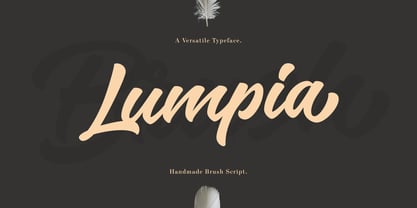 Lumpia Brush is a hand-lettering brush script font with natural nuance. This font is great for any creative project such as logos, printed quotes, invitations, cards, product packaging, headers, Logotype, Letterhead, Poster, Apparel Design, Label, and more. Lumpia Brush comes with uppercase, lowercase, numerals, punctuations, multilingual and alternative glyphs on each character and has with OpenType features, common ligatures and also additional swash. They will help your creativity to customize your designs.
 - Bold Fashion by Mans Greback,
$59.00 Bold Fashion is a heavy slab-serif font of the disco era. Its funk-style design, coupled with soft, rounded serifs, embodies the soul of retro, bringing forth memories of neon lights, bell-bottoms, and roller discos. Each letter is profoundly heavy, yet they prance with a bouncy, comfy rhythm, akin to catchy 70s beats. The swashes adorning the uppercase letters add flair, reminiscent of iconic burger joint signs and groovy vinyl covers.
 - Monograph by Pelavin Fonts,
$25.00 Monograph conjures ancient typewriters, telephone switchboards, vintage office machines past visions of the future. As though it were drawn with the rounded nib a of a Speedball "B" style pen, the soft curves and rounded serifs speak of a gentler less complicated time. It is nuanced with traces of the Arts and Crafts movement at the turn of the 20th Century which stressed craftsmanship and preserving and emphasizing the qualities of construction and materials.
 - Right Beginning by Twinletter,
$14.00 Right Beginning is adorable and cute fonts, there are various variations in each upper and lowercase letter, making this font suitable for you to place and use in any of your projects or in any media you want, this font is surnamed script with cute and beautiful nuances. It also has a charming modern character, perfect for Halloween and Cristmast nuances. This charming font also offers the beauty of abstract typography harmony for a wide variety of design projects, including digital natural handwriting for designs, quote designs, for social media business designs, advertisements, trademarks, food and beverage promotion banners, text, posters, a signature, and all designs require handwriting or whatever design you want. This font is equipped with uppercase, lowercase, numbers, punctuation marks, swhases and several variations on each character including multi-language. This font is best suited for open type friendly applications. How to get alternative glyphs from open type fonts: http://adobe.ly/1m1fn4Y PUA Character Code - Fully accessible without additional design software. do not hesitate anymore start using this font. and Feel free to send any message you want to convey.
 - Elektrakution by Comicraft,
$19.00 SHE'S DEAD, FRANK It's the year 1991, BC (Before Comicraft) when REM were still making records and Frank Miller’s memorable run on Marvel Comics’ DAREDEVIL was just over ten years old. Comicraft’s Richard Starkings found himself working in Anaheim, California for Graphitti Designs. Graphitti had produced the first hardcover edition of Miller’s Batman tale, DARK KNIGHT RETURNS and was now putting together the sequel to Miller’s DAREDEVIL — ELEKTRA LIVES AGAIN! Richard was not engaged to letter this book, the pages of Frank’s incredible original art that came through Graphitti’s studio were already lettered by Marvel Stalwart, Jim Novak. However, there were some cover elements that needed to be added, based on the logo originally rendered by Frank’s brother, Steve. Starkings set about the task of creating an alphabet that could be used to develop Steve’s idea for the trade dress -- the cover elements, the back cover copy and credits on the interior pages. This was long before Macintosh computers and font programs made this work considerably easier, so Rich sat down with a pencil and a sheet of vellum and rendered an alphabet that could be used as the basis for the text that was needed... Those sketches have languished in a drawer for nearly thirty years, but now, finally, Comicraft’s John Roshell has dusted off those old letterforms and Elektrakuted a font based on those designs, a font we HAD to call ELEKTRAKUTION! As for Elektra; she’s dead, Frank. Features: Ten weights (Light, Regular, Bold; Rough Light, Regular & Bold; Inline, Inline Rough, Outline & Outline Rough) with upper & lowercase characters, Western & Central European accents and Greek characters.
 - Hive Mind by Okaycat,
$7.50This font has 2 styles in one keyboard layout! There is a solid style, and an outline style. The capital letters match the small-case. The capitals are all solid letters, while the small-case are the same, but an outline version. Same with your numbers, there is 2 styles (Outlined hollow numbers, or press shift and a number to get it's matching solid version). Common punctuation marks, brackets, etc., are included too, in both styles (There's even a hexagonal euro and dollar sign). To make these characters easier to find, repeats are spread throughout your alternate keys. The two styles can be used together, nicely complimenting each other. Hive Mind is NOT appropriate for important business presentations, lengthy novels, or anything you want to be an easy read. Use this font anywhere you want to create a funky look or need to be cryptic... Have fun with it!


