10,000 search results
(0.15 seconds)
- The Bounde by Cititype,
$12.00 The Bounde is a bold script, carefully handcrafted to become a true favorite. Its casual charm makes it appear wonderfully down-to-earth, readable and, ultimately, incredibly versatile. The Bounde will look outstanding in any context, whether it’s being used on busy backgrounds or as a standalone headline!
 - Glowing Bubble by Crumphand,
$10.00 Introducing the new fonts, Glowing Bubble. Glowing Bubble is a Pop, Bold and Retro fonts. Good for your brand cute brand. as long as you can matching your layout. Glowing bubble comes with 4 style : Regular Outline Shadows/Extrude Hightlights The font has include Multilingual Language. Thank You, Regards.
 - Buck by Here East Fonts,
$16.00 BUCK HEAVY is an extremely monumental, architectural and brutal unicase font, designed for maximum visual and emotional impact. Use it in big and really big scales. It's great for headlines, prints, branding, editorial and websites — everything that strives for being really bold, vibrant and super strong and masculine.
 - Bodine by Balevgraph Studio,
$12.00 Bodine is a bold and geometric looking display font. It can easily be matched to an incredibly large set of projects, so add it to your creative ideas and notice how it makes them stand out! What's Included? Uppercase & Lowercase Numbers & Punctuation Alternate & Ligature Multilingual Support PUA Encoded
 - Ruadson by Letterena Studios,
$10.00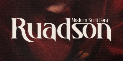 Ruadson is bold and stylish serif font. This typeface is perfect for an elegant & luxury logo, book or movie title design, fashion brand, magazine, clothes, lettering, quotes, and so much more. This font is PUA encoded which means you can access all of the glyphs and swashes with ease.
 - Gordon by Letterbox,
$50.00 Although appearing at first as a no-nonsense bold titling face, Gordon actually offers a much greater complexity through the addition of a wide range of special superscript ornaments. This adds an element of spice and depth to the face, creating a wide variation of creative typographic possibilities.
 - Baby Magpies by Sipanji21,
$10.00 this baby magpies font, Made with love and joy. Comic look, Bold, Thick, so it will make your design more beautiful, cute, fun, and colorful. you can use this font for any design, such as logo, poster, advertise, packaging, and much more. make your design awesome with our font.
 - Music Ad Stencil JNL by Jeff Levine,
$29.00 An ad appearing in the January 5, 1952 edition of Billboard Magazine promoted the then-new releases from Capitol Records. The headline copy was set in a bold, condensed sans serif stencil typeface. This inspired Music Ad Stencil JNL, which is available in both regular and oblique versions.
 - Montern Vintage by HansCo,
$15.00 Montern Vintage font is a vintage decorative typeface which is inspired by lettering sign and art. While this font has a victorian touch, it still looks bold and solid. Very suitable for for packaging, headline, logotype, apparel, branding, advertising etc. How to access alternate / ornament ? : https://hanscostudio.com/tutorial/ Enjoy!
 - Lavana by Nirmalagraphics,
$12.00 Lavana is made with a style brush. If you like natural fonts in a bold and handwriting style, you must have it. You can use Lavana for any needs, can be for logos, flyers, magazines, clothes, business card brochures and others. Lavana is also equipped with multi-lingual support.
 - Japoneh by Okaycat,
$29.50 Japoneh is a dynamic font set in all bold heavy brushed characters. It practically jumps off the page with the action of these fluid strokes! Take your design to the next level with Japoneh. Japoneh is extended, containing West European diacritics & ligatures, making it suitable for multilingual environments & publications.
 - Junior Detective JNL by Jeff Levine,
$29.00 A 1930s kids' premium booklet from Post cereals called "Inspector Post's Junior Detective Corps Manual #2" offered up some great hand lettering in an Art Deco sans serif style. Bold, authoritative and perfect for headlines or titling, Junior Detective JNL now recreates this hand lettering in digital form.
 - Mares by Alex Camacho Studio,
$24.00 Mares is an unicase typeface inspired by the American psychedelic movement from the mid 1960’s where capitals and lowercase used to be mixed and distorted to become part of the image. Mares is a bold and modern psychedelic font for use on special occasions. The bigger the better.
 - Cadaques by Supfonts,
$18.00 Cadaques is a bold, condensed font inspired by the nostalgia and aesthetics of the early 90s. Ideal for advertising, headlines, editorial design, branding, and posters. Cadaques Font Features: - Full Set of standard alphabet and punctuation - PUA Encoded - no special software needed to access extra characters - Multilingual Characters AÁĂÂÄÀĀĄÅÃÆBCĆČÇĊDÐĎĐEÉĚÊËĖÈĒĘẼFGĞĢĠḠHĦIIJÍÎÏİÌĪĮĨJKĶLĹĽĻŁMNŃŇŅÑ OÓÔÖÒŐŌØÕŒPÞQRŔŘŖSŚŠŞȘẞTŤŢȚUÚÛÜÙŰŪŲŮŨVWẂŴẄẀXYÝŶŸỲỸZŹŽŻ
 - Masyte by holyline design,
$17.00 MASYTE by Holyline is a sans serif display typeface with reguler and italic style . It's very bold and fun with a unique shape. Perfect for headline, custom logo, or anything for your creativity and MASYTE is perfect typeface if you want something new with your project. Happy creating!
 - Burnston by Maculinc,
$16.00 This is a bold font with a simple and unique retro concept. We provide this font in uppercase, lowercase, number, and equipped with punctuation, alternatives and swash. Combine swash to add an interesting impression in every word you want, we provide swash as an alternative available in this font.
 - Aranekie by Differentialtype,
$10.00 Aranekie is a modern sans serif font inspired by the bold and thin serif fonts. Aranekie comes in 4 styles, regular and italic styles that are perfect for documents, and Aranekie Dxy which can be used for display fonts such as logos, pamphlets, book covers and many other projects.
 - Mangana Sega by Differentialtype,
$12.00 Mangana Sega is a bold display serif font with a retro design. Mangana Sega is equipped with alternate and ligature, which will add an elegant and luxurious impression to every project you make. Mangana Sega is PUA encode, which mean you can easily access all required alternates and swashes.
 - Ladoni by Diogo Pisoeiro,
$15.00 This typeface is inspired on Bodoni, but this is like his gross sister, because it has angles instead of curves. Is a typeface with personality, strong and robust but at the same time sweet with his italics. This typeface has 5 weights, regular, italic, bold, poster and poster italic.
 - THD Praxim by Tim Hutchinson Design,
$25.00 THD Praxim is a modern, condensed style, sans serif font that comes in four weights – thin/regular/bold/heavy. The font is perfect for header & subheadings, editorial, display, brand & identity, campaigns, apps & web. It has a clarity & confidence which can communicate a range of messages through different media channels.
 - Dohrma by The Northern Block,
$12.80 A bold display typeface that blends subtle curves with precision geometry. This crafted detailing creates a wide variety of typesetting options ideal for use on signage, book jackets, packaging, posters and t-shirts. Details include 4 unique styles, a full character set, manually edited kerning and Euro symbol.
 - Quick Baseball by Nirmana Visual,
$22.00 Quick Baseball, contemporary of Serif font, Insipired by Baseball Club Logo, Quick Baseball it's retro, bold, and playful. Perfect if you need a dose of fun in your project. offers beautiful typographic harmony for a diversity of design projects, including logos & branding, social media posts, advertisements & product designs.
 - Movie Show JNL by Jeff Levine,
$29.00 A 1911 movie poster for a film called “How Bella Was Won” from the Edison studios had the name “Edison” hand lettered in a bold, spurred sans serif design. These few letters became the basis for Movie Show JNL, which is available in both regular and oblique versions.
 - Rightland by MJB Letters,
$17.00 Rightland is a modern bold script font, which is very strong and clean, has elegant swashes in each curve that can be applied to various design needs such as logos, posters, branding packaging and others. This font supports Multi-Language and OpenType features and it is PUA encoded.
 - Formal Dance JNL by Jeff Levine,
$29.00 A vintage Canadian-published music book circa the 1940s had the title "Strauss Waltzes" hand lettered in a bold Art Deco sans serif that featured block style letters with rounded corners. This was the working model for Formal Dance JNL, which is available in both regular and oblique versions.
 - Detective Bureau JNL by Jeff Levine,
$29.00 Traditional stencil type faces have always projected images of strength, power, police, military or industry. The hand-lettered title card for 1951's "Detective Story" (directed by William Wyler) is a perfect example of this. A bold Roman letter style, it was the perfect inspiration for Detective Bureau JNL.
 - Thornton by Arendxstudio,
$18.00 Thornton is a bold script that looks elegant when used for your design. It's also elegant and modern and works well with your design interests, be it for logos, branding names, posters, podcasts and so on. Features 1.Uppercase & Lowercase 2.Numbers & Punctuation 3.Multilingual Support 4.Ligatures
 - Wataha by Soar Studio,
$22.00 Wataha (in polish - wolf pack) is a sharp, robust uppercase family of 3 fonts: Bold, Heavy and Black. Perfect for posters, headlines and logotypes. With a range of OpenType features you have access to alternative letter shapes, fractions, arrows etc. Wataha supports most Latin-based languages and few others.
 - SBB Power Grid by Sketchbook B,
$9.00 Powerful and angular. Power Grid comes in four versions: Regular, Stencil, Inline and Rounded. Inspired by 1920s constructivist posters, it's perfect for industrial and bold applications. Power Grid is all caps and includes a handful of alternate glyphs. 8 fonts 4 styles: Regular, Stencil, Inline and Rounded Alternate characters
 - Vanda by SG Type,
$19.00 Vanda – A unique display font with numerous alternate letters, ligatures, decorative elements, and multilingual support. Vanda is a very versatile font that works great in all kinds of projects, from unique branding to bold magazine design. This all-caps typeface features numerous alternate glyphs with decorative elements and ligatures.
 - Landepz by Zamjump,
$9.00 Landepz Typefamily includes three normal styles, grunge texture and glitch, Landepz is a family of bold hand-printed types, celebrating the style of the original printing press and all its beautiful imperfections. Its solid, robust shape lends itself to a robust design, while its texture provides an authentic sound.
 - FRUiTZ by Abo Daniel,
$10.00 Introducing FRUITZ, a Juicy Bold Font. This font family is great for apparel, branding, logo, magazine, quotes, packaging, advertising, and more, that need cheerful feel. It come in uppercase, lowercase, with punctuations, symbols & numerals. Also support multilingual and already PUA encoded. The Fruitz Doodles are completing this font family.
 - Abdominal Krunch by PizzaDude.dk,
$20.00Abdominal Krunch is a wacky handwriting font. But that's not all; if you write in ALL CAPS a totally new font appears! Write in lowercase and you get the wacky/chunky handwriting letters - or choose to write in CAPS and you get a more bold, steady comic-like font! - Warp by Intellecta Design,
$9.00inspired in the idea of traveling in the light velocity - Arbotek by Type-Ø-Tones,
$60.00 Arbotek has the original skeleton that the author used for the development of his typeface Arboria, a real 'architect typography', with a basic and radical approach to pure geometric forms. The three basic styles - Thin, Light and Light Rounded - try to approach the cartographic technique annotations and their output on plotters. The voluptuous style, Ultra, keeps the same structure of the Light versions, but develops as a historic Art Decó variant of this 20s and 30s graphic style.
 - Brushstrike by Zetafonts,
$39.00 The Brush Strike Family is an exercise in dynamic, gestural brush type design by Francesco Canovaro. The typeface contains no lowercase set, but it doubles the uppercase with a strikethrough alternate set to be used for dynamic logo design and unusual word highlighting. Two weights are available with consistent design: the light weight (Brushstrike Light aka Lightstrike) can work together with the heavier regular weight but can also be used in white on dark background for light effects.
 - Dwight by Groen Studio,
$25.00 Dwight is a Serif font family, which has a strong and bold character with eight variants, Dwight gives a clear and elegant look to logos, quotes, advertisements and more. Dwight is a versatile typography filled with the character you want, Dwight has standard styles, Stylistic Alternates and ligatures. and includes upper and lower case letters, numbers and punctuation marks. Multilingual support for various languages including: French, German, Spanish, Portuguese, Italian, Dutch, Finnish, Swedish, and more. Dwight works great in any branding, logos, magazines, films. The different weights give you full range to explore a whole host of applications, while the outlined fonts give a real modern feel to any project. OpenType features can be accessed by using OpenType smart programs such as Adobe Photo Shop, Adobe Illustrator, Adobe Indesign, Corel Draw and Microsoft Office. can also be accessed through the character map.
 - ITC Lubalin Graph by ITC,
$40.99 ITC Lubalin Graph® was initially designed by Herb Lubalin and drawn to fit the requirements of typographic reproduction by Tony DiSpigna and Joe Sundwall in 1974. Its underlying forms are those of Lubalin's previously released ITC Avant Garde Gothic, but its shapes were modified to accommodate large slab serifs. Its condensed weights, which include small caps and oldstyle figures, were later additions by Helga Jörgenson and Sigrid Engelmann in 1992. The family, with its generous x-height and overall tight fit has come to represent the typographic style of American graphic design in the 1970s. The typeface is at home when paired with mid-century modern design and spare sanses or more traditional text faces from the period. ITC Lubalin Graph covers four weights in its condensed width from Book to Bold, and five weights in its normal width.
 - Bradley Type by ITC,
$40.99The details that work for ITC Bradley Hand™ at smaller sizes, might be a little too distracting for some at larger, display sizes. Bradley Type™, is a little softer, more refined, and a touch more condensed - especially useful if space is an issue. It can be used as a compliment or counterpart to Bradley Hand, or on its own for short bursts of text or headlines. Richard Bradley explains, I designed the family for casual home computer users as well as professional graphic communicators. For anyone who's looking for a handwriting typeface, Bradley Type can be used at a variety of sizes for diverse projects." For added versatility, it's available in three weights, from the lean Regular, through Bold, and Heavy; and a number of ligatures and alternates for variety, and that little added flair." - Vectis by Greater Albion Typefounders,
$14.95 Vectis, named in honor of the Roman settlement of Britain's south coast on the Isle of Wight, brings a fresh approach to the classic simple elegance of ancient Roman faces. Vectis is offered as a small caps face designed to add a fresh hint of character to this style of classical design. Vectis can lend a note of formal dignity to any design project or poster and is ideal for clear headings and titles with a traditional feel. Two basic weights are offered, regular and bold, as well as a range of alternate letterforms and ligatures. This popular family has now been expanded with the incised 'Monumental' display face, and well as 'miniscule' lower case forms and condensed widths. Vectis and our Anavio families compliment each other perfectly, and can also be purchased together in a value pack.