10,000 search results
(0.055 seconds)
- Cardigan Christmas by Aldedesign,
$25.00 Cardigan Christmas // Modern Calligraphy is a stylish script font that features a varying baseline, smooth line, modern, and depth of love. For those of you who need a touch of love and modernity for your designs or branding, it can be used for various purposes such as headings, weddings, invitations, signatures, logos, branding, t-shirt, letterhead, signage, labels, news, posters, badges, etc. Each Font Has: Stylish modern handwritten script Beautiful Swash (Ending tail) Beautiful Titling (Beginning tail) Special Ligatures Multilingual Support
 - Matricule 57 by designdefontes,
$24.00 Matricule 57 is a typeface whose design is inspired by license plates and by the deformations due to the stamping in the metal plates. These deformations give a very specific style, especially concerning the hairlines. It is the Condensed version of Matricule, a Typeface designed by Loïc Choquet. It consists of 4 fonts : Light, regular, bold and black. For Mac or PC. Well-suited for edition, logotypes, posters, etc. Each font contains 359 glyphs and supports up to 89 different languages.
 - Geographica Hand by Three Islands Press,
$39.00 Geographica Hand replicates the neat hand-lettering typical of engraved British maps of the 18th century, including the work of cartographers Emanuel Bowen (circa 1694–1767), Geographer to King George II, and Thomas Jefferys (circa 1719–1771) Geographica ro King George III. A kindred font to our Geographica serif family, Geographica Hand exhibits long serifs, irregular edges, and a genuinely hand-made character. Use to simulate historical materials, vintage documents, or other time-worn text. The OpenType release of Geographica Hand comes with true small capitals, contextual and historical ligatures, a series of sketchy map ornaments (e.g., trees, churches, windmills, boats), and full Latin support.
 - Better Times by Set Sail Studios,
$16.00 Introducing Better Times, a handmade brush font! This bold, free-flowing and confident brush font is designed to be easily customisable with 2 sets of each letter and a bonus set of 20 swashes! Oh, and not to mention it looks great in both all-caps as well as lowercase - all of this together providing you with a huge range of layout options. Better Times is a brush font which you can use and enjoy again and again, for anything from promotional material and handwritten quotes, to product packaging, merchandise and branding projects. The Better Times family consists of 3 fonts; 1. Better Times • A handwritten brush font containing upper & lowercase characters, numerals and a large range of punctuation. 2. Better Times Alt • This is a second version of Better Times, with a completely new set of lowercase and uppercase characters. If you wanted to avoid letters looking the same each time to recreate a custom-made style, or try a different word shape, simply switch to this font for an additional layout option. 3. Better Times Swash • A set of 20 hand-drawn swashes, the perfect finishing touch to underline your Better Times text. Simply install this as a separate font, select it from your font menu and type any A-U character to create a swash. Fonts include multilingual support for the following languages; English, French, Italian, Spanish, Portuguese, German, Swedish, Norweigen, Danish, Dutch, Finnish, Polish, Indonesian, Filipino, Malay
 - Sketchnote by Delve Fonts,
$29.00 The Sketchnote typeface was born of necessity: designer Mike Rhode needed a series of hand-drawn fonts to illustrate and produce his book, “The Sketchnote Handbook.” Because of its origin, this typeface was designed to be practical and convey the human character and quirks of his normal handwriting and hand-drawn lettering. The family is comprised of five fonts: Sketchnote Text in Regular, Bold, and Italic, the somewhat compressed and bold Sketchnote Square for headlines, and the playful Sketchnote Dingbats. Sketchnote Text is a casual script with a slightly bouncy baseline. In order to mimic the differences present in natural handwriting, OpenType features are built-in that automatically switch between multiple versions of each letter or number. In total, over 240 alternates in each of the text fonts are employed, making for a more authentic appearance. The warm texture of Sketchnote is the result of actual ink-spread on paper captured in the scans of written letterforms and was intentionally left intact during the digitization process to preserve that feeling. Rhode created Sketchnote Square as a display type to complement Sketchnote Text. Drawn instead of written, the letters often have neat little happenstance voids within the strokes. Sketchnote Dingbats features a selection of icons, rules, and arrows to provide some functional and fun tidbits, handy for bringing additional life to any design.
 - Numpty by Hanoded,
$15.00 Numpty is a word of Scottish origin and means ‘someone who, by speech or action, demonstrates a lack of knowledge’. I use this word quite often (as this world, unfortunately, seems to be full of numpties). And guess what? Now you know what it means, you can use it too! Hooray! Numpty is a fat, rounded display font. A little uneven, a little weird, but with enough panache to make your designs stand out.
 - Asterisp by Typodermic,
$11.95 Asterisp is a set of gorgeous 4,5,6,7,8,9,10,12 and 13-sided asterisks in a bevy of styles. A few flashes, flowers, stars, splats and balloons are included along with outlined and 3D variations. They can be used on their own, or strung together to make fetching borders. Asterisp comes with a visual guide to take the guesswork out of choosing the symbol you need. Warning: using oversized, thirteen-sided asterisks in your layouts can be highly addictive!
 - Tooth & Nail by Set Sail Studios,
$12.00 Introducing Tooth & Nail; a rustic & hearty hand-painted dry brush font, designed to work in both all-caps as well as lowercase. It also includes a bonus vector pack, featuring 24 elements designed to boost your text and reaffirm it's hand-made style. With rough bold strokes and high quality textures throughout, Tooth & Nail is the perfect workhorse font for product packaging, promotional messages, handwritten quotes, home decor and branding projects. Tooth & Nail is reliable and familiar, like meeting someone for the first time and feeling like you've been reunited with an old friend. Tooth & Nail consists of 2 styles: 1. Tooth & Nail • A handwritten brush font containing upper & lowercase characters, numerals and a large range of punctuation. 2. Tooth & Nail Alt • This is a second version of Tooth & Nail, with a completely new set of lowercase characters. If you wanted to avoid letters looking the same each time to recreate a custom-made style, or try a different word shape, simply switch to this font for an additional layout option.
 - Aegiste by Flawlessandco,
$9.00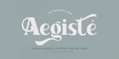 Aegiste is a Serif Retro Font with some font swashes that can add a touch of vintage to each letter. An Original typeface that suitable for any graphic designs such as branding materials, t-shirt, print, business cards, logo, poster, t-shirt, photography, quotes .etc This font support for some multilingual. Modern Serif Retro that contains uppercase A-Z and lowercase a-z, alternate character, numbers 0-9, and some punctuation. If you need help, just write me! Thanks so much for checking out my shop!
 - Javin by Flawlessandco,
$9.00 Javin is a Sweet Script Font with some font swashes that can add a touch of sweetness to each letter. An Original typeface that suitable for any graphic designs such as branding materials, t-shirt, print, business cards, logo, poster, t-shirt, photography, quotes .etc This font support for some multilingual. Modern Script that contains uppercase A-Z and lowercase a-z, alternate character, numbers 0-9, and some punctuation. If you need help, just write me! Thanks so much for checking out my shop!
 - Chatarina by Flawlessandco,
$9.00 Chatarina is a Sweet Script Font with some font swashes that can add a touch of sweetness to each letter. An Original typeface that suitable for any graphic designs such as branding materials, t-shirt, print, business cards, logo, poster, t-shirt, photography, quotes .etc This font support for some multilingual. Modern Script that contains uppercase A-Z and lowercase a-z, alternate character, numbers 0-9, and some punctuation. If you need help, just write me! Thanks so much for checking out my shop!
 - Voix by Wilton Foundry,
$9.00 VOIX Regular and Italic is a stylish, modern & monospaced font ready to make your work hard for you! It has several unique glyphs that create a unique style. VOIX is not your typical monospaced boring font - from the outset the goal was to develop an exuberant, dynamic and contemporary mono-spaced font. Ideal for coding, writing and has plenty of attitude to stretch into display formats!
 - CCS Neue Rinjani by Creative Corner Studio,
$29.00 Neue Rinjani is a all-caps sans serif with Wide Stretch contemporary typographic, vintage futuristic art-deco touch Streamline influence of the 1930s and 1940s. A mix from the old Euro-American signage/advertising letters and modern clean sans serif, carefully mousecrafted to bring you the genuine feel of the era. If you're into classic/vintage letter designs, then this typeface suits best for you.
 - Sweet Square by Sweet,
$39.00The Engraver’s Square Gothic—like its rounder cousin, the engraver’s sans serif, Sweet® Sans,has been one of the more widely used stationer’s lettering styles since about 1900. Its minimal forms, made without curves, were popularized long ago by bankers and others seeking a serious, established feel to their stationery. One might argue that the design is a possible precursor to Morris Fuller Benton’s Bank Gothic® typeface. Sweet® Square is based on antique engraver’s lettering templates called “masterplates.” Professional stationers use a pantograph to manually transfer letters from these masterplates to a piece of copper or steel that is then etched to serve as a plate or die. This demanding technique is rare today given that most engravers now use a photographic process to make plates, where just about any font will do. But the lettering styles engravers popularized during the first half of the twentieth century remain both familiar and appealing. Referencing various masterplates, Mark van Bronkhorst has drawn Sweet Square in nine weights. The sources offered just uppercase, small caps, and figures, yet similar, condensed examples had a lowercase, making it possible to interpret a full character set for Sweet Square. Italics were also added to give the family greater versatility. The fonts are available as basic, “Standard” character sets, and as “Pro” character sets offering special characters, a variety of typographic features, and full support for Western and Central European languages. Sweet Square gives new life to an uncommon class of typeface: an early twentieth-century commercial invention that brings a singular verve to modern design. Its unique style is as useful as it is novel. Bank Gothic is a registered trademark of Grosse Pointe Group LLC. - Sweet Square Pro by Sweet,
$59.00 The Engraver’s Square Gothic—like its rounder cousin, the engraver’s sans serif, Sweet® Sans,has been one of the more widely used stationer’s lettering styles since about 1900. Its minimal forms, made without curves, were popularized long ago by bankers and others seeking a serious, established feel to their stationery. One might argue that the design is a possible precursor to Morris Fuller Benton’s Bank Gothic® typeface. Sweet® Square is based on antique engraver’s lettering templates called “masterplates.” Professional stationers use a pantograph to manually transfer letters from these masterplates to a piece of copper or steel that is then etched to serve as a plate or die. This demanding technique is rare today given that most engravers now use a photographic process to make plates, where just about any font will do. But the lettering styles engravers popularized during the first half of the twentieth century remain both familiar and appealing. Referencing various masterplates, Mark van Bronkhorst has drawn Sweet Square in nine weights. The sources offered just uppercase, small caps, and figures, yet similar, condensed examples had a lowercase, making it possible to interpret a full character set for Sweet Square. Italics were also added to give the family greater versatility. The fonts are available as basic, “/fonts/sweet/square/” character sets, and as “Pro” character sets offering special characters, a variety of typographic features, and full support for Western and Central European languages. Sweet Square gives new life to an uncommon class of typeface: an early twentieth-century commercial invention that brings a singular verve to modern design. Its unique style is as useful as it is novel. Bank Gothic is a registered trademark of Grosse Pointe Group LLC.
 - Stack Braille by Echopraxium,
$5.00 This is a monospace font for the Braille alphabet. The idea came while exploring new ways to display the regular braille glyph ( 3 rows of 2 dots ). The glyph design is inspired by "stackable multiple board" games like the famous Vulcan chess (from Star Trek series) and the Qubic (3D tic-tac-toe). The stack is made from 3 levels, each level is a 3x3 grid with 2 "playable" cells (South-West and North-East). Each cell can be either empty, filled by a white square token or a black square token. The 3D effect is obtained by means of the classic isometric perspective. Lowercase letters use black tokens, while uppercase letters use white tokens. Most special characters (e.g. digits, *$#@, []{}() etc.. ) are also provided for special usages like program source code (see poster 5).
 - Whiskey State by Mans Greback,
$59.00 Whiskey State strides onto the canvas like a cowboy entering a saloon: Tall, confident, and impossible to ignore. The font boasts an impressive height, stretching upwards with the same vigor as plumes of smoke rising from a smoldering campfire. Every letter stands upright and proud, imbued with the spirit of the Old West, yet exuding a contemporary coolness and innovativity. Its serifs aren't just appendages; they are expressions, giving the typeface its unique, assertive character.
 - Strak by Kustomtype,
$25.00 Strak is a font that was born out of admiration for the work of E. Vermeulen, a Belgian artist known for his tight, precise line and an unseen masterpiece that is spread around the world. He has published and exhibited his work in London, Liverpool, Angoulême, New York, Geneva, Amsterdam, Lyon and Turku (in Finland) and he even signed for the New York Times. Based on a few characters, a complete font was composed by Kustomtype. After a few sketches, Strak came to life. The name Strak, in this case, refers to the slender, beautiful woman with the correct waistlines and proportions. The font is designed this way; it is completely hand-drawn, digitized and can be used in all modern and graphic media. Strak is available in 8 different styles, has class and will make many people's mouth water when they see it on your designs. Do you want quality and style? Then Strak is the font-perfect solution!
 - Linotype Franosch by Linotype,
$29.99Linotype Franosch™ is a three weight display typeface designed by artist/graphic designer Max Franosch. Around the time of making the initial sketches, Franosch was looking a lot at Arabic newspaper and magazine headlines. He was drawn to their bold and very graphic" type. A common feature was the "floating" dots which added a rhythmic quality to the text. This came to influence the use of dots in Linotype Franosch™. Apart from this influence, Linotype Franosch also has a very clean and futuristic feel to it, due mainly to the highly geometric nature of the characters and the uniform stroke weight. More about the usability of this typeface can be seen at the Font of the Week of Linotype Franosch. Linotype Franosch is perfect for party flyers, headlines, and internet banner ads. All three faces in the Linotype Franosch family are part of the Take Type 4 collection from Linotype." - Ring Netlike by Fridaytype,
$17.00 Ring Netlike - Classic Serif Font Ring Netlike is a classic serif typeface called weiss roman. A unique modern font that is a mix of old and new. The Elegant curves also make for a unique logo or masthead. Ring Netlike comes with multilingual support also. The combination with the width of each letter forms a modern feel and is suitable for various magazines, logos, branding, photography, invitations, wedding invitations, quotes, blog headers, posters, advertisements, postcards, books, websites, etc. Files Includes: - Uppercase & Lowercase - Numerals & Punctuation - Multilingual - Ligature - Alternative Fridaytype
 - Engrave by BaronWNM,
$14.00 Engrave is a vintage-style scrips font. This font is an elegant font, and has a luxurious impression with sweet curves on the alternate letters. "Engrave" is perfect for branding luxury fashion products, jewelry, and is also great for use as a lettering in logos and mockups. The use of this font is also not limited to that, but can also be used for writing book covers, movies, posters, taglines, etc. "Engrave" also has ligatures and alternatives that give each lowercase style a choice of styles and add a luxurious feel to this font.
 - Distill by MADType,
$19.00 Distill draws its inspiration mainly from Theo van Doesburg's De Stijl era lettering. The type he designed for the Aubette Café, De Stijl Magazine, etc was used as a starting point and then expanded upon. While this typeface was inspired by historical references, it also has the ability to invoke a contemporary feel under the right conditions. Distill will work hard whether you are designing a neo-constructivist poster or a futuristic website. Distill is a family of 12 fonts: 4 weights, each containing condensed, regular, and expanded widths. It also features several alternate characters.
 - Filistique by URW Type Foundry,
$39.99 Filistique is gracious, flexible, and stylish. In the first sketches of this typeface, the one-line drawing principle was the rule. This principal had to perish soon when more complex characters came up. But still the one-line rule was kept in tradition to maintain the behavior of the natural course of the drawing line. Once writing, the characters joined fluidly into words and slipped easily into sentences like they had always belonged there. They have these natural features maybe somewhat familiar on the first sight. Filistique approaches handwriting but likes to be straight up as well. Please, no Christmas card writing with this character! She is best in shape for finger licking good menus of classy restaurants, lyrics on an album cover of a renowned and utterly cool artist, for a letter to your precious loved one and of course for making a hell of an impression anyway!
 - Broadgauge Ornate by FontMesa,
$25.00Broadgauge Ornate originated from MacKellar, Smiths & Jordan in 1869 and was only available as an all caps font with numbers. Today this old beautiful wood type rises again from the archives complete with original numbers and an all new lowercase. An all caps Greek character set has also been added plus accented characters for western, central and Eastern European countries. Included in each font file are two sets of left and right pointing hands located on the Less Than and Greater Than keys and also on the Bracket keys. Because this font works well with a Las Vegas theme I've decided to make the pointing hands gambling related with one set of hands rolling dice and the other holding cards. The condensed versions were created because in today's computer graphics applications people stretch and condense fonts to fit their project but don't notice the change in vertical stroke widths or line thickness. After compressing the letter shapes of each Broadgauge Ornate condensed font the vertical lines were corrected making sure they were the proper width or thickness. The results are balanced condensed versions that weren't simply compressed with out consideration for their appearance. - ViabellaT H Pro by Elsner+Flake,
$40.00 The script version of the typeface Viabella introduces us to the calligraphic side of the Berlin type designer and typographer Karl-Heinz Lange. The sketches for this script typeface, which resulted from the close cooperation with Veronika Elsner and Günther Flake, found their roots in sketch drawings which Karl-Heinz Lange had already drawn in the 1980’s. For the Viabella design, Karl-Heinz Lange drew the basic letterforms of the Black and Regular cuts with a brush. He then re-worked the drawings and transferred them on to tracing paper. The design studio Elsner+Flake in Hamburg cut these typeface extensions and later digitized them manually with the help of the IKARUS Sustem. With the Regular cut as a basis, Elsner+Flake extended the family with the Light version and interpolated and re-worked the Medium weight. The completion of the family was taken over by the type designer Björn Gogalla who had done the same kind of work on Rotola, a design which Karl-Heinz Lange had also created for Elsner+Flake. While Viabella was originally conceived as a headline typeface, its lighter weights can certainly be used for shorter text applications. The Black version creates powerful headlines with highly effective accents. With the help of swashes, which are available for all weights, the user can lighten up longer texts and add special character to titles. In contrast to pure headline fonts, Viabella has been enriched by an extensive complement of special characters. In addition to the Europa-Plus character set which allows setting type in over 70 latin-based languages, the user will find multiple versions of numerals as well as oldstyle figures, tabular and proportional lining figures, diagonal fractions, and a complete set of superior and inferior figures and fractions (60%). With such a rich character set, Viabella is not only ideal for many different uses in the areas of newspaper, magazine and advertising but it will surely be chosen for the design of greeting cards, invitations and other design projects within the privat sphere.
 - Seria Pro by Martin Majoor,
$49.00 The multi award-winning Seria (1996) is Martin Majoor’s second comprehensive typeface family and the successor to his popular text letter Scala. Seria explores the proportions of classical text typefaces. Its degree of sophistication is perfect to be used for poetry and other refined literature, its eye-catching details however makes Seria also suitable as a display typeface. The first sketches for Seria emerged in the summer of 1996 on the train from Berlin to Warsaw, to be precise, on July 25 – the date Majoor noted on the napkins of the train’s on-board restaurant, which he used for lack of suitable drawing paper. The italics are almost upright which contributes much to Seria’s delicately proportioned appearance. The Seria family consists of Seria Serif and Seria Sans. Combining the two creates countless possibilities of expression.
 - Phoenica Std by preussTYPE,
$29.00 PHOENICA is a contemporary humanistic typeface family suitable for traditional high-resolution print purposes, office application and multi-media use. Of the creation formed the basis an idea which was developed for the first time by Lucian Bernhard approx in 1930 with the Berhard Gotic and was taken up in the last time by different written creators repeatedly: the repeated elimination anyway (in comparison to a Antiqua, e.g. Garamond) already very much diminished form Grotesque (as for example Helvetica) by systematic leaving out of the serifs. The horizontal direction of the writing is thereby stressed remarkably by which so-called »Rail effect« originates. The eyes can grasp the line to be read very well what is ordinarily left to a Serif-stressed font. By this desired effect is suited PHOENICA also for big text amounts. In numerous test runs Stems and tracking was compared to experienced fonts and was adapted. The experienced was taken over without renouncing, nevertheless, the modern and independent character PHOENICA. PHOENICA offers to you as a welcome alternative to the contemporary humanistic Sansserif. It is a very adaptable family for text and Corporate design uses. Several companies have discovered PHOENICA meanwhile as a Corporate font for themselves and use them very successfully. She provides a respectable typeface combined with refinement and elegance. Every PHOENICA family has at least six weights in each case in regular and italic. In addition more than three fine Haarline weights (Hairline 15, 25, 35). These are a total of 27 possibilities. Phoenica as well as Phoenica Condensed are excellently readable fonts, because they were optimised especially for amount sentence. Both basic styles (Regular and Condensed) are tuned on each other and follow the same form principle. The family is neither exclusively geometrical nor is constructed humanistically, the forms were sketched on quick and light Recognition effect of every single letter. The PHOENICA family design and logo is suited for all only conceivable uses like newspapers and magazines, for the book typography and Corporate Design.
 - Odisean by deFharo,
$24.00 Odisean Fonts and its 3 styles (One, Tech & Small Caps) are ideal for graphic design, editorial, logos and posters. Its rounded finish and marked contrast between antlers evoke the charm of bygone eras. In addition, it has a collection of retro icons accessible through OpenType: Small Caps. Letter proportions are multiples of 8, ensuring exceptional visual harmony, while metrics and kerning use values multiples of 8 for impeccable legibility and aesthetics. Discover Odisean and revive retro nostalgia in your designs. Each Odisean variant comes loaded with a set of alternative letters that allow you to customize and adapt each project to your liking. In addition, you will be able to access an exclusive collection of retro icons through the OpenType feature: Small Caps, adding even more versatility and charm to your creations. - Odisean One will transport you to a bygone era with its retro charm, offering you alternative lyrics that evoke the aesthetic of the golden and happy years. - Odisean Tech for those who love technology and innovation, the font is full of graphic elements and retro transportation icons, which will immerse you in a futuristic world of the past. - Odisean Small Caps bring elegance and versatility to your designs with their small capital letters.
 - Populaire Typewriter by Ana's Fonts,
$15.00 Populaire Typewriter font is a retro set of typewriter fonts sourced from a real 1970s typewriter. It includes Regular, Dirty and Misprints fonts. The Regular and Dirty versions of the font are monospaced fonts, with three alternatives for each character that show up randomly through contextual alternates. These features make these fonts extremely realistic and fun to use! Use this set in any design that needs a vintage touch. Use it in long or short texts, in digital collages, branding and packaging, social media posts, logotypes, etc.
 - Prumo Slab by DSType,
$40.00 Prumo is a new type system, based on a unique skeleton that flows, like a pendulum, from high contrast to low contrast. It’s a sort of typographic journey, from the 18th century typefaces to the 19th century slab serif typefaces, gathering information from the Scotch Roman fonts on its journey. Prumo is a type family with classic proportions that takes advantage of the recent type production technology while looking carefully at the most important historical references.
 - Prumo Poster by DSType,
$40.00 Prumo is a new type system, based on a unique skeleton that flows, like a pendulum, from high contrast to low contrast fonts, is a sort of typographic journey, from the eighteen century typefaces to the nineteen century slab serif typefaces, gathering information from the scotch roman fonts on it's journey. Prumo is a type family with classic proportions, that takes advantage of the recent type production technology while looking carefully at the most important historical references.
 - Prumo Banner by DSType,
$40.00 Prumo is a new type system, based on a unique skeleton that flows, like a pendulum, from high contrast to low contrast. It’s a sort of typographic journey, from the 18th century typefaces to the 19th century slab serif typefaces, gathering information from the Scotch Roman fonts on its journey. Prumo is a type family with classic proportions that takes advantage of the recent type production technology while looking carefully at the most important historical references.
 - Prumo Text by DSType,
$40.00 Prumo is a new type system, based on a unique skeleton that flows, like a pendulum, from high contrast to low contrast. It’s a sort of typographic journey, from the 18th century typefaces to the 19th century slab serif typefaces, gathering information from the Scotch Roman fonts on its journey. Prumo is a type family with classic proportions that takes advantage of the recent type production technology while looking carefully at the most important historical references.
 - Prumo Deck by DSType,
$40.00 Prumo is a new type system, based on a unique skeleton that flows, like a pendulum, from high contrast to low contrast. It's a sort of typographic journey, from the 18th century typefaces to the 19th century slab serif typefaces, gathering information from the Scotch Roman fonts on its journey. Prumo is a type family with classic proportions that takes advantage of the recent type production technology while looking carefully at the most important historical references.
 - Prumo Display by DSType,
$40.00 Prumo is a new type system, based on a unique skeleton that flows, like a pendulum, from high contrast to low contrast. It’s a sort of typographic journey, from the 18th century typefaces to the 19th century slab serif typefaces, gathering information from the Scotch Roman fonts on its journey. Prumo is a type family with classic proportions that takes advantage of the recent type production technology while looking carefully at the most important historical references.
 - Probeta by deFharo,
$11.00 Probeta is an exclusive Sans Serif typeface family, condensed in proportion into three styles: Regular, Italic & Small Caps. Each family consists of 7 weights (Extra Light, Light, Regular, Medium, Semi Bold, Bold and Extra Bold). Plus three bonus fonts: Circle, Cube & arrows • Includes a bonnus font with the purchase of each style! After defining all the proportions of the new typeface, and starting from the drawing of the lowercase letter «o», in an exercise of minimalist construction, I have built all the characters, contributing with this technique, morphological coherence and a balanced reading. I have put special interest in defining the width of each character, depending on the relationship with others, then the configuration of the metrics and the exhaustive definition of Kerning, provide maximum readability in paragraph texts and titles. The use in graphic design, editorial or advertising guarantees originality and difference. Very versatile fonts for billboards, video games, movie titles, logos, publications, etc. They include the symbol of Bitcoin and other Cryptocurrencies.
 - Kiddie Love by Sipanji21,
$15.00 Kiddie Love is a lovely display font that radiates charm. It features gorgeous hearts in each letter which give it an incredibly romantic feel. this font suitable for valentine day poster, logo, t shirt, event banner and etc. you can use this font for any design, apparel, kids logo, logo type, with many swash for make your design awesome. feature : Kiddie Love Uppercase Kiddie Love Number and Punctuation Kiddie Love Multilingual Kiddie Love Swash
 - Glory Mathilda by Atharuah Studios,
$16.00 Introducing Glory Mathilda! An energetic brush stroke fonts. With two sets of all-caps letters, Glory Mathilda can support your creativity on your logo design, brand imagery, quotes, merchandise, product packaging, music projects, social media posts, etc. Glory Mathilda also has ten swashes that you can access in each alternative letter A-J. That's it! I hope you enjoy it. You can also say hello to me on Instagram: https://www.instagram.com/atharuah_ Thank You!
 - Aqualita by Artisan Studio,
$12.00 Aqualita is bold and italic script font, with flexible character, and the top of each glyph slightly sloping. Font features: - Standard ligatures - Stylistic Alternates - Stylistic sets Font file included: Aqualita OTF Can be used for various purposes.such as headings, logos, wedding invitation, t-shirt, letterhead, signage, lable, news, posters, badges etc. To enable the OpenType Stylistic alternates, you need a program that supports OpenType features such as Adobe Illustrator CS, Adobe Indesign & CorelDraw X6-X7
 - Milica by PeGGO Fonts,
$18.00 Milica is a display font, inspired on action movies and urban Military culture, designed with straight verticals but slanted horizontals with no curves and sharped hard strokes, in 5 sizes, ExtraLight, Light, regular, Bold & ExtraBlack, plus italic version to each weight. Recommended for use in poster, Movies, video games, TV, Animation, letterhead, magazines titles, POP & Graphic culture, young stuff, hip-hop topics, urban, big sizes prints, Volumetric 3D shapes, labels, etc. Powered by OTF technology.