10,000 search results
(0.022 seconds)
- Stoan by Scholtz Fonts,
$7.00 - Felix Titling by Monotype,
$39.00 - Modern Wave by 2D Typo,
$32.00 - English Script by Wiescher Design,
$39.50 - Etch A Sketch by JOEBOB graphics,
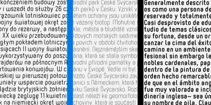
$9.00 - Borba Sans by Edyta Demurat,
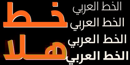
$20.00 - JH Hala by JH Fonts,
$30.00 - Century Schoolbook WGL by Bitstream,
$49.00 - Shield Ornaments by Gerald Gallo,
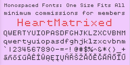
$20.00 - HeartMatrixed by Ingrimayne Type,
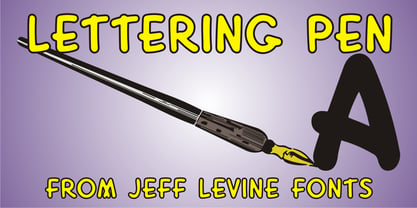
$12.95 - Lettering Pen JNL by Jeff Levine,
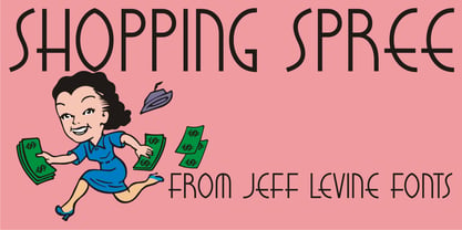
$29.00 - Shopping Spree JNL by Jeff Levine,
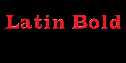
$29.00 - Latin by Wooden Type Fonts,
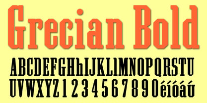
$15.00 - Grecian by Wooden Type Fonts,
$15.00 - Stampede by FontMesa,
$25.00 - Secret Agent NF by Nick's Fonts,
$10.00 - General Merchant JNL by Jeff Levine,
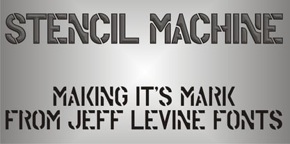
$29.00 - Stencil Machine JNL by Jeff Levine,
$29.00 - PL Fiorello by Monotype,
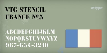
$29.99 - Vtg Stencil France No5 by astype,
$28.00 - Architec by Monotype,
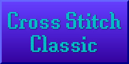
$29.99 - Cross Stitch Classic by Gerald Gallo,
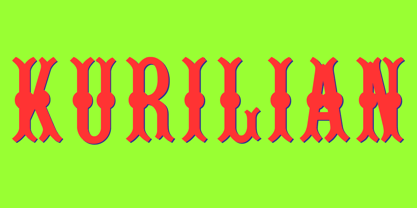
$20.00 - Kurilian by Wooden Type Fonts,
$15.00 - Comic FX - Unknown license
- Spund - Unknown license
- DreamerOne - Unknown license
- Dreamspeak - Unknown license
- Mistress Script - Unknown license
- Dreamspeak - Unknown license
- Stencil Export - 100% free
- FuturistStencil - Unknown license
- Diogenes - Unknown license
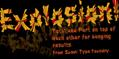
- Explosion by Suomi,
$25.00 - Monotype Baskerville eText by Monotype,
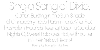
$103.99 - OL Hairline Gothic by Dennis Ortiz-Lopez,
$75.00 - Candycorn Overdose by Fontosaurus,
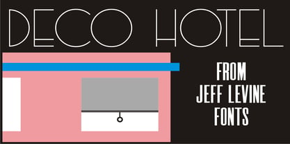
$19.95 - Deco Hotel JNL by Jeff Levine,
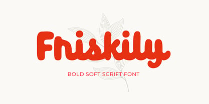
$29.00 - Friskily by Ali Hamidi,
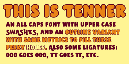
$12.00 - Tenner by Suomi,
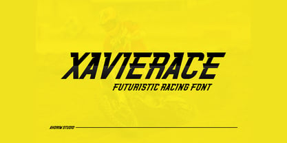
$35.00 - Xavierace by Portograph Studio,
$20.00
