1,628 search results
(0.017 seconds)
- MFC Arkena Monogram by Monogram Fonts Co.,
$19.95 The source of inspiration for MFC Arkena Monogram is a specimen from the 1917 “Strong’s Book of Designs”. This popular lettering style has been incorporated into numerous film type foundries of the past, but lacked digital permanence. We’ve expanded the original All Capitals glyphset to include smallcaps to make monograms, have added numerals and included unique ornamentation for basic titling typesetting. Download and view the MFC Arkena Monogram Guidebook if you would like to learn a little more.
 - Brice by Studio Sun,
$10.00 Brice refers to cultural products of the 80s such as music, art, literature, fashion, dance, film, that are consumed by the majority of society population. The Characteristic of Brice are in the small bouncy serif with a dynamic contrast, like R, B, S, K, P, etc. Perfect for Logotype, Caption, & Header. Brice are available in 5 Widths (Condensed - SemiCondensed - Normal - SemiExpanded - Expanded) with matches 6 weights (ExtraLight - Light - Normal - SemiBold - Bold - Black) and support for 75+ language.
 - Fortune by Gleb Guralnyk,
$14.00 Introducing Fortune Font set. This typeface has an old school look with classic western shapes. Fortune Variable Font has three predefined weights (Thin, Regular & Bold) and Variable font with flexible weight. All of the small letters has one or two alternates with bottom expanded shape*. Fortune Variable Font supports most of the European languages. *Make sure that "Contextual & Stylistic Alternates" features are supported & enabled in your software. Also please consider that this feature is available only for English alphabet.
 - Quadrat Grotesk by ParaType,
$30.00 PT Quadrat Grotesk™ was designed for ParaType in 2001 by Vladimir Pavlikov. An expanded sans serif with square letterforms due to what the face was named. Based on the shapes of one of old Russian wooden types. Wooden types were used for placard display composition at large sizes. Their printouts retained wooden texture and traces of handling. These features are reflected in the shapes of Quadrat Grotesk. It is a good typeface for display and advertising typography.
 - SK Lisovik by Shriftovik,
$32.00 SK Leshiy is an authentic monumental font inspired by ancient Slavic legends and fairy tales. This font combines geometric and natural forms, each of its symbols creates a unique image of a fabulous creature that hides in the forest thicket. The SK Leshiy font has a basic and alternative character sets that allow you to expand the font's capabilities and its decorative functions. The font supports a multilingual set and an extended table of Cyrillic and Latin characters.
 - Era404 by Don Citarella,
$20.00 Following the development of a new identity for era404 Creative Group, Inc. (www.era404.com), Founder and Creative Director, Don Citarella, decided to expand the wordmark into a complete typeface. era404 is a soft, vertical font with a high x-height and regular stroke, combined with sweeping arches to create a modern, unique font. This display font is best used for headlines, identities, wordmarks and other instances involving minimal copy and maximal whitespace The typeface includes 256 glyphs and ligatures.
 - SYN Nova by Borutta Group,
$- SYN NOVA is a digitisation project of SYN – futuristic typeface designed by Wojeciech Freudenreich, famous polish graphic designer. Our concept, besides giving it a digital form, was to expand the character set, design minuscule and opentype features for the typeface. Together with Wojciech Freudenreich we created 4 new weights. The complete family (5 styles & Variable Font Version) is distributed under open and free font license. Subsidised by the National Centre for Culture under the programme Kultura w sieci
 - DIN Mittel EF by Elsner+Flake,
$35.00The typeface DIN Mittel, offered by Elsner+Flake, is based on the DIN 1451 used in Germany since 1931. The DIN 1451 which was primarily seen in the areas of technology and traffic had to adhere to the so-called DIN Norms. Variations of the DIN 1451 are also employed in Austria, Eastern Europe, Greece and the Near East. With its new release Elsner+Flake has expanded the DIN Mittel with the characters EuropaPlus and Cyrillic. - Goudy National by Matteson Typographics,
$19.95 Frederic Goudy designed National Old Style Roman in 1916. It is loosely based on a logo he lettered for the National Biscuit Company in 1901. Steve Matteson expanded on Goudy’s original by designing a bold, semibold and matching italics. While much of Goudy’s work is strongly influenced by Venetian types of the 15th and 16th centuries - this design has a truly American quality about it. The design is useful for text or headlines that captures a sense of Americana.
 - Herben by Innire,
$14.00 The Herben - is a unique ligature serif font inspired by nature and autumn mood. It is perfect for logos (especially to word-mark logos), branding, invitation card, and much more; and well to emphasize your unique style, eco concept, or something else. 75 ligatures and 14 swashes will help create individual writing, thereby expanding the scope for creative expression. What's about details and features? Letters A-Z, a-z, 0-9 and punctuation (all in preview); 75 unique ligatures;
 - Grecian Empire by Elemeno,
$25.00The designer's father, Philip Grecian drew a logo for his business, Grecian Creative Services and asked Alex Grecian to expand on the logo. Alex extrapolated from the existing letters, creating a font to compliment his father's logo. Naming it was the easy part. Grecian Empire has since become one of the most popular fonts offered by Elemeno. The Strikes Back and Engraved styles have limited character sets and are far less versatile than the regular version. - Lazar by Discourse Type,
$5.00 Lazar takes its inspiration from the designs of early Russian designers like El Lissitzky. Designed initially as a custom font for a trainers collecting website it was expanded into a full family including a stencil, rounded and distressed styles. Lazar has a fresh and vibrant feel and is very flexible with its alternates lowercase characters, small caps and discretionary ligatures. It works well on posters, flyers and magazine. Mix all four styles to achieve unique typographic designs.
 - MC Scienta by Maulana Creative,
$15.00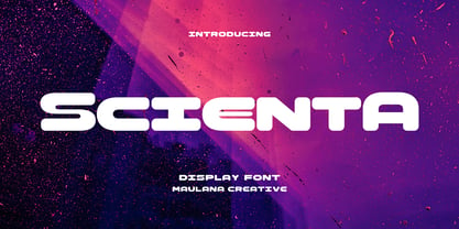 Scienta is a modern Decorative expanded sans Display font. Bold stroke, fun character with a bit of ligatures and alternates. To give you an extra creative work. Scienta font support multilingual more than 100+ language. This font is good for logo design, Social media, Movie Titles, Books Titles, a short text even a long text letter and good for your secondary text font with script or serif. Make a stunning work with Scienta font. Cheers, Maulana Creative
 - KhaoSans by TypeK,
$35.00 KhaoSans is a Rounded typeface. The latin was inspired from Thai woodtype used as headline in old day Thai newspaper. The refined curve with some sharp end add uniquely beautiful touch to the typeface. In Thai language, ‘Khao’ (ข่าว) means ‘news’ and ‘Sans’ (สาร) means ‘message’. The font comes in 8 weights, ranging from a delicate ExtraLight to Black, with 3 widths (Normal, Wide, and Expanded). Matching italics are provided, resulting in a total of 48 styles family.
 - Rochek Display by Maulana Creative,
$15.00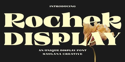 Rochek is a fancy Display serif font. With bold expanded stroke, fun character with a bit of ligatures and alternates. To give you an extra creative work. Rochek font support multilingual more than 100+ language. This font is good for logo design, Social media, Movie Titles, Books Titles, a short text even a long text letter and good for your secondary text font with sans or serif. Make a stunning work with Rochek font. Cheers, MaulanaCreative
 - Bristone by Almarkha Type,
$29.00 Hello Everyone, Introduce our new collection, Bristone – Expanded Sans Family famous logos of Technology and brands that have very strong characteristics, Bristone has 6 Fonts that allow you to get a job with satisfying results. very suitable for posters, t-shirt, packaging, branding, logotype and more. Bristone font with strong and challenging nuances. very suitable for the title, typography, clothes, Poster, magazines, brochures, packaging,Websites and much more for your design needs, making your designs more modern and professional
 - Rutland AOE by Astigmatic,
$19.95 80’s technotronic meets out of this world style in Rutland AOE. From its beefy weight to its narrow counters, Rutland AOE started as a digitization of a film typeface called Maccaro by LetterGraphics. This bulky technotastic typeface was taken from its limited character set and fleshed out to include an expanded language glyph set. This interstellar alphabet funhouse screams electronica/house flyers, space games, alien invasions and more. Rutland AOE is ready to abduct your designs.
 - Cobya by Creativemedialab,
$20.00 Cobya is inspired by the waves and the ocean. Some letter like A,W,V reflects the dynamic and beautiful shape of the waves. Try All Capitals and play with the spacing for a modern and fashionable look. Cobya consists of three widths condensed, normal and expanded. Each width has 9 weights, also a variable format. Cobya has distinctive and unique characteristics, so it is very suitable when used as a branding logo or fashion design concept.
 - MFC Petworth Monogram by Monogram Fonts Co.,
$19.95 The source of inspiration for MFC Petworth Monogram is a specimen from the 1917 "Strong's Book of Designs". This popular lettering style has been incorporated into numerous film type foundries of the past, but lacked digital permanence. We've expanded the original All Capitals glyphset to include smallcaps to make monograms, and have added numerals and basic punctuation for extended basic typesetting. Download and view the MFC Petworth Monogram Guidebook if you would like to learn a little more.
 - Phaserwave by Mysterylab,
$22.00 Part of the wave of modern explorations expanding on the 50+ year-old traditions of groovy psychedelic typography, Mysterylab brings you Phaserwave. With an intriguing fusion of pillowy shapes and sharp stroke ends, this font cooks up a heady mélange of whimsical flow and high precision. We've applied our usual meticulous attention to great kerning, extensive character set, and seamless functionality, so this font's ready to rock your designs any way you might want to do it.
 - AZN Unified by AthayaDZN,
$14.99 Introducing "AZN Unified" font by AthayaDZN. UNIFIED was inspired by the evolving sports world that recently just expanded into the digital verse. UNIFIED’s rounded and sharp look is representing its nature of unity, equipped with 4 different angles of corners, UNIFIED achieved its mixed modern style of a bold serif font. Language Support : Afrikaans, Albanian, Danish, Dutch, English, Estonian, Filipino, Finnish, French, Galician, Indonesian, Irish, Italian, Luxembourgish, Norwegian, Portuguese, Romansh, Scottish Gaelic, Spanish, Swedish, Swiss German, Uzbek (Latin).
 - Halenoir by Ckhans Fonts,
$34.00 • Composed of 3 sets: Normal, Compact, Expanded. • Consisting of 3 distinct optical sizes: Display and Text, Expanded. • Comprises 102 fonts • Support for 28 languages: Afrikaans Albanian Catalan Croatian Czech Danish Dutch English Estonian Finnish French German Hungarian Icelandic Italian Latvian Lithuanian Maltese Norwegian Polish Portugese Romanian SlovakSlovenian Spanisch Swedish Turkish Zulu Swedish Turkish Zulu • Contains OpenType features with alternates or substitutes • Tabular Figures • Ordinal numbers • 74 icons (It will keep updating.) • 72 graphic patterns for designer (It will keep updating.) • 28 brand symbols (It will keep updating.) • 27 arrows glyphs • 0-99 line circled glyphs • 0-99 solid circled glyphs • A-Z line circled glyphs • A-Z solid circled glyphs Halenoir is a modern sans serif with a geometric touch that support for 28 languages. It comes in 10 weights, 102 uprights and its matching outlines, Obliques, pattern, so you can use them to your heart’s content, in each of which there are more than 801+ glyphs. Halenoir is composed of 3 types: Original, Compact, Expanded, and each is designed to be suitable for mobile, graphic, and editorial design. Halenoir comprises 102 fonts, consisting of three distinct optical sizes: Display and Text. Each one has been carefully tailored to the demands of its size. The larger Display versions are drawn to show off the subtlety of Halenoir and spaced with headlines in mind, while the Text sizes focus on legibility, using robust strokes and comfortably loose spaces. In the typeface, each weight includes extended language support, fractions, tabular figures, arrows, ligatures and more. Perfectly suited for graphic design and any display use. It could easily work for branding, web, signage, corporate as well as for editorial design. documents and folders, mobile interface. Useful links: Gravitica PDF Type Guide and Specimen (You can know how to use icons and arrows, other glyphs.)
 - Sevigne ST by Reserves,
$39.99 Sevigne [sey-vee-nyey] is a highly refined, contemporary geometric stencil, inspired by the ambience of high-end fashion and luxury combined with the raw, utilitarian nature of the stencil. The inclusion of over 130 unique ligatures expand it’s sensibility of alluring, well-balanced letterforms and distinctive style. The stencil marks are atypically placed and vary throughout, giving it a purposely forward presence. Stylistically, as an all-caps typeface, Sevigne exudes a greater sense of harmony and polish due to it’s unicase form where the interplay of a limited amount of characters is the focus. Subtle, considered details are found within individual letters, contrasted by the complex, intersecting forms that make up the various ligatures. With multiple stylistic sets added to the expanded ligatures, individual letters and ligature pairs can be carefully exchanged to fine-tune text settings for a unique custom type solution. Features include: Precision kerning- Expanded set of over 130 Ligatures, including alternates (ae, oe, fi, fl, ffi, ffl, ffj, ff, fh, fj, ft, tt, th, ct, st, oo, og, go, ogo, gog, la, ea, ev, ew, fy, ez, et, oc, ga, do, uv, vu, yu, uy, nn, mm, xy, yx, ao, oa, ac, da, aq, nt, aa, ll, ss, ut, tu, ka, ca, ag, of, off, co, ne, nr, nl, nd, nk, hn, mn, me, mp, al, an, af, ar, ak, ah, ad, ab, and, gg, all, co, ço, he, the, tl, tn, tf, tr, tk, td, tb, te, am, ame, amb, tm, ap, tp, wu, uw, kt, tz, ra, za, mk, xx, yy, vv, ww, ky, fu, oq, cc, cq) Alternate characters (A, G, R, Q, _, $, ®, •, ¶) Slashed zero Full set of numerators/denominators Automatic fraction feature (supports any fraction combination) Extended language support (Latin-1 and Latin Extended-A) *Requires an application with OpenType and/or Unicode support.
 - Verdana Pro by Microsoft,
$40.00 The Verdana typeface family was designed specifically to address the challenges of on-screen display. Verdana was originally designed by world-renowned type designer Matthew Carter, and tuned for screen display by the leading TrueType hinting expert, Tom Rickner. The Verdana fonts are unique examples of type designed specifically for the computer screen.The Verdana family received a major update in 2011 as a collaboration between The Font Bureau, Monotype Imaging and Matthew Carter. The original Verdana family included only four fonts: regular, italic, bold and bold italic. The new and expanded Verdana Pro family contains 20 fonts in total. The Verdana Pro and Verdana Pro Condensed families each contain 10 fonts: Light, Regular, Semibold, Bold and Black (each with matching italic styles).Verdana exhibits characteristics derived from the pixel rather than the pen, the brush or the chisel. The balance between straight, curve and diagonal were meticulously tuned to ensure that the pixel patterns at small sizes are pleasing, clear and legible. Commonly confused characters, such as the lowercase i j l, the uppercase I J L and the number 1, have been carefully drawn for maximum individuality - an important characteristic of fonts designed for on-screen use. Another reason for the legibility of the Verdana fonts on the screen is their generous width and spacing.Designed by David Berlow and David Johnathan Ross of the Font Bureau, with typographic consultation by Matthew Carter, the new Verdana Pro includes a variety of advanced typographic features including true small capitals, ligatures, fractions, old style figures, lining tabular figures and lining proportional figures. An OpenType-savvy application is required to access these typographic features. The expanded weights and completely new condensed range of fonts provide designers with an expanded palette of typographic options for use in print and on-screen, in both small text sizes and headlines.
 - Sevigne by Reserves,
$39.99 Sevigne [sey-vee-nyey] is a highly refined, contemporary geometric sans, inspired by the ambience of high-end fashion and luxury. The inclusion of over 130 unique ligatures expand its sensibility of alluring, well-balanced letterforms and distinctive style. Stylistically, as an all-caps typeface, Sevigne exudes a greater sense of harmony and polish due to its unicase form where the interplay of a limited amount of characters is the focus. Subtle, considered details are found within individual letters, contrasted by the complex, intersecting forms that make up the various ligatures. With multiple stylistic sets added to the expanded ligatures, individual letters and ligature pairs can be carefully exchanged to fine-tune text settings for a unique custom type solution. Features include: Precision kerning- Expanded set of over 130 Ligatures, including alternates (ae, oe, fi, fl, ffi, ffl, ffj, ff, fh, fj, ft, tt, th, ct, st, oo, og, go, ogo, gog, la, ea, ev, ew, fy, ez, et, oc, ga, do, uv, vu, yu, uy, nn, mm, xy, yx, ao, oa, ac, da, aq, nt, aa, ll, ss, ut, tu, ka, ca, ag, of, off, co, ne, nr, nl, nd, nk, hn, mn, me, mp, al, an, af, ar, ak, ah, ad, ab, and, gg, all, co, ço, he, the, tl, tn, tf, tr, tk, td, tb, te, am, ame, amb, tm, ap, tp, wu, uw, kt, tz, ra, za, mk, xx, yy, vv, ww, ky, fu, oq, cc, cq) Alternate characters (A, G, R, Q, Z, _, $, ®, •, ¶) Slashed zero Full set of numerators/denominators Automatic fraction feature (supports any fraction combination) Extended language support (Latin-1 and Latin Extended-A) *Requires an application with OpenType and/or Unicode support.
 - Royal Stencil JNL by Jeff Levine,
$29.00 An image spotted on the internet of a brass shipping stencil for the Royal Quality Brand (for the John H. Fitch Company of Youngstown, Ohio – a coffee and spice merchant). The lettering style for “Royal Quality” was a hand-cut, condensed, slightly flared sans serif with various character flourishes, giving the letters a stylish, somewhat regal look. Expanding on this idea, a full character set was developed and redrawn digitally as Royal Stencil JNL, which is available in both regular and oblique versions.
 - ITC Cheltenham by ITC,
$40.99 ITC Cheltenham font in its present form is the work of designer Tony Stan. Originally designed by architect Bertram Goodhue, it was expanded by Morris Fuller Benton and completed by Stan in 1975 with a larger x-height and improved italic details. ITC Cheltenham font is an example of an up-to-date yet classic typeface. In 1993 Ed Benguiat added the Handtooled weights to this family. ITC Cheltenham® font field guide including best practices, font pairings and alternatives.
 - Dexa Pro Variable by Artegra,
$79.00 Dexa Pro is now available on variable version. The family was designed by Ceyhun Birinci in 2020 with an inspiration to create a contemporary super family with inspiration from classic sans serif families. It's a workhorse family consisting of condensed, narrow, normal and expanded widths. Each width has a wide weight range from thin to black, along with their true italic counterparts. With more than 770 glyphs per font, It offers a ton of language support from all the Latin languages to Cyrillic.
 - Summerisle by Scriptorium,
$12.00Summerisle was developed from a small sample of hand-lettered characters in one of the two theatrical posters for the cult movie The Wicker Man. The style combines elements of Celtic and Art Nouveau design with a bit of the feel of the late sixties paganistic theme of the movie. We've expanded it to a full character set while preserving the unique look. The name for the font comes from the name of Christopher Lee's pivotal character in the movie. - Albemarle by Scriptorium,
$18.00Albemarle is a distinctive text font based on hand lettered text from the turn of the century. It's designed to work well at text sizes, but to have some of the flair and personality of a calligraphic font. The result is both attractive and readable and doesn't look much like any other text font. We've been working on expanding the Albemarle family so that it now includes not just Albemarle, but also three swash variations and a new italic version of the font. - Murqas by holyline design,
$19.00 MURQAS by Holyline is a Retro serif and width variable typeface, have 5 style condensed to expanded . It's very unique, elegant, bold and have beautiful shapes from each character . MURQAS perfect for headline, custom logo, merchandise, packaging, wedding designs, invitations, watermark,social media posts, label, and anything for your creativity and MURQAS is perfect typeface if you want something new with your project. And you can play and choose the width axis, for make your project more awesome! Happy creating!
 - LeadSheet Pen by NorFonts,
$29.95 LeadSheet Pen font is my handwriting emulation of an Engraving font style. It is a handwritten text font witch can be used with any word processing program for text and display use, print and web projects, CAD, Headlines, apps and ePub, comic books, graphic identities, branding, editorial, advertising, scrapbooking, cards and invitations and any casual lettering purpose… or even just for fun! The set comes with 12 weights in Light, Normal, Heavy Small-Caps and Expanded each with Italic version.
 - HWT Bernice by Hamilton Wood Type Collection,
$24.95 HWT Bernice is an ornament font system designed by Marian Bantjes. The basic shapes were designed by Bantjes for the Hamilton Wood Type Museum's border stamping machine as a contemporary application for this 150 year old machine, which punches shapes into end grain wood to form continuous border patterns. The digital version expands a bit beyond the punch machine and allows designers to assemble a multitude of options using flipped and rotated variations of these 6 basic shape sets using simple keystrokes.
 - Fortune Vintage by Gleb Guralnyk,
$15.00 Introducing Fortune Vintage Font set. This typeface has an old school look with classic western shapes. Fortune Vintage Font has three "layers" for more convenient recoloring. All of the small letters has one or two alternates with bottom expanded shape*. Fortune Vintage Font supports most of the European languages and also has Ukrainian Cyrillic characters. *Make sure that "Contextual & Stylistic Alternates" features are supported & enabled in your software. Also please consider that this feature is available only for English alphabet.
 - Dassie by Prioritype,
$35.00 Introducing. Dassie - Expanded Display Fonts Cool display fonts are ready to create new ideas for your design projects. It is good to be applied to various types of designs for young people today and goes back to the past. Now you can team up with this font to create t-shirt designs, book covers, posters, logos, landing pages, promotional designs, social media posts etc. See some of the previews above for reference. Features: • All Caps • Numeral • Punctuation • Multilingual • PUA Encoded Thanks.
 - LTC Artscript by Lanston Type Co.,
$24.95 Artscript was Sol Hess's "attempt to convert into rigid metal the graceful penmanship of the ancient scribe". This type of script is more common in digital from but when originally released in 1948, it required special handling to avoid breakage. Extensive alternates were added based on original Hess drawings and additional sources. Both versions are combined into the Opentype version along with an expanded Central European character set as well as ligatures, Swash/Alternates, fractions, superior/inferior numerals and ornaments.
 - Litto by VladB,
$12.00 The name of the font is taken from the concept "Littoral zone" - this is the part of the sea that is close to the shore. The width of the shore varies as a result of the tides. Hence the idea of my font family — changing the width of a character from condenced to extra expanded. Litto is a modern sans serif geometric font, includes upper and lower case characters, Latin and Cyrillic. Graphically, the characters have uniform thickness for all family.
 - Heinch by Almarkha Type,
$29.00 Hello Everyone, Introduce our new collection, Heinch - Expanded Sans Family,inspired by famous logos of Technology and brands that have very strong characteristics, Heinch has 5 Fonts that allow you to get a job with satisfying results. very suitable for posters, t-shirt, packaging, branding, logotype and more. Heinch font with strong and challenging nuances. very suitable for the title, typography, clothes, Poster, magazines, brochures, packaging,Websites and much more for your design needs, making your designs more modern and professional
 - Filler by CarnokyType,
$32.00 Filler is a display typeface that allows you to change the width of font characters from extra narrow to extremely wide shapes. The typeface includes complete Latin language support with contrasting drawing of accents and punctuation. The character set includes special symbols, such as a set of emoticons or arrows that support OpenType features. In addition to the five styles – Compressed, Condensed, Medium, Extended, Expanded, Filler also offers Filler Variable font. The font is intended primarily for strong display use in large proportions.
 - Cringe by Aiyari,
$25.00 Introducing "Cringe": a captivating typeface that draws inspiration from the mesmerizing world of psychedelic pop culture and combining it with a uncial letter form and calligraphy approach. Each character exudes a sense of whimsy and free-spiritedness. Cringe Font Family contains 5 style regular, medium, semi bold, bold, & Expanded. It comes with Stylistic set & ligatures. Ayr Cringe Font Family is best used for headings, logotype, quotes, apparel design, invitation, poster, flyers, greeting cards, packaging, book cover, printed quotes, cover album, movie, & etc