931 search results
(0.009 seconds)
- Brunette by DearType,
$29.00 The Brunette font was created with the sole purpose to serve companies that want to express character, emotion, and personal touch through their logotypes (think Bakeries, Juice Bars, Cafes, Jewelry stores, etc.) Brunette was made entirely from scratch (handwritten letters on paper), which were then vectorized and tweaked to gain consistency. The charm of the font is in its irregularity and resemblance to real handwriting. Brunette is perfect for businesses that want to convey a casual and organic image while making their products more human and approachable.
 - Jackfire by Cititype,
$17.00 Introducing Jackfire, a captivating handwritten font that embodies the natural ink flow of a skilled hand. Its appearance reflects the genuine essence of ink and evokes a sense of soulful emotion. With its relaxed and casual feel, Jackfire stands out, making it a great choice for those looking to make a bold statement. Whether you're designing a logo or developing a brand, Jackfire brings a distinctive charm that sets your work apart. Allow Jackfire to infuse your designs with its unique character and capture the attention of your audience
 - PR Viking by PR Fonts,
$20.00 This typeface is inspired by the angular shapes of runes; the early writing of Northern European peoples. The letters have been given an eroded finish, as though they were carefully carved a thousand years ago, and weathered over time. This font includes at least two versions of every letter one simple, one more ornate, with all alternate characters for other European languages. The Alternates Font includes additional variations of some characters as well as Ligatures, astrological and elemental symbols. More Nordic symbols are available in the Valknut font.
 - Starboard by Hanoded,
$15.00 The term starboard derives from the Old English steorbord, meaning the side on which the ship is steered. Before the steering wheel, boats were steered by an oar at the stern of the ship. Since most sailors were right handed, this is where you would find your steering oar! Starboard font is a rough, handmade, brushy kinda font. It was, of coarse, made with my favourite cheep brush and Chinese ink - resulting in a slightly eroded looking font. Starboard comes with all the trimmings, including double letter ligatures for the lower case.
 - Saeta Pro by DBSV,
$90.00 About family “SaetaPro” Wind games… The name is taken from an old paper toy made by someone who makes paper planes with teasing messages. But there are also songs with a strong feeling in flamenco style. It is also a way of expression in order to give way to emotion and interpersonal communication. They are wind games that people have been playing for a long time ago!!! This series is composed and includes twelve fonts with 632 glyphs each, with true italics, true Sloping and supports of course: Latin, Greek & Cyrillic.
 - Altair by Zetafonts,
$39.00 Altair is a sans serif type family derived from Zetafonts's Digitalino typeface. The original bold design by Francesco Canovaro has been expanded in a seven weights family, suitable for a wide range of design uses, from body copy to display text and ranging from a thin weight to the ultra one. Altair's main originality lies in the calligraphic roots of its design, that gives it a friendly, confident look that is perfect for corporate voices, new technology startups, news blogs and any other case where a solid design must be given an emotional context.
 - Pinguino by Sudtipos,
$49.00 Angel Koziupa's familiar brush goes upright and narrow with Pinguino. Koziupa's approach to condensed brush fonts makes use of the same elements that have always distinguished his calligraphy from any other. With Pinguino, however, we see him softening his corners and adding a distinctly feminine touch to his exotic brush. Pinguino would feel at home on sobering coffee packaging just as it would on a bouncy mixed-fruit juice bottle. Try Pinguino for your next packaging project, and tell your client an Angel told you to use it.
 - Spicy Rice Pro by Stiggy & Sands,
$29.00 Our Spicy Rice Pro has a festive flair to it that works through winter holidays to summertime jams. Casual and exciting, the extra heavy letterforms are imbued with a little exotic flair and flavor to spice up the party. The SmallCaps and extensive figure sets only offer Spicy Rice Pro an even wider range of creative options. Opentype features include: - SmallCaps. - Full set of Inferiors and Superiors for limitless fractions. - Tabular, Proportional, and Oldstyle figure sets (along with SmallCaps versions of the figures). - Stylistic Alternates for Caps to SmallCaps conversion.
 - Leftover Crayon by Hanoded,
$15.00 My kids have a tin box filled with crayon and pencil leftovers: bits and pieces that have fallen or broken off, but are still good enough to use. For me it is a treasure trove, as I often find a nice bit of crayon to use for a new font. In this case, I created Leftover Crayon. Leftover Crayon is a fat, crumbling and seriously eroded crayon font. Completely hand made, completely legible and full of character. Use it for your bedtime stories, product packaging and invitations. Comes filled to the brim with diacritics.
 - Wild Bunch by Hanoded,
$15.00 The Wild Bunch, also known as the Doolin–Dalton Gang, was a gang of outlaws that terrorized Kansas, Missouri, Arkansas, and Oklahoma Territory during the 1890s. They robbed banks, killed lawmen and held up trains. Of course its members were hunted down and 'wanted' posters, with that typical 'Wild West' font, appeared all over. Wild Bunch is a 'wanted poster' type font. It is an all caps font, but upper and lower case differ slightly. A set of alternate, non-eroded, glyphs for the lower case (including alternate numbers) completes this font.
 - Qestero PS by pentagonistudio,
$14.00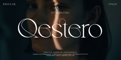 Qestero Is A Modern Display Font Inspired By Sleek and Exotic Style. SOFTWARE REQUIREMENTS : Fonts and alternate: No special software is required they may be used in any basic program /website app that allows standard fonts That's it, folks! You can go ahead and get cracking :) Follow My Shop For Upcoming Updates Including Additional Glyphs And Language Support. And Please Message Me If You Want Your Language Included or If There Are Any Features or Glyph Requests, Feel Free to Send me A Message. Have a Good Day!
 - Hondo Grunge by Fontasmic,
$16.99 The Hondo Grunge fonts are a collection of ultrabold eroded slab serif typefaces with a dynamic look and extended functionality. Accented with decorative and functional inktraps and complete with Slant and Backslant styles, this heavyweight has a high performance hardcore edge to it. Ideal for titling, poster work, logos, and small bits of copy. For the Opentype savvy, the Opentype version contains a complete alternate set of base characters, which by enabling contextual alternates option will force the typeface to continually alternate between the original & alternate character sets for a more spontaneous look.
 - Ballpoint by FontJuice,
$15.00 Ballpoint font family was designed by David Fox in 2021 for the FontJuice™ foundry. A rounded sans serif style, Ballpoint has a simplicity which does not reject traditional forms . It is non ornamental and non emotional, just clearly presentable. This font is suitable for logotype, brand, packaging, quotes, music poster, t-shirt, cover book and more custom design. More specifically, whilst the heavier weights are best used for display in advertising, the lighter weights remain readable in text. Ballpoint features uppercase, lowercase, numeral, punctuation & symbol, multilingual support.
 - Kudos Kaps NF by Nick's Fonts,
$10.00Introducing a series of decorative initials with a twist: each font contains two complete alphabets, A-Z, and numerous border elements in the numeral and shift-numeral positions. Classic, ornate, quaint and exotic, these fonts are essential tools for adding style and charm to your next project. Kudos Kaps Five features Jakob Erbar’s eponymous Initials in the uppercase slots, and Aldo Novarese’s Fontasi in the lowercase AND numeral slots. The font also includes three complete eight-piece borders, a two-piece accent set, two single border elements and an elegant penman dingbat. - Ironbridge by Device,
$29.00 A cast iron plaque from Bristol Temple Meads Station serves as inspiration for this antique font. The plaque commemorates the design contribution of Isambard Kingdom Brunel, who in March 1833 at only 27 was appointed chief engineer of the Great Western Railway, the line that links London to Bristol. This helped establish Brunel as one of the world’s leading engineers. Impressive achievements along the route include viaducts at Hanwell and Chippenham, Maidenhead Bridge, Box Tunnel and Bristol Temple Meads Station. Ironbridge evokes industrial heritage, gothic spookiness or eroded heavy metal.
 - Stupid Meeting by Sharkshock,
$115.00 Stupid Meeting is an all caps display sans that didn't quite get its full 8 hours of sleep. A lot of attitude went into the design process and it shows throughout the entire character set. From a distance it looks fairly pedestrian but the closer you get, the rougher it gets around the edges. It's very simple, yet extremely playful. This family is available in 3 different styles. Use Stupid Meeting for a cartoon, product packaging, or a logo. Try the Eroded version for menu lettering or a band poster. Caps only Fonts.
 - Frequent Flyer by Hanoded,
$16.00 I used to be a frequent flyer; as a tour guide I often had 6 to 10 international flights per year. At the time I didn’t even think about the consequences of flying, as I loved my job and the job was all about travel. Now, with the planet in deplorable state, I try to keep flying to an utter minimum. I guess you call it ’shame of flying’… Frequent Flyer font is a nice, eroded, all caps font. It comes with multilingual support, so you may come across it during your travels.
 - Boondock by Canada Type,
$24.95Boondock is another Imre Reiner design resurrected from the ashes of hot metal type for digital use. This wild paint font is a revival of the fascinating Bazaar brush type from 1956. Boondock has some very unique characters that combine to form a statement of casual but loud strength, seriousness and raw primal emotion. Great for short sudden-impact spurts, like book cover titles, single sentence headers, movie posters and music sleeves. Redrawn from original specimen by Patrick Griffin, and expanded with some built-in extras too add to the convenience of this digital version. - Joyful Reason by Sipanji21,
$15.00 Joyful Reason is a delightful and charming Display font that exudes a sense of love and cuteness. With its gentle and playful strokes, this font captures the essence of affection and tenderness. Each letter carries a unique and whimsical touch, resembling handwritten notes filled with love. Joyful Reason is perfect for adding a romantic and joyful touch to various design projects, such as greeting cards, invitations, social media posts, and more. Its lovely and cute characteristics make it an ideal choice for expressing heartfelt emotions in a visually appealing way.
 - Autumn Field by IKIIKOWRK,
$17.00 Introducing Autumn Field - Handwriting Type created by ikiiko. Autumn Field is rough and exotic handwriting style with unique line curves. Autumn Field is also combine with a ton of stylistic to choose. This typeface is perfect for an elegant logo, poster font, magazine layout, headline font, header page, beauty product, packaging product, quotes, or simply as a stylish text overlay to any background image. What's included? Uppercase & Lowercase Number & Punctuation Alternates & Stylistic Multilingual Support Enjoy our font and if you have any questions, you can contact us by email : ikiikowrk@gmail.com
 - Federico by Olga Umpeleva,
$30.00 Federico is a typeface based on the handwriting of Federico Garcia Lorca, the eminent Spanish poet and playwright (1898-1936). Original version was designed for a book about Lorca. The face has two styles. One looks like an original poets writing, the second looks like if Lorca would write with a ball pen. Federico includes many alternative glyphs and ligatures, which make it look like a real writing of an emotional, negligent, creative man. Despite the fact that Garcia Lorca has written in spanish, the font has western and eastern european, cyrillic, turkish letters.
 - Compagnon by Hanoded,
$15.00 Compagnon is a friend, a partner. This handmade display font will come in super handy when you are working on that book cover, or the packaging of a product. It will shine on posters and websites and it will keep you warm at night. I guess that last bit is an exaggeration… Compagnon comes in three distinct styles: a ‘regular’ version, which is a bit rough around the edges, a ‘dirty’ version, with a juicy eroded look and a polka dot version. All three have their accompanying italics.
 - Guttie by Yukita Creative,
$14.00 Guttie Display Typeface says something about graphics and usability. People tell stories for a reason. We want to convey certain information, change a reader's opinion or make them feel something; Guttie Display Typeface helps you to do all this easily. --- It's all about visuals and functionality. For example, people will use words to convey information, convince readers of something specific, or share emotions they are feeling right now. --- - Fonts can be read from a much larger distance than regular fonts - Elegant letters give the impression of luxury - Smooth curves for elegant typography
 - Linotype Pide Nashi by Linotype,
$29.99Linotype Pide Nashi is part of the Take Type Library, chosen from the entries of the Linotype-sponsored International Digital Type Design Contests of 1994 and 1997. German artist Verena Gerlach created a typeface which looks almost like Arabic at the first glance, only with the second do the familiar forms become clear. Rounded lower case letters, generous, sweeping capitals and diamond-shaped ornaments give the font its Arabic feel. The exotic Linotype Pide Nashi is best suited for short and middle length texts and headlines and especially for ornamental texts. - Love Scars Handwritten by Sipanji21,
$15.00 Love Scars is a delightful and charming handwritten font that exudes a sense of love and cuteness. With its gentle and playful strokes, this font captures the essence of affection and tenderness. Each letter carries a unique and whimsical touch, resembling handwritten notes filled with love. Love Scars is perfect for adding a romantic and joyful touch to various design projects, such as greeting cards, invitations, social media posts, and more. Its lovely and cute characteristics make it an ideal choice for expressing heartfelt emotions in a visually appealing way.
 - Aniuk by Typejockeys,
$40.00 Aniuk is an original display type family from Typejockeys designed and optimized for the use in large sizes. With five robust weights—Regular, Medium, Bold, Heavy and Black—it is perfectly suited for editorial, posters or logo design. Aniuk is lively, young, and probably a little crazy. However, there certainly is one thing that it is not: boring. A perfect balance of characteristic curves and edgy details make this a strong but playful typeface. Be passionate, get emotional and express yourself with a variety of five different weights. A solid partner for your creative adventures.
 - Amys Hand by Kustomtype,
$15.00 "The Amy Winehouse Script" unveils a unique window into the artistic and personal world of the iconic British singer and songwriter, Amy Winehouse. Renowned for her soulful voice and heartfelt lyrics, Amy's handwriting, a lesser-known facet of her life, offers a captivating story. Amy's script mirrors her artistic and unconventional spirit, marked by artistic flourishes and cursive elegance, echoing her expressive personality. Her cursive style, chosen for its fluidity, mirrors her singing, creating a deep connection between her music and script. Her individualistic script is characterized by varied letter sizes and shapes, reflecting her nonconformist nature and her desire to stand out. It can be messy, much like her turbulent life, representing her emotional journey, marked by highs and lows. Amy's handwriting evolved with her emotional state, sometimes appearing chaotic during difficult times. It's important to note the limited public samples, making it challenging to draw definitive conclusions. "The Amy Winehouse Script" invites you to explore uncharted territories of her life and artistry, offering fresh insights into her unspoken expressions and enduring intrigue. In every line, you can hear the music of her words and the story of her script, reminding us how art transcends boundaries, leaving an indelible mark.
 - Only You Sexy by LeType,
$49.90 Is the real romanticism over? This is not the intention achieved on a creation of the new version of Only You Pro. Develop a font that reflects the perfect union of sensuality and romanticism: Only You Sexy. It has a soft trait and delicated curves that evokes contemporary and musicality while has erotic and sensual references. The icons are a piece of show. They make reference to hipsters concept a recurring nostalgia and a recovery of an almost forgotten romanticism. Bring all that romance back. Bring the sensuality in your work and graphic texts. This font brings back everything that the true romanticism deserves: a font that allows you to write using beauty, sensuality and the sounds from the hearts. Only You Sexy is handmade, stylish, modern and multilingual. With more than 800 glyphs it is possible to get an infinity of combinations at your disposal. The font doesn't have PDF and works better in softwares that support the complete OpenType function.
 - Gobsmacked by Hanoded,
$15.00 Gobsmacked is a rather new English word. It has been around since 1959 and was used mostly around Liverpool at that time. The word means: ’astounded’, ‘flabbergasted’ (another nice word!) or ‘speechless’. Gob could be of French or Scottish Gaelic origin and means ‘mouth’. Gobsmacked font was created using a brush and black gouache. The result is a very eroded, very legible and quite unique brush font. I have created alternates for the lower case letters, plus two double letter ligatures (oo and ss). Use it for any design that needs a little brushwork; I am sure the result will leave you gobsmacked!
 - Pondicherry by Hanoded,
$15.00 Pondicherry is a nice city in the South-East of India. It has changed colonial hands over time, but after the last colonial power (the French) left in 1954, it reunited with India. I have always liked the name Pondicherry. It evokes something happy and exotic and I guess I had the same feeling when I developed this font. Pondicherry font is an outlined affair with an uneven baseline and an overall 'happy' feel. It is an all caps font, but upper and lower case differ and you can use them together. Pondicherry comes with a treasure chest full of diacritics.
 - Bonedigger by Hanoded,
$15.00 For some reason I had Paul Simon’s song ‘You Can Call Me All’ in my head when I was busy working on this font, so I just had to call it Bonedigger. Bonedigger does not dig bones, but it does have ‘heavy bones’, as it is quite big. Bonedigger is seriously eroded and would look great on book covers and product packaging. It comes in a lovely regular and italic style and a seriously twisted inline style (with, of course, its own italic). As the song goes: With a knick-knack paddywhack, give the dog a bone, this old font came rolling home.
 - Integral CF by Connary Fagen,
$35.00 Integral CF is designed for maximum visual and emotional impact with its stunning, superbold letterforms. An all-caps titling font family, Integral's six weights excel in posters, social media, headlines, video, and print. Hidden behind the linear, confident construction is a hint of roguish charm. Designed to be bold and large, Integral pairs nicely with lighter typefaces that provide contrast, such as a sans serif like Greycliff CF, Criteria CF, or Work Sans. Text-friendly serifs like Artifex CF are also pair well with Integral. All typefaces from Connary Fagen include free updates, including new features, and free technical support.
 - Linotype MhaiThaipe by Linotype,
$29.99Linotype Mhai Thaipe is part of the Take Type Library, chosen from the entries of the Linotype-sponsored International Digital Type Design Contests of 1994 and 1997. The work of German designer Markus Remscheid, the name is not hard to recognize as an English-Asian play on my type and describes its general character. The small circles which ornament the alphabet and the unusual flowing forms which look like a mixture of Arabic and Sanskrit combine to give the typeface an ornamental, exotic look. Linotype Mhai Thaipe is best used for headlines with point sizes of 12 or larger. - Missing Stone by Pesic,
$29.00 Missing Stone features grunge rough, lapidary, antique look inspired by letters carved in stone plates. Capital glyphs are, although damaged, satisfactorily legible, whereas instead of lowercase letters, capital glyphs are placed, also featuring nearly abstract, hardly legible look, cross cut with rough horizontal lines and dots. The overall visual experience is rough, reminiscent of erosion of stone and disintegration. Capitals are legible and of small size, whereas the second group can be used only in bigger size, whereby rendering an interesting text texture in the course of alternate use. The font contains all the Latin accented characters used in European languages.
 - Buckthorn by Hanoded,
$15.00 Buckthorn is a genus of about 110 species of shrubs and small trees, native to North America and Asia. Its uses are varied: it is used for dye, oil, printing ink and oil. That concludes the botany class for today, on with Buckthorn ‘The Font’. Buckthorn is a handmade typeface with a lot of character. It is severely eroded, giving your designs an authentic look. It comes in 4 styles, including a ‘hollow’ style, plus a dingbat font with very nifty shapes. Buckthorn is quite a pleasing font and comes with a rich harvest of diacritics.
 - PiS Malefiz by PiS,
$24.00 PiS Malefiz is inspired by the hand-drawn type on the package of the german 60's version boardgame „Malefiz“, also known as Barricade or Barricata. Extended to five hand-drawn weights PiS Malefiz turned out to be the weird lovechild of Saul Bass and Ralph Steadman, fun and childish plus angry and strange. Just as playing the boardgame, PiS Malefiz is a wild and superfast rollercoaster ride of emotions! Combine the five interchangeable weights for total whackyness or use the clean and legible thin and regular versions for sleek and slender slanting. Have fun! Keep the dice rolling!
 - Ida by ParaType,
$30.00 Ida is a simple and utilitarian typeface reminiscent of late 19th/early 20th Century grotesques, yet having a warm and friendly nature. Closed apertures and low contrast combined with elegant skeleton of individual characters create an impression of both rationality and comfort. Technically the font is modern and functional but still calls forth the emotion of a valve radio. Ida comes in 18 styles – 6 roman weights with companion italics and 6 narrow widths. One can also benefit from the use of small caps, alternate characters and indices. The typeface was designed by Maria Kharlamova (Selezeneva) and released by ParaType in 2017.
 - SK Klyaksa by Shriftovik,
$32.00 SK Klyaksa is an experimental font inspired by the most striking and unusual artistic techniques of graffiti art. Its non-standard shapes, rounded points and hypnotic curved lines immerse you in the world of bright colors and unlimited creative freedom on the streets of the city. The SK Klyaksa font plays on the contrast between lightness and heaviness, creating an effect of brightness and dynamism, creating bright and emotional compositions that perfectly emphasize youth and individuality. Like graffiti art, the font speaks its own language and provokes bold decisions in graphic design, bringing originality and character to any project.
 - Terpentijn by Hanoded,
$15.00 Terpentijn is Dutch for Turpentine. If you say it out loud, it actually sounds quite similar! Here you thought you were just buying a font, but you get to learn some Dutch too! Terpentijn is a handmade typeface with a serious twist. It is very uneven, very unusual, and, if I may say so myself, very adorable. Terpentijn has that ‘eroded’ look, which will make your designs stand out. It comes in a regular and an inline version, plus a handy shapes pack, which will add that extra wow to your work. Besides Dutch, terpentijn speaks a lot of languages!
 - Linotype Sjablony by Linotype,
$29.99Linotype Sjablony is part of the Take Type Library, chosen from the entries of the Linotype-sponsored International Digital Type Design Contests of 1994 and 1997. Designed by Dutch artist Mark van Wageningen, the typeface with its interrupted strokes has the characteristics of the stencils seen on crates and barrels. The difference lies in the raw contours of this font, which make the characters look as though they were slowly eroded away by water and wind. Linotype Sjablony is composed exclusively of heavy capital letters and is particular suitable for initials and headlines with point sizes of 18 and larger.