10,000 search results
(0.036 seconds)
- Coil by Brownfox,
$44.99 Coil feels comfortable like a well-worn pair of shoes. It could easily pass for an assertive industrial European sans serif of the early 1960s with its slight reverse contrast, monotonous proportions, and squared-off curves, if not for its less predictable side. What appears initially as ellipses upon closer inspection turns out to be irregular shapes, closer to an inverted egg than an oval. The s looks topsy-turvy with its higher curve that is larger than the lower. Some terminal strokes overhang the bowl (as in the a), others open flat (as in the Q, the f, the j, and the t). The resulting effect shakes up this seemingly “retro” face just to make it new. Our midcentury recollections are slightly distorted and reinterpreted by this ironic typeface making it fresh while deceptively cozy and familiar. Coil’s high x-height and even texture make it readable even in small sizes despite its tight apertures. Available in four weights with their italics, with two sets of figures, fractions, and alternates for Extended Latin and Cyrillic scripts. Designed by Vyacheslav Kirilenko and Gayaneh Bagdasaryan, 2020-21.
 - Gutta Percha by HiH,
$8.00 Gutta Percha is a font for golfers. It takers its name from a hard, resilient natural substance that comes from the sap of trees grown in southeast Asia and which was used for the hard core of golf balls well into the twentieth century, when it was gradually replaced with synthetic material. It therefore seemed an appropriate name for a font using the image of a golfer of the 1920s. The letters are from our font Besley Clarendon, reduced to 70%. That means that Gutta Percha set at 40 points will have the same size letters as Besley Clarendon set at 28 points. However, it should be noted that the two fonts have different baselines. If you use them together you will have to manually adjust the vertical alignment. Gutta Percha is obviously a very specialized font, both because of the subject matter and because the uppercase is designed for use as dropped caps. There may not be many uses for it, but when it is right, it will be really right. Whether you are publishing a book about the history of golf or a clubhouse bulletin, Gutta Percha will surely be noticed.
 - Magedov Military by Mans Greback,
$69.00 The Magedov Military font is a strong and robust font that exudes power and authority. It has a sharp, geometric design with bold, hard edges that gives it a strict, army-inspired feel. In a blend of sans and slab serif styles, its unique and versatile look can be utilized for a wide range of projects. This font is perfect for university or college projects, as its straight and clear-cut design gives it an academic, high-school or college feel. It is also ideal for projects that require a strong and tough look, such as law enforcement, university or sports logos. Use the parenthesis symbols ( ) [ ] { } to make decorative elements. Example: United]States The Magedov Military family consists of four high-quality fonts: Regular, Italic, Bold and Bold Italic The font is built with advanced OpenType functionality and has a guaranteed top-notch quality, containing stylistic and contextual alternates, ligatures and more features; all to give you full control and customizability. It has extensive lingual support, covering all Latin-based languages, from Northern Europe to South Africa, from America to South-East Asia. It contains all characters and symbols you'll ever need, including all punctuation and numbers.
 - Eigerdals Slab by insigne,
$30.00 Introducing Eigerdals Slab - the ultimate font for creating a cozy and inviting atmosphere in your designs. This slab-serif font family captures the essence of the mountains of Norway and the streets of Stockholm, making it the perfect choice for design projects that need a touch of Hygge. With its top-heavy characters, Eigerdals Slab has a more approachable and warm feel that sets it apart from other font choices. Plus, its tall x-height, brushed and smooth look makes it both readable and stylish. But that's not all, Eigerdals Slab comes loaded with practical OpenType features like ligatures, unicase alternates, and a set of upright italic swash alternates, that can be fully utilized in software like Quark and Adobe suite. Not only that, it also includes support for a wide range of languages. Eigerdals Slab is an extension of the Eigerdals family, and its distinctive look pairs perfectly with other text faces. Whether you're using it for display work or longer blocks of text, Eigerdals Slab is the perfect font for adding warmth and friendliness to your designs. Don't wait any longer, try Eigerdals Slab today and elevate your work to the next level!
 - Monbloc by Rui Nogueira,
$6.99 Monbloc is a typeface inspired by geometry and lines. It intends to be a practical font wich gives the designer the freedom to incorporate it in his wildest designs.
 - Linotype Freytag by Linotype,
$29.99Linotype Freytag is a condensed display face with simple, geometric shapes. With its highly readable and trendy letterforms, it is perfect for flyers, advertising, packaging, posters and magazine headlines. - Motherblood by Letterafandi Studio,
$10.00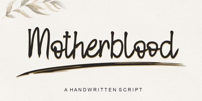 Motherblood is a sweet and friendly handwritten font. Its natural and unique style makes it incredibly fitting to a large pool of designs. The only limit is your imagination!
 - Bobila by Rashatype,
$10.00 Bobila is a cool and casual display font. It will look stunning on any poster flyer or print. Use this font for your designs and explore its endless possibilities.
 - Flintoye by Illushvara,
$10.00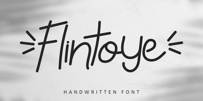 Flintoye is a sweet and friendly handwritten font. Its natural and unique style makes it incredibly fitting to a large pool of designs. The only limit is your imagination!
 - WalcomeOne by Ingrimayne Type,
$7.95 WalcomeOne simulates sloppy, messy hand printing. Despite being irregular and childlike, it is quite legible even at small sizes. It comes in four weights, each with an oblique style.
 - Display Chamfer by Gerald Gallo,
$20.00 Display Chamfer is a display font not intended for text use. It was designed specifically for display, headline, logotype, branding, and similar applications. It has caps, lowercase and numbers.
 - Sentry by Solotype,
$19.95Here's a good old Victorian job printing font. Faithful to the original issued by Barnhart Bros. & Spindler about 1880. Nothing wildly decorative about it, yet it clearly looks old. - Agoxes Game by Sealoung,
$10.00 Agoxes Game is an awesome display font. It features an authentic style that makes it perfect for games, posters, movies, magazines and any design that requires a great look!
 - Cul De Sac by Hanoded,
$25.00 Cul De Sac is a beautiful cartoon-like font. It was hand drawn, using an old fashioned pen and India ink. Use it for your ads, posters and websites.
 - Trapeze by Solotype,
$19.95We took a distressed-looking Victorian type called Cabinet and redesigned it with clean lines to make it more suitable for today's decorative work. Quite readable in all sizes. - Detention JNL by Jeff Levine,
$29.00Detention JNL is simply the hand printing of its designer, Jeff Levine. Its uses range from personalizing notes and messages to a graffiti look or as "legible grunge lettering". - Majestic Valentine by Seemly Fonts,
$12.00 Majestic Valentine is a tall and sweet font. Its natural and unique style makes it incredibly fitting to a large pool of designs. The only limit is your imagination!
 - Rock Wood by Kprojects,
$15.00 Rock Wood is a fresh version of old western wood type. With its strong and sinuous lines it has a taste of vintage and modern at the same time.
 - Vasavine by Rvandtype,
$9.00 Vasavine is a Blackletter font. Its elegant and cool look makes it the perfect choice for logos, branding, invitations, stationery, wedding designs, social media posts, and so much more.
 - OL Egiziano Classic by Dennis Ortiz-Lopez,
$30.00This was my best seller of all time. It should do well at MyFonts.com now that it has a full character set and an Italic style (exclusive to MyFonts.com). - Georado by Balpirick,
$15.00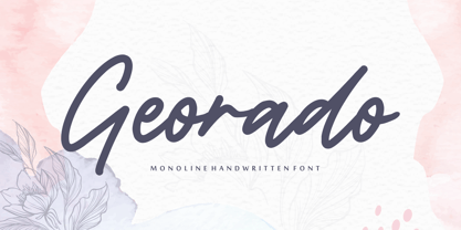 Georado is a sweet and friendly handwritten font. Its natural and unique style makes it incredibly fitting to a large pool of designs. The only limit is your imagination!
 - Love Radiate by Seemly Fonts,
$12.00 Love Radiate a joyful and casual handwritten font. Its natural and unique style makes it incredibly fitting to a large pool of designs. The only limit is your imagination!
 - Pattaya by Larin Type Co,
$12.00 Modern script font inspired by summer, airy and attractive, Pattaya will fit perfectly into any project and decorate it. Alternates and ligatures will help to make it more natural.
 - Bloc Boy by Mans Greback,
$59.00 Bloc Boy is a handwritten typeface by Måns Grebäck. Its 150+ alternates and swashes gives it great variety, and the contextual alternates ensures the font a genuinely handwritten look.
 - Easter Discover by Seemly Fonts,
$14.00 Easter Discover a joyful and casual handwritten font. Its natural and unique style makes it incredibly fitting to a large pool of designs. The only limit is your imagination!
 - Murisa Boxana by Murisa Studio,
$10.00 Boxana is a cool and bold display font. It will look stunning on any poster, flyer or print. Use this font for your designs and explore its endless possibilities.
 - Derivation by Seemly Fonts,
$12.00 Derivation is a sweet and friendly handwritten font. Its natural and unique style makes it incredibly fitting to a large pool of designs. The only limit is your imagination!
 - Alma Mono by Great Scott,
$22.00 Alma Mono is a monospace typeface with a friendly personality. It comes in five weights and its rounded ends convey a more friendly atmosphere then a more mechanical monospace.
 - King15 by Typo5,
$5.95King15 is a beautiful script font based on signatures dated back from hundreds of years. Its asymmetry and ink imperfections give it a strong and a truly unique character. - Zawiya by Eyad Al-Samman,
$3.00 The word Zawiya in Arabic language means Angle in English language. "Zawiya" is a Kufic modern square-shaped Arabic typeface. The typeface has only right-angled angles which makes it full of open and closed squares and free from any curves or arches. This font comes in two different weights. I am originally an engineer and I have liked to draw geometric shapes since my early childhood. I decided to design a typeface that embodies both of the technical and artistic human that I have inside me. The main characteristic of "Zawiya" Typeface is in its modern and attractive right-angled and square-shaped styles for its all-Arabic characters. The character "Faa" is one of its most distinguished characters that I myself adore it so much. "Zawiya" Typeface is suitable for books' covers, advertisement light boards, titles in magazines and newspapers, posters, greeting cards, cards, covers, satellite channels, exhibitions' signboards and external or internal walls of malls or metro's exits and entrances, geometric instruments and tools, technical devices, computers and laptops, IT and electric devices and also calculators. It is advisable to use the font in fields related to sciences such as geometry, mathematics, physics, chemistry, astronomy, industry, economy, and other fields. It can also decorate surfaces of calculators, geometric tools, rulers, pens, computers, cars, ships, trucks, and other related electric and electronic devices. It is sharp design qualifies it to be printed in public signs in streets, airports, hospitals, schools, malls, hotels, mosques, and other public places. It can also be used in titles for Arabic news and advertisements appeared in different Arabic and foreign satellite channels.
 - Planet Express by Estudio Calderon,
$29.99 Family type designed by Felipe Calderón. This type is a display with a modern style and a different and innovative concept. The development of this type was a challenge because it was set out from the begining as a script font with ornaments and complements, where the round shapes do not have prominence in the result. Planet Express is an interesting job from the aesthetic point of view, it works for big scale texts and contains little shadow-cuts in each character to give it more personality and stand out among other fonts from this gender. I hope this new project works to solve issues in design. Planet Express is composed of Regular & Italics, it has 250 intelligent ligatures to produce the best signs in big scale, it is perfect for branding and works very well with the geometric complements. It is designed with programming in opentype: Ligatures, Discretionary ligatures, Stylistic Alternates, Stylistic set 01, Stylistic set 02, Stylistic set 03, Stylistic set 04, Stylistic set 05, Stylistic set 06, Stylistic set 07, Stylistic set 08 & Stylistic set 09, multiple language support and a complete set of extras like arrows, catchwords, flags, emblems, hands, fleurons & crossed elements. Planet Express can be used in different ways, each character pretends to cover the needs in any circumstance where it is used. It is funny to write words and play with the complements. It also works with current concepts in graphic design like sports, cars, hip hop, music, social network, skateboarding and more. Everybody can use this font, it works with different languages like italian, french, portuguese, danish, german and so forth. See specimen and samples here. Enjoy it!
 - Temeraire by TypeTogether,
$49.00 Quentin Schmerber’s Temeraire serif font family was not designed to be invisible. It is a typographic exploration meant to be seen — with its beauty, one could even say beheld. While some fonts aim to be as easily ignored as possible, Temeraire is offered as a gift to wide-eyed readers with its anything-but-boring character and its conspicuous inconsistency in styles. Most type families increase the weight of each character to expand the family. Instead, research into 17th century sources produced Temeraire’s wide range of letterforms, from the predictable to the odd and loosely related through time. Each style is designed to work alongside the others but are also standalone homages to specific parts of English lettering tradition: gravestone cutting, writing masters’ copperplates, Italiennes, and others. Temeraire’s Regular style is a contrast-loving Transitional Serif with vertical stress, making it great for period and classic works, ironic pieces, and modern throwbacks. The weight of the Bold squares off the ends of each glyph to give it stability, and the italic style rings true: flowing, contrasting, and purposefully inconsistent. Temeraire’s Display Black style is one salvaged from expressive gravestone artistry. The details most easily noticed are the ‘g’ with its descending bowl that has been pressed back up in the centre, and the additional serif on the ‘t’ crossbar that holds its neighbouring character at bay. (The ‘g’ and ‘Q’ have loopless alternates.) The final style is the Italienne, the horizontally stressed counterpoint to the family. By design its characters flow and bend in ways not in step with the rest of the family. All the weight has been pushed to either hemisphere within each glyph, resulting in a display style that demands space and peacefulness around it so its presence can impress. As with all TypeTogether families, Temeraire meets the current designer’s needs. Not only does its five styles shine in print work, it includes alternates for when the defaults are too boisterous and has been expertly crafted for screens. The Temeraire serif font family is resurrected from echoes in time and finds its family relation through impeccable taste.
 - Fox Christmas Doodle by Fox7,
$15.00 Fox Christmas Doodle is a cute dingbat font specially designed for the Xmas season, Its versatility makes it great for a wide pool of craft projects, designs, planners, diaries, activity books, or anything that your heart desires. Add this beautiful doodle dingbat font to each of your creative ideas, and notice how it makes them stand out.
 - Kinera by Zamjump,
$17.00 Kinera is a display elegant serif . It seduces your eyes with its curves yet still looks serene and classy. Perfect for any kind of creativity you are about to start :). with a binder in it will add a very memorable impression to the writing you want. Note : Ligature can be active in CAPSLOCK File Included : - All Caps - Ligature
 - Cyritech by Tadiar,
$12.00 Cyritech is stylish futuristic geometric tech Three Fonts' Family designed for such areas as hi-tech, future, sport, space, army, games and many others. The feature of this font that it has serifs of triangle shape, that allows organic letters' connection, which makes it interesting and unique. Multilingual support (Latin extended). It is designed for header and text both.
 - Dime Museum by Solotype,
$19.95This idea of "wrong way weights" was originally called French Clarendon by the Americans, Italienne by the French, and American by the Italians. Sounds like nobody wanted to own up to it. When it was revived by ATF in 1933, it was given the name P. T. Barnum. Many variations have appeared. Dime Museum is an old wood type. - Atipla ND by Nicolas Deslé,
$20.00 Atipla ND is a contemporary sans serif typeface. It works best at large sizes, with softened ink traps pair legibility with aesthetic, while its strict horizontal and vertical terminals give it a rigid yet friendly appearance. The typeface contains a stylistic set, case sensitive forms, symbols and arrows, and the font covers all Latin Extended-A languages.
 - YT Big Latin by Yangtype,
$9.00 The concept of this letter is a young alligator. Young crocodiles have lean bodies and are agile. It has uncontrollable power, and the angular leather vinyl and teeth feel vivid. This font was created to convey the most compressed energy possible through a collection of compressed squares. Although it doesn't attack, it is quite an aggressive letter.
 - Pismo Clambake NF by Nick's Fonts,
$10.00This stylish stout script was originally issued in the 1930s under the name “Fulgor” by the spanish foundry Fundición Gans. Cursory research suggests that Saks-Fifth Avenue found it suitably snooty to use extensively in its newspaper ads of that period. Perhaps somewhat ironically, this version takes its name from one of comedian W. C. Fields' many odd aliases. - The Pallace by Cititype,
$19.00 The Pallace feels equally charming and elegant. This stunning handwritten font is a stylish homage to modern calligraphy. It features a varying baseline, smooth lines, gorgeous glyphs and stunning alternates. Fall in love with its incredibly versatile style and use it to create gorgeous wedding invitations, beautiful stationary art, eye-catching social media posts, and much more!