10,000 search results (0.126 seconds)
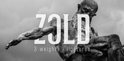
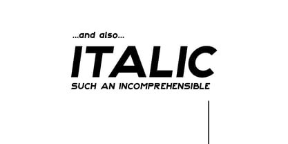
  1. Zold by EMME grafica, $9.90
    Zold is the first font designed by EMME Grafica. It's a simple, statuesque, architectural, eye-catcher, tough yet elegant font, particularly suitable for titling, subtitling, branding and typographic amusements. The solemnity of Zold does not affect the the elegance of the curves of the font, but gives it the right visibility and temper, like that of Zold, the surly character who will be the antagonist of a multimedia project currently under development at EMME Grafica.
  2. Boldu by Ryzhychenko Olga, $4.00
    Boldu is a simple grotesque font. I created it using simple forms. I love geometry and tried use only one size of lines. Boldu was created being impressed by works of beginning of 20th century - period of strict and geometric forms
  3. LTC Italian Old Style by Lanston Type Co., $39.95
    LTC Italian Old Style is not to be confused with the English Monotype font also called Italian Old Style, which is an earlier design from 1911 based on William Morris’s Golden Type that is based on Nicholas Jenson’s Roman face. Goudy went back to Jenson’s original Roman and other Renaissance Roman faces for his inspiration and the result is what many consider to be the best Renaissance face adapted for modern use. Bruce Rogers was one of the biggest admirers of Italian Old Style and designed the original specimen book for Italian Old Style in 1924 using his trademark ornament arrangement. These ornaments are now contained in the pro versions of the Roman styles—Regular Pro and Light Pro. With most digitizations of old metal typefaces, one source size is often used as reference (as was Goudy’s method for his own cuttings of his Village foundry types) so that all sizes refer to one set of original artwork. The original hot metal fonts made by Lanston Monotype (from Goudy’s drawings) and other manufacturers used two or three masters for different size ranges to have optimal relative weights—smaller type sizes would need proportionally thicker lines to not appear thin and larger sizes would require thinner lines to not appear to bulky. The variations in size ranges can also be affected by the size of the cutter head in making the master patterns. The light weights of LTC Italian Old Style were digitized from larger display sizes (14, 18, 24, 30, 36 pt) and the regular weights were digitized from smaller composition sizes (8,10,12 pt). The fitting for the regular weights is noticeably looser to allow for better setting at small sizes. Very few font revivals take this approach. Italian Old Style, originally designed by Frederic Goudy in 1924, was digitized by Paul Hunt in 2007. In 2013, it has been updated by James Grieshaber and is now offered as a Pro font. The newly expanded Pro font includes all of the original ligatures, plus small caps and expanded language coverage in all 4 Pro styles.
  4. Brave New Era (outline) G98 - Unknown license
  5. Brave New Era (narrow) G98 - Personal use only
  6. Brave New Era (flat) G98 - Unknown license
  7. Shorelines Script Bold - Personal use only
  8. DIST Inking Bold - Unknown license
  9. D3 Biscuitism Bold - Unknown license
  10. Goulong Bold Outline - Unknown license
  11. Ashby Extra Bold - Unknown license
  12. DDD Pipe Bold - Unknown license
  13. D3 Euronism Bold - Unknown license
  14. Monday Bold (sRB) - Unknown license
  15. Spylord Bold Expanded - Unknown license
  16. Phat Grunge Bold - Unknown license
  17. Pecot Outline Bold - Unknown license
  18. BN Pinky Bold - Unknown license
  19. Walkway Oblique Bold - Unknown license
  20. D3 Honeycombism Bold - Unknown license
  21. Yukon Tech Bold - Unknown license
  22. Samson Bold Oblique - Unknown license
  23. D3 LiteBitMapism Bold - Unknown license
  24. Walkway Condensed Bold - Unknown license
  25. Bagad Bold Tryout - Unknown license
  26. GF Matilda bold - Unknown license
  27. Spylord Bold Italic - Unknown license
  28. Rowling Stone Bold - Unknown license
  29. Walkway UltraCondensed Bold - Unknown license
  30. Walkway Expand Bold - Unknown license
  31. Walkway Bold RevOblique - Unknown license
  32. Hog Bold - HMK - Unknown license
  33. Chizzler Bold Outline - Unknown license
  34. Earth's Mightiest Bold - Unknown license
  35. PsychedelicSmoke Cn Bold - Unknown license
  36. Bionic Type Bold - Unknown license
  37. Walkway UltraExpand Bold - Unknown license
  38. Wyld Stallyns Bold - Unknown license
  39. ITC Legacy Serif by ITC, $40.99
    ITC Legacy¿ was designed by American Ronald Arnholm, who was first inspired to develop the typeface when he was a graduate student at Yale. In a type history class, he studied the 1470 book by Eusebius that was printed in the roman type of Nicolas Jenson. Arnholm worked for years to create his own interpretation of the Jenson roman, and he succeeded in capturing much of its beauty and character. As Jenson did not include a companion italic, Arnholm turned to the sixteenth-century types of Claude Garamond for inspiration for the italics of ITC Legacy. Arnholm was so taken by the strength and integrity of these oldstyle seriffed forms that he used their essential skeletal structures to develop a full set of sans serif faces. ITC Legacy includes a complete family of weights from book to ultra, with Old style Figures and small caps, making this a good choice for detailed book typography or multi-faceted graphic design projects. In 1458, Charles VII sent the Frenchman Nicolas Jenson to learn the craft of movable type in Mainz, the city where Gutenberg was working. Jenson was supposed to return to France with his newly learned skills, but instead he traveled to Italy, as did other itinerant printers of the time. From 1468 on, he was in Venice, where he flourished as a punchcutter, printer and publisher. He was probably the first non-German printer of movable type, and he produced about 150 editions. Though his punches have vanished, his books have not, and those produced from about 1470 until his death in 1480 have served as a source of inspiration for type designers over centuries. His Roman type is often called the first true Roman." Notable in almost all Jensonian Romans is the angled crossbar on the lowercase e, which is known as the "Venetian Oldstyle e."" Featured in: Best Fonts for Logos
Looking for more fonts? Check out our New, Sans, Script, Handwriting fonts or Categories
abstract fontscontact usprivacy policyweb font generator
Processing