10,000 search results
(0.04 seconds)
- Lady Ice - Unknown license

- Illustrate IT - Unknown license

- Lady Ice - Unknown license

- Buckwheat TC by Tom Chalky,
$12.00 Introducing the Buckwheat Font Collection; Each and every font within the Buckwheat Collection was carefully created to be timeless, super versatile, and effortlessly cohesive. An essential kit to come back to time and time again for any number of design projects; from clean and modern, to rough and organic. What's Inside? - Buckwheat TC Regular: A condensed heading/titling font boasting real small caps (along with numerals, currency glyphs and more to match the small caps). - Buckwheat TC Sans: A rounded sans-serif font with several stylistic alternatives for various capitals (A, B, G, H, J, K, P, and R). - Buckwheat TC Script: Tying everything together, a simple yet effective monoline script font designed to look great big or small. - Rough and Smooth Styles: All of the aforementioned fonts are available in both smooth and textured styles. The textures are consistent throughout the collection, improving the cohesion of the fonts and eliminating the need to texture them yourself. - All of the typefaces within this collection include multilingual support and a full western character glyph range.
 - Ice Valley by Good Java Studio,
$25.00 Introducing Ice Valley Hand-drawn Fonts The Ice Valley hand-drawn font is perfect for logos, invitations, stationery, wedding designs, social media posts, advertisements, product packaging, product designs, label, photography, watermark, special events or anything. This font includes: Ice Valley OTF font file, Ligatures, and Multilingual support.
 - IC Havolane by Ironbird Creative,
$7.00 Havolane, A display serif font with a modern vintage twist, ideal for branding, headlines, and packaging. Havolane offers two styles, "Regular" and "Inked," to add versatility and depth to your designs. Perfectly complements sans-serif fonts, making your creations stand out effortlessly.
 - Ice Flowers by kapitza,
$69.00 Kapitza's 2009 Ice Flowers font is a derivative of their snowflake font Snow. It is a much bolder interpretation of the theme, with strong black and white contrasts. The graphic style of Ice Flowers is inspired by 1960s folk art and embroidery.
 - Ice Creamery by FontMesa,
$29.00Ice Creamery is a new variation of our Saloon Girl font family complete with italics and fill fonts which may be used to layer different colors into the open parts of each glyph. We don’t recommend using the fill fonts for Ice Creamery as stand alone solid fonts, Ice Creamery Chocolate was designed as a the stand alone solid font for this font family. Fill fonts go back to the 1850's where they would design matched sets of printing blocks and the layering of colors took place on the printing press, they would print a page in black then on a second printing they would print a solid letter in red or blue over the letters with open spaces to fill them in. Most of the time the second printing didn't line up exactly to the open faced font and it created a misprinted look. With the fill fonts in Ice Creamery and other FontMesa fonts you have the option to perfectly align the fill fonts with the open faced fonts or shift it a little to create a misprinted look which looks pretty cool in some projects such as t-shirt designs. I have some ice cream making history in my family, my Grandfather Fred Hagemann was the manager of the ice cream plant for thirty years at Cock Robin Ice Cream and Burgers in Naperville IL. In the images above I've included an old 1960's photo of the Cock Robin Naperville location, the ice cream plant was behind the restaurant as seen by the chimney stack which was part of the plant. If you were to travel 2000 feet directly behind the Cock Robin sign in the photo, that's where I started the FontMesa type foundry at my home in Naperville. My favorite ice cream flavor was their green pistachio ice cream with black cherries, they called it Spumoni even though it wasn't a true Spumoni recipe. Their butter pecan ice cream was also incredibly good, the pecans were super fresh, their Tin Roof Sundae ice cream was chocolate fudge, caramel and peanuts swirled into vanilla ice cream. One unique thing about Cock Robin and Prince Castle was they used a square ice cream scoop for their sundaes. - Ice Cream by Positype,
$25.00 Ice Cream is the product of an abandoned typeface concept a non-connected script for food packaging. The original exemplars were so iconic, so inspiring, it demanded completion. Curvy with a huge dollop of fun, to be honest, and I wouldn’t have it any other way with this one. Influenced heavily by Kari and Juicy (and even the shameless copies of my originals, wink wink), Ice Cream’s recipe blends in some very simple elements that are unobtrusive and clean, perfect for packaging designs, children’s books, and anywhere a light-hearted scoop with a cherry on top is needed.
 - Hand It by PintassilgoPrints,
$24.00 Carefully messy, sweetly odd, this friendly family conveys a cool - but warm - organic feel. With mixed letterforms and somewhat unexpected choices here and there, each font brings a handful of alternates for a nice natural look: there are five alternates for letters, three for numbers plus alternates for punctuation marks. All cleverly programmed into Contextual Alternates feature to instantly cycle at your command. This is not an usual font. Is that one just strange enough to nicely fit a wide range of designs, carrying your idea with plenty of personality. Quite cool. Hand it!
 - Ice Age by URW Type Foundry,
$35.00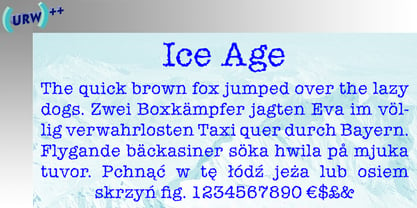
- Rustic TC by Tom Chalky,
$19.00 Proudly introducing Volume Rustic, where hand-craftsmanship meets professional design. Each of these meticulously handcrafted fonts were thoughtfully designed to harmoniously complement one another, oozing the essence of authenticity, warmth, and the human touch. These fonts are tailor-made for projects that celebrate the organic, the handmade, the local, and everything that puts people at the center. Compatible & Multilingual The fonts are in the OpenType font format. OpenType fonts are accepted within the vast majority of design software (including mobile and tablet design apps). Multilingual support is also included for Basic Latin, Western European, Euro & Pan African Latin.
 - EF It by Elsner+Flake,
$35.00 - TC Europa by Monotype,
$29.99Europa gives a rectangular appearance to words. Strokes have lightly flaired terminals to give the effect of serifs. The Europa font is excellent for headlines in journals. - Rock It by Fenotype,
$29.95 Rock it! is a type family that let's you create instant graphic design for any ROCK, PUNK, HARDCORE, HORROR and so on -gig, poster, logo, and whatever you need. Just type your texts and combine all the tree versions for authentic look! Rock It! includes three ultra condensed sans fonts with different eroded textures and partially different letter shapes. Different versions of Rock It! are set as "Light," "Regular," and "Bold", where Light and Regular have eroded holes in them whereas Bold has "dirty print stains" all over the characters.
 - TC Astariah by Tom Chalky,
$19.00 Whimsical, timeless, and elegant. Three words typically used to describe yours truly, and when one is introducing my latest typeface, Astariah. Drawing inspiration from typefaces of the late 1800s, Astariah is perfect for all designs requiring a splash of quirky elegance. UPDATE: Astariah now includes an additional ‘Outline’ style that perfectly aligns with the original. Both styles also host a variety of discretionary ligatures and stylistic alternates, providing buckets more creative potential!
 - Headliner TC by Tom Chalky,
$19.00 Proudly introducing the Headliner font family. 12 display fonts specially designed to grab and hold attention. This loud and proud family will make a powerful addition to your existing arsenal of design assets. Featuring Opentype kerning and multilingual support, this family is ready to command & conquer your projects right from the offset.
 - TC Broadway by Monotype,
$29.99 Modeled after a 1928-1928 design by M.F. Benton -- Broadway --, TC Broadway is ideal for show posters and signs for restaurants and boutiques. The TC Broadway font has strong contrasting strokes, and as such is only suitable for short lines.
 - TC Jasper by Monotype,
$40.99TC Jasper is a headline face with oblongated characters, suitable for letterheads and packaging. The serifs have an engraver's influence, making the TC Jasper font crisp in appearance. - IC Kindwall by Ironbird Creative,
$7.00 Kindwall, Fraktur Blackletter is carefully hand-drawn and organically crafted, boasting two captivating styles: Regular & Stamped. This font is tailor-made for commanding headlines, captivating packaging, and alluring labels, exuding a robust and assertive persona while exquisitely channeling a vintage aesthetic, characteristic of the esteemed blackletter tradition.
 - TC Brixton by Tom Chalky,
$19.00 Meet TC Brixton (The Handmade Version of my Brixton Pro font family!), a family of 16 fonts that blends professionalism and timeless elegance with a touch of authenticity. Not all handmade fonts need to be wild, wacky, or bursting with eccentricity. Classic fonts, like Brixton, can be enhanced by the introduction of those perfectly imperfect elements that only hand-drawn fonts can offer! This combination offers reliability and organic charm.
 - Ice Cube by Blankids,
$19.00 Hello, Are you looking for a SVG font? Do you want of creating Something that stand out and inspire creativity, imagination, and endless fun? Wait no more, we will give you the best choice. Ice cube a SVG Color Font Inspiring from Playful typography. This font is perfect for a design that makes it more attractive and playful. made with a very good level of aesthetics making this font suitable for book cover, poster, packging, merchandise, logotype and much more.
 - Maketa IT - Personal use only

- Night Club 70s - Personal use only

- Final Frontier Old Style - 100% free

- Old printing press_free-version - Personal use only

- SF Old Republic SC - Unknown license

- Old Dog, New Tricks - Unknown license

- SF Old Republic SC - Unknown license

- YY Old English Dingbats - Unknown license

- SF Old Republic SC - Unknown license

- SF Old Republic SC - Unknown license

- Ye Olde Block NF by Nick's Fonts,
$10.00Lewis F. Day, in his book Alphabets Old and New, offered this typeface as an example from sixteenth-century England of lettering incised in wood. The font is essentially monocase, but there several lowercase letters are alternate letterforms. Please note that, due to the ornate nature of the letterforms, this font does not contain math operators, fractions or superior numbers. Both versions of the font include 1252 Latin and 1250 CE (with localization for Romanian and Moldovan) character sets. - Scripps College Old Style by Monotype,
$49.00The story of Scripps College Old Style is a heart-warming and inspiring chronicle about a young librarian, a handful of students, a wealthy grandmother, a dedicated educator -- and two eminent American type designers. The story begins in 1938, when Dorothy Drake, the newly hired librarian at Scripps College, a small women's college in southern California, became an impromptu dinner companion of the American type designer Fred Goudy. By the 1990s, the original fonts that Goudy had created for Scripps College in the 1940s had become prized -- but they were seldom-used antiques. Scripps needed digital versions of the metal fonts. This goal posed two immediate challenges: finding a designer familiar with letterpress printing who was skilled at creating digital fonts, and locating the money to commission the designer's services. The first challenge was the easiest to conquer. Sumner Stone was my first and only choice," recalls Kitty Maryatt, the current curator of the Scripps College Press. "I knew he had letterpress experience, was an accomplished calligrapher, and that his typeface designs were simply exquisite. The choice was easy."The second challenge was more difficult. It took the dedication, hard work and tenacity of Maryatt to bring the beautiful Goudy designs into the twenty-first century. While Stone was eager to begin work on the project, the college had no more money for new typeface designs in the 1990s than it did in the1930s. Years of lobbying, cajoling and letter writing were necessary to obtain the college's approval for the design project. Once she had the necessary funding, the design brief posed yet a third challenge. Goudy had provided two sizes of type to the Press: 14 point and 16 point. Which would serve as the foundation for Stone's work? In addition, the Goudy fonts were quite worn. Should Stone use printed samples as his design master, or base his work on the original Goudy renderings? The 14-point master drawings were the ultimate choice, with the stipulation that the finished fonts would provide both a seamless transition from the worn metal versions and a faithful representation of the original Goudy designs. Once the budget and design brief were established, the process of converting the original Goudy drawings into digital fonts took just a little over two months. Stone delivered finished products to Scripps in the fall of 1997. The first official use of the fonts was to set an announcement for a lecture by Stone at Scripps in February of 1998. But the story is not quite finished. Maryatt was so pleased with the new digital fonts, she wanted to share them with the graphic design community. At Stone's suggestion, she contacted Monotype Imaging with the hope that the company would add the new designs to its library. An easy decision! Now Monotype Imaging is part of the story. We are proud to announce the release of Scripps College Old Style as a Monotype Classic font. The once exclusive font of metal type is now available in digital form for designers around the world. " - Cheltenham Old Style SB by Scangraphic Digital Type Collection,
$26.00Since the release of these fonts most typefaces in the Scangraphic Type Collection appear in two versions. One is designed specifically for headline typesetting (SH: Scangraphic Headline Types) and one specifically for text typesetting (SB Scangraphic Bodytypes). The most obvious differentiation can be found in the spacing. That of the Bodytypes is adjusted for readability. That of the Headline Types is decidedly more narrow in order to do justice to the requirements of headline typesetting. The kerning tables, as well, have been individualized for each of these type varieties. In addition to the adjustment of spacing, there are also adjustments in the design. For the Bodytypes, fine spaces were created which prevented the smear effect on acute angles in small typesizes. For a number of Bodytypes, hairlines and serifs were thickened or the whole typeface was adjusted to meet the optical requirements for setting type in small sizes. For the German lower-case diacritical marks, all Headline Types complements contain alternative integrated accents which allow the compact setting of lower-case headlines. - Baskerville Old Face SH by Scangraphic Digital Type Collection,
$26.00Since the release of these fonts most typefaces in the Scangraphic Type Collection appear in two versions. One is designed specifically for headline typesetting (SH: Scangraphic Headline Types) and one specifically for text typesetting (SB Scangraphic Bodytypes). The most obvious differentiation can be found in the spacing. That of the Bodytypes is adjusted for readability. That of the Headline Types is decidedly more narrow in order to do justice to the requirements of headline typesetting. The kerning tables, as well, have been individualized for each of these type varieties. In addition to the adjustment of spacing, there are also adjustments in the design. For the Bodytypes, fine spaces were created which prevented the smear effect on acute angles in small typesizes. For a number of Bodytypes, hairlines and serifs were thickened or the whole typeface was adjusted to meet the optical requirements for setting type in small sizes. For the German lower-case diacritical marks, all Headline Types complements contain alternative integrated accents which allow the compact setting of lower-case headlines. - Old Borders And Lines by RMU,
$15.00 A special offer by RMU Typedesign for those who like it old-style. Now finally with the possibility to create a Greek Meander frame.
 - Engravers' Old English BT by Bitstream,
$29.99Designed by Morris Fuller Benton in 1907; an improved version of the familiar nineteenth century blackletter as he had executed it in his Wedding Text. - Ongunkan Old Turkic Arrival by Runic World Tamgacı,
$40.00 It's the old Turkish runic script, which I adapted the written language of the three-legged aliens, the characters of a fantastic science fiction movie called Arrival.
 - Archive Old Style Condensed by Archive Type,
$19.95Compressed old style display typeface.


