10,000 search results
(0.037 seconds)
- Wild Month by Din Studio,
$29.00 Hi, Everyone! Want font to make your branding bold? Looking for a fabulous, stylish, modern, and adventure font? We've got what you want. Wild Month- A Serif Font Wild Month is a a serif typeface that is made in uppercase and lowercase. An excellent choice to add the right amount of modernity. This typeface with artistic style looks very interesting for loads of different projects and promotions. A great all-in-one package for your logo, book cover, poster, t-shirt, branding, and advertisement needs. Our font always includes Multilingual Support to make your branding reach a global audience. Features: Ligatures Alternates Stylistic Set Swashes PUA Encoded Numerals and Punctuation Thank you for downloading premium fonts from Din Studio
 - PF Bulletin Sans Pro by Parachute,
$79.00 This is a grotesque typeface which was derived from an older more simple version designed back in 2000. Bulletin Sans Pro is distinguished by its selective deep cuts which give this typeface a robust and contemporary look. These cuts become more apparent at larger sizes while they create a more subtle effect at smaller sizes. For intense titles try the black version. When space and legibility for long texts are critical, use the lighter versions. The family consists of 10 fonts—from black to light—including true italics. It supports 20 special OpenType features like small caps, fractions, ordinals, etc. and offers multilingual support for all European languages including Greek and Cyrillic. Finally, every font in this family has been completed with 270 copyright-free symbols, some of which have been proposed by several international organizations for packaging, public areas, environment, transportation, computers, fabric care and urban lifestyle.
 - Polin Sans by Borutta Group,
$39.00 For several years I have been thinking about the design of a type family that explores, on the one hand, the modernist aesthetic that we know, from the Alphabet "a.r." designed by Władysław Strzemiński, and on the other, to the multiscript pre-war Warsaw. This is how the idea of creating the Polin Sans typeface was born. After researching on geometric variants of the Cyrillic alphabet, I was inspired by the text "Towards an open layout: A letter to Volodya Yefimov". I was intrigued by the fact that circular forms, which we are mostly familiar with in the Bulgarian Cyrillic, can be implemented in the classical version, without disrupting the reading process. At the same time, while working on typoteka.pl, I was fascinated by the Hebrew typeface jaffa, published by the Idźkowski & Sk-a foundry, which at some points looks like the Hebrew equivalent of the Alphabet "a.r.". Ben Nathan from Israel joined the project and was responsible for creating his native script. The idea of creating a multiscript family expanded to include Greek and Vietnamese. As a result, Polin Sans is a historical journey through the nooks and crannies of Polish modernism, which was created by people with diverse cultural backgrounds. The Polin Sans family was designed by Mateusz Machalski and Ben Nathan with the support of Michał Gorczyca and Małgorzata Bartosik.
 - Plinc Flourish by House Industries,
$33.00 Flourish breaks the mold of traditional typography. Part italic, part roman, this iconoclastic font is all style. William Millstein casts the contours of formal pen strokes in a taut upright framework to create a typeface that nods back to its origins while looking defiantly forward. The neat and light semi-serif flaunts crisp geometric touches without conceding warmth or personality. A sophisticated design solution that isn’t stuck up, Millstein Flourish makes invitations, identities, and editorial settings thrive. Originally offered by Photo-Lettering in the early 1940s, Millstein Flourish was digitally updated by Jeremy Mickel in 2011. Like all good subversives, House Industries hides in plain sight while amplifying the look, feel and style of the world’s most interesting brands, products and people. Based in Delaware, visually influencing the world.
 - Peckham by Los Andes,
$29.00 Peckham, designed by Daniel Hernández, is a contemporary and versatile slab serif of 8 weights (and matching italics)—ranging from an elegant Thin to a heavy Black—with strong serifs that give it a playful look while preserving the overall geometric structure of the font. Peckham comes with the standard Latinotype set of 395 glyphs resulting in a language support for 94% of the languages using the Latin alphabet. The font also includes stylistic alternates (A, R, Y, a) which provides extra versatility. The name of the font reminds us of the city that witnessed the birth of Vincent Figgins (1766). Figgins became known as the type designer who first included slab serif fonts in a commercial catalog. Peckham pays homage to classic typefaces yet looks very contemporary. Digital editing and corrections by Alfonso García.
 - Di Mare by Ksenia Belobrova,
$49.00 Di Mare is a layered script inspired by Italian restaurant and cafe signs. It’s about delicious food and the joyful atmosphere of traveling: freedom, sea, fresh wind and warm sun. This font family has three styles: Regular, Line, Shadow. You can combine and overlay them to get different effects. Di Mare works well for menu, packaging, clothes, signs, magazines, and as a starting point for lettering and logos. Di Mare is designed with hundreds of contextual alternates and ligatures. It makes all connections look natural and harmonious. Di Mare supports most European languages, has small capitals, numbers, fractions, currency and mathematical signs. All contextual alternates are built into the “Liga” feature that is turned on by default. However, when your work with typeface, please make sure that “Liga” is turned on.
 - Polygraph by PintassilgoPrints,
$29.00 Inspired on posters by the extraordinary polish artist Leszek Żebrowski, Polygraph is a highly unusual face. Packed with eccentric alternates, it is an all-caps font with four exchangeable variations for each letter. These alternates are programmed to cycle when the font is used in OpenType-savvy programs, creating a random effect on glyphs distribution. The resulting pieces are truly outstanding, with an audacious handmade twist. To achieve this, just turn on the contextual alternates feature and play – you can easily try different glyphs sequences by adding spaces before words. When you need a more well-behaved look, but still with a subtle hand-drawn flair, turn off the contextual alternates and set text in uppercase. Polygraph comes in two weights, for added flexibility. But be warned: it’s quite addictive!
 - Laureen pro Arabic by Zaza type,
$29.00 Laureen pro typeface Laureen pro is an Arabic typeface that has a very particular appearance. It combines the characteristics of different genres; most notably the contrast of serif faces. While its design is influenced by Kufic and the Naskh style. Laureen pro consists of two typefaces, text and display, and 4-weights. It’s a perfect choice for bold headlines, oversize typography, fashion logos, branding, identity, website design, album art, covers, posters, advertising, etc.
 - Artegra Slab by Artegra,
$29.00 Artegra Slab is the latest addition to the Artegra superfamily. It contains 54 fonts with over 1000 glyphs per font in condensed, normal and extended widths. With Cyrillic and Greek sets it supports more than a hundred languages. It’s based on the perfectionist geometric shapes of Artegra Sans, which makes it beautiful to look at and easy to read.
 - Preta by Lián Types,
$39.00 Preta, portuguese for a very pure kind of black, has its name very related to its concept: I wanted to make the fattest/darkest script ever. People who follow my work may notice its forms are very related to works of my past (1) but this time the challenge was to be very cautious with the white spaces between letters. Not only I followed some rules and ductus of the copperplate style of calligraphy but also I took a lot of inspiration in posters of the early Art Nouveau (specially in Alfred Roller of the Vienna Secession) where letters forms looked like black squares if not looked from a close distance. With Preta, I wanted to achieve that same idea of “darkness” and thanks to the always welcomed question -what if?- the font grew a lot. The result is a very fat font, that looks delicious. Due to possible customer needs, I designed Preta Small, so it can be used in smaller sizes. Preta Ao Sol (which literally means under the sun!) is a style with those lovely tiny details to give the sensation of bright. Preta Ao Sol Solo was made to be used as a layered font with Preta. Finally, Preta Capitals serves as a company for Preta. Hope you enjoy the font as much as I did when designing it: The fact that it’s full of alternates, swashes, ligatures and swirls makes it really pleasurable at the moment of using it. Give it a try and dance with Preta! TIPS For better results, use Preta with the ‘standard ligatures’ feature activated. NOTES (1) Beatle in 2014. Seventies in 2015.
 - Isle Body by Mans Greback,
$19.00 Isle Body is a high-quality serif typeface family, drawn by Måns Grebäck during 2018 and 2019. It is a sweet font with a casual and calm look, with generous spacing and an even weight, adapted for body texts and small sized type settings. It comes in four weights, each one as italic, totaling in eight styles: Light and Light Italic, Medium and Medium Italic, Bold and Bold Italic, Black and Black Italic. The font family can be used in a combination with a font of a different style, or together with its sister font Isle Headline, also a serif font, which has the same basic structure but more distinct weights and a sharper look. Each style contains ligatures and support for a wide range of languages.
 - Isle Headline by Mans Greback,
$19.00 Isle Headline is a high-quality serif typeface family, drawn by Måns Grebäck during 2018 and 2019. It is a sharp font with a clear and attentive look, adapted for headlines, titles and large type settings. It comes in four weights, each one as italic, totaling in eight styles: Light and Light Italic, Medium and Medium Italic, Bold and Bold Italic, Black and Black Italic. The font family can be used in a combination with a font of a different style, or together with its sister font Isle Body, also a serif font, which has the same basic structure but with a softer look and adapted for body text and smaller type. Each style contains ligatures and support for a wide range of languages.
 - AL Hermaiona by Aluyeah Studio,
$90.00 Bonjour! Hermaiona a royal and lux display font. This font was carefully crafted and inspired by luxury fashion in the world. It creates a luxurious, rich, exclusive and elegant look in design. Coming to you with 100+ rich and luxury alternate to create a perfectly beautiful, classy, rich, elegant, and luxurious design. Use this font for your luxury brand, fashion brand, resort, cosmetics, invitations, wedding, branding, packaging, magazines, boutique, social media, restaurant, spa, greeting cards, headers, headline and many more. Features: OpenType support Multilingual support (15 languages) PUA Encoded Super Easy to Use alternates - It's OpenType support but you can easily call alternates character using special combination like A.2 B.2 a.2 a.5 b.3 etc so you dont need special software You will receive: Al_Hermaiona.otf Al_Hermaiona.ttf Thanks for checking out my font. I really hope you enjoy using it! If you have any questions I'd be more than happy to answer them, just send me a message! linggarsundoro@gmail.com Stay Healthy & Stay Strong
 - Brode by Storictype,
$10.00 Brode is a display slab serif font with 2 style clean and rough ,looks bold and wide also comes with alternative characters that created for adding a altivative uppercase decor of the letters. and it looks right on every character's we've made. Stylistic alternates allows versatile design options and works. Perfect for headline, logo, branding, emblem, enamel, for a adventure tone, posters, packaging, t shirt, presentationn and much more Features: - Uppercase & lowercase - Numerals & Punctuation - Stylistic Alternate Characters uppercase - Multilingual Supports Find out more ways to use this font by taking a look at the font preview. Hopefully you enjoy your experience in using our font. Feel free to contact us for further product information or trouble complaints. Thank you and happy designing.
 - Zona Black Slab by Intelligent Design,
$8.00 Zona Black Slab is a geometric slab–serif display black typeface. It is the brother font of Zona Black which was inspired by posters from the late 1920’s. Despite being black it has a tall x–height, making it quite legible even at smaller sizes. Its strong features are clean lines, neat square slabs and distinctive glyphs which tend to look even more beautiful at large sizes. Zona Black Slab supports Latin and Greek characters, ligatures and special characters. The Zona Black Slab awaits you!
 - Basati by Blancoletters,
$33.00 Basati is a display typeface designed for headlines and hard-hitting messages. It is sharp, heavy, and hard as an axe. But don’t be fooled by its rough look or the impression of having been carved with a machete. Each character is precise and sharp as a scalpel, and in that perfectly cut informality lies her deliberately wild temperament. Perhaps because its design was conceived during a severe bout of lumbago, its strokes are heavy and provocative, as if trying to defy logic and gravity alike.
 - WL Rasteroids Monospace by Writ Large,
$5.00 Rasteroids Monospace is a typographic flashback to computing of the mid 1980s, when 9-pin dot-matrix printers were the state of the art, and most home computer displays were TVs hooked up to RF modulators. Rasteroids not only captures the dot-matrix printer look, but recreates the rasterized appearance of text on those lower-resolution monitors. Because of its fixed character width, Rasteroids Monospace is intended for use in accents or small areas of copy rather than long documents.
 - Classic Heritage by Gleb Guralnyk,
$15.00 This vintage typeface named "Classic Heritage" has a steampunk look and was inspired by old-school lettering styles. The 13 stylistic alternate letters can help you to create a unique and interesting text composition.
 - Angkasa Script by Struggle Studio,
$16.00 Looking for vintage script fonts? Angkasa is a vintage handwritten font inspired by traditional Calligraphy, Angkasa font includes a full set of Classic upper and lower case letters, multilingual symbols, numbers, punctuation and ligatures.
 - Regiola Script by Lucky Type,
$16.00 Regiola Font Duo is an elegant serif typeface paired with natural handwritten script. By presenting a luxurious and chic look, for websites, modern logos, social media quotes, brand identities, wedding stationery and much more.
 - Freeform 721 by Bitstream,
$29.99Auriol font was the basis for the lettering used by Hector Guimard for the entrance signs to the Paris Metro. Bitstream’s Freeform 721 with his brush stroke look, is well-suited to display settings. - Cindy FA by Fontarte,
$39.00 Imelda Marcos, Cinderella - welcome to the club ... A picture font containing over sixty shoes, slippers and boots, fashionable yesterday, today and maybe tomorrow. Hand drawn by a designer Magdalena Frankowska. Not only for fetishists.
 - FlyHigh by Ingrimayne Type,
$12.95 FlyHigh is a decorative text face with slab serifs. It comes in eight styles: plain, semibold, bold, extrabold, italic, semibold italic, bold italic, and extrabold italic. Its low x-height makes it more appropriate for uses such as invitations than for book text.
 - Abkad by limitype,
$17.00 ABKAD is a display font with a gothic style made with a more modern touch, perfect for your design projects such as merchandise, posters, book headlines, logos, etc. ABKAD is equipped with uppercase, numbers, punctuation, multilingual and unique alternate
 - Orpheus by Scriptorium,
$18.00In response to many requests for Morpheus, an idea came to us. Why not make a font that looked a bit like Morpheus, but which had more attractive, more consistent character forms, was rendered cleanly and properly spaced and kerned? We took a look at Morpheus and decided to redo the concept from the ground up, replacing some of the amateurish characters, adding a bit of a Celtic look and feel, developing a set of alternate characters and making sure that the design elements were consistent from letter to letter. The result is Orpheus, a font which has the general look and feel of Morpheus, but is a much more complete and fully realized design. In addition, Orpheus is a fully developed font set, with not only regular and bold versions, but with a special customized italic style and a really neat looking heavy weight rough-outlined variant. - Borba by Edyta Demurat,
$20.00 Borba is light, fresh and friendly at first glace. It's simple, modern and elegant due to its monoline and minimalistic form. It is really readable which makes it perfect for long texts but it looks great in titles and short sentences as well. To sum up, borba is a universal typeface which may be used whenever you need a stylish and modern typography.
 - Serba by Sealoung,
$15.00 Serba is a fun, unique look serif display. With a modern look, it looks perfect when paired with a conventional serif/sans serif. It can be used for mastheads, posters, business identity and just about anything else. The all-inclusive also includes the complete set: All caps Multilingual character Number Punctuation
 - Blog by BA Graphics,
$45.00Blog has a new distinctive look and comes in four weights light, regular, medium and bold. It can be seen as quite elegant in the light weights while looking masculine in the heavy weight. Its unique look lends to so many different applications. Blog works well for both headline and text. - Beaufort by Shinntype,
$59.00 Engaging the issue of scalability, Beaufort® is configured so that serifs render with great sharpness, independent of type size, limited only by device resolution. This scale of effect empowers the typographer with a design axis stretching from awesomely huge to preciously tiny, further enhanced by weights from Light to Heavy, small caps, and alternate figure styles. In style, Beaufort has a number of affinities. In particular, the bold romans recall a kind of “grotesque with small serifs” style popular with sign painters and package lettering artists in the early 20th century, and still going strong. In proportion, the basic Beaufort is in the vein of the classic oldstyle types that descend from Granjon , via the French Oldstyles, or Elzevirs, to Plantin and Times in the early twentieth century. Designed for optimum clarity, readibility, and word count, these types have a pronounced angle of stress in the lower case, which is quite large and fairly narrow in relation to the caps. None of the caps are exceptionally narrow, and both cases have an evenness of width that makes for a no-nonsense, orthodox appearance. The strength of the capitals distinguishes these types from those of another “optimizing” era, the 1970s and ’80s, when puny caps made for monotonous text. However, strong though they may be, Beaufort’s caps are not as obtrusive in text as those of Times or Plantin.
 - Organic Benefit by Bogstav,
$15.00 Say hello to my new organic monospaced unicase font! It's handmade and has this true organic look to it! Choose between 5 different versions of each letter, or just type ahead and let the Contextual Alternates do their cycling of letters automatically!
 - Breaking The Comic by Gassstype,
$23.00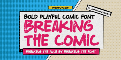 Breaking The Comic is a Cartoon Display Font it will make your designs look modern, unique and fun. It’s perfect for labels, quotes, posters, DIY projects, branding, packaging, greeting cards, websites, photos, photography overlays, signs, window art, scrapbooking, tags and so much more!
 - Stenciling Cards JNL by Jeff Levine,
$29.00Stenciling Cards JNL is the digital equivalent of the individual letter and number stencils used to paint markings on walls, crates, boxes, etc. Use this type design when you want a reversed stencil look. Kern it super tight for a continous word stencil. - Flabioga by PizzaDude.dk,
$20.00Flabioga may look like your every day stencil font - but it's not. It contains two sets of letters, one for uppercase and one for lowercase + ligatures for double letters and numbers! You will need to use OpenType supporting applications to use the autoligatures. - Brake by Black Studio,
$19.00 New from Black Studio, presenting Brākė is a typeface that is feminine, adaptable, contemporary aesthetic and creates endless variations for your creative needs. Its striking contrasts and subtle details, together with its sumptuous strokes and voluptuous curves, create a beautiful and powerful statement for any typographic composition, blending glamor with a contemporary aesthetic. Brākė really helps you create unlimited variations for your creative needs in making your project titles: such as Books, fashion, magazines, logos, branding, photography, invitations, wedding invitations, quotes, blog headers, posters, advertisements, postcards, books, websites, etc. WHAT IS INCLUDED • Brākė – Regular • Brākė – Oblique • Brākė – Outline This type of family has become the work of true love, making it as easy and fun as possible. I can't wait to see what you do with Brākė! Feel free to use the #Black Studio tag and the #Brākė font to show what you've been up to, I really hope you enjoy it! Thank You!
 - Bentoga by Black Studio,
$25.00 New from Black Studio, presenting bentoga is a typeface that is feminine, adaptable, contemporary aesthetic and creates endless variations for your creative needs. Its striking contrasts and subtle details, together with its sumptuous strokes and voluptuous curves, create a beautiful and powerful statement for any typographic composition, blending glamor with a contemporary aesthetic. Bentoga really helps you create unlimited variations for your creative needs in making your project titles: such as Books, fashion, magazines, logos, branding, photography, invitations, wedding invitations, quotes, blog headers, posters, advertisements, postcards, books, websites, etc. WHAT IS INCLUDED • Bentoga – Regular • Bentoga – Italic This type of family has become the work of true love, making it as easy and fun as possible. I can't wait to see what you do with Bentoga! Feel free to use the #Black Studio tag and the #Bentoga font to show what you've been up to, I really hope you enjoy it! Thank You!
 - Artic Fiction by LetterStock,
$20.00 Artic Fiction This font was inspired from lettering design that i saw online, It was crafted by hand specially to add natural handmade feeling in its brand identity than i make it clean with pentool. If you looking for Script Monoline Font for your authentic design, this font is a great choice for that. Artic Fiction is original hand writting font its perfect for lettering design or event logotype. Opentype features Artic Fiction font is very good looking in logo, labels, t-shirt prints, product packaging, invitations, advertising and others. What includes * Multilingual support (Western European characters). This fonts works with folowing languages: English, Danish, Dutch, Estonian, Faroese, Filipino, Finnish, French, German, Hungarian, Icelandic, Irish, Italian, Norwegian, Polish, Portuguese, Spanish, Swedish. Thank you for using this font. LS
 - Omnibus by Linotype,
$29.99Omnibus is one of my absolute favourites. My intention was to design a typeface as easy to read as Baskerville, without being a copy of it. It is easy to see that I was influenced by Baskerville, e.g. in the open lowercase g. I had in mind to design a Baskerville with the looks of the Baskervilles used in earlier typesetting. I put aside those plans for a while (but fulfilled them later on) and dedicated myself to Omnibus. In both cases my aim was to achieve a typeface with darker looks than the most used Baskerville. The name has nothing to do with buses, it is Latin with the meaning of for all". It is also in the name of Omnibus Typografi. Omnibus was released in 1993. - Rainbow Pancake by Yumna Type,
$15.00 Looking for a font with playful style? This is it. Rainbow Pancake is a display font that generates fun and cute feels. What's particularly nice about this font is the readability and the weight that bring strength when you apply it. This font makes designing look easy to do. As a special extras you will get 15 illustrations that you can to beautify your designs. Features: Stylistic Sets Multilingual Supports Uppercase and lowercase PUA Encoded Numerals and Punctuation It is can be used on your branding, logos, social media quotes, stickers, posters, wall art, merchandise, social media, and many more. Get more inspiration about how to use it by seeing the font preview. Thank you for purchasing our fonts. If you have any further questions, don't hesitate to contact us. Happy Designing.
 - Nautical Fabulous by Letterhend,
$14.00 The Nautical Fabulous font features a perfect blend of boldness and condensed letterforms. Its clean lines and sharp edges give it a catchy look that is ideal for modern branding, striking headlines, and impactful displays. With its commanding presence, this font effortlessly stands out in any design composition. This font perfectly made to be applied especially in logo, and the other various formal forms such as invitations, labels, logos, magazines, books, greeting / wedding cards, packaging, fashion, make up, stationery, novels, labels or any type of advertising purpose. Features : Uppercase & lowercase Numbers and punctuation Alternates & Ligatures Multilingual PUA encoded We highly recommend using a program that supports OpenType features and Glyphs panels like many of Adobe apps and Corel Draw, so you can see and access all Glyph variations.
 - HS Alnasma by Hiba Studio,
$69.00 Hs Alnasma is an Arabic display typeface, under “titles” category. It is useful for book titles, creative designs and modern logos. Also, it is used when a contemporary and simple look is desired that can fit with the characteristics of Latin fonts where horizontal parts are thinner than vertical ones for use in technical and engineering company. The font is based on some modern lines of Kufi calligraphy along with some derived ideas of Latin fonts, maintaining the beauty of the Arabic font and its fixed rates. This font supports Arabic, Persian, Urdu, Kurdish and Pashto and also includes Basic Latin and consisting of two weights (regular and bold) which can add to the library of Arabic and Latin fonts contemporary models that meet with the purposes of various designs for all tastes.