10,000 search results
(0.097 seconds)
- Virtus Sans by Andrew Footit,
$20.00 This clean sans-serif typeface brings your designs and layouts together in one great looking typeface, uncomplicated and legible large or small. VIRTUS SANS has 4 weights each with italics.
 - Grunge - Unknown license

- Kremlin Duma - Unknown license

- Grootesk - Unknown license

- Business Lunch JNL by Jeff Levine,
$29.00 Business Lunch JNL is an extra bold hairline serif font based on Monotype’s Falstaff, which in turn was greatly influenced by Bodoni Extra Bold. Great for posters, menu headers and other forms of headlining, Business Lunch JNL is available in both regular and oblique versions.
 - Rough Therapy by Hanoded,
$15.00 No, I don’t need therapy - at least, not that I’m aware of. I needed a bold and rough name for this bold and rough font. Rough Therapy is a strong display font. Comes in a clean and a dirty version, so take your pick!
 - RSVP Brush by Outside the Line,
$19.00 RSVP Brush is a fresh, bold, confident brush font. The bigger the better... great for posters, signs, a headline or a small block of copy. Versatile and quirky. Turn on Contextual Alternates in supporting programs so multiple letters do not repeat. Big. Bold. Brush.
 - Explore Wonders by Sarid Ezra,
$15.00 Explore Wonders is a bold handwritten font that will make all your project more unique and handy. With bold touch, this font will make your artwork feels more natural. This font is suitable for quotes & instagram post. Comes with number & symbol! Also support multi language!
 - Kirens Brush by limitype,
$18.00 Kirens is a brush font made in a modern, bold, classic and textured handwriting style, suitable for all your design needs that require display typeface to make your design appear bold and stylish. Kirens brush is equipped with: - Allcaps Font - Alternate - Numbers - Symbols - ligatures - Multilingual
 - Faible by Identity Letters,
$29.00 An open-hearted humanist sans-serif. Playful and friendly. Faible is everybody’s darling. You cannot not like this good-natured humanist typeface. Sure, it’s a typeface for serious work—but all serious work is better when you put a smile on your face and a whistle on your lips. The typeface itself isn’t rooted in calligraphy, but there are quite some details in Faible that reference handwriting and add a friendly, humanist facet to its appearance. Take the bowls of B, P, and R: they are merrily bulged, like balloons about to take off. The curved leg of the R adds to this joyful mood. Faible’s italics are rendered playfully, too: they’re not merely sloped Roman styles. Rather, they were designed independently with an internal dynamic that sets them apart on the page. With its trademark glyphs, the swooshin’ K and k, and its friendly details, Faible will radiate optimism in display sizes, titles, and headlines. That makes it a great choice for book covers, posters, editorial design, branding, corporate design, advertising, and packaging. Nontheless, it’s carefully spaced and equipped with plenty OpenType features—a reliable tool for short texts and body copy, too. The font family consists of six weights (ranging from Thin to Black), each with its corresponding italic style. Faible’s glyph set contains more than 600 characters, allowing you to enhance your layouts with ligatures, different sets of figures, case sensitive forms, arrows, and other necessities for the ambitious typographer. Faible is the typeface that puts “fun” back into “functional”.
 - Appleyard by Red Rooster Collection,
$45.00 Appleyard is a transitional serif font family that combines the elements of a modern serif and old-style typefaces. It is loosely based on an old Monotype design called ‘Prumyslava.’ Appleyard was designed by A. Pat Hickson (P&P Hickson) exclusively for the Red Rooster Collection and produced by Steve Jackaman (ITF) in 1992. The typeface’s rounded serifs give it a sophisticated, warm, and friendly feel; it excels in projects that need a delicate touch. Appleyard was designed with legibility in mind, and is ideal in children’s books and for young readers.
 - Killuminati by IKIIKOWRK,
$17.00 Introducing Killuminati - Gothic Type, created by ikiiko. Killuminati is a simple english old type with modern blackletter style. This typeface is inspired by gothic & classic rock band logo. killuminati has a bold font with a combination of sharp and curved corners. This font is perfect for an poster event, stencil, logotype, magazine layout, fashion stuff, quotes, and so much more. What's included? Uppercase & Lowercase Number & Punctuation Alternates Multilingual Support Enjoy our font and if you have any questions, you can contact us by email : ikiikowrk@gmail.com
 - Malik by Zetafonts,
$39.00 Taking its name from the arabic word for "king", Malik is a flared sans serif typeface family designed in 2020 by Andrea Tartarelli. The designer wanted to find a way to bridge the classical letterforms of Roman Old Style typefaces with the readability of contemporary sans typefaces. This was achieved by using the so-called flared serif that emerges gradually from the stem of the letter, ending in a sharp angle. It's something that also reminds of the peculiar shapes of the Simoncini Method, invented by italian type designer Francesco Simoncini to get a sharper definition of letterforms. To this blend of classical elegance and modernist expertise, Malik adds the calligraphic influence of modern masters like Frederic Goudy or Ed Benguiat, visible in signature details like the reverse contrast uppercase B, or the calligraphic lowercase k. Malik also means "owner", and this font surely wants to rule the page. It manages to be extremely readable when used in body text size, but looks surprising and expressive in display use. The inclusion of the Malik Heavy Display weight, with its black texture balanced by deep inktraps, allows for striking logo design. The weight range of the family is extremely wide, including a Book alternative to the Regular weight for fine-tuning readability, a range of light display weights and a solid choice of bold weights for branding, all coming with matching true italics. The 16 cuts of Malik have been equipped with all the features you need to solve your editorial and design challenges, including a wide language coverage (thanks to over one thousand latin and cyrillic characters) and a complete set of open type features (including small capitals, positional numbers, case sensitive forms). Alternate characters and stylistic sets allow you to fine-tune your editorial and branding design by choosing variant letter shapes. Malik is the typeface for everyone who wants to design like a king...or like he doesn't care who the king is!
 - Temporal Shift by Comicraft,
$19.00You're trapped in an endless now... seconds seem to be stretching out interminably... There’s an eternity between every tick, every tock of the clock... Your consciousness is stretched to the limit as time is expanded to fill the void between each microsecond. There’s a signpost up ahead... the letters appear to stretch into infinity. Anyone know the name of the font it’s set in? See the families related to Temporal Shift & Gap Expanded: Temporal Shift & Gap & Temporal Shift & Gap Compressed Features Four fonts (Shift Regular, Shift Bold, Gap Regular & Gap Bold) with upper and lowercase characters. - Temporal by Comicraft,
$19.00 You're trapped in an endless now... seconds seem to be stretching out interminably... There’s an eternity between every tick, every tock of the clock... Your consciousness is stretched to the limit as time is expanded to fill the void between each microsecond. There’s a signpost up ahead... the letters appear to stretch into infinity. Anyone know the name of the font it’s set in? See the families related to Temporal Shift & Gap Expanded: Temporal Shift & Gap & Temporal Shift & Gap Compressed Features Four fonts (Shift Regular, Shift Bold, Gap Regular & Gap Bold) with upper and lowercase characters.
 - Rufolo by Eurotypo,
$22.00 Rufolo is a family of fonts that can be considered both aesthetic and utilitarian. It has an apparent serif, barely hinted at, whose clear past reference is a beautiful epigraphic script on the marble plate placed at the southern entrance of the Roman amphitheatre, in Pompeii. Perhaps its origin dates back to Ugarit's cuneiform writing (as Morrison suggests as the origin of the serif in "Politics and Scripts") whose characteristic triangular-shaped incision footprint produces a powerful trait that not only gives character to the writing but also facilitates its support and visual compensation of sizes with neighboring signs. Other clear inspirational references have been Robert Hunter Middleton's Stellar (1929); Albertus (1932) by William A. Dwiggins; Optima (1952) by Hermann Zapf; And more recently RRollie (2016) by our foundry. Rufolo collects the attractive characteristic of the stroke endings but the proportions of its structure becomes much more regular, the capitals are in line with a constant square module, while the above references retain the proportions of the Roman Trajan. Some endings strokes have slightly baroque reminiscence with the intention of giving it greater plasticity and aesthetic enrichment, but absolutely controlled, taking special care of the aspects of readability and expressive neutrality. Rufolo Family comes in four weight: Light, Regular, Bold and Black, accompanied by its corresponding Italic versions.
 - Store Clerk JNL by Jeff Levine,
$29.00 The cover of the 1929 sheet music from the First National/Vitaphone picture “The Girl from Woolworth’s” had its title (“Someone”) hand lettered. This single word title was the model for Store Clerk JNL, which is available in both regular and oblique versions as well as solid and solid oblique versions (without an inline). A bold, casual sans serif with rounded ends and an inline, Store Clerk JNL is perfectly suited for projects where a strong, yet playful title is necessary to grab the reader’s attention. For those old enough to remember, Woolworth’s was a leading “Five and Dime” store chain, especially in the days when a nickel or a dime actually could purchase something.
 - Regional by Sudtipos,
$39.00 Sudtipos is really proud to announce the release of Regional, a solid workhorse type family of 27 styles inspired by the Old Style Bold models from the late XIX century by different type foundries. The unique diagonal in the "R" has been the key that inspired us to create many of the several alternates included in the set. From a delicate and expressive thin condensed to an exaggerated expanded black, Regional merges the past with the present, making it useful for a wide range of designs. We have imagined Regional to be used in magazines, packaging labels and posters. The addition of a complementary one-file variable format is included when you license the complete set.
 - Super Active Matrix by Folding Type,
$9.00 S.A.M (Super Active Matrix) combines the big, bright and bold with the microscopic and mathematically precise. Inspired by old science fiction films and new technologies, S.A.M merges the rigid constraints of display mechanics with the free-flowing curves of neon signs. This font is great for a classic sci-fi look – perfect for headlines/logotype. S.A.M also works for blocks of text, unlike some other display fonts. The matrix exists to bring order to an idea – it tames the free-flowing curves of neon signage into a repeatable structure while maintaining a retro aesthetic. Each character, glyph or symbol is drawn on a bitmap grid, merged with a dot matrix to round off the edges.
 - Omerta by Anomali Creative,
$15.00 Omerta Blackletter Font Blackletter fonts have letters that are very bold and ornate. It is a Western calligraphy style that was used in Europe from 1100s to the 1600s. Blackletter is also known as Old English or Gothic script. During the 20th century, blackletter type styles were adopted by new audiences and came to be associated with punk, street art, and heavy metal. Omerta Blackletter Font Specifically developed to be suitable for perfect for tattoos clothing, labels and packaging, branding, or any Gothic-themed projects. Omerta Blackletter Font are great for Classic Calligraphic type projects and convey a sense of what’s to come. This font can be used with all software that can read standard fonts.
 - Binario by Tarallo Design,
$14.99 Binario is a simple and friendly font with three weights and matching obliques. The geometric and modular characteristics of this typeface subtly reference the Art Deco and early modernist periods. It is an ideal choice for achieving a clean, distinctive, and contemporary aesthetic, making it suitable for branding, posters, and screen-based designs. The light weight of Binario is good for body text. The regular weight exudes confidence, making it suitable for both body and heading text. For impactful headlines, the bold weight is superb. The clear weight distinction of this family make it easy to create organized text. Binario was designed in Siena, Italy taking some inspiration from train stations and shop signage. The name Binario means train platform in Italian. Other aspects that informed the design of this font are modularity and efficiency. The interior rounded forms of the letters (counterforms) are based on shape of the Roman arch. Binario has a sibling, Binario Soft. This version has gently rounded stroke ends, which make a softer impression on the page.
 - FF Good Headline by FontFont,
$72.99 FF Good is a straight-sided sans serif in the American Gothic tradition, designed by Warsaw-based Łukasz Dziedzic. Despite having something of an “old-fashioned” heritage, FF Good feels new. Many customers agree: the sturdy, legible forms of FF Good have been put to good use in the Polish-language magazine ‘Komputer Swiat,’ the German and Russian edition of the celebrity tabloid OK!, and the new corporate design for the Associated Press. Although initially released as a family of modest size, the typeface was fully overhauled in 2010, increasing it from nine styles to 30 styles, with an additional 30-style sibling for larger sizes, FF Good Headline. In 2014, the type system underwent additional expansion to become FontFont’s largest family ever with an incredible 196 total styles. This includes seven weights ranging from Light to Ultra, and an astonishing seven widths from Compressed to Extended for both FF Good and FF Good Headline, all with companion italics and small caps in both roman and italic. With its subtle weight and width graduation, it is the perfect companion for interface, editorial, and web designers. This allows the typographer to pick the style best suited to their layout. As a contemporary competitor to classic American Gothic style typefaces—like Franklin Gothic, News Gothic, or Trade Gothic—it was necessary that an expanded FF Good also offers customers both Text and Display versions. The base FF Good fonts are mastered for text use, while FF Good Headline aims for maximum compactness. Its low cap height together with trimmed ascenders and descenders give punch to headlines and larger-sized copy in publications such as newspapers, magazines, and blogs.
 - Recumba by Pixesia Studio,
$23.00 Introducing Recumba - Modern Display Font Recumba is modern display font with bold characters. Recumba is perfectly suited for branding projects, headlines, poster, movie titles, games, logos, social media posts, advertisements, product packaging, labels, photography, watermarks, stationery, and any creative project seeking a touch of modern bold elegance. FEATURES - Stylistic Alternates - Ligatures - PUA Encoded - All Caps - Numbering and Punctuations - Multilingual Support - Works on PC or Mac - Simple Installation - Support Adobe Illustrator, Adobe Photoshop, Adobe InDesign, also works on Microsoft Word Hope you Like it. Thanks.
 - Amberlion by Maulana Creative,
$14.00 Amberlion is a bold 70's script font, with a curvy bold stroke, uprights and fun character. It has Opentype features ligatures of character and alternate lowercase swashes, To give you an extra creative work. Amberlion script font support multilingual more than 100+ language. This font is good for logo design, Social media, Movie Titles, Books Titles, a short text even a long text letter and good for your secondary text font with sans or serif. Make a stunning work with Amberlion font. Cheers, MaulanaCreative
 - Elysia by Factory738,
$15.00 We present Elysia, a fresh two-faced serif with both MODERN and CLASSIC curves. Elysia is a split personality font that can be used for a variety of projects, including bold magazine imagery, wedding invitations, branding, poster design, and much more. 2 Weights (Light & Bold) 2 Styles (Modern & Classic) Basic Latin A-Z and a-z Numerals & Punctuation Stylistic Ligatures glyps Multilingual Support for ä ö ü Ä Ö Ü ... Free updates and feature additions Thanks for looking, and I hope you enjoy it.
 - Blue Bronx by Putracetol,
$24.00 Blue Bronx - Bold Vintage Scipt Font. Blue Bronx is a bold vintage script font. Blue Bronx is font we combine vintage with luxury script font. Blue Bronx can be used in various projects with retro or vintage and luxury themes. Such as logos, branding, posters, packaging, book covers, clothes/apparel, quotes, titles and others. Blue Bronx come with clean and rough font version. Come with Opentype feature with a lot of alternates, its help you to make great lettering. This font is also support multi language.
 - Deadfrog by Ilhamtaro,
$23.00 DEADFROG is a simple classic font, the base is a super bold serif font that is given a grunge texture effect, resulting in a vintage font, which is suitable for supporting designs related to the world of motorcycle custom. But it can also be used for other designs that require a vintage, bold design style, such as magazine headlines or posters. To enable the OpenType Stylistic alternates, you need a program that supports OpenType features such as Adobe Illustrator CS, Adobe Indesign & CorelDraw X6-X7. Cheers!
 - Hollgati by Grontype,
$4.00 Hollgati is a bold sans serif font with moderate and elegance lines, It is based on the combining a variety of styles available in both an elegant regular weight as well as outlined weight.The font is simply work with bold scary touch which is great for halloween titles. Holgati font is Suitable for Logo, greeting cards, quotes, posters, branding, name card, stationary, design title, blog header, art quote, typography. Please contact us if you have any questions. Enjoy the font and thanks for supporting us. Regards, Grontype.
 - Curve by Fontador,
$24.99 Curve is a modern neo-classical typeface family with some features of the Didone genre, but especially designed for contemporary typography. A large x-height not only creates space in the letters for extra-bold styles, but also lends Curve an open and generous character in the more narrow and semi-bold versions. It has 616 glyphs with small caps, numbers and ligatures in 10 weights. Curve is a contemporary serif typeface, special for logos, brands, magazines and editorial and for setting trends in fashion and design.
 - Hoodie & Sweater by Ira Natasha,
$10.00 Hoodie & Sweater is a bold handwritten sans serif font. A new fresh handmade font with smooth edges. This font is support multi language. Available in OTF file. This font will perfect for many different project ex: quotes, logo, blog header, poster, branding, fashion, apparel, letter, invitation, stationery, etc….
 - Jingle Bells by Girinesia,
$13.00 Hello guys... We proud presenting our new font. Jingle Bells is playfull font, display bold font. Jingle Bells would perfect for kids poster, flyer , cover children book, cartoon, comic , cristmast invitation, new year party and etc. Features: Standard glyphs Uppercase and Lowercase Numerals & Punctuations Multilanguage Works on PC & Mac
 - Dusky Slab by Gleb Guralnyk,
$13.00 Hello, introducing a vintage style all caps typeface "Dusky Slab". It's a seventies style font with bold serifs and reverse contrast inspired by western hippie culture. Dusky Slab supports a lot of languages, including west european and cyrillic characters (check out all available symbols on the last screenshot).
 - Black Mint by Ira Natasha,
$10.00 Black Mint is a bold handwritten sans serif font. A new fresh handmade font with smooth edges. This font is support multi language and available in OTF file. This font will perfect for many different project ex: quotes, logo, blog header, poster, branding, fashion, apparel, letter, invitation, stationery, etc….
 - Quick Baseball by Nirmana Visual,
$22.00 Quick Baseball, contemporary of Serif font, Insipired by Baseball Club Logo, Quick Baseball it's retro, bold, and playful. Perfect if you need a dose of fun in your project. offers beautiful typographic harmony for a diversity of design projects, including logos & branding, social media posts, advertisements & product designs.
 - Wataha by Soar Studio,
$22.00 Wataha (in polish - wolf pack) is a sharp, robust uppercase family of 3 fonts: Bold, Heavy and Black. Perfect for posters, headlines and logotypes. With a range of OpenType features you have access to alternative letter shapes, fractions, arrows etc. Wataha supports most Latin-based languages and few others.
 - SBB Power Grid by Sketchbook B,
$9.00 Powerful and angular. Power Grid comes in four versions: Regular, Stencil, Inline and Rounded. Inspired by 1920s constructivist posters, it's perfect for industrial and bold applications. Power Grid is all caps and includes a handful of alternate glyphs. 8 fonts 4 styles: Regular, Stencil, Inline and Rounded Alternate characters
 - Automatic Typewriter by Ana's Fonts,
$16.00 Automatic Typewriter is a monospaced typewriter font in two styles: Upright and Oblique, and two weights: Regular and Bold, plus an Automatic Underline version of each font, for a total of 8 fonts. This makes it versatile and ready to use in modern and vintage designs alike. This font is also very legible at a wide range of sizes and looks great in both long or short texts, in digital collages, branding and packaging, social media posts, logotypes, etc.
 - Mochalatte by Grontype,
$14.00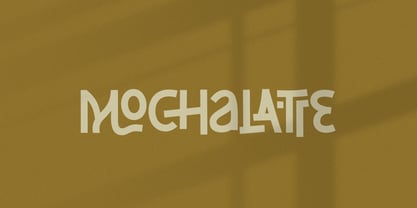 Mochalatte is an attractive and modern semi bold, elegant decorative font with a fun, dashing style look. This font equipped with extra ligatures and alternates, that will make your creative designs projects look impressive and stunning. Mochalatte is perfect for logotype, posters, t-shirt designs, packaging brand, or quotes, magazine header etc. Features: Basic Latin Glyphs Multilingual Numeral and Punctuation Standard Ligatures Stylistic Alternates Thankyou for picking up this font, hope you enjoy it. Regard. Grontype
 - Qisharon by LetterMuzara,
$20.00 Qisharon is a contrast sans serif font, consisting of four styles (light, book, regular, bold) and including 5 writing systems such as Latin (supporting all European languages and Turkish), Cyrillic, Greek, Hebrew, and Arabic. It is based on classic calligraphic rules and respects the traditions of every script. There are plenty of ligatures, that will draw attention to your design. Qisharon with it's formal and elegant nature is a perfect fit for logos, visit cards and magazine headings.
 - Hip Pop NF by Nick's Fonts,
$10.00Type designer Friedrich Poppl is perhaps best known for his classic text faces and elegant scripts, but it seems he had a playful side as well. This frisky face is based on Dynamische Antiqua, which Poppl did for the Stempel foundry in 1960, but which was never released. Bright, bold and bouncy, it’s the perfect choice for headlines with impish impact. Both versions of this font include the complete Unicode Latin 1252 and Central European 1250 character sets.


