10,000 search results
(0.094 seconds)
- Gothic Special Normal Italic by Wooden Type Fonts,
$15.00 A revival of one of the popular wooden type fonts of the 19th century, suitable for text or display, short descenders, tall ascenders, the narrow, italic version, completing the Gothic Special family of 5 fonts in total, sans serif.
 - Formal Notice JNL by Jeff Levine,
$29.00 Samuel Welo’s “Studio Handbook for Artists and Advertisers” was a popular book of inspiration for sign painters, graphic artists and designers from the 1920s through the 1960s. Many digital revivals of Welo’s hand lettered typography have been made available. Formal Notice JNL is one such revival, and is available in both regular and oblique versions.
 - Cross Stitch Formal by Gerald Gallo,
$20.00 Cross Stitch Formal is based on upper case characters 20 stitches tall and contains upper case characters A-Z. All characters are linked by at least one stitch.
 - Nouveau Formal JNL by Jeff Levine,
$29.00 Lettering found on the cover of 1915 textbook pamphlets from the Woman’s Institute of Domestic Arts and Sciences, Inc. [of Scranton, PA] inspired the creation of Nouveau Formal JNL. This attractive serif typeface is available in both regular and oblique versions.
 - Formal Dance JNL by Jeff Levine,
$29.00 A vintage Canadian-published music book circa the 1940s had the title "Strauss Waltzes" hand lettered in a bold Art Deco sans serif that featured block style letters with rounded corners. This was the working model for Formal Dance JNL, which is available in both regular and oblique versions.
 - Formal Invite JNL by Jeff Levine,
$29.00 The thin, condensed serif lettering found in a 1937 magazine ad for Chris Craft boats inspired Formal Invite JNL, which is available in both regular and oblique versions.
 - David Hadash Formal by Monotype,
$50.99Monotype Imaging is pleased to present David Hadash (New" David), the full family of typefaces by Ismar David, in its intended authentic form. The Estate of Ismar David has sought to revive this jewel of Twentieth-Century design by granting an exclusive license to Monotype Imaging to implement it in industry-standard format. Never before has the typeface in its full set of sub-styles been made available to the design community. David Hadash consists of three style families, Formal, Script, and Sans. Each of these appears in three weigths: regular, medium, and bold. Originally devised as a companion to the upright Formal style, the Script style has a beauty and grace all its own that allows it to be used for full-page settings also. While it is forward-leaning and dynamic, it does not match any of the existing cursive styles of Hebrew script. Ismar David created an eminently readable hybrid style which is like no other by inclining the forms of the upright while blending in some features of Rashi style softened with gentle curves. One can say that the Script style is the first truly italic, not just oblique, typeface for Hebrew script. Although the proportions of the Sans style are very similar to those of the Formal style, its visual impression is stunningly different. If the Formal style is believably written with a broad-point pen, the Sans is chiseled in stone. Rounded angles turn angular and stark. The end result is an informal style that evokes both ancient and contemporary impressions. David Hadash (Modern) supports the writing conventions of Modern Hebrew (including fully vocalized text) in addition to Yiddish and Ladino. David Hadash Biblical is a version of the Formal style that supports all the complexities of Biblical Hebrew, including vocalization and cantillation marks. " - Formal Event JNL by Jeff Levine,
$29.00 The hand lettered actors’ credits on a title card from the 1937 film “Shall We Dance” served as the model for Formal Event JNL – an Art Deco sans serif font available in both regular and oblique versions.
 - Vera Humana 95 - Unknown license

- Bitstream Vera Sans - Unknown license

- DS Eraser Cyr - Unknown license

- Long Ears MF - Unknown license

- KR Mardi Gras - Unknown license

- Erased Typewriter 2 by Intellecta Design,
$27.00 A distressed typewriter font design, great for mimicking the distressed and sloppy ink effect of older machines.
 - Linea Nera NF by Nick's Fonts,
$10.00Here's another Disco-era darling, based on Wolf Magin's contemporary offering, originally called Black Line. It's a natural choice for sassy headlines with a cool Retro vibe. Both versions contain the complete Latin 1252, Central European 1250 and Turkish 1254 character sets. - Erased Figgins Brute by Intellecta Design,
$21.90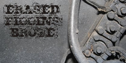
- Mardi Gras Improved by Solotype,
$19.95George Bruce's New York foundry had a remarkable number of decorative types, most of which were lost or destroyed when the firm was taken over by the American Type Founders Co. and closed down in 1906. Bruce catalogs are prized among collectors. - Eva Antiqua SG by Spiece Graphics,
$39.00 Based on the 1922 Klingspor model by German designer Rudolf Koch, this hand-drawn quill roman has an informal and curiously delicate appearance. The typeface was known in Germany as Koch Antiqua and in the rest of Europe as Locarno. Eve, as it was called in the United States, continues to enjoy great popularity in advertising and book publishing circles. This deluxe version includes display light, display heavy, and display black as well as the hard-to-find display light and heavy (Koch Kursiv) italics. Eva-Paramount, which is based on Morris Benton's 1928 ATF Paramount, has also been included. It contains a set of alternates characters that are in keeping with the light and heavy display letter styles. Eva-Antiqua is also available in the OpenType Std format. Alternates are now merged together into each style as stylistic alternates or as swashes. These advanced features currently work in Adobe Creative Suite InDesign, Creative Suite Illustrator, and Quark XPress 7. Check for OpenType advanced feature support in other applications as it gradually becomes available with upgrades.
 - HT Fera Text by Hype Type,
$34.00 Transitional serif font inspired by the italian’s lettering tradition, in particular by the street sign letters you can find around Florence. All elements are designed to be elegant and easy-to-read, even in a long blocks of text. -- The HT Fera Text is freely inspired by the typographical tradition of Florence's municipality and its streets. Letters shape, contrasts, junctions, stems, teardrops, they are all the result of careful research carried out on the Dante's streets, redesigned in a contemporary mood. -- hype-type.com / kidstudio.it
 - ITC Legacy Serif by ITC,
$40.99 ITC Legacy¿ was designed by American Ronald Arnholm, who was first inspired to develop the typeface when he was a graduate student at Yale. In a type history class, he studied the 1470 book by Eusebius that was printed in the roman type of Nicolas Jenson. Arnholm worked for years to create his own interpretation of the Jenson roman, and he succeeded in capturing much of its beauty and character. As Jenson did not include a companion italic, Arnholm turned to the sixteenth-century types of Claude Garamond for inspiration for the italics of ITC Legacy. Arnholm was so taken by the strength and integrity of these oldstyle seriffed forms that he used their essential skeletal structures to develop a full set of sans serif faces. ITC Legacy includes a complete family of weights from book to ultra, with Old style Figures and small caps, making this a good choice for detailed book typography or multi-faceted graphic design projects. In 1458, Charles VII sent the Frenchman Nicolas Jenson to learn the craft of movable type in Mainz, the city where Gutenberg was working. Jenson was supposed to return to France with his newly learned skills, but instead he traveled to Italy, as did other itinerant printers of the time. From 1468 on, he was in Venice, where he flourished as a punchcutter, printer and publisher. He was probably the first non-German printer of movable type, and he produced about 150 editions. Though his punches have vanished, his books have not, and those produced from about 1470 until his death in 1480 have served as a source of inspiration for type designers over centuries. His Roman type is often called the first true Roman." Notable in almost all Jensonian Romans is the angled crossbar on the lowercase e, which is known as the "Venetian Oldstyle e."" Featured in: Best Fonts for Logos
 - ITC Studio Script by ITC,
$29.99ITC Studio Script was designed by Robert Evans, an informal script for applications in which a calligraphic look would be appropriate. The font includes a wide variety of alternate characters, which give a graphic designer's creativity no limits. - ITC Cheltenham Handtooled by ITC,
$29.99ITC Cheltenham font in its present form is the work of designer Tony Stan. Originally designed by architect Bertram Goodhue, it was expanded by Morris Fuller Benton and completed by Stan in 1975 with a larger x-height and improved italic details. ITC Cheltenham font is an example of an up-to-date yet classic typeface. In 1993 Ed Benguiat added the Handtooled weights to this family. - ITC Humana Sans by ITC,
$29.99ITC Humana Sans font is the work of British designer Timothy Donaldson, an extended and versatile font family with a large array of variations. Donaldson first created ITC Humana Script with a broad-tipped pen and then went on to design the corresponding roman. ITC Humana Sans is the perfect font for anything requiring both clarity and a touch of personality. - ITC Legacy Sans by ITC,
$40.99 ITC Legacy¿ was designed by American Ronald Arnholm, who was first inspired to develop the typeface when he was a graduate student at Yale. In a type history class, he studied the 1470 book by Eusebius that was printed in the roman type of Nicolas Jenson. Arnholm worked for years to create his own interpretation of the Jenson roman, and he succeeded in capturing much of its beauty and character. As Jenson did not include a companion italic, Arnholm turned to the sixteenth-century types of Claude Garamond for inspiration for the italics of ITC Legacy. Arnholm was so taken by the strength and integrity of these oldstyle seriffed forms that he used their essential skeletal structures to develop a full set of sans serif faces. ITC Legacy includes a complete family of weights from book to ultra, with Old style Figures and small caps, making this a good choice for detailed book typography or multi-faceted graphic design projects. In 1458, Charles VII sent the Frenchman Nicolas Jenson to learn the craft of movable type in Mainz, the city where Gutenberg was working. Jenson was supposed to return to France with his newly learned skills, but instead he traveled to Italy, as did other itinerant printers of the time. From 1468 on, he was in Venice, where he flourished as a punchcutter, printer and publisher. He was probably the first non-German printer of movable type, and he produced about 150 editions. Though his punches have vanished, his books have not, and those produced from about 1470 until his death in 1480 have served as a source of inspiration for type designers over centuries. His Roman type is often called the first true Roman." Notable in almost all Jensonian Romans is the angled crossbar on the lowercase e, which is known as the "Venetian Oldstyle e."" ITC Legacy® Sans font field guide including best practices, font pairings and alternatives.
 - ITC Atelier Sans by ITC,
$29.99ITC Atelier Sans began as one of Curtis's renovations. His goal was to create a monoline design with Art Deco “sensibilities,” but without the geometric precision and relatively small x-height of faces like Futura or Kabel. Gentle curves and suggestions of serifs create a crisp, clean and open face that is at once sleek, sensuous and still affable. Available as a two-weight family with complementary italics, ITC Atelier Sans is another successful and usable revival from Nick Curtis. - ITC Humana Script by ITC,
$29.99ITC Humana Script font is the work of British designer Timothy Donaldson. He crafted this typeface with a broad-tipped pen on paper before carefully creating the final digital version. ITC Humana Script is the perfect font for anything requiring both clarity and a touch of personality. - ITC Officina Display by ITC,
$29.99When ITC Officina was first released in 1990, as a paired family of serif and sans serif faces in two weights with italics, it was intended as a workhorse typeface for business correspondence. But the typeface proved popular in many more areas than correspondence. Erik Spiekermann, ITC Officina's designer: Once ITC Officina got picked up by the trendsetters to denote 'coolness,' it had lost its innocence. No pretending anymore that it only needed two weights for office correspondence. As a face used in magazines and advertising, it needed proper headline weights and one more weight in between the original Book and Bold."" To add the new weights and small caps, Spiekermann collaborated with Ole Schaefer, director of typography and type design at MetaDesign. The extended ITC Officina family now includes Medium, Extra Bold, and Black weights with matching italics-all in both Sans and Serif -- as well as new small caps fonts for the original Book and Bold weights. - ITC Berranger Hand by ITC,
$29.99Controlled casualness is the watchword in this new handwriting script from the prolific young French designer Éric de Berranger, who also designed the sans serif type family ITC Octone. ITC Berranger Hand has its roots in chancery calligraphy, yet its surface looks like contemporary informal lettering that was written quickly with a felt-tip pen on slightly absorbent paper. The counters of some letters appear to almost fill in from ink spread, yet Berranger Hand is admirably readable at small sizes. The capital letters are restrained, without swashes, so they can be used together in all-caps combinations. - ITC Humana Serif by ITC,
$29.99ITC Humana font is the work of British designer Timothy Donaldson, an extended and versatile font family with a large array of variations. Donaldson first created ITC Humana Script with a broad-tipped pen and then went on to design the corresponding roman. ITC Humana is the perfect font for anything requiring both clarity and a touch of personality. - ITC Zapf Dingbats by ITC,
$40.99 The Zapf Dingbats originally had been a selection of 360 symbols, ornaments and typographic elements from over 1200 designs. (For the first time a lady's hand is shown for the index symbol, the fist). The exisiting Zapf Dingbats offers a small selection out of this great offer. Therefore Hermann Zapf created new symbols for the set of the Zapf Dingbats, which are available today from Linotype as "Zapf Essentials?" 6 fonts with new and fresh symbols like fax, cell phone and internet symbols.
 - ITC Stone Sans by ITC,
$40.99 Sumner Stone worked together with Bob Ishi of Adobe to create the Stone family fonts, which appeared in 1987. Coincidentally, ishi is the Japanese word for stone, which precluded any squabbling about whose name the font would carry. The family consists of three types of fonts, a serif, a sans-serif and an informal style. The Stone fonts are very legible and make a modern, dynamic impression.
 - ITC Home Improvement by ITC,
$29.99 - ITC Migration Sans by ITC,
$29.99 Through his hands-on experience choosing fonts as a graphic designer, type newcomer André Simard developed a type family with a good measure of design sensibility. His ITC Migration™ Sans suite of fonts offers five readable weights that can be utilized across a variety of projects. Expect more to come from this designer-turned-typophile.
 - ITC American Typewriter by ITC,
$40.99 ITC American Typewriter was designed by Joel Kaden and Tony Stan. It is an ode to the invention that shaped reading habits and the idea of legibility, the typewriter. A compromise between the rigidity of its ancestor and the expectations of the digital age, ITC American Typewriter retains the typical typewriter alphabet forms, lending the font a hint of nostalgia. ITC American Typewriter™ font field guide including best practices, font pairings and alternatives.
 - ITC Edwardian Script by ITC,
$40.99 In 1994, Edward Benguiat designed ITC Edwardian Script, an emotional, lyrical, even passionate calligraphic typeface. Its appearance was influenced by the look of writing with a steel pointed pen, an instrument which can be pushed as well as pulled, and which produces stroke contrast when pressure upon it is varied. The delicate, sophisticated letterforms of ITC Edwardian Script font were drawn and redrawn until the connective elements of the letters were perfected to create the look of true handwriting.
 - ITC Bradley Hand by ITC,
$40.99 ITC Bradley Hand is a calligraphy font from Richard Bradley, designed in 1995. The contours make it look as though it were written by hand with a felt tip pen on rough paper and it has all the details which give it a handwritten character. The font has a balanced, harmonious look and lends correspondence a personal touch. Bradley Hand is legible in point sizes as small as 8 and is good for headlines and short to middle length texts.
 - ITC Christoph's Quill by ITC,
$29.99ITC Christoph's Quill is just about everything you could want in a typeface: it's distinctive, beautiful, and exceptionally versatile. According to designer Russell Bean, ITC Christoph's Quill is the culmination of experimentation with a graphics tablet that spanned several years. Then one day, as if by magic, it all just fell into place. The design seemed to flow from my pen." Bean was born in Australia and, except for a brief stint with a photo-lettering firm in Southern California, has spent most of his career working down under. "I can recall a deep fascination for the written word," he says. "Even before learning to spell, read or write, I think I recognized that this was a means of visual communication." Bean's first job was in a small ad agency as a trainee in the production department, where he learned art techniques and how to handle print, as well as "the value of visual impressions," he says. His career path meandered from one design job to another, but always in the general direction of fonts and typefaces. Today, his workload consists of logo design commissions, font editing, typography and print production consultation to a select group of loyal clients - still leaving time, notes Bean, "to pursue my type design ambitions." ITC Christoph's Quill began life as a simple, visually striking font of caps, lowercase, punctuation and numerals. To this Bean added a bold weight, for when a little more strength is desirable. Next came a flock of alternate characters. Finally, Bean drew a set of decorative caps, a suite of logos, and a sprinkling of beginning and ending swashes. The net result is a type family that can add a signature flourish to a vast range of projects: from invitations and menus to logos, signage, packaging and more." - ITC Golden Cockerel by ITC,
$40.99ITC Golden Cockerel font is based on designs created by Eric Gill in 1929 for the Gold Cockerel Press in England. These elegant and meticulously crafted typefaces were inspired by and modeled on Gill's skills of stone carving, calligraphy and wood engraving. The typeface family includes ITC Golden Cockerel Roman, Italic, Titling, and Initials and Ornaments. - ITC Motter Corpus by ITC,
$40.99ITC Motter Corpus was designed by the Austrian type designer Othmar Motter in 1993 to combine the display advantages of a sans serif extra bold design with the legibility of a roman weight. The Motter Corpus is available in the weights regular and condensed regular. The capitals with their strong strokes display slight irregularities and natural looking outlines. When used in very large point sizes the tiny serifs become noticeable. Distinguishing characteristics of this typeface are the unusual design of the g with its upward reaching ear and that of the capital C, whose curve ends in an angular stroke in its upper third. Almost, but not quite, a sans serif, the typeface has diminutive serifs which, along with its modulated weight contrasts, make ITC Motter Corpus remarkable legible in display applications and will give text a nostalgic feel. A similar typeface is Linotype Bariton. - ITC Serif Gothic by ITC,
$29.99 ITC Serif Gothic font is the joint effort of Herb Lubalin and Antonio DiSpigna. Its distinguishing feature is its uniquely designed serifs, combining gothic simplicity with traditional roman elegance.


