3,523 search results
(0.183 seconds)
- Sun Pride by Attype Studio,
$13.00 Sun Pride is script font with beginning and ending swash of sun flower and is suitable for any summer event. Sun Pride is perfect for branding, logo, invitation, stationery, social media post, product packaging, merchandise, blog design, game titles, cute style design, Book/Cover Title and more. Includes Multilingual Support for Afrikaans, Albanian, Catalan, Danish, Dutch, English, Estonian, Finnish, French, German, Icelandic, Italian, Norwegian, Portuguese, Spanish, Swedish, Zulu. Hope you enjoy with our font! Attype Studio
 - Inhabits by Gassstype,
$23.00 Hello Everyone, introduce our new product Font Inhabits it is Handwritten Brush Font,This is a Textured Natural Style and classy style with a clear style and dramatic movement. This font Inhabits is great for your next creative project such as logos, printed quotes, invitations, cards, product packaging, headers, invitation,advertisements,product designs, stationery, wedding designs,label ,product packaging, special events or anything that need handwritting taste. You can activate 16 Ligatures glyphs and 13 Alternates glyphs OpenType panel.
 - Somehand by PintassilgoPrints,
$24.00 Handsome in its own way, More versatile than one could say. Four alternates to each letter, Because in this family Spontaneity do matter. (And just in case someone wonders, Yes, there are alternates for numbers!) Seven cuts the family holds. Six of them Are for saying with words. And the very last, (Before someone asks) Holds some very cool dingbats. Books, apps, mags, To just name a few, Now go with Somehand And try something new :)
 - Excelsia Pro by Wiescher Design,
$69.50 Excelsia Pro Script is a beautiful narrow script designed in the tradition of Bodoni and Fournier, it has lots of variations. There are for example seven different versions for the uppercase letters that can be accessed with opentype savy software. different ampersands, @-signs, Th combinations, lots of different lowercase letters and so on. The font can be used in all of Europe, Turkey and the Baltic countries (sorry no Greek and Cyrillic). Yours very versatile Gert Wiescher
 - Crossfit Core by TypeThis!Studio,
$50.00 Crossfit is a new headline font for great sizes, such as big movie posters, advertising or editorials. Matching topics might be adventures, sports, strong nature and all kind of challenging life events. Its bold stability transforms your creation into a non questionable design. It is bold, clear and also friendly thanks to its rounded corners. www.typethis.studio Thank you for checking out Crossfit font family. If you have any questions, please send us an email: hello@typethis.studio
 - Ms Claudy by Calamar,
$20.00 Ms. Claudy is an elegant modern calligraphy font that will look awesome on wedding and event stationery, logos and branding materials, cards and so on. Ms Claudy includes includes full set of Uppercase and Lowercase Basic Characters, Numerals and Punctuation. Also it contains ligatures and a lot of stylistic alternates to perfectly re-create natural calligraphy (check the previews in order to see them all). You can check your language typing characters in text box above.
 - Santos by Gassstype,
$23.00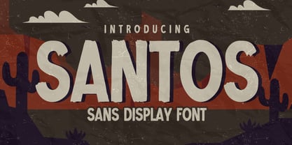 Here comes a New font, Introducing SANTOS It's Sans Display Font is a Textured Natural Style and Authentic Classy Style, this font is great for your creative projects such as watermark on photography, and perfect for logos & branding, invitation,advertisements,product designs, stationery, wedding designs,label ,product packaging, special events or anything that need handwritting taste. SANTOS is a vintage natural Hand Drawn feel. This handmade font will make your design has a beautiful natural touch for each details.
 - Mister Luston by Gian Studio,
$16.00 Mister Luston is a bold, retro display with lots of ligatures and alternatives that will make your presentation or logo stand out! This font will make your project look retro, chic and neat. You can use this font for your posters, events or social media posts. Get your nostalgic feeling with this font character! Features Include: Uppercase & Lowercase Ligature Numbers & Symbols Multy languages Please contact us if you have any questions, we are happy to help you! Enjoy!
 - Heritage Signature by Lunas Type,
$19.00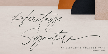 Introducing, Heritage Signature! Heritage Signature is a modern and stylish signature font. This Font have natural flow and unique shape for each letter. Heritage Signature is perfect for many design needs such as merch, T-shirts, signature logo, wedding, book covers, social media posts, websites, events, and many more. What’s you get : – Ending Swashes, beginning swashes, Love connector swashes. – Underline Swashes (just type _1, _2, etc) – Numeral & Punctuation. – ligature. – Multilingual Support. Enjoy Designing! Thanks! Lunas Type
 - Sweet Hearts by Gatype,
$11.00 Sweet Hearts, This font is perfect for branding, invitations, stationery, wedding design, social media posts, advertising, product packaging, product design, labels, photography, watermarks, special events and more. Sweet Hearts is encoded with PUA Unicode, which allows full access to all additional characters without having to design any special software. Mac users can use Font Book, and Windows users can use Character Map to view and copy any additional characters to paste into your favorite text editor/app.
 - Atompunk by Konstantine Studio,
$10.00 Inspired by the first wave of the industrial revolution back in the 60s. The glory of steam and steel machines in manufacturing technology. Atompunk was referenced from the science-fiction visual of the retro-futurism mindset—the imagination of nuclear-based technology for every human need. Perfectly fit for sci-fi movies, serials, technology-based branding, poster, logo, vintage illustration, packaging, snack, event, festival, album artwork, cover artwork, books, toys, games, arcades, cards, automotive, and many more.
 - My Autumn by Good Java Studio,
$22.00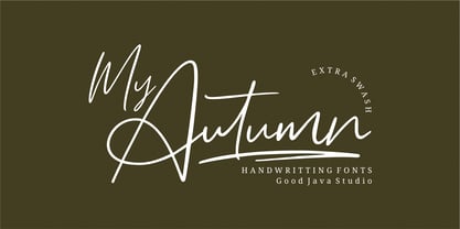 My Autumn signature font is a natural & modern handwritten font. It's perfect for logos, invitations, stationery, wedding designs, social media posts, advertisements, product packaging, product designs, labels, photography, watermark, special events or anything. This font includes Multilingual support. What's Advantages My Autumn? - Very simple installation - PUA Encoded open - Great for branding, logotype, handlettering, invitations, or fashion branding - Multilingual Support - Support for Adobe Illustrator, Corel Draw, Indesign, Adobe Photoshop and Procreate 4.3 (NEW UPDATE) - Support for Mac or Windows
 - Tactic Round by Miller Type Foundry,
$35.00 Tactic Round is the softer cousin to Tactic Sans. Seven weights times three widths, all with italics, means that Tactic Round has forty-two options to make every design accomplish its mission. From technology to sports, posters to email blasts, Tactic Sans works for almost any project. Tactic Sans supports extended Latin alphabets as well as Cyrillic alphabets. Opentype accessories include: Alternate Characters, Tabular Lining Figures, Ligatures (including symbol ligatures), Numerators (including $¢£€¥ƒ#%) Denominators Superscript & Subscript, Fractions and more!
 - Cassandre by Lunas Type,
$19.00 Introducing, Cassandre! Cassandre is a hairline and modern signature handwritten font. Cassandre comes with ending swashes to add charming feel. Just type "-" at the end of the letters to access swashes. Or you can access it via alternates option. Cassandre is perfect for many design needs such as merch, T-shirts, logo, titles, wedding, book covers, social media posts, websites, events, and many more. What's you get : - Ending Swashes - Numeral & Punctuation. - Ligature. - Multilingual Support. Enjoy Designing! Thanks! Lunas Type
 - Jeenull by Twinletter,
$15.00 Jeenull is a distinctively appealing typeface with a thick character that gives a distinct impression ideal for a variety of serious and casual applications. What are you waiting for? Get this font and enjoy the beauty of letter combinations in words that you may use in a variety of projects. This font is perfect for games, sporting events, branding, banners, posters, movie titles, book titles, quotes, logotypes, and more. Start using our fonts for your amazing projects.
 - Boss Signature by Good Java Studio,
$21.00 Introducing to the new signature font: Boss Signature Boss Signature font is a natural & modern handwritten font. It's perfect for logo, invitation, stationery, wedding designs, social media posts, advertisements, product packaging, product designs, label, photography, watermark, special events or anything. - Very simple installation - PUA Encoded open - Very great for branding, logotype, handlettering, invitations, or fashion branding. - Multilingual Support - Support for Adobe Illustrator, Corel Draw, Indesign, Adobe Photoshop and Procreate 4.3 (NEW UPDATE) - Support for MAC or WINDOWS
 - J Scott Campbell by Comicraft,
$29.00 Cliffhanger's top-selling DANGER GIRL creator and artist, Jeff Campbell, also topped our first MASTERS OF COMIC BOOK ART poll. Originally Jeff wanted his font to be wholly exclusive to the DANGER GIRL book, but we begged him, we pleaded with him and, eventually, we took photographs of him (in compromising positions with his "models") and he relented. Now, at long last we are making this slick and stylish font available as a part of our catalog, and you no longer need be a stranger to danger. See these families related to J Scott Campbell: J Scott Campbell Lower & J Scott Campbell Sketchbook .
 - CA Magic Hour by Cape Arcona Type Foundry,
$19.00 You remember the time when the Concorde was the fastest passenger plane on earth? When it was possible to travel from Paris to New York in 3 3/4 hours? Those were cool times. Times when cocktails tasted good and you didn’t think of an eventual headache afterwards. Times when you didn’t have to think how to dress because there was only one way. Straight from that time comes CA Magic Hour. A vintage font from a time from which we could learn a lot today. Optimistic and straight forward, it will speed up your designs.
 - Deja Rip by Anatoletype,
$33.00 DejaRip is a contemporary, neutral, all-purpose sans-serif. It is modest and inconspicuous thanks to its basic, natural shapes; yet it lends a remarkable sense of clarity and accuracy to the overall design. DejaRip was originally designed for a mobile phone interface. Although it was eventually developed into a much more versatile family, DejaRip remains particularly readable on screen. The DejaRip family is an ideal solution for corporate design. DejaRip’s extended character set includes Unicode Latin Extended A and B, as well as full support of Cyrillic. Small caps for all languages are also included.
 - Piccadilly Circus by Type Innovations,
$39.00 Piccadilly Circus is an original design by Alex Kaczun. Piccadilly Circus takes you back to Old London and is reminiscent of billboards and neon signs which made the area famous. It's a busy spot, and it is said that a person who stays long enough at Piccadilly Circus will eventually bump into everyone they know. So, take a stroll down the historic downtown shopping district and enjoy the shops, boutiques and pubs. This whimsical font is great for display posters, banners and carnival signs and is sure to captivate your audience. A decorative and cute alternative to any advertisement.
 - Franklin Gothic Raw Semi Serif by Wiescher Design,
$19.50 When drawing a new font, there is a time when the final form is found – almost – but the curves are not slick and clean yet, that's what I call the "raw" form. Raw – no sweeteners added! In this family I redefined this moment in type development for the eternally beautiful "Franklin Gothic". I call the design "Franklin Gothic Raw". This packet is the semi-serif addition. There never was a Franklin-Gothic with serifs but actually the font lends itself perfectly to a slab-serif. I started with adding a half serif and eventually add a full slab-serif later on.
 - Club Type by Club Type,
$37.00 Perhaps the greatest tragedy in all English history began in 1642 when, for five years, families and friends were divided by violent struggle. Respect for the monarchy was as great then as it is today; but it was squandered by Charles I and Civil War ensued. Out of Cromwell's eventual victory came a period of absolute rule just as arbitrary. In communicating the affairs of Court, Mercurius Aulicus can claim to be England's first regular newspaper, printed at Oxford and reprinted in London almost throughout the entire war. This typeface family echoes the calligraphic scripts of newspaper cartoons of the time.
 - Lektorat by TypeTogether,
$35.00 Florian Fecher’s Lektorat font family is one for the books, and for the screens, and for the magazines. While an editorial’s main goals are to entertain, inform, and persuade, more should be considered. For example, clear divisions are necessary, not just from one article to the next, but in how each is positioned as op-ed or fact-based, infographic or table, vilifying or uplifting. From masthead to colophon, Lektorat has six concise text styles and 21 display styles to captivate, educate, and motivate within any editorial purpose. Magazines and related publications are notoriously difficult to brand and then to format accordingly. The research behind Lektorat focused on expression versus communication and what it takes for a great typeface to accomplish both tasks. In the changeover from the 19th to 20th century, German type foundry Schelter & Giesecke published several grotesque families that would become Lektorat’s partial inspiration. Experimentation with concepts from different exemplars gave birth to Lektorat’s manifest character traits: raised shoulders, deep incisions within highly contrasted junctions, and asymmetrical counters in a sans family. After thoroughly analysing magazine publishing and editorial designs, Florian discovered that a concise setup is sufficient for general paragraph text. So Lektorat’s text offering is concentrated into six total styles: regular, semibold, and bold with their obliques. Stylistic sets are equally minimal; an alternate ‘k, K’ and tail-less ‘a’ appear in text only. No fluff, no wasted “good intentions”, just a laser-like suite to focus the reader on the words. The display styles were another matter. They aim to attract attention in banners, as oversized type filling small spaces, photo knockouts, and in subsidiary headings like decks, callouts, sections, and more. For these reasons, three dialed-in widths — Narrow, Condensed, and Compressed — complete the display offerings in seven upright weights each, flaunting 21 headlining fonts in total. If being on font technology’s cutting edge is more your goal, the Lektorat type family is optionally available in three small variable font files for ultimate control and data savings. The Lektorat typeface was forged with a steel spine for pixel and print publishing. It unwaveringly informs, convincingly persuades, and aesthetically entertains when the tone calls for it. Its sans serif forms expand in methodical ways until the heaviest two weights close in, highlighting its irrepressible usefulness to the very end. Lektorat is an example of how much we relish entering into an agreed battle of persuasion — one which both sides actually enjoy.
 - Azbuka by Monotype,
$29.99 The Azbuka™ typeface family has its roots in a fairly pedestrian source. “The idea came in part from an old sign in London that read ‘SPRINKLER STOP VALVE’,” says Dave Farey, designer of the typeface. Like all good sign spotters, Farey took a photograph of the sign and filed it away for possible use in a lettering or typeface design project. In Prague a number of years later, the street signs reminded Farey of the London signage - and his camera came out again. Comparing the two back in his studio, he realized that the signs from London and Prague were not as similar as he initially thought. However, they were enough alike to serve as the foundation for a no-frills, 21st century sans serif typeface family. “I wanted to draw a wide range of weights, italic and condensed designs all in one go,” recalls Farey, “rather than add on to the family later.” His goal was to create a family that could be used for text and display copy, with sufficient weights to provide a broad typographic palette. Indeed, the completed design, created in collaboration with fellow type designer Richard Dawson, consists of twenty typefaces in eight weights ranging from extra light to extra black. The five mid-range designs have complementary italics. Seven condensed designs round out the family. Azbuka’s lighter weights perform remarkably well in blocks of text composition. “They’re clean and legible - and perhaps a little boring,” says Farey, “but they are perfect for copy with a down-to-earth, yet contemporary flavor.” The heavier weights are equally well suited for a variety of display uses. The designs are authoritative but not overbearing and will readily make a strong statement without calling attention to themselves. The condensed weights of Azbuka are ideal for those instances where you have a lot to say - and not much room to say it. The name Azbuka? It’s Russian for “alphabet.” And what more appropriate name could there be for this utilitarian, industrial-strength type family than alphabet? The Azbuka family is available as a suite of OpenType Pro fonts. Graphic communicators can now work with this versatile design while taking advantage of OpenType’s capabilities. The Azbuka Pro fonts also offer an extended character set that supports most Central European and many Eastern European languages
 - Straight Line by K-Type,
$20.00 Straight Line is essentially an outline Modern, but drawn without any curves whatsoever. Thin horizontals and thick verticals provide the classic look of a Didone, updated and enhanced by clean, minimalist geometry. In addition to the Straight Line font itself, the package includes Straight Line Solid with matching spacing and kerning. The Solid font can be used solo, or layered with the outline font to provide a colour background. Straight Line is an excellent display face for contemporary, eye-catching headings and sub-headings, and the fonts contain a full complement of Latin Extended-A characters. The typeface was inspired by a 1930s experimental alphabet by the British artist, Percy J Smith.
 - Madang by Aiquitype,
$15.00 Introducing Madang Font is a sophisticated fusion of classic elegance and modern flair. With its meticulously crafted letterforms, it exudes a timeless charm that effortlessly captivates the eye. The balance between its refined strokes and contemporary elements encapsulates a sense of versatility, making it a perfect choice for a wide range of creative projects. Whether used in headlines or body text, Madang Font's graceful presence lends an air of distinction and refinement to any design, establishing itself as an essential asset for discerning typographers and designers alike. What’s Include ? 1. Uppercase, Lowercase, Number and Punctutation 2. Ligature and Alternates 3. Multilingual Support 4. Installed on Mac and Windows 5. PUA Encode Enjoy our Font.
 - Hedone by Jehoo Creative,
$19.00 Blending minimalist and elegant styles makes Hedone typeface have a classy character. Hedone is a condensed sans typeface but in some glyphs it has a complete circle shape, and the ink trap on each glyph makes a strong elegant impression on Hedone typeface. it's perfect for a striking vintage and elegant minimalist theme design. Stunning details and versatile possibilities for this font make it an essential addition to any type magazines, posters, album covers, brochures, social media posts, web UI and so on. 4 weights with more than 475 glyphs each, have the Opentype Alternate feature, ligature, and discretionary ligature. Support Western Europe, Central / Eastern Europe, Baltic, Turkish, Romanian, Cyrillic making it very flexible when combined with other typefaces.
 - Ride my Bike Serif by Latinotype,
$39.00 Ride my bike Serif is a new version of successful handmade typeface Ride My Bike designed by Coto Mendoza. Inspired by street style and the new culture that moves pedaling around the city. Perfect for use in headlines, brands and fashion photography compose alternative, thanks to its leading characters, terminals, alternate characters and ligatures that you can find in the Pro version. This time with serif. The ‘Ornaments’ font in this family has 121 dingbats, very fun to compliment and accentuate the handmade design. If you do not want to ride so fast, you can find a version without OpenType features - Essential. Come! Get on it and let’s go ride my bike! Photography by Nico Alari.
 - Laviossa by Jehoo Creative,
$17.00 Laviossa is an elegant serif font that has a soft and modern character. Small letters have a distinctive accent that represents a flexible wind, their soft curves make for a bold impression and easily blend into your designs. so that your design looks beautiful and stands out Laviossa has an alternative binder that is perfect for a simple and minimalist style. The stunning details and versatility of this font make it an essential addition to any type of design, such as magazines, books, ui ux designs, posters and many more. Laviossa has 5 weights, which is more than 380 glyph at each weight including various opentype features in it. already supports many Latin languages.
 - Nur Hidayah by Anomali Creative,
$10.00 Introducing Nur Hidayah Arabic Calligraphic Font this is an Arabic display style font that weaves intellect with imagination in a harmonious flow of letterforms. Nur Hidayah Arabic Calligraphic Font demonstrates a mysterious beauty of Arabic typography which is found to be essential for narrative content titling. The font is also suitable for branding and visual advertising. in the Arabic Language, Nur Hidayah refers to the Holy Enlightment. It also indicates the person who’s allready get a clear bright enlightment in their spiritual journey. The font features a unique writing style with a solid geometric structure which suits titling and creative heading. Nur Hidayah Arabic Calligraphic Font consists of three (3) style; Regular, dotted and Bold.
 - Alternate Gothic by Linotype,
$20.99 Alternate Gothic was designed by Morris Fuller Benton for American Typefounders Company in 1903. All three weights of Alternate Gothic are bold and narrow. In fact, this face is essentially a condensed version of Benton’s other well-known sans serif types, Franklin Gothic and News Gothic. In the early twentieth century, the modern concept of type “families” had not yet been formed — and though Benton designed these sans serifs to harmonize with each other, the foundry gave them different names. Robust, dark, and coolly competent, Alternate Gothic is a good choice when strong typographic statements must fit into tight spaces. As a modern usage, it is currently the font of YouTube’s homepage logo.
 - Railham by OhType!,
$25.00 RAILHAM is a slab typeface with more than 330 glyphs including uppercase, lowercase, numbers, small caps, accents, punctuation, currencies, etc. Inspired by the tracks of a railroad, with stems that narrow at the top, Railham typeface, like a train looks to the future without forgetting the fundamentals of a long road, detaining in the detail of every element to form a strong, fast and versatile family. Retaking and uniting essential concepts of typography, rounded serifs with especially wide base, forms and counterblocks that complement together, RailHam typeface neatly adapts to any topic, besides being practical and readily legible in small and large formats, joining a select list of modern slab serif fonts.
 - Breaking Bread by Missy Meyer,
$12.00 This font came to be when I was creating a cake topper mockup (see the promo images) and didn't have a thick script font that I liked for it. So I got to work writing out some fun chunky cursive letters that could top a cake! The concept of breaking bread is an old one, often meaning two parties working together. In the Breaking Bread font, I've combined that heavy connecting script with a hand-lettered sans-serif uppercase set. It works in all lowercase, all uppercase, and title case with equal ease! I've also included a number of alternates and ligatures, so you can have a truly hand-written look when double-letter words show up, plus a few extra characters and swashes to add some pizzazz to your work. It's great for crafting a mug or t-shirt, creating a logo, or making product packaging! And all of those alternates are PUA-encoded, so they're easy to access in any character map. Breaking Bread also comes with over 300 extended Latin characters for language support, including but not limited to: Catalan, Czech, Danish, Esperanto, Estonian, Finnish, French, Gaelic, German, Icelandic, Irish, Italian, Latvian, Lithuanian, Norwegian, Polish, Portuguese, Romanian, Serbian (Latin), Slovak, Slovenian, Spanish, Swedish, Turkish, Welsh, and more!
 - Preto Serif OT Std by DizajnDesign,
$50.00 Preto is an extensive type family, which explores the function of serifs on readability and legibility. Preto consist of three subfamilies: Sans, Semi and Serif. Preto is designed for multilingual typesetting. All of the subfamilies have equal gray value but different texture which can be use to differentiate languages. Preto sub-families have two text weights and two bold styles (Regular -> Bold, Medium -> Black). Every weight has a companion Italic style as well. The serif version has been designed to work best at small point sizes (around 8, 9 points). You will not achieve calm, boring or invisible look of your text with Preto Serif. Its long, spiky and sharp serifs contribute to give the typeface a distinct and energetic character. It is very suitable for magazines, corporate identity, brochures or other print materials where a typeface for continuous reading is required. The ligatures in Preto Serif are very special. You can set them in different tracking values and spacing will increase/decrease consistently in the ligatures as well. Alternative characters in the font files allow you to change the feeling of the text from typical to more special (J, Q, g , &). Each font contains a full set of small caps and many alternative characters for complex typesetting.
 - Malden Sans by Monotype,
$49.00 Malden Sans is a mischievous grotesque sans serif with charming details that gives designers a solid typographic voice. It was created by Michele Patanè with regular and condensed widths, as a utilitarian typeface family for print and digital environments. It was originally designed as part of a type system for cinema magazines, and embodies the devil-may care attitude of the silver screen. Designer Michele Patanè looked back to an earlier era of typography to create the typeface, embracing unusual details, rather than ironing them out. “There is a very naive way of using typography in the 30s and 40s, something not as clean as how it’s used in the late 50s and 60s when everything passed through a rationalisation of the typographic palette,” he explains. “In film magazines you can still see a bit of roughness, and I like that.” This is a design that’s desperate to be used in editorial environments, and has been created to stand up to lower quality paper. It would be equally at home on posters, packaging, and even in digital environments where designers are looking for something more expressive than another geometric sans serif. Malden Sans includes a Normal and Condensed range, with 7 weights in the normal and 6 in the Condensed, both including italics.
 - Preto Serif by DizajnDesign,
$24.00 Preto is an extensive type family, which explores the function of serifs on readability and legibility. Preto consist of three subfamilies: Sans, Semi and Serif. Preto is designed for multilingual typesetting. All of the subfamilies have equal gray value but different texture which can be use to differentiate languages. Preto sub-families have two text weights and two bold styles (Regular -> Bold, Medium -> Black). Every weight has a companion Italic style as well. The serif version has been designed to work best at small point sizes (around 8, 9 points). You will not achieve calm, boring or invisible look of your text with Preto Serif. Its long, spiky and sharp serifs contribute to give the typeface a distinct and energetic character. It is very suitable for magazines, corporate identity, brochures or other print materials where a typeface for continuous reading is required. The ligatures in Preto Serif are very special. You can set them in different tracking values and spacing will increase/decrease consistently in the ligatures as well. Alternative characters in the font files allow you to change the feeling of the text from typical to more special (J, Q, g , &). Each font contains a full set of small caps and many alternative characters for complex typesetting.
 - Core Sans GS by S-Core,
$29.00 The Core Sans GS Family is a rounded version of Core Sans G and a part of the Core Sans Series such as Core Sans N, M, A, E, D. Core Sans GS is constructed of straight, circular or square shapes. These geometric shapes are inspired by classic geometric sans (Futura, Avenir, Avant Garde etc.). Every stem is a rectangle or a straight line and every letter, lowercase or uppercase, seems to be in perfect geometric form and even weighted. The small x-height makes readability clean and clear. Core Sans G can be used equally well in headings or in body copy. The Core Sans GS Family consists of 9 weights (Thin, Extra Light, Light, Regular, Medium, Bold, Extra Bold, Heavy, Black) with maching Italics. It also includes alternate characters (a,g,t) and a bunch of ligatures. The Core Sans GS provides a wide range of character sets to support (Cyrillic, Central and Eastern European characters) and advanced typographical support with features such as proportional Figures, tabular Figures, numerators, denominators, superscript, scientific Inferiors, subscript, fractions, standard ligatures, discretionary ligatures and stylistic alternates. Core Sans G is an ideal font family for use in magazines, web pages, screens, displays, and so on.
 - Garet by Type Forward,
$36.00Garet is a modern geometric sans serif. It is characterised by high x-height, clean and soft letterforms with a smooth masculine tone. Garet derives its distinctive oval shapes from the optically perfect circle and has closed counters to further emphasise that form. The Garet type family consists of 11 weights ranging from quite thin to extremely fat and their corresponding Italics to make a total of 22 fonts. And all of them are combined into one variable font that will give you unlimited opportunities to explore and express without the restrictions of the predefined weights. We understand the need for more extensive language support. That’s why the typeface includes Extended Latin and Cyrillic and covers more than 200 languages. Garet also comes with several alternative stylistic sets that will change the overall look of a paragraph, giving it a slightly different appearance. In addition to that, the type family is enriched with an extensive list of OpenType features for advanced typographic layout, including standard and discretionary ligatures, tabular and small figures, fractions, language localizations, case-sensitive punctuation, and more. Тhe wide variety of weights, characters, and additional features allow Garet to be implemented equally well both in print and on-screen media. - 360 by Wilton Foundry,
$29.00Distorted fonts are great but are mostly not very practical - 360 is an attempt to create a simple distorted font that can be used far beyond a few logos or headlines. Each 360 character averages roughly half the number of sharp angles of a regular sans serif. This gives it an unusually fresh and timeless appeal and creates a dynamic presence across body text that is very legible and compact without looking overly condensed. 360 was chosen as a name because it can be used as an everyday font, all year round, and because 360 has so many unusual angles that don't conform to normal font conventions. 360 also happens to be a cool number: 360 makes a highly composite number. 360 is also a superior highly composite number and a colossally abundant number. A circle is divided into 360 degrees for the purpose of angular measurement. 360° is also called round angle. 360 is a convenient standard since, 360 being highly composite, it allows a circle to be divided into equal segments with each segment measured in integer degrees rather than fractional degrees. 360 is the sum of a twin prime (179 + 181). A year is roughly calculated as 360 days. - Change Serif by Borutta Group,
$39.00 Change Serif is a typeface family designed as a part of Mateusz Machalski's PhD project, carried out in 2015-2021. The main goal was to create a typeface allowing for the typesetting of complex humanistic texts, containing many historical letterforms. The starting point was the preparation of most of the glyphs provided in unicode for Latin, Cyrillic and Greek. From the formal point of view, the Change family is based on Renaissance proportions with contemporary details. Classic upright version is paired with expressive and calligraphic italics, inspired by the works of Robert Granjon. Each of the styles contains about 4,000 characters, allowing for a broad range of typesetting capabilities – multiscript publications, historical translations, and texts transcription. The crucial aspect was to treat all scripts equally. All OpenType features, such as swashes, final forms, decorative ligatures, can be found in Latin, Cyrillic and also Greek. The name of the typeface refers to the design process in which there are constant changes and corrections. On the other hand, it means to convey how this project influenced my perception of typography and allowed me to embrace it as a medium of artistic expression. Due to its similar proportions, Change works perfectly with the Gaultier typeface.