10,000 search results
(0.031 seconds)
- Alderman JNL by Jeff Levine,
$29.00 Alderman JNL is a wide slab serif typeface based on the classic wood type Antique Light Face Extended, and is available in both regular and oblique versions.
 - Signage JNL by Jeff Levine,
$29.00 Signage JNL shows the heavy influence of the perennial favorite Futura Black with a couple of minor changes here and there. The design was inspired by a set of British brass stencils for sale in an online auction.
 - Manufacturer JNL by Jeff Levine,
$29.00 Manufacturer JNL is a reinterpretation of the classic type face Venus Extra Bold Extended, and is available in both regular and oblique versions. According to Wikipedia: “Venus or Venus-Grotesk is a sans-serif typeface family released by the Bauer Type Foundry of Frankfurt am Main, Germany from1907 onwards. Released in a large range of styles, including condensed and extended weights, it was very popular in the early-to-mid twentieth century. It was exported to other countries, notably the United States, where it was distributed by Bauer Alphabets Inc, the U.S. branch of the firm.”
 - Sleuth JNL by Jeff Levine,
$29.00 The movie trailer for the1936 film "After the Thin Man" is filled with text lettered in this classic Art Deco condensed typeface. Sleuth JNL seems the appropriate name for this digital revival, as the romantic comedy centers around detective Nick Charles' and his wife Nora's adventures.
 - Wavely JNL by Jeff Levine,
$29.00Wavely JNL is a font that could have been made by a child or a nervous writer. Squiggly, handmade lines form the characters and this font can also be used for spooky or horror-oriented themes. - Teterboro JNL by Jeff Levine,
$29.00Teterboro JNL is a bold, slab serif font built (in part) on the letter shapes from Jeff Levine's stencil font Interboro JNL. - Lockup JNL by Jeff Levine,
$29.00Lockup JNL is a more condensed version of Jeff Levine's Hoosegow JNL - based on a classic wood type design. - Vendor JNL by Jeff Levine,
$29.00Vendor JNL is Jeff Levine's take on the popular ribbon font of the Victorian Era, but using a vertical type (Trade Journal JNL) rather than skewed letters. End caps for the ribbon can be found on the left and right parenthesis, and a blank panel is on the hyphen key. Limited character set. - Signboard JNL by Jeff Levine,
$29.00Signboard JNL is based on die-cut cardboard display lettering once made by the Duro Decal Company (now Duro Art Industries) of Chicago, Illinois. Available in various sizes, these letters and numbers could be affixed to a number of different surfaces to make affordable signs, displays and show cards. - Sunbursts JNL by Jeff Levine,
$29.00 Sunbursts JNL is a simple little collection of sun dingbats for all types of creative embellishment. Make sure to use them with the recommended SPF-rated sunblock!
 - Werble JNL by Jeff Levine,
$29.00 Werble JNL is a wiggly, wavy, novelty font that can be used for anything that needs to show movement. It also lends itself well to spooky themes such as Halloween or horror films.
 - Overnight JNL by Jeff Levine,
$29.00 Hand lettering on the cover of the 1932 sheet music for "Sleep, Come On and Take Me" was the basis for Overnight JNL, which is available in both regular and oblique versions.
 - Police JNL by Jeff Levine,
$29.00Police JNL was modeled from one of the many fonts created by the late Alf Becker exclusively for Signs of the Times magazine during the 1930s through the 1950s. This was a bit of a difficult design to translate into a digital font file, because the individual characters did not follow a formal structure as to the width and length of the cast shadows or the letter shapes—such is the way of the hand-lettered alphabet. Special thanks to Tod Swormstedt of ST Publications (and curator of the American Sign Museum in Cincinnati) for providing the archival material to work from in creating this font. Police JNL has a limited character set. The basic A-Z character is on the upper and lower case keys, along with numbers, some punctuation and the dollar and cents signs. - McCadden JNL by Jeff Levine,
$29.00 McCadden JNL was inspired by the hand-lettered credits for the George Burns and Gracie Allen Show [1950-1958]. Its casual theme offers a lighthearted approach to titling and display work. The font gets its name from McCadden Productions (the company started by George Burns), which itself was named after a street Burns' brother William once lived on.
 - Presswood JNL by Jeff Levine,
$29.00 Presswood JNL was modeled from the title font used on the cover of a specimen book issued by the Delittle Wood Type Company of York, England. This bold, friendly sans serif is available in both regular and oblique versions.
 - Picz JNL by Jeff Levine,
$29.00Picz JNL is a rockin' font made up of guitar picks and is perfect for any projects representing good times. Use it moderately in short phrases or as initial caps, or combine it with Sock Hop JNL for a matching look. Limited character set. - Gilbert JNL by Jeff Levine,
$29.00 Gilbert JNL is an interpretation of Eric Gill's classic sanserif typeface, which has become an all-purpose workhorse in ad copy. While other versions of gill-sans fonts have multiple weight sets, Jeff Levine chose to replicate this particular weight as a single design [in both regular and oblique versions] because of its popularity with sign makers of the past and give to it the minor nuances of hand-made lettering.
 - Discotheque JNL by Jeff Levine,
$29.00 A 1930s casual Art Deco type style with as much influence in 1970s graphic design as in its day was found within the pages of the 1930s French publication L'Art du Tracé Rationnel de la Lettre. Discotheque JNL is available in both regular and oblique versions.
 - Theatrics JNL by Jeff Levine,
$29.00Theatrics JNL gives a rounded corner treatment to Prismatiq JNL; which in turn was modeled from lettering found in an early 1900s French lettering book displayed at an online image sharing site. Limited character set. - Estella JNL by Jeff Levine,
$29.00Estella JNL is a sparkly variation on Jeff Levine's Farragut JNL, and named for a friend of Jeff's. - Technopen JNL by Jeff Levine,
$29.00 At first glance, the lettering style of Technopen JNL seems to emulate the computer-age fonts of the 1980s. In actuality, this font is derived from an alphabet sample found in an instructional booklet for the Esterbrook Drawlet Pens. The Drawlet line was Esterbrook's answer to the iconic Speedball pen points sold through their chief competitor, the Hunt Pen Manufacturing Company. So, what seems to be late 20th Century typography is actually from vintage source material. In fact, the entire contents of the instructional booklet were copyright 1929! A few minor changes were made to the original A-Z alphabet and additional characters were added. The name Technopen is a shortening of the term 'technical pen', which is both a nod to the techno age of the 80s and the technical instruments of the past utilized for drawing and lettering.
 - Mondawmin JNL by Jeff Levine,
$29.00Here's yet another stencil font based on a vintage source, and part of Jeff Levine's extensive library of stencil typefaces. - Stadium JNL by Jeff Levine,
$29.00 Block-style typefaces make excellent sports-themed fonts, and Stadium JNL is no exception-- but this lettering style is also filled with nostalgia for decades past. Modeled from one of the many classic designs found in the Speedball® Lettering Textbook, this style of alphabet was quite popular in signage of the 1920s and 1930s. Stadium JNL fills the bill either way-- a font that is just as much at home on a gridiron or baseball diamond, or as lettering for a garage, warehouse or attention-getting ad copy.
 - Censorship JNL by Jeff Levine,
$29.00 Censorship JNL joins the wide array of stencil-themed fonts from Jeff Levine. An advantage to this particular design is the larger amount of stencil sections per letter or number. When used with a plotter/cutter, stencils in excess of 12 inches high can be cut into masking material without the cut-out characters becoming floppy or unstable.
 - Sandcastle JNL by Jeff Levine,
$29.00 Based on a popular design of the 50s-60s, Sandcastle JNL has the retro-casual charm of many prints ads of that era. It lends itself well to headlines, price tags, announcements, name plates and just about anything that recreates the mid-century panache.
 - Geometron Pro Angular by Marius Mitran,
$39.00 Geometron has its origin in a custom typeface that I was commissioned to design for an architectural project. The concept was a "back to basics", minimalist typeface constructed mainly with straight lines and circles or circular arcs, but without departing from the classical style of Roman & Greek lettering. Notable requirements were: an extensive character set needed for multi-language documentation, as well as a full collection of symbols and alternate glyph forms (e.g. superiors & inferiors) for scientific use. Special care was taken to obviate the almost identical similarities that were prone to appear between letters like uppercase "i" and lowercase "L" or between Latin and Greek letters such as "a" and "alpha". This was also a prerequisite for scientific notation where ambiguity is not acceptable. All in all, the font would have to blend a modern design with a wealth of functional features. Consequently, all of these were made possible by choosing the OpenType format for development, resulting in a comprehensive and feature-rich font family specifically targeted for use in high-end design/typesetting applications.
 - Wiener Gentil Toutou - Unknown license

- Reprise Title - Unknown license

- Komika Title - Unknown license

- Ubuntu-Title - Unknown license

- Crown Title - Unknown license

- Stevens Titling by Linotype,
$29.99 Stevens Titling refers to the classic Roman alphabet as it appears on the Trajan column and numerous other monuments. With its realistic brush strokes, it shows the letterforms as they might have been sketched on the marble before the stonecutter reached for his hammer and chisel. The four fonts that constitute the Stevens Titling suite are named after animals — badger, boar, sable and wolf –, each known for the specific character of its hairs when used to make painting brushes. Sable Brush is the most formal and elegant, with solid forms which show no obvious trace of the handdrawn brush stroke; it comes with a set of small capitals for those classical titles preferred by Hollywood. In fact, each of these fonts would do a great job as a film title and poster font. The Badger Brush variant is compact and firm; Boar Brush is dramatic, and in Wolf Brush each part of the letter is made up of realistic, dry strokes.
 - Columbia Titling by Typetanic Fonts,
$24.00 Columbia Titling is a titling-caps display family based on wide Clarendon-style wood type and industrial signage design from the late-19th and early-20th Century. Columbia Titling includes a small set of OpenType features, including both tabular and proportional figures, special superscript ordinal suffixes, underlined superscript alternate letters, and OpenType fractions. Columbia Titling can have a ‘period feel’ depending on its use, but is fresh enough to use in contemporary designs, like magazine headlines, invitations, or stationery. The typeface — released in four weights — takes its name from the historic S.S. Columbia, a steamboat launched in 1903. Lettering found on the ship’s wheelhouse provided initial inspiration for Columbia Titling.
 - Breve Title by DSType,
$50.00 Breve was designed for use in editorial projects. Simple but with enough personality to stand by is own, in a quest for a more forceful and contemporary appearance. All the fonts in Breve superfamily, share the same exact structure, both in terms of anatomy and functionality. The Text versions provide a softer and warm feel to the typographic palette and is intended for use in much longer passages of text, while the Title versions are distinguished by non-descending letterforms, making the titles and headlines much more uniform and interesting. The News version is more classic, with ball terminals and classic proportions, while the Display is, somehow, the set of fonts we had to design: extra-black, ultra-contrasted, proud-display fonts.
 - Weiss Titling by URW Type Foundry,
$35.00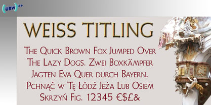
- Kress Titling by RMU,
$30.00 In 1923, the Schriftguss AG, Dresden, released this all-caps Art Deco font designed by Otto von Kress. From the existing basics, the now available font was completely redrawn and redesigned for modern use.
 - Abril Titling by TypeTogether,
$35.00 Abril is an extension of the Abril typographic system that was engineered as a response to a very specific requirement from the editorial design community: a low contrast typeface for head- lines. Given its broad range of styles though, Abril deserves to be considered a separate font family on its own. Based on the original text styles of Abril, the letter shapes are sturdy, very legible, and deliver a newsy and trustworthy feel. The accented editorial style of the Scotch Roman finds continuity in this new type family, but some of the details have been ironed out for improved performance in headline, both in print and on screen. The family is conceived as four series of different widths, with four weights in each series plus matching italics, a total of 32 fonts. This wide range of styles allows for setting titles at almost any size. The wider series are aimed for smaller point sizes while the con- densed weights can deliver a striking and cohesive appearance as front cover headlines. Abril was designed as a versatile tool for those graphic and web designers looking for a workhorse with high impact. It is also an excellent companion for the rest of the Abril type family: Abril Titling and Abril Narrow.
 - Holland Title by Monotype,
$39.00 - Zornale Title by Eurotypo,
$20.00 Zornale TITLE is a family of four fonts that can be combined with the rest of Zornale family (text and caption). These fonts have been designed with precise kerning and full OpenType features: Old-style figures, swashes, stylistic alternates, ligatures and case-sensitive forms.
 - Hermanz Titling by California Type Foundry,
$47.00 Hermanz™ Titling is inspired by the most majestic caps that Hermann Zapf ever drew. They are inscriptional caps, square caps, or “capitalis monumentalis”. These caps are some of the most beautiful letters made by one of the greatest talents of our time; so beautiful they deserve to be seen and appreciated by everyone. If you do any work for churches, wedding, funeral, anniversary, or other ceremonies, for the fine arts, exclusive clubs, or higher education—you will love how these letters make your brochures, pamphlets and announcements look. Hermanz Titling works for anything labeled "fine": fine dining, fine music, fine art (pamphlets, books, posters, cookbooks). It also fits well for religious topics: posters, events, websites, hymnals, for biblical; and ceremonies, religious or otherwise. Emotions It Can Communicate: • Importance • Timelessness • Special Event • Tradition • Reverence • Artistry • Beauty Released June 2021 on the Memorial of Hermann Zapf, as part of the California Type Foundry Memorial Series: Honoring the life and work of the great font designers. FONT STORY The Majestic Caps When I was on one of my visits to rare books rooms I found some large caps of Hermann Zapf, and I knew that I had to make a font inspired by these. I was surprised that no one had ever made them into a font. They were some of the most beautiful caps I had ever seen. These caps were surprisingly difficult to make. I thought it would take me a week or two; to get the detail and spirit right took significantly longer– but it was well worth the effort! When you print Hermanz Titling on a page, you will see what I mean. Even when printed digitally, it’s the closest thing to letterpress. You might even have some people thing it was printed by a traditional method with ink! (Note: Unless printed at very large sizes, this font is not recommended for actual letterpress, because the serifs are too thin.) If you do any work for churches, wedding, funeral, anniversary, or other ceremonies, for the fine arts, exclusive clubs, or higher education—you will love how these letters make your brochures, pamphlets and announcements look. Enjoy this breathtaking font, and may it help inspire people with your messages! –Dave Lawrence & the California Type Foundry


