10,000 search results
(0.07 seconds)
- Jamarius Script Font Trio by Zane Studio,
$15.00 Jamarius Script - This handwritten font is a new modern script with an irregular base line. Trendy and feminine. Jamarius Script looks beautiful in wedding invitations, thank you cards, quotes, greeting cards, logos, business cards, and more. Perfect for use in ink or watercolors. Including beginning and end letters, alternatives and support for many languages.
 - Smithrose by Sibelumpagi,
$19.00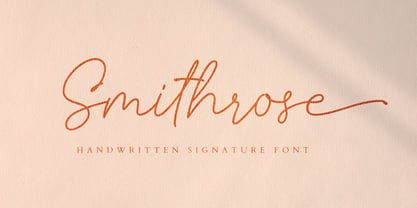 Smithrose is inspired by monoline signature letters and is a natural & modern handwritten signature font. Smithrose comes with 85 ligatures and ending swashes. Smithrose is perfect for many different projects such as logos and branding, invitation, stationery, wedding designs, social media posts, advertisements, product packaging, product designs, label, photography, watermark, special events and more.
 - Lilycat by Letters&Numbers,
$26.00 Lilycat is based on paper cut-outs of circles and rectangles. Letter shapes share characteristics of early modern fonts such as Futura. Uneven edges give the typeface a hand-made, playful, authentic feel. The font is suitable for use in short paragraphs, headings and captions, logo types or whatever use you see fit. Enjoy!
 - Armeria by Tanincreate,
$17.00 Armeria is a modern serif font with modern look and elegant minimalistic style. Armeria aims to be a universal, it works great in headlines, high-end branding, logo designs, magazines, product packaging & invitations. It comes in 1 style - regular and is equipped with an advanced character set, supporting Central European languages. Armeria Regular Armeria Italic
 - Buttoneer by DonkeyWorx,
$20.00Buttoneer is a specialist symbol font for representing media controls such as play, stop, fast forward, and so on as well as other icons useful in developing multimedia or interactive applications. Also useful in printed materials for representing these items - for example software or hardware manuals. Layout optimised for use with codepage utilities e.g: CharMap. - Artonic by Seventh Imperium,
$37.00 Artonic is a tattoo script typeface inspired by elegant script and sharp look typeface. The characteristic of artonic is flowing edge, elegant,sharp and black. These typefaces are made out of pride and passion for urban tattoo design. Of course Artonic comes with a variety of ligatures and alternative forms, available through OpenType features.
 - Agane by Trim Studio,
$20.00 Agane is a Basic modern Sans Serif font. Design with oval as main shape, It's combine the basic sans type with smooth curve in the end, perfectly suited for graphic artists to complete their design such as web design, advertisements, posters, logos, product signs, and many more. Agane contains all standard glyphs and punctuations.
 - Space Quest by Lone Army,
$10.00 This font is inspired by aerospace. I use the negative spaces of each font to form planets or rockets. every glyph has its power. can be used as initials or as a word nicely. and also supports multilingual. the space design side is also found in punctuation to! thanks and enjoy the design! cherrs
 - Anttalla by Attype Studio,
$15.00 Anttalla is modern script calligraphy font, include front swash and ending swash for lowercase glyph, combine it to make the best word for your design. Anttalla font perfectly match for design like banner, book cover, t-shirt, branding, promotion, social media post, quotes, wedding, photography and more. Hope you enjoy with our font! Attype Studio
 - Amelia Harper by Letterhend,
$14.00 Amelia Harper , a new font duo where the elegance of a serif font intertwines flawlessly with the beauty of a handwritten script. This font duo is carefully crafted to bring together the classic charm of serifs with the contemporary edge of modern scripts. Features : Uppercase & lowercase Numbers and punctuation Alternates & Ligatures Multilingual PUA encoded
 - Bible Script by ITC,
$29.00Bible Script font is the work of designer Richard Bradley. A textured edge, swash alternate characters and additional flourishes enhance this traditional, calligraphic font. Word settings look as though they were written by hand. Bible Script font is perfect for certificates, diplomas, citations, greeting cards, or anything that should have a personal, elegant touch. - Homestone by Typebae,
$17.00 Homestone is an exquisite handwritten font, masterfully designed to become a true favorite. It maintains its classy calligraphic influences while feeling contemporary and fresh. To use alternates, heart connector, beginning and ending swashes, you don't need to use software that supports opentype, because we have made it separately so it's very easy to use.
 - Quickstep Sans by Holland Fonts,
$30.00A 'quick' font, originally made for the 25th anniversary of SSP Printing Co. in Amsterdam. First used for an intro spread in Wired Magazine (#3.05, May 1995): "The problem with computers is that they don't have enough Africa in them. What's pissing me off is that they use so little of my body" (Brian Eno). - Dupliciter by JAF 34,
$9.90 DUPLICITER is an experimental display sans serif font which has two typefaces for comfortable and experimental use. DUPLICITER is a (latest) part of new school in type design that could be called like mind-free and geometric direction in the world. Sans serif, condensed, sharp edges, geometric, experimental, these are the main attributes of DUPLICITER.
 - KG Defying Gravity by Kimberly Geswein,
$5.00 Use the [ and ] key to create a unique flag ending on your words. Use alternating lowercase and uppercase with the Bounce version to create a bouncy look. To create a solid space instead of an empty space, use the bar key | which shares a key with the \ backslash on my keyboard. Your keyboard may vary.
 - Better Summer by Din Studio,
$29.00 "Summer is Never Ending :D" Introducing a Better Summer Script. Made from a chic brush, it will make your design more beautiful. Includes: Better Summer (OTF) Features: Character Set A-z Numerals and Punctuation (OpenType Standard) Accents (Multilingual characters) PUA Encoded Beautiful ligatures I hope you can enjoy the font as you enjoy the summer :)
 - Teimer Std by Suitcase Type Foundry,
$75.00Typographer and graphic designer Pavel Teimer (1935-1970) designed a modern serif roman with italics in 1967. For the drawing of Teimer he found inspiration in the types of Walbaum and Didot, rather than Bodoni. He re-evaluated these archetypes in an individual way, adjusting both height and width proportions and modifying details in the strokes, thus effectively breaking away from the historical models he used as a starting point. Teimer's antiqua has less contrast; the overall construction of the characters is softer and more lively. The proportions of the italics are rather wide, making them stand out by their calm and measured rhythm. This was defined by the purpose of the typeface, as it was to be utilised for two-character matrices. The long serifs are a typical feature noticeable throughout the complete family of fonts. In 1967, a full set of basic glyphs, numerals and diacritics of Teimer's antiqua was submitted to the Czechoslovak Grafotechna type foundry. However, the face was never cast. At the beginning of 2005 we decided to rehabilitate this hidden gem of Czech typography. We used the booklet "Teimer's antiqua - a design of modern type roman and italics", written by Jan Solpera and Kl‡ra Kv’zov‡ in 1992, as a template for digitisation. The specimen contains an elementary set of roman and italics, including numerals and ampersands. After studying the specimen, we decided to make certain adjustments to the construction of the character shapes. We slightly corrected the proportions of the typeface, cut and broadened the serifs, and slightly strengthened the hair strokes. In the upper case we made some significant changes in the end serifs of round strokes in C, G and S, and the J was redrawn from the scratch. The top diagonal arm of the K was made to connect with the vertical stem, while the tail of Q has received a more expressive tail. The stronger hairlines are yet more apparent in the lower case, which is why we needed to further intervene in the construction of the actual character shapes. The drawing of the f is new, with more tension at the top of the character, and the overall shape of the g is better balanced. We also added an ear to the j, and curves in the r have become more fluent. To emphasise the compact character of the family, the lining numerals were thoroughly redrawn, with the finials being replaced by vertical serifs. The original character of the numerals was preserved in the new set of old-style figures. To make the uppercase italics as compact as possible, they were based on the roman cut rather than on the original design. The slope of lowercase italics needed to be harmonised. The actual letter forms are still broader than the characters in the original design, and the changes in construction are more noticeable. The lower case b gained a bottom serif, the f has a more traditional shape as it is no longer constricted by the demands of two-matrice casting, the g was redrawn and is a single storey design now. The serifs on one side of the descenders of the p and q were removed, the r is broader and more open. The construction of s, v, w, x, y, and z is now more compact and better balanced. Because Teimer was designed to make optimal use of the OpenType format, it was deemed necessary to add a significant amount of new glyphs. The present character set of one font comprisess over 780 glyphs, including accented characters for typesetting of common Latin script languages, small caps and a set of ligatures, tabular, proportional, old style and lining, superscript and fraction numerals. It also contains a number of special characters, such as arrows, circles, squares, boxed numerals, and ornaments. Because of its fine and light construction, the original digitised design remained the lightest of the family. Several heavier weights were added, with the family now comprising Light, Light Italic, Medium, Medium Italic, Semibold, Semibold Italic, Bold, and Bold Italic. - ITC Officina Display by ITC,
$29.99When ITC Officina was first released in 1990, as a paired family of serif and sans serif faces in two weights with italics, it was intended as a workhorse typeface for business correspondence. But the typeface proved popular in many more areas than correspondence. Erik Spiekermann, ITC Officina's designer: Once ITC Officina got picked up by the trendsetters to denote 'coolness,' it had lost its innocence. No pretending anymore that it only needed two weights for office correspondence. As a face used in magazines and advertising, it needed proper headline weights and one more weight in between the original Book and Bold."" To add the new weights and small caps, Spiekermann collaborated with Ole Schaefer, director of typography and type design at MetaDesign. The extended ITC Officina family now includes Medium, Extra Bold, and Black weights with matching italics-all in both Sans and Serif -- as well as new small caps fonts for the original Book and Bold weights. - ITC Officina Sans by ITC,
$40.99When ITC Officina was first released in 1990, as a paired family of serif and sans serif faces in two weights with italics, it was intended as a workhorse typeface for business correspondence. But the typeface proved popular in many more areas than correspondence. Erik Spiekermann, ITC Officina's designer: Once ITC Officina got picked up by the trendsetters to denote 'coolness,' it had lost its innocence. No pretending anymore that it only needed two weights for office correspondence. As a face used in magazines and advertising, it needed proper headline weights and one more weight in between the original Book and Bold."" To add the new weights and small caps, Spiekermann collaborated with Ole Schaefer, director of typography and type design at MetaDesign. The extended ITC Officina family now includes Medium, Extra Bold, and Black weights with matching italics-all in both Sans and Serif -- as well as new small caps fonts for the original Book and Bold weights. - ITC Officina Serif by ITC,
$40.99 When ITC Officina was first released in 1990, as a paired family of serif and sans serif faces in two weights with italics, it was intended as a workhorse typeface for business correspondence. But the typeface proved popular in many more areas than correspondence. Erik Spiekermann, ITC Officina's designer: Once ITC Officina got picked up by the trendsetters to denote 'coolness,' it had lost its innocence. No pretending anymore that it only needed two weights for office correspondence. As a face used in magazines and advertising, it needed proper headline weights and one more weight in between the original Book and Bold." To add the new weights and small caps, Spiekermann collaborated with Ole Schaefer, director of typography and type design at MetaDesign. The extended ITC Officina family now includes Medium, Extra Bold, and Black weights with matching italics-all in both Sans and Serif -- as well as new small caps fonts for the original Book and Bold weights."
 - Carrigallen Display by Tony Fahy Font Foundry,
$20.00 The Carrigallen family of fonts has roots in Megalithic and Celtic Ireland. It has six weights—Light, Regular and Bold and their corresponding italics. The distinctiveness of the Carrigallen family, is in it's sculpted, spiral nature, inspired by the graphics at the entrance stones and kerbstones at the Newgrange passage graves in Ireland. This is where it derives it’s decorative nature and suitability, as a very distinct Display font. Exceptionally suited for Logos and Headlines, it can increase the corporate presentation of a company as its main identifying feature—and with high memorability! The three separately designed letterforms—differing in line weight—are held in place by the white space within and without the character giving a distinctive twenty first century flavour! It is this dynamic that makes the font unique! Carrigallen Display is a modern font. It draws from its nomadic influences allowing it to be culturally representative of all languages.
 - Geoffrey - Personal use only

- BLOODSTAIN PERSONAL USE - Personal use only

- Nadejda - Unknown license

- Zekton - Unknown license

- MGN Burro by Morgana Studio,
$17.50 MGN Burro by Morgana Studio is a slab serif font offering 7 styles: Thin, Light, Regular, Medium, Semibold, Bold, and Extra Bold. Combining classic and modern elements, it caters to diverse designs, ensuring readability and impact. From delicate Thin to bold Extra Bold, each weight caters to various preferences, making MGN Burro a versatile toolkit for designers.
 - BEEF 3 PERSONAL USE - Personal use only

- THINK EXTRA PERSONAL USE - Personal use only

- BAHAMAS TWO PERSONAL USE - Personal use only

- Richie by Monotype,
$29.99 The Richie™ typeface grew out of a lettering experiment inspired by the work of Czech type designer Oldrich Menhart (1897-1962). Menhart’s typefaces were primarily text designs with a strong personal calligraphic influence. Monotype Studio designer, Jim Ford, wondered what a display typeface from Menhart might look like, and began drawing bold script characters with a broad-tipped chisel marker. “It was a familiar but laborious exercise,” explains Ford, “I tried to achieve an authentic – yet controlled – randomness that would serve as the foundation of a typeface.” Ford first drew a large suite of characters using the marker. All the drawings were then carefully adjusted, and scanned. Ford then pieced together a typeface from the best versions of letters, and refined those further. The result is a rugged, somewhat eccentric and playful script built on an obvious hand-drawn foundation. In a world of smooth scripts, the Richie design is heavy, chunky and rough. Its hand-made feel and vigorous rhythm put the power of raw brush lettering into the typographer’s hands. OpenType® fonts of Richie include standard, contextual and discretionary ligatures, in addition to contextual and stylistic alternates, old style, lining and superior figures, plus a large complement of swash characters. The name “Richie”? It grew out of Ford’s original premise for the design. “I wondered what it might it look like if ‘Old Richie’ had designed a heavy display face or script.”
 - Cowboy Wanted by Shakira Studio,
$19.00 Introducing "Cowboy Wanted" - The Ultimate Western Retro Serif Font! Saddle up and embrace the wild, wild west with Cowboy Wanted, the font that's taking the design world by storm. This font embodies the perfect blend of old-school ruggedness and contemporary flair, making it the hottest ticket in town for all your Western-inspired design needs. Each character in Cowboy Wanted is meticulously crafted to capture the essence of the Old West, from the sweeping serifs to the rugged lines. Whether you're working on a saloon-inspired logo, a rustic poster, or a themed event invitation, Cowboy Wanted adds that authentic Western touch that's so in demand right now. Don't miss your chance to lasso the trendiest Western retro serif font of the moment. With Cowboy Wanted, you'll be the sheriff of style in your design projects, standing out in the crowded frontier of design. Saddle up and make a bold statement with Cowboy Wanted today! Here's what you get: Cowboy Wanted Regular All Multilingual symbol Opentype features ( ligature, alternate ) Accessible in the Adobe Illustrator, Adobe Photoshop, Adobe InDesign, even work on Microsoft Word. PUA Encoded Characters - Fully accessible without additional design software. Multilingual character supports : (Afrikaans, Albanian, Catalan, Croatian, Czech, Danish, Dutch, English, Estonian, Finnish, French, German, Hungarian, Icelandic, Italian, Lithuanian, Maltese, Norwegian, Polish, Portuguese, Slovenian, Spanish, Swedish, Turkish, Zulu) Follow my shop for upcoming updates, and for more of my work, Thank you!
 - Temeraire by TypeTogether,
$49.00 Quentin Schmerber’s Temeraire serif font family was not designed to be invisible. It is a typographic exploration meant to be seen — with its beauty, one could even say beheld. While some fonts aim to be as easily ignored as possible, Temeraire is offered as a gift to wide-eyed readers with its anything-but-boring character and its conspicuous inconsistency in styles. Most type families increase the weight of each character to expand the family. Instead, research into 17th century sources produced Temeraire’s wide range of letterforms, from the predictable to the odd and loosely related through time. Each style is designed to work alongside the others but are also standalone homages to specific parts of English lettering tradition: gravestone cutting, writing masters’ copperplates, Italiennes, and others. Temeraire’s Regular style is a contrast-loving Transitional Serif with vertical stress, making it great for period and classic works, ironic pieces, and modern throwbacks. The weight of the Bold squares off the ends of each glyph to give it stability, and the italic style rings true: flowing, contrasting, and purposefully inconsistent. Temeraire’s Display Black style is one salvaged from expressive gravestone artistry. The details most easily noticed are the ‘g’ with its descending bowl that has been pressed back up in the centre, and the additional serif on the ‘t’ crossbar that holds its neighbouring character at bay. (The ‘g’ and ‘Q’ have loopless alternates.) The final style is the Italienne, the horizontally stressed counterpoint to the family. By design its characters flow and bend in ways not in step with the rest of the family. All the weight has been pushed to either hemisphere within each glyph, resulting in a display style that demands space and peacefulness around it so its presence can impress. As with all TypeTogether families, Temeraire meets the current designer’s needs. Not only does its five styles shine in print work, it includes alternates for when the defaults are too boisterous and has been expertly crafted for screens. The Temeraire serif font family is resurrected from echoes in time and finds its family relation through impeccable taste.
 - Inkarus by Scratch Design,
$10.00 Introducing Inkarus a playful font with a bold and all uppercase characters style. This font is perfect for posters designs, packaging, logotype, title, label, print ads, gift card, magazine title, movie title, sign, and the beautiful and curvy shape will give your designs that alternative look to your creative work looks innovative. Amazing curvy was hand-drawn and make the outlines look irregular and beautiful. This font has a lot of hand-lettered looks and the characters give a retro or urban feel. Inkarus has a serif style but can collaborate with sans-serif style together because the modern bold sans serif typeface has been the alternatives and ligatures of this font. Combine that bold shapes together will make your work a more unique, retro attitude. Ligatures Inkarus has 32 ligatures that you can turn on via the glyphs panel in Adobe applications. The ligatures make a innovative difference in the look of this font. It switches out between serif and sans serif styles that make your designs look still unity. Opentype The Alternatives and Ligatures use OpenType features. First, you will need a design app to access these options an application such as Adobe Photoshop, Illustrator, or InDesign. Alternatives All lowercase a,d,e,h, I, j,k,l,m,n, p,r, t, r you can switch out letters for other and makes your design look more like hand-lettering and innovative although you using in a repetitive way. Inkarus font includes; All uppercase characters 32 ligatures option Support for multi-languages characters Punctuation, Symbols, and Numbers Alternative lowercase characters ( a,d,e,h, I, j,k,l,m,n, p,r, t, r ) The font format is OTF So what you are waiting for? Grab it fast this font and make your innovative design. If you have any questions drop me a message.
 - BaselBook - Unknown license

- SF Foxboro Script Extended - Unknown license

- Bikly - Unknown license

- 3x3 dots - 100% free

- Ben Hard Life - Unknown license

- Sci Fied - 100% free

- Mordred - Unknown license


