10,000 search results
(0.199 seconds)
- Tarweed by Matteson Typographics,
$19.99 Tarweed is based on a Gothic Tuscan style wood type. Its floral decorative stem endings are similar to the buds of the pungent Tarweed flower found at elevation in the Rockies. Useful for any 19th century-looking typographic design Tarweed’s style can be useful for flower shops, billiard halls, music venues, restaurants and more. Expertly crafted to be used at large sizes these fonts also work well in digital applications.
 - Backbone by 38-lineart,
$17.00 Backbone is a unique blackletter font. It’s suitable for use in various projects such as gothic letters, tattoos, headlines, posters, magazines, newspapers, t-shirts, labels, and any other designs that you wish to create. Get inspired by Black metal and It will add an edgy feel to any crafting project! Bold and spooky, Ideal for any October project or Halloween party, this font will become your top choice in no time!
 - Painting Stencil JNL by Jeff Levine,
$29.00 Painting Stencil JNL was modeled in part from a vintage set of 8 inch Gothic stencils. Alphabets of this size were generally referred to as painting stencils because each letter could be painted individually in marking signs, streets or buildings, where the classic 'lettering guide' type of stencils were used for smaller projects and had alignment holes for accurate letter spacing as well as multiples letters per page.
 - Flanker Ruano by Flanker,
$18.00 The typeface Ruano was inspired from “Lettera cancelleresca formata” by the Vatican calligrapher Ferdinando Ruano, carved and cast in 1926 by Nebiolo of Turin on the advice of Raffaello Bertieri who designed the capital letters and numbers, missing in the original. The difficulty of the design of this chancery font lies in its original vertical layout, bending the calligraphic harmonies to the Gothic style, thus distinguishing it from contemporary cursive alphabets.
 - Waxen by Twinletter,
$15.00 Introducing our newest gothic font called WAXEN, presenting a vintage and elegant style. With a classic Roman typeface, this font evokes confident elegance with striking details on each side of the lettering. This font can be used in a variety of projects to create a vintage and elegant style. Use it to enhance visual projects, titles, or banners, packaging with a bold classic look that exudes style, elegance, and strong personality.
 - Tisk by Gittype,
$20.00 Tisk is a superb blackletter font. The Blackletter typeface (also sometimes referred to as Gothic, Fraktur or Old English) was used in the Guthenburg Bible, one of the first books printed in Europe. This style of typeface is recognizable by its dramatic thin and thick strokes, and in some fonts, the elaborate swirls on the serifs. Use this font for any crafting project that requires a personalized look!
 - Drafting Class JNL by Jeff Levine,
$29.00 Within the pages of “The Essentials of Lettering” by Thomas E. French and Robert Meiklejohn (circa 1912) is an example for creating a sans serif alphabet and numerals. The lesson plate is entitled “Upright Single-Stroke Gothic”; a basic monoline font most useful for architectural and drafting plans because of its easy-to-read properties. This type design is now available as Drafting Class JNL, in both regular and oblique versions.
 - Wilhelm Klingspor Gotisch by Linotype,
$40.99Wilhelm Klingspor Gotisch appeared in 1925 with the Klingspor font foundry in Offenbach, Germany. Designer Rudolf Koch based his work on the Gothic forms of the 14th century and his broken letter font is often seen in advertisements. However, the ornamental letters do not match today’s legibility standards and Wilhelm Klingspor Gotisch is therefore recommended for use in headlines and short texts with a point size of 12 or larger. - Florida Rose by Yahya Type,
$16.00 Florida Rose is a Sharped version of "Peroba Rosa" Font. It is a modern sans serif type family featuring a blend of modern, classical, and playful characteristics. The simple, clean forms and classically inspired proportions give it a timeless quality and interesting visual rhythm. Florida Rosa is perfect for logo design, magazine headers, product packaging, branding projects, clothing or simply as a stylish text overlay to any images or websites. WHAT’S INCLUDED? • Comes with regular, thin, light, italic, bold, thin italic, light italic, bold italic and bold italic font styles. • Uppercase & lowercase letters, numbers, punctuation Ligature & Huge Stylistic alternate, Multilingual support. Still got a question? Send me a message and I’ll be happy to answer! qura.yahya@gmail.com
 - The Vikings Power by Estudio Sunrise,
$10.00 Embark on an epic journey with "Mythical Vikings Power," a font infused with the might of Norse warriors, runes, and Viking ships. Channel their fearless spirit and unleash your creative potential in every design. Follow the link for more info: https://www.behance.net/gallery/137062963/Mythical-Vikings-Power-font
 - Helvetica Hebrew by Linotype,
$65.00Helvetica is one of the most famous and popular typefaces in the world. It lends an air of lucid efficiency to any typographic message with its clean, no-nonsense shapes. The original typeface was called Neue Haas Grotesk, and was designed in 1957 by Max Miedinger for the Haas'sche Schriftgiesserei (Haas Type Foundry) in Switzerland. In 1960 the name was changed to Helvetica (an adaptation of Helvetia", the Latin name for Switzerland). Over the years, the Helvetica family was expanded to include many different weights, but these were not as well coordinated with each other as they might have been. In 1983, D. Stempel AG and Linotype re-designed and digitized Neue Helvetica and updated it into a cohesive font family. At the beginning of the 21st Century, Linotype again released an updated design of Helvetica, the Helvetica World typeface family. This family is much smaller in terms of its number of fonts, but each font makes up for this in terms of language support. Helvetica World supports a number of languages and writing systems from all over the globe. Today, the original Helvetica family consists of 34 different font weights. 20 weights are available in Central European versions, supporting the languages of Central and Eastern Europe. 20 weights are also available in Cyrillic versions, and four are available in Greek versions. Many customers ask us what good non-Latin typefaces can be mixed with Helvetica. Fortunately, Helvetica already has Greek and Cyrillic versions, and Helvetica World includes a specially-designed Hebrew Helvetica in its OpenType character set. Helvetica has also been extende to Georgian and a special "eText" version has been designed with larger xheight and opened counters for the use in small point sizes and on E-reader devices. But Linotype also offers a number of CJK fonts that can be matched with Helvetica. Chinese fonts that pair well with Helvetica: DF Hei (Simplified Chinese) DF Hei (Traditional Chinese) DF Li Hei (Traditional Chinese) DFP Hei (Simplified Chinese) Japanese fonts that pair well with Helvetica: DF Gothic DF Gothic P DFHS Gothic Korean fonts that pair well with Helvetica: DFK Gothic" - Helvetica Thai by Linotype,
$149.00Helvetica is one of the most famous and popular typefaces in the world. It lends an air of lucid efficiency to any typographic message with its clean, no-nonsense shapes. The original typeface was called Neue Haas Grotesk, and was designed in 1957 by Max Miedinger for the Haas'sche Schriftgiesserei (Haas Type Foundry) in Switzerland. In 1960 the name was changed to Helvetica (an adaptation of Helvetia", the Latin name for Switzerland). Over the years, the Helvetica family was expanded to include many different weights, but these were not as well coordinated with each other as they might have been. In 1983, D. Stempel AG and Linotype re-designed and digitized Neue Helvetica and updated it into a cohesive font family. At the beginning of the 21st Century, Linotype again released an updated design of Helvetica, the Helvetica World typeface family. This family is much smaller in terms of its number of fonts, but each font makes up for this in terms of language support. Helvetica World supports a number of languages and writing systems from all over the globe. Today, the original Helvetica family consists of 34 different font weights. 20 weights are available in Central European versions, supporting the languages of Central and Eastern Europe. 20 weights are also available in Cyrillic versions, and four are available in Greek versions. Many customers ask us what good non-Latin typefaces can be mixed with Helvetica. Fortunately, Helvetica already has Greek and Cyrillic versions, and Helvetica World includes a specially-designed Hebrew Helvetica in its OpenType character set. Helvetica has also been extende to Georgian and a special "eText" version has been designed with larger xheight and opened counters for the use in small point sizes and on E-reader devices. But Linotype also offers a number of CJK fonts that can be matched with Helvetica. Chinese fonts that pair well with Helvetica: DF Hei (Simplified Chinese) DF Hei (Traditional Chinese) DF Li Hei (Traditional Chinese) DFP Hei (Simplified Chinese) Japanese fonts that pair well with Helvetica: DF Gothic DF Gothic P DFHS Gothic Korean fonts that pair well with Helvetica: DFK Gothic" - Helvetica Monospaced Paneuropean by Linotype,
$89.00Helvetica is one of the most famous and popular typefaces in the world. It lends an air of lucid efficiency to any typographic message with its clean, no-nonsense shapes. The original typeface was called Neue Haas Grotesk, and was designed in 1957 by Max Miedinger for the Haas'sche Schriftgiesserei (Haas Type Foundry) in Switzerland. In 1960 the name was changed to Helvetica (an adaptation of Helvetia", the Latin name for Switzerland). Over the years, the Helvetica family was expanded to include many different weights, but these were not as well coordinated with each other as they might have been. In 1983, D. Stempel AG and Linotype re-designed and digitized Neue Helvetica and updated it into a cohesive font family. At the beginning of the 21st Century, Linotype again released an updated design of Helvetica, the Helvetica World typeface family. This family is much smaller in terms of its number of fonts, but each font makes up for this in terms of language support. Helvetica World supports a number of languages and writing systems from all over the globe. Today, the original Helvetica family consists of 34 different font weights. 20 weights are available in Central European versions, supporting the languages of Central and Eastern Europe. 20 weights are also available in Cyrillic versions, and four are available in Greek versions. Many customers ask us what good non-Latin typefaces can be mixed with Helvetica. Fortunately, Helvetica already has Greek and Cyrillic versions, and Helvetica World includes a specially-designed Hebrew Helvetica in its OpenType character set. Helvetica has also been extende to Georgian and a special "eText" version has been designed with larger xheight and opened counters for the use in small point sizes and on E-reader devices. But Linotype also offers a number of CJK fonts that can be matched with Helvetica. Chinese fonts that pair well with Helvetica: DF Hei (Simplified Chinese) DF Hei (Traditional Chinese) DF Li Hei (Traditional Chinese) DFP Hei (Simplified Chinese) Japanese fonts that pair well with Helvetica: DF Gothic DF Gothic P DFHS Gothic Korean fonts that pair well with Helvetica: DFK Gothic" - Farm Wave by Authentype,
$11.00 Farm Wave Regular & italic - beauty font design include regular & italic font Image used : All photographs/pictures/logo/vector used in the preview are not included, they are intended for illustration purpose only.
 - FF Sale by FontFont,
$41.99 British type designer Tony Booth created this script FontFont in 1996. The family contains 4 weights: Light Italic, Regular, Medium Italic, and Bold Italic and is ideally suited for advertising and packaging and poster and billboards. FF Sale provides advanced typographical support with features such as ligatures, alternate characters, and case-sensitive forms. It comes with proportional lining and tabular lining figures.
 - Lichtspiele Reklame by Typocalypse,
$29.00 Lichtspiele Reklame is the ultra condensed version of Lichtspiele inspired by the 1920s — the golden age of cinema — where neon lights and marquee letters decorated cinema facades. Lichtspiele Reklame is crafted for large narrow formats and contains the display font and two italics (italic & contra-italic), like in these 20s, a time where movie announcements were shown on huge so called Litfaßsäulen.
 - Soft Aura by Sarid Ezra,
$15.00 Soft Aura is a minimalist and simple sans family that have four fonts in total. You will get the regular, italic, bold, and bold italic in the package. You can use this font for any purpose, suitable for contrast logotype and branding. Combine the style fonts, italic and bold in one word to get stylish contrast look. This font also support multi language.
 - FS Sophie by Fontsmith,
$50.00 Slinky Chic, svelte and slinky, FS Sophie was inspired by and designed in partnership with ATTIK UK. With clean lines, simple, elegant curves and dynamic forms, it brings a feminine sophistication to text and headlines in publishing and advertising. Kinky FS Sophie’s engaging simplicity arises from its construction, using a modular set of core, rounded shapes and straight strokes, drawn and then repeated to create letterforms. An extra technical detail of occasional, short 45-degree diagonals adds a distinctive little kink to Sophie’s cool exterior. Alchemy By some kind of typographic alchemy, the combination of simple curves and lines with unexpected twists to the shapes of characters creates an unusually spirited and lively design in all three weights and their italic sets. Born for the spotlight, FS Sophie is a natural for big headlines, pull quotes and other high-profile text elements.
 - Poster by Extratype,
$40.00 The long awaited full version of Poster, a recreation of Bodonian/Didot excess designed by Iñigo Jerez. The family has been finely improved with more styles. The family consists of: Poster and Poster Italic, a bolder version named Poster Monster and Poster Monster Italic– a virtuoso exercise in counter forms and contrast to be used with power unleashed, as the name suggests–; and finally Poster Display, Poster Display Italic, Poster Display Monster and Poster Display Monster Italic: four styles designed for even bigger sizes, with more contrast and splendor.
 - Qualux by Asenbayu,
$12.00 Qualux is a versatile high-contrast serif font family. Qualux comes from the words Quality and Luxury. This font has vintage characteristics with a luxurious style in light, but also has a friendly and playful style in bold. Each glyph has a soft, rounded tip. This font is suitable for many various projects such as logos, branding, magazines, signage, fashion and many more. Qualux consists of 8 styles: Light, Light Italic, Regular, Italic, Semibold, Semibold Italic, Bold, and Bold Italic. These fonts feature Kerning, Standard Glyph, Stylistic Alternate & Ligature, Numeral, Symbol, and Multilingual Supports.
 - Heart Mother by Yoga Letter,
$14.00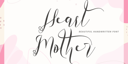 "Heart Mother" is a unique and beautiful handwritten font. This font is equipped with lowercase, uppercase, ligatures, numerals, punctuation, and multilingual support. Suitable for weddings, engagements, stickers, posters, prints, invitations, and others.
 - Antikan Rayo by Yoga Letter,
$20.00 "Antikan Rayo" is a beautiful handwritten font. This font is equipped with uppercase, lowercase, numerals, punctuation, and multilingual support. very suitable for Christmas, winter, weddings, engagements, valentines, invitations, photography, birthdays, and others.
 - Christmas Break by Yoga Letter,
$16.00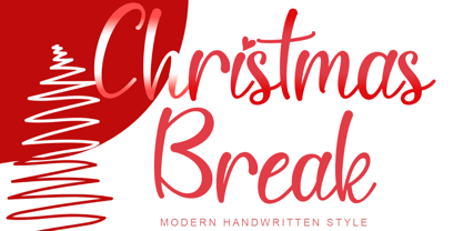 "Christmas Break" is a beautiful handwritten font. This font is perfect for weddings, Christmas, stickers, banners, posters, photography, engagements, and more. Equipped with uppercase, lowercase, numerals, punctuation, swash, titling, and multilingual support
 - Morris by HiH,
$10.00 Morris is a four-font family produced by HiH Retrofonts and based on the work of the very English William Morris. William Morris wanted a gothic type drawn from the 14th century blackletter tradition that he admired both stylistically and philosophically. He drew from several sources. His principal inspiration for his lower case was the 1462 Bible by Peter Schoeffer of Mainz; particularly notable for the first appearance of the ‘ear’ on the g. The upper case was Morris’s amalgam of the Italian cursive closed caps popular throughout the 12th through 15th centuries, a modern example of which is Goudy’s Lombardic Capitals. The gothic that Morris designed was first used by his Kelmscott Press for the publication of the Historyes Of Troye in 1892. It was called “Troy Type” and was cut at 18 points by Edward Prince. It was also used for The Tale of Beowulf. The typeface was re-cut in at 12 points and called “Chaucer Type” for use in The Order of Chivalry and The Works of Geoffrey Chaucer. Morris' objective is designing his gothic was not only to preserve the color and presence of his sources, but to create letters that were more readable to the English eye. ATF copied Troy and called it Satanick. Not only was the ATF version popular in the United States; but, interestingly, sold very well in Germany. There was great interest in that country in finding a middle ground between blackletter and roman styles -- one that was comfortable for a wider readership. The Morris design was considered one of the more successful solutions. Our interpretation, which we call Morris Gothic, substantially follows the Petzendorfer model used by other versions we have seen, with the following exceptions: 1) a larger fillet radius on the upper arm of the H, 2) a more typically broadpen stroke in place of the foxtail on the Q, which I do not like, 3) inclusion of the aforementioned ear on the g and 4) a slightly shorter descender on the y. We have included five ornaments, at positions 0135, 0137, 0167, 0172 and 0177. The German ligatures ‘ch’ & ‘ck’ can be accessed using the left and right brace keys (0123 & 0125). Morris Initials One and Morris Initials Two are two of several different styles of decorative initial letters that Morris designed for use with his type. He drew from a variety of 15th century sources, among which were Peter Schoeffer’s 1462 Mainz Bible and the lily-of-the-valley alphabet by Gunther Zainer of Augsburg. Each of the two initial fonts is paired with the Morris Gothic lower case. Morris Ornaments is a collection of both text ornaments and forms from the surrounding page-border decorations.
 - Ameche Pisa by Bogusky 2,
$15.00Outline drop-shadow italic font - RosarGrad by Ingrimayne Type,
$9.95 RosarGrad is a simple but elegant calligraphic face with six style: plain, italic, medium, medium italic, bold, and bolditalic. It was inspired by hand lettering on a graduation picture from the late 1960s.
 - Segoe TV by Microsoft Corporation,
$39.00The Segoe™ TV font family was originally developed for MSNTV. Segoe TV italic was designed with attributes for improved legibility on TV screens. Segoe TV italic includes the Latin-1 character set. - Joane by W Type Foundry,
$25.00 Joane mixes the elegancy of French didones, calligraphic endings and glyphic serifs, thus its features convey a warm unique style. Moreover, its curves have been beautifully designed, and it also comes with both and engraved and deco versions, which add more versatility to the way it can be used. Joanes is perfectly suited for magazines, branding, advertising, labels, web and packaging. Joane is my first typeface to be published worldwide. To achieve this goal, I received essential help from W team and friends. I personally want to say thanks to Diego Aravena for the patience, good will and learning; for the friendship and support to Franco Jonas and Raúl Meza. Because of their help I could find the treasures at the end of the process. Ale Navarro
 - Moonless by Franzi draws,
$- Moonless is a charming handmade font duo, designed for texts, with a matching display font for titles in four different styles. The text font has true-drawn small caps available as an OpenType feature. In case you have no access to OpenType features, there is "Moonless SC" - the small caps version of the font. Moonless is perfect for children's books, poetry, invitations and design magazines. Moonless for texts comes in four different weights: light regular semi bold bold Moonless SC the small caps version of Moonless Moonless SC Regular is free! :) The display font comes in four styles: regular ("night") engraved ("shine") with dots ("stars") outline ("space") The font name was inspired by one simple word from Farid Attar's poem "The Conference Of The Birds".
 - Falkirk Script by Mysterylab,
$17.00 Introducing Falkirk Script, a three-font suite that is excellent for product branding, logos, t-shirts, high-end food and beverage labels, and much more. This collection includes the main letter body font (Falkirk Script Bold), an extruded shadow version, and finally a horizontal line engraving version that highlights the upper half of the letters. Stack the font variations in alignment, assign different colors, outlines, and/or gradients to each layer, and you'll see a wealth of versatile design possibilities opening up. This script has a unique topheavy wedge effect in the lower case, and lyrical old-world script detailing in the capitals. The tapered sweep and simplified ascender design works extremely well in the context of curved arc or arched word designs.
 - Megumi by Eclectotype,
$70.00 Megumi was originally commissioned as a headline face for a fashion and lifestyle magazine with a heavy Japanese influence. The uppercase letters are narrow and have an almost monospaced aesthetic, being influenced by Romaji letterforms. Serifs are severe, and curves sinuous. Although experiments were made with extra weight, it was decided that only this ultra light weight would be developed, to be set large in headlines. The italic has an over-the-top 35° slant (so slanted in fact that the backslash from the italic is the exact same shape as the forward slash in the Roman) and a discretionary ligature feature that can be engaged to add extra interest to headlines. The Roman has a few wide alternate glyphs for round uppercase characters. Both styles have a stylistic set (ss03) feature which switches regular parentheses for angle brackets, which the Art Director thought “looked cool”. In a mess of venture capitalist pull-outs and Covid related issues, the publication never came to be, but the Hipster Japanophile Magazine World’s loss is your gain, as this beautifully crafted, editorial oddity is now available to license. Use it editorially, obviously, but it would also look great on posters, perfumes, postmodern publications, and perhaps some other things that don’t begin with p.
 - Ardy Mass by Substance,
$12.00 Ardy Mass is a hand drawn and scanned type face available in italic, italic outline, regular & regular outline. Ardy Mass was drawn at a small scale with a fine nibbed black permanent marked pen.
 - Silvestre Weygel by Intellecta Design,
$20.90 A complete figurative alphabet was published by one Peter Flotner (ca. 1485-1546) in 1534. In Flotner’s alphabet, naked or nearly-naked figures are posed singly or disposed in pairs to form the various letters. Unlike de Grassi’s alphabet, we find only human figures here, no other animals. And unlike Tory’s illustrations, these letters seem an end in themselves, rather than the means of demonstrating a design strategy. Flotner’s alphabet was imitated by other engravers. The letters G and N are reproduced from an alphabet published by one Martin Weygel in Bavaria in 1560. Peter Flötner , c.1485-1546, German medalist and artisan, possibly Swiss by birth. He was active in decorative sculpture, wood carving, and other crafts, making medals and plaques and furnishing designs of classical motifs for silversmiths. He was in Nuremberg by 1522 and did most of his work there, although he made two trips to Italy. Flötner is now regarded as a pioneer of the German Renaissance. His Kunstbuch was published in 1549. In the Metropolitan Museum are five of his bronze plaques illustrating biblical episodes. A stylistical tip : Use this caps with SchneiderBuchDeutsch, as shown in the banners above, to create a perfect historiated layout.
 - Isle Body by Mans Greback,
$19.00 Isle Body is a high-quality serif typeface family, drawn by Måns Grebäck during 2018 and 2019. It is a sweet font with a casual and calm look, with generous spacing and an even weight, adapted for body texts and small sized type settings. It comes in four weights, each one as italic, totaling in eight styles: Light and Light Italic, Medium and Medium Italic, Bold and Bold Italic, Black and Black Italic. The font family can be used in a combination with a font of a different style, or together with its sister font Isle Headline, also a serif font, which has the same basic structure but more distinct weights and a sharper look. Each style contains ligatures and support for a wide range of languages.
 - Isle Headline by Mans Greback,
$19.00 Isle Headline is a high-quality serif typeface family, drawn by Måns Grebäck during 2018 and 2019. It is a sharp font with a clear and attentive look, adapted for headlines, titles and large type settings. It comes in four weights, each one as italic, totaling in eight styles: Light and Light Italic, Medium and Medium Italic, Bold and Bold Italic, Black and Black Italic. The font family can be used in a combination with a font of a different style, or together with its sister font Isle Body, also a serif font, which has the same basic structure but with a softer look and adapted for body text and smaller type. Each style contains ligatures and support for a wide range of languages.
 - The Romance Fatal Goth Versal font, designed by Juan Casco, is a fascinating foray into the world where gothic sensibilities intermingle with romantic fatalism, presenting an artistic expression that...
- Christmas Friday by Yoga Letter,
$18.00 "Christmas Friday" is an elegant and beautiful handwritten font. This font is equipped with uppercase, lowercase, numerals, punctuation, ligatures, and multilingual support. It is suitable for Christmas, parties, birthdays, weddings, engagements, invitations, bann
 - Beautiful Agatha by Yoga Letter,
$30.00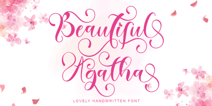 "Beautiful Agatha" is the best beautiful handwritten font. This font comes with uppercase, lowercase, ligature, swash, alternate, punctuation, and multilingual support. very suitable for weddings, engagements, invitations, Christmas, Valentine's, spring, summer, autumn, etc.
 - Sindelar by Willerstorfer,
$95.00 Please note: Sindelar webfonts are exclusively available at willerstorfer.com Sindelar is a capable, contemporary text face addressing today’s news design requirements. Its large x-height, low contrast and robust serifs grant a high legibility in small sizes. The balanced, well chosen proportions make the typeface economic (i.e. space saving) without giving it a too narrow appearance. These characteristics make it the ideal choice for extensive text setting in newspapers and magazines – on paper and on screen. Named after famous Austrian football (soccer) player Matthias Sindelar (1903–1939), one of the best players of his time, the typeface shares two major qualities with its namesake: their technical brilliance and their way of performing aesthetically to the last detail. The football player’s nickname »Der Papierene« (the Paper-man) elegantly refers to the media too. Although optimised for small sizes, Sindelar’s low contrast and robust serifs give the typeface a strong impact and an unmistakable personality in larger sizes. Sindelar’s calligraphic influences can be noticed in the Italics best. The italic letters are inclined by slightly different angles, respecting the letters’ shapes and proportions and resulting in a balanced, yet vivid appearance. Sindelar comes in 18 styles – nine weights in Roman and Italic each. Each font is equipped with a huge character set of about 980 glyphs and various OpenType features.
 - Hunter by Aboutype,
$24.99A redraw of Beton, Bauer, Intertype. with additional weights, shorter x-height and new Italic styles. Roman and Italic share same Roman Caps. Hunter has some text kerning but requires subjective display kerning and compensation.