544 search results
(0.265 seconds)
- Super Chill MC by Saja TypeWorks,
$12.00 There is nothing wrong with your computer screen. Do not attempt to adjust the picture. We will control the horizontal. We will control the vertical. You are about the experience the awe and mystery which is Super Chill. Super Chill Mind Control (MC) mixes super narrow letterforms with gothic inspiration, lulling you to sleep and also given you a freak out! The font includes: - A complete set of uppercase and lowercase letters, basic punctuation, numerals and currency figures, and diacritics - Stylistic Opentype Alternates to avoid letter crashing - Fun dingbats all sorts of nefarious purposes - Western Europe language support Need an extended license? Simply email us at hello@sajatypeworks.com and we’ll be happy to help! A collaboration between Dave Savage of Savage Monsters and Aaron Bell of Saja Typeworks. Get in touch: We’re here to help! If you have any questions or need assistance, please DM or contact us via hello@sajatypeworks.com Languages supported: Abneki, Afaan Oromo, Afar, Albanian, Alsatian, Amis, Anuta, Aragonese, Aranese, Arrernte, Arvanitic (Latin), Asturian, Aymara, Basque, Bikol, Bislama, Breton, Cape Verdean Creole, Cebuano, Chamorro, Chavacano, Chickasaw, Cofán, Corsican, Dawan, Delaware, Dholuo, Drehu, English, Faroese, Fijian, Filipino, Folkspraak, French, Frisian, Friulian, Galician, Genoese, German, Gooniyandi, Guadeloupean Creole, Haitian Creole, Hän, Hiligaynon, Hopi, Ido, Ilocano, Indonesian, Interglossa, Interlingua, Irish, Italian, Jamaican, Javanese (Latin), Jèrriais, Kala Kagaw Ya, Kapampangan (Latin), Kaqchikel, Kikongo, Kinyarwanda, Kiribati, Kirundi, Klingon, Latin, Lojban, Lombard, Makhuwa, Malay, Manx, Marquesan, Meriam Mir, Mohawk, Montagnais, Murrinh-Patha, Nagamese Creole, Ndebele, Neapolitan, Ngiyambaa, Norweigan, Novial, Occidental, Occitan, Oshiwambo, Palauan, Papiamento, Piedmontese, Portuguese, Potawatomi, Q’eqchi’, Quechua, Rarotongan, Romansh, Rotokas, Sami (Southern Sami), Samoan, Sango, Saramaccan, Sardinian, Scottish Gaelic, Seri, Seychellois Creole, Shawnee, Shona, Sicilian, Slovio (Latin), Somali, Sotho, Spanish, Sranan, Sundanese (Latin), Swahili, Swazi, Swedish, Tagalog, Tetum, Tok Pisin, Tokelauan, Tshiluba, Tsonga, Tswana, Tumbuka, Tzotzil, Uzbek (Latin), Volapük, Walloon, Waray-Waray, Warlpiri, Wayuu, Welsh, Wik-Mungkan, Wiradjuri, Xhosa, Yapese, Yindjibarndi, Zapotec, Zulu.
 - Industrial Spill by Saja TypeWorks,
$12.00 “Safety first!” claimed the sign. The janitor huffed, and continued mopping up the nuclear sludge from the floorboards. Just another day in the wasteland. Industrial Spill is available in three destructive styles: - Regular (great for those warning signs that everyone ignores when rummaging for salvage) - Ooze (reminds you to always clean up after contaminated muck covers the floor) - Wasteland (gives that wonderful feel of wandering around a desolate landscape) Please note that Industrial Spill Wasteland is highly detailed, realistic texturing. It may render slowly in older applications. Each font includes: - A complete set of uppercase and lowercase letters, basic punctuation, numerals and currency figures, and diacritics - Stylistic Opentype Alternates to avoid letter crashing - Punctuation shifts in All-Caps scenarios for better placement - Western Europe language support Need an extended license? Simply email us at hello@sajatypeworks.com and we’ll be happy to help! A collaboration between Dave Savage of Savage Monsters and Aaron Bell of Saja Typeworks. Get in touch: We’re here to help! If you have any questions or need assistance, please DM or contact us via hello@sajatypeworks.com Languages supported: Abneki, Afaan Oromo, Afar, Albanian, Alsatian, Amis, Anuta, Aragonese, Aranese, Arrernte, Arvanitic (Latin), Asturian, Aymara, Basque, Bikol, Bislama, Breton, Cape Verdean Creole, Cebuano, Chamorro, Chavacano, Chickasaw, Cofán, Corsican, Dawan, Delaware, Dholuo, Drehu, English, Faroese, Fijian, Filipino, Folkspraak, French, Frisian, Friulian, Galician, Genoese, German, Gooniyandi, Guadeloupean Creole, Haitian Creole, Hän, Hiligaynon, Hopi, Ido, Ilocano, Indonesian, Interglossa, Interlingua, Irish, Italian, Jamaican, Javanese (Latin), Jèrriais, Kala Kagaw Ya, Kapampangan (Latin), Kaqchikel, Kikongo, Kinyarwanda, Kiribati, Kirundi, Klingon, Latin, Lojban, Lombard, Makhuwa, Malay, Manx, Marquesan, Meriam Mir, Mohawk, Montagnais, Murrinh-Patha, Nagamese Creole, Ndebele, Neapolitan, Ngiyambaa, Norweigan, Novial, Occidental, Occitan, Oshiwambo, Palauan, Papiamento, Piedmontese, Portuguese, Potawatomi, Q’eqchi’, Quechua, Rarotongan, Romansh, Rotokas, Sami (Southern Sami), Samoan, Sango, Saramaccan, Sardinian, Scottish Gaelic, Seri, Seychellois Creole, Shawnee, Shona, Sicilian, Slovio (Latin), Somali, Sotho, Spanish, Sranan, Sundanese (Latin), Swahili, Swazi, Swedish, Tagalog, Tetum, Tok Pisin, Tokelauan, Tshiluba, Tsonga, Tswana, Tumbuka, Tzotzil, Uzbek (Latin), Volapük, Walloon, Waray-Waray, Warlpiri, Wayuu, Welsh, Wik-Mungkan, Wiradjuri, Xhosa, Yapese, Yindjibarndi, Zapotec, Zulu.
 - M Zhi Ngai HK by Monotype HK,
$523.99 Zhi series is inspired from vertical shop banners/signages from Japan, where each banners is attached to a slim simple structured skeleton. M Zhi Ngai™ takes reference from M Zhi Hei’s straightforwardness and masculinity but inserted plenty of ornaments and gentleness. Featuring a strong thick–thin contrast in the strokes, the typeface looks bright, smart and contemporary, suitable for promotional materials and more other media.
 - M Zhi Ngai PRC by Monotype HK,
$523.99 Zhi series is inspired from vertical shop banners/signages from Japan, where each banners is attached to a slim simple structured skeleton. M Zhi Ngai™ takes reference from M Zhi Hei’s straightforwardness and masculinity but inserted plenty of ornaments and gentleness. Featuring a strong thick–thin contrast in the strokes, the typeface looks bright, smart and contemporary, suitable for promotional materials and more other media.
 - Subway Circle by Hanoded,
$15.00 My eldest son Sam always wanted to visit Japan and he has been saving up for a ticket for years now. We should have traveled there this year, but due to the pandemic, that was impossible. We’re now trying to go next year. Sam and I did make some kind of itinerary and I told him how we were going to get around, as I have been to Japan many times. I told him about the Shinkansen trains, the cute Tram in Nagasaki and the immense subway system in Tokyo. One of the lines in Tokyo is the so-called Yamanote Circle Line, which I have used on numerous occasions. A new font name was born and it stuck to this particular font! Subway Circle is a 100% handmade font. It is rounded, slightly slanted and comes with a sunny disposition. I am sure that, when you use it, you will find your 生きがい… ;-)
 - Bakemono by Zetafonts,
$39.00 Francesco Canovaro created Bakemono as a way to explore the design space around the duality of fixed/proportional width. He was also interested in the concept of monowidth design, inherent in monospaced typefaces, that can bring flexibility and ease of use also to proportional type - allowing you to change the weight of a word without losing the text alignment. In his research on fixed width type design he mixed the lessons of mechanical typewriter technology with the intuitions of eastern brush calligraphy, which has been dealing with for centuries with fixed space grids. The name of the typeface comes from the Japanese shape-shifter yokais that could change their form freely between human and animal, and aptly describes the metamorphic nature of this wide superfamily coming in proportional, monospace and intermediate subfamilies. With a design mixing the expansion principles of the brush with the sharp technicality of typewriter and system fonts, Bakemono can both excel at text size in its regular widths optimized for legibility as well as owning the page at display size with its uncommon design details. Bakemono reflects its multicultural nature with its extended latin + cyrillic charset, soon to be expanded with Bakemono Arabic (exploring the fascinating world of monospaced arabic script) and Bakemono Kana (our first experiment in cjk scripts). • Suggested uses: born to allow you to change the weight of a word without losing the text alignment, Bakemono can both excel at text size in its regular widths optimised for legibility as well as owning the page at display size with its uncommon design details. Perfect for contemporary branding, web design, packaging and countless other projects; • 21 styles: 7 weights x 3 different styles + 1 variable font; • 839 glyphs in each weight; • Useful OpenType features: Access All Alternates, Contextual Alternates, Case-Sensitive Forms, Glyph Composition / Decomposition, Denominators, Fractions, Localized Forms, Mark Positioning, Mark to Mark Positioning, Alternate Annotation Forms, Numerators, Ordinals, Scientific Inferiors, 7 Stylistic Sets, Subscript, Superscript, Slashed Zero • 217 languages supported (extended Latin and Cyrillic alphabets): English, Spanish, Portuguese, French, Russian, German, Javanese (Latin), Vietnamese, Turkish, Italian, Polish, Afaan Oromo, Azeri, Tagalog, Sundanese (Latin), Filipino, Moldovan, Romanian, Indonesian, Dutch, Cebuano, Igbo, Malay, Uzbek (Latin), Kurdish (Latin), Swahili, Hungarian, Czech, Haitian Creole, Hiligaynon, Afrikaans, Somali, Zulu, Serbian, Swedish, Bulgarian, Shona, Quechua, Albanian, Catalan, Chichewa, Ilocano, Kikongo, Kinyarwanda, Neapolitan, Xhosa, Tshiluba, Slovak, Danish, Gikuyu, Finnish, Norwegian, Sicilian, Sotho (Southern), Kirundi, Tswana, Sotho (Northern), Belarusian (Latin), Turkmen (Latin), Bemba, Lombard, Lithuanian, Tsonga, Wolof, Jamaican, Dholuo, Galician, Ganda, Low Saxon, Waray-Waray, Makhuwa, Bikol, Kapampangan (Latin), Aymara, Ndebele, Slovenian, Tumbuka, Venetian, Genoese, Piedmontese, Swazi, Zazaki, Latvian, Nahuatl, Silesian, Bashkir (Latin), Sardinian, Estonian, Afar, Cape Verdean Creole, Maasai, Occitan, Tetum, Oshiwambo, Basque, Welsh, Chavacano, Dawan, Montenegrin, Walloon, Asturian, Kaqchikel, Ossetian (Latin), Zapotec, Frisian, Guadeloupean Creole, Q’eqchi’, Karakalpak (Latin), Crimean Tatar (Latin), Sango, Luxembourgish, Samoan, Maltese, Tzotzil, Fijian, Friulian, Icelandic, Sranan, Wayuu, Papiamento, Aromanian, Corsican, Breton, Amis, Gagauz (Latin), Māori, Tok Pisin, Tongan, Alsatian, Atayal, Kiribati, Seychellois Creole, Võro, Tahitian, Scottish Gaelic, Chamorro, Greenlandic (Kalaallisut), Kashubian, Faroese, Rarotongan, Sorbian (Upper Sorbian), Karelian (Latin), Romansh, Chickasaw, Arvanitic (Latin), Nagamese Creole, Saramaccan, Ladin, Kaingang, Palauan, Sami (Northern Sami), Sorbian (Lower Sorbian), Drehu, Wallisian, Aragonese, Mirandese, Tuvaluan, Xavante, Zuni, Montagnais, Hawaiian, Marquesan, Niuean, Yapese, Vepsian, Bislama, Hopi, Megleno-Romanian, Creek, Aranese, Rotokas, Tokelauan, Mohawk, Onĕipŏt, Warlpiri, Cimbrian, Sami (Lule Sami), Jèrriais, Arrernte, Murrinh-Patha, Kala Lagaw Ya, Cofán, Gwich’in, Seri, Sami (Southern Sami), Istro-Romanian, Wik-Mungkan, Anuta, Cornish, Sami (Inari Sami), Yindjibarndi, Noongar, Hotcąk (Latin), Meriam Mir, Manx, Shawnee, Gooniyandi, Ido, Wiradjuri, Hän, Ngiyambaa, Delaware, Potawatomi, Abenaki, Esperanto, Folkspraak, Interglossa, Interlingua, Latin, Latino sine Flexione, Lojban, Novial, Occidental, Old Icelandic, Old Norse, Slovio (Latin), Volapük
 - Nori by Positype,
$49.00 First, the important information…Nori is a hand-lettered typeface that contains over 1100 glyphs, 250 ligatures, 487 alternate characters, 125+ swash and titling alternates, lining and old style numerals. To make sure it is perfectly clear—Nori is the result of brush and ink on paper. The textures produced in each glyph are real and the imperfections are intentional and add to the sincerity of the letters. I say this to be as blunt as possible in order to avoid confusion and to frame what this typeface represents—calligraphic, handwritten letters captured digitally for their warmth and poetic variation for print and screen. Like my handwritten, calligraphic or brush-driven faces before it (the Baka series and the TDC2 2010 winning typeface, Fugu), Nori is a product of my analog and digital hand. To view the words and sentences formed by this typeface is to look at how my hands, yes hands, make letters. The fluidity, as well as the irregularity, is human, honest and intentional—to do so lets the brush I am holding breathe life into each letter. Once digital, any number of points and repetitive processes can’t mask its influences—and I like that. The brush, a simple instrument, my tool, my friend designed to emulate traditional Japanese sumi-e brushes... the Pilot Japan Kanji Fude brush pen. Each letter, each variation was written over and over again until I found the right combination. From there, each was scanned, digitized and optimized. Points were removed in order to ‘clean’ the glyphs up some but I did not want to compromise the integrity of the actual brush stroke. Once this base set of characters (about 350) were completed, the thoughtful manipulation of the glyphs, their gestures and forms were further expanded to solidify the embellishments used within the ligatures, alternates, swashes and additional features. This process was admittedly self-indulgent to an extent. I wanted the words created with this typeface to have the flexibility of variation and cohesiveness of movement that someone fluidly producing these letters by hand might have. I hope you enjoy this typeface as much as I did during the six months working on it. A specimen and style guide is included with the purchased of Nori.
 - Nanami by Thinkdust,
$10.00 A font inspired by the oriental flavours of Japan, Nanami a confident font with clear, clean lines which are well defined without being obtrusive. The distinctly sharp edges slice through empty space like Samurai swords, proudly wearing curves and corners like a Samurai wears their traditional ceremonial armour, and just as fierce. If Nanami isn't quite floating your boat why not check out its counterparts Nanami Rounded and Nanami Handmade.
 - Hatchira by Maulana Creative,
$13.00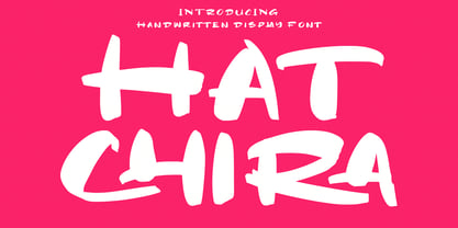 Hatchira is a Japan vibes handwritten display font. With reverse contrast stroke, fun character. To give you an extra creative work. Hatchira font support multilingual more than 100+ language. This font is good for logo design, Social media, Movie Titles, Books Titles, a short text even a long text letter and good for your secondary text font with sans or serif. Make a stunning work with Hatchira font. Cheers, Maulana Creative
 - As of my last update in April 2023, "13_Roshi" is not recognized as a standard or widely-known font in mainstream typographic resources or font libraries. However, the naming itself suggests a unique...
- Street Anthem by Colllab Studio,
$17.90 Presenting Street Anthem! A Graffiti Display Font with Extra. This font made with the perfect combination of each character. You can combine with Extra, Mix and Match Uppercase and Lowercase to get a unique combination. It looks original and can be used for all your project needs. Each glyph has its own uniqueness and when meeting with others will provide dynamic and pleasing proximity. This font can be used at any time and in any project. You can see in the presentation picture above, Street Anthem looks unique and Japanese style on design projects. So, Street Anthem can't wait to give its touch to all your design projects such as quotes, graffiti design, poster design, personal branding, promotional materials, website, logotype, product packaging, etc. WHAT'S INCLUDED? 1. Street Anthem • It comes with uppercase, lowercase, ligatures, numeral, punctuation, symbols, ligatures, and Standard Latin Multilingual Support (Afrikaans, Albanian, Catalan, Danish, Dutch, English, French, German, Icelandic, Indonesian, Italian, Malay, Norwegian, Portuguese, Spanisch, Swedish, Zulu, and More). 2. Extra Glyphs • Included 24 Graffiti Dingbats. You can feature all with typing c_1 until c_24. A Million Thanks Colllab Studio
 - Johto by Superpencil,
$32.00 Finally, a font that’s ready for your pixel adventures. Johto is a hand-crafted, pixelated font that captures the excitement of 1990s Tokyo for today’s developers, designers, and video-game makers. We all love the pixelated games we played as kids. Now, as programmers, video makers, and creators of side projects that make our hearts pound with passion, there is nothing more satisfying than imagining ourselves in the shoes of the people that inspired us. We want to feel like we're right back there in the excitement of 1990s Tokyo, as an artist or engineer. Johto was created because of our disappointment with the pixel fonts we found online. And for people like us, who care deeply about the quality of our work - especially the work we do for ourselves - we realized we needed a high-quality pixel font to give our work the look it deserves. With over six hundred characters plus support for dozens of languages, including Japanese, tons of fun hand-crafted ligatures to get the look right, Johto is an authentic nostalgia trip. It has all those missing details you didn't notice, but your brain did.
 - Brohero by Alit Design,
$16.00 Presenting ⚔️The Brohero Typeface⚔️ by alitdesign. The Brohero font is inspired by action movie posters with the theme of war or knights in the Japanese Samurai. The bold character of The Brohero font is perfect for making hero movie titles, game titles, logotypes, t-shirt designs and so on with heroic themes. Apart from the regular font, the Brohero also has an italic style which makes the design more dynamic and cool. The Brohero font has alternatives that you can combine between swashes and symbols that have the theme of heroes and war. Besides that this font is very easy to use both in design and non-design programs because everything changes and glyphs are supported by Unicode (PUA). The Brohero Typeface has a total of 789 glyphs including symbol, multilingual. Language Support : Latin, Basic, Western European, Central European, South European,Vietnamese. In order to use the beautiful swashes, you need a program that supports OpenType features such as Adobe Illustrator CS, Adobe Photoshop CC, Adobe Indesign and Corel Draw. but if your software doesn't have Glyphs panel, you can install additional swashes font files.
 - Kamuy by Andinistas,
$39.95 Kamui is a font designed by Carlos Fabian Camargo G. and used to write headlines. Its strategy makes it ideal for covers and advertisements with Japanese-style manga comics requiring latin style. Precisely its purpose was inspired by typographical classics such as Mistral by R. Excoffon and Zapfino by H. Zapf that then were diluted by separate strokes as blackletter calligraphy. However, high doses of miscegenation and lettering untimely torn between 50% esthetic and 50% legibility. That way his radical expression is highly profitable for composing and designing words and phrases with Eastern look. And more importantly, the writing seems drawn quickly with thin-tipped brush staining over a rough surface, from that process comes the idea of corroded outlines and changes in contrast. In conclusion, some diagonal strokes, horizontal, curved and vertical stand or hide from their simulation of scarcity or abundance of ink clots. That way each stroke seems inconsistent, footprint of the 423 brush drawing glyphs in Regular Kamuy. In that sense, the OpenType features included are: Standard Ligatures, Contextual Alternates, discretionary ligatures, swash, stylistic alternates, alternatives for titles, ordinals, fractions. And to end the Variable “Kamuy Dingbats” has is 52 fictitious drawings and zamurais.
 - Ciseaux by Wilton Foundry,
$29.00 Ciseaux was inspired and is dedicated to the art of paper cutting. Early paper cutting artists were often royalty, but it soon became a folk art practiced by commoners whose cutouts decorated their homes. By the seventeenth century it had spread throughout the world. The Japanese called it Mon-kiri, the German's Scherenschnitte and Turkey even boasted a guild devoted to the art form. In Poland the designs were traditionally symmetrical and often used layers of colors to form pictorial collages. When Russian invaders confiscated scissors, villagers were found to cut their intricate designs with sheep shears! The art form later developed into cutting out elaborate designs of nature scenes and people, celebrating special occasions and even decorating legal documents. Ciseaux letterforms mimic paper cutting art in its shapes with a rather loose and almost joyous rhythm. The overall effect is somewhat earthy and natural yet it has an element of sophistication that cannot be ignored. Just like paper cutting, Ciseaux can be used for special occasions like invitations, brochures, identities, restaurant menus, and if you dare, some awesome looking paper graffiti. Available in TT, PS and Opentype for Mac and Windows.
 - Qillsey Einstein by Asd Studio,
$15.00 Introducing the new font Qillsey Einstein, a type of script that has a natural scratch texture. I made Qillsey Einstein by using a Japanese calligraphy pen that makes the impression seem natural. My font is complete with 3 Stylistic Sets which will make the writing more beautiful and charming. This typeface is suitable for use in a variety of design fields, such as event advertisements, product promotions, book titles, activity titles, logos, adventure, and others. This font can when paired with serif font types will make your design project more beautiful and perfect. I highly recommend using a program that supports OpenType features and Glyphs panels such as Adobe Illustrator, Adobe Photoshop CC, Adobe InDesign, or CorelDraw, so you can see and access all Glyph variations. This font is encoded with Unicode PUA, which allows full access to all additional characters without having special design software. Mac users can use Font Book, and Windows users can use Character Map to view and copy one of the extra characters to paste into your favorite text editor / application. Thank you if you are interested in purchase and using my font. I hope you enjoy the font, thank you.
 - Garuda by Campotype,
$49.00 Garuda typeface, featuring the shape and style based on "Garuda Pancasila", the state symbol of the Republic of Indonesia. Garuda is a mythical bird in the Javanese puppet stories, is very similar to the eagle. At the typeface we can find more ligatures beside than the standard. Within Garuda at least encoded 792 glyphs per weight onto major codepage: win 1252, 1250, 1254, 1257 including Mac OS Roman. It is containing more OpenType features such as swash, contextual alternate, stylistic, figures/number, and a few bit ornaments. The typeface has a pretty good readability and legibility even in small sizes. So it is useful for short texts (text length? Whom fear) for print and screen material. Usage on headlines, posters, titles, or something like that, can utilize ornament lines as a sweetener. Please find more information about the OpenType Manual of this typeface on the gallery page (pdf).
 - Daitengu by Hanoded,
$15.00 I have always been fascinated by Tengu - a mythical creature from Japan. Tengu are usually depicted with a red face, a very long nose, white moustaches and a funny hat. They used to be regarded as harbingers of war, but over the centuries, their image softened and they became the protective spirits of mountains and forests. Daitengu means ‘greater tengu’ and stems from the Genpei Jōsuiki - an extended version of the ‘The Tale of the Heike’ - an epic account of the struggle between the Taira and Minamoto clans for control of Japan. So, now you know about tengu, end of the history lesson! Daitengu is an epic brush font. I made it with a soft brush and China ink (like most of my brush fonts), but instead of forming the glyphs I saw in my head, I let the brush do the work. A more ‘zen’ approach to brushwork if you will! The result is a messy, organic brush font with a lot of spirit. Comes with diacritics and double letter ligatures.
 - Tipsy Waitress by Saja TypeWorks,
$12.00 The clock struck 2am. In the Wixendorf Café, a dingy diner off Route 75, the waitress behind the bar took another swig of whiskey—it was one of those nights. Ask to get a cup of coffee and you’re never sure how much will end up in your cup and how much will end up on the bar top. But it is hot, and paired with a plate of cherry pie? Why, that place is a slice of heaven. Tipsy Waitress, with a few too many swigs of liquor, is full of character and ready for any task—if you don’t mind a bit of sloppiness! The font includes: - A complete set of uppercase and lowercase letters, basic punctuation, numerals and currency figures, and diacritics - Western Europe language support - A whole heck of a lot of fun Need an extended license? Simply email us at hello@sajatypeworks.com and we’ll be happy to help! A collaboration between Dave Savage of Savage Monsters and Aaron Bell of Saja Typeworks. Get in touch: We’re here to help! If you have any questions or need assistance, please DM or contact us via hello@sajatypeworks.com Languages supported: Abneki, Afaan Oromo, Afar, Albanian, Alsatian, Amis, Anuta, Aragonese, Aranese, Arrernte, Arvanitic (Latin), Asturian, Aymara, Basque, Bikol, Bislama, Breton, Cape Verdean Creole, Cebuano, Chamorro, Chavacano, Chickasaw, Cofán, Corsican, Dawan, Delaware, Dholuo, Drehu, English, Faroese, Fijian, Filipino, Folkspraak, French, Frisian, Friulian, Galician, Genoese, German, Gooniyandi, Guadeloupean Creole, Haitian Creole, Hän, Hiligaynon, Hopi, Ido, Ilocano, Indonesian, Interglossa, Interlingua, Irish, Italian, Jamaican, Javanese (Latin), Jèrriais, Kala Kagaw Ya, Kapampangan (Latin), Kaqchikel, Kikongo, Kinyarwanda, Kiribati, Kirundi, Klingon, Latin, Lojban, Lombard, Makhuwa, Malay, Manx, Marquesan, Meriam Mir, Mohawk, Montagnais, Murrinh-Patha, Nagamese Creole, Ndebele, Neapolitan, Ngiyambaa, Norweigan, Novial, Occidental, Occitan, Oshiwambo, Palauan, Papiamento, Piedmontese, Portuguese, Potawatomi, Q’eqchi’, Quechua, Rarotongan, Romansh, Rotokas, Sami (Southern Sami), Samoan, Sango, Saramaccan, Sardinian, Scottish Gaelic, Seri, Seychellois Creole, Shawnee, Shona, Sicilian, Slovio (Latin), Somali, Sotho, Spanish, Sranan, Sundanese (Latin), Swahili, Swazi, Swedish, Tagalog, Tetum, Tok Pisin, Tokelauan, Tshiluba, Tsonga, Tswana, Tumbuka, Tzotzil, Uzbek (Latin), Volapük, Walloon, Waray-Waray, Warlpiri, Wayuu, Welsh, Wik-Mungkan, Wiradjuri, Xhosa, Yapese, Yindjibarndi, Zapotec, Zulu.
 - Makio by HIRO.std,
$25.00 Makio is San Serif Typeface Makio inspired by modern life, clean, simple life, Japan culture, and minimalist symbols. This font works great in any branding, name card, logos, title, websites, product packaging, flyers, magazines, label, films, stationary, posters, etc. and any design project that requires clean, modern and simple touch. FEATURES - Six Weight - Uppercase and Lowercase letters - Support Opentype Features - Numbering and Punctuations - PUA Encoded Characters - Ligatures - Multilingual Support - Works on PC or Mac Enjoy using! Thanks. HIRO.std
 - Serat by Wahyu and Sani Co.,
$24.00 Serat is a medium contrast flared serif with mixed up styles of classic typefaces which is highly influenced by early stages of Latin based hand writing. The lowercase are modernized versions of Carolingian minuscules, vertical stems which touch the baseline have been modified to have horizontal cut for simpler look and keep the calligraphic style for terminals & stroke ends. Then the uppercase are flared serif which were influenced by Roman inscriptional capitals. The font name was taken from the Javanese word "serat" which means writing (noun). It comes with some unique features, such as: - Carolingian style alternate for some letters (a,e,f,g,t), also comes with separated stylistic set for long 's', and long left leg 'x' and alternative ampersand. - Discretionary ligatures for all caps titling. - Standard Ligatures. - Tabular and Proportional for both Lining and Old-style figure. - Fraction with Nominator and Denominator. - Superscript and Subscript for numbers, etc. Serat would be suitable for "classic" themed work; poster, book cover, branding, videography, etc.
 - Yakitori Alley by Kitchen Table Type Foundry,
$16.00 My son Sam saved all his pennies for a trip to Japan with me. Hi dream came true this year and we traveled around Honshu for 10 days. One of the things on his ‘to do’ list was eating yakitori, so I took him to famous Yakitori Alley in Tokyo. The setting was legendary, the smell was great, but the yakitori, unfortuntely, was so-so.. Yakitori Alley is a fun, scribbly script font with language support and a set of contextual alternates.
 - Optima Nova by Linotype,
$57.99 With the clear, simple elegance of its sans serif forms and the warmly human touches of its tapering stems, the Optima family has proved popular around the world. In 2002, when it was finally possible to produce digital alphabets without technical limitations and compromises, and more than fifty years after the first sketches, an expansion and redesign of the Optima family was completed and released as Optima nova. Hermann Zapf and Japanese type designer, Akira Kobayashi, collaborated on the project, which included re-working of the existing weights and the addition of several new weights: small caps, old style figures, light, heavy, and condensed. The original Optima was never manufactured with a real italic, only an oblique version of the roman. Optima nova has a complete range of beautifully designed real italics; the new italic forms, of the e, f and g are especially notable. The titling face includes capital letters with special and unusual letter combinations and ligatures, making it an excellent choice for headlines, logos and advertising purposes. Optima continues to be an all-purpose typeface; and Optima nova works for just about anything from book text to signage. Optima Nova® font field guide including best practices, font pairings and alternatives.
 - Nanami Handmade by Thinkdust,
$10.00 Can we get a drum roll please? It’s not every day that a new link in a best selling chain is forged. First, there was Nanami, a font which took the world of type by force, storming to the top of MyFonts Hot New Fonts list; then there was Nanami Rounded, the most successful follow-up since Terminator 2. Well, say Hasta La Vista to boring design because now, there’s Nanami Handmade. With all the geometric, Japanese inspiration and style of the first two iterations, Nanami Handmade carries a quirky, mischievous charm. The font has a charisma matched by roguish anti-heroes; bad guys you love to love and good guys the other good guys hate, but everyone knows they’re what the audience turns up to see. Nanami Handmade comes in two styles, a solid and a hand-drawn, each of which has eight weights. Mix and match between these options to create a balanced piece which makes good use of the tactile, warm, earthy nature of the font. With these sans-serif styles working well in small and large sizes, both on and off screen, Nanami Handmade’s applications are virtually endless. Get your own piece of typography’s elite now, with Nanami Handmade, by Thinkdust.
 - Megumi by Eclectotype,
$70.00 Megumi was originally commissioned as a headline face for a fashion and lifestyle magazine with a heavy Japanese influence. The uppercase letters are narrow and have an almost monospaced aesthetic, being influenced by Romaji letterforms. Serifs are severe, and curves sinuous. Although experiments were made with extra weight, it was decided that only this ultra light weight would be developed, to be set large in headlines. The italic has an over-the-top 35° slant (so slanted in fact that the backslash from the italic is the exact same shape as the forward slash in the Roman) and a discretionary ligature feature that can be engaged to add extra interest to headlines. The Roman has a few wide alternate glyphs for round uppercase characters. Both styles have a stylistic set (ss03) feature which switches regular parentheses for angle brackets, which the Art Director thought “looked cool”. In a mess of venture capitalist pull-outs and Covid related issues, the publication never came to be, but the Hipster Japanophile Magazine World’s loss is your gain, as this beautifully crafted, editorial oddity is now available to license. Use it editorially, obviously, but it would also look great on posters, perfumes, postmodern publications, and perhaps some other things that don’t begin with p.
 - Knock Type by sugargliderz,
$20.00 KnockType is based on the concept of braille notation in Japanese. It does not support braille notation in other languages. KnockType is not necessarily aimed at facilitating “braille transcription”. It is designed so that someone who understands the grammar of “braille transcription” can instantly transliterate into braille text that was previously transcribed to kana characters, etc. In addition, it allows ink characters to be converted to braille using OpenType features. It is recommended for use in applications that are compatible with OpenType features. If they are not compatible, KnockType is “simply a kana font”. To be a little more specific, it is assumed that KnockType will be used in Adobe’s InDesign and Illustrator applications. If you don't have them, you will not get satisfactory results. Four types of font are available. There are “hasBox&Line”, “hasnotBox&Line”, and the reversed font of each. When displayed on a convex surface, the assumption is that they will be used mainly for printing applications. When displayed on a concave surface, the assumption is that they will be used mainly for writing on braille boards, etc. By printing, you can get a rough idea of the dot positions. It is more effective to match them to the grid size of the braille board.
 - Quendel by URW Type Foundry,
$39.99 Quendel has been expanded to become Quendel Happy Family. Apart from the new Bold weight for easy distinction and emphasis, there are now four other very exciting variants, rendering different writing tools and writing materials. The basic form of Quendel was written with a Japanese bamboo tip and therefore embodies a form letter of natural flow. The new versions show other features that provide the feel of written scripts. While the styles Wood and Crayon include some alternate characters, Q Marking Pen and Q Fingertip, due to their apparently more complex enacted forms, do not need additional alternates without looking stiff or boring. The wood relief of Quendel Wood was created by a freehand wood relief drawn with oiled chalk. Quendel Marking Pen seems to be written with a felt-tip pen soon depleted. At the same time it is also reminiscent of the blooming effect, which we know from photography. The name of Quendel Fingertip suggests what can be seen - someone seems to have written with the finger in a grainy material. One would like to try it himself. The effect of broken lines which can be gained by writing with chalk as reflected in Quendel Crayon. Almost like parched sandy soil, the writing material seems to crumble.
 - TX Signal Signifier by Typebox,
$39.00Eight designers present a set of icons that indicate the fun and fantastic world of signage. Each collaborator's solution represents a completely different interpretations on signage vernacular. Akira Kobayashi's "Subsumption", obscured by foliage, offers a perspective that signs on Japanese roads can be vague and beautiful. M.A.D.'s "People Signs" is a graphical association of people signage with a variety of well known situation symbols. Cynthia Jacquette's "Honest Arrows" are a series of arrows that attempts to honestly tell you how to get from point A to Point B in a big, confusing city. Mike Kohnke's "Road Kill" and the "Bump & Bruise" highlight how signs make for perfect targets when unloading a round of buckshot, and the licking a contruction barrier often endures. Joachim Muller-Lance's "Traffic Blends" places faces on things! Hey, didn't you give your first car a nickname? Cars are alive, you know - they guzzle and smoke all day. Jean-Benoît Lévy's "Inner-State" was inspired while reading the California driver handbook to pass a driver's test. Kevin Roberson's "Tail Lighting" reminds us to drive carefully and not to forget to signal. Diana Stoen's "Drivers Out There" shows us "driver personality archetypes", including the lil'ol lady that everyone tries to avoid. - Go To Town JNL by Jeff Levine,
$29.00 Vintage sheet music for a song from the 1941 animated feature "Mr. Bug Goes to Town" featured a casual, hand-lettered inline type style on its cover page. Recreated as the digital font Go to Town JNL, this design is presented in all the imperfect glory of pen and ink lettering. Go to Town JNL is available in the regular inline version as well as a solid version. A bit about the cartoon: The project was created by the legendary Fleischer Studios in Miami, Florida (they had relocated from New York City), after they could not obtain the rights to adapt Maurice Maeterlinck's "The Life of the Bee". Beset by the expenses of relocating to Florida, growing production costs on the full-length feature cartoon and other problems; mid-way through the making of "Mr. Bug Goes to Town" the Fleischer brothers were forced to sell their studio to their distributor (Paramount Pictures) in order to continue in operation. It was released on Dec. 5, 1941 - just two days before the Japanese attack on Pearl Harbor. The release [and subsequent re-release by Paramount as "Hoppity Goes to Town"] was a disappointing failure, earning [as late as 1946] only $241,000 of the initial cost of $713,511 it took to make the film.
 - Soft Whisperings Calligraphic by Joanne Marie,
$16.00 Introducing Soft Whisperings Calligraphic - A beautifully flowing modern calligraphy font. This delicate, modern script font is full of romance and elegance. It’s perfect for wedding stationery, Save The Date and special occasion cards. Soft Whisperings has a lovely handwritten feel to it so it’s also great for logos, signatures, taglines and calligraphic projects. There are plenty of alternate glyphs and ligatures! International Language Support Soft Whisperings Calligraphic supports 219 latin based languages, which are spoken in different 212 countries. Abenaki, Afaan Oromo, Afar, Afrikaans, Albanian, Alsatian, Amis, Anuta, Aragonese, Aranese, Aromanian, Arrernte, Arvanitic (Latin), Asturian, Atayal, Aymara, Azerbaijani, Bashkir (Latin), Basque, Belarusian (Latin), Bemba, Bikol, Bislama, Bosnian, Breton, Cape Verdean Creole, Catalan, Cebuano, Chamorro, Chavacano, Chichewa, Chickasaw, Cimbrian, Cofán, Cornish, Corsican, Creek, Crimean Tatar (Latin), Croatian, Czech, Danish, Dawan, Delaware, Dholuo, Drehu, Dutch, English, Esperanto, Estonian, Faroese, Fijian, Filipino, Finnish, Folkspraak, French, Frisian, Friulian, Gagauz (Latin), Galician, Ganda, Genoese, German, Gikuyu, Gooniyandi, Greenlandic (Kalaallisut), Guadeloupean Creole, Gwich’in, Haitian Creole, Hän, Hawaiian, Hiligaynon, Hopi, Hotcąk (Latin), Hungarian, Icelandic, Ido, Igbo, Ilocano, Indonesian, Interglossa, Interlingua, Irish, Istro-Romanian, Italian, Jamaican, Javanese (Latin), Jèrriais, Kaingang, Kala Lagaw Ya, Kapampangan (Latin), Kaqchikel, Karakalpak (Latin), Karelian (Latin), Kashubian, Kikongo, Kinyarwanda, Kiribati, Kirundi, Klingon, Kurdish (Latin), Ladin, Latin, Latino sine Flexione, Latvian, Lithuanian, Lojban, Lombard, Low Saxon, Luxembourgish, Maasai, Makhuwa, Malay, Maltese, Manx, Māori, Marquesan, Megleno-Romanian, Meriam Mir, Mirandese, Mohawk, Moldovan, Montagnais, Montenegrin, Murrinh-Patha, Nagamese Creole, Nahuatl, Ndebele, Neapolitan, Ngiyambaa, Niuean, Noongar, Norwegian, Novial, Occidental, Occitan, Old Icelandic, Old Norse, Onĕipŏt, Oshiwambo, Ossetian (Latin), Palauan, Papiamento, Piedmontese, Polish, Portuguese, Potawatomi, Q’eqchi’, Quechua, Rarotongan, Romanian, Romansh, Rotokas, Sami (Inari Sami), Sami (Lule Sami), Sami (Northern Sami), Sami (Southern Sami), Samoan, Sango, Saramaccan, Sardinian, Scottish Gaelic, Serbian (Latin), Seri, Seychellois Creole, Shawnee, Shona, Sicilian, Silesian, Slovak, Slovenian, Slovio (Latin), Somali, Sorbian (Lower Sorbian), Sorbian (Upper Sorbian), Sotho (Northern), Sotho (Southern), Spanish, Sranan, Sundanese (Latin), Swahili, Swazi, Swedish, Tagalog,Tahitian, Tetum, Tok Pisin, Tokelauan, Tongan, Tshiluba, Tsonga, Tswana, Tumbuka, Turkish, Turkmen (Latin), Tuvaluan, Tzotzil, Uzbek (Latin), Venetian, Vepsian, Volapük, Võro, Wallisian, Walloon, Waray-Waray, Warlpiri, Wayuu, Welsh, Wik-Mungkan,Wiradjuri, Wolof, Xavante, Xhosa, Yapese, Yindjibarndi, Zapotec, Zarma, Zazaki, Zulu, Zuni. --------------------------------------------------------------------------------------------------------------------- The fonts are PUA encoded which means that you don’t need any special software to be able to use the alternates and Ligatures. Well, that’s about it! Enjoy! Jo
 - OT Minima by OtterType,
$15.00 OT Minima is a carefully crafted display font that looks incredible. You can use it for a variety of design projects like posters, business cards, wedding invitations, games, covers, social media posts, quote photos, branding, editorials, and much more. --- Language Support: Afrikaans • Albanian • Asu • Azerbaijani • Basque • Belarusian • Bemba • Bena • Bosnian • Bulgarian • Catalan • Cebuano • Chiga • Colognian • Cornish • Corsican • Croatian • Czech • Danish • Dutch • Embu • English • Erzya • Esperanto • Estonian • Faroese • Filipino • Finnish • French • Friulian • Galician • German • Gusii • Hungarian • Icelandic • Ido • Indonesian • Interlingua • Irish • Italian • Javanese • Jju • Kabuverdianu • Kalaallisut • Kalenjin • Kamba • Kikuyu • Kinyarwanda • Kurdish • Latvian • Lithuanian • Lojban • Low German • Lower Sorbian • Luo • Luxembourgish • Luyia • Machame • Makhuwa-Meetto • Makonde • Malagasy • Malay • Maltese • Manx • Māori • Meru • Morisyen • North Ndebele • Northern Sotho • Norwegian Bokmål • Norwegian Nynorsk • Nyanja • Nyankole • Occitan • Oromo • Polish • Portuguese • Romanian • Romansh • Rombo • Rundi • Russian • Rwa • Samburu • Sango • Sangu • Sardinian • Scottish Gaelic • Sena • Shambala • Shona • Sicilian • Slovak • Slovenian • Soga • Somali • South Ndebele • Southern Sotho • Spanish • Sundanese • Swahili • Swati • Swedish • Swiss German • Taita • Taroko • Teso • Tsonga • Tswana • Turkish • Turkmen • Upper Sorbian • Vunjo • Walloon • Walser • Welsh • Western Frisian • Xhosa • Zulu - Thank you!
 - TA KokoroF by Skill Information"S",
$99.00 TA-kokoro is very popular in Japanized font. TA-kokoro is designed by Yasushi Saikusa who is famous as typographer and based with Maru-gothic. TA-kokoro expresses yet cuteness. TAこころは、日本語のデザイナーズフォントの中で大変人気の有るフォントです。 タイポグラファで有名な七種泰史がデザインしたフォントで、丸ゴシックのデザインをベースにして更に可愛らしさを表現したフォントです。
 - Jesus Saves by Breauhare,
$13.94 Jesus Saves is a font based on the familiar old logo that has “JESUS” hidden within a maze-like set of multi-branched vertical bars. The characters appear to be an alien, cryptic language at first sight, perhaps even a Japanese, Chinese, or Korean language, thanks to the unusual figures created by the combinations of various letters. It is a teaser for the eyes, as well as a visual feast of De Stijl-type art. It is an attention-getting font that is cool to look at, an eye puzzle that is enticing to decipher. It’s a great font to use for striking logos (see Gallery Images) by the judicious use of ligatures, where in word settings ligatures may be used at the beginnings of words, the middle or the endings of words. Jesus Heals is the missing spaces from the Jesus Saves font, sort of like a doughnut hole font! If you use this font to fill in the spaces in the Jesus Saves font, it becomes whole, or healed, thus the name. Jesus Lives is a raised block/3D or three dimensional version of Jesus Heals. For color combinations in apps that support layering, Jesus Lives synchs and has perfect kerning register with Jesus Heals, as Jesus Heals has with Jesus Saves. The digitization was done by fontmeister John Bomparte.
 - Kaizen by Colllab Studio,
$9.00 Presenting Kaizen! A Bold Handbrush Font in 2 Versions. This font made with the perfect combination of each character. You can combine with Extra to get a unique combination. It looks original and can be used for all your project needs. Each glyph has its own uniqueness and when meeting with others will provide dynamic and pleasing proximity. This font can be used at any time and in any project. You can see in the presentation picture above, Kaizen looks unique and Japanese style on design projects. So, Kaizen can't wait to give its touch to all your design projects such as quotes, poster design, personal branding, promotional materials, website, logotype, product packaging, etc. WHAT'S INCLUDED? 1. Kaizen Version One (Solid) • The first version comes with uppercase, lowercase, ligatures, numeral, punctuation, symbols, and Standard Latin Multilingual Support (Afrikaans, Albanian, Catalan, Danish, Dutch, English, French, German, Icelandic, Indonesian, Italian, Malay, Norwegian, Portuguese, Spanisch, Swedish, Zulu, and More). 2. Kaizen Version Two (Inline texture) • The first version comes with uppercase, lowercase, ligatures, numeral, punctuation, symbols, and Standard Latin Multilingual Support (Afrikaans, Albanian, Catalan, Danish, Dutch, English, French, German, Icelandic, Indonesian, Italian, Malay, Norwegian, Portuguese, Spanisch, Swedish, Zulu, and More). 2. Extra Swashes • Included 6 Underline Swashes. You can feature all with typing c_1 until c_6 (in both versions) A Million Thanks Colllab Studio
 - Raigatta Script by Colllab Studio,
$17.00 Presenting Raigatta Script! An authentic script font with Alternates and Extra. This font made with the perfect combination of each character. You can combine with aLternates and extra to get a unique combination. It looks original and can be used for all your project needs. Each glyph has its own uniqueness and when meeting with others will provide dynamic and pleasing proximity. This font can be used at any time and in any project. You can see in the presentation picture above, Raigatta Script looks unique and so flow style on design projects. So, Raigatta Script Font can't wait to give its touch to all your design projects such as quotes, weddings, Japanese theme design, poster design, personal branding, promotional materials, website, logotype, product packaging, etc. WHAT'S INCLUDED? Raigatta Regular • It comes with uppercase, lowercase, ligatures, numeral, punctuation, symbols, Many Ligatures, Alternates, and Standard Latin Multilingual Support (Afrikaans, Albanian, Catalan, Danish, Dutch, English, French, German, Icelandic, Indonesian, Italian, Malay, Norwegian, Portuguese, Spanisch, Swedish, Zulu, and More). Raigatta Stylish Alternate • It comes with uppercase and lowercase. Just access using Opentype Feature or Characters Map Tool. Raigatta Alternate Ending Swash • It comes with lowercase only. Just access using Opentype Feature or Characters Map Tool. Extra Swashes • Included 12 Underline Swashes. You can feature all with typing c_1 until c_12. Just access using Opentype Feature or Characters Map Tool. A Million Thanks Colllab Studio
 - Hachi Maru Pop by Norio Kanisawa,
$40.00 It is a cute font that imaged a circle that was popular among young Japanese girls in the 1970s and 1980s, plus elements of the current round character as well. The momentum of the circle fads of the 70s and 80s back then seemed to have been great, and it seems that there were schools that prohibited the use of the round letters as students were all writing, too. In addition, a circular letter contest was held, and it seems that the work selected from many entries was released as a phototype. I tried to round up to the limit while incorporating the elements of that circle and the elements of the round letters that the current Japanese girls would write. It corresponds to Hiragana · Katakana · Alphabet · Numerals · Symbols · Kanji(chinese characters). You can also write vertically. You can use it easily, because it contains JIS first · second level, and IBM extended Kanji(about 6700chinese characters). I think that it is an eye-catching design although it lacks a little on readability, so it is also recommended to use it point-wise. The name "Hachimaru" is a thing that touched "80" in the 1980s. The 80s is one of my favorite times. I think that the power to young girls 'Kawaii' such as circle letters, fancy goods and idols was a very strong era. I hope I can express even a little "Kawaii" culture of that unique and unique 80's Japan. <「はちまるポップ」紹介文> 1970年〜80年代に、日本の若い女の子の間で流行した丸文字をイメージし、現在の丸文字の要素もプラスしたかわいいフォントです。 70〜80年代当時の丸文字の流行の勢いは凄かったらしく、学生さんもみな書いていたそうで、丸文字の使用を禁止する学校もあったそうです。 また、丸文字のコンテストが行われ、多数の応募から選ばれた作品が写植書体としてリリースされたこともあるそうです。 その丸文字の要素と、現在の日本の女の子が書くような丸文字の要素も取り込みながら、極限まで丸っこくしてみました。 ひらがな・カタカナ・アルファベット・数字・記号類・漢字に対応しており、縦書きもできます。 漢字はJIS第一水準・第二水準・IBM拡張漢字に対応(約6700文字)しているので、使い勝手も良いかと思います。 可読性には少々欠けますが目を引くデザインだと思うので、ポイント的に使うのもオススメです。 名称の「はちまる」は80年代の「80」をもじったものです。 80年代は私の好きな時代の1つです。丸文字をはじめ、ファンシーグッズやアイドルなど、若い女の子の「かわいい」へのパワーがとても強い時代だったんだなぁと思います。 その個性的で独特な80年代日本の「かわいい」カルチャーを少しでも表現できてればいいなぁと思います。 <スタイルカテゴリー> 手書き風、丸ゴシック
 - Tokyo Geisha by Kitchen Table Type Foundry,
$15.00 My wife was watching ‘Memoirs Of A Geisha’ the other day, and I am going to take my son Sam to see Japan in May this year, so when I started drawing out the glyphs for this font, the name was already chosen! Tokyo Geisha is a handmade brush font. I made it with Chinese ink and one of the Chinese brushes my late father in law gave me. Tokyo Geisha is a font with speed and a certain flamboyance. It comes with extensive language support and a cool .notdef glyph. I am sure you will put it to good use! Arigato Kozaimasu!
 - Odaiba Script by Hanoded,
$15.00 I have been to Japan many times, but I have to admit that I have not (yet) been to Odaiba, so this font is a reminder that I should go there one day. Odaiba is a large artificial Island in the bay of Tokyo. It is a popular shopping and sightseeing destination and its sights include a copy of the Statue of Liberty and a mega-sized Gundam Robot. Odaiba Script is a handwritten font. I used a Sharpie pen on paper, so it is nice and thick. It comes with double letter ligatures and all diacritics.
 - Al Stagen by Aluyeah Studio,
$120.00 Stagen is a cloth with a length ranging from 5-10 meters and a width of about 15 cm which is usually used by traditional Javanese women as part of the traditional kebaya dress. The stagen is wrapped around the stomach to help maintain posture and "lock" the jarik cloth on the kebaya. Stagen existed before World War II in Indonesia and became an elegance in the harsh world at that time. Inspired by the rich culture, Stagen is a modern sans serif typeface that has an upright and sturdy impression, with unique curves in it. A simple, yet distinctive, elegant font that can be applied to many areas of design. Coming with 130+ stunning and super easy to use alternates and ligatures. Very suitable for magazine, headline, website, ads, product package and all type of design project you have. Features: OpenType support Multilingual support (15 languages) PUA Encoded Super Easy to Use alternates - It's OpenType support but you can easly call alternates character using special combination like A.2 R.3 L.A L.a etc so you don't need special software. To get results like the preview just type Sta.gen.
 - Daito by insigne,
$29.99 It’s alive! Insigne’s new creation, Daito, is now functional, built to process your logos, business cards, magazine layouts, packaging and more without the slightest glitch. But this new slab serif is no heartless churn of the same factory nuts and bolts. Daito is designed to greet your reader with a friendly face. Inspired by types from the era of the Space Race, this new take on some old faces brings a contemporized, unique set of serif forms to the font race. Daito comes complete with a variety of weights to help you find the best settings for your current needs or moods. Need soft and playful? Daito light communicates its message gently with softened serif. Need a different feel with more authority? With the touch of a few buttons, engage the powerful Black or striking Bold. Additional features with Daito include stylistic alternates, ligatures, titling capitals and small caps among other typographic features. Please note: use magical OpenType-savvy applications such as Adobe Creative Suite, QuarkXPress, etc to keep your font from malfunctioning, shorting, attacking people, or attempting a world takeover. Daito also speaks Western, Eastern, and Central European languages. However, Japanese is not available for this edition. It’s not every day you find a top-of-the-line font like Daito. This machine can handle most anything on your list, short of folding your laundry (though it may make your laundry look nicer). Don’t wait. Order yours today while supplies last.