3,377 search results
(0.022 seconds)
- Picayune Intelligence BT by Bitstream,
$50.99The unusual name for this Deco style typeface comes from the playful and pun-laden 1960s Rocky & Bullwinkle TV show. It is the name of the newspaper in the mythical town of Frostbite Falls, MN, home of the two cartoon stars. The name, Picayune Intelligence, literally means “pretty dumb”, but we don’t think that describes Nick’s competent design at all. It is comforting to know that someone is still watching quality television. - Full Moon BT by Bitstream,
$50.99A collaboration based on lettering by Vermont illustrator/artist Mary Trafton and brought to typographic life by Charles Gibbons, the Full Moon Suite is a collection of casual typefaces called after folk names for full moons. A winner of the TDC2 2003 Type Design Competition. Family members include: Falling Leaves, Rustling Branches, Black Cherry, Black Cherry Alternate, Black Cherry Ligatures and Black Cherry Doubles. - Chervonec Uzkj BT by Bitstream,
$50.99Possessing a distinctive Russian appearance, Chervonec Uzkj, or Chervonec Condensed, is a hybrid semi-serif designed by Russian designer Oleg Karpinsky. The typeface family includes three weights with drawn italics. - News Gothic BT by Bitstream,
$29.99 The standard American sanserif of the first two thirds of the twentieth century, prepared for ATF by Morris Fuller Benton in 1908 under the name News Gothic, with a matching lightface known as Lightline Gothic. Linotype’s Trade Gothic follows News Gothic except for its widely-spaced straight-sided boldface based on ATF Alternate Gothic No.3. Linotype matches News Gothic Bold, a boldface version that originated at Intertype, with Trade Gothic Bold No.2. Ludlow Record Gothic follows News Gothic more loosely. News Gothic BT™ font field guide including best practices, font pairings and alternatives.
 - Engravers' Roman BT by Bitstream,
$29.99A set of capitals popular with American engravers and typefounders through the last third of the nineteenth century, shown under this name by ATF in 1903. - Drescher Grotesk BT by Bitstream,
$50.99 Mr. Gogoll's successful revival of Arno Drescher’s Super Grotesk was awarded the 1999 Kurt Christians Award. The Drescher Grotesk family consists of seven roman weights, including a version designed for use at small point sizes. Drescher Grotesk is a classic German geometric design, complete with the original “angled” brackets.
 - Artane Elongated BT by Bitstream,
$50.99Artane, Tony Fahy's first typeface for Bitstream Inc., has a specific philosophy at the core of it's creation. He decided he would try to create a Roman sans that would have the elegance of a serifed italic, such as Stempel Garamond, Bembo, or Baskerville. - Engravers' Gothic BT by Bitstream,
$29.99 Gothic capitals of the same form as Copperplate Gothic, lacking only the oversharpened corners.
 - Lindisfarne Nova BT by Bitstream,
$50.99 Lindisfarne Nova is an uncial-like design based on the script found in the Lindisfarne Gospels. Created by Harry Pears and Margaret Layson, it is available in two weights, regular and bold. Lindisfarne Nova is Harry’s first completed font. There are also two companion styles, Lindisfarne Nova Incised and Lindisfarne Runes.
 - Cruz Cantera BT by Bitstream,
$50.99 Cruz Cantera is a crisp and stylish yet informal sans serif typeface created by NYC type designer Ray Cruz. It is a slightly condensed design. The vertical strokes have rounded terminals, and there are some characters with serifs. Notable characters include the upper and lowercase E. There are three weights and each works equally well alone, or together for both display and text. Original design by Ramon Cruz completed in 2002.
 - Wavy Rounded BT by Bitstream,
$50.99Wavy Rounded is a stylized sans serif display typeface by Japanese designer Hajime Kawakami. Some of the characters possess quirky features that randomly create fun visual “waves”. There is a handful of alternate characters including an old style figure set. Catch the Wave. - Frank Ruehl BT by Bitstream,
$29.99Frank-Rühl (or Ruehl) is the ubiquitous Hebrew text font style. There are many fonts that belong to this style, and all are based on an early 20th-century design by Raphael Frank. Some of the fonts are actually called Frank-Rühl (or Ruehl) and some are not. It was originally designed in a single weight. Bitstream developed Frank Ruehl for the Microsoft Windows operating system. The font is encoded with a Microsoft defined Hebrew character set, Hebrew Code Page 1255. Within the TrueType fonts, the characters are assigned Unicode character IDs. The font includes Hebrew characters, and Latin glyphs from Dutch 801 bold. - English Gothic, 17th c. - Unknown license

- YY Old English Dingbats - Unknown license

- AW_Siam English not Thai - Unknown license

- English Arabesque Revival 1900 by Intellecta Design,
$16.90
- Monotype Old English Text by Monotype,
$40.99Old English is a digital font that was produced by Monotype's design staff, circa 1990. But its roots go much further back: the face's design is based on that of Caslon Black, a Blackletter type cast by the venerable William Caslon foundry in England, circa 1760. This design has been popular throughout England for centuries. Its style of lettering, conveniently also called Old English, can be found all over the UK. Old English-style typefaces belong to the Blackletter category. They nicely combine the design attributes of both the medieval and Victorian eras. This is mostly because their Textura forms, which were born during the Middle Ages, became quite fashionable again in the late 1800s! This Old English font is very legible for a Blackletter face. Perhaps that is why it is more familiar to readers in the UK and North American than German Blackletter varieties, like Fraktur. A favorite once again today, Old English is ideal for certificates, diplomas, or any application which calls for the look of stateliness and authority. It's a sturdy and sure bet for newspaper banners, holiday greeting cards, and wedding announcements. - Monotype Engravers Old English by Monotype,
$29.99 The rather wide, caps-only Monotype Engravers family imitates scripts that evolved from copperplate and steel plate engravers hands of the nineteenth century, which were a quite expressive medium! Monotype Engravers' letters show a strong contrast between thick and thin strokes and have sharply cut serifs. In 1899, Robert Wiebking (who worked for a number of foundries in his time) designed an all-caps typeface named Engravers Roman."" Shortly thereafter, American Type Founders, Inc. (ATF) released another successful ancestor of this design in 1902, ""Engravers Bold,"" designed by Morris Fuller Benton. Engravers Bold was also released by the Barnhart Brothes & Spinder foundry. Also made available by Lanston Monotype at the beginning of the twentieth century, the Engravers faces soon became a popular choice for letter heads, advertising and stationery.
 - Same Old English JNL by Jeff Levine,
$29.00 Same Old English JNL is your basic, everyday Old English text font with one small difference—it more resembles a hand-lettered typeface complete with tiny inconsistencies than it does the "perfect" versions found in printer's type.
 - Ongunkan Tolkien English Runic by Runic World Tamgacı,
$50.00 Cirth was invented by J.R.R. Tolkien for use in his novels. It is modelled on the Anglo-Saxon Runic alphabet, and is used to write the language of the Dwarves (Khuzdul) in The Hobbit and The Lord of the Rings in inscriptions in wood and stone. It is also used as a alternative alphabet for English. This font is english version.
 - Large Old English Riband by Intellecta Design,
$15.90
- Billie Eilish by Zane Studio,
$15.00 Introducing the new Billie Eilish Modern Ligature Serif!!! Billie Eilish is a modern, elegant and classy serif typeface, best used as a display for headings, logos, branding, magazines, product packaging and invitations. Billie Eilish comes with clean lines and smooth curves that give any project an extra touch of class. Billie Eilish is built with OpenType features and includes 136 ligatures, alternatives, numbers, punctuation, and also supports other languages. If there's anything else you're not sure about, feel free to message me :) That's it! Have fun using Sparkling Modern Serif Ligatures!!! Feel free to follow, like and share. Thank you so much for checking out my shop!
 - Rare Bird Specimen III by Rare Bird Font Foundry,
$100.00 RARE BIRD SPECIMEN III Rare Bird Specimen III is a graceful hand by Karla Lim of Written Word Calligraphy. This all lowercase font feels both modern and feminine. While uppercase letters are still lowercase in shape, they are larger and read as caps. OBSERVATIONS Specimen III has a dancer-like form; supple and lithe. Willowy letters are nimble and lissome, content alone or paired with a stronger, more masculine specimen. DEFINING CHARACTERISTICS Opentype programming, formal title and preposition word art, 7 alternate lowercase t cross-strokes, Roman numerals, old-style numerals, seamlessly semi-connecting calligraphic letters, realistic double-letter ligatures, in and out-stroked letters at the beginning and end of words where appropriate, basic Latin encoding. POTENTIAL SIGHTINGS Bridal + baby shower stationery, logo design, gourmet food packaging, clothing labels.
 - H74 Viva Los Vatos by Hydro74,
$25.00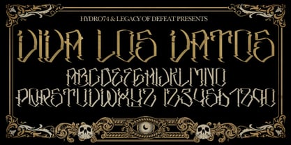
- New Lincoln Gothic BT by Bitstream,
$50.99New Lincoln Gothic is an elegant sanserif, generous in width and x-height. There are twelve weights ranging from Hairline to UltraBold and an italic for each weight. At the stroke ends are gentle flares, and some of the round characters possess an interesting and distinctive asymmetry. The character set supports Central Europe, and there are three figure sets, extended fractions, superior and inferior numbers, and a few alternates, all accessible via OpenType features. Back in 1965, Thomas Lincoln had an idea for a new sanserif typeface, a homage of sorts, to ancient Roman artisans. The Trajan Column in Rome, erected in 113 AD, has an inscription that is considered to be the basis for western European lettering. Lincoln admired these beautiful letterforms and so, being inspired, he set out to design a new sanserif typeface based on the proportions and subtleties of the letters found in the Trajan Inscription. Lincoln accomplished what he set out to do by creating Lincoln Gothic. The typeface consisted only of capital letters. Lincoln intentionally omitted a lowercase to keep true his reference to the Trajan Inscription, which contains only magiscule specimens. The design won him the first Visual Graphics Corporation (VGC) National Typeface Competition in 1965. The legendary Herb Lubalin even used it to design a promotional poster! All this was back in the day when typositor film strips and photo type were all the rage in setting headlines. Fast forward now to the next millennium. Thomas Lincoln has had a long, illustrious career as a graphic designer. Still, he has one project that feels incomplete; Lincoln Gothic does not have a lowercase. It is the need to finish the design that drives Lincoln to resurrect his prize winning design and create its digital incarnation. Thus, New Lincoln Gothic was born. Lacking the original drawings, Lincoln had to locate some old typositor strips in order to get started. He had them scanned and imported the data into Freehand where he refined the shapes and sketched out a lowercase. He then imported that data into Fontographer, where he worked the glyphs again and refined the spacing, and started generating additional weights and italics. His enthusiasm went unchecked and he created 14 weights! It was about that time that Lincoln contacted Bitstream about publishing the family. Lincoln worked with Bitstream to narrow down the family (only to twelve weights), interpolate the various weights using three masters, and extend the character set to support CE and some alternate figure sets. Bitstream handled the hinting and all production details and built the final CFF OpenType fonts using FontLab Studio 5. - Iowan Old Style BT by Bitstream,
$40.99Iowan Old Style was designed for Bitstream in 1990 by noted sign painter John Downer. Iowan Old Style is a hardy contemporary text design modeled after earlier revivals of Jenson and Griffo typefaces but with a larger x-height, tighter letterfit, and reproportioned capitals. Iowan Old Style Titling was designed by John Downer and added to the Iowan Old Style family in 2002. The cap-only character set includes several ornaments and fleurons, broadening the appeal and functionality of the typeface family. Iowan Old Style was originally designed for Bitstream in 1990 by Downer, a noted sign painter. Iowan Old Style is a hardy contemporary text design modeled after earlier revivals of Jenson and Griffo typefaces but with a larger x-height, tighter letterfit, and reproportioned capitals. Expert and old style figure font sets were added in 2000. - Oz Handicraft BT WGL by Bitstream,
$50.99Oswald Cooper is best known for his emblematic Cooper Black™ typeface. Although he was responsible for several other fonts of roman design, Cooper never drew a sans serif typeface. But that didn’t stop George Ryan from creating one. Ryan saw a sans serif example of Cooper’s lettering in an old book and decided that it deserved to be made into a typeface. Ryan’s initial plan was to make a single-weight typeface that closely matched the slender and condensed proportions of the original lettering. While the resulting Oz Handicraft™ typeface proved to be very popular, Ryan was not satisfied with the limited offering. So, between other projects – and over many years – Ryan worked on expanding the design’s range. The completed family includes light, semi bold and bold weights to complement the original design, plus a matching suite of four “wide” designs, which are closer to normal proportions. Fonts of Oz Handicraft include a Pan-European character set that supports most Central European and many Eastern European languages. - DIY One - Unknown license

- Ibis MF by Masterfont,
$59.00 - SP Isis by Remote Inc,
$39.00They say the Nile has many secrets and she was the most sacred of them all. Isis. I met her in a small tavern outside of Edfu, hidden like a jewel between Luxor and Aswan. I had journeyed to Egypt to study the mating habits of homosexual hippos. I had no idea it was the journey that would teach me the true nature of love. - Ivy Tiles by Aga Silva,
$9.50 Ivy Tiles was designed as a set of 62 seamless, endless patterns accompanied by font map(s). They well might be a base for designing your own wallpapers, textiles, glass wall opaque foil privacy screens or even wooden fancy trellises - the choice is yours :) The font features simple, fancy, intricate patterns in three variants (Fill, Outlines and Stencil). - Outlines were designed with an idea of serving as an unobtrusive pattern on its own, or as a playful addition to the Fill pattern. - Fill pattern was designed to give more statement to Outlines, which in some cases may be too subtle for the job you have to be done. - Stencil has the most robust shapes. I have thrown this one in just in case you might want to do some DIY stencils. You may also use this file as a starting point for some CNC cut fancy trellis, however please do match pattern to the cutting method (ie. CNC, bolt cutter etc.) to the pattern and the material you intend to cut. -By overlaying Outlines & Fill (or Stencil & Fill) and manipulating those two layers you may get “more flat” or “more 3D” look. Have fun! Note: Please be aware that you may need to prepare those patterns in order to work with them in CAD-CAM or if you intend them for bolt cutter etc.
 - Iris Hand by Ingo,
$48.00 The ballpoint pen woman’s handwriting As the name suggests — the Iris’ Hand is a woman’s personal handwriting, written with a ballpoint pen. Iris’ Hand is an amazing font — almost indistinguishable from “real” handwriting. Thanks to the over 200 different ligatures and stylistic alternates the typeface is extremely lively and varied. The ballpoint pen has its own characteristics, which are clearly expressed in this font. The stroke is not always uniformly thick. Sometimes only a delicate, thin line is created. Often it breaks off suddenly and leaves a gap. In addition to the normal version, there is also a light and a bold version. Handwriting is sometimes written more or less slanted. So does Iris’ Hand. The normal version is only slightly slanted. But there is also an oblique version that is significantly more inclined by 20°, which makes the script appear more regular and somehow feminine. The Iris’ Hand is also available as a variable font!
 - Henry VII by Greater Albion Typefounders,
$15.00 Henry VII draws it's inspiration from an inscription in Westminster Abbey dedicated to the memory of His Late Majesty of the same appellation. However, it is also in large part in the best tradition of 19th and 20th century Tudor revival. The inscription consisted wholly and completely of Capital Letter forms and we have 'imagined' all the rest in similar style, so Henry VII is very much a Mock Tudor work. Never the less, we feel it is great fun and ideal for lending an aire of 'Olde England' to any piece of design. Best used with 'Greensleeves' playing ever so softly in the background!
 - Magic Ivy by Anmark,
$18.00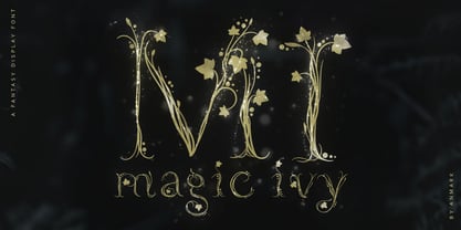 I’m pleased to introduce my decorative font Magic Ivy. Magic Ivy is a fantasy font to add a touch of magic to your designs! Unique uppercase letters are ideal for your wedding monograms and logos. Use this botanical font for wedding invitations, branding, packaging, magazines, florist shops, social media, restaurant menus, greeting cards, headers, poster, fabulous book cover and many more. Magic Ivy comes with uppercase, lowercase, numerals and punctuation.
 - Eurotypo SII by Eurotypo,
$18.00 Eurotypo SII is a sibling of our Eurotypo Sans family and is composed of two Expanded weights and six Condensed styles. Each font of Eurotypo SII contain 359 glyphs and advanced typographical support with OpenType features such as ligatures, discretional ligatures and case-sensitive forms. It also contain diacritics for Central European languages. All aspect of readability and accurate kerning were carefully controlled.
 - Iki Mono by CAST,
$45.00 Iki Mono is a multifaceted monospaced typeface designed for publishing and coding. Its sans serif structure displays some letterforms (as well as a degree of contrast) that are reminiscent of 19th-century grotesques, while in the non-oblique versions the letters have been very slightly slanted leftwards. Like typewriter typefaces Iki Mono has to cope with the limitations of a width system that forces shapes into a specific space. This extensive type family of forty weights and styles – from Compressed Thin to ExtraExpanded Bold, including their slanted versions – takes its name ‘Iki’ from the Japanese word for breath.
 - Poison Ivy by Hanoded,
$15.00 Poison Ivy is a messy, scrawled font. It looks like the glyphs have been etched by an unsteady hand. Poison Ivy is ideal for use in books, albums and posters. Comes with a witches' kettle full of diacritics.
 - Iris MF by Masterfont,
$59.00 - Zone23_Two Kinds of Love III - Unknown license

- Enlisted Stencil JNL by Jeff Levine,
$29.00 An unsold 1973 TV pilot for the series “Catch 22” (based on Joseph Heller’s 1961 book and the subsequent 1970 movie) had its title hand lettered in an extra bold stencil type style. Heller coined the phrase as a satire on absurd military rules and bureaucracy. Although the show’s title provided only five characters to work with, there was enough inspiration there to create the military styled Enlisted Stencil JNL, which is available in both regular and oblique versions. According to Wikipedia: “A catch-22 is a paradoxical situation from which an individual cannot escape because of contradictory rules or limitations.”


