10,000 search results
(0.034 seconds)
- Dancing Brush by Letterara,
$16.00 Dancing Brush is a strong original handwritten font with a unique feel. Natural and elegant, cursive, legible script font which can be used on a wide variety of designs such as headlines, titles, headings, logos, branding, posters, books, and any other creative design. It will add a unique spark to any design project that you wish to create! This font is PUA encoded which means you can access all of the amazing glyphs and ligatures with ease!
 - Asutenan by Letterara,
$12.00 Asutenan is a strong original handwritten font with a unique feel. Natural and elegant, cursive, legible script font which can be used on a wide variety of designs such as headlines, titles, headings, logos, branding, posters, invitations, books, and any other creative design. It will add a unique spark to any design project that you wish to create! This font is PUA encoded which means you can access all of the amazing glyphs and ligatures with ease!
 - Espuma Pro by Mint Type,
$- Espuma Pro is a soft and friendly humanist sans-serif font family with strong calligraphic aftertaste. Presented in 7 weights, with true italics each, it features the traditionally rich language support, small caps, 6 sets of figures and a bunch of ligatures. Its delicate flavor is suitable for brands that wish to communicate friendliness and openness. This typeface is especially good for FMCG and packaging, but it can be used virtually anywhere thanks to its extreme legibility.
 - Australia Handwritten by Letterara,
$14.00 Australia Handwritten is a strong original handwritten font with a unique feel. Natural and elegant, cursive, legible script font which can be used on a wide variety of designs such as headlines, titles, headings, logos, branding, posters, invitations, books, and any other creative design. It will add a unique spark to any design project that you wish to create! This font is PUA encoded which means you can access all of the amazing glyphs and ligatures with ease!
 - Triump Rough by Latinotype,
$20.00 The Triump Rough typeface comes with 2 different subfamilies: Blur, a soft, delicate font with a vintage and hipster feel that gives your design a breath of fresh air; and Rock, a strong, hard font in upper and lower case well-suited for high-impact headlines. This version provides a wide variety of OpenType features, such as ligatures, alternates and catchwords as well as a series of ornaments and extras, which help give your artwork a different look!
 - Worker by Ndiscover,
$29.00 Worker is a versatile family of geometric fonts with a sturdy industrial feel. It has a vintage flavor and conveys a professional and technical look. It has 5 styles with matching slants and a generous language support. Worker works very well in branding and headlines, but also renders peculiarly well in short strings of text. This design has great personality having the power to create a whole universe of meaning resorting only to a few letters.
 - Sardo by SD Fonts,
$34.00 Not serif, nor sans, partly soft, partly crude, but highly individual. Sardo comes with a vivid slanted look resulting from the contrast of its common classic stroke difference and straight thin serifs, adding a rigid component to its appearance. Thus Sardo shows a strong character projecting a huge amount of individuality. A new display font made to draw attention where classic serifs and sans serifs appear just dull. So please meet Sardo, a cosy wild cat showing Sharpe claws.
 - Longshanks by Mysterylab,
$21.00 Longshanks is a condensed serif display font with a low waist, blade-like strokes, and other unusual detailing. This font features a medium-low x-height and works very well at larger display sizes. It's an excellent choice for any headline, banner, or title that would benefit from an old-world, historical, fantasy, magic, or sword & sorcery vibe. It also harks back to the metallic foil stamped type treatments from 1980s – 1990s romance novel book cover design. The offbeat features are subtle enough to leave this font with a very high degree of legibility in spite of its strong and dynamic treatment of certain serifs and finials. The namesake for this typeface is King Edward I of England, whose nickname was Edward the Longshanks.
 - Piano Keys by Funk King,
$10.00 Piano Keys is a musically-inspired font. It can be used for commercial as well as educational projects. In other versions, I tried to accurately replicate the pattern of black and white keys across the character set. Of course when used, the randomness of text and characters often produced less than realistic results when needed. This version allows black and white keys to be accurately arranged, if desired.
 - Fonty by RodrigoTypo,
$29.00 Fonty, inspired by Spiro, is a very gestural typography special for titles. It contains Regular, Extrude and Spring, with which you can further enhance the message! I hope you enjoy it!
 - Ouders by Garisman Studio,
$10.00 Introducing Ouders - Stencil & Regular Font A display font that has a strong and bold look. This font is made by hand so it looks natural and very suitable for vintage and rustic theme. Perfectly made to be applied especially in logos, and the other various formal forms such as invitations, labels, magazines, books, greeting/wedding cards, packaging, stationery, novels, labels or any type of advertising purpose. By combining both styles (stencil and regular) you will create a single design with an old style that is perfect! That's why you have to use this font. If you like the previous styles, you are right to use this font!
 - Uppercut Angle by Delve Fonts,
$39.00 Joachim Müller-Lancé's Uppercut is a rather sporting fellow, originally developed for the Krav Maga training center of San Francisco (Krav Maga is a simple and efficient self-defense system that has become equally popular in Hollywood and with law enforcement). Joachim has spent several years training, hitting things and people whenever he needs a break from kerning. Uppercut can be seen on the school's t-shirts and other articles. Despite bearing the same moniker as an upwards punch to the chin, the name actually fell together quite naturally as Uppercut is an all uppercase typeface, and the word "cut" is also historically used to describe a type style in hot metal type. For this slanted look, "Angle" felt just right (with thanks to Mia McHatton). The design idea sprang from pencil sketches for the center's new identity. Uppercut's shapes are not calligraphic or handwritten, more like lettering seen in comics or sports logos. Its brush movements are imaginary, not too literally brushy. During development, details were simplified and reduced until a bit of a cut-paper feel emerged, but more fluid like writing. The shapes are economical and efficient; simplicity makes the font versatile, holding up in small as well as big sizes. Uppercut is decidedly analog, muscular but not bulky, with the fluid but determined movements of a boxer or martial artist - not theatrical but powerful, fast, confident and dynamic. Well... it has punch. In the proportions, there is emphasis on a strong upper edge "keeping its guard up", while several stems protrude downward, giving the impression of leaping or being "light on the feet". Use Uppercut to pick up the pace, add snap, verve and drive - on movie posters for action and adventure, to advertise your dojo, rumble or prizefight, racing team or tuning shop, or invite friends to your barbecue with old time rock'n'roll and homemade hot pepper sauce.
 - Spitzkant by Julien Fincker,
$29.00 About the design Spitzkant is a serif typeface family that is characterized by strong contrasts. Pointed, sharp serifs and edges contrast with round and fine forms, making it very individual and expressive. This makes it particularly suitable for branding, editorial, packaging and advertising. The high-contrast display version has been complemented by a lower-contrast text version, making Spitzkant in combination suitable for both strong headlines and extensive body text. An allrounder that can be used for many purposes. Features The Spitzkant Head and Text family has a total of 2 optical sizes, 5 weights and 20 styles, from thin to bold and matching italics. With over 850 characters, it covers over 200 Latin-based languages. It also has an extended set of currency symbols and a whole range of open type features. For example, there are alternative characters as Stylistic Sets, Small Caps, automatic fractions and many other features. Ligatures Especially the extensive selection of ligatures (standard and optional) is a special feature which was an important part during the design process. With over 95 different ligatures there are many possibilities to give headlines and logos an individual touch. Get the Variable Font here: https://www.myfonts.com/fonts/julien-fincker/spitzkant-variable/
 - OBITRUK by Twinletter,
$17.00 Meet Obitruk, a powerful display font with a superhero style that will take your projects to a new level. Whether you’re working on a movie, a game, or a design with a strong and bold theme, Obitruk is the perfect solution. With its strong, bold appearance, this font exudes confidence and draws attention. Distinctive superhero style adds fun and adventure to your creations, making them stand out from the crowd. Obitruck not only looks amazing but is also packed with features that will enhance your designs. Ligature and alternative characters provide flexibility and creative possibilities, allowing you to customize and add unique touches to your typography. Plus, multilingual support ensures your message is accessible to a global audience. Show the power of Obitruk and bring your projects to life. Get ready to make a bold statement with this dynamic font that embodies strength, thickness, and a fearless spirit. Improve your designs with Obitruk and leave a lasting impression on your audience. What’s Included : File font All glyphs Iso Latin 1 Alternate, Ligature Simple installations We highly recommend using a program that supports OpenType features and Glyphs panels like many Adobe apps and Corel Draw so that you can see and access all Glyph variations. PUA Encoded Characters – Fully accessible without additional design software. Fonts include Multilingual support
 - Gemsea by Product Type,
$17.00 With Gemsea Fonts, you open the door to a world of limitless creativity. A display theme that celebrates the power of the ocean, bringing a strong, bold, and fun touch to any of your projects. Gemsea is the perfect solution for projects that require a unique theme. From epic films to stunning games and unforgettable streaming events, this font offers durability and appeal in various languages. Stunning Features: Five different family styles: Regular, Blur, Engrave, Outline, and 3D. This gives you the flexibility to create a variety of nuances in your designs. It supports multilingual so that you can connect with a global audience without restrictions. Gemsea creates not just projects, but unforgettable works of art. Get the Gemsea Font now and bring the magic of the ocean into your designs!
 - We Love Nature Summer Flowers by kapitza,
$79.00 We Love Nature Summer Flowers is a picture font inspired by a late summer visit to an organic flower farm in the south of England. The farm specializes in growing local seasonal flowers for lovely bouquets and arrangements. This picture font features 52 hand-drawn illustrations inspired by these flowers. The contemporary flower illustrations can used on their own or in combination with the other illustrations in the We Love Nature font collection to create striking designs.
 - MFC Arkena Monogram by Monogram Fonts Co.,
$19.95 The source of inspiration for MFC Arkena Monogram is a specimen from the 1917 “Strong’s Book of Designs”. This popular lettering style has been incorporated into numerous film type foundries of the past, but lacked digital permanence. We’ve expanded the original All Capitals glyphset to include smallcaps to make monograms, have added numerals and included unique ornamentation for basic titling typesetting. Download and view the MFC Arkena Monogram Guidebook if you would like to learn a little more.
 - MFC Petworth Monogram by Monogram Fonts Co.,
$19.95 The source of inspiration for MFC Petworth Monogram is a specimen from the 1917 "Strong's Book of Designs". This popular lettering style has been incorporated into numerous film type foundries of the past, but lacked digital permanence. We've expanded the original All Capitals glyphset to include smallcaps to make monograms, and have added numerals and basic punctuation for extended basic typesetting. Download and view the MFC Petworth Monogram Guidebook if you would like to learn a little more.
 - Synthica by Volcano Type,
$35.00 Synthica is the advanced version of a geometrically constructed typeface – designed for a thesis project in summer 2010 in Pforzheim. In the context of electronic music and the profound analysis of its parameters, this typeface is primarly based on a strict modular grid. Additionally, the ascender, descender and the x height had slightly been increased in order to even out a visual difference in size between the glyphs. The name „Synthica“ dervives from a basic principle in electronic sound synthesis. Sinus, triangle and square are some of the basic waveforms in the synthesizers’ oscillator section and were thus used as geometric modules for the grid. The modularity and geometry also derive from different structures of electronic music. The strong emphasis on diagonal lines creates a rhythmic typeface that connotates electronic music patterns with highly recognisable glyphs. The contrast between digital and analog is another basic idea of this typeface: while Synthica Outline has a more synthetic and fragile character, the filled version Synthica Black serves as the analog counterpart.
 - Prêt-à-porter by Latinotype,
$39.00 Prêt-à-porter is a project developed as part of a series of type experiments appearing on the blog ‘Letritas’. Prêt-à-porter is a very expressive friendly font with a handwritten look, smooth curves and strong identity. Its counterforms make it a carefree, wild, cheerful, light and highly readable typeface. This type system consists of two Script families—Contrast and Linear—and a Slab family. The Contrast set works as a complement, providing more elegance and formal refinement. Both Linear and Contrast come in 5 weights plus Ornaments, which can be used as initial and terminal forms since they have been designed for connecting with each letter. Linear and Contrast families include ligatures and the whole font family supports 208 different languages.
 - Bilgres by Azzam Ridhamalik,
$18.00 Introducing Bilgres, a hippie-themed font that combines strong and gentle shapes with rounded edges, giving it a unique and playful style. This bold and wide font is perfect for creating eye-catching designs that stand out, whether you're designing posters, album covers, logos, or social media graphics. With extensive multilingual character support, including Latin Pro, Bilgres is versatile and adaptable to all your design needs. If you're looking to create designs that are both hippie and modern, Bilgres is the font for you. Its distinct and playful style will elevate your designs to the next level, making them pop and catch the eye. Don't wait to try out Bilgres – purchase now and start creating stunning, hippie and groovy designs that will leave a lasting impression.
 - Poppin by Kustomtype,
$20.00 Poppin is a playful font-type that you can comfortably use in all kinds of styles, from modern to old school. A combination of a few names on an old movie poster is what triggered the creation of this font type. Because it had such a strong rock and roll character, I decided to dedicate a font-type to it. The Poppin font is completely hand-drawn and then digitized. It results in being an extremely user-friendly, complete and modern font that you can use in all your graphic applications. Poppin is a font from the subculture that has been updated to a hip and classy font, ideal for eye-catching designs. Poppin comes in 4 styles, regular, bold , round & bold round. Poppin makes everyone smile!
 - Delvona by Great Studio,
$19.00 Delvona is a contemporary serif typeface, retro styled with a strong personality and a soft look. And also its high contrast and very simple and easily recognizable shape make it very easy to read. Delvona was inspired by the serif typography used in editorial headlines in the 80s. Delvona excels in display settings such as headlines, titles, branding projects, Logo design, packaging, magazine titles, advertisements, short or long text.
 - Aesthetic Moment by Mevstory Studio,
$25.00 Aesthetic Moment serif font with medium contrast. Inspired by classic fashion. Carefully designed with a short ascender to give a solid look, also the sharp serif makes the letters look more strong. Aesthetic Moment is a display-type which perfect for a headline, sub-headline, and short body text for magazine, books, fashion, quotes, hipster t-shirt, signboards, logo, and etc. A great choice for a brave concept!
 - Kazootie by Chank,
$99.00 Kazootie was inspired by cut-paper shapes and named after the hand puppet character Rootie Kazootie in a 1950s children's television show. Kazootie is a light-hearted and fun display font with a big, strong voice and crisp confident stride. Best for headlines and larger text in picture books, Kazootie is all caps, but you can type your letters in uppercase or lowercase to access two different variants of the style.
 - Al Chevrola by Aluyeah Studio,
$80.00 Al Chevrola is a dynamic modern sans serif. Strong, with curves and an elegant touch. It is a rounded, geometric near-monoline construction sans serif typeface with display details which gives it modern, simple, elegant, chic, cool, and strong vibes. Each style and character looks amazing in large headlines. Al Chevrola works great in branding, logos, magazines, packaging. FEATURES: 4 Weight OpenType support Easy to use (with special combination) Multilingual support (15 languages) PUA Encoded Thanks for checking out Al Chevrola. I really hope you enjoy using it! If you have any questions I'd be more than happy to answer them, just send me a message.
 - Antipod by Octotypo,
$18.00 Antipod is a versatile sans serif family designed with the stroke of the nib in mind. The early sketches were made with a reed pen and then stabilised to keep the specific junctions between verticals and horizontals shapes. The design of the letters constantly balance between curves and inner sharp corners and the contrast of one is cohabiting with the other to give Antipod its specific design. When Antipod is set at small size its specific are almost unnoticeable but the text has a very particular type colour. And this specificity is useful when setting texts for display, to give your design a strong personality. Each weight includes a set of extra glyphs to make your text settings more singular. It also comes with extended language support, tabular figures, fractions and more. It is suited for any work editorial design, signage, corporate as well as onscreen applications.
 - Guitarist by SAMUEL DESIGN,
$19.00 Guitarist, a symbol of freedom and self-confidence. A good font must be enduring and of high quality. This font is simple in shape, and at the same time pays attention to changes in thickness, and strives to be classic and timeless. This font is great for music, fashion, magazines and is very eye-catching. GUITARIST can be matched with various fonts, and the visual effect is very strong. This font is modern and elegant with high-quality details. Designers like listening to jazz very much, looking for freedom, passion, independence, and change in jazz, and integrating these spirits into this font. I hope this font will help your brand be more visible.
 - Adelphi PE by Rosetta,
$70.00 Adelphi is a geometric sans, redefined for the northern side of the English Channel. Typographic modernism was a late arrival in Britain — due partly to the Second World War and to the strong local type tradition. This delay provided for fruitful divergence, thus modernism was not adored in quite the same way as it had been in Germany and central Europe. It was instead rethought and repurposed against the backdrop of the bleak British weather and postwar social reform – a continental fashion statement reshaped into a more humanist variant. Likewise, when crafting Adelphi, Nick Job reimagined the constraints that defined the geometric sans as a genre. Whereas other typefaces seem overly bound by the rules, Adelphi feels relaxed and approachable. Elementary square and circular shapes are merely implied. A keen observer may notice that the uncomplicated letterforms occasionally reveal a subtle naïveté associated with early Grotesques. Brunel’s bridges and Harry Beck’s tube map spring to mind alongside the Bauhaus and Futura. But Adelphi is by no means nostalgic! It is a contemporary, comprehensive, and durable system with a pragmatic set of features. These include a wide array of weights, ‘uniwidth italics’, and variable extenders that go from tall and flat in Adelphi Text to short and sharp in Adelphi Display, with default Adelphi standing midway between these two extremes. You can set the extenders to your preference in the all-inclusive variable font or use one of the three static fonts that come packed together, priced as a single font. The pan-European support for Latin, Cyrillic and Greek scripts already makes for a vast character set, but Adelphi takes things a step further by including alternate glyphs to satisfy the DIN1450 legibility norm, a range of ordinals that can be used to create specialist compositions in all three scripts and two kinds of fractions and arrows. Play with the alternates or use it as-is. Either way, this understated beauty will carry you through.
 - Architype Van der Leck by The Foundry,
$50.00 Architype Konstrukt is a collection of avant-garde typefaces deriving mainly from the work of artists/designers of the inter-war years, whose ideals have helped to shape the design philosophies of the modernist movement in Europe. Due to their experimental nature character sets may be limited. Architype Van der Leck originates from the lettering that Bart Van der Leck created for ‘Flax’ magazine in 1941. The letterforms‘ restricted shapes and abstract, stencil-like forms reflect the strong geometric language of De Stijl and show influence from his abstract paintings.
 - Gemini Type Fontpack by Chank,
$49.00 INTRODUCING THE GEMINI TYPE FONTPACK, an industrial-strength OpenType font bundle inspired by and optimized for dimensional type. Chank Co is proud to introduce the new “Gemini Type Fontpack,” a collection of ten fonts available for use on your desktop computer or web pages, but also optimized for use as exterior cast-metal signage in bronze or aluminum in collaboration with Gemini, a family-owned industry leader in the wholesale manufacture of dimensional letters, logo and plaques based in Cannon Falls, MN. Gemini collaborated with Chank Co to assemble a line of fonts that would work well as dimensional, cast-letter signage for use on the sides of buildings, in stores, and other public spaces. The fonts included in the “Gemini Type Fontpack” are reinterpretations of previous Chank Fonts, now optimized for dimensional signage display, but then also repackaged and presented for your use as an OpenType desktop computer font collection: GT-Adrianna DemiBold GT-Adrianna Bold GT-Adrianna ExtraBold GT-Fairbanks GT-Forward Thinking GT-Hydropower ExtraCondensed GT-Kegger GT-Shopaganda GT-Shopaganda Condensed GT-Timeless Geometric. This is a multi-purpose collection of heavy-lifting fonts to convey your message strong and clearly, full of legibility and clarity, but also displaying personality and distinction. You can purchase and download these fonts in OpenType format for your desktop computer right now via MyFonts. Get it today and you'll also get a great introductory special sale price. These exclusive typefaces are also available as dimensional letters, manufactured by Gemini in bronze or aluminum, from 6" tall up to 18" tall, with a variety of finish options, for use in public signage and wayfinding systems. Gemini manufacture their products in 20 plants through out the US, Canada and Mexico, and all their products are backed by a lifetime guarantee. Chank Co is excited to offer these ten strong, industrial font designs in durable cast metal format via Gemini. ----- More about the fonts in the Gemini Type Fontpack: GT-Adrianna DemiBold, Bold, and Adrianna ExtraBold Clear, invisible, no-nonsense, multi-purpose. A versatile sans-serif heavy-lifting font family. GT-Fairbanks Vintage, silent film, speedball, old-timey, old-fashioned, retro. Based upon the lettering in the 1914 silent film, “The Good Bad Man.” GT-Forward Thinking Futuristic, semi-serif, clean, distinctive, contemporary, idiosyncratic. A font for tomorrow and the future. GT-Hydropower ExtraCondensed Extra-condensed, compressed, strong, rigid and concise. GT-Kegger Strong, sporty, collegiate, athletic. Nothing says “GO TEAM” quite like a big, bold slab-serif font. GT-Shopaganda and GT-Shopaganda Condensed Industrial, geometric, constructivist, propaganda, oh there’s so much to love about the strength and clarity of these two fonts. Based on Chank’s Liquorstore and Nicotine fonts, which have been married and unified here, with a few new twists and turns to their letterforms. GT-Timeless Geometric Bauhaus, anyone? The geometric and minimalist alphabet here is about as clean and straight-forward as a semi-condensed sans can get. ----- All of the fonts in this package are available individually, or save money when you purchase all ten of them as a collection. Download this digital font package from MyFonts today and you'll receive both OpenType and TrueType formats in your download for your desktop computer. Webfont format is also available. (If you'd like to use these fonts as cast-metal letters for exterior, architectural purposes, visit the Gemini website to learn more about how you can find a signage retailer near you.)
 - DeBorstel Brush Pro by Ingo,
$49.00 A personalized cursive written with the pointed brush The strange name of this font means nothing other than ”brush,“ but only the Dutch understand it. The typeface is spirited, amusing and flashy. I made the handwritten original of DeBorstel Brush quickly and without interruption with a pointed brush. In the capitals, DeBorstel Brush appears to be almost too balanced for handwriting. In contrast, the lower case letters are intentionally very individual and uneven. A bit more life is added to the typeface with ligatures activated which are constructed with alternative letter forms — and as a result, a number of problematic letter-combinations are improved. And if this typeface is still not lively enough for you, the additional alternative character forms a e g i j l n o s t u z are available with the Open Type-Function ”Discretional Ligatures“. DeBorstel Brush is suitable for all European languages. It includes ”Unicode Latin Extended-A,“ for Central and Eastern Europe incl. Turkish, and even Cyrillic and Greek, too.
 - Adellia Heart by Rotterlab Studio,
$15.00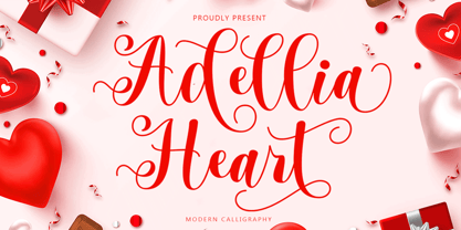 Adellia Heart is a modern calligraphy font created especially for Spring. Adellia Heart is great for unique branding, photo overlays, watermarks, greeting cards, posters, business cards, invitations, weddings, photography, fashion, clothing, letters, stationery, etc. This font is PUA encoded which means you can access all the glyphs and sweeps easily! Thank You
 - Geodot by Okaycat,
$24.50 Geodot is subtly faded with a bold graphic appearance. Inspired by atomic structure, it is defined by a harmonious arrangement of tiny spheres. Since the appearance varies widely depending on scale, this font has many possible applications. Geodot is extended, containing West European diacritics & ligatures, making it suitable for multilingual environments and publications.
 - Picadilly by Borutta Group,
$- Picadilly family was made after my short visit in London and huge impression of Edward Johnston works. I've designed family of 20 modern typefaces with strong personality.
 - Bushwick JNL by Jeff Levine,
$29.00 Bushwick JNL and Bushwick Oblique JNL are modeled from a wood type sanserif that has a strong resemblance to Franklin Gothic, yet keeps its own distinct personality.
 - Valor by Tim Rolands,
$29.00Valor is a display face inspired by uncial forms seen through a modern roman lens. The result is a type with strong contrast between thick and thin strokes and a highly geometrical construction that even so retains a hint of the charm of hand-written uncial letters. A number of alternate forms and ligatures add to the personality of the face and offer flexibility in usage. Best suited for large titling work such as in posters or book and magazine covers. - Windsor by URW Type Foundry,
$35.99 Windsor is an unusual design cut by Stephenson Blake in 1905. Windsor is a bold face with heavy rounded serifs and strong diagonal stress. Capitals M and W are widely splayed, P and R have very large upper bowls. The Lowercase a h m and n of the Windsor font have angled right hand stems, e has an angled cross-stroke. The overall effect is one of friendliness and warmth. Use the Windsor font in advertising, on posters and for general display work.
 - Windsor by Monotype,
$40.99 Windsor is an unusual design cut by Stephenson Blake in 1905. Windsor is a bold face with heavy rounded serifs and strong diagonal stress. Capitals “M” and “W” are widely splayed, “P” and “R” have very large upper bowls. The Lowercase “a”, “h” “m” and “n” of the Windsor font have angled right hand stems, “e” has an angled cross-stroke. The overall effect is one of friendliness and warmth. Use the Windsor font in advertising, on posters and for general display work.
 - Equip Slab by Hoftype,
$49.00 Equip Slab, a new hardline, serif dominated face designed on the same geometric base as the rest of the Equip family. With its clarity it appears strong, imperative and straight forward. The Equip Slab family comprised 16 styles and is well suited for ambitious typography. It comes in OpenType format with extended language support. All weights contain ligatures, proportional lining figures, tabular lining figures, proportional old style figures, lining old style figures, matching currency symbols, fraction- and scientific numerals and matching arrows.