8,503 search results
(0.022 seconds)
- Arabetics Detroit by Arabetics,
$39.00 Arabetics Detroit is a monoshape font family with a fixed single shape per each Arabic Unicode character. This font family supports all Arabetic scripts covered by Unicode Standards 6.1, and the latest Arabic Supplement and Extended-A Unicode blocks, including support for Quranic texts. It includes three weights: regular, bold, and light, each of which has normal and left-slanted (Italic) versions. The design of this font family follows the Arabetics Mutamathil style design principles utilizing varying x-heights and no glyph substitutions. The Mutamathil type style was introduced by the designer more than 15 years ago. The Arabetics Detroit font family includes all required Lam-Alif ligatures in addition to all soft vowel diacritics (harakat), which are selectively positioned with most of them appearing on similar high and low levels—top left corner—to clearly distinguish them from the letters. The Tatweel or Kashida lengthening character is a zero-width glyph.
 - Pasto by Antipixel,
$15.00 Pasto is a fun and charming display type family of two styles with four weights each. 'Print' is a textured irregular stamp style, and 'Sharp' is a straightforward soft-edged type with clean strokes. It is clean, playful, and expressive, with a lightweight structure and fairly aired inner space. Pasto is perfect for display use and intended for medium and large settings. Still, it can be used in smaller point sizes for short sentences or words, providing a softer, delicate look. Pasto has three alternating alphabets that slightly differ from one another. Thanks to the Contextual Alternates, these alphabets are automatically replaced to avoid the same letterforms and textures appearing next to each other, creating a more spontaneous look when typing. This OT Feature is available for all the Sharp and Print styles. Some of Pasto's features are ligatures, stylistic alternates, numerators, fractions, special characters, currency symbols, and a glyph coverage that ensures extended language support.
 - Secca by astype,
$42.00 Secca is a fresh and versatile typeface series. With its workhorse qualities, Secca is perfectly suited for a wide range of applications - especially where legibility and economy are important factors. Secca is rooted in the tradition of early German Grotesk typefaces, but is tailored for the needs of today, with a wide language support and many typographic features and extras. » pdf specimen « The core family comes in nine weights from Thin to Ultra Black plus another three Hairline weights - each with italics, small caps and italic small caps. While the weights from Light to Bold perform well in text sizes, the more extreme styles give extra freedom for Headlines & Signage. For setting tables and charts, Secca offers tabular figures, fractions, currency signs and mathematic operators which share the same fixed width throughout the entire range of weights. This special feature is called “weight duplexing” and is a time saver for designers of annual reports and other figure-heavy texts.
 - Charcuterie by Laura Worthington,
$20.00 Charcuterie is a collection of ten distinct yet related typefaces, and three ornamental typefaces. Used individually or blended with other fonts from this large family, elements of Charcuterie are well suited for headlines, titling, logos, display, packaging, signage, or advertising. The entire collection lends itself to experimentation, acting as a complete and complex toolbox, enabling you to work in extraordinarily varied ways. Each Charcuterie typeface has different, yet complementary features. Engraved features 135 swash alternates and Cursive boasts 275. Frames offers a broad and endless approach to creating frames of any proportion and style. Catchwords features nine different styles for a total of 82 glyphs. 100 Ornaments include a vast array of arrows, brackets, rules, icons, ribbons and more. See what’s included! http://bit.ly/2c5OzoK *NOTE* Basic versions DO NOT include swashes, alternates or ornaments These fonts have been specially coded for access of all the swashes, alternates and ornaments without the need for professional design software! Info and instructions here: http://lauraworthingtontype.com/faqs/
 - Senohraby by Spurnej Type Foundry,
$19.00 Senohraby is an uppercase display typeface inspired by the old sign at Senohraby train station that is now slowly chipping away. Senohraby is available in three interconnected styles that freely various ages of the sign. “Paint” is a more or less preserved font written with a flat brush and featuring slight scratches and errors. The other styles, “Dirt” and “Trash”, follow up on this style and are increasingly marked by age, damage and erosion... In each style one can use simple alternation with lowercase letters, context-based alternation to eliminate repetition of adjacent characters, and a broad range of language support. As a result, each letter offers six variations that can be combined. These can be used as another alternation within a single word or as different bold weights. As a bonus, a fourth, additional style named “Crap” is freely available and as the name implies, it contains a wide array of various impurities.
 - Garota Sans - Personal use only

- Quillia by Create Big Supply,
$15.00 Embrace the expressive beauty of Quillia, a remarkable Signature Handwriting Script Font that exudes elegance and authenticity. With its bold and natural signature style, Quillia adds a touch of sophistication to your designs. This versatile font features both uppercase and lowercase letters, numbers, and punctuations, ensuring flexibility for various design projects. Its multilingual support enables seamless communication across different languages, while the PUA encoding allows easy access to special characters and ligatures. Download Quillia Signature Handwriting Script Font now and elevate your projects with its distinctive handwritten charm.
 - Alessandra by Lunas Type,
$19.00 Introducing Alessandra, a stunning script font inspired by the elegance of Victorian style. With its graceful curves and intricate details, Alessandra exudes a timeless beauty that captivates the senses. This font is adorned with exquisite ending and beginning swashes, adding a touch of refinement and sophistication to every letter. Perfectly suited for various design needs, Alessandra shines brightest on wedding invitations, greeting cards, and any project that calls for a touch of romance and charm. Let Alessandra elevate your designs with its enchanting allure, bringing a sense of elegance and grace to your creative endeavors.
 - Wesker by SimpleType Studios,
$15.00 Introducing our Wesker - Sans Serif Display Font Collection—a stunning blend of style, versatility, and impact. With 15 fonts, 5 weights, and 3 widths to choose from, your designs will shine like never before. Each font is meticulously crafted to leave a lasting impression, offering unparalleled elegance and precision. Whether you're creating logos, packaging, or posters, our collection empowers you to make a bold statement. Don't settle for ordinary—unlock the power of extraordinary typography. Order our Sans Serif Display Font Collection today and elevate your designs to new heights.
 - Sabrina Destiny by Timurtype,
$14.00 Introduced by Timurtype Studio! Sabrina Destiny is a Handwritten Script Font This font Introducing the epitome of elegance and refinement, our exclusive luxury handwritten script font. Every stroke, meticulously crafted with precision and passion, exudes an aura of opulence and sophistication. Elevate your design projects to new heights as this exquisite typeface seamlessly blends the timeless charm of handwritten artistry with a touch of modern luxury. Sabrina Destiny Font also supports multilingualism. Enhance your designs with our original fonts, feel free to comment or provide feedback, Enjoy the fonts 😊 Thank You
 - Abor by Nirmana Visual,
$24.00 Introducing our sophisticated modern serif ligatures font, crafted to add an extra touch of elegance and sophistication to your designs. With its intricate ligatures and unique design, this font is perfect for creating eye-catching headlines, logos, and branding materials that demand attention. Our modern serif ligatures font features a harmonious balance of clean lines and curved shapes, creating a timeless and sophisticated aesthetic that is sure to elevate your designs. The beautifully crafted ligatures add an extra level of refinement, seamlessly connecting letters to create a stunning visual display.
 - Arona by Peninsula Studioz,
$4.99 Arona is a modern geometric sans typeface tailored to elevate all your design projects, from UI and app design to web design, branding, posters, magazines, infographics, packaging, and beyond. With its sharp yet rounded strokes, Arona effortlessly radiates both professionalism and friendliness. Boasting 12 font weight variations, Arona excels in delivering a multi-level content hierarchy in your design, ensuring your value is communicated clearly and easily. Key features: Extended language support Small capitals Mathematical symbols Currency symbols Alternate stylish letters Directional arrows Fraction support Special ligatures Numerator and Denominator support
 - Maduratna by Nirmana Visual,
$22.00 Introducing our latest modern font collection, perfect for elevating your designs to the next level. Our collection features sleek and versatile typefaces that are ideal for a range of projects, from branding and advertising to editorial design and web design. Our fonts are carefully crafted to provide clean and minimalist lines, bold and stylish curves, and geometric shapes that give your designs a modern and contemporary look. With a range of styles and weights, our fonts are perfect for creating eye-catching headlines, branding materials, and commercial designs.
 - Morgan Flower Psychedelic by Nirmana Visual,
$24.00 Inspired by Psychedelic Poster Design, This font is perfect for those looking to add a unique and mind-bending touch to their designs. With its bold and fluid lines, this font will harmony for a diversity of design projects, including logos & branding, social media posts, advertisements & product designs. So why settle for boring fonts when you can use our Morgan Flower Psychedelic Typeface to elevate your designs to the next level? Give your projects a groovy touch and let your imagination run wild with this one-of-a-kind font.
 - Rock Attack by Letterara,
$26.00 Introducing "Rock Attack," a bold and impactful serif font that commands attention and makes a powerful statement. With its strong and confident letterforms, this font is perfect for adding a touch of authority and professionalism to your designs. Whether you're working on editorial layouts, branding materials, or even YouTube thumbnails, Rock Attack is the ideal choice to captivate your audience and leave a lasting impression. Stand out from the crowd and elevate your designs with the striking elegance of Rock Attack, the font that combines strength and sophistication in perfect harmony.
 - Rodixu by Product Type,
$17.00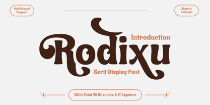 Rodixu is a classic serif font that exudes elegance and sophistication. Each character is carefully crafted with clean lines and balanced proportions, making it perfect for any project that requires a refined touch. Its timeless appeal makes it suitable for anything from editorial layouts to branding materials. With its stylistic alternates and ligatures, Rodixu offers a range of design possibilities and can elevate any project to the next level. Whether you’re creating a logo, website, or print materials, Rodixu is a font that will help you achieve a polished and professional look.
 - Milcone by Letterhend,
$14.00 Introducing Milcone Sans, a versatile variable font designed to elevate your projects with a modern and professional touch. With its 7 weight variations, this font offers flexibility and adaptability to suit any design need. Whether it's for digital or print, Milcone Sans delivers a sleek and contemporary aesthetic that exudes professionalism. Features : Uppercase & lowercase Numbers and punctuation Alternates & Ligatures Multilingual PUA encoded We highly recommend using a program that supports OpenType features and Glyphs panels like many of Adobe apps and Corel Draw, so you can see and access all Glyph variations.
 - Planjer by TypeFaith Fonts,
$10.00 Art deco typography from the Netherlands that summons a thirties vibe for a nostalgic twist on chic lines. Planjer is the work of designer Leon Hulst, and you can see from the layout examples here that nostalgia means ruin, and it has become super cool to use a ruin vibe in retro aesthetics. Yep, there's a touch of class to that worn out look and feel, and the beautiful lines of the typography and numerals show how the barely restrained charisma of art deco can be coupled with the new obsession with all things vintage.
 - Ribka by Craft Supply Co,
$20.00 Ribka - The Elegant Pointed Serif Font harmoniously blends the classic appeal of sharp serifs with an exquisite sense of sophistication. This typeface radiates timeless charm, making it an excellent choice for projects that seek a touch of enduring beauty and grace. Whether you're creating invitations, developing branding materials, or curating editorial content, Ribka seamlessly instills a sense of opulence and distinction into your work. With its precise and pointed serifs, Ribka stands as an emblem of timeless sophistication in the realm of typography, elevating any project with an essence of refinement and exclusivity
 - Barnic Slab by Peninsula Studioz,
$9.00 Barnic Slab is a modern geometric slab typeface tailored to elevate all your design projects, from UI and app design to web design, branding, posters, magazines, infographics, packaging, and beyond. With its sharp slab edges, Barnic Slab effortlessly radiates professionalism and trustworthiness. Boasting 12 font weight variations, Barnic Slab excels in delivering a multi-level content hierarchy in your design, ensuring your value is communicated clearly and easily. Key features: Extended language support Mathematical symbols Currency symbols Alternate stylish letters Directional arrows Fraction support Special ligatures Numerator and Denominator support
 - Belgium Catherine by Almarkha Type,
$25.00 Belgium Catherine – Handwritten Signature Font is a handwritten script font with a Signature Style and classy style, this font is great for your creative projects such as watermark on photography, and perfect for logos & branding, photography, invitation, watermark,advertisements,product designs, stationery, wedding designs,label ,product packaging, special events or anything that need handwritting taste. Belgium Catherine is here to elevate your work to the highest level. Belgium Catherine comes with 2 Style Regular and Slant : uppercase letters, lowercase letters, lowercase , numbers, punctuation, ligature, alternative letters and multilingual support Thank You
 - Mikhael Handwritten by Letterara,
$16.00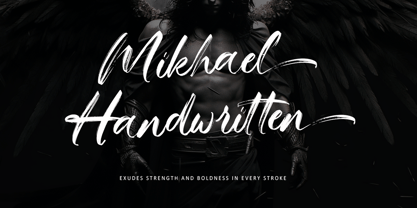 Introducing Mikhael Handwritten, an authentic brush script font that brings a raw and energetic vibe to your designs. With its dynamic strokes and natural brush texture, this font is crafted to make a bold statement in logos, posters, packaging, and various design projects. Its striking appearance and smooth flow make it an ideal choice for conveying a strong and stylish impression. PUA encoding ensures effortless access to all the expressive glyphs. Elevate your projects with Mikhael Handwritten, a font that effortlessly infuses vigor and character into your creative endeavors.
 - Saphile by Craft Supply Co,
$20.00 Saphile – The Epitome of Elegant Sans Serif Elegance in Every Detail Saphile, an elegant sans serif font, stands out with its gracefully angled stem ends and terminals, coupled with high contrast, making it the perfect choice for luxurious designs. A Typeface of Luxury Saphile is more than just a font; it embodies luxury. Its sleek design and high contrast add an opulent touch to any project it graces. Tailored for Luxury Designs Designed with luxury in mind, Saphile elevates the visual appeal of high-end branding, premium packaging, and more.
 - Bontana by Flawlessandco,
$9.00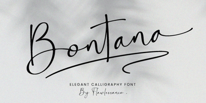 Introducing "Bontana" - An Elegant Calligraphy Font. Elevate your designs with the timeless beauty of "Bontana," an exquisite calligraphy script font that embodies elegance and sophistication. There's some connected letters and some alternates that suitable for any graphic designs such as branding materials, t-shirt, print, business cards, logo, poster, t-shirt, photography, quotes .etc This font support for some multilingual. Also contains uppercase A-Z and lowercase a-z, alternate character, numbers 0-9, and some punctuation. If you need help, just write me! Thanks so much for checking out my shop!
 - Kurdis by That That Creative,
$32.00 Kurdis Varibel Font Family is a modern sans serif family with six widths and five Weights Making 30 Set Styles and of course 10,000 more combinations when considering the Variable options. This Typeface is a real work horse for titles. At its condensed Width it is sophisticated and professional with well considered ink traps that help it really stand out at Large Sizes. the Regular width works well for longer bodies of text on websites or posters and the Wide Styles give an elevated look to your average wide sans serif.
 - Kecumik by IbraCreative,
$17.00 Kecumik, a stunning Glamour Serif typeface, seamlessly blends elegance with modern sophistication. Its graceful letterforms exhibit a harmonious balance of curves and serifs, exuding a timeless allure that captivates the eye. Kecumik’s intricate details and refined strokes contribute to its distinctive personality, making it an ideal choice for projects that demand a touch of glamour and a nod to classical aesthetics. Whether used in editorial design, branding, or luxury packaging, Kecumik’s versatile charm elevates any visual composition, embodying a sense of refined beauty that resonates across diverse design applications.
 - Bluzonir by Typebae,
$15.00 Bluzonir is an exquisite sans-serif font that effortlessly blends elegance and style. Featuring 52 style alternatives and 26 ligatures included in the regular variant, as well as provided separately for ease of use, with no special software needed to access them. Its versatility allows you to create visually stunning designs that stand out. Elevate your projects with the impeccable elegance and style of Bluzonir. What Includes? Character Map Features: Standard alphabet and punctuation Stylistic Alternates and Ligatures PUA Encoded - no special software is needed to access extra characters Multilingual Characters
 - TT Milks by TypeType,
$29.00 TT Milks useful links: Specimen | Graphic presentation | Customization options About TT Milks: The collection of scripts and wonderful decorative typefaces. Initially the idea for TT Milks was to create a collection of fonts to be used for packaging and branding of dairy products. While working on the initial idea, we've tested all possible glyph variations, which resulted in a large decorative designer font family. Thanks to a variety of elements, TT Milks collection has exceeded its initial idea and now offers an unlimited application range. TT Milks type collection includes several subfamilies and consists of 26 typefaces: TT Milks Script subfamily is a satellite to the basic typefaces and features 5 weights. Every typeface of the TT Milks Script subfamily consists of 801 glyphs and supports a lot of OT features: ordn, frac, case, sups, sinf, numr, dnom, tnum, onum, pnum, liga, calt. TT Milks Casual Script consists of two script faces with a different degree of roughness. In TT Milks Casual we've collected 6 typefaces—the unique Black called 900 in three degrees of roughness, and the Bold called 700 featuring three degrees of roughness as well. TT Milks Casual Shadow is a version with broader letter setting and shadow effects. There's a clean shadowed version, three variants of rough typefaces with shadows, and a rough shadowed inline typeface—5 typefaces in total. TT Milks Casual Pie is a special set of typefaces which can be easily combined with each other using different layers. The set of the subfamily includes two basic typefaces—black and inline, and also features a typeface with a clean shadow, a shadowed inline typeface and line typeface. TT Milks Outline completes the collection. It consists of a total of 3 amusing super-display typefaces—outline, outline shadow, and a cow pelt patterned typeface. All typefaces belonging to TT Milks Casual and TT Milks Outline subfamilies contain uppercase letters only, and support tabular numbers and case sensitivity. TT Milks language support: Acehnese, Afar, Albanian, Alsatian, Aragonese, Arumanian, Asu, Aymara, Banjar, Basque, Belarusian (cyr), Bemba, Bena, Betawi, Bislama, Boholano, Bosnian (cyr), Bosnian (lat), Breton, Bulgarian (cyr), Cebuano, Chamorro, Chiga, Colognian, Cornish, Corsican, Cree, Croatian, Czech, Danish, Embu, English, Erzya, Estonian, Faroese, Fijian, Filipino, Finnish, French, Friulian, Gaelic, Gagauz (lat), Galician, German, Gusii, Haitian Creole, Hawaiian, Hiri Motu, Hungarian, Icelandic, Ilocano, Indonesian, Innu-aimun, Interlingua, Irish, Italian, Javanese, Judaeo-Spanish, Judaeo-Spanish, Kalenjin, Karachay-Balkar (lat), Karaim (lat), Karakalpak (lat), Kashubian, Khasi, Khvarshi, Kinyarwanda, Kirundi, Kongo, Kumyk, Kurdish (lat), Ladin, Latvian, Laz, Leonese, Lithuanian, Luganda, Luo, Luxembourgish, Luyia, Macedonian, Machame, Makhuwa-Meetto, Makonde, Malay, Manx, Maori, Mauritian Creole, Minangkabau, Moldavian (lat), Montenegrin (lat), Mordvin-moksha, Morisyen, Nahuatl, Nauruan, Ndebele, Nias, Nogai, Norwegian, Nyankole, Occitan, Oromo, Palauan, Polish, Portuguese, Quechua, Rheto-Romance, Rohingya, Romanian, Romansh, Rombo, Rundi, Russian, Rusyn, Rwa, Salar, Samburu, Samoan, Sango, Sangu, Scots, Sena, Serbian (cyr), Serbian (lat), Seychellois Creole, Shambala, Shona, Slovak, Slovenian, Soga, Somali, Sorbian, Sotho, Spanish, Sundanese, Swahili, Swazi, Swedish, Swiss German, Swiss German, Tagalog, Tahitian, Taita, Tatar, Tetum, Tok Pisin, Tongan, Tsonga, Tswana, Turkish, Turkmen (lat), Ukrainian, Uyghur, Vepsian, Volapük, Võro, Vunjo, Xhosa, Zaza, Zulu.
 - Bellefonte by Gunjan,
$42.00 Introducing Bellefonte Typeface: Where Elegance Meets Versatility Unleash the power of elegance and versatility with Bellefonte, a captivating typeface that breathes life into your creative endeavors. Whether you're a designer, artist, or entrepreneur, Bellefonte is the perfect companion to elevate your projects and leave a lasting impression. Discover the Beauty of Bellefonte: Timeless Elegance: Inspired by the beauty of classic typography, Bellefonte exudes a timeless charm that effortlessly elevates your designs. Its graceful curves and carefully crafted letterforms add a touch of sophistication to any project, from branding and packaging to editorial layouts and invitations. Endless Versatility: Bellefonte's adaptable design seamlessly transitions across various design contexts. From captivating headlines to legible body text, this typeface ensures your message is delivered with clarity and impact, making it a versatile choice for any creative endeavor. Crafted with Precision: Meticulously designed by skilled typographers, Bellefonte boasts an exceptional level of detail and craftsmanship. Each character is thoughtfully created to ensure a flawless and professional finish, allowing your designs to stand out from the crowd. Multilingual Support: Embrace a global audience with ease as Bellefonte offers comprehensive Latin language support. Break language barriers and connect with diverse communities worldwide, enhancing the reach and impact of your projects.
 - RAN by URW Type Foundry,
$35.99 RAN Reformed Typeface for Beginners by Georg Salden - a headstrong and courageous approach to an improved handling of handwriting. Diverse and sometimes irreconcilable theories exist about how beginners are supposed to learn writing and reading. This has led to fierce discussions among experts already. We don’t want to pour more oil on the fire, but hope to create a new awareness for this topic, which is important to everyone of us. For beginners the combination of single characters (sounds) to whole words is essential during the acquirement of reading and writing. In this process they develop the skill to recall entire terms from memory. Therefore, after current practice, every word shall be written in a single stroke without lifting the pen in between. Georg Salden contradicts this postulate and warns, that coercively holding the pen down within a word can easily lead to exaggerated loop formations and a general meandering of the written text. The intellectual process in connecting single sounds to words while writing would happen anyway and the prohibition to lift the pen would often lead to tensions. To still support the necessary connections in general and to simplify the connecting, he teaches to write all round letters like a, e, g, o with inclusion of the connecting stroke, so that the spacing and combining with the next character arise by themselves. By settling the stroke at certain points and with a clear and logical writing method, a conscious and careful contact with the various strokes arises. All this automatically leads, together with a certain deceleration, to an increase of beauty and readability in the handwriting. The repeatedly discussed topic »connected or unconnected« appears to be solved in the most comfortable way as, depending on the particular character combination, both solutions are possible.
 - Guaruja Neue by Tipogra Fio,
$- Get in touch with Tipogra Fio and get inspired by Guaruja Neue specimens. Guaruja Neue is a neo-grotesque typeface with additional industrial traits to it, such as open corners in diagonal glyphs and short curves. The semi-cursive italics shapes, more than an orthographic matter, give sea waves for the headlines and copies that Guaruja Neue will compose, since it is named after a city on the coast of São Paulo, Brazil. Stylistic alternates, ligatures, ordinals, arrows and emojis give extra personality for texts that cross millennial and modernist concepts, going from a comprehensive Latin script, including Vietnamese support, until a basic Cyrillic set. Brazilian music tells the graphic story of Guaruja Neue specimens, songs that speak about beaches and the city of Guarujá, as well as the inspiration of 50’s and 60’s modernist design and the music movement of Bossa Nova. This family is also an evolution of Guaruja Grotesk (2021), a typeface with four fonts —Regular, Italic, Bold and Bold Italic— developed as part of a design school project, that now in Neue gains professionalism, refinement and knowledge. Guaruja Grotesk took 18 months to make, and Neue took additional 12 months of redrawing and rethinking, as design as processes. Part of the project got feedback from the typeface designer Ulrike Raush, under the Alphabettes mentorship program. Overview and features: 8 weights and 8 italics; 2 free fonts: Guaruja Neue Regular and Guaruja Neue Italic; Extended Latin and basic Cyrillic; 800+ glyphs; Numbers: proportional, tabular, superscripts, subscripts, denominators, numerators and fractions; Greek for math; Case-Sensitive forms; Arrows; Standard and discretionary ligatures; SS01: one story a and SS02: two story g; Emojis and SS03: negative alternate emojis; Ligatures for English ordinals;
 - Sevigne ST by Reserves,
$39.99 Sevigne [sey-vee-nyey] is a highly refined, contemporary geometric stencil, inspired by the ambience of high-end fashion and luxury combined with the raw, utilitarian nature of the stencil. The inclusion of over 130 unique ligatures expand it’s sensibility of alluring, well-balanced letterforms and distinctive style. The stencil marks are atypically placed and vary throughout, giving it a purposely forward presence. Stylistically, as an all-caps typeface, Sevigne exudes a greater sense of harmony and polish due to it’s unicase form where the interplay of a limited amount of characters is the focus. Subtle, considered details are found within individual letters, contrasted by the complex, intersecting forms that make up the various ligatures. With multiple stylistic sets added to the expanded ligatures, individual letters and ligature pairs can be carefully exchanged to fine-tune text settings for a unique custom type solution. Features include: Precision kerning- Expanded set of over 130 Ligatures, including alternates (ae, oe, fi, fl, ffi, ffl, ffj, ff, fh, fj, ft, tt, th, ct, st, oo, og, go, ogo, gog, la, ea, ev, ew, fy, ez, et, oc, ga, do, uv, vu, yu, uy, nn, mm, xy, yx, ao, oa, ac, da, aq, nt, aa, ll, ss, ut, tu, ka, ca, ag, of, off, co, ne, nr, nl, nd, nk, hn, mn, me, mp, al, an, af, ar, ak, ah, ad, ab, and, gg, all, co, ço, he, the, tl, tn, tf, tr, tk, td, tb, te, am, ame, amb, tm, ap, tp, wu, uw, kt, tz, ra, za, mk, xx, yy, vv, ww, ky, fu, oq, cc, cq) Alternate characters (A, G, R, Q, _, $, ®, •, ¶) Slashed zero Full set of numerators/denominators Automatic fraction feature (supports any fraction combination) Extended language support (Latin-1 and Latin Extended-A) *Requires an application with OpenType and/or Unicode support.
 - Monotype Goudy by Monotype,
$40.99Over the course of 50 years, the charismatic and enterprising Frederic W. Goudy designed more than 100 typefaces; he was the American master of type design in the first half of the twentieth century. Goudy Old Style, designed for American Type Founders in 1915-1916, is the best known of his designs, and forms the basis for a large family of variants. Goudy said he was initially inspired by the cap lettering on a Renaissance painting, but most of the flavor of this design reflects Goudy's own individualistic style. Recognizable Goudy-isms include the upward pointing ear of the g, the diamond-shaped dots over the i and j, and the roundish upward swelling of the horizontal strokes at the base of the E and L. The italic was completed by Goudy in 1918, and is notable for its minimal slope. Goudy Bold (1916-1919) and Goudy Extra Bold (1927) were drawn not by Goudy, but by Morris Fuller Benton, who was ATF's skillful in-house designer. Goudy Catalogue was drawn by Benton in 1919-1921 and was meant to be a medium weight of Goudy Old Style. Goudy Heavyface was designed by Goudy for Monotype in 1925, and was intended to be a rival to the successful Cooper Black. Goudy Modern was designed by Goudy in 1918; its small x-height, tall ascenders and shorter caps impart a spacious and elegant feeling. Benton designed Goudy Handtooled, the shaded version that has just a hairline of white through its bold strokes. The Goudy faces, especially the bolder weights, have long been popular for display and advertising design. They continue to pop up all over the world, and still look reassuring to our modern eyes." - Goudy Ornate MT by Monotype,
$29.99Over the course of 50 years, the charismatic and enterprising Frederic W. Goudy designed more than 100 typefaces; he was the American master of type design in the first half of the twentieth century. Goudy Old Style, designed for American Type Founders in 1915-1916, is the best known of his designs, and forms the basis for a large family of variants. Goudy said he was initially inspired by the cap lettering on a Renaissance painting, but most of the flavor of this design reflects Goudy's own individualistic style. Recognizable Goudy-isms include the upward pointing ear of the g, the diamond-shaped dots over the i and j, and the roundish upward swelling of the horizontal strokes at the base of the E and L. The italic was completed by Goudy in 1918, and is notable for its minimal slope. Goudy Bold (1916-1919) and Goudy Extra Bold (1927) were drawn not by Goudy, but by Morris Fuller Benton, who was ATF's skillful in-house designer. Goudy Catalogue was drawn by Benton in 1919-1921 and was meant to be a medium weight of Goudy Old Style. Goudy Heavyface was designed by Goudy for Monotype in 1925, and was intended to be a rival to the successful Cooper Black. Goudy Modern was designed by Goudy in 1918; its small x-height, tall ascenders and shorter caps impart a spacious and elegant feeling. Benton designed Goudy Handtooled, the shaded version that has just a hairline of white through its bold strokes. The Goudy faces, especially the bolder weights, have long been popular for display and advertising design. They continue to pop up all over the world, and still look reassuring to our modern eyes." - Hot Rush by Set Sail Studios,
$16.00 Prepare yourself for a wild retro ride with Hot Rush – 80s nostalgia is about hit you harder than a DeLorean at 88 miles per hour. This Sans & Script font duo were simply meant to be together; the unmistakeable clean & condensed sans is complimented perfectly by the long, fast, textured strokes of the script. It’s the ideal font pairing for retro-inspired high impact display text, merchandise design, logos, packaging & more. The Hot Rush font family consists of; Hot Rush Script • A fast, textured script font hand-made with a marker pen. Hot Rush Script contains uppercase-only characters, however a full alternate set of uppercase letters is available when you switch to lowercase. Supports a full set of numerals & punctuation. Hot Rush Sans • A condensed sans-serif font with a big impact, containing uppercase-only characters. Supports a full set of numerals & punctuation. Hot Rush Sans Striped • A second version of Hot Rush Sans, with vertical stripes running through each letter for added retro style. Italic Versions • For Hot Rush Sans & Hot Rush Sans Striped are also included as separate fonts. Extra Stuff; End Forms For Hot Rush Script are available for the letters A, C, E, F, G, H, K, L, R & T. These have elongated horizontal strokes and look great as the last letter of a word. Simply turn on ‘Stylistic Alternates’ with any Opentype capable software to access these characters. 4 Swashes For Hot Rush Script are available, these are great for underlining your text for extra style. Simply type any of the square brackets [ ] { } in the Hot Rush Script font to access the swashes. Language Support; All fonts support English, French, Italian, Spanish, Portuguese, German, Swedish, Norwegian, Danish, Dutch, Finnish, Indonesian, Malay, Hungarian, Polish, Turkish, Slovenian
 - CoffeeBreak by Andinistas,
$36.00 The coffee made typography. CoffeeBreak is a typefamily designed by Carlos Fabian Camargo G. Its purpose is to communicate similar feelings to the ones you get when you first try the best roasted Colombian coffee early in the morning. That is the reason of the waiting, accompanied, or when you only want to be, nuances your design with its fonts full of flavor, texture and passion. For each time, every time, it gives you hints of flavor to design your day. It unleashes your artistic streak mixing possibilities as you wish, to your taste or the taste of your friends or that special someone. From handwriting to every warm drop of your first mug of the morning, we've always got something for you. Eye catching, modern, beautiful, cool and adventurous styles in the CoffeeBrwak shop ready for you to purchase. - CoffeeBreak A & B: 2 typographic tools with countless swashes and ligatures ideal for use at the beginning, in the middle or end of words that need italics, flavored dancers and rhythm masterfully expressed in gestural strokes for his calligraphic experimental logic. - Coffee Break Script 1 & 2: write them you can easily with decorative letters advocating a return to the artisan product ingenuity of the primacy of man over machine so your upper and lower case letters travel in a single line. - CoffeeBreak Words & WordsBold: It contains words specially designed to attract attention. - CoffeeBreak Dingbats: They are figurative silhouettes with textures that add warmth and a highly communicative environment. All are easily activated glyphs using the Glyphs panel in Illustrator, InDesign and Photoshop. Special thanks: Ilustrations: Eduardo Gomes. Photos: Karen Salvatierra. Texts: Javier Lineares- Description: Ernesto Googolplex. French translation: Marta Cano
 - Leifa by Identity Letters,
$39.00 A flare-serif socialite. Elegant and affable at once. Leifa is a flare-serif typeface that strikes a balance between elegant and affable. It’s pleasant to read in text sizes yet takes center stage in headlines and display applications. With its higher-than-usual contrast, Leifa might evoke Didone typefaces at first. However, it differs from strictly Didone designs in the details: flattened serifs and deeply incised, tapered spurs provide an organic effect. These humanist elements are restrained and almost inconspicuous in body copy. It’s in display sizes that they realize their full potential. Set your message in Leifa, set it large, and it will get noticed. A true socialite, Leifa is a most welcome guest on any party. With its dual character and a range of weights that allow for fine-tuning the desired visual voice, it’s a brilliant choice for branding and editorial design. Its good-natured yet sophisticated character makes Leifa the perfect typeface for fashion, sports, lifestyle, social media, food and cooking, health, beauty, architecture, interior design, art, literature, theater, and travel. (And any other topic that you’d love to talk about at a dinner in good company.) The entire font family consists of eight weights. Each comes with an italic counterpart, totaling 16 styles. Leifa’s italics are oblique, optically corrected versions of the upright styles. Each style comprises a character set of 883 glyphs that includes small caps, a set of ligatures, tabular and old-style figures, case-sensitive forms, fractions, symbols, and many other features. Four stylistic sets allow you to adjust the appearance of the Leifa fonts: a single-story a (SS01), a simple f (SS02), a triple-story g (SS03), and thin punctuation marks (SS04) are at your disposal. If you’re looking for a typeface with some debonair spirit, look no further than Leifa.
 - Goudy Handtooled by Monotype,
$40.99Over the course of 50 years, the charismatic and enterprising Frederic W. Goudy designed more than 100 typefaces; he was the American master of type design in the first half of the twentieth century. Goudy Old Style, designed for American Type Founders in 1915-1916, is the best known of his designs, and forms the basis for a large family of variants. Goudy said he was initially inspired by the cap lettering on a Renaissance painting, but most of the flavor of this design reflects Goudy's own individualistic style. Recognizable Goudy-isms include the upward pointing ear of the g, the diamond-shaped dots over the i and j, and the roundish upward swelling of the horizontal strokes at the base of the E and L. The italic was completed by Goudy in 1918, and is notable for its minimal slope. Goudy Bold (1916-1919) and Goudy Extra Bold (1927) were drawn not by Goudy, but by Morris Fuller Benton, who was ATF's skillful in-house designer. Goudy Catalogue was drawn by Benton in 1919-1921 and was meant to be a medium weight of Goudy Old Style. Goudy Heavyface was designed by Goudy for Monotype in 1925, and was intended to be a rival to the successful Cooper Black. Goudy Modern was designed by Goudy in 1918; its small x-height, tall ascenders and shorter caps impart a spacious and elegant feeling. Benton designed Goudy Handtooled, the shaded version that has just a hairline of white through its bold strokes. The Goudy faces, especially the bolder weights, have long been popular for display and advertising design. They continue to pop up all over the world, and still look reassuring to our modern eyes." - Goudy by Linotype,
$39.00Over the course of 50 years, the charismatic and enterprising Frederic W. Goudy designed more than 100 typefaces; he was the American master of type design in the first half of the twentieth century. Goudy Old Style, designed for American Type Founders in 1915-1916, is the best known of his designs, and forms the basis for a large family of variants. Goudy said he was initially inspired by the cap lettering on a Renaissance painting, but most of the flavor of this design reflects Goudy's own individualistic style. Recognizable Goudy-isms include the upward pointing ear of the g, the diamond-shaped dots over the i and j, and the roundish upward swelling of the horizontal strokes at the base of the E and L. The italic was completed by Goudy in 1918, and is notable for its minimal slope. Goudy Bold (1916-1919) and Goudy Extra Bold (1927) were drawn not by Goudy, but by Morris Fuller Benton, who was ATF's skillful in-house designer. Goudy Catalogue was drawn by Benton in 1919-1921 and was meant to be a medium weight of Goudy Old Style. Goudy Heavyface was designed by Goudy for Monotype in 1925, and was intended to be a rival to the successful Cooper Black. Goudy Modern was designed by Goudy in 1918; its small x-height, tall ascenders and shorter caps impart a spacious and elegant feeling. Benton designed Goudy Handtooled, the shaded version that has just a hairline of white through its bold strokes. The Goudy faces, especially the bolder weights, have long been popular for display and advertising design. They continue to pop up all over the world, and still look reassuring to our modern eyes." - Paralucent Slab by Device,
$39.00 Paralucent Slab is an addition to the ever-popular Paralucent family. Paralucent is versatile all-purpose modern sans and slab serif design. Available in seven weights, from Thin to Heavy, with corresponding italics, it avoids some of the more eccentric calligraphic quirks of Akzidenz or Helvetica or the cool precision of Univers for an elegant, functional, yet warm design. Several core ideas inform Paralucent’s design. Prime attention has given to the negative space between characters, giving a more even “colour”, especially in text. For example, the J, L and T have shorter arms than comparable sans typefaces, while the M and W are wider. The A has a lower bar, opening up the interior counter. An unusually high lower-case x-height again helps to give a more even colour and improve legibility. Care has been taken to rationalise repeated elements like the tails on lower-case letters, or the Q and the “ear” of the g. Typographic design solutions that are consistent across all these features add more stylistic cohesion. ‘Ink traps’ are exaggerated incisions used to open up a letter's narrower internal angles, which can become clogged with ink, especially in small point sizes. Now largely redundant due to the high quality of modern print, they are still sometimes used as a stylistic quirk or design feature. Now that digital fonts are often reversed or outlined, or enlarged to enormous sizes, these can also lead to unexpected or obtrusive results. Paralucent takes these inevitable digital manipulations into account, and adds optical corrections without resort to ink traps. The family has been picked up by many UK and US publishers, featuring heavily in magazines like Loaded, Heat and TV Quick, as well as high-end coffee-table photography books and gallery websites. The addition of the Slab family adds even more options for running text and headline.
