8,503 search results
(0.022 seconds)
- As of my last update in April 2023, Lindau is not widely recognized as a mainstream or popular font, and it might not exist in prominent font libraries or collections. Given this, let's take a creati...
- As of my last update in April 2023, "Houndtime" designed by Bree Gorton may not be widely recognized within the mainstream font databases or among popular typeface discussions. However, let me create...
- As of my last update in April 2023, the font "Aviel" by Asley Cruz was not widely recognized in mainstream typographic circles or font directories. However, considering the query, I can propose a des...
- As of my last update, the Hancock font might not be as universally recognized as some of the mainstream typefaces like Helvetica or Times New Roman. However, assuming it follows the typical character...
- Brightown by MJB Letters,
$24.00 Introducing Brightown, our latest font creation that seamlessly blends authenticity with a contemporary signature style. Crafted to emulate natural hand strokes, this font exudes a casual yet refined demeanor. With additional features such as ligatures, alternates, tail swashes, and underline swashes, 'Brightown' offers a versatile toolkit for creative expression. Ideal for branding, signatures, posters, packaging, stationery, and beyond, this font elevates your design projects with a touch of personalized elegance. Step into a world where your typography speaks volumes – embrace 'Brightown.'
 - Morning Waves by RahagitaType,
$19.00 Immerse your designs in the refreshing essence of the early morning with Morning Waves Font. Inspired by the gentle breeze preceding rainfall, this font effortlessly captures a cute and bold aesthetic. Made for versatility, it serves as the perfect choice for logos, packaging, brochures, cover titles, fashion statements, and enchanting wedding invitations. Elevate your design with the lively and beautiful touch of Morning Waves, infusing every project with a charming vibrancy that resonates with the tranquility of a misty morning.
 - The American Family by Ake,
$18.00 The American Family Font is a bold and thick lettered display font that exudes strength and versatility. With its robust and confident character, this font is perfect for various branding projects, including logos, t-shirt printing, creative products, and much more. The American Family Font makes a powerful statement, adding a touch of boldness and impact to your designs. Its carefully crafted letterforms ensure readability while making a lasting impression. Unleash your creativity and elevate your projects with The American Family Font.
 - Al Bulgaria Ligatura by Aluyeah Studio,
$125.00 Hello Aluyeaholics! The Bulgaria Ligatura is a stunning display font that features beautifully crafted ligatures and alternates that provide a visually captivating effect, that will elevate your design to new heights. Coming with 200+ stunning and super easy to use alternates and ligatures with quick access. Super Easy to Use - Quick access combination like B.2 a.3 u.4 r.a c.m etc (more on images preview). To get results like the preview just type B.4u.4lga.ria.3 L.2iga.tu.4r.a
 - Club Winers by Andfonts,
$29.00 Elevate your designs with Club Winers, a captivating serif font that exudes sophistication, richness, and luxury. With its elegant and timeless appeal, Club Winers is the perfect choice for those seeking a touch of refined beauty in their typographic creations. Designed with meticulous attention to detail, Club Winers showcases graceful serifs, meticulously crafted letterforms, and subtle yet distinctive curves. Each character is thoughtfully balanced, resulting in a harmonious interplay between classic elegance and contemporary allure. All CAPS letters have alternates.
 - Tereiya by IbraCreative,
$17.00 Tereiya is a timeless embodiment of modern serifs, seamlessly blending classical elegance with contemporary design. Its gracefully sculpted letterforms boast a harmonious balance of thick and thin strokes, exuding a sense of sophistication and refined aesthetics. Tereiya’s serifs are striking yet understated, delivering a distinguished presence that elevates any typographic composition. With its meticulously crafted details and graceful curves, Tereiya remains a paragon of typographic artistry, ideal for conveying a sense of timelessness and enduring style in both print and digital applications.
 - GROCHES by Surotype,
$20.00 Groches is a contemporary typeface. The typeface can span from a refined vintage feel to an industrial futuristic vibe. Forged from geometric and technical styles with wide characters, make this font type so strong and bold. Comes in two different styles, clean and rusty it brings a vintage touch to any creative project and elevates contemporary editorial layouts. Groches very suitable to use for headlines, sign, display, and logotype, or take it for a spin with short-form body copy.
 - Lumina by BXS Type,
$10.00 Lumina is a font that exudes sophistication and style. Combining modern and classic elements, it boasts a unique and distinctive look that sets it apart. This versatile font shines brightly in larger contexts, making it ideal for various design applications. Whether you're working on a logo, web font, or looking to add a touch of elegance to your project, Lumina is the perfect choice. With its radiant presence, Lumina effortlessly elevates any design, adding a dose of charm to your visual creations. **Uppercase
 - Void Reaver by Zamjump,
$17.00 Introducing Void Reaver, a chilling masterpiece perfectly blending the themes of crash and horror. This unique typeface is meticulously crafted to evoke an unsettling and edgy atmosphere, making it an ideal choice for various applications. This font is your go-to choice for infusing a dark and mysterious atmosphere into a variety of creative projects, from social media graphics to website design. Elevate your designs with a font that leaves a lasting impression and invites exploration into the realms of crash and horror.
 - Energize by Burntilldead,
$10.00 Energize is a sports font family with 3 weight (thin, regular, bold) & various styles of outline - extrude. The Italic styles bring another vibe of speed. This font family is built to bring active looks, racing, workouts, and other athletic activities. Its shape is rooted in the the competitive sports spirit. The Idea is to bring the dynamic shape mixed with weight , elevating athletic performance through progressive innovation of font, so whenever people see the font they think of hard work and sports.
 - Mini Moniker by AnkaDrozd,
$27.00 Mini Moniker Simple Font Elevate your design simplicity with Mini Moniker, a digital font that embodies the essence of minimalism. Perfectly curated for short phrases and print design, this font brings a clean and understated style to your creative projects. Each letter is a testament to the beauty found in simplicity, making Mini Moniker the ideal choice for those seeking a sleek and modern aesthetic. Enhance your visual language with this versatile font and let your words speak with clarity and elegance.
 - Hampala by TSA Creative,
$14.00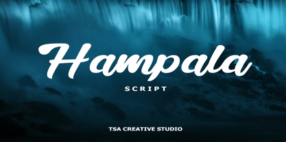 Hampala is a handwritten script font with a simple and classy style, such as branding, watermark on photography, signature, logo design, quotes, album cover, business card, and many other design project. From business cards to photo watermarks, Hampala is here to elevate your work. Hampala comes with uppercase letters, lowercase letters, lowercase, numbers, punctuation, ligature and multi lingual support If you have any queries, questions or issues please don't hesitate to contact us direct. Thank you very much Tiko Creative
 - Saturday Lunchtime by Rillatype,
$17.00 Saturday Lunchtime Font is a delightful combination of handwritten sans serif in uppercase and charming script in lowercase. Crafted with a cute and playful vibe, this font is perfect for creating logos for children's brands or adding a touch of whimsy to quotes. Its versatility allows you to use either the uppercase or lowercase alone, and you can activate swashes by typing underscore followed by numbers 1-3. Elevate your designs with the joyful and dynamic aesthetic of Saturday Lunchtime Font!
 - Wild Believers by Prestige Artsy Studio,
$19.00 Introducing Wild Believers, a bold vintage serif treasure that takes you back to the golden era of classic typography. This font embodies the timeless charm and elegance of vintage serif typefaces, with a bold twist that adds a modern edge. Elevate your designs with the charm and character Wild Believers. Let it transport your audience to a bygone era, where elegance and tradition reigned supreme. Rekindle the nostalgia of classic typography and make a bold statement with this captivating font.
 - Street Rats Monoline by Sipanji21,
$18.00 Street Rats is a Handwritten font with a Realistic monoline graffiti style, with awesome swash perfect for your awesome urban designs. It will elevate a wide range of design projects to the highest levels, be it branding, headings, designs, invitations, signatures, logos, labels, and much more! Features: Uppercase Punctuation Swash PUA Encoded open Support for MAC or PC Simple installation for Adobe Illustrator, Corel Draw, Photoshop, or Procreate (New Updated) That's it! If you have any questions don't hesitate to ask! Stay Classy!
 - Faston by Flawlessandco,
$9.00 Faston is a Modern Display Sans Serif Font. Unleash the power of contemporary design with Faston, a dynamic and versatile display sans serif font that elevates your projects to the cutting edge. There's some connected letters and some alternates that suitable for any graphic designs. This font support for some multilingual. Also contains uppercase A-Z and lowercase a-z, alternate character, numbers 0-9, and some punctuation. If you need help, just write me! Thanks so much for checking out my shop!
 - Vanderlin by Rillatype,
$19.00 Introducing "Vanderlin," a captivating retro script font that takes you on a nostalgic journey. With its charming swashes and alternate characters, Vanderlin adds a touch of vintage elegance to your designs. Crafted with precision, this font offers versatility and a timeless appeal. Whether you're working on a poster, logo, or any design project, Vanderlin brings a perfect blend of classic and contemporary. Elevate your creations with the distinctive style of Vanderlin and let your designs resonate with the beauty of the past.
 - Christmas Frosty by Letterara,
$17.00 Introducing "Christmas Frosty," a captivating serif font designed to make a bold statement and capture attention. With its powerful letterforms exuding strength and confidence, this font is ideal for infusing authority and professionalism into your designs. Whether you're crafting editorial layouts, branding elements, or eye-catching YouTube thumbnails, Christmas Frosty is the perfect choice to engage your audience and leave a lasting impact. Elevate your designs with the striking sophistication of Christmas Frosty, a font that seamlessly blends strength and elegance
 - Meymona Script by Create Big Supply,
$15.00 With its elegant and feminine style, this script font is perfect for various design projects. It offers a wide range of features, including uppercase and lowercase letters, numbers, punctuations, multilingual support, ligatures, alternate characters, and PUA encoding. Whether you're creating logos, labels, magazines, greeting cards, or book covers, Meymona Script font will elevate your designs. Its abundance of alternative swashes allows for creative exploration, giving your projects a unique and personal touch. Explore the endless possibilities with this versatile and stunning font
 - Chutpen by Graphicfresh,
$9.00 Introducing our Handwriting Font Editorial: a classic yet modern and elegant typeface inspired by the charm of hand drawn letters. This versatile font is perfect for adding a touch of sophistication to your magazine layouts. With its meticulously crafted curves and stylish strokes, our Handwriting Font Editorial will elevate your designs and captivate your readers, making it an essential tool for any editorial project. Embrace the artistry of handwritten fonts and bring a timeless appeal to your publications with our Font.
 - Aviano Future by insigne,
$24.99 The Aviano series returns with a vigorous and futuristic sans serif. Aviano Future’s powerful squared forms lend intensity and authority to your designs. Aviano Future’s extended forms give the face strength and muscle. Aviano Future is a versatile new addition to the Aviano titling series. Aviano Future comes in six different weights with “fast” Fasts and is packed with OpenType features. Want to use more traditional rounded forms? Need swash forms? Art Deco alternates? Aviano Future includes 390 alternate characters. Eleven style sets are available, two sets of art deco inspired alternates, small forms, tough swash, constructivist titling and traditional stylistic alternates. Aviano Future also includes 40 discretionary ligatures for artistic typographic compositions. Please see the informative .pdf brochure to see these features in action. OpenType capable applications such as Quark or the Adobe suite can take full advantage of the automatically replacing ligatures and alternates. This family also includes the glyphs to support a wide range of languages. Aviano Future is a great choice for a professional designer that wants to achieve a technological, futuristic or epic look. Be sure to check out the rest of the Aviano series which can be used as complementary faces, including Aviano, Aviano Serif, Aviano Sans, Aviano Didone, Aviano Flare and Aviano Slab.
 - Xamire Monoline by Afkari Studio,
$19.00 Introducing Xamire, the epitome of elegance and modernity in typography. This monoline script font redefines sophistication, blending sleekness with a touch of artistic flair. Its seamless strokes and graceful curves exude a timeless charm, perfect for elevating any design project. Crafted with precision and attention to detail, Xamire offers versatility that transcends traditional boundaries. Whether used for branding, invitations, advertising, or editorial design, its clean lines and effortless flow add a touch of refinement to any visual creation. Embrace the allure of Xamire and unlock a world of creative possibilities. With its extensive character set and seamless connectivity, this font is designed to empower your designs, captivating audiences and leaving a lasting impression. Elevate your projects with Xamire - where modernity meets sophistication in every stroke. Highlighted Features: – Uppercase, Lowercase, Number, and Punctuation – Special alternates and ligatures – Works on PC & Mac – Simple installations – Accessible in Adobe Illustrator, Adobe Photoshop, Adobe InDesign, and even work on Microsoft Word – Fully accessible without additional design software. – Mültîlíñgúãl Sùppört for; ä ö ü Ä Ö Ü ß ¿ ¡ Hope you enjoy our font and this font is a useful font for your projects!
 - Berthusen by Sabrcreative,
$25.00 Introducing Berthusen, a stunning handwriting signature font that exudes elegance and sophistication. With its graceful curves and fluid strokes, this script font captures the essence of handwritten beauty and adds a touch of refinement to your designs. Whether you're creating logos, branding materials, invitations, or any creative project, Berthusen will elevate your work with its timeless charm. Berthusen features a perfect balance between uppercase and lowercase letters, offering versatility and creative freedom. The inclusion of numbers and punctuations ensures seamless integration into your designs, allowing you to craft captivating compositions. With multilingual support, this font enables you to express your message effectively across different languages, reaching a broader audience. The PUA encoding of Berthusen allows for easy access to its extensive collection of unique glyphs and ligatures. These special characters and letter combinations add an authentic and handcrafted touch to your typography, enhancing the overall visual appeal of your designs. With its refined script style, Berthusen is perfect for various design projects where a touch of elegance is desired. Its versatility makes it ideal for wedding invitations, stationery, quotes, branding, and much more. Let Berthusen elevate your designs and leave a lasting impression on your audience.
 - Gelion by Halbfett,
$30.00 Gelion is a large family of geometric sans serif fonts. It ships both as two Variable Fonts or as 16 traditional fonts. Those static fonts span eight different weights, ranging from Extralight to Black. Each has an upright and an italic font on offer. The italics are carefully crafted, with an 8° slope. Gelion is inspired by 20th-century geometric sans serifs and classic neo-grotesque designs from the late 19th century and the middle of the 20th century. Its forms remain true to the gracefully geometric look of its classic predecessors, which will surely tick off any client’s long list of branding requirements. Letters in all of Gelion’s weights are drawn with virtually monolinear strokes. Its lowercase letters have a tall x-height. Yet, that still leaves enough room for the fonts’ diacritical marks. Gelion’s default “a” and “g” each have single-storey forms by default. The dots on the ‘i’, ‘j’, and diacritics are round, as are the punctuation marks. Gelion is an excellent choice for both corporate design and editorial design projects, thanks to its range of weights and its legibility in text. The fonts include a lot of ligatures, some monochromatic emoji, a set of arrows, lovely Roman Numerals, and more. Thanks to Gelion’s stylistic alternates, if a project comes up where you do not need a geometric vibe, you can activate Stylistic Set 1. That will replace many of the fonts’ letters with more humanistic-sans alternates, giving your text the feeling of a whole other type design with just one click. Last but not least, the descending “f” available in Gelion’s italics is a nice typographic trait.
 - FF Kaytek Slab by FontFont,
$50.99 Kaytek™ Slab is a fresh take on the correspondence typefaces of the 90s - which were originally designed for the demands of office environments. Just like its predecessors, this text typeface is robust and hard-working - meaning it works well in challenging design or printing environments - but it’s not without personality. Look closer at the lowercase g and a, especially in the italic, and you can see some unexpected elements of subversiveness within the design. This blend of sturdiness and quirkiness means it’s just as relevant for information-heavy projects, such as annual reports, as it is in more expressive environments. Although first and foremost designed for text, Kaytek Slab’s details shine through in its heavier weights and larger sizes, meaning it also has display potential. Every style of the typeface takes up exactly the same amount of space, thanks to the way Radek Łukasiewicz created the design. He based the entire typeface on a single, master set of proportions. This means designers can switch between styles without the text being reflowed, making it particularly useful in magazines, where space might be limited, and also on the internet, where hover links appear in a different style. As well as its roots in the office, Kaytek Slab draws on a little bit more 90s nostalgia. It’s named for the first and only Polish walkman, and embodies the same solid, no-nonsense shapes that made the analogue technology of the era so charming. Kaytek Slab is robust and solid. Kaytek Slab comes in 12 weights, from Thin to Black Italic, and offers multi-language support. Kaytek Sans, Kaytek Headline and Kaytek Rounded, are also available.
 - Minotaur by CastleType,
$59.00 Minotaur is an original monoline design based on an Oscan (http://en.wikipedia.org/wiki/Oscan_language ) votive inscription from the second century B.C.E. The letterforms immediately caught my eye in the wonderful book, Lettering by Hermann Degering, and I decided to create a typeface based on them with only enough compromises to make it usable as a modern alphabet. Not quite as straightforward as I had hoped. For example, the Oscan language (the predominant language in the Italian peninsula before the ascendance of Latin), has no letter "O", so the distinctive curve of the "D" was used as the model for the rounded letters "C" and "G" and more subtly for "O" and "Q"; this shape is also echoed in the original design of "B", "P" and "R". Also, the Oscan letterforms for A, K, L, M, N, S, and U are rather quaint, so I've included modern forms as alternates. Minotaur offers the best of both worlds: Just as the mythical Minotaur is half man and half bull, the font Minotaur is half modern and half ancient. Thanks to OpenType features (stylistic sets), you can easily switch from ancient letterforms to modern (if you have an OpenType-savvy application such as Adobe InDesign) for Latin, Greek, and Cyrillic alphabets. Minotaur supports all modern European languages, including Modern (monotonic) Greek and those that use the Cyrillic alphabet. And, yes, it supports Oscan, both right-facing and left-facing. Minotaur includes 3 OpenType Stylistic Sets: 1 - converts ancient (default) letterforms (A, K, L, M, N, S, and U) to modern alternates; 2 - converts Latin letterforms to equivalent left-facing (standard) Oscan letterforms; 3 - converts Latin letterforms to equivalent right-facing Oscan letterforms.
 - Caribe by Andinistas,
$37.00 Caribe is an expressive typefamily like the blue sky and bright Caribbean sun, designed by CFCG @andinistas. We love to design experimental fonts with a large amount of ligatures and swashes, drawn with special respect and study for what is handmade by ancient artisans. In this context, Caribe is an impressive typefamily of 5 fonts to create logos, posters, book covers, menus, labels, packaging, etc. The 5 Caribbean fonts add up to more than 1500 glyphs that serve to be mixed or independent, functioning as a springboard to encourage your creativity in the design of words, phrases or remarkable headlines of the elements that appear around them. Caribe Script has lowercase letters such as "b d f g h i j k l p q y z" with extremely short ascending and descending strokes achieving generous height x in: "a c e m n o r s u v w x". Caribe Script Produces visual attraction in words and phrases that need lowercase letters with sparing horizontal space width and bold stroke thickness, producing exceptional legibility in headlines or advertising texts. Caribe Script & Caps are based on ancient and multiple letterings from the 40s and 50s that were useful inspiration tools to produce visual pleasure. Caribe Words has more than 60 script words drawn diagonally generating greater intensity within a sentence. Caribe Shields & Digits has more than 50 designs each and they have containers and numbers designed to accompany words, phrases or drawings that serve to harmonize different writings. ENJOY more than 1500 glyphs: + Caribe Script: 743 glyphs + Caribe Caps: 507 glyphs + Caribe Words: 71 glyphs + Caribe Shields: 230 glyphs + Caribe Digits: 40 glyphs
 - Baroniene ML by HiH,
$12.00 Genovaite Baroniene is former school teacher and a native of Lithuania who loves fancy letters. When she writes, she likes to add extra flourishes to her handwriting and printing. It simply appeals to her to do so. While living in the United States a few years ago and working in the health care field, she put pen to paper to provide a specimen of her writing from which a font could be developed. The process has taken longer than either of us expected. Now we are finally able to present Baroniene ML, a stylishly unique example of what we call Lithuanian Folk Baroque. Baroniene ML has a total of 362 glyphs, including the Unicode Latin Extended-A glyphs (0100 to 017F), covering the more widely-used Central European languages. To resolve the cedilla/undercomma conundrum, we have chosen to design a hybrid disconnected accent for use with C, G, K, L, N, R, S & T. We hope this solution is acceptable to users of Albanian, Catalan, French, Latvian, Portuguese, Romanian and Turkish. Baroniene ML also comes with four ligatures: gh, Th, th and Ch (167, 172, 177 and 181). Baroniene ML is certainly not the polished script of a professional calligrapher. It is very personal. The human source is still visible in its form. The letter spacing is uneven. Some of the curves are not quite perfect. In sum, the individuality has not been refined out of it. That is why it is so charming. If you want for a font that has a very different look, perhaps Baroniene ML is what you need.
 - Simplo by Durotype,
$49.00 Simplo: the ‘Italian Futura’. Simplo is a geometric sans serif typeface, built in sixteen styles. It is a tribute to the 1930s typeface Semplicità, designed by Nebiolo’s Alessandro Butti. Although many details of Simplo differ from Semplicità, it preserves the spirit of the original. Simplo is ideal for use in display sizes. It is also quite legible in text, and is well suited for graphic design and corporate identity design. Simplo has sixteen styles, extensive language support, eight different kinds of figures, sophisticated OpenType features — so it’s ready for advanced typographic projects. The most notable characteristics of this typeface are the ‘t’ and the ‘f’. The ‘t’ is the culmination of simplicity: a vertical line with just a simple right-side crossbar. The ‘f’ also has just a right-side crossbar, and is really tall: it reaches both the highest and lowest vertical position of the typeface. The top of the distinctive ‘s’, is much narrower than its bottom. The ‘a’, ‘b’, ‘d’, ‘g’, ‘p’, ‘q’, and ‘u’ are spurless, and show a family resemblance with Hans Reichel’s 1990s typeface Dax. However, these letters are rounder and more geometric than Dax’s counterparts, because of Dax’s higher x-height and narrower design. In Paul Shaw’s Imprint article about typefaces that have been overlooked and/or underappreciated, “Overlooked Typefaces”, he concluded his discussion of Semplicità as follows: “These idiosyncrasies suggest that Semplicità might find a warm reception today, given the current love affair with Gotham, Neutraface and Proxima—and the resurgence of ITC Avant-Garde Gothic.” Free demo font available. For more information about Simplo, download the PDF Specimen Manual.
 - Genotype BRK Pro by CheapProFonts,
$10.00 A stylistic and square outline font suitable for headlines and logos. The original font contained no diacritics at all, so I have designed these to match. I also made the descenders on "g/j/p/q/y" a bit longer - so they would balance better with the letters with diacritics below the letter... I redesigned the "t", but have included the original "t" as an alternate, available via your programs' glyph palette or using the OpenType functions "Stylistic Alternates"/"ss01". Genotype S BRK Pro is the perfect companion for Genotype H BRK Pro (The H stands for Hollow and the S stands for Solid). Can be used as a fill for its companion (using layers), but is also quite a usable font on its own. ALL fonts from CheapProFonts have very extensive language support: They contain some unusual diacritic letters (some of which are contained in the Latin Extended-B Unicode block) supporting: Cornish, Filipino (Tagalog), Guarani, Luxembourgian, Malagasy, Romanian, Ulithian and Welsh. They also contain all glyphs in the Latin Extended-A Unicode block (which among others cover the Central European and Baltic areas) supporting: Afrikaans, Belarusian (Lacinka), Bosnian, Catalan, Chichewa, Croatian, Czech, Dutch, Esperanto, Greenlandic, Hungarian, Kashubian, Kurdish (Kurmanji), Latvian, Lithuanian, Maltese, Maori, Polish, Saami (Inari), Saami (North), Serbian (latin), Slovak(ian), Slovene, Sorbian (Lower), Sorbian (Upper), Turkish and Turkmen. And they of course contain all the usual "western" glyphs supporting: Albanian, Basque, Breton, Chamorro, Danish, Estonian, Faroese, Finnish, French, Frisian, Galican, German, Icelandic, Indonesian, Irish (Gaelic), Italian, Northern Sotho, Norwegian, Occitan, Portuguese, Rhaeto-Romance, Sami (Lule), Sami (South), Scots (Gaelic), Spanish, Swedish, Tswana, Walloon and Yapese.
 - Charpentier Sans Pro by Ingo,
$41.00 A humanistic sans serif The first version of this font was created in 1994 within the framework of the bid placed by the city of Graz to become the location for the Winter Olympics in 2006. Appropriately, its original name was ”Olympia.“ The font is intended to embody classic ideals as well as to meet modern demands. The proportions of Charpentier Sans are directly derived from Roman capitals and the humanistic book-face. The contrast between strokes and thin strokes is based on medieval uncial script. And thus, a modern serif sans was created emphasizing thick and thin strokes together. Thanks to its traditional form language, Charpentier Sans is very legible, adapts to various forms of content and expresses a kind of calmness and certainty. Details resulting from writing with the quill guarantee that the font doesn’t appear too rough and unemotional. Even the tiny, pointed mini serifs contribute to the unmistakable appearance of the font. They create an exciting contrast to the soft flowing forms of the letters and are, to a great extent, conducive to the legibility. Consequently Charpentier Sans always appears with an extremely sharp and clear outline. Charpentier Sans Italique has an even more distinct ductus derived from writing. Especially the rounded forms from a, e, f, g and y reflect the handwritten humanistic cursive. Charpentier Sans is comprised of many ligatures, including discretional ones, plus proportional medieval and capital figures for the normal type as well as disproportional tabular figures with a consistent width. Above and beyond the ”normal“ Latin typeface system, small caps are available as an especially elegant form of distinction.
 - Andes Neue by Latinotype,
$29.00 Unlike its predecessor, Andes Neue contains a larger character set of 759 glyphs which support 219 Latin-based languages from 212 countries. The font comes in 4 variants that provide a wide stylistic range. Andes Neue is the most similar to the original Andes design. The Alt1 character set bears some similarity to the old Andes's (yet cleaner); Alt2 uses the alternates in the font as default glyphs; and Alt3 is a mixture of the other three variants that offers a balanced set of characters. Andes Neue also includes new accents and glyphs for a wider language support, and a set of small caps (in each variant). All of these features give the font a strong personality that helps make text look more appealing. Andes Neue varied weights work well with both short and mid-length text sections, providing a wide range of choices for any design project.
 - Frisco Antique Display SG by Spiece Graphics,
$39.00 Here is a decorative condensed antique design that is sure to fit a variety of contemporary situations. The Bruce Type Foundry (later acquired by V. B. Munson) developed this wonderfully shaded Tuscan in the 1880s - or possibly earlier. It was known back then as Style No. 1050 and carried a pronounced three-dimensional look with a thin hairline at the bottom and right of each stroke. It is best to use Frisco Antique in large display sizes because it is easy to lose these delicate hairlines. A lowercase and several alternate characters have been provided for your convenience. Frisco Antique Display is also available in the OpenType Std format. Some new characters have been added to this OpenType version. Advanced features currently work in Adobe Creative Suite InDesign, Creative Suite Illustrator, and Quark XPress. Check for OpenType advanced feature support in other applications as it gradually becomes available with upgrades.
 - MFC Whitworth Monogram by Monogram Fonts Co.,
$19.00 The inspiration source for MFC Whitworth Monogram is an alphabet set from a vintage embroidery alphabets book, Alphabets Broderies No. 238 by N. Alexandre & Cie. What began as 26 referenced capital letters has been expanded to three sets of alphabets within a single typeface. True to the original reference, the Capitals are the stylized cursive capital letters in all their gorgeousness. The lowercase encapsulates the capital letters intertwined within rectangular frame. By enabling Stylistic Alternates and typing any lowercase letter, you get each letter encapsulated and intertwined within an oval frame. A handful of decorative forms are placed in the 0-6 numeral slots. Originally intended to adorn handkerchiefs and other linens, this digital revival opens it up to a whole new realm of possibilities. This is one of many monogram designs from the late 1800's to early 1900’s that is loaded with panache and intricate detailing.
 - Magnesit Dark by Rekord,
$22.00 Sporty and brawly, Magnesit Dark creates impact everywhere it lands. Impressive headlines are its specialty, but it feels right at home used in packaging, branding and poster design. Very tall x-height, wide language support and minimalistic yet playful appearance, make it suitable on any serious typographic job. Three distinct styles expand the possibilites even further: the straight to the point Regular, the friendly Soft and the determined Hard styles share metrics across related Magnesit and Magnesit Stencil families, so you can mix and match to achieve exactly the effect you need. Magnesit Dark works great with illustrations, the generous shapes can be easily filled with strong imagery to great effect. Based on the best-selling Grim, Magnesit is a vast improvement of the concept with long awaited addition of lowercase, reworked proportions, spacing and kerning, expanded language support and useful icons to satisfy even the most demanding typographers’ needs.
 - Velino Compressed Headline by DSType,
$50.00 Velino is one of our most complete type families. The serif version comes in two packages with three widths: Velino, Velino Condensed, and Velino Compressed. The display package contains high-contrast typefaces, with a modern flair—very feminine but with plenty of character, specially designed for fine print in big text sizes. The text package was designed for any running text. Its proportions and colors make it ideal for text, even in very difficult conditions such as newspaper printing. We also designed the perfect companion to this enormous type system: Velino Poster, a slab serif typeface with only one weight and its respective italic, but with plenty of muscle, for every time some extra strength is needed, such as setting very big text, magazine covers or newspapers’ special sections. Finally, we designed Velino Sans and Velino Sans Condensed to perfectly match the weight and proportions of Velino, all with matching italics.