10,000 search results
(0.033 seconds)
- Bike Power by PizzaDude.dk,
$19.00 I love my bike, and I couldn't dream of not using it on a daily basis - I use my bike in rain, sun, snow, and windy days...all year, in other words! This font is dedicated to my bike, and is the first in a series of handmade fonts! Play around with the three layers and your favourite colours, for awesome effects. All versions comes with Contextual Alternates, which means several versions of each letter. In this case, every letter has 5 different versions that automatically cycles as you type! A quite awesome thing, because it makes your text more lively and natural looking!
 - Mighty Monday by Nathatype,
$29.00 Mighty Monday is an adorable serif display font that will bring a smile to your designs. With its cute and playful letterforms and a fairly thick weight, this typeface exudes a delightful and charming vibe. This font duo special feature lies in its cute and endearing serifs, which add a touch of whimsy and character to each letter. The fairly thick weight of the font enhances its boldness and creates a visual impact. This font is perfect for projects that require a standout and attention-grabbing typographic choice. Inspired by the charm of playful design, Mighty Monday captures the essence of cuteness and joy. The letterforms are carefully designed to be friendly and approachable, making them perfect for designs targeted at children or any audience that appreciates a lighthearted and cheerful aesthetic. This font brings a sense of fun and playfulness to your designs. The uppercase letterforms are carefully crafted to maintain legibility and clarity, even in the thick weight. Each letter retains its distinctive characteristics, allowing your message to be easily understood. You can use it in big text sizes to be greatly legible and enjoy the available features here. Features: Stylistic Sets Ligatures Multilingual Supports PUA Encoded Numerals and Punctuations Mighty Monday fits in children's books, packaging, greeting cards, headlines, titles, logos, branding materials, and any design project that aims to evoke a sense of cuteness and playfulness. Find out more ways to use this font by taking a look at the font preview. Thanks for purchasing our fonts. Hopefully, you have a great time using our font. Feel free to contact us anytime for further information or when you have trouble with the font. Thanks a lot and happy designing
 - Tecna Dark Up Triangle BNF by Descarflex,
$30.00 The Tecn@ Dark&Light Triangle Background Nomenclature Font family is differentiated by the direction of the triangle tip in the 4 cardinal points. The family were designed to head, enumerate, indicate or highlight writings or design plans, for this reason, the characters are available only in capital letters and some signs or symbols that can serve such purposes. A triangle or empty character is included so that the user can use it overlaying any character of his choice or to be used alone. What is Lorem Ipsum? Lorem Ipsum is simply dummy text of the printing and typesetting industry. Lorem Ipsum has been the industry's standard dummy text ever since the 1500s, when an unknown printer took a galley of type and scrambled it to make a type specimen book. It has survived not only five centuries, but also the leap into electronic typesetting, remaining essentially unchanged. It was popularised in the 1960s with the release of Letraset sheets containing Lorem Ipsum passages, and more recently with desktop publishing software like Aldus PageMaker including versions of Lorem Ipsum. Why do we use it? It is a long established fact that a reader will be distracted by the readable content of a page when looking at its layout. The point of using Lorem Ipsum is that it has a more-or-less normal distribution of letters, as opposed to using 'Content here, content here', making it look like readable English. Many desktop publishing packages and web page editors now use Lorem Ipsum as their default model text, and a search for 'lorem ipsum' will uncover many web sites still in their infancy. Various versions have evolved over the years, sometimes by accident, sometimes on purpose (injected humour and the like). Where does it come from? Contrary to popular belief, Lorem Ipsum is not simply random text. It has roots in a piece of classical Latin literature from 45 BC, making it over 2000 years old. Richard McClintock, a Latin professor at Hampden-Sydney College in Virginia, looked up one of the more obscure Latin words, consectetur, from a Lorem Ipsum passage, and going through the cites of the word in classical literature, discovered the undoubtable source. Lorem Ipsum comes from sections 1.10.32 and 1.10.33 of "de Finibus Bonorum et Malorum" (The Extremes of Good and Evil) by Cicero, written in 45 BC. This book is a treatise on the theory of ethics, very popular during the Renaissance. The first line of Lorem Ipsum, "Lorem ipsum dolor sit amet..", comes from a line in section 1.10.32. The standard chunk of Lorem Ipsum used since the 1500s is reproduced below for those interested. Sections 1.10.32 and 1.10.33 from "de Finibus Bonorum et Malorum" by Cicero are also reproduced in their exact original form, accompanied by English versions from the 1914 translation by H. Rackham. Where can I get some? There are many variations of passages of Lorem Ipsum available, but the majority have suffered alteration in some form, by injected humour, or randomised words which don't look even slightly believable. If you are going to use a passage of Lorem Ipsum, you need to be sure there isn't anything embarrassing hidden in the middle of text. All the Lorem Ipsum generators on the Internet tend to repeat predefined chunks as necessary, making this the first true generator on the Internet. It uses a dictionary of over 200 Latin words, combined with a handful of model sentence structures, to generate Lorem Ipsum which looks reasonable. The generated Lorem Ipsum is therefore always free from repetition, injected humour, or non-characteristic words etc.
 - Dranskof by PintassilgoPrints,
$29.00 Dranskof is a light-hearted, cheery font. It is inspired by a page from an extraordinary serbian publication for children by the writer, poet and journalist Duško Radović. Dranskof whimsical letterforms are full of joie de vivre, consisting of different glyphs on upper and lower case slots for added flexibility.The contextual alternates feature will instantly alternate glyphs. To literally add a twist here and there, Dranskof is equipped with a spirited set of stylistic alternates, easily accessible through stylistic alternates feature or by the glyphs palette. This is definitely a 'make feel good' font. Enjoy!
 - Heptagroan Mono by Ingrimayne Type,
$9.00 If there is ever a need for a heptagonal font, that is, a font based on a seven-sided polygon, Heptagroan may fit the bill, unless the need is also for true lower-case letters. Heptagroan is caps only, though some of the caps on the lower-case keys differ from those on the upper-case keys. Heptagroan is monospaced and is available in two weights.
 - Sovereign Display by G-Type,
$46.00 Sovereign Display is a decorative all caps headline face in one style with small caps on the lower case positions. Thin horizontal crossrules underpinned by a heavier solid shadow give the typeface a prominent three dimensional appearance and an air of formal distinction. Ornate and iconic, Sovereign Display is perfect for certificates, manuscripts, titling or anything requiring a more sombre, elaborate or engraved slab serif style.
 - Alexa by Adobe,
$29.00In 1994, John Benson designed Alexa, Caliban and Balzano, three typefaces with a similar style. Characteristic of all of them is their calligraphic touch and the likeness to handwriting. Alexa shows a hint of a broad tipped pen style and its legible figures are reserved yet lively. Alexa is best for short and midsized texts as well as headlines and gives texts a personal, classic look. - AndrijScript Cyrillic by AndrijType,
$36.00 The glyphs of AndrijScript typeface are based on usual calligrapher's handwriting, my own native Cyrillic. This strange mix of freedom and professionalism looks vivid but a bit elegant. In three very different weights it has some ligatures and contextual alternatives for more natural look. All you need is love, you know ;)
 - Mirandolina by ParaType,
$25.00 A freestyle serif typeface, some details of its letterforms are modelled after flat-nib pen calligraphy (serifs with slanting ends, cutting terminals). Three decorative calligraphic versions with swashes and connecting elements are incuded. For text and display typography. The face designed by Natalya Vasilyeva and licensed by ParaType in 2007.
 - Choc by Linotype,
$29.99Choc is the work of French designer Roger Excoffon, based on the traditions of Japanese brush calligraphy, thick yet graceful. Choc light was designed by Phil Grimshaw, who had to redraw many times in different weights before finding one that worked as a text face and remained true to the original. - Daisy Girl by Subectype,
$18.00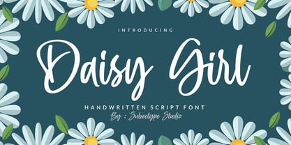 Daisy Girl is a flowing handwritten font, described by an elegant touch, perfect for your favorite projects. Fall in love with its incredibly distinct and timeless style and use it to create spectacular designs! Enjoy the font, feel free to comment or feedback, send me PM or email. Thank you!
 - Compton by Greater Albion Typefounders,
$10.00 Compton is a clean modern slab serif face that emphasises simplicity of line and legibility. It's offered in three weights: regular, bold and light. Compton brings the spirit of the 60s and 70s to the present day. It is ideal for clear, simple graphic design that makes an immediate impact.
 - Romanicum - Personal use only

- Night Club 70s - Personal use only

- Urban Elegance - Personal use only

- Integral CF by Connary Fagen,
$35.00 Integral CF is designed for maximum visual and emotional impact with its stunning, superbold letterforms. An all-caps titling font family, Integral's six weights excel in posters, social media, headlines, video, and print. Hidden behind the linear, confident construction is a hint of roguish charm. Designed to be bold and large, Integral pairs nicely with lighter typefaces that provide contrast, such as a sans serif like Greycliff CF, Criteria CF, or Work Sans. Text-friendly serifs like Artifex CF are also pair well with Integral. All typefaces from Connary Fagen include free updates, including new features, and free technical support.
 - Alabaster Antique FJ by Frncojonastype,
$39.00 fj Alabaster Antique™ is a hybrid typefamily with a 10 styles inspired of the develop and exploration of “serif” since the first half in XIX century, envolves a special influence of the slab humanist typefaces, —with a calligraphy flavor in his Italic— with the goal to generate a contrast in to texts sheets. Has a three display versions based in the universe of “woodtypes” to deliver a “unity” in all typeset, like his versions fj Alabaster Antique™ Display, Engraved & Shaded. Include Small Caps, Swashes, Modern and OldStyles figures to decimal notation that envolve to fj Alabaster Antique™ in a ideal typeface for first and second lecture in the most of the visual communication pieces. • To exclusive licenses and to follow the develop of this project please visit frncojonas.com Learn about upcoming releases, work in progress and get to know us better! WB: frncojonas.com BE: beh.net/frncojonas TW: @frncojonas ING: @frnco.jonas
 - Beni by Nois,
$18.00 Beni is a bold & strong sans serif font family beautifully crafted to perform in short headlines in posters or contemporary interface design. Each character has been optically adjusted for maximum effect in the space between; as such, this is a strong contender for movie posters, titling, album artwork, and any design project that needs a clean sans serif that makes an impact wherever it is applied. This type family is available in four unique weights that stand well apart from one another in visual style. Beni Light is the runway model of the family, standing with a narrow posture and towering height. It’s a fantastic choice for conveying a message in a limited horizontal space. Beni Regular and Beni Bold are shorter in stature but both pack a punch, carrying bold strokes that speak with confidence and offer great legibility. The heaviest of the heavy, Beni Black is the super-bold, go-to type design for projects that need an impossibly strong type design at the helm. Beni extends multilingual support to Basic Latin, Western European, Euro, Catalan, Baltic, Turkish, Central European, Pan African Latin, Igbo Onwu, and Basic Greek for design projects intended for an international audience.
 - Journeyman by Cafe.no,
$12.00 Journeyman is an all caps layered display typeface in the sign painter tradition. It has normal width caps in lowercase position and a wider caps in uppercase position. Letters in lowercase position are slightly more rounded than those in uppercase position thus providing two styles. Journeyman supports languages with latin characters and ligatures as well as Greek and Cyrillic. The normal front layer is Line while Silhouette is usually put at the back for a three dimensional effect. Other layer arrangements are possible. The type works well for shop displays, poster work, menus, signage and other purposes where you want the type to have impact.
 - Hello Winds by Ahmad Jamaludin,
$15.00 Just in time for your Halloween projects hopefully :) Introducing HELLO WINDS! a font that's ready to cast a spooky spell on your designs. This eerie display font is the perfect choice for all your Halloween-related projects and crafty ideas. But that's not all – to spark your creativity, we've thrown in The Doodles used in these previews for free! What's Included? Hello Winds Main File Instructions (Access special characters, even in Cricut Design) Unique Letterforms Works on PC & Mac Simple Installations Accessible in Adobe Illustrator, Adobe Photoshop, Microsoft Word even Canva! PUA Encoded Characters. Fully accessible without additional design software. Thank you, Dharmas Studio
 - Late Hours JNL by Jeff Levine,
$29.00 The free form hand lettered titles for the 1961 film “The Children's Hour” inspired the digital typeface Late Hours JNL, which is available in both regular and oblique versions.
 - Perva by Eller Type,
$30.00 Perva is a suite of three eye-catching fonts inspired by display types from the 19th century. This unconventional family has three different font styles that can be used individually or combined to build a playfulness multi-typeface design system. It is suitable for titling, posters headlines, book covers, packaging, social media, and branding. Perva brings together a Slab serif font, a.k.a Antique or Egyptian; a Reverse-contrast or Italian; and an Old English Blackletter. The design is inspired by the display types listed as “Typographic monstrosities” in Thomas C. Hansard’s book Typographia (1825). What he found absurd was understood here as interesting and enjoyable to introduce a contemporary approach of the types widely sold by foundries such as Bruce’s New York Type-Foundry and Caslon Foundry. Each of the three fonts holds around 400 glyphs, covering the languages of Northern, Western, Central, and Southern Europe. Opentype features include case-sensitive forms and a couple of alternates for the Blackletter style.
 - Sassoon Write by Sassoon-Williams,
$66.00 These fonts will join-as-you-type in your OpenType application as shown in the posters above. Choose Use Contextual Alternates option in your app to get basic recommended baseline joins for teaching. Additionally, use can choose from 7 Stylistic Sets of alternative letterforms that are so important for Teachers. Create 'pen-lifts' too! Fonts display unjoined by default on this website and are delivered that way - joining is controlled by you. A mature ‘joined-up’ hand is the result of correct instruction from an early age. Sassoon Write typefaces are a direct progression from the separate letters of Sassoon Infant or Sassoon Primary and were specially created for teaching cursive handwriting in a flexible way. Designed for older pupils and adults, rather than children. A family of 4 fonts than join, or enter " | " between letters for unjoined text. For use with OpenType compatible applications such as Word. Enables progressive pupil exercises for a smooth transition between separate letters and teaching joined handwriting. Free to download resources Stylistic Sets and how to access the alternative letters feature in these OpenType fonts Purchasers of this font package may use their Order Number to receive a free Copybook PDF by Rosemary Sassoon recommended for effective teaching
 - The Rounded Font by Sven Pels,
$15.00 the rounded font is a slight condensed and fun rounded typeface that comes in three weights: light, regular & bold. all letters are designed in the same line thickness. the fun way that the characters flow makes the font a useful but also unique typeface to use. it works great as both body text and headers. especially when you use the different weights in the right way. as graphic designer sven pels often deletes the dots of both the i’s en j’s to make it unique but also just to break some rules… svenpels.com instagram.com/svenpels
 - Pittsbrook by Fontdation,
$15.00 Pittsbrook Family, a pack of classic typefaces that inspired by the letters used in old advertisement and packagings. Its rigid shape gives you strong, sharp and blocky feelings, no curves were harmed in the making of these typefaces. Comes in three styles; Sans, Serif and Outline, all of them are consistently mouse-crafted characters, we spent a lot of attention to every details. Suits best for any classic/vintage design project, such as E-Sport logo, liquor/food label, packaging, headline, space-filler, logotype, typographic quote writings, etc.
 - URW Akropolis by URW Type Foundry,
$39.99 The design of this display face is based on the hot metal typeface Acropolis, issued by the German type foundry Ludwig Wagner in Leipzig in 1940. To further increase its usefulness a Cyrillic was added to it: URW Akropolis, redrawn and digitally remastered by Coen Hofmann for the URW Font Forum, is a true display design that should not be set below 48 point if you want to preserve it's fine details like the open triangular sections, e.g. in L, G, S, T etc. and gain the full typographic splendidness of this beautiful typeface.
 - Chesterville by Andrew Tomson,
$10.00 Hello, friends! Just this year I went to the United States for the first time. To my surprise, the neighborhoods, streets, and parks that I had only seen in the movies turned out to be true. There is a soul in them. I really enjoyed wandering these endless streets, soaking up this spirit. They feel childishly carefree, as if you were in a movie.Just try this font and understand my feelings. The font will work for almost anything: social media, cards, invitations, announcements. Good luck and love to you!
 - Leksa Sans by Alexandra Korolkova,
$50.00Leksa Sans is a humanist sans-serif face with some contrast. The family consists of 14 faces (upright & true italic in seven weights from Extralight to Black). Designed as a sans-serif companion for Leksa, Leksa Sans works perfectly either with it or alone. It is suitable both for text setting and for short inscriptions. One of the main features of the typeface is its professionally-designed Cyrillic which (together with serif companion Leksa) was awarded for excellence in type design at Modern Cyrillic competition in Superfamilies category. - Dalglish by Tanziladd,
$10.00 Dalglish is a serif family with clean curves that gives the typeface a refined touch that give any headline an elegant appearance, with both modern and vintage curves. Dalglish represents luxury, glamour, exuberance, and faith in social and technological progress. Dalglish is inspired by the art deco design style and poster design at France in the 19th Century. Dalglish has pretty alternatives glyphs choice in the pack as well. Beside those alternatives, the pack also includes three different stylistic alternatives which are Regular, Italic, Bold annd multilingual support.
 - Seashore Pro by Sudtipos,
$59.00 A feminine, graceful script whose thicker horizontals create a wave-like rhythm — hence the name. Seashore is loosely based on an "eccentric" (left-leaning) penmanship style of the late 19th century. Used mainly by professional "engrossers" in certificates and tributes, or by society ladies in their stationery and invitations, it sent a message of true refinement, as the style would have been only been mastered after the more common business, Spencerian, and standard ornamental styles. In fact, unusual script styles were in such demand that type foundries of the era exploded with metal-type knockoffs of increasing fanciness. Seashore includes a wide variety of swash capitals, alternate endings, and contextual ligatures, over 900 glyphs in all. Seashore is best used in short display settings — in names and addresses on formal invitations, in menus and food packaging, or fashion and beauty contexts.
 - Holistic Duo by Letrasupply Typefoundry,
$15.00 Pure and natural hand drawn typeface, it's Holistic font! Comes with two casual yet delicate style (script and sans), then wrap in three different look (solid, textured and rough). Holistic Script includes alternative characters, you can play with it to get a bit messy but still pretty. Have fun with these fonts and make a lovely combination for logos, displays, posters and other project that needs natural handwritten work. All in one package to get an organic feeling.
 - Klik by Fenotype,
$25.00 Klik is a universal sans serif family – clean and timeless. Both iconic and legible, Klik is suited to cover many needs from brand identities to editorial design, advertising, logos and beyond. Cyrillic characters are featured and a wide range of languages is supported. OpenType features are abundant – from built-in small capitals to various numeral styles (linear and old style; tabular and proportional, subscript and superscript). Klik comes in three widths – each featuring eight weights and corresponding italics.
 - Lunatique by The Flying Type,
$20.00 Lunatique is a highly decorative font, available in three widths, with extended language coverage as well as alternates for some glyphs. This font is inspired by Lucky typeface, designed in 1972 by André Pless for the Mecanorma permanent type contest. The style was later released as Letter-Press transfer sheets. Transfer sheets... Sounds quite nice, definitely. But hey, these digital ones will be way smoother to use, you bet. Give them a go and make your text shine!
 - Kumo Sans by EchadType,
$10.00 Kumo Sans is a clear and comprehensible font stylized to mimic marker pen handwriting. The idea was to interpret swift and negligent hand movement in a distinct and easy to read familiar glyph silhouette. Family comes in three weights and italic slant option. Shadow version with outline and shadow effect is perfect for short catchy phrases, brand names and headlines use. Font contains Latin diacritics, Hebrew cursive writing, Bitcoin, Indian Rupee, New Israeli Shekel symbols, fractions etc.
 - Mouzambik by Kereatype,
$17.00 Mouzambik is a simple, condensed sans-serif font with a bold and intricate personality. It comes in three styles: regular, Inktrap, and Smooth, each with italics. Crafted with intention, it maintains its allure in both large and small point sizes. This font is ideal for headlines, billboards, magazines, websites, titles, posters, branding, and logos. With an abundance of ligatures, alternates, and other features to choose from, you can ensure your project stands out from the rest.
 - Tabaiba wild ffp - Personal use only

- Quinella by Eclectotype,
$40.00 Plumper than a misguided Z-lister's dodgy lip job, this is Quinella, named after the cheffy scoops of ice cream and the like, quinelles. It's a cute, fat script with a seventies vibe but a personality all of its own. It's non-connecting in the usual sense, but the letters overlap to make the white space as tiny as possible. Ligatures (standard and discretionary) make smoother solutions for quite a few pairs and trios, and every upper case letter has a more exuberant swash alternate. The contextual alternates feature substitutes in an alternate t for a better fit with certain letters. Fonts don't come much more voluptuous than this. The full-fat, creamy appearance makes it perfect for food packaging, but don't let it end there; it'll make memorable logos, unmissable headlines, and posters with more punch.
 - Kendrick by Monotype,
$15.99 A heavy-set but lively font, Kendrick’s dense strokes were hand-painted using a thick wet brush. This all-caps set of letters is bold but brushy, textured and expressive; fun but very much meaning business. Kendrick is streetwise and no-nonsense, but with a big cheesy grin to boot.
 - Rockland by Monotype,
$15.99 This is an original, confident and cheeky little font; characterised by its boldness and dense letterforms, which boast a solid texture and distinctive lack of counters. Drawn with a marker pen, the bounciness of Rockland counteracts its solidity to make for a friendly aesthetic that’s as confident as it is playful.
 - Urbanhive by Jaetwo Type,
$45.00 Urban Hive : reinterpreting three-dimension to the typeface A blueprint consists of two-dimensional elements changes into a three-dimensional structure. What works would be created by reversing the process? The building components were divided into three parts : Facade, Inside space and Construction materials to apply all the features to the typeface. This is Facade version.


