10,000 search results
(0.039 seconds)
- Koziupack by Sudtipos,
$45.00 Wild and free as usual, but now with a touch of sharp focus presented in curled ascenders and descenders, swashy care-free caps, and very unique figures. Koziupack is the ideal choice of font for food and drink product labels, signage, magazine advertisements. It looks particularly great when accenting any work of modern illustration, or by itself brightly knocked out of a dark background. Designed by Koziupa and digitized by Ale Paul.
 - 1968 GLC Graffiti by GLC,
$38.00 This font was inspired by the paint brushed letters in use in the 60 - 70s for protest slogans tagged on the cities walls. In those days, we didn't commonly use aerosols like today, so we used paint brushes, with paint or tar cans, drew the letters, and ran away quickly ! Capitals and lower case have the same size, and a lot of alternates characters or ligatures allows the user to vary each letter (until tree alternates for single letters) in each word of a text . Likewise, the words may be easily underscored or intersected by a few stains looking like paint spots, substituted to the following standards characters: [greater], [less], [dagger], [backslash], [bullet], and [underscore].
 - Bouncer by Fenotype,
$9.95 Bouncer is an all-caps font family with automatic interlocks. With soft and rounded look and over 150 automatic ligatures and three weights Bouncer is a flexible and easy to use font. It's very suitable for anything from a Jazz poster to a restaurant menu. To access the ligatures you only need to write in CAPS in any OpenType-supporting application.
 - London Court by Greater Albion Typefounders,
$16.50 London Court is a family of three 'Tudor Revival' display faces, inspired by an inscription seen underneath a clock in a splendid Tudor revival arcade in Perth, Western Australia. The resulting typeface designs are similarly 'Tudor Revival' or if you prefer 'Tudorbethan'- Roman with Blackletter details. Ideal for creating headings and posters which have an 'Olde-Worlde' feel with modern legibility.
 - Chroman by Larin Type Co,
$16.00 Chroma this is a modern and elegant typeface. It carries a bold weight and with it in highlight the main thing, make a title or logo and much more. It can also be more expressive and playful, thanks to the many alternates that are harmoniously combined in this font and make it more attractive and expressive. Try to change the alternatives, ligatures and you will get a lot of options for your project that will make it unique. This font is easy to use and has OpenType features.
 - Norando by Larin Type Co,
$16.00 Norando this is a modern and elegant serif font. It carries a bold weight and with it in highlight the main thing, make a title or logo and much more. It can also be more expressive and playful, thanks to the many alternatives and ligatures that are harmoniously combined in this font and make it more attractive and versatile. Try to change the alternatives, ligatures and you will get a lot of options for your project that will make it unique. This font is easy to use and has OpenType features.
 - Paragon by Greater Albion Typefounders,
$12.50 Paragon is a display Roman family of nine faces, combining elements of formality and fun. It embodies a high degree of contrast between near hairline horizontal strokes and bold vertical strokes. The family is offered in three widths and in regular, small capitals and title faces. Use Paragon to lend impact to your next design project.
 - Ahuta by Twinletter,
$15.00 Ahuta Arabic style font. This particular font is designed to look like a true vintage Arabic font, but in a simple and elegant form, so you can use it in all your designs which will surely make your projects beautiful. This font has been created by our dedicated team to create the best quality typeface you will ever find.
 - Cut Cut Cut by Green Type,
$19.00 Cut Cut Cut is a decorative font family. Designed for use in outdoor advertisements, branding, packaging. Cut Cut Cut is also perfect for children's books and cartoon, greeting cards and posters. It is also suitable for use in online activities. Cut Cut Cut contains latin, cyrillic and greek gliphs. There is also a free symbols style.
 - PiS HansHand Pro by PiS,
$28.00 HansHand started out in 2003 as a simple free font, the adaption of my grimy handwriting. For its 10th anniversary it got a complete overhaul and lots of new characters. Now also available in BOLD for the first time, featuring scribbles, strokes, circles and boxes to underline the fast taking-notes-while-on-the-phone look!
 - Top Forty by Jeff Levine,
$29.00 A 1963 issue of Billboard Magazine contained an ad for Jimmy Smith (along with some other artists on the same record label) that was hand-lettered in a free-form style similar to show-card ‘one-stroke’ typographic design. This was the inspiration for Top Forty JNL, which is available in both regular and oblique versions.
 - SK Barbicane by Salih Kizilkaya,
$9.99 SK Barbicane is a family of typefaces named after Jules Verne's famous book, From the Earth to the Moon. Inspired by Jules Verne's foresight, it was designed with a synthesis of the future and the past. While it carries sharper and futuristic lines than the future, it also incorporates the organic structure of the past. All characters have equal dimensions in this font with mono weight and mono space. In this way, you can create regular typographic layouts in your designs. Consisting of two different families, Normal and Unicase, this font has a total of 12 different fonts and 5088 glyphs. In this way, it contains many typographic elements that you will need in your designs.
 - Ongunkan Brahmi by Runic World Tamgacı,
$60.00 The Brāhmī alphabet is the ancestor of most of the 40 or so modern Indian alphabets, and of a number of other alphabets, such as Khmer and Tibetan. It is thought to have been modelled on the Aramaic or Phoenician alphabets, and appeared in India sometime before 500 BC. Another theory is that Brāhmī developed from the Indus or Harappa script, which was used in the Indus valley until about 2,000 BC. The earliest known inscriptions in the Brāhmī alphabet are those of King Asoka (c.270-232 BC), third monarch of the Mauryan dynasty. Brāhmī was used to write a variety of languages, including Sanskrit and Prakrit.
 - BLT Heirloom by Black Lab Type,
$19.00 Heirloom grew from an interest of soft and friendly forms from the 1970s, with respect to the time's chill vibes and natural earthy roots. Its refined approachable characteristics allow it to be very readable carry a modern relaxed attitude. Available in 3 weights: Light, Regular and Bold. Any weight can be used as a display type, logotype and/or headlines, and lighter weights would work in bodies of text. The font pairs well with natural, historical or vintage graphic elements.
 - Bunaken by Typefactory,
$14.00 Bunaken looks bold, yet sophisticated and features chunky and extended characters that will look particularly adept when used in logos, branding, packaging design, and much more. This masterfully designed brush script is a true must-have.
 - Lonely Cowpoke by 10four,
$20.00 Inspired by circus billboards, old west posters and torn paper constructs, "Lonely Cowpoke" is an oddity of bold graphic forms and cheerful curving lines. Revelling in its own quirky nature, this playful font lightens up any mood.
 - Hounslow by Device,
$29.00 Hounslow is closely related to Acton in structure, and takes the latter’s simple block construction into the third dimension. Three variants – open, solid and shadow – can be freely mixed in one setting for effect. Originally designed solely in the italic variant, an upright was added by request. A further unreleased set with a range of line weights was later commissioned by the New York Times magazine, and used extensively in their television supplement.
 - Mielle CF by Connary Fagen,
$25.00 Flowing like warm honey, Mielle® CF is a playful cursive script perfect for logos, signage, and posters. Automatic ligatures and contextual letters flow across Mielle's six weights. Mielle® CF pairs well with simple, elegant typefaces that won’t compete for visual attention, such as Artifex CF and Artifex Hand CF. Please note that some contextual glyphs may not appear in the generated previews, but will work correctly in the full typeface. All typefaces from Connary Fagen include free updates, including new features, and free technical support.
 - JAF Lapture by Just Another Foundry,
$59.00 Lapture is based on the Leipziger Antiqua by Albert Kapr, released in 1971 by the East German foundry Typoart. It has been extended and carefully redesigned by Tim Ahrens in 2002-05. The strong calligraphic characteristics are a result of the design process: "The size of the counters and the width of individual characters at small optical sizes were analysed with a steel pen while the letter shapes were designed in larger size with a specially trimmed reed pen. Sometimes the hand is more innovative than the head alone," says Kapr. A unique feature of this font is the introduction of gothic shapes into a latin typeface. "The basic concept is to string together narrow white hexagons as counters and inter-letter spaces, defined by vertical stems and triangular serifs. The interior spaces are at least as important as the strokes that make up the characters." Lapture is an ideal choice if a reference to gothic style is desired, as true black letter types are often too eye-catching and not as legible as latin fonts for unfamiliar readers. "The last few years have seen a number of very elegant typefaces based on the mellow and feminine renaissance model. However, sometimes we require a font that is strong and robust, harmonic yet rigid," says designer Tim Ahrens. JAF Lapture is provided in OpenType format. Each font contains more than 600 glyphs, including true small caps, nine sorts of figures, contextual and stylistic alternates and accented characters. This means that you only need to purchase one font whereas in other families you would have to buy two or three fonts in order to get the same. Technically, they follow the Adobe Pro fonts and provide the same glyph set and OpenType functionality. JAF Lapture Basic is provided in OpenType format. Each font contains the standard sets of both MacOS and Windows. In contrast to JAF Lapture they do not provide any advanced OpenType features and no extended glyph set.
 - Altivo by Kostic,
$40.00 Altivo is a proper workhorse sans serif. Sixteen OpenType fonts in eight weights (with true Italics) range from Thin to Ultra. Meticulous care was taken to ensure high legibility in text sizes on the screen. The typeface is designed to have wide proportions, generous x-height, loose spacing, ink traps, large apertures and low stroke contrast. Altivo’s ink traps are not only a functional design feature, they also look interesting and lend character to the typeface in headlines. True Italics, small caps and multiple sets of figures, as well as a complete set of lowercase superscript were all included in the family to accommodate high typographic standards. If you need to pair it with a serif font, you can’t go wrong with Chiavettieri, since both typefaces were made with the same basic proportions, and their tabular figures are the same width.
 - InsideLetters by Ingrimayne Type,
$9.00 These letters were developed to decorate the font Bowling and then were also used in the fonts Coffeemug and Teapot. For many years the InsideLetters family had only one family member, InsideLetters. An upgrade in early 2019 added two more family members, InsideLettersHalloween and InsideLettersXmas. The first puts the letters from InsideLetters on pumpkins and the second puts them on Christmas tree ornaments. In 2022 and oblique stye was added to the family. Inside letters is caps-only. It is a casual and playful handwritten sans-serif font.
 - Arbuz by Justyna Sokolowska,
$19.00 Arbuz is sans serif and distressed font. It has lowercases and three options for every letter. All of the characters have a high resolution so they can be used in a large size. Every variety contains 3 alternative characters with automatic replacement.
 - Tough Cookie by Hanoded,
$15.00 Tough Cookie is a handmade font that looks like it has been cut out. It comes in three varieties that work together really well. Use it for your book covers and product packaging, or (if you’re a tough cookie) for your christmas cards…
 - Olympik by The Northern Block,
$16.70 A multi-lined typeface digitally remastered from the 1970s Letraset font Optex. The font has gone through an exacting design program with over 100 hours in the production. Details include: three unique styles, a full character set, manually edited kerning and Euro symbol.
 - Cerellia by Illushvara,
$12.00 Cerellia is a bold script font, carefully handcrafted to become a true favorite. Its casual charm makes it appear wonderfully down-to-earth, readable and, ultimately, incredibly versatile. Fall in love with its incredibly versatile style and use it to create spectacular designs!
 - Clever Science by Putracetol,
$16.00 Clever Science - 11 Quirky Education Theme Font is a delightful and versatile typeface designed with an education theme in mind. It features quirky, rounded characters with a playful and cheerful appeal at each endpoint. This font can be used either on its own or in combination with its various charming variations. With its 11 distinctive variations, including regular, lab, DNA, electric, tube, ruler, gear, microscope, and more, Clever Science brings a fun and educational atmosphere to your designs. It's perfectly suited for projects related to children, schools, education, cheerfulness, playfulness, and kindergarten themes. This font is an excellent choice for creating logos, crafting projects, invitations, children's activities, birthday cards, greeting cards, stickers, children's books, and kids' magazines. It seamlessly integrates into designs related to children and education. With its playful and educational theme, Clever Science helps you create engaging and charming visuals for young audiences and educational purposes.
 - Hollistic by Gatype,
$14.00 Hollistic is a sweet, versatile, unique and flexible handwritten font. Warm, jovial and compromise. This font will turn any of your project ideas into anything true works of art! This font is PUA encoded which means you can access all of the glyphs and swashes with ease! These fonts include: OTF files. Displayed fonts: Uppercase, Lowercase, Numbers, Symbols, Accents, Styles, Swashes and Ligatures also Multilingual Support Enjoy the font, feel free to comment or feedback, send me a PM or email. Thank You!
 - Ador by Fontador,
$24.99 Ador is a humanist sans serif especially designed for contemporary typography and comes up with 8 weights from ultralight to black plus true italics and 343 ligatures. A large x-height not only creates space in the letters for extra-bold styles, but also lends Ador an open and generous character in the more narrow and semi-bold versions. The nice balance between sharp ink trapped and soft, dynamic shapes helps to work in small sizes. Diagonal stress, angled finials and the 4 degree true italic styles give Ador a dynamic look. The font contains 981 glyphs including small caps, tabular, old style, fractions … and a wide range of flexibility for Latin language support for every typographical needs. Ador is a contemporary sans serif typeface, special for logotypes, brands, magazines and editorial.
 - Culpa by BaronWNM,
$10.00 "Culpa" is a children's themed handwritten font. This font looks cheerful and without being bound by standard rules, just like the nature of children who have not been constrained by standard rules. This font has almost the same lowercase and uppercase sizes, so it can be mixed up in words and sentences. "Culpa" is very suitable for use in designs with children's themes, such as posters, clothes printing, children's books, birthday greeting cards, etc.
 - Tocco by Papanapa,
$30.00 Meet the first typographic family designed by Papanapa. Inspired by leftover chunks of wood found in a workshop we conducted with one of our clients, this type carries an elegant and distinctive personality due to its unexpected angles. Tocco is available in 8 weights, from Thin to Black, and it was designed to be used primarily on headlines, titles or small texts. It also supports basic Latin. We hope you enjoy it!
 - Narrow Way by Ingrimayne Type,
$9.00 NarrowWay is a family of 18 condensed and ultra-condensed sans-serif typefaces. The family started with the ultra-condensed widths, then the condensed and regular widths (the regular is still quite condensed) were added. All widths have three weights and each weight has an italics style. These 18 styles lack a true lowercase but rather have a set of alternative characters, some based on lower-case forms, on the lower-case keys. Some alternative letters can be reached with the OpenType feature of stylistic sets. The character spacing in most of the styles is quite loose and it can be tightened with an application's character spacing if needed. These typefaces are display faces that can be useful for squeezing tall lettering into tight spaces. They are not readable at small point sizes.
 - Galeana by Latinotype,
$29.00 Galeana is a flat-sided sans serif typeface that features a closed aperture. The font is a reinterpretation of Latin American-flavored typefaces used for European editorial designs such as Plastique and Zembla magazines. This superfamily consists of 4 sub-families: Compressed, Condensed, Standard and Extended. The heaviest and narrowest variants—created at the early stage of the design process—resemble the slender trunks of the Galenas (African tulip trees). The other variants have an extended width, which evokes the broad crown shape of these trees. Galeana comes in 48 styles and contains 417 glyphs that support over 200 Latin-based languages. The font performs well for mid-length text and it's the perfect choice for headlines, editorial design, brand identity design, advertising, social media and use on Tv.
 - Kathleen Serif by ActiveSphere,
$30.00 Kathleen Serif is a geometric serif display font and works best in text and display applications, such as posters, headline, magazine, logos, titles, product branding, corporate branding and publishing. Kathleen Serif font has three weights: Light, Regular, and Bold, each available in italic, making a total of six styles. Each style has a full upper and lower-case, accents, punctuation and a selection of monetary symbols.
 - TextFace Type by Forme Type,
$9.99 The idea for this font family, derived from SMS text message faces (Emojis) and found photographs of faces collected over the last ten years. The concept for this project was to a create text-face characters using only the glyphes found in a standard version of a Sans Serif typeface. There are 36 different Textfaces. Available in three weights, Regular, Bold and a Stencil version.
 - Alkes by Fontfabric,
$35.00Features: Over 1200 gyphs in 14 styles; True form of italics; Humanist character and proportions; Extended Latin, Extended Cyrillic & Greek scripts; For more than 130 languages Moderate contrast; Perfect for text, headlines and web; Coverage of many OpenType features Ligatures, Small Caps, Case sensitive forms, OldStyle figures, Tabular figures, Fractions Named after a star and inspired by the cosmos, Alkes traveled a long way from a graduation project to a published multiscript serif type family. Designed with the intention of harmonising between three scripts - Latin, Cyrillic and Greek, the contemporary, yet well defined humanist serif combines the best out of the digital and analog worlds. Featuring a generous x-height, wide letter spacing, large open counters and angled stress contrast, Alkes is highly effective for editorials and publishing, where long texts and legibility are the key forces. Its attractive details, calligraphic structure and asymmetrical serifs shine through in the larger sizes and make Alkes suitable for headlines. Alkes has a pull with editorial designers, graphic designers and publishers who aim for a clear structure, hierarchy and coherent non-Latin scripts for both print and on-screen environments, in order to achieve otherworldly designs - Bacca la Hurra by Ilhamtaro,
$17.00 BACCA LA HURRA is a vintage font in the style of sign painting, characterized by bold strokes and squares. Consisting of Uppercase, Lowercase, Numerials and Punctuations, this font is perfect for vintage food packaging designs or other vintage branding. To enable the OpenType Stylistic alternates, you need a program that supports OpenType features such as Adobe Illustrator CS, Adobe Indesign & CorelDraw X6-X7. Cheers!
 - Victory Speech Lower by Comicraft,
$49.00 Speak quietly but carry a big stick' as President Theodore Roosevelt once said... so, with so much heated rhetoric in the air this -- let's face it, EVERY -- Election season, we felt that it was important to put together a more dignified and sedate lower case edition of our popular Victory Speech font. Bad Hair and Big Sticks not included. See related font: Victory Speech
 - Konstarica by Ilhamtaro,
$27.00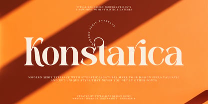 KONSTARICA is a serif font with some unique ligatures. It is suitable for branding and can be used for fonts on social media. In addition, it will also be suitable for headline fonts. To enable the OpenType Stylistic alternates, you need a program that supports OpenType features such as Adobe Illustrator CS, Adobe Indesign & CorelDraw X6-X7. Guides to access all alternates glyphs : http://adobe.ly/1m1fn4Y Cheers!
 - Comic Book by Kika Fonts,
$19.00 Designed by designer Tingnian Liu in 2015/10, Comic Book is a hand-drawn typeface specially designed for comic. Comic Book supports English, French, Spanish, Portuguese and German. It is a distinct choice for your comic book editorial challenge. Instead of adding rounded end to standard comic-type typefaces, Comic Book‘s squared ends were perfectly complementing the whole rounded style. It gives audience a cheerful feeling and makes them laugh.
 - Art Project JNL by Jeff Levine,
$29.00 A 1930s WPA (Works Projects Administration) poster advertising a play entitled “Abraham Lincoln, The Great Commoner” had the play’s name done in a hand-lettered Art Deco sans. This is the basis for Art Project JNL. According to Wikipedia, “the Works Progress Administration (renamed in 1939 as the Work Projects Administration; WPA) was the largest and most ambitious American New Deal agency, employing millions of unemployed people (mostly unskilled men) to carry out public works projects, including the construction of public buildings and roads. In a much smaller but more famous project, Federal Project Number One, the WPA employed musicians, artists, writers, actors and directors in large arts, drama, media, and literacy projects.”