10,000 search results
(0.042 seconds)
- Fibra by Los Andes,
$26.00 The font is actually not a revival of ‘Avant Garde’—by Herb Lubalin—but it takes its spirit. Fibra is a geometric sans serif, yet without the typical structural strictness of these kind of fonts, that represents experimental type design. This can be seen in the contrast between curves and straight lines in some characters such as ’n’ and ‘h’ unlike rounded ones such as ‘a’ and ‘d’; details of some display characters (e.g. three upper terminals in ‘W’ and projection off the stem in ‘A’); and exaggerated terminal in ‘R’. All these features give Fibra a strong personality—a sans serif typeface that ‘gives you the chills’. Fibra was specially designed for display use. The font has a very generous x-height that allows for use in corporate text, thanks to its good readability. Fibra comes with 2 subfamilies—a more ’normal’ Basic family, with a smaller amount of stylistic features, for use in subheadings or any other type of text that requires formality, and an Alt family that shows off the true potential of the font, making it the perfect choice for magazine headlines, posters and logotypes.
 - Springwood by Hanoded,
$12.00 Spring is in the air! At least, where I live. My two pear trees are in bloom, bees are buzzing and everything turns a brighter shade of green. Time for a new and fresh font package with a spring-inspired name! Springwood is a handmade set of fonts, ranging from a fat display font to a messy script font. Use it for your freshest ideas, your coolest designs or just anything that needs a bit of springtime.
 - Bubblegum Pop by Device,
$39.00 A funky balloon type in three variants, Highlight, Shadow and plain old Vanilla. Guaranteed to bring a sense of playful fun to packaging, comic magazines, and merchandise.
 - Bohemia by Linotype,
$29.99Argentinean designer Eduardo Manso created the Bohemia type family in 2003. Bohemia's cunning and elegant essence shows off refined letters that evoke the Transitional style typefaces like Baskerville, though most Baskerville-like designs tend not to be as curvaceous as Manso's! True to form, Bohemia shines in smaller text sizes, like 9 point and above, while still maintaining a unique character and spirit. Bohemia is a great alternative to better-known text faces. The critics have been raving. Bohemia came to Linotype via its fourth International Type Design Contest (ITDC) [Link] in 2003, where it received one of the three top awards. Under the name Argot, this typeface received a Certificate of Excellence in Type Design from the Type Directors Club of New York in 2004. Bohemia was also selected for inclusion in the 21st International Biennale of Graphic Design 2004 in Brno, Czech Republic, and was later named one of the most relevant works in the Bienal Letras Latinas 2004 exhibition, which traveled through Buenos Aires, San Paolo, Santiago, and Vera Cruz." - Film Event JNL by Jeff Levine,
$29.00 The August 11, 1929 issue of “The Film Daily” carried an ad for Tiffany-Stahl Productions’ presentation of a special film release featuring a wrestling match between “Strangler” Lewis and Gus Sonnenburg. The hand lettering for the ad was rendered in an Art Deco sans serif style, and is now available digitally as Film Event JNL in both regular and oblique versions.
 - Positive Vibe JNL by Jeff Levine,
$29.00Positive Vibe JNL is a meeting of two eras... The model for this font was Jeff Levine's Two Reeler JNL, modeled after title cards in a Charlie Chaplin movie from the beginning of the 1900s. With a few stroke weight shifts, this versatile font takes on the image of the "Peace and Love" generation of the mid-60s and early 70s. - Alphonse Mucha by K-Type,
$20.00 Alphonse Mucha is a decorative display font in the Art Nouveau style which originated over a century ago. The font is extrapolated from just nine capital letters in Mucha's 1913 concert poster for the cellist Zdeňka Černý. Letters and numerals are consistently top-heavy, imbuing text with a graceful uniformity and evenness of type color. A full repertoire of Latin Extended-A characters is contained within the font.
 - Lomidrevo by Juraj Chrastina,
$39.00 Lomidrevo is a grunge stencil family derived from Valibuk. In the free demo version, you can see numbers and lowercase letters without kerning.
 - Tobi Greek Cyrillic by RodrigoTypo,
$40.00 Tobi Greek Cyrillic is a typography based on Tobi (2015), now much improved with alternative ligatures and better than containing the Greek in capital letters and also in Cyrillic. Tobi Greek Cyrillic is a very cheerful typography, especially fun for children’s titles, juvenile children’s clothing comics, this typography was designed with a lot of love. Authors: Rodrigo Araya https://www.behance.net/Rodrigotypo and Andrey Kudryavtsev.
 - Journal Sans New by ParaType,
$40.00 The Journal Sans typeface was developed in the Type Design Department of SPA of Printing Machinery in Moscow in 1940–1956 by the group of designers under Anatoly Schukin. It was based on Erbar Grotesk by Jacob Erbar and Metro Sans by William A. Dwiggins, the geometric sans-serifs of the 1920s with the pronounced industrial spirit. Journal Sans, Rublenaya (Sans-Serif), and Textbook typefaces were the main Soviet sans-serifs. So no wonder that it was digitized quite early, in the first half of 1990s. Until recently, Journal Sans consisted of three faces and retained all the problems of early digitization, such as inaccurate curves or side-bearings copied straight from metal-type version. The years of 2013 and 2014 made «irregular» geometric sans-serifs trendy, and that fact affected Journal Sans. In the old version curves were corrected and the character set was expanded by Olexa Volochay. In the new release, besides minor improvements, a substantial work has been carried out to make the old typeface work better in digital typography and contemporary design practice. Maria Selezeneva significantly worked over the design of some glyphs, expanded the character set, added some alternatives, completely changed the side-bearings and kerning. Also, the Journal Sans New has several new faces, such as true italic (the older font had slanted version for the italic), an Inline face based on the Bold, and the Display face with proportions close to the original Erbar Grotesk. The new version of Journal Sans, while keeping all peculiarities and the industrial spirit of 1920s-1950s, is indeed fully adapted to the modern digital reality. It can be useful either for bringing historical spirit into design or for modern and trendy typography, both in print and on screen. Designed by Maria Selezeneva with the participation of Alexandra Korolkova. Released by ParaType in 2014.
 - Robot Monster NF by Nick's Fonts,
$10.00A design experiment run amok! To some, the upper case A of this font resembles a diving helmet. If you put same on a guy in a gorilla suit, you have the really cheesy 50s sci-fi movie that gives the font its name. Both versions of this font contain the Unicode 1252 (Latin) and Unicode 1250 (Central European) character sets, with localization for Romanian and Moldovan. - Dimitrina by Evolutionfonts,
$- Dimitrina was created with a simple premise: Can there exist a typeface which features a minimum of sharp angles? And a readable typeface, as well? With these strict rules in mind, the development started. At first the typeface looked more like a script, and some characters ( M G or R, to name a few) still hold traces of a handwritten style which spices the overall taste of Dimitrina. Since the first draft every character was redrawn, and edited several times, for the purpose of making the typeface readable, and distinct at the same time. Estimate for yourself if our goals are achieved, while you observe the three weights which are available exclusively in MyFonts. All of them feature a full set of characters plus cyrillic support. You can also try the regular weight which is offered free.
 - Bevel Gear by Sipanji21,
$12.00 "Bevel Gear" is a racing display font with multiple layers that can be used to create a three-dimensional (3D) effect in your text. Fonts like this are often used in racing-related design projects, including logos, posters, and advertisements for racing events or automotive-related content. By utilizing the multiple layers available in "Bevel Gear," you can give your text a three-dimensional appearance that adds depth and dimension to your design. This font allows you to create text that looks dynamic and is well-suited for designs in the world of motorsports and racing.
 - Balance by Victory Type,
$12.00The three typefaces that make up the Balance font set are legible, funky and stylish. Every character has been spaced and designed on a uniform geometric grid to insure true typographic "balance." There are only two shapes that make up every character: a parallelogram and a quarter circle. This design renders Balance a distinct family of fonts which are appropriate for all documents. Balance Regular is legible, funky and stylish. Every character has been spaced and designed on a uniform geometric grid to insure true typographic "balance." There are only two shapes that make up every character: a parallelogram and a quarter circle. This design renders Balance Regular a distinct font that is appropriate for all documents. Balance Light is legible, funky and stylish. Every character has been spaced and designed on a uniform geometric grid to insure true typographic "balance." There are only two shapes that make up every character: a parallelogram and a quarter circle. This design renders Balance Light a distinct font that is appropriate for all documents. Balance Unicase is legible, funky and stylish. Every character has been spaced and designed on a uniform geometric grid to insure true typographic "balance." Each letter, in this unicase version of Balance uses a single character height. There are only two shapes that make up every character: a parallelogram and a quarter circle. This design renders Balance Unicase a distinct font that is appropriate for all documents. - Hand It by PintassilgoPrints,
$24.00 Carefully messy, sweetly odd, this friendly family conveys a cool - but warm - organic feel. With mixed letterforms and somewhat unexpected choices here and there, each font brings a handful of alternates for a nice natural look: there are five alternates for letters, three for numbers plus alternates for punctuation marks. All cleverly programmed into Contextual Alternates feature to instantly cycle at your command. This is not an usual font. Is that one just strange enough to nicely fit a wide range of designs, carrying your idea with plenty of personality. Quite cool. Hand it!
 - Avoiste Laverta by Ilhamtaro,
$19.00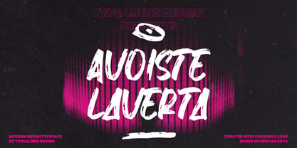 AVOISTE LAVERTA is a display font with a brush texture. Modern in nature suitable for social media design and branding. This font is allcaps font. To enable the OpenType Stylistic alternates, you need a program that supports OpenType features such as Adobe Illustrator CS, Adobe Indesign & CorelDraw X6-X7. Cheers!
 - Persona by Linotype,
$29.99Persona is based on characters texted with a brush and found on a poster made for the Swedish poetry magazine Lyrikvännen. While the characters in Manuskript are typographically and calligraphically done with great skill, the ones in Persona carry a highly personal touch. Still, they are fully usable - for the right kind of work. The name refers to the personal shaping of the characters. In Esperanto, which contributed with the name once more, persona" means "personal". Persona was released in 1995. - Seminary by Solotype,
$19.95This began life as a European font that was copied in the United States by Bruce's Type Foundry in 1885. It was caps only and had a fine line "three-D" shadow. We scrapped the shadow, added a lower case, and voila! - Tulipán by Estudio Calderon,
$59.95 After Letrista Script, Calderón Estudio returns with a new contemporary and adaptable typeface. Tulipán Lovely Script is a font with three variations resulting in a subtle design that can be smooth as the fresh tulips that inspired it, markedly delineated as a tulip in full bloom, or rough as crocodile skin. Tulipán evokes the soul of vintage brush lettering. See our samples here. Features include: Tulipan Display: Stylistics alternatives, contextual alternates, swash, discretionary ligatures, standard ligatures, oldstyle figures, language support, titling alternates and 59 ornaments. Tulipan Broken: Broken effect, Stylistics alternatives, contextual alternates, swash, discretionary ligatures, standard ligatures, oldstyle figures, language support, titling alternates, small caps and 59 ornaments. Tulipan Rough: Rough effect, Stylistics alternatives, contextual alternates, discretionary ligatures, language support, cath words, 77 ornaments and free samples patterns! You will love it!
 - Willow Eden by Balpirick,
$15.00 Willow Eden is a Modern Handwritten Font. Willow Eden is a magical script font carefully created with a touch of elegance. Whether you’re looking for fonts for Instagram or calligraphy scripts for DIY projects, this font will turn any creative idea into a true piece of art! Willow Eden also multilingual support. Enjoy the font, feel free to comment or feedback, send me PM or email. Thank you!
 - Alt Fat by ALT,
$- Do you like fat fonts? Well here is a free one from me. Regular & Italic both free. Fat is a caps only font. Because of that if you type something with caps on, as you can see is typing in Greek I decide to make it like this since there no lowercase letters.
 - Papillon Woodcuts by Celebrity Fontz,
$24.99 Papillon Woodcuts is a digital revival of an ornate alphabet by French engraver Jean Michel Papillon dating back to 1760, when engraving was very fashionable in France. Each letter is displayed with a different themed background, such as a ship at sea; a fancy table topped with a bounty of fruits; flying birds; a parasol with flowers; playful cherubs; rich textured drapes and tapestries; and many more. These woodcut initials are especially beautiful when used at the beginning of a paragraph as in olden texts.
 - North point - Unknown license

- West point - Unknown license

- Hemicube by Mans Greback,
$59.00 Hemicube is a geometric logotype font, created by Mans Greback in 2020. Its futuristic lettering follows a mathematical pattern while being minimalistic and clean, which makes in work perfectly in sci-fi or technology context graphics. It is a three-style typeface family; in addition to the regular Hemicube style, it also comes as a basic Type style as well as a monogram Logo style. In the Hemicube Logo font, write any three capital letters to make a cube monogram. Example: ABC Use underscore to create a logo with fewer letters. Examples: A_B _CD _E_ It has a very extensive lingual support, covering all European Latin scripts. The font contains all characters you'll ever need, including all punctuation and numbers.
 - Huckleberry by Canada Type,
$24.95Huckleberry is a revival and expansion of a 1973 typeface called Mark Twain, which was G. Jaeger's reaction to the popularity of VGC's Eightball (also digitized and expanded as Orotund by Canada Type) from across the ocean. Jaeger's reaction was typical German efficacy, with majuscules that surpass their inspiration in art and humour, and minuscules that could have been just the thing if one wanted to make the Eightball lowercase friendlier. Back in its day, this font reached its own heights of popularity in Western Europe, but in the Americas it was less known because art nouveau faces were being made by the hundreds in the 1970s. Round, happy and bouncy, Huckleberry comes as a timely response to public demand for big and cheerful letters. Huckleberry is also very effect-friendly. Stretch it a bit, drop-shadow it, warp it, and it will still keep its cheer and communicate the message with a smile. Huckleberry comes in all popular formats, and contains plenty of alternates sprinkled throughout the character set. - Sunny Weather by Hanoded,
$15.00 Spring is in the air! My chickens are broody and are sitting on an ever increasing pile of eggs; my fruit trees are budding and the sun is shining! Sunny Weather is a happy kind of font: it was handwritten, using a Sharpie pen. It comes with double letter ligatures and a good dose of vitamin D!
 - Sitcom by GroupType,
$19.00 If there was an American Typeface Hall of Fame, Bank Gothic, designed by the great Morris Fuller Benton would hold a place of special distinction considering this design has survived so many trends in typographic fashion since being introduced in 1930. It's just as desirable today as it was over eighty years ago; arguably more. Today, Bank Gothic is a very popular choice as a titling face for science fiction books, posters and countless television and movie titles. It is also a popular typeface for use in computer games and digital graphics. GroupType’s 2010 revival of this American classic is true to the design, the period, and Benton’s aesthetic. GroupType worked with some of the most talented and experienced type designers that were historically grounded and sensitive to this design project. Fortunately, Mr. Benton has left us a large selection of other great typefaces for insight and guidance. GroupType’s new revival includes the original three weights in regular and condensed style but also a new small cap and lowercase in each font necessary for 21st century typography.
 - SP Honey Bunny by Studio Pulp,
$12.00 Discover the effective simplicity of SP Honey Bunny, a masterfully crafted display font created in 2023 by Studio Pulp. Inspired by the character Honey Bunny, the partner of Pumpkin in the cinematic classic "Pulp Fiction" (1996), this font, while not taking center stage, exudes a striking presence. This remarkable typeface, designed with meticulous attention to detail and craftsmanship, showcases versatility that seamlessly complements various design projects, particularly excelling in titles. The three well-balanced weights provide the freedom to unleash your creativity, while the clear, open forms optimize readability. SP Honey Bunny, anchored in a clean grid design, embodies modern minimalism and accessible elegance. Whether you're working on web design, graphic design, or print materials, this font adds a touch of timeless class to your creations. Be inspired by the seamless blend of functionality and aesthetics in SP Honey Bunny. Specifically crafted to meet the demands of 2023, this font brings a contemporary flair to your projects while remaining true to Studio Pulp's legacy of dedication to quality and innovation. Transform your typographic landscape with SP Jody and leave a lasting impression.
 - Bank Gothic by GroupType,
$29.00 If there was an American Typeface Hall of Fame, Bank Gothic, designed by the great Morris Fuller Benton would hold a place of special distinction considering this design has survived so many trends in typographic fashion since being introduced in 1930. Its just as desirable today as it was over eighty years ago; arguably more. Today, Bank Gothic is a very popular choice as a titling face for science fiction books, posters and countless television and movie titles. It is also a popular typeface for use in computer games and digital graphics. GroupType’s 2010 revival of this American classic is true to the design, the period, and Benton’s aesthetic. GroupType worked with some of the most talented and experienced type designers that were historically grounded and sensitive to this design project. Fortunately, Mr. Benton has left us a large selection of other great typefaces for insight and guidance. GroupType’s new revival includes the original three weights in regular and condensed style plus two new distressed fonts. All have a new small cap and lowercase in each font necessary for 21st century typography.
 - Schema by Fonthead Design,
$19.00Schema is a family of hand-drawn architectural lettering designed by Ethan Dunham. Schema comes in three weights, light, regular and bold. This font works well both in mixed case and upper case settings. - Kargert by Oleg Gert,
$30.00 Kargert is a typeface that carries powerful messages in a modern graphic style with ease. It uniquely combines simplicity and sophistication. With the display typeface Kargert, you can create stunning headlines that will grab attention. Let Kargert impress your viewers and help deliver your message with strong impact.
 - Wild Flower Peach Creme by PeachCreme,
$14.00 Bonjour, and we are pleased to present "Wildflower"! A cheery, little hand-lettered typeface that has a charming and reassuring air. Ideal for making banners, logos, cards, and packaging, among other things. You may use its endearing and friendly personality to offer your work a genuine, one-of-a-kind vibe.
 - Dime by Produce,
$29.00 Intended to create a typeface that contain both two dimensional and three dimensional elements, Dime gives a very bold optical illusion effect. It is so intense and masculine that it is still macho in pink. Available in both Solid and Lined.
 - Holybuck by Sarid Ezra,
$15.00 Introducing, Holybuck, classic signature family! Holybuck is signature script with three style that contain stylistic alternate, swash and underline to create your own costumized signature or logo design. This font is also support multi language. Available in OTF and TTF. Also Support PUA. It's available in three weigh style! For another questions, please send a mail to saridezra@gmail.com. Thank You! To add the line in under the text, type underscore + number (from 1 to 5). Or copy Some_5thing in preview bellow..
 - Adoreles by Nathatype,
$29.00 Adoreles is a distinctive sans-serif display font that stands out with its elegance and unconventional charm. Crafted with a delicate touch, this font creates a visual experience that is both refined and uniquely artistic. With Adoreles, you have a sans-serif display font that redefines the expected. The characters in Adoreles are presented in uppercase, each possessing a subtle sophistication. By eschewing boldness, the font embraces a refined simplicity. The true magic of Adoreles lies in its inlines—irregular, yet meticulously designed to add a touch of unpredictability and individuality to each letter. Enjoy the features here. Features: Multilingual Supports PUA Encoded Numerals and Punctuations Adoreles fits in headlines, logos, posters, flyers, branding materials, greeting cards, print media, editorial layouts, and many more designs. Find out more ways to use this font by taking a look at the font preview. Thanks for purchasing our fonts. Hopefully, you have a great time using our font. Feel free to contact us anytime for further information or when you have trouble with the font. Thanks a lot and happy designing.
 - Compagnon by Hanoded,
$15.00 Compagnon is a friend, a partner. This handmade display font will come in super handy when you are working on that book cover, or the packaging of a product. It will shine on posters and websites and it will keep you warm at night. I guess that last bit is an exaggeration… Compagnon comes in three distinct styles: a ‘regular’ version, which is a bit rough around the edges, a ‘dirty’ version, with a juicy eroded look and a polka dot version. All three have their accompanying italics.
 - Nouveau Square JNL by Jeff Levine,
$29.00 Sheet music for the 1915 song "Is There Still Room for Me Neath the Old Apple Tree" had the title hand-lettered in a condensed, square sans serif. Although far from the more decorative lettering styles of the Art Nouveau period, this type of simple understatement was also a popular choice for the illustrators of the day. It is presented digitally as Nouveau Square JNL in both regular and oblique versions.
 - Gandur New by Blackletra,
$50.00 Gandur is a display textura in three weights, split into two families: Alte — the German word for old — and New. Gandur was inspired by other geometric texturas, specially Max Bittrof’s Element (1933). The design began by adhering to a strict hexagonal grid, but during its development, slowly moved from a purely geometric to a more pen-based design (this is especially true in the heaviest weights). The differences between Alte and New are essentially morphological, with reflections in the character set and OpenType features. Gandur New has a more humanistic, contemporary structure and is more ‘romanized’ then Alte. Gandur New also features small capitals. Gandur Alte, on the other hand, remains truer to historical forms, most notably: S s X x Z z. Gandur Alte also features the long-s, which can be accessed via a Stylistic Set or the glyph palette. (As is historically accurate, a short-s will be used at the end of words automatically when the historical Stylistic Set has been activated).
 - Gandur Alte by Blackletra,
$50.00 Gandur is a display textura in three weights, split into two families: Alte — the German word for old — and New . Gandur was inspired by other geometric texturas, specially Max Bittrof’s Element (1933). The design began by adhering to a strict hexagonal grid, but during its development, slowly moved from a purely geometric to a more pen-based design (this is especially true in the heaviest weights). The differences between Alte and New are essentially morphological, with reflections in the character set and OpenType features. Gandur New has a more humanistic, contemporary structure and is more ‘romanized’ then Alte. Gandur New also features small capitals. Gandur Alte, on the other hand, remains truer to historical forms, most notably: S s X x Z z. Gandur Alte also features the long-s, which can be accessed via a Stylistic Set or the glyph palette. (As is historically accurate, a short-s will be used at the end of words automatically when the historical Stylistic Set has been activated).

