10,000 search results
(0.059 seconds)
- Lewis Hamilton by IbraCreative,
$27.00 Lewis Hamilton is a stylish signature font that embodies elegance and sophistication. Inspired by the signature of the renowned Formula One driver, Lewis Hamilton, this typeface exudes a sense of confidence and refinement. Each letter carries a graceful flow, reminiscent of a personalized signature, adding a touch of exclusivity to any design. With its sleek lines and carefully crafted curves, Lewis Hamilton captures the essence of a stylish and modern aesthetic. Whether used for branding, luxury products, or high-end invitations, this font brings a sense of prestige and class. Lewis Hamilton is the perfect choice for those seeking a signature font that exudes timeless style and a touch of celebrity allure.
 - Shade of Adelyne - Personal use only

- More than Enough - Personal use only

- The World Is Yours - Personal use only

- Sue Ellen Francisco - Personal use only

- Blue Highway Linocut - Unknown license

- Magical Mystery Tour - Unknown license

- DS Nova - Unknown license

- Alpha Flight Solid - Unknown license

- Alpha Flight Small Caps - Personal use only

- Activate - Unknown license

- Bright Orchid by Balpirick,
$15.00 Bright Orchid is a Bold Handbrushed Font. Bright Orchid is perfect for product packaging, branding project, megazine, social media, wedding, or just used Bright Orchid has multilingual support. Enjoy the font, feel free to comment or feedback, send me PM or email. Thank you!
 - Cullens Shoes by Aboutype,
$24.99Decorative three-dimensional display font with cap and lowercase. Originally designed for a shoe company. Works with colors, gradients and filters. Cullens Shoes was designed for all media and works best at 30 point and above. Cullens Shoes requires subjective display kerning and compensation. - Mysthiqa by Essentials Studio,
$16.00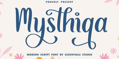 Introducing by Essentials Studio Mysthiqa Is a Modern Script Font Mysthiqa is perfect for product packaging, branding project, megazine, social media, wedding, or just used to express words above the background. Enjoy the font, feel free to comment or feedback, send me PM or email
 - Beautifull Weakness by Sarid Ezra,
$15.00 Beautiful Weakness is a free-styled handwritten font that will make all your project more unique. With brush touch, this font will make your artwork feels more natural. Comes with ligatures and underline that you can access it from opentype feature. Also support multi language!
 - Moodystone by Adante Creative,
$23.00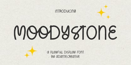 Moodystone A Playful Display Font Moodystone is perfect for product packaging, branding project, magazine, social media, wedding, or just used to express words above the background. Moodystone also multilingual support. Enjoy the font, feel free to comment or feedback, send me PM or email.
 - Signaday by Allouse Studio,
$16.00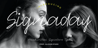 Proudly Present, Signaday a Modern Monoline Handwritten Font. Signaday is perfect for product packaging, branding project, megazine, social media, wedding, or just used to express words above the background. Enjoy the font, feel free to comment or feedback, send me PM or email. Thank You!
 - Redmilk by Awan Senja,
$14.00 Redmilk embodies fun, quirkiness and authenticity. This enchanting handwritten font will turn any creative idea into a true standout. Get inspired by its authentic feel and use it to create gorgeous wedding invitations, beautiful stationary art, eye-catching social media posts, and cute greeting cards.
 - Optima Cyrillic by Linotype,
$65.00Many typefaces are distinctive or attractive at the expense of legibility and versatility. Not so the Optima® family. Simultaneously standing out and fitting in, there are few projects or imaging environments outside of its range. Although Optima is almost always grouped with sans serif typefaces, it should be considered a serifless roman. True to its Roman heritage, Optima has wide, full-bodied characters – especially in the capitals. Only the E, F and L deviate with narrow forms. Consistent with other Zapf designs, the cap S in Optima appears slightly top-heavy with a slight tilt to the right. The M is splayed, and the N, like a serif design, has light vertical strokes. The lowercase a and g in Optima are high-legibility two-storied designs. Optima can be set within a wide choice of line spacing values – from very tight to very open. In fact, there are few limits to the amount of white space that can be added between lines of text. Optima also benefits from a wide range of letter spacing capability. It can be set quite tight, or even slightly open – especially the capitals. If there are any guidelines, Optima should be set more open than tight. It’s not that readability is affected that much when Optima is set on the snug side; it’s just that the unhurried elegance and light gray typographic color created by the face are disrupted when letters are set too tight. Optima is also about as gregarious as a typeface can be. It mixes well with virtually any serif design and a surprisingly large number of sans serif faces. The Optima family is available in six weights, from roman to extra black, each with an italic counterpart. In addition, the family is available as a suite of OpenType® Pro fonts, providing for the automatic insertion of small caps, ligatures and alternate characters, in addition to offering an extended character set supporting most Central European and many Eastern European languages. When you’re ready to find its perfect pairing, browse these fantastic matches: Monotype Century Old Style™, Dante®, Frutiger® Serif, Joanna® Nova, Malabar™, and Soho®. - Optima by Linotype,
$45.99 Many typefaces are distinctive or attractive at the expense of legibility and versatility. Not so the Optima® family. Simultaneously standing out and fitting in, there are few projects or imaging environments outside of its range. Although Optima is almost always grouped with sans serif typefaces, it should be considered a serifless roman. True to its Roman heritage, Optima has wide, full-bodied characters – especially in the capitals. Only the E, F and L deviate with narrow forms. Consistent with other Zapf designs, the cap S in Optima appears slightly top-heavy with a slight tilt to the right. The M is splayed, and the N, like a serif design, has light vertical strokes. The lowercase a and g in Optima are high-legibility two-storied designs. Optima can be set within a wide choice of line spacing values – from very tight to very open. In fact, there are few limits to the amount of white space that can be added between lines of text. Optima also benefits from a wide range of letter spacing capability. It can be set quite tight, or even slightly open – especially the capitals. If there are any guidelines, Optima should be set more open than tight. It’s not that readability is affected that much when Optima is set on the snug side; it’s just that the unhurried elegance and light gray typographic color created by the face are disrupted when letters are set too tight. Optima is also about as gregarious as a typeface can be. It mixes well with virtually any serif design and a surprisingly large number of sans serif faces. The Optima family is available in six weights, from roman to extra black, each with an italic counterpart. In addition, the family is available as a suite of OpenType® Pro fonts, providing for the automatic insertion of small caps, ligatures and alternate characters, in addition to offering an extended character set supporting most Central European and many Eastern European languages. When you’re ready to find its perfect pairing, browse these fantastic matches: Monotype Century Old Style™, Dante®, Frutiger® Serif, Joanna® Nova, Malabar™ and Soho®.
 - Silent Brush by Ditatype,
$29.00 Silent Brush is a very lovely, elegant script font in capital letters bigger than ordinary ones to express such dramatic, attractive visual effects. To be consistently legible and harmonious in the whole context, every letter has its own proportions. One of the font’s main features is the brush scratch on every letter to show that the writing is made up of a paint brush producing a lot of rough textures. You can see the brush scratches along the letters’ edges and the letters’ sides to express dynamic moving flows. Despite being inspired by handwritings, this script font has gone through various adjustments making it more consistent and legible. Furthermore, it is much better to use this font for big text sizes to be more legible. In addition, you may enjoy the available features here as well. Features: Multilingual Supports PUA Encoded Numerals and Punctuations Silent Brush fits best for any design projects requiring artistic touches such as brands’ logos, posters, merchandise designs, and other promoting media. Find out more ways to use this font by taking a look at the font preview. Thanks for purchasing our fonts. Hopefully, you have a great time using our font. Feel free to contact us anytime for further information or when you have trouble with the font. Thanks a lot and happy designing.
 - Saikend by Twinletter,
$17.00 Welcome to the world of Sakend! A display font that describes the strength and courage of a superhero. Whether you are working on film projects, games, or designs with strong and action-packed themes, Saikend is the perfect choice for you. With a style inspired by superheroes, Saikend will make your designs the center of attention. The courage and strength that radiate from each letter will bring your project to life, giving it a bold and unforgettable look. Not only has an attractive appearance but Saikend is also equipped with special features. Alternate ligatures and characters provide flexibility in usage, allowing you to create unique and creative typographical combinations. In addition, Saikend supports multiple languages, so you can get your message across the world. It’s time to show the power of Saikend in your projects. Bring a touch of hero to your designs with this font, and create an unforgettable look for your audience. Feel free to express courage and thickness through Saikend, and create stunning and inspiring pieces. What’s Included : File font All glyphs Iso Latin 1 Alternate, Ligature Simple installations We highly recommend using a program that supports OpenType features and Glyphs panels like many Adobe apps and Corel Draw so that you can see and access all Glyph variations. PUA Encoded Characters – Fully accessible without additional design software. Fonts include Multilingual support
 - Fortune by Gleb Guralnyk,
$14.00 Introducing Fortune Font set. This typeface has an old school look with classic western shapes. Fortune Variable Font has three predefined weights (Thin, Regular & Bold) and Variable font with flexible weight. All of the small letters has one or two alternates with bottom expanded shape*. Fortune Variable Font supports most of the European languages. *Make sure that "Contextual & Stylistic Alternates" features are supported & enabled in your software. Also please consider that this feature is available only for English alphabet.
 - Nordic Folk by Kaer,
$19.00 Hey there! I'm happy to introduce to you my new ethnic-based font. Hurray! It was long and hard work because every glyph is unique. I sketched each letter of the font. Each letter is uniquely designed and has nordic folk art in the background. What you will get: Filled and Regular styles Icons and patterns font Uppercase (lowercase glyphs are same) Numbers and symbols Multilingual support Please feel free to request to add characters you need: kaer.pro@gmail.com
 - Laftale by Midvel,
$12.00 Fresh script font, Laftale. Laftale help you to make brush font easily. Laftale is casual script typeface with clean characters. This font comes in three style, regular, Italic, and bold. This font is perfect to design especially poster, logo, apparel, book cover, greeting card, birthday card, quotes, advertising poster, and anymore. Explore Opentype features to get unique combination. Feature : · Uppercase · Lowercase · Number · Punctuation · Multilingual (Accented Letters) · Ligature · Swash · Contextual Alternate · Style set (01-03) · PUA Encoded Characters
 - Varius by Linotype,
$29.99The shapes of the f-holes on a violin reminded German designer André Maaßen of an italic letter "f". Maaßen used these captivating contours as the theme for his type family, Varius. The name "Varius" is an homage to the manufacturer of the violin that inspired Maaßen's project, Antonio Stradivarius, the most famous manufacturer of violins in music history. Varius has three separate styles. Varius 1 and its italic are the base style of the family, and are typefaces in the baroque serif manner. Varius 2 and its italic are slab serif egyptiennes, slightly heavier than Varius 1's more classical forms. Varius 3 and its italic are semi serif faces; their characters are serifed, but some of the serifs have been cut off. The family is rounded out with two pi faces: an ornaments font (which can be used in conjunction with the text fonts, or on its own to create beautiful borders or individual decorative elements), and a font of musical symbols and notations. Each of the six text fonts has dozens of supplemental ligatures included in their character sets. When these fonts are used in an OpenType-supporting application, such as Adobe InDesign, these ligatures automatically appear in text when the "Discretionary Ligatures" feature is activated. Additionally, the character sets include added alternate glyphs, such as a swash "m" or "n" to finish off a line of text. These can be inserted manually in applications that include glyph palettes (e.g., Adobe InDesign or Illustrator CS). All of the Varius family's letterforms appear slightly narrow, and traces of the wide-nibbed pen can be seen within their forms. Additionally, the shape of a violin's f-hole is a reminiscent element within all of the family's curves. Varius is particularly suited for use many applications, such as body text, newspaper text, display text, headlines, posters, books, screen design, and corporate identity. Use in sizes ranging from body copy text to display and poster format allow the different facets of the typeface to effectively present themselves. The effects can be as versatile as the possibilities! Due to its special character, the typeface could be used in the design of a logo, or within an appropriate corporate design context, to particularly stress individuality. - URLOP by Mikołaj Grabowski,
$9.00 Colour is more fun than black, but multicolour is even better. Let me introduce URLOP, a wide type family suitable for your fancy posters, headlines, covers, illustrations, websites, initials, blackmails, chronicles, signboards, poems and many others. Twelve basic styles, which make the overall construction, give a wide range of opportunities. All of them, being able to mix with each other, vary from a thin INSIDE, through a medium FILL, to a double-stem PLUS styles. And then comes a range of colour fonts, so you don’t have to waste any of your precious time for experiments, because I’ve already done it for you! URLOP is an all-caps display collection consisting of three sub-families of fonts, divided by the usage they are designed for. First of all, there is a wide range of alphabets made in the new OpenType-SVG colour fonts format. This is quite a novelty and a very promising technology at the same time. It allows designers to store colour information inside the font. Due to my experience with layered colour thinking that I explored in my first family - Epilepsja , I decided to make several preset layer combinations in this auspicious format. This sub-group is tagged RGB. Make sure that your field of usage and software support OT-SVG format. However, if you feel a need to experiment in the old-fashioned way, you may buy separate layers under the DIY tag. The last group is very similar to the DIY, but it was optimized to look better when standing without other layers. It’s called PRO*. All styles cover Latin alphabets of Europe, basic Cyrillic and Greek sets. Have fun! Before using the font, read the instructions and specimen attached to font files in the purchased package or download them from the Gallery tab on this site. This will help you avoid making unexpected mistakes when combining layers. *PRO subfamily release planned in 2019.
 - Neonrec by Ditatype,
$29.00 Neonrec is an innovative display font that merges futuristic aesthetics with the mesmerizing allure of neon lights. With its bold uppercase letterforms and a luminous neon backlight, this typeface commands attention, creating a visually stunning and forward-thinking experience. The special characteristic of this font lies in the sleek and cutting-edge design, embodying the essence of a futuristic world. Each letter is meticulously crafted with precision and sharp lines, exuding a sense of technological advancement and modernity. The neon backlight adds a striking visual element that elevates the font to new heights. Inspired by the captivating glow of neon lights, Neonrec infuses a sense of energy and innovation into each character. The luminous backlight creates a radiant glow that casts a captivating hue, reminiscent of the neon signs that adorn the streets of a futuristic metropolis. This futuristic neon effect adds depth and dimension to the font, creating an eye-catching visual impact. Features: Ligatures Multilingual Supports PUA Encoded Numerals and Punctuations Neonrec is perfect for attention-grabbing headlines, logos, and sleek branding applications that require a touch of futuristic sophistication. It is thrives in designs that embrace a forward-thinking and cutting-edge style. Whether you're creating posters, digital interfaces, sci-fi themed artwork, or anything in between, this font will add a captivating futuristic element that sets your project apart. It shines particularly bright in applications related to technology, gaming, science, and futuristic-themed designs. Find out more ways to use this font by taking a look at the font preview. Thanks for purchasing our fonts. Hopefully, you have a great time using our font. Feel free to contact us anytime for further information or when you have trouble with the font. Thanks a lot and happy designing.
 - Squealer Embossed - Unknown license

- Teen - Unknown license

- NCL Bliss Sureal by Enxyclo Studio,
$19.00 NCL BLISS SUREAL is bold brush script font. It's fun, unique, stylish and modern-classic display font. Masterfully designed to become a true favorite, this font has the potential to bring each of your creative ideas to the highest level! It was purposely crafted to be used in large point sizes, although it doesn’t lose its magic in small point sizes. It is perfect for headline, billboard, magazines, website, titles, poster, branding, t-shirt design, and logos. No matter the topic, this font will be an incredible asset to your fonts’ library, as it has the potential to elevate any creation. With this beautiful font, absolutely you can make your project stand out from the rest. See the previews above to get some inspiration on how to use them. FEATURES Contains 374 Glyphs Uppercase, Lowercase, & Numeral Punctuation, Symbol & Currencies 25 Ligatures Multilingual Support
 - Neutro by Durotype,
$49.00 Neutro is a neutral, multi-purpose font family. It is Aspira made more neutral, by removing angled terminals. Neutro’s subtle, fresh geometric personality, makes it ideal for any use where the content is more important than the font used to display this content. As neutral as it may be, its presence is always pleasant in an inconspicuous way. Neutro is well suited for both text and display use — for graphic design, corporate identity design, magazines, newspapers, books, reports, editorials, web, advertising, signage, etc. Neutro includes eight uprights and matching italics. Neutro includes nine numerical styles: lining and oldstyle figures (proportional and tabular), small cap figures, superiors, inferiors, numerators, and denominators. Neutro includes small caps, arbitrary fractions, and extensive language support. Free demo font available. Neutro in use: 1. For more information about Neutro, download the PDF Specimen Manual.
 - Zulu-Ndebele Pattern by Scholtz Fonts,
$19.00Zulu-Ndebele Pattern is the first ever font to be based solely on the traditional decorative patterns of the Zulu and Ndebele tribes of Southern Africa. The designer has lived in KwaZulu (Place of the Zulu), for over 50 years and has made a life-long study of traditional Zulu beadwork and carving, and of Ndebele wall decoration. There are 52 pattern units that may be combined in many ways to create borders, backgrounds and an unlimited number of designs. The pattern units correspond to the upper and lower case letters. The reason that the Zulu and Ndebele patterns have been grouped together is that the true tribal areas are contiguous and the there has been much artistic cross-fertilization between the two cultures. Many of the patterns that are used by the two tribes are identical. - Copperplate Classic Medium by Wiescher Design,
$49.50 Copperplate was the classic nineteenth century engravers typeface, consisting of capitals and small caps only. Among others (for example Deberny & Peignot) F. W. Goudy's cut for ATF around 1901 is probably the most widely known. Copperplate typefaces are traditionally used for business cards and all that "serious" stuff. My Copperplate Classic is a completely new design, based on some old samples. To make it look more up-to-date and elegant, I gave it some extra swings here and there. The old fonts were all designed with clogging corners or points that can break off in the minds of its designers. Today we do not have those problems any longer, so I could give my Copperplate Classic real sharp pointed serifs. To give you more choice I now added this medium cut in three variations, medium, sans and rounded! Enjoy! Gert Wiescher
 - Copperplate Classic Light by Wiescher Design,
$88.00 Copperplate was the classic nineteenth century engraver's typeface, consisting of capitals and small caps only. Among others (for example Deberny & Peignot) F. W. Goudy's cut for ATF around 1901 is probably the most widely known. Copperplate typefaces are traditionally used for business cards and all that "serious" stuff. My Copperplate Classic is a completely new design, based on some old samples. To make it look more up-to-date and elegant, I gave it some extra swings here and there. The old fonts were all designed with clogging corners or points that can break off in the minds of its designers. Today we do not have those problems any longer, so I could give my Copperplate Classic real sharp pointed serifs. To give you more choice I now added this light cut in three variations, light, sans and rounded! Enjoy! Gert Wiescher
 - ITC Garamond Handtooled by ITC,
$34.99Claude Garamond (ca. 1480-1561) cut types for the Parisian scholar-printer Robert Estienne in the first part of the sixteenth century, basing his romans on the types cut by Francesco Griffo for Venetian printer Aldus Manutius in 1495. Garamond refined his romans in later versions, adding his own concepts as he developed his skills as a punchcutter. After his death in 1561, the Garamond punches made their way to the printing office of Christoph Plantin in Antwerp, where they were used by Plantin for many decades, and still exist in the Plantin-Moretus museum. Other Garamond punches went to the Frankfurt foundry of Egenolff-Berner, who issued a specimen in 1592 that became an important source of information about the Garamond types for later scholars and designers. In 1621, sixty years after Garamond's death, the French printer Jean Jannon (1580-1635) issued a specimen of typefaces that had some characteristics similar to the Garamond designs, though his letters were more asymmetrical and irregular in slope and axis. Jannon's types disappeared from use for about two hundred years, but were re-discovered in the French national printing office in 1825, when they were wrongly attributed to Claude Garamond. Their true origin was not to be revealed until the 1927 research of Beatrice Warde. In the early 1900s, Jannon's types were used to print a history of printing in France, which brought new attention to French typography and the Garamond" types. This sparked the beginning of modern revivals; some based on the mistaken model from Jannon's types, and others on the original Garamond types. Italics for Garamond fonts have sometimes been based on those cut by Robert Granjon (1513-1589), who worked for Plantin and whose types are also on the Egenolff-Berner specimen. Linotype has several versions of the Garamond typefaces. Though they vary in design and model of origin, they are all considered to be distinctive representations of French Renaissance style; easily recognizable by their elegance and readability. ITC Garamond? was designed in 1977 by Tony Stan. Loosely based on the forms of the original sixteenth-century Garamond, this version has a taller x-height and tighter letterspacing. These modern characteristics make it very suitable for advertising or packaging, and it also works well for manuals and handbooks. Legible and versatile, ITC Garamond? has eight regular weights from light to ultra, plus eight condensed weights. Ed Benguiat designed the four stylish handtooled weights in 1992." In 1993 Ed Benguiat has designed Handtooled versions. - VTC-SumiSlasherOne - Personal use only

- VTC-KomikSkans-Two - Personal use only

- Bodaholic by Bungletter,
$12.00 Bodaholic is a very cute, elegant and unique script font. Expertly designed to become a true favorite, this font has the potential to take your creative ideas to the highest level! Bodaholic is appealing because it's sleek, clean, feminine, sensual, glamorous, simple and easy to read, thanks to its many fancy lettering connections. I also offer a number of viable alternative styles for all letters. Classic style is very suitable to be applied in various formal forms such as invitations, labels, restaurant menus, logos, fashion, make up, stationery, novels, magazines, books, greeting cards/weddings, packaging, labels or all kinds of advertisements. for your purposes. . . . . . . Contains full set: -Uppercase -Lowercase -Alternative - Ligature - Punctuation -Number - Multilingual support. Need help or have questions let me know. I'm happy to help. Thank you & Congratulations on the Design.
 - Lichtspiele by Typocalypse,
$29.00 Cinemas from the early 20th century are called “Lichtspiele” in Germany. “Lichtspiele” transports you back to a time where neon lights and marquee letters decorated cinema façades. Of the five styles, three have two versions of italics — the left-leaning italic evokes looking up from lower-left, the right-leaning italic is as if we are looking from lower-right. Display is the basic style, while Neon is inspired by the old neon letters found outside cinemas. Try placing Neon Outline on top of Display or Neon to add another layer to your artwork. Neon 3D is a extruded version of Neon. The Screen Credits style is based on the notes — producers, cast, crew and so on — on movie posters. Get more out of life, go out to a movie.


