Carouge Pro is a contemporary typeface with a classical twist. This duality gives Carouge an energetic and vivid sensibility. Its subtle shapes are highly suitable for all types of documents, including corporate collateral and publicity literature. The fineness of the types provides a pure and elegant style that is highly valued in the fashion and design industry. While extremely legible in small body sizes, its personality comes into full bloom when used in large type sizes. Carouge comprises a wide range of bold fonts, from Ultra Thin to Ultra. The italic companion of the roman type has a split-line allure with a rounded personality. Carouge Pro is available in eight weights from the UltraThin to an Ultra Black. Each weight is also supported by a strong personality cursive italic. “When I designed Carouge, I wanted to create a typeface with a sober appearance and a dash of audacity. Carouge provides a fine balance between two different worlds.” — André Simard Carouge Pro is a contemporary typeface with a classical twist. This duality gives Carouge an energetic and vivid sensibility. Its subtle shapes are highly suitable for all types of documents, including corporate collateral and publicity literature. The fineness of the types provides a pure and elegant style that is highly valued in the fashion and design industry. While extremely legible in small body sizes, its personality comes into full bloom when used in large type sizes. Carouge comprises a wide range of bold fonts, from Ultra Thin to Ultra. The italic companion of the roman type has a split-line allure with a rounded personality. Carouge Pro is available in eight weights from the UltraThin to an Ultra Black. Each weight is also supported by a strong personality cursive italic. “When I designed Carouge, I wanted to create a typeface with a sober appearance and a dash of audacity. Carouge provides a fine balance between two different worlds.” — André Simard
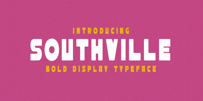
Introducing, Southville! a bold and fun display font. it's bold characteristic and round at the edges makes this font bold and brave but have soft and fun charm. this font is perfect for books, packaging, branding, make up, novel, label, etc. Features : uppercase & lowercase numbers and punctuation multilingual PUA encoded
Tabac Slab was created by combining several contradictory influences, the result of which is a universal linear font. The combination of brisk serifs and refined calligraphic details in the structure of the characters serves to create an original concept that mixes influences from both book and advertising graphics. Serifs aid legibility in long texts, while small drawn details realise their full potential in sizes of twenty-four points and larger. The basis for our Egyptienne was Tabac Sans, with which Slab logically forms a harmonic duo. The addition of bracket-less serifs caused the typeface to thicken and become solidly anchored on the lines, giving a firm answer to all typographers who like to complain about the slight exuberance of grotesque fonts.
Introducing 58 Rodeo: A Classic Redefined 58 Rodeo is based on several different woodtypes used primarily as display faces in the late 1800s/early 1900s. The difference with this version of a classic woodtype is the balance and legibility. 58 Rodeo has been redrawn to emphasize line and character uniformity. The goal is to create a eurostyle, square look in a western font designed for modern applications with wild west sensibility. Additional characters provide whimsy and flair to round out any layout on the fly. Stars and other sorts are included in this reinterpreted design. Egyptienne-style fonts possess a universal appeal and are spectacular for adding interest and legibility in a variety of applications. The extended character set includes the Euro, placed on the currency key.
A single-stoked gothic font with UltraLight, Light, DemiBold, Bold and Extra Bold weights. Usage recommendations: Captions, packaging, cards, posters, ads, book jackets, manuals, menus, fashions.