10,000 search results
(0.059 seconds)
- Bric-a-Braque NF by Nick's Fonts,
$10.00This assertively Art Deco face is based on Cubist Bold, designed by John W. Zimmerman for Barnhart Brothers & Spindler in 1929, and takes its name from one of the co-founders—with Pablo Picasso—of the Cubist Movement. Both versions of this font contain the complete Unicode 1252 (Latin) and Unicode 1250 (Central European) character sets, with localization for Romanian and Moldovan. - Dolphus Mieg Alphabet Three by Intellecta Design,
$14.00 The Dollfus Mieg Company was founded in 1800 by Daniel Dollfus (1769-1818) and Anne-Marie Mieg (1770-1852). In the 1890s and again in 1901 it published Monograms and Alphabets for Combination, a book with alphabets and monograms for cross-stitching. This book served as example for several digital fonts by Paulo W. Here you can get one of them,
 - Metropolis CT by CastleType,
$29.00 Metropolis Bold was commissioned by Publish magazine for their 1990 redesign. Although other digital versions exist, I think this was the first one and is characterized by extremely pointy serifs. It is well to remember in laying out copy for Metropolis to allow plenty of white space in the layout. Metropolis is based on the 1932 Stempel cut as designed by W. Schwerdtner.
 - Illumini by The Infamous Foundry,
$39.00 Illumini is a thin and rounded neoish sans-serif suitable for everything from logotypes to large text blocks. It contains several of the traditional ligatures normally found in serif fonts.
 - BitchSlap - Unknown license

- Fizzo - Unknown license

- Corinthia by TypeSETit,
$24.95 A festive, elegant script, Corinthia flows with perfect connections and beautiful curves. It’s a delightful design that offers wide usage... Available in OpenType format, this award winning font comes with over 500 glyphs, and character sets for European languages. All three weights are perfect for creating elegant design work from packaging and romance novels, to invitations and social expression products.
 - Kaelawan by Sopheynoft,
$40.00 Kaelawan Regular is a beautiful and versatile script font that is perfect for a variety of design uses. It features elegant, flowing lines that are both feminine and elegant. Kaelawan Regular is also highly legible, making it a great choice for both print and digital designs. Possible design uses for Kaelawan Regular: Invitations and wedding stationery Logos and branding Social media graphics Product packaging Website design Book covers and magazines Greeting cards and posters And much more! What makes Kaelawan Regular unique: Kaelawan Regular has been carefully crafted to be both elegant and legible. The flowing lines and graceful curves give the font a touch of femininity, while the clear and concise letterforms make it easy to read. Kaelawan Regular is also highly versatile. It can be used for a variety of design purposes, from formal invitations to fun and whimsical social media graphics. Functional aspects of Kaelawan Regular: Kaelawan Regular is available in OpenType format. Kaelawan Regular includes a variety of special features, such as ligatures and alternates.
 - Fuse V.2 by W Type Foundry,
$25.00 Fuse Vol 2 is an extension to our popular Fuse type family. All of the corners of the typeface’s character are rounded, making Fuse Vol 2 friendlier and more amiable variant of the original Fuse. Designed with a powerful OpenType features in mind. Each weight includes alternate characters, ligatures, fractions, special numbers, arrows, extended language support , small caps and many more.. Perfectly suited for graphic design and any display / text use. The 32 fonts are part of the larger Fuse super family. We’re proud to introduce: Fuse Vol 2. Learn about upcoming releases, work in progress and get to know us better! On Instagram W Type Foundry On facebook W Type Foundry wtypefoundry.com
 - Koodgeta by Ws Studio,
$19.00 Koodgeta Script is a calligraphy script font that comes with exquisite character changes, a kind of classic decorative copper script with a modern twist, designed with high detail for an elegant style. Koodgeta Script is attractive because it is smooth, clean, feminine, sensual, glamorous, simple and very easy to read, because there are many luxurious letter connections. I also offer a decent number of stylistic alternatives for some of the letters. Classic style is very suitable to be applied in various formal forms such as invitations, labels, restaurant menus, logos, fashion, make up, stationery, novels, magazines, books, greeting/wedding cards, packaging, labels or all kinds of advertising purposes. . . . Koodgeta Script has alternative Glyph characters, including multiple language support. With OpenType features with alternate styles and elegant binding. The OpenType features work automatically, but you can access them manually and for best results your creativity will be required in combining variations of these Glyphs.
 - Lethbridge by Factory738,
$15.00 Introducing Lethbridge a luxury handwritten font with a personal touch. Lethbridge script is ideal for a variety of projects that require a handwritten touch, such as branding and logo designs, wedding invitations and stationery, social media posts and advertisements. Lethbridge Script (Regular, Caps, and Tails) Basic Latin A-Z and a-z Numerals & Punctuation Stylistic Ligatures Multilingual Support for ä ö ü Ä Ö Ü … OTF file format Free updates and feature additions Thanks for looking, and I hope you enjoy it.
 - Azuza by Parkinson,
$20.00 In the 1990s I drew a text face for the San Francisco Chronicle. It was based on W. A. Dwiggins’ Electra and incorporated many features of the Linotype Legibility Series: More compact, with a taller lowercase X-height, etc. That type was called Electric and it was the Chronicle’s text face for nearly a decade, surviving several redesigns. From that, I made Azuza, a more detailed and sensitive style. Azuza was recognized in the TDC2 type competition in 2001. Then it went into hibernation as a Type 1 font family. Today it is back. Six fonts. Open Type.
 - Avooka MF by Masterfont,
$59.00 The formal letter formal will have that impressive touch to you next annual report.
 - Gallinari by Jehoo Creative,
$18.00 Modern Grotesk with attractive Display set Gallinari has it. . Gallinari is an attractive Grotesque suitable for all kinds of design needs. Starting from the Heading - Body font is reliable, Has a humanist and geometric character makes it a universal grotesque. Gallinari is equipped with very complete size variants, thin to black, not only that, this font has a condensed style which is paired with Oblique style for a total of 36 fonts in a complete family. What makes it interesting Gallinari has the Uppercase Display set on ss05 bold and sharp, for the letters C, G, O, Q, S, Z completely changed from their basic shape to meet the wild and cool type of display, ss01 ss02 ss03 ss04 is used to give alternative forms of the basic letters (A, P, R, Q, W, Y, a, w, y). Each Gallinari style has more than 680 glyphs and supports various Western European and Cyrillic languages.
 - Grava by Positype,
$35.00 Grava is Neil Summerour’s injection of warmth within the geometric sans font category. Historically, geometric sans families have been based on primal shapes — triangle, circle, square — and the more closely they held to those rigid rules, the more internal inconsistencies they showed. Angles won’t match up correctly, letters will lean, overshoots complicate clean typesetting, and idealized circles become grotesque and unwieldy in some weights. Because of issues like these, geometric sans fonts have a reputation of being cold, austere, even a bit “off”. Grava was made to hold a T-square and triangle in one hand while giving a welcoming handshake with the other. The Grava font family comes in two styles (a normal and a Display), each with 20 weights (Thin to Ultra) and paired with italics. Its design allowed the three scripts of Latin, Cyrillic, and Greek to emerge seamlessly, ensuring Grava will find its home in multilingual publications. Even better, each character in the three scripts is spaced with every other character for a beautifully matched fit, and it’s a buy-one-get-all-three deal since they are all packaged together. The normal style’s large x-height won’t let you down in paragraphs, headings, and any call-out text. And have you seen the angles on those numerals? Pairing Grava’s numerals on a jersey is sure to catch some eyes, just sayin'. Grava Display is purposefully quirky and sharp, and made for poster sizes, book and album covers, and those websites with a well-defined character — somewhere between playfully self-aware and overtly vintage. Flat edges are abandoned to make way for sharp points and conspicuousness, for geometrical attitude and respectful expressiveness. Corporate reports use Grava Display to take on a professional and current look. The optional ligatures (N–T, L–L, G–A, C–O, almost anywhere an ‘A’ is placed, and more) in both the normal and Display styles invoke a midcentury modernist and high art feel. Now that introductions are done, you can let go of Grava’s hand and put it to work for you.
 - Sacramento Pro by Stiggy & Sands,
$39.00 The Sacramento Pro family of typefaces was inspired by a monoline, semi-connected script from hand-lettering artist brochure work of the 1950's and 1960's. With its sophisticated upright stance, it stands on a thin line between formal and casual lettering styles, yet it has a commanding presence for headlines and titles. The Slim adds a fine pen-line style, while the Stout style expands the formal/casual dichotomy much further than the original weight. Opentype features include: - Contextual Alternates for initial and final forms. - Stylistic Alternates for an alternate lowercase t. - Discretionary Ligatures* for catch words like “and”, “at”, “by”, “for”, “of”, “or”, “the”, “to”, and “with”. - Full set of Inferiors and Superiors for limitless fractions. - Proportional and Oldstyle figure sets. * Discretionary Ligatures not included in the Stout style due to heavyweight nature.
 - Ashbury by Hoftype,
$49.00 Ashbury derives its inspiration from 18th century transitional types such as Caslon and Baskerville. It is, however, not a revival but interprets formal aspects in a new and individual fashion. With a flowing outline, it remains warm and pleasant but assertive because of its solid stroke weights. It is very well equipped for a wide range of ambitious applications. Ashbury comes in ten styles, in OpenType format, and with extended language support for more than 40 languages. All weights contain small caps, swash capitals, standard and discretional ligatures, proportional lining figures, tabular lining figures, proportional old style figures, tabular old style figures, matching currency symbols, fractions, and scientific numerals.
 - Tweed SG by Spiece Graphics,
$39.00 Tweed is a journey into the 1930s world of hand-lettering. The design looks very much like the personal scribblings of an old-fashioned cartoon animator. It’s the sort of sketch-style you might find describing a goofy caterpillar or laughing willyworm. Tweed is fun and light-hearted with open and rounded letters of a somewhat musical quality. Derived from old letterforms popularized by Carl Holmes in his wonderful book on the subject, Tweed is basically friendly in nature. This typeface is great for personal greeting cards and stationery - any kind of casual correspondence. It works well in display situations, too. And yes, there is an alternate to the funny-looking “w” character. Just press option l (el) on Mac. Or Alt 0172 on Windows. Tweed is now available in the OpenType Std format. Some new stylistic alternates have been added to this OpenType version. Advanced features work in current versions of Adobe Creative Suite InDesign, Creative Suite Illustrator, and Quark XPress. Check for OpenType advanced feature support in other applications as it gradually becomes available with upgrades.
 - Antoinette Monogrammes by Dharma Type,
$19.99 Antoinette Monogrammes is a monogram font based on old embroideries in the early 20th century by Janon Co. This font includes Upright script capitals and Normal slanted script capitals and 24 fancy frames. By combining each letters and frames, you can make your own monogram. And Every letters and frames were added handwritten effect to make warm and handcrafted impression. How about making monogram for wedding card, scrap book, stamp, logo? Upright script capitals can be accessed by typing Uppercase keys(A, B, C ....) and Slanted script capitals by lowercase key(a, b, c ...). Frames are 0-9 and exclamation mark(!), at mark(@), number sign(#), dollar($), percent(%), ascii circumflex(^), ampersand(&), asterisk(*), left and right brackets(()), period(.), comma(,), less and greater(). You need to arrange and set the position manually to finish making monograms. Please use graphic applications such as adobe illustrator or photoshop but not microsoft word.
 - Specific by Fatih Güneş,
$12.00 It has a higher uppercase structure than the normal ones. It has a condensed, rounded and squared character. It is a typeface which you can use in posters, packagings, newspaper & magazine ads, logos, banners, promo images & soccer uniforms.
 - Valverde Rounded by Jehoo Creative,
$20.00 Valverde Rounded is the more playful and gentle variant of Valverde Family. It still remains a super-serif font family with 2 widths condensed and normal, each width consists of 18 fonts and has a complete weight from thin to black combined with beautiful italic cuts to meet the needs of any design in any format. Inspired by the type of vintage rounded look that has recently become a trend, this round letter character has a comfortable and friendly impression. Opentype features such as Stylistic Alternate and Ligature on the Valverde family make it look more aesthetic so that it fits in a classy modern look. Stunningly beautiful and vintage rounded serifs make them an essential addition to any type of tool kit.
 - The Jamroods by Skinny Type,
$14.00 The Jamroods Script is a calligraphic script font that comes with exquisite character changes, a kind of classic decorative copper script with a modern twist, designed with high detail for an elegant style. The Jamroods is interesting because it is smooth, clean, feminine, sensual, glamorous, simple and very easy to read, because there are many fancy letter joints. I also offer a number of decent stylistic alternatives for multiple letters. Classic styles are very suitable to be applied in various formal forms such as invitations, labels, restaurant menus, logos, fashion, make up, stationery, novels, magazines, books, greeting / wedding cards, packaging, labels or all kinds of advertising purposes. . The Jamroods Script has 350+ Glyph alternative characters, including multiple language support. With OpenType features with alternative styles and elegant binding. The OpenType feature works automatically, but you can access it manually and for the best results required for your creativity in combining these Glyph variations.
 - Beurre by Wilton Foundry,
$29.00 In thinking about a way to express the character of this script, it occurred to me that the splitting of the main downstrokes in the caps is almost like when knife cuts into butter. Picture a butter knife that slices into butter, slowly wedging the cut wider so that when it is pulled back, the remaining shape would resemble the main downstroke of any capital letter. The lowercase characters have an almost roundhand-like character but with a slightly more formal presence. Available in Postscript, Truetype and Opentype for both Mac and Windows, Beurre is ideal for Menu's, Invitations and pretty much anywhere you need a reasonably strong, but friendly legible script. Enjoy!
 - 64-SRC by ILOTT-TYPE,
$49.00 64-SRC is a condensed monospace font inspired by 1960s IBM Selectric type seen on HAL’s telemetric displays in 2001: A Space Odyssey. It is characterized by unique "double-space" alternates for the widest characters such as “w” and “m”. These alternates maximize legibility, improve the rhythm of readability and keep typographic color even. As a result 64-SRC is as well suited for extensive copy as it is display type.
 - AT Move PiPi by André Toet Design,
$39.95 PiPi is named after a happy Italian cat with a remarkable pattern, color and attitude. Designed by Andre Toet in 2011. Every letter is a different expression in itself although it has an identical base. It gives a joyful feeling to use this font in all your designs whether they be graphic or digital. M E O O O W ! Concept/Art Direction/Design: André Toet © 2017
 - Headline Brush by MJB Letters,
$16.00 Headline Brush is a versatile brush script font designed for a natural, casual feel. Crafted from hand-brushed letters scanned into vector format. Making it ideal for diverse projects like logo design, poster design, blog titles, posters, clothing, and branding. The font's variations and alternative underlines enhance text and design, adding a distinctive touch to any professional endeavor.
 - Noah by Fontfabric,
$39.00 [Noah PDF Type Specimen] [Download 4 Free Fonts] Noah is more than just another geometric sans. With sharp details and a distinctive arrangement, it further extends the limits of the x-height, providing unparalleled flexibility. The specific structure is paired with normal width proportions, moderate contrast and vertical stress – making Noah well suited for a wide range of typographic purposes. This type family consists of 72 fonts divided into four subfamilies with different x-heights – ranging from Noah Grotesque at the bottom, through Noah and Noah Text, and extending to the highest one – Noah Head. The entire set includes styles from Thin to Black, with matching true italics and supports Extended Latin and Cyrillic scripts in more than 130 languages. The inclusion of terminals with a humanistic flavor and typographic letter alternates, such as the binocular “g” or the geometric “a”, offers a blend of the best aspects of both geometric and grotesque typeface classics. Noah features 4 weights that are available completely FREE. Features: • Over 650 glyphs in 72 styles (Thin to Black) • Extended Latin and Cyrillic scripts for more than 130 languages; • 4 different x-heights; • Normal width proportions; • Moderate contrast and vertical stress; • Geometric characteristics and terminals with humanistic flavor.
 - Amanda Manopo by IRF Lab Studio,
$15.00 Amanda Manopo is a calligraphy script font that comes with very beautiful changing characters, a kind of classic decorative copper script with a modern touch, designed with high detail to bring stylish elegance. Amanda Manopo Script is attractive as a typeface that is smooth, clean, feminine, sensual, glamorous, simple and very easy to read, because there are many fancy letter connections. I also offer a number of viable style alternatives for many letters. The classic style is perfect to be applied in various formal forms such as invitations, labels, restaurant menus, logos, fashion, make up, stationery, novels, magazines, books, greeting / wedding cards, packaging, labels or any type of advertising purpose.
 - Bootspur JNL by Jeff Levine,
$29.00Art Deco and Western styles fuse into one design in Bootspur JNL. A rounded A,M,N and W along with the Art Deco curvature found in the K,R,X and Y set Bootspur JNL apart from many of the other condensed Western fonts currently available. - Inform by ParaType,
$30.00 The typeface was designed by Gennady Baryshnikov. Bold Italic is based on Flash typeface, 1939, by Edwin W. Sharr. Additional styles were developed at ParaType (ParaGraph) in 1992 by Vladimir Yefimov and Alexander Tarbeev. Inspired by non-joining brush calligraphy. For use in advertising and display typography.
 - Augusta Torino Ornaments by Intellecta Design,
$10.00 Intellecta Design, in partnership with Monocracy Types (Paulo W) launches Augusta Torino Ornaments. Classic art deco ornaments digitized from the font catalogues of "Società Augusta Torino", also Nebiolo Fundicion, one of the most important european extinct typefoundry from last century. Soon, more fonts of that collection.
 - Lucky Spark by Letterhend,
$19.00 Introducing, Lucky Spark Script - an enchanting script. What makes this font unique than the other is its beautiful swashes which will make the lettering looks customized. This type of font perfectly made to be applied especially in logo, and the other various formal forms such as invitations, labels, logos, magazines, books, greeting / wedding cards, packaging, fashion, make up, stationery, novels, labels or any type of advertising purpose. Features : uppercase & lowercase numbers and punctuation multilingual alternates and ligatures swashes PUA encoded We highly recommend using a program that supports OpenType features and Glyphs panels like many of Adobe apps and Corel Draw, so you can see and access all Glyph variations.
 - Merodine by Letterhend,
$19.00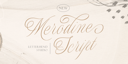 Merodine Script. A Beautiful and classy script that has many swashes that allows you to create beautiful lettering instantly. it has many stylistic set alternates that you can choose from. This font perfectly made to be applied especially in logo, and the other various formal forms such as invitations, labels, logos, magazines, books, greeting / wedding cards, packaging, fashion, make up, stationery, novels, labels or any type of advertising purpose. Features : uppercase & lowercase numbers and punctuation multilingual ligatures alternates swashes PUA encoded We highly recommend using a program that supports OpenType features and Glyphs panels like many of Adobe apps and Corel Draw, so you can see and access all Glyph variations.
 - Utusi Star - 100% free

- Hanley Pro by District 62 Studio,
$29.00 The origin story of HANLEY FONT COLLECTION all starts with the Script. We were designing logos and kept feeling like we needed a different kind of script, vintage feeling but not dated, and not too baseball-y or too formal. We couldn’t find exactly what we were looking for, so we decided to create it ourselves. After that we realized what we really wanted was good wood block looking lettering especially with small caps. And the collection just grew from there - a tall slim style, a monoline version of the script and of course a good sans. We topped off the group with a large selection of catchwords and extras with plenty of swirls, swashes and frames. Hanley has just enough irregularity to the edges to impart a human feel, but it’s still clean. Super versatile, all the styles work well together and can look authentically vintage or modern and hand-crafted.
 - Bordonaro Spur by Estudio Calderon,
$35.00 Bordonaro Spur - Bordonaro Script’s partner - is a typography strongly influenced by old beer labels and includes some serifs based on Frederic W. Goudy’s Copperplate, but with some softened spurs adding an elegant and soft texture to the text. It is ideal to be used on large bodies and has a set of special ligatures ideal to be used in branding. Psss...Check out the NEW Bordonaro Spur with Rounded corners , same version but soft! FEATURES Co = company1 Co = company2 Estd = established Inc = incorporated Ltd = limited Mc = mac Rd = Road St = street And also from Adobe CC you can activate Style Sets (SS) and get ideal ligatures for ordinal numbers: 1st = st 2nd = nd 3rd = rd 4th = th Bordonaro Script and Bordonaro Spur are two typographic styles that were designed under the same characteristic features with the idea of combining them to obtain better results, for that reason, we recommend merging them in a creative way and you will realize everything you can design with them. The banners designs are based on old brands of beer labels, coffee packaging, sports logos and in some cases we use Copperplate Gothic but only as a complementary font in order to harmonize the layout of the elements in each banner.
 - Strong Display by XdCreative,
$29.00 The "Strong Display Font" is a derivative of the Clinto slab serif font, originally designed by. Faldy Kudo. This font is specifically crafted to exude strength and impact, making it an ideal choice for display and headline usage. It incorporates the unique typographic feature of ink traps, enhancing its readability even at larger sizes. The font family comprises 6 distinct styles: "Normal, Normal Rounded, Medium, Medium Rounded, Condensed, and Condensed Rounded.” offering versatility in design choices. Additionally, the font provides multi-language support, ensuring that it can be effectively used for a wide range of global content and projects.
 - The Morydane by Letterhend,
$19.00 Introducing Morydane a script font perfect for designers looking for a modern and casual style. With its clean lines and flowing curves, this font is ideal for adding an interesting touch to your designs,especially in logo, and the other various formal forms such as invitations, labels, logos, magazines, books, greeting / wedding cards, packaging, fashion, make up, stationery, novels, labels or any type of advertising purpose. Features : Uppercase & lowercase Numbers and punctuation Alternates & Ligatures Multilingual PUA encoded
 - Backstroke by Eclectotype,
$50.00 Normal and upright italic script fonts line a well-trodden path; left-leaning fonts (or "rightalics" as they're confusingly called), on the other hand, are a rarity. Here at Eclectotype Fonts we don't like to do things too conventionally, so here's Backstroke, a laid back script with a unique voice. With contextual alternates for start and end forms of certain characters, swash versions of L, Q and Z (surely the most used initial caps!), and a handful of stylistic sets, Backstroke is a restrained script. Stylistic sets are: 1. the start forms of i, j, m, n, and p are used always instead of only at word starts. 2. lower case ascenders get a whole lot loopier. 3. alternate versions of G, N and Y. 4. swash L, Q and Z. 5. swaps the default Polish script lslash for a more familiar version While fonts that lean the wrong way may be a bit more difficult to fit into your layouts than boring old regular italics, they will reward you with their individuality. Why not give it a go?
 - Rodia by Monotype,
$25.00 Rodia is an Oddball Geometric Sans Typeface consisting of nine weights in both roman and oblique. It’s a geometric sans with a twist that’s perfect for branding and identity projects – it will also give your body text a unique voice. Inspiration came from the iconic “RADIO” signage that was once in place at 5041, Pico Boulevard, Los Angeles in 1985 (documented at https://tinyurl.com/y2krt2ox). With its distinctive leg, the /R/ provides a personality trait to define the style of the character set. You can clearly see how this characteristic separates Rodia from other geometric sans families – the /k/v/w/x/y/K/R/V/W/X/Y/ glyphs all display the distinctive ‘feet’ and ‘hands’ as terminals to legs and arms. Then there is the /A/ with its triangular crossbar – this triangular motif has been used to embellish alternates in Stylistic Set 1 for /A/E/F/G/H/Q/S/ glyphs. These will add another layer of versatility for your typographic projects. Rodia features an extensive character set covering all Latin European languages. Key features: 9 weights in Roman and Oblique Full European character set (Latin only) 400+ glyphs per font.


