10,000 search results
(0.033 seconds)
- Humming by Garisman Studio,
$18.00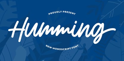 Humming is a naturally modern script, delivering a stylish look and is guaranteed to add an eye-catching appeal to your logo designs, brand imagery, quotes, product packaging, merchandise, social media posts, and more. - Simple installation - Work for Windows or MAC - PUA Encoded Open - Versatile for poster, logotype, labels, book cover - Supported for: Adobe Illustrator, Photoshop, Shillouette, Corel Draw, Indesign, and Procreate (updated)
 - Eurydome by Emboss,
$30.00 Eurydome is one of Jupiter's many moons, and was named after Eurydome, the mother of the Graces in Greek mythology. Eurydome was inspired by the Grotesque face Venus, with an additional flair added to the lowercase a, b, d and g. Eurydome was designed to complement any display face that may be used in your project. Add grace to your layout, with Eurydome.
 - Sincerity by Océane Moutot,
$32.90 Sincerity is an elegant and strong typeface identified by its high contrast, its sharp shapes and triangular serifs. Inspired by the Didone style, Sincerity adds modernity and some unique features to it. It offers a large choice of uses, from titles of magazines to newspapers, logotypes and so on. Sincerity is available in 16 styles, from thin to black in roman and italic.
 - Movie Palace JNL by Jeff Levine,
$29.10 Decorative, Display, Headline, Sans Serif, 1930s, Hand Lettered, Monoline, Retro, Vintage, Nostalgic, Stylized, Elegant Some beautiful and stylized Art Deco hand lettering found in the Jan. 6, 1934 issue of the British movie fan publication Picturegoer Weekly inspired Movie Palace JNL, which is now available in both regular and oblique versions. This monoline design adds a touch of elegance to any retro projects.
 - Faithful Colony by Creativemedialab,
$20.00 Faithful Colony is a modern, elegant, classic typeface with a timeless look. It comes with seven weights ranging from thin to black, matching italics, and a variable format. Faithful Colony is perfect for fashion-related concepts, Luxury and Elegant design, Classy or high-end branding, logo, and many more. Try to combine the regular and italic styles for a modern and elegant look.
 - Wyoming Macroni by Ingrimayne Type,
$14.95 Wyoming Macroni is the split-serif (or Tuscan) version of the Wyoming series. The Pegged version adds a horizontal spike through the middle of the stems, which has been a popular variation of this style. Included in the family are two shadowed versions. The ShadowedInside styles can be used in layers with the Shadowed styles to easily create two-colored letters.
 - MPI Arcadian by mpressInteractive,
$5.00 Arcadian was first produced in wood type around 1870 by William H. Page & Company. It is a semi-ornamented face based on a French Clarendon, with dots added to the median and the tops and bottoms of the letters. It has a distinctly “Old West” feel, and was likely used to add a little pizzazz to advertising and broadsides of the time.
 - Character Sans by Brave Lion Fonts,
$14.00 Character Sans is a detail full sans serif typeface in 5 styles. It features all european languages, ligatures, arrows and minuscule numbers. It's characteristic style features are straightened ends and sharp curves. The lighter weights have great white spaces and their width is orientated on the heavier weights. Character Sans was made to have style and not to be uniform.
 - Open Book ING by Ingrimayne Type,
$9.00 OpenBookING is a gimmick or novelty font that has letters on pages of a book. It is caps only and monospaced. The letters on the upper-case keys are on the left-handed pages of an open book and the letters on the lower-case keys are the same letters but on the right-handed pages of an open book. One could alternate upper and lower case keys to get letters on complete books, but the Opentype feature of contextual alternatives (calt) does this automatically. Several previous typefaces from IngrimayneType used the calt feature to alternate shapes that fit together in an interlocking pattern, such as alternating concave and convex shapes. OpenBookING uses the calt feature in a different way, to alternate two halves of a symmetrical shape. To provide two copies of numbers and common symbols, some non-alphabetical characters are unavailable because their slots were taken by the second form of the number or common symbol. If stylistic set one (ss01) is turned on, spaces are replaced with empty pages. This may leave you with unwanted spaces at the end of lines, and to eliminate them, turn off the feature (or change the font) for these spaces. The empty pages can be used in a layer to add color to the text. There is also a second set of empty pages with a filled page that can also be used in layers. (See poster for examples.) These pages are on the (logicalnot multiply) and (register divide) characters for the first set and on the (ordmasculine ellipsis) and (macron trademark) keys for the second set. Finally, OpenBookING has a large set of accented characters if anyone should need them. The letters used on the books were derived from the font Myhota-Bold. For a related typeface of letters on book covers, see NewLibrary. OpenBookING has limited uses and is priced accordingly.
 - Raincoat by Typodermic,
$11.95 Looking for a typeface that oozes class and style? Look no further than Raincoat. This stunning display font combines the best of both worlds, with a geometric sans serif that’s been given a timeless, antique feel. But Raincoat is more than just a pretty face. With its OpenType features, it’s a font that can truly personalize your designs. Letter combinations are transformed into custom ligatures, making your work truly unique. From the altered ends of the “T” to the interlocking rings of the “O”, Raincoat is a typeface that adds a touch of personality to any design. So if you’re looking to make a statement, whether it’s for a logo, poster, or website, Raincoat is the perfect choice. With its candid style and classy design, it’s a font that’s sure to impress. So why not try Raincoat today and see for yourself the creative design options it can bring to your work? Most Latin-based European, Greek, and most Cyrillic-based writing systems are supported, including the following languages. Afaan Oromo, Afar, Afrikaans, Albanian, Alsatian, Aromanian, Aymara, Bashkir, Bashkir (Latin), Basque, Belarusian, Belarusian (Latin), Bemba, Bikol, Bosnian, Breton, Bulgarian, Buryat, Cape Verdean, Creole, Catalan, Cebuano, Chamorro, Chavacano, Chichewa, Crimean Tatar (Latin), Croatian, Czech, Danish, Dawan, Dholuo, Dungan, Dutch, English, Estonian, Faroese, Fijian, Filipino, Finnish, French, Frisian, Friulian, Gagauz (Latin), Galician, Ganda, Genoese, German, Greek, Greenlandic, Guadeloupean Creole, Haitian Creole, Hawaiian, Hiligaynon, Hungarian, Icelandic, Ilocano, Indonesian, Irish, Italian, Jamaican, Kalmyk, Kaqchikel, Karakalpak (Latin), Kashubian, Kazakh, Khalkha, Kikongo, Kinyarwanda, Kirundi, Komi-Permyak, Kurdish, Kurdish (Latin), Kyrgyz, Latvian, Lithuanian, Lombard, Low Saxon, Luxembourgish, Maasai, Macedonian, Makhuwa, Malay, Maltese, Māori, Moldovan, Montenegrin, Ndebele, Neapolitan, Norwegian, Novial, Occitan, Ossetian, Ossetian (Latin), Papiamento, Piedmontese, Polish, Portuguese, Quechua, Rarotongan, Romanian, Romansh, Russian, Rusyn, Sami, Sango, Saramaccan, Sardinian, Scottish Gaelic, Serbian, Serbian (Latin), Shona, Sicilian, Silesian, Slovak, Slovenian, Somali, Sorbian, Sotho, Spanish, Swahili, Swazi, Swedish, Tagalog, Tahitian, Tajik, Tatar, Tetum, Tongan, Tshiluba, Tsonga, Tswana, Tumbuka, Turkish, Turkmen (Latin), Tuvaluan, Ukrainian, Uzbek, Uzbek (Latin), Venetian, Vepsian, Võro, Walloon, Waray-Waray, Wayuu, Welsh, Wolof, Xhosa, Yapese, Zapotec Zulu and Zuni.
 - Arapix by Anatoletype,
$69.00 Arapix is a 12 pixel high multilingual Latin-Arabic pixel font with incredible capabilities. The Arapix is an almost traditional Naskh. It is elegant and easy to read even in very small sizes. It includes almost every feature you would expect from a high range Naskh font. Its humanistic look and feel fit perfectly to its Latin counterpart. Arapix was originally designed for a web project that didn't see the light a few years back. It started with the idea of fitting both Latin and Arabic into a 12 pixel vertical grid. The latin glyphs fit properly within the vertical limits, but when it came to the arabic glyphs, it proved to be more challenging. Arabic letters with lower diacritic dots like the (Yeh-fina) or letters with accents above like the (Alef-Hamza-above) need much more space than any Latin letter. Add to this the fact that accents needs to be positioned above and below the glyphs. It is technically impossible to fit a (Yeh-fina-kasratan) or a (Alef-Hamza-above-shadda-damma) into 12 pixels. Initially the accents were dropped and not included in the design. Although it seemed impossible at the start, Sylvain found a solution in the end, including as many contextual alternates and contextual kerning as needed to avoid every collision between letters and diacritics, letters and accents, and diacritics and accents. The contextual kerning was added to achieve an even letter and word spacing in longer text. Arapix is amazingly legible in small size on screen and in print. On the other hand, it also works perfectly as display titling font due to its unique and contemporary pixel approach. It can be used for screens with very low resolution as well as for high resolution screens and prints. The new Arapix comes with various new features and new glyphs including Persian and Urdu letters, stylistic set, old style figures, contextual kerning, contextual alternates and a few icons too. Enjoy the new Arapix and have fun with it.
 - Morvien by Alit Design,
$19.00 Introducing Morvien Typeface - a bold and dynamic display font that brings a unique edge to your creative projects. With its distinctive torn shapes and powerful design, Morvien Typeface is the perfect choice for film titles, game interfaces, comic book lettering, superhero themes, and music posters. This font is not just a typeface; it's an artistic statement that adds a touch of drama and excitement to your visual creations. Torn Shapes Design: Morvien Typeface stands out with its edgy and torn shapes, giving your text a rebellious and energetic vibe. Each character is carefully crafted to convey a sense of dynamism and movement. Display Style: Morvien Typeface is designed specifically for display purposes, ensuring that your headlines and titles command attention. The bold and impactful strokes make it ideal for creating a strong visual impact. Ligatures and Alternatives: Morvien Typeface includes a rich set of ligatures and alternative characters, providing you with creative flexibility. Experiment with different combinations to customize your text and make it uniquely yours. 633 Characters: Morvien Typeface boasts an extensive character set with 633 characters, offering a wide range of options for your design needs. Whether you're working on a detailed project or a quick creative piece, Morvien Typeface has you covered. Multilingual Support: Morvien Typeface is crafted with global compatibility in mind, supporting multiple languages. Now you can express your creativity in various linguistic contexts without compromising on style. Versatile Usage: Morvien Typeface is well-suited for a variety of creative projects, including film titles, game interfaces, comic book lettering, superhero-themed designs, and music posters. Its versatility makes it a go-to choice for projects that demand a bold and expressive typographic style. Elevate your design projects with Morvien Typeface and let your text speak with intensity. Embrace the torn shapes, explore ligatures, and make a lasting impression with this powerful and versatile display font. Your creativity knows no bounds with Morvien!
 - PykesPeakZero - 100% free

- Darkness Awakening by Ditatype,
$29.00 Darkness Awakening is a chilling display font designed to send shivers down your spine. This uppercase font features eerie details that give it an air of horror and mystery, making it the perfect choice for spine-tingling design projects. Each letter in Darkness Awakening is meticulously crafted with the appearance of brush strokes, evoking a sense of handcrafted artistry. The brush details add a touch of unpredictability and chaos, giving the font a haunted and unsettling vibe. While the font is uppercase, it is not bold, allowing the horror theme and brush details to take center stage. For the best legibility you can use this font in the bigger text sizes. Enjoy the available features here. Features: Multilingual Supports PUA Encoded Numerals and Punctuations Darkness Awakening fits in headlines, logos, movie posters, flyers, invitations, branding materials, print media, editorial layouts, headers, and any horror-themed projects. Find out more ways to use this font by taking a look at the font preview. Thanks for purchasing our fonts. Hopefully, you have a great time using our font. Feel free to contact us anytime for further information or when you have trouble with the font. Thanks a lot and happy designing.
 - Josefa Rounded Pro by Ingo,
$42.00 A sans serif without rough edges Josefa Rounded is a beautiful text typeface. It’s unostentatious forms and balanced narrow proportions along with the softened round edges make it to appear gentle and pleasing even in longer texts. modern very legible narrow proportions high x-height distinctive forms Dtermining for the personality of Josefa Rounded are also particular idiosyncratic letters. For instance B P and R is designed openly; the bars of E and F equal each other; lower case c and e are distinctly withdrawn in their lower zone; y is symmetrical. Short ascenders generate compact word images. Cap height is shorter than the ascenders, so capitals are only little higher than x-height. Josefa Rounded is provided in 7 weights including the corresponding italics. Tabular figures and proportional figures are available through the appropriate OpenType function as well as ligatures and discretionary ligatures.
 - Franzi Variable by Wannatype,
$211.00 The new sans-serif Franzi typeface family – as neutral as can be, but at the same time individual and striking. Its unmistakable character lies in the detail, with no effect pushing itself to the fore. As a wide-running typeface with a relatively large x-height, the typeface family is perfectly suited to small text sizes but, with its elegant details, it leaves nothing to be desired in display applications either. Originally designed with constructed, often rectangular elements, Franzi has gradually been rounded during the development process and is now less hard in order to guarantee optimal legibility. Franzi Variable is designed alongside the italic and the weight axes. The italics are softly and elegantly drawn, while the upright characters appear much more severe. The design appeal reveals itself in the two-storey ‘a’ – a tribute to legibility in body copy; however, for those who prefer the geometric in applications, an alternative single-storey ‘a’ is also available. All styles have small caps, superscript and subscript lowercase letters, lining, non-lining and small caps figures, fractions as well as several ligatures, alternative fonts, symbols and arrows. The Latin uppercase letters are also available as discreet swash variants. In addition to the extended Latin alphabet, the typeface family also includes the complete Greek, Cyrillic and International Phonetic Alphabet IPA. Franzi was created as a further development of an order to produce a sign for a therapy practice in Vienna’s Franz-Hochedlinger-Gasse – hence the name, which is more common as an abbreviation for Franziska than as a diminutive for the male name Franz: Franzi is therefore a hybrid typeface name which has female tendencies.
 - Verao by insigne,
$24.99 Remember clear summer days as a kid? Remember open fields that you explored? Sun shining? Simple breezes sweeping past your face as you ran far and free? The feeling was uncomplicated and enjoyable. It was natural. That’s Verao, the simple spirit of summer. Alive and vibrant, Verao takes a turn away from the cold structure of today’s rigid creations and embraces the movement back to the value of things handmade. This artisan creation represents the rare, soul-invested fusion of the craftsman’s tools, materials, and hand movements, which shapes the solid--but beautifully defined--parts, pieces that, when put together, breathe a measure of life into everyday paragraphs and other bodies of text. Verao’s hand-written brush script, with its characters’ imperfect elegance and handmade quality, keeps your work looking organic. Write a word in more than a hundred different ways thanks to the large number of extra letters it offers. Two sets of lowercase alternative letters without connectors are included as is a set of swashed endings. Verao contains stylistic substitutions and ligatures, too, that you can combine however you like. Whichever way you design, the elements continue to appear balanced and separate and will undoubtedly add more personality to your design. So stop switching out cogs in your rigid set of fonts. Take time again to play with a natural face that’s both easy and energetic. Verao’s great temperament makes it a joy to design with. Let this spirit of summer take you away from the mundane. There’s a good chance Verao will lead you where you need to go. Production assistance from Lucas Azevedo.
 - Zaius by The Northern Block,
$12.80 A bold sans serif typeface influenced by Ed Benguiat 's work for the 1968 movie poster for Planet of the Apes .
 - Dena by Linecreative,
$16.00 Presenting Dena Font, a forward-thinking typeface that straddles the boundaries of future aesthetics and modern design. Designed for the cutting edge designer, Dena Font is more than simply a letterform—it's a design language, a representation of sophisticated elegance influenced by cyberculture, sci-fi movies, and innovative video games. Dena Font is a tool that gives designers the ability to push the frontiers of creativity and reshape the visual world. Elevate your projects with Dena Font's futuristic appeal, which combines typography with creativity. Every letterform in Dena Font has a vibrant, futuristic feel to it. The deftly drawn characters blend together to create a visual rhythm that mirrors the quick-paced, constantly-changing nature of contemporary design. Modern Futuristic style: With futuristic style, Dena Font is at the vanguard of modern design. It is the perfect option for forward-thinking design projects because every curve and shape is painstakingly created to communicate a sense of innovation and advancement. Ligature-Enhanced Creativity: Dena Font's rich ligature set enables designers to smoothly combine characters to create a flowing and melodic typographic expression. These artistically elegant ligatures provide a touch of refinement to your designs and are ideal for creating distinctive logo types and brand identities. Overcoming linguistic obstacles, Dena Font provides extensive assistance for the Latin Western Europe character set. This makes your creative vision a flexible instrument for international design projects by guaranteeing successful communication across linguistic environments.
 - Seraya by Ahmad Jamaludin,
$17.00 New Contemporary Style for you, Seraya! Seraya - is a unique contemporary and classic serif typeface. We add random thickness that makes the font look memorable, so perfect when you need something classy but not boring. Seraya - Sharp letter with smooth curves creating unique glyphs that are perfect for interesting header of magazines, wordmark logos, and typographic posters. File Included Seraya TTF, OTF, SVG, WOFF Unique letterforms Works on PC & Mac Simple Installations Accessible in Adobe Illustrator, Adobe Photoshop, Microsoft Word even work on Canva! PUA Encoded Characters Fully accessible without additional design software. Come and say hello over on Instagram! https://www.instagram.com/dharmas.studio/ Dharmas Studio
 - Obvia by Typefolio,
$29.00 Obvia, a geohumanist type for all media. Obvia appeared as a result of direct observation on typefaces classified as geometric and the plan to explore for the first time width axes - to be published soon - expanding its usability. The idea behind Obvia’s design was to create a distancing from geometrically pure shapes, in this case, square shapes. Then some details were added, such as subtle inktraps, concave endings of the stems and carefully drawn alternate characters, giving a ‘geohumanist’ tone to the font. This first family of Obvia has 9 weights ranging from Thin to Black with their respective italics, delivering a strong typographic identity, from the paper to the pixel.
 - Calm by RainBomb Studio,
$20.00 Calm Handmade is a versatile slab font family with a touch of serenity and modernity. It strikes a perfect balance between elegance and sophistication, making it a delightful addition to any project. Its fancy and playful style adds a touch of creativity, while the cool and understated shapes elevate its visual appeal. Calm Handmade proves to be an ideal choice for a variety of design projects, creating captivating signatures, eye-catching album covers, and distinct logos and branding. Moreover, its readability and adaptability ensure seamless integration into magazines, social media posts, advertisements, and an array of other design ventures, showcasing its versatility across diverse creative endeavors.
 - Geographica Hand by Three Islands Press,
$39.00 Geographica Hand replicates the neat hand-lettering typical of engraved British maps of the 18th century, including the work of cartographers Emanuel Bowen (circa 1694–1767), Geographer to King George II, and Thomas Jefferys (circa 1719–1771) Geographica ro King George III. A kindred font to our Geographica serif family, Geographica Hand exhibits long serifs, irregular edges, and a genuinely hand-made character. Use to simulate historical materials, vintage documents, or other time-worn text. The OpenType release of Geographica Hand comes with true small capitals, contextual and historical ligatures, a series of sketchy map ornaments (e.g., trees, churches, windmills, boats), and full Latin support.
 - Dansley by Letterhend,
$17.00 Meet Dansley – a script font that brings together the vintage and classic looks with a unique twist. Its bold form and chic details add a touch of sophistication and personality to any design project especially in logo, and the other various formal forms such as invitations, labels, logos, magazines, books, greeting / wedding cards, packaging, fashion, make up, stationery, novels, labels or any type of advertising purpose. Features: Uppercase & lowercase Numbers and punctuation Ligatures & Alternates Multilingual PUA encoded We highly recommend using a program that supports OpenType features and Glyphs panels like many of Adobe apps and Corel Draw, so you can see and access all Glyph variations.
 - Delphine by Hipfonts,
$9.00 Delphine is a modern and elegant font that exudes sophistication and timeless charm. With its sleek and refined letterforms, this typeface effortlessly combines classic elements with a contemporary twist. Its clean lines and graceful curves lend a sense of luxury and refinement to any design. Delphine is perfect for adding a touch of elegance to wedding invitations, high-end branding, fashion editorials, and other upscale projects. Its versatility allows it to shine in both display and body text, while its attention to detail ensures legibility and readability at any size. Elevate your designs with Delphine and let its understated beauty and refined aesthetics captivate your audience.
 - ITC Malstock by ITC,
$29.99ITC Malstock is the work of Czech designer Frantisek Storm. The idea is based on a sign painting technique that uses a flat brush and a Maalstok, a long bar with soft padding which is used as a rest for the painter's hand and a guide for vertical lines. The strokes of this font end with a split stem which recalls the traces of the writer's brush. ITC Malstock is a narrow typeface which is ideal for headlines, invitations and advertisements. The designer recommends combining his typeface with others, to create harmony with sans serif typefaces in text sizes or contrast with serif typefaces. - Script Typewriter Rough by Jeremia Adatte,
$19.00 Script Typewriter Rough from Jeremia Adatte Studio is the very first complete cursive typewriter font ever made after the original 1960 Smith-Corona Electra 210 typewriter that comes with a unique script typeface design. It’s loaded with more than 270 ligatures to avoid letter texture repetition in a word (switch Discretionary Ligatures on) and is extremely detailed to imitate the subtle letterpress effect you get with a real typewriter. During the typewriting era, only a few models came with this rare type style that was created to imitate hand-lettering to add more personality in a correspondence. You can send letters around the world in more than 80 languages!
 - 52-Kfx by ILOTT-TYPE,
$49.00 Where most fonts are available in varying weights, 52-Kfx is a family consisting of 3 heights; High, Mid and Low. These offer the typographer a full palette, Low is readable for setting copy while at the opposite end High is better suited for display—names, headlines and logotypes. 52-Kfx has a sophisticated and elegant period feel with clean, modern lines that remain relevant for contemporary application. Exaggerated ascenders and descenders of the lowercase and a tall cap-height give it a lofty stature while the low x-height keeps characters grounded. The spacing and lyrical rhythm are perfectly in sync and epitomized by the fluidity seen in the ligatures.
 - Galavant by Atlantic Fonts,
$32.00 Galavant will take you anywhere you want to go! Enjoy three font looks in one; a fun, chunky lower-case, a bold, animated upper-case, and in all-caps with discretionary ligatures turned on, Galavant is tightly interlocking. To explore the interlocking possibilities, turn some ligatures off and others on until you settle on the best combo. There are over 260 two, three, and four-letter ligatures available. Discover interlocking ligatures featuring lower-case "i" along the road as well. In sentence-case, turn discretionary ligatures off, except to add more handmade variation in double-letter pairs and to access a fine "ft". However you roam, Galavant aims to entertain.
 - Banco by ITC,
$29.00Banco was the first typeface work of French designer Roger Excoffon and was released in 1952. The strong forms look as though they were rolled out of sheet metal and feature upright, tapering strokes. The slight slant, the varying heights of stroke ends, and the relationships between line and curve give Banco font its sense of liveliness and dynamism. Excoffon did not design a matching lower case alphabet for his capitals, but this was accomplished later by Phill Grimshaw, who also designed the light weight. He deliberately 'underdesigned' the lower case forms, producing a more reserved alphabet based on the design ideas of the original. - Hanisha Lovely by Cooldesignlab,
$15.00 Hanisha Lovely - a modern calligraphy font designed with skill and care with strokes of love. Perfect for greeting cards, branding materials, business cards, shirt mockups, quotes, posters, and more! Hanisha Lovely includes a complete set of international uppercase letters, numbers, punctuation, and binders. All lowercase letters including the start and end of the attack. The script is coded with Unicode PUA, which allows full access to all additional characters without any special design software. Mac users can use Letter Book, and Windows users can use Character Map to view and copy additional characters to include in your favorite text editor / application. Thank you and have a nice day. CooldesignLab,
 - Old Labels JNL by Jeff Levine,
$29.00 Old Labels JNL was inspired by the red and white gummed labels that were used for shipping parcels long before self-adhesive materials and desktop publishing rendered the older labels obsolete. The fifty-two glyphs include a generous supply of phrases such as ‘Air Mail’, ‘Do Not Bend’, ‘Rush’, etc. along with a number of blank label backgrounds and decorative frames. NOTE: Commercial replication of the images within this font for any resale purposes (including, but not limited to labels, t-shirts, stock designs, et al) requires a separate license which may be obtained by contacting the designer via the email address found within the End User License Agreement.
 - Controller by Dharma Type,
$19.99 Controller is a geometric rounded sans serif including 5 weights and corresponding obliques and their extended style are ready. Originally, the designer was inspired by a mixture of techno and organic design in the end of 20th century around the West Coast. The letterforms of this font are designed geometric but are also slightly rounded to make a natural, warm and organic impression. Uppercase N has its alternative glyph that can be accessed by using OpenType stylistic feature. Controller is a versatile and useful family for a wide range of projects. We released 4 big Sci-Fi families in 2013. Check it out! Clonoid Controller Geom Graphic Space Colony
 - M Elle PRC by Monotype HK,
$523.99 The concept of M Elle comes from M Hei and M Yuen, with a sense of contemporary graphic design, aims to accomplish a refreshing, harmonious balance of softness and toughness. The combination of regular crossbars (橫) and stems (豎), rounded hooks (勾) and angles (折), as well as dots (點), ticks (剔) and downstrokes (撇、捺) that are ended sharply, makes it a classy but contemporary, clean and affectionate typeface. The font family consists of 3 essential weights to cater for different needs. Xbold appears elegant and magnificent, Medium weight is practical and affectionate, while the Light style is especially clear, legible and flexible in use.
 - Reservation Wide by TypeTrust,
$30.00Reservation Wide is intended for headlines with its relatively snug letterspacing and extended forms. Its simplicity will accommodate smaller sizes and lower resolution displays. OpenType Stylistic Alternates for characters 'a', 'g' and 't' lend an even simpler finish. The hand-drawn curves and angled stroke endings temper the otherwise rigid proportions of the family. This painterly tendency becomes more apparent in the heavier weights keeping them from looking too imposing. The design first took shape as a custom font named Majestos for the cable channel The Food Network . It can be found in their growing online and printed presence in addition to their broadcast identity for which it was developed. - Book Worm by me55enjah,
$14.00 Introducing Book Worm! A simple, fun and easy-to-read typeface. Base on hand lettering with paintbrush, this typeface inspired by kids storybook. This typeface add more fun in reading a book with this easy-to-read & playful characters. Including simple ligatures, number & punctuation, this typeface can be use for quotes, title, and also body text. This font just fills you with joy when you design with it. It's so fun and cutesy it is ideal for all child like designs and especially for birthday invites! We love this happy-go-lucky typeface and can't wait to see what you do with Book Worm!
 - Wolpe Tempest by Monotype,
$50.99 “It looks like it could have been designed last year,” says Toshi Omagari, the lead designer for The Wolpe Collection, about the original Tempest typeface. For Wolpe Tempest™, Omagari drew three weights and additional characters with flourishes that add more energy and movement to the original design. The new designs can take on just about any online or offline project that calls for typography that’s dynamic, flowing and powerful – everything from game branding to billboard sized posters. Available as set of fonts that support most Western European and many Eastern European languages, Wolpe Tempest is also one of the five typeface designs in The Wolpe Collection.
 - Mortice by ArtyType,
$24.00 I set out to create a solid, bold, strong, rugged font, one that would lend itself to any industrial type of use, and by that I mean industry in general, but probably sectors that would still be considered male preserves such as carpentry or metalwork. I thought specifically of mortice & tenon joints, whilst toying with shape and form for this self imposed challenge. I was also visualizing a router tool used for producing most wood joints nowadays. I think the general premise worked out well; in the end I settled on the name Mortice, referring to the slots or negative spaces that the matching part, or tenon would fit into.
 - Karika Swirls by Deniart Systems,
$20.00 Add charm with intricate swirls! Karika Swirls was inspired by our obsessive love of swirly patterns and symmetric designs. Karika, a Hungarian word for circle, is a charming way of saying we love circular symmetrical forms. These 52 original illustrations are great for creating stationery, adding borders to greeting cards or design projects, background images, etc. The glyphs can be used individually or combined with other glyphs to form complex patterns. Karika Swirls is part of the Karika Collection of fonts. These intricate swirls are symmetrically sized in height and width so they'll work charmingly together for any project. See also Karika Hearts and Karika Encore .
 - Fezola by IbraCreative,
$17.00 Fezola, a handwritten signature typeface, epitomizes the essence of personalized elegance. With its fluid strokes and graceful curves, Fezola captures the artistry of a handcrafted signature, infusing a sense of individuality into every letter. The seamless connectivity between characters emulates the natural flow of a pen, creating a signature style that feels authentic and unique. Whether used for branding, invitations, or personal correspondence, Fezola adds a touch of sophistication and warmth, transforming words into a visual representation of personal expression. This typeface transcends conventional fonts, embodying the charm and character of a handwritten signature to impart a distinctive and memorable quality to any project it graces.
