10,000 search results
(0.057 seconds)
- Naxmos by Twinletter,
$17.00 Naxmos is a futuristic font with upper- and lowercase letters, a set of numbers, and a galaxy alternative and cyberpunk theme. It has a distinctive futuristic design. Use it to create time-traveling movie posters for futuristic or extraterrestrial productions. Fantastic for creating unique cards and artwork for science fiction fans. This font was created to be used for universal events like game competitions, wall advertisements, and poster designs. Your design can look better with a simple combination. Purchase it right away to enjoy using it ahead of the competition. What’s Included : - File font - All glyphs Iso Latin 1 - Alternate, Ligature - Simple installations - We highly recommend using a program that supports OpenType features and Glyphs panels like many Adobe apps and Corel Draw so that you can see and access all Glyph variations. - PUA Encoded Characters – Fully accessible without additional design software. - Fonts include Multilingual support
 - Barney Script by Mans Greback,
$59.00 Barney Script is a cool baseball typeface. A sporty calligraphy, this retro lettering will be your go-to style for a fresh team logotype or a vintage headline. Drawn and created by Mans Greback in 2022, it has a competitive style and a bold personality. The Barney Script family consists of three professional styles: Regular, Bold and Rounded, complimenting each other for greater design opportunities. Use underscore _ to make a swash. Example: Letter_ Use multiple underscores to make longer swashes. Example: Football____ The font is built with advanced OpenType functionality and has a guaranteed top-notch quality, containing stylistic and contextual alternates, ligatures and more features; all to give you full control and customizability. It has extensive lingual support, covering all Latin-based languages, from Northern Europe to South Africa, from America to South-East Asia. It contains all characters and symbols you'll ever need, including all punctuation and numbers.
 - Kiosk by Fenotype,
$19.00 Kiosk is a prominent display typeface pair. It is a sturdy condensed sans serif and an eloquent brush script. In addition there are textured “print” versions of them both. Kiosk fonts work as a pair or as themselves. Sans is great for sturdy headlines, menu titles, packaging or any such, the bigger the better. Script is great as a logotype, used for quotes, magazines, packaging and branding. Textured versions are the same fonts with a rugged outline and with a “stamp” texture inside the letters. Kiosk Script is equipped with several OpenType features. It has Contextual Alternates and Standard Ligatures that are automatically help to keep the connections smooth. They’re both automatically on. In addition it has Swash, Stylistic and Titling Alternates and even more alternates for some characters. The font is PUA encoded and you can access alternate characters from OpenType controls or manually from Character or Glyphs window.
 - Quarzo by Corradine Fonts,
$39.95 This script font is inspired by the flexible nib strokes to create a concatenation of refinement with character mixing the contrast with pronounced but rounded angles. This angles along with the inktraps give the font a better performance when printing. Texts will have a very even rhythm due to its consistency on the stroke’s angle and spacing. The words can receive a dramatic touch by using the wide range of glyphs with curly and refined ornamentation. There are lots of caps and number variants dressed up with a variety of swashes. Also, two sets of versatile ornaments will be found: a first set of ending flourishes that match with any lowercase letter and a second set of independent flourishes to be placed around the words. Quarzo will give a great sophistication level to invitations, cards, tags, menus, advertising and packaging. Its character map covers Western and Central European characters.
 - Kerney Script by Mans Greback,
$59.00 Kerney Script is a cool baseball typeface. A sporty calligraphy, this retro lettering will be your go-to style for a fresh team logotype or a vintage headline. Drawn and created by Mans Greback in 2022, it has a competitive style and a bold personality. The Kerney Script family consists of three professional styles: Regular, Bold and Rounded, complimenting each other for greater design opportunities. Use underscore _ to make a swash. Example: Letter_ Use multiple underscores to make longer swashes. Example: Football____ The font is built with advanced OpenType functionality and has a guaranteed top-notch quality, containing stylistic and contextual alternates, ligatures and more features; all to give you full control and customizability. It has extensive lingual support, covering all Latin-based languages, from Northern Europe to South Africa, from America to South-East Asia. It contains all characters and symbols you'll ever need, including all punctuation and numbers.
 - Sunshine by Chank,
$49.00 Sunshine is the unlikely alphabet collision of Gobbler and Liquorstore. Chank's napkin scrawl smashed into the letters commonly found on signage at the neighborhood liquor store. Gobbler's blotchy textures fragmented Liquorstore's uniform stroke. It began as a hideous lumpy thing with random vector points everywhere. Chank came to the rescue with his Alphabetician's first aid kit. He smoothed the blunt corners with a few hammer blows. He wrapped the font in extra strokes, in a sans serif Roman style, to increase its contrast. His industrial influence helped stabilize Gobbler's gloppy qualities and his grunge aesthetic softened Liquor store's checkerboard rigidity. The end result is a font with a solid structure and a painterly wiggle that creates a dirty display or a slightly clumsy text face. Because of its many detailed strokes, it tends to look a little better in print than on the web. All organic. Earthy.
 - XXII DONT-MESS-WITH-VIKINGS - Unknown license

- ITC Johnston by ITC,
$29.00ITC Johnston is the result of the combined talents of Dave Farey and Richard Dawson, based on the work of Edward Johnston. In developing ITC Johnston, says London type designer Dave Farey, he did “lots of research on not only the face but the man.” Edward Johnston was something of an eccentric, “famous for sitting in a deck chair and carrying toast in his pockets.” (The deck chair was his preferred furniture in his own living room; the toast was so that he’d always have sustenance near at hand.) Johnston was also almost single-handedly responsible, early in this century, for the revival in Britain of the Renaissance calligraphic tradition of the chancery italic. His book Writing & Illuminating, & Lettering (with its peculiar extraneous comma in the title) is a classic on its subject, and his influence on his contemporaries was tremendous. He is perhaps best remembered, however, for the alphabet that he designed in 1916 for the London Underground Railway (now London Transport), which was based on his original “block letter” model. Johnston’s letters were constructed very carefully, based on his study of historical writing techniques at the British Museum. His capital letters took their form from the best classical Roman inscriptions. “He had serious rules for his sans serif style,” says Farey, “particularly the height-to-weight ratio of 1:7 for the construction of line weight, and therefore horizontals and verticals were to be the same thickness. Johnston’s O’s and C’s and G’s and even his S’s were constructions of perfect circles. This was a bit of a problem as far as text sizes were concerned, or in reality sizes smaller than half an inch. It also precluded any other weight but medium ‘ any weight lighter or heavier than his 1:7 relationship.” Johnston was famously slow at any project he undertook, says Farey. “He did eventually, under protest, create a bolder weight, in capitals only ‘ which took twenty years to complete.” Farey and his colleague Richard Dawson have based ITC Johnston on Edward Johnston’s original block letters, expanding them into a three-weight type family. Johnston himself never called his Underground lettering a typeface, according to Farey. It was an alphabet meant for signage and other display purposes, designed to be legible at a glance rather than readable in passages of text. Farey and Dawson’s adaptation retains the sparkling starkness of Johnston’s letters while combining comfortably into text. Johnston’s block letter bears an obvious resemblance to Gill Sans, the highly successful type family developed by Monotype in the 1920s. The young Eric Gill had studied under Johnston at the London College of Printing, worked on the Underground project with him, and followed many of the same principles in developing his own sans serif typeface. The Johnston letters gave a characteristic look to London’s transport system after the First World War, but it was Gill Sans that became the emblematic letter form of British graphic design for decades. (Johnston’s sans serif continued in use in the Underground until the early ‘80s, when a revised and modernized version, with a tighter fit and a larger x-height, was designed by the London design firm Banks and Miles.) Farey and Dawson, working from their studio in London’s Clerkenwell, wanted to create a type family that was neither a museum piece nor a bastardization, and that would “provide an alternative of the same school” to the omnipresent Gill Sans. “These alphabets,” says Farey, referring to the Johnston letters, “have never been developed as contemporary styles.” He and Dawson not only devised three weights of ITC Johnston but gave it a full set of small capitals in each weight ‘ something that neither the original Johnston face nor the Gill faces have ‘ as well as old-style figures and several alternate characters. - Lektorat by TypeTogether,
$35.00 Florian Fecher’s Lektorat font family is one for the books, and for the screens, and for the magazines. While an editorial’s main goals are to entertain, inform, and persuade, more should be considered. For example, clear divisions are necessary, not just from one article to the next, but in how each is positioned as op-ed or fact-based, infographic or table, vilifying or uplifting. From masthead to colophon, Lektorat has six concise text styles and 21 display styles to captivate, educate, and motivate within any editorial purpose. Magazines and related publications are notoriously difficult to brand and then to format accordingly. The research behind Lektorat focused on expression versus communication and what it takes for a great typeface to accomplish both tasks. In the changeover from the 19th to 20th century, German type foundry Schelter & Giesecke published several grotesque families that would become Lektorat’s partial inspiration. Experimentation with concepts from different exemplars gave birth to Lektorat’s manifest character traits: raised shoulders, deep incisions within highly contrasted junctions, and asymmetrical counters in a sans family. After thoroughly analysing magazine publishing and editorial designs, Florian discovered that a concise setup is sufficient for general paragraph text. So Lektorat’s text offering is concentrated into six total styles: regular, semibold, and bold with their obliques. Stylistic sets are equally minimal; an alternate ‘k, K’ and tail-less ‘a’ appear in text only. No fluff, no wasted “good intentions”, just a laser-like suite to focus the reader on the words. The display styles were another matter. They aim to attract attention in banners, as oversized type filling small spaces, photo knockouts, and in subsidiary headings like decks, callouts, sections, and more. For these reasons, three dialed-in widths — Narrow, Condensed, and Compressed — complete the display offerings in seven upright weights each, flaunting 21 headlining fonts in total. If being on font technology’s cutting edge is more your goal, the Lektorat type family is optionally available in three small variable font files for ultimate control and data savings. The Lektorat typeface was forged with a steel spine for pixel and print publishing. It unwaveringly informs, convincingly persuades, and aesthetically entertains when the tone calls for it. Its sans serif forms expand in methodical ways until the heaviest two weights close in, highlighting its irrepressible usefulness to the very end. Lektorat is an example of how much we relish entering into an agreed battle of persuasion — one which both sides actually enjoy.
 - Type Master by VP Creative Shop,
$39.00 NOTE : If you want any specific ligature included, just write me a message and I will add it with next update :) Type Master is a sophisticated and delicate serif font that exudes elegance in every aspect. With its extensive collection of over 100 ligatures and alternate glyphs, this font offers endless possibilities for creative expression. Additionally, its support for 87 languages ensures that it is versatile enough to meet the needs of any project. Whether you are designing a logo, creating marketing materials, or crafting an editorial layout, Type Master is the perfect choice for adding a touch of refinement to your work. Language Support : Afrikaans, Albanian, Asu, Basque, Bemba, Bena, Breton, Chiga, Colognian, Cornish, Czech, Danish, Dutch, Embu, English, Estonian, Faroese, Filipino, Finnish, French, Friulian, Galician, Ganda, German, Gusi,i Hungarian, Indonesian, Irish, Italian, Jola-Fonyi, Kabuverdianu, Kalenjin, Kamba, Kikuyu, Kinyarwanda, Latvian, Lithuanian, Lower Sorbian, Luo, Luxembourgish, Luyia, Machame, Makhuwa-Meetto, Makonde, Malagasy, Maltese, Manx, Meru, Morisyen, North Ndebele, Norwegian, Bokmål, Norwegian, Nynorsk, Nyankole, Oromo, Polish, Portuguese, Quechua, Romanian, Romansh, Rombo, Rundi, Rwa, Samburu, Sango, Sangu, Scottish, Gaelic, Sena, Shambala, Shona, Slovak, Soga, Somali, Spanish, Swahili, Swedish, Swiss, German, Taita, Teso, Turkish, Upper, Sorbian, Uzbek (Latin), Volapük, Vunjo, Walser, Welsh, Western Frisian, Zulu Ligatures : IS, FO, OD, FA, TY, EX, NN, PI, EY, AY, SS, LL, FU, US, UT, AS, AN, AM, CI, LO, ES, RO, ET, TE, CK, OH, OO, OE, OC, KO, KE, KC, CH, SE, EA, UR, RS, KS, TH, TU, TT, TK, TL, HE, RG, EP, ER, RE, RC, LE, ND, ED, OF, HA, EN, CT, ST, NT, ON, ME, MO, NG, NC, UG, UC, OU, GH, OR, OP, EE, YO, VE, IT, WE, TI, FAS, FAST, CKS, OOD, FOOD, FOO, THEY, HEY, HYP, TYP, OUT, UST, URS, WAS, THE, WES, EST, WEST, ERS, EAST, EAS, LES, ENT, FOR, OUG, OUGH, ERE, TER, YOU, VER, HER, THER, THA, AND, ITH, THI, MENT, WERE, WER, ROM, THE How to access alternate glyphs? To access alternate glyphs in Adobe InDesign or Illustrator, choose Window Type & Tables Glyphs In Photoshop, choose Window Glyphs. In the panel that opens, click the Show menu and choose Alternates for Selection. Double-click an alternate's thumbnail to swap them out. UPDATES : COMING SOON Mock ups and backgrounds used are not included. Thank you! Enjoy!
 - Vtks espinhuda - 100% free

- Diehl Deco - Unknown license

- Crimson Dream by Seemly Fonts,
$12.00 Crimson Dream is a cute and simple lettered handwritten font that can be used for all chalkboard quotes or teaching material! Its authentic look will add a personal and realistic feel to your designs.
 - Cotorra by Letter INC.,
$20.00 Cotorra is a birdie font with a full character set ideal to write feathered messages. Part of the official selection of Tipos Latinos 2016, Latin American Biennale of type design. Published by Letter INC.
 - Zakosten by Jadatype,
$12.00 Zakosten is a display corporate font that comes with a Monospaced Style. suitable for product, branding, social media, logotype and so on. contains standard English letters, numbers, punctuation, and several accents that support multilingualism.
 - Maghfirah by ARToni,
$36.00 Maghfirah is a delicate and elegant handwritten font. Its distinct and well rounded letters make this font a masterpiece. Fall in love with its incredibly versatile style and use it to create spectacular designs.
 - Schema by Fonthead Design,
$19.00Schema is a family of hand-drawn architectural lettering designed by Ethan Dunham. Schema comes in three weights, light, regular and bold. This font works well both in mixed case and upper case settings. - Corpus Typewriter by Brent Galloway,
$14.00 Corpus Typewriter is an authentic typewriter font, sampled from a real vintage typewriter. Each letter and number has three alternative characters, giving you a large variety of options to get an authentic, vintage look.
 - Lampoon Brush by Rocket Type,
$19.95 Lampoon Brush originates from a film strip of paint brush lettering. It has crisp deliberate brush strokes and is perfect for use in many different applications namely when you’re seeking that retro/vintage feel.
 - Individual Thinking by Seemly Fonts,
$14.00 Individual Thinking is a bold and chunky lettered display font. You can use it for various projects, such as blog posts, logos, branding, ads, invitations, greeting cards, planners, photo albums, decorations, and much more.
 - Cherlotte by Viswell,
$17.00 Cherlotte is a modern calligraphy font. This font will be perfect for your design project like Branding, wedding, cards, and many more. Cherlotte includes Upercase & Lowercase letters, numeral, punctuation, lowercase ending swash, and ligaures.
 - Burswood by Epiclinez,
$18.00 Burswood is a delicate and elegant handwritten font. Its distinct and well rounded letters make this font a masterpiece. Fall in love with its incredibly versatile style and use it to create spectacular designs!
 - Fair Play JNL by Jeff Levine,
$29.00 Inspired by hand lettering on a 1939 World’s Fair Poster, Fair Play JNL is a bold, condensed design with spurred serifs and some flared characters… and is available in both regular and oblique versions.
 - Peronel by Tanincreate,
$16.00 Peronel is a serif font with swash line under the lowercase letters. It has a regular and an italic style and works perfectly for logos, headlines, posters, packaging, postcards, social media and much more.
 - Saint Abigail by Fromletterel,
$12.00 Saint Abigail is a handmade font with clean and modern signature style, perfect for creating authentic hand- lettered, branding, logos, card, gift design, wedding related stuffs, web design and social media post. Happy design.
 - Quarz 974 by Domenico Ruffo,
$40.00 Quartz 974 is a typology of font inspired by simple and geometric lines as triangle. It is very suitable for titles, logos, posters, that’s why it is composed by only capital letters and numbers.
 - Impermanence by Essentials Studio,
$16.00 Introducing by Essentials Studio Proudly Present, IMPERMANENCE IMPERMANENCE is a Black Letter Font IMPERMANENCE is perfect for product packaging, branding project, megazine, social media, wedding, or just used to express words above the background.
 - Sleeping Wild by Arendxstudio,
$14.00 Sleeping Wild is a signature handwritten font package with a personal charm. With ruling pen texture you can feel different style here. It contains upper and lower case letters, numbers and various complete signs.
 - Realite by Roman Melikhov,
$20.00 Realite font is suitable for creating minimalistic logos, wordmarks, titles, taglines. Each letter of the font has two or three alternates. You can mix default characters and alternate characters to get the best combination.
 - Easy Speech by Jean-Jacques Morello,
$10.00 Easy Speech is a hand drawn font inspired by my own writing, suitable for texts made in a hurry on sticky notes, letters, postcards... Most glyphs collide to give a real badly written feeling.
 - Dayang by Phoenix Group,
$13.00 Dayang is a font that has a geometric shape and is directly related to traditional culture. This font is made with an organic theme and brings out a sense of "passion" in each letter.
 - TXT Santa Font by Illustration Ink,
$3.00Dress up your handmade holiday greeting cards, newsletters, programs, letters to Santa Claus, and party invitations with this vintage style true type font. It gives an old world feel to your Christmas paper creations. - Mangotea by FHFont,
$17.00 Mangotea is bold script brush font with a hand-lettering brush style, and includes Opentype features. It is suitable for design, element design, wedding, event, t-shirt, logo, badges, sticker, and awesome work, etc...
 - Mique by Orenari,
$17.00 Mique is a chunky lettered, sweet display font. It will add an incredibly joyful touch to your designs. Add it to each of your creative ideas and notice how it makes them stand out!
 - Karamboule by Bogstav,
$17.00 ALL CAPS font with an organic crunchy look. Very good for posters and stuff that needs a organic look. Multilingual support and 6 different versions of each letter - these cycles automatically AS you type!
 - Amellya by Sealoung,
$10.00 Amellya is a delicate and elegant handwritten font. Its distinct and well rounded letters make this font a masterpiece. Fall in love with its incredibly versatile style and use it to create spectacular designs!
 - Little Pet by WAP Type,
$10.00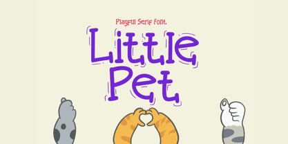 Little Pet is a fun and cute kids handwritten font, perfect for invitations, birth announcements, logo design, stickers, quotes and much more! Features Uppercase and lowercase letters Accented characters Thank you for your interest!
 - Emotios by Jadatype,
$15.00 Emotios is a display font with a bold brush style. suitable for posters, logotypes, apparel, branding, and so on. contains standard English letters, numbers, punctuation, Ligatures and several accents that support multilingualism Thank you!.
 - Socilo by Jadatype,
$15.00 Socilo is a display font that comes with a rounded square style. suitable for posters, tshirt, branding, social media, and so on. contains standard English letters, numbers, punctuation, and several accents that support multilingualism.
 - Maidenly Modesty by Ali Hamidi,
$10.00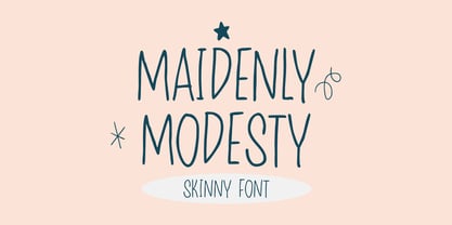 Maidenly Modesty is a cute and simple lettered handwritten font that can be used for all chalkboard quotes or teaching material! Its authentic look will add a personal and realistic feel to your designs.


